email responsive
TRANSCRIPT

Email Responsive also for Gmail App
Justin @ 2015 Aug

Why Email Responsive ?
轉換率!轉換率!轉換率!

Design with data
Calculated from 1.06 billion opens tracked by Litmus Email Analytics in July 2015

Design Process1.Gather content
2.List elements on paper
3.Sketch wireframes
4.Mock-up design
5.Write the code
6.lnline CSS
7.Test in web browsers
8.Test with real email clients
9.Test and Test
10.Lift-off !!!

Let’s go with Email Design

Make a listList the elements on some paper
Mark then up as h1,p ,button …etc
develop a hierarchy and source order(good for mobile first approach)
Keep Things Simple Use Just 1 or 2 columns if you can
Be generous with spacing
Complicated designs take times to test and debug

Consider how things will look in the inbox


Meeting with PM and Design
http://mailchimp.com/resources/email-design-guide/

Building


inline your cssWe need to do this because gmail strips css from <style> tag.

Use tablesUse <table></table> because Outlook has poor support for css based layouts

Attribute selectorsUse attribute selectors for any styles contained in your media queries to make sure Yahoo! ignores them.

Use !importantUse !important in your media quiresmake sure the styles override any inline styles.( mobile-specific)


Media Query Support in Email Clients
https://litmus.com/blog/understanding-media-queries-in-html-email

ChecklistCheck you have include alt text
Remove unused css
Optimize image
Check email with images turned-off
Check images and links have absolute paths


Drag and drop to design page
Mailchimp: Features

upload zip files and online editor
Mailchimp: Features


Campaigns record
Mailchimp: Features

Mailchimp: Features

Result?!

good for outlook (windows)

good for yahoo mail
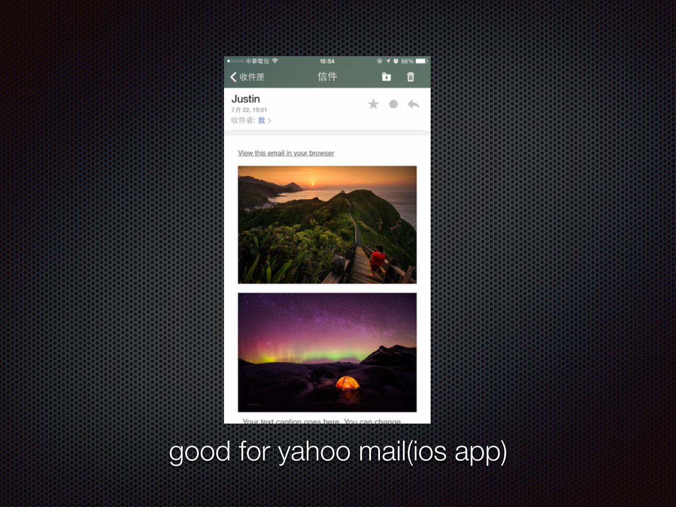
good for yahoo mail(ios app)

good for gmail (web)

gmail (iphone client)

failure for gmail iOS app and need to scale size
scale sizenormal size

Gmail app responsive

failure in use : align-left, align-right
example: use 2 columns layout

success: display:inline-block (div)

Reference

Email client market share
https://emailclientmarketshare.com/
Responsive Email resources:
http://responsiveemailresources.com/
Slide share:
https://www.slideshare.net/secret/bqAfYEmEzBf0jn
http://www.slideshare.net/benjystanton/responsive-html-emai
Media query issues in yahoo mail mobile email
https://www.campaignmonitor.com/blog/post/3457/media-query-issues-in-yahoo-mail-mobile-email/
creating a centre responsive design without media queries
https://www.campaignmonitor.com/blog/post/4240/creating-a-centred-responsive-design-without-media-queries