emmanuel college web style guide
DESCRIPTION
Web Style Guide for Emmanuel College, Boston, MATRANSCRIPT

Emmanuel College Web Site Style Guide
Prepared by BigBad, Inc.
June, 2007

�
t a b l e o f c o n t e n t S
Contents
overview & color Palettes ..................................................................................................................................................................................... 3
General Guidelines ........................................................................................................................................................................................... 4-7
content Hierarchy & Styles ......................................................................................................................................................................... 4
Image Use ..................................................................................................................................................................................................... 5-6
Page Design Usage Guidelines .............................................................................................................................................................. 7-8
Module Useage & Definitions ...................................................................................................................................................................... 9
Sample Pages ................................................................................................................................................................................................. 10-31
Home ................................................................................................................................................................................................................ 10
level 2 admissions ....................................................................................................................................................................................... 11
level 2 Standard .......................................................................................................................................................................................... 12
level 3 Standard ......................................................................................................................................................................................... 13
level 4 Standard ......................................................................................................................................................................................... 14
level 5 Standard ......................................................................................................................................................................................... 15
level 6 Standard ......................................................................................................................................................................................... 16
custom Page: form ..................................................................................................................................................................................... 17
custom Page: news & events ................................................................................................................................................................... 18
custom Page: news Detail ......................................................................................................................................................................... 19
custom Page: event Detail ........................................................................................................................................................................ 20
custom Page: alumni & friends ............................................................................................................................................................... 21
custom Page: Departments & areas of Study ...................................................................................................................................... 22
custom Page: Departments landing ...................................................................................................................................................... 23
custom Page: Departments Sub level ................................................................................................................................................... 24
custom Page: Graduate & Professional Studies l2 landing ............................................................................................................ 25
custom Page: Graduate & Professional Studies l3 ............................................................................................................................ 26
custom Page: Graduate & Professional Studies l3 ............................................................................................................................ 27
custom Page: Wide ................................................................................................................................................................................ 28-29
custom Page: looking closer Pop-Up .................................................................................................................................................... 30
custom Page: Profile Pop-Up ..................................................................................................................................................................... 31
Photoshop Instructions ..................................................................................................................................................................................... 3�

3
Color Palettes
the following HtMl colors have been carefully selected to match emmanuel college’s
identity, support current collateral designed for emmanuel, and to ensure maximum
readability on the Web. text colors should be used as they are available in the cMS.
to maintain consistency throughout all areas of the site, additional colors should
snot be used.
HEX B3BB19R179 G187 B25
HEX FEE6B5R254 G230 B181
HEX 7B8CA1R123 G140 B161
HEX FDD98DR253 G217 B141
HEX ABB400R171 G180 B0
HEX D39100R211 G145 B0
HEX FFBD00R255 G189 B0
this style guide outlines the HtMl text styles, color usage and image formats for the
newly redesigned emmanuel college Web site. In order to ensure visual consistency
throughout the site, it is important to follow these guidelines as closely as possible.
General Rules
• body content should always be flush left, never centered or flush right.
• Page content should not begin with a bulleted list.
• for maximum consistency and readability, use only the text styles and colors available in the cMS.
• text modifications should be used sparingly, or they may become overwhelming and affect readability. If certain words require additional emphasis, apply a style that is bold or italic.
• all content or in-line images must be re-sized to the appropriate dimensions for the page on which they will appear and saved as 72 dpi JPG files.
• Imagery should be used judiciously within content, and only when it supports the message within the content.
• Where “Resources” & “See also” links and embedded content links are permitted, the links should be directly relevant to the content of the page. these links should not lead the user to unrelated information.
• Web content should be as succinct as possible. be sure content is relevant and keep copy to a minimum.
HEX 668CB5R102 G140 B181
Primary Palette
HEX 94516FR149 G65 B111
Secondary Palette
HEX CBDDE8R203 G221 B232
HEX 55708DR85 G112 B141
HEX A0B0C0R160 G176 B192
HEX C07922R192 G121 B34
HEX 00000R0 G0 B0
o V e R V I e W & c o l o R P a l e t t e S
HEX FFFFFFR255 G255 B255

4
Default Text
the default text style should be used for the bulk of the content on the site. examples of
default text can be seen throughout the style guide.
H� (main content heading)
this style should be applied to the highest level headings within the standard content.
H3 (content subheading)
this style should be applied to subheadings for content under H2 headings.
H4 (content subheading)
this style should be applied to subheadings for content under H3 headings.
Bulleted List
a bulleted list style has been provided for lists within content. bulleted lists enhance
scanning readability and comprehension. list items should be limited to one paragraph
each. examples of bulleted lists can be seen throughout the style guide.
Numbered List (ordered list)
a numbered list style has been provided for numbered lists within content. choose a
numbered list if clear sequence or hierarchy among items is critical.
List Links
this style should be used for lists of links.
Anchor Links
an anchor link style has been provided for use within content. anchor links can help
users navigate a long page of content by taking them directly to a particular are of a
page.
Table Styles
a default table style has been provided for use within content. tables are an effective
means of presenting data such as timetables, weights & measures, and prices.
Content: Hierarchy & Stylesthe content and navigation text styles used in the Web site have been carefully created
to support usability by defining and establishing a hierarchy of information that is
consistent across all areas of the site. Styles should not be used for other than their
intended purpose. Improper use of styles will detract from the user’s experience and
understanding of the site and its content. Header styles should be applied and used
as described below. the default text style should be used for most text on the site. text
should be flush left, never flush right or centered. bold or italic text may be used for
special emphasis within the body—use text modifications sparingly and only when
appropriate. other styles not listed here are unique to particular templates. In some
cases it may be necessary to revise or edit content so that its structure is consistent
with that of the rest of the site.
H2 Example H3 Example
Default Text Example
G e n e R a l G U I D e l I n e S HIERaRCHy & STylES

�
I M a G e U S e TyPES of ImaGERy
Content Imagerycontent imagery refers to photographs placed within the content area of a page (in-
line). content photographs should be used judiciously and care should be taken that
images add value to the site and specifically enhance or illustrate concepts or ideas
present in the text of the page on which they are placed. In some cases, it may be best
not to use images if there are none that directly support or illustrate the content of the
page.
Imagery on the emmanuel college Web site will include two major types: brand
imagery and content imagery. While the occasional image will fit into both categories,
it is easiest to think of these image types separately.
Brand Imagerybrand imagery is used to communicate high-level information about emmanuel and
to communicate a feeling of what the college is like. these images should illustrate
key attributes of emmanuel, and should depict the students, faculty, interpersonal
interactions, and facilities of the college. While brand imagery is used throughout the
site, it is most concentrated at upper levels, such as on the home page and second-
level pages.
Brand Imagery Examples Content Imagery
Examples

�
Image GuidelinesImages are one of the primary elements contributing to a page’s file size, and
numerous large photos will adversely affect download speed.
• In the majority of cases, users are best served by placing no more than one content or in-line image per text page.
• If more than one image is used, each image should be placed as stated below making sure that no less than one paragraph of content separates them.
• all in-line images should be placed in the left-hand side of the content area, and should not be centered or placed on the right.
• In-line images (content images) for standard page designs should be sized to 115 x 135 pixels and saved as 72 dpi JPG files.
• Use of in-line (content) images next to a bulleted list, list of links, or quote module is not recommended.
Choosing ImagesWhenever possible, use photographs that include people. this will reflect the friendly,
supportive atmosphere of emmanuel, and in the case of prospective students, will help
them picture themselves at the school. People should be positioned relatively close
together—space between people that works well in print easily becomes distracting
dead space on the Web and can reduce the amount of interesting detail that can be
included. Imagery should highlight not only student–student and student–faculty
interaction, but should also feature strongly the facilities located on campus.
In the Web medium, certain types of imagery works better than others:
• tight shots (close-ups on subject or content) work much better than wider shots.
• Images with a lot of detail and/or complicated composition are less effective.
• all images need to be able to work well at a relatively small size.
• Simple backgrounds work best; in the online environment too many details can easily overwhelm the rest of the subject matter.
G e n e R a l G U I D e l I n e S ImaGE GuIDElInES

7
I M a G e U S e TyPES of ImaGERy
Second Level Page Designs
Second level pages define most of the major
sections of the site and provide users information
about what will be found in each of these sections.
Some examples* of pages that will use Second
level page design are:
• academics • admissions • about emmanuel • tuition & aid • Student life
Third Level Page Designs
the third level of the site is where users begin to
explore longer, more detailed content. Some areas
of the site are purely informational, while other
areas include rich content and visual imagery.
Some examples* of pages that will use third level
page design are:
• Message from the Dean • International Students • Student Policies • Support emmanuel
Fourth Level Page Designs
the fourth level page design provides additional
navigation on the right (if needed) that is designed
to feature additional navigation to related areas of
that section. examples* of pages that would use
the fourth level page design are:
• President’s biography • Honors Program • academic advising
Fifth Level and Deeper
this page occurs only under fourth level pages
and may include a deeper level of navigation on
the right hand side. examples* of pages that would
use the fifth level page design are:
• Services • family Weekend • Grants
* This is a partial list and does not include all pages that may be used with this page design.
STanDaRD PaGE DESIGnS Pa G e D e S I G n U S a G e G U I D e l I n e S

�
I M a G e U S e TyPES of ImaGERy
Graduate & Professional Programs (GPP)
the GPP Page Designs are exclusively for the
Graduate and Professional Studies area of the
emmanuel Web site. this unique section of the site is designed to speak directly to the adult professional seeking an advanced degree—
bachelor’s or master’s.
Department Landing & Sub Page Designs
the Department Page Designs are to be used for the
various department sub-sites within emmanuel’s
Undergraduate Majors and Programs. these page
designs can be customized to each individual
department with imagery on the header and title
bar, department-specific news & events and other
timely content. examples* of pages that will use the
Department page design are:
• biology • Global Studies • Philosophy
Alumni & Friends
this Page Design provides a wealth of information
directed at alumni in an easy-to-access manner
including activities and online giving.
News & Events Page Designs
the news & events page design is specifically
designed to highlight top events and news stories
in a timely fashion.
* This is a partial list and does not include all pages that may be used with this page design.
unIQuE PaGE DESIGnS Pa G e D e S I G n U S a G e G U I D e l I n e S

�
M o D U l e S uSaGE & DEfInITIonS
Looking Closer a link to the looking closer Module will appear on the Home page as well as Standard level 2 pages. clicking into this link from the home will expand the window to reveal images and lead-in story to five unique attributes. from here you can learn more about each attribute by clicking the learn More button which will launch the looking closer pop-up feature. clicking into the looking closer feature link from level 2 pages will automatically launch the pop-up window.
Profiles the Profile Module will appear on all Standard level 2 pages and GPP level 2 pages in the upper right-hand corner. the featured profile image and lead-in story will be changed on refresh or revisit of the page. the profiles are actual stories told about real students, alumni, faculty and staff and should reflect the emmanuel experience.
Timely Content (optional) there are several areas within the emmanuel site that feature timely content areas. these flexible areas were developed to promote various communication needs that are not specifically news or events. timely content are short factoids or blurbs editable by the cMS and may include: admission due dates, student clubs and organizations, etc.
Resources and See Also (optional) links that fall under the heading “Resources” are task-oriented links that should relate specifically to the section/page content and live within the emmanuel college site. “See also” links should also relate to the section and content but can link outside of the emmanuel site. these links are optional on all standard levels 2-5.
Research (optional) this is an optional module that may be used on levels 2-5 and the Department home. the contact module is for section/page related contact information.
Career Paths (optional) this optional module is used in the Department and areas of Study pages and links to the “What can I do with my major?” page.
Quote (optional) this module available to use on Standard level 3 pages throughout the site and is intended to be used at the beginning of content and when there is no content image. this module is entirely graphic and not editable by the cMS.
modulesbigbad has created several specialty modules for the new emmanuel Web site.
Modules are essentially content enhancing assets that allow the user to gain access to
related and/or additional information that is strategically relevant to the page and it’s
content. You will find a listing and additional information on the modules in the cMS.
module Examples
looking Closer module

10
S a M P l e Pa G e S
Home PageExample: Home
the home page is unique among all pages of the site. Individual content
is variable but should be kept brief. each content item on the page should
be thought of as a “teaser”—you want to interest a user so they will click
into the site. attempting to provide too much information or too lengthy
content on this page will overwhelm users. Use deeper pages of the site to
provide full details and information.
Home Page Branding Images
the large main image is meant to convey the iconic images of boston. the 2 images of the students to the right are meant to show the diversity of students at emmanuel. the people images swap out upon page refresh or revisit, and new images must be created using the supplied PhotoShop file (see page 31 for instructions).
Looking Closer at Emmanuel Flash Feature Upon rollover, a menu is revealed that lists several breakout topics which link to more infromation via a pop-up window (see pages 9 and 29 for detailed descriptions of Looking Closer).
Timely Content Feature Area
this area address up-to-the-minute communication needs such as important announcements, dates, links to dynamic areas of the site, etc. It is composed of a title and description, together no more than � words (must remain on 3 lines) and a thumbnail image sized to 41 x 40 pixels in dimension.
Graduate & Professional Program
this area can be used to describe a new program, campus location, or upcoming informational meeting. Description can be no more than 1� words in length.
News & Events Highlights links to 3 recent news or event items. the cMS al-lows for the administrator to select which 3 appear on the home page (see pages 19 & 20 for instructions on entering content).
1
3
4
�
1
3
4
�
Primary navigation (Second level links)
footer navigation
additional navigation

S a M P l e Pa G e S
11
level 2 admissionsExample: Home > Undergraduate admissions
level 2 pages define the major sections of the site, and provide users information about what will be found in each of these sections. all level 2 sections will use this template unless otherwise specified as having a custom template detailed further in this document.
Level �+ Branding Image
the image at the top-left of the page should represent brand-imagery of the campus and students. each main section will have one image that runs constant throughout that section as you drill down. the image should be 33� x 1�� pixels in dimension.
Profile
the Profile Module will appear on all level 2 Standard pages in the upper right-hand corner. the featured profile image and lead-in story will be changed on page refresh. the content is entered when creating a new profile (see page 9 and 30 for detailed descriptions). the profiles are actual stories told about real students, alumni, faculty and staff and should reflect the emmanuel experience.
Level � Intro Image
this image should represent general imagery of the overall lead-in text that appears to the right of the image, and is only present on level 2 pages. the image should be �� x �3 pixels in dimension.
Timely Content Module
the timely content module on level 2 pages should be no more than � words in length (4 lines long).
Decision Date Feature (optional)
Highlights admissions deadlines and applications. Keep wording to a couple of sentences.
1
3
4
1
34
Default Text
H2
H2
H2
H2
��
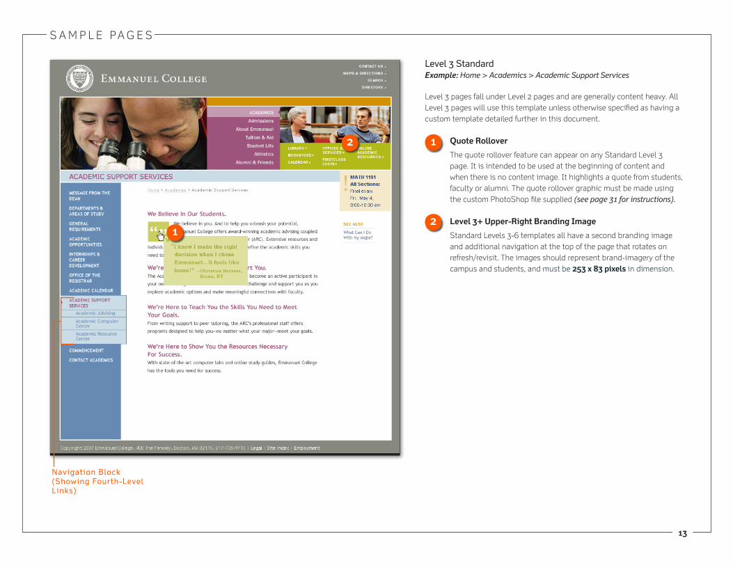
navigation Block (Showing Third-level links)

S a M P l e Pa G e S
1�
level 2 StandardExample: Home > academics
this level 2 page is similar to the level 2 admissions page, except it features additional (global) navigation on the right and has an example
of a research feature in the content area.
Research Feature
Highlights department student-faculty research and service learning opportunities. composed of a thumbnail image sized to �� x �� pixels in dimension, a title of up to 7 words and a description of up to 1� words in length.
1
1
Global navigation
S a M P l e Pa G e S
13
navigation Block (Showing fourth-level links)
level 3 StandardExample: Home > Academics > Academic Support Services
level 3 pages fall under level 2 pages and are generally content heavy. all level 3 pages will use this template unless otherwise specified as having a custom template detailed further in this document.
Quote Rollover
the quote rollover feature can appear on any Standard level 3 page. It is intended to be used at the beginning of content and when there is no content image. It highlights a quote from students, faculty or alumni. the quote rollover graphic must be made using the custom PhotoShop file supplied (see page 31 for instructions).
Level 3+ Upper-Right Branding Image
Standard levels 3-6 templates all have a second branding image and additional navigation at the top of the page that rotates on refresh/revisit. the images should represent brand-imagery of the campus and students, and must be ��3 x �3 pixels in dimension.
1
1
�
�

S a M P l e Pa G e S
14
level 4 StandardExample: Home > Academics > Academic Support Services > Academic Resource Center
level 4 pages fall under level 3 pages, and are generally content heavy. all level 4 pages will use this template unless otherwise specified as having a custom template detailed further in this document.
Optional Content Imagery In-line images can be added to the standard content (default text) on most pages. the image should be directly related to the main body of content. the border is applied automatically by the cMS. all in-line images must be 11� x 13� pixels wide.
navigation Block (Showing fourth-level links)
1
1
H2Bold

S a M P l e Pa G e S
1�
level 5 StandardExample: Home > Academics > Academic Support Services > Academic Resource Center > Mission Statement
level 5 pages fall under level 4 pages, and are generally content heavy. all level 5 pages will use this template unless otherwise specified as having a custom template detailed further in this document. level 5 page titles show up in the content area in green.
navigation Block (Showing fifth-level links)
Bulleted
level 5 Page Title

S a M P l e Pa G e S
1�
level 6 StandardExample: Home > Academics > Academic Support Services > Academic Resource Center > Mission Statement > Level 6 Page
level 6 pages fall under level 5 pages, and are generally content heavy. all level 6 pages will use this template unless otherwise specified as having a custom template detailed further in this document. level 6 page titles show up in the content area in green.
navigation Block (Showing Sixth-level on-State)

S a M P l e Pa G e S
17
Example of a formExample: Home > Undergraduate Admissions > Applications & Deadlines Online Application Form
this page is an example of a custom form. all of the styles are applied automatically. See detailed instructions on creating forms in the administrator Document.

S a M P l e Pa G e S
1�
news & Events PageExample: Home > About Emmanuel > Emmanuel News & Events
the news & events main page contains highlights that link to 3 news and
2 event items. the cMS allows for the administrator to select which ones
appear on the the highlight page.

S a M P l e Pa G e S
1�
news Detail TemplateExample: Home > about emmanuel > emmanuel news & events > news Detail
this page layout is for news detail pages. When entering the content into the cMS, you would upload the thumbnail images and lead-in content seen on the Home page and news & events page.
Detail Page Image & Caption
news articles can have an in-line image that must be 11� x 13� pixels wide. the border is applied automatically. a caption can also be entered with the image within the image’s alt text.
Thumbnail Image
a second image must be created (a cropped version of the detail page image) and must be sized to �� x �� pixels in dimension. the border is applied automatically. this image will appear on the Home page and news & events main page.
1
1
H2
example of thumbnail from news & events Page
�
�
S a M P l e Pa G e S
�0
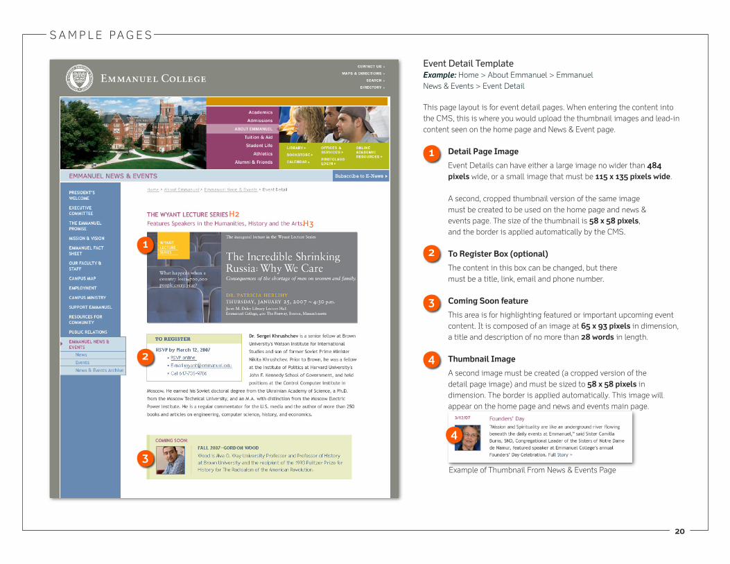
Event Detail TemplateExample: Home > about emmanuel > emmanuel news & events > event Detail
this page layout is for event detail pages. When entering the content into the cMS, this is where you would upload the thumbnail images and lead-in content seen on the home page and news & event page.
Detail Page Image
event Details can have either a large image no wider than 4�4 pixels wide, or a small image that must be 11� x 13� pixels wide.
a second, cropped thumbnail version of the same image must be created to be used on the home page and news & events page. the size of the thumbnail is �� x �� pixels, and the border is applied automatically by the cMS.
To Register Box (optional)
the content in this box can be changed, but there must be a title, link, email and phone number.
Coming Soon feature
this area is for highlighting featured or important upcoming event content. It is composed of an image at �� x �3 pixels in dimension, a title and description of no more than �� words in length.
Thumbnail Image
a second image must be created (a cropped version of the detail page image) and must be sized to �� x �� pixels in dimension. the border is applied automatically. this image will appear on the home page and news and events main page.
1
3
1
3
H2H3
example of thumbnail from news & events Page
4
4

S a M P l e Pa G e S
�1
alumni & friendsExample: Home > alumni & friends
this page layout is for alumni & friends and features a custom graphic at the top along with featured alumni news and events.
Alumni & Friends Main Page Image
the image in the center of the page will rotate on refresh/revisit and is editable in the cMS. new images should feature alumni and friends and be 3�4 x 1�4 pixels in dimension. the text above and below are graphics and cannot be edited.
Alumni News & Events Features Highlights links to 3 news and 3 event items. You must enter content via the master news list (see pages 19 & 20 for instructions on entering content). the cMS allows for the administrator to select which 3 appear on the page. 1
Bold Bold� �
1
�

S a M P l e Pa G e S
��
Header Row (rule style)
Departments and areas of StudyExample: Home > academics > Departments & areas of Study
this page features a listing of all the departments and areas of study. each one links off to it’s corresponding department pages or areas of study.
S a M P l e Pa G e S
�3
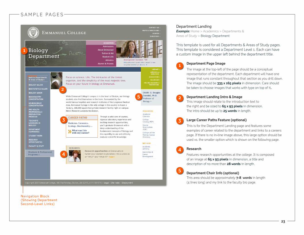
Department landingExample: Home > academics > Departments & areas of Study > biology Department
this template is used for all Departments & areas of Study pages. this template is considered a Department level 1. each can have a custom image in the upper left behind the department title.
Department Page Image
the image at the top-left of the page should be a conceptual representation of the department. each department will have one image that runs constant throughout that section as you drill down. the image should be 33� x 1�� pixels in dimension. care should be taken to choose images that works with type on top of it.
Department Landing Intro & Imagethis image should relate to the introduction text to the right and be sized to �� x �3 pixels in dimension. the intro should be up to �� words in length.
Large Career Paths Feature (optional)
this is for the Department landing page and features some examples of career related to the department and links to a careers page. If there is no in-line image above, this large option should be used vs. the smaller option which is shown on the following page.
Research
features research opportunities at the college. It is composed of an image at �� x �3 pixels in dimension, a title and description of no more than �� words in length.
Department Chair Info (optional)this area should be approximately 7-� words in length (4 lines long) and my link to the faculty bio page.
1
�
�
3
4
1
�
3
4
�
navigation Block (Showing Department Second-level links)

S a M P l e Pa G e S
�4
Department Sub level Example: Home > academics > Departments & areas of Study > biology Department > biostatistics Major
this template is used for all Departments and areas of study level 2 pages.
Department Page General Image the image at the top-right of the page should be brand imagery relating to the department. each department will have one image that runs constant throughout lev-els 2+ within that section as you drill down. the im-age should be ��1 x 1�0 pixels in dimension.
Section Intro the section intro should be no more that one paragraph in length.
Department In-lie Image (Optional) the image should be directly related to the main body of content. It must be sized to 11� x 1�4 pixels in dimen-sion; the border is applied automatically by the cMS.
Small Career Paths Feature (Optional)
this is for Department level 2 pages. and features a link to a careers page.
Department Chair or Coordinator
features the name and title of the department chair or coordinator. these can link to the faculty bio page.
1
�
3
4
�
1
�
3
4
�
navigation Block (Showing Department Second-level on-State)

S a M P l e Pa G e S
��
GPP level 2 (landing)Example: Home > Graduate & Professional Programs
this is a custom template for the Graduate and Professional Programs section. this template has a new color palette and a custom banner at the top of the page.
Level �+ Branding Image
the image at the top-left of the page should represent brand-imagery related to GPP. the image should be 33� x 14� pixels in dimension.
Profile
the Profile Module will appear on the level 2 landing page of the GPP section in the upper right-hand corner. the featured profile image and lead-in story will be changed on page refresh or revisit. the content is entered when creating a new profile (see page 9 and 30 for detailed descriptions). the profiles are actual stories told about real students, alumni, faculty and staff and should reflect the emmanuel GPP experience.
Level � Intro
this lead-in text is only present on the GPP level 2 page. the text is a graphic image.
GPP Program Listings
the program listing links bring you to information about each specific GPP program or area of study. GPP News FeatureHighlights links to 3 news items. You must enter content via the master news list (see pages 19 & 20 for instructions on entering content). the cMS allows for the administrator to select which 3 appear on the page.
Satelite Campus Link
links to information about off-campus GPP locations.
1 �
3
4�
1
�
3
4
�
GPP navigation Block (Showing local GPP navigation)
�
7
�

S a M P l e Pa G e S
��
GPP level 3Example: Home > Graduate & Professional Programs > academic
Information
this is a custom template for the Graduate and Professional Programs section. this template has a new color palette and a custom banner at the top of the page.
GPP Section Branding Image
the image at the top-left of the page should be brand imager representing the graduate and professional programs. each section within the main GPP page has its own image which remains consistent throughout that section. the image should be �0� x 14� pixels in dimension.
In-line Image (Optional) the image should be directly related to the main body of content. It must be sized to 11� x 1�4 pixels in dimen-sion; the border is applied automatically by the cMS.
1
�
1
�
navigation Block (Showing GPP Third-level links)
list links

S a M P l e Pa G e S
�7
GPP level 4Example: Home > Graduate & Professional Programs > Academic Infor-mation > Academic Advising
this is a GPP level 4 page. If there is additional navigation at level 4, you may enter fifth level navigation as needed.
navigation Block (Showing GPP fifth-level links)

S a M P l e Pa G e S
��
Wide TemplageExample: Home > Offices & ServicesExample: Home > Search
this template is used for pages that require full-width for wide content. there is no left or right navigation or modules. content can be in columns or can be within tables.

S a M P l e Pa G e S
��
Wide Templage (cont.)Example: Home > Site Map
this template is used for pages that require full-width for wide content. there is no left or right navigation or modules. content can be in columns or can be within tables.
S a M P l e Pa G e S
30
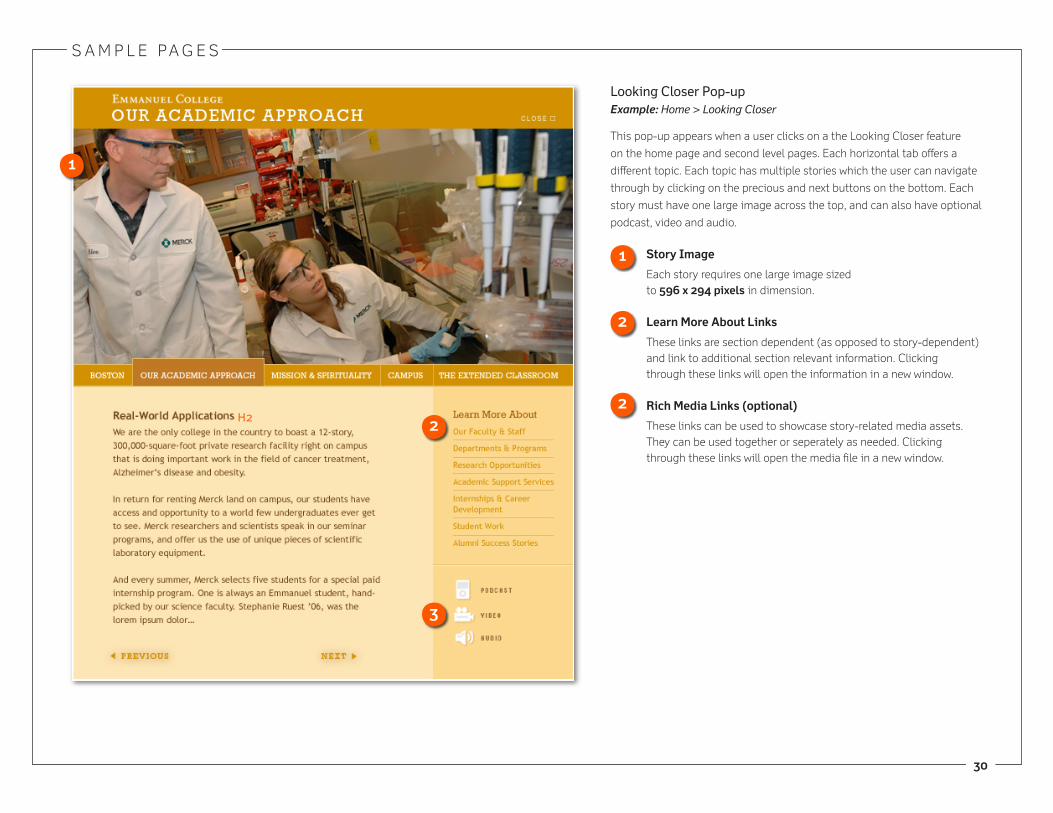
looking Closer Pop-upExample: Home > Looking Closer
this pop-up appears when a user clicks on a the looking closer feature
on the home page and second level pages. each horizontal tab offers a
different topic. each topic has multiple stories which the user can navigate
through by clicking on the precious and next buttons on the bottom. each
story must have one large image across the top, and can also have optional
podcast, video and audio.
Story Image
each story requires one large image sized to ��� x ��4 pixels in dimension.
Learn More About Links
these links are section dependent (as opposed to story-dependent) and link to additional section relevant information. clicking through these links will open the information in a new window.
Rich Media Links (optional)
these links can be used to showcase story-related media assets. they can be used together or seperately as needed. clicking through these links will open the media file in a new window.
1
1
H2
�
�
3
�

S a M P l e Pa G e S
31
Profile Pop-upExample: Home > Academics > Profile
the Profile Pop-up appears when a user clicks on a profile module.
Profile Image
each profile must have 2 copies of the profile image. the images can be the same or 2 different images of the same person:
a large vertical format for the profile main page cropped to show the upper half of the person. this image should be sized to ��� x 311 pixels in dimension.
a small horizontal format for the level 2 Modules cropped to the head and shoulders of the person. this image should be sized to ��3 x �� pixels in dimension.
1H2
level 2 Module
1

3�
Home Page: � Students Right Image (home_students_�images.psd)
there are 2 image layers in the PSD. one for the top image, and one for the bottom. the layers have masks applied to them that have the exact dimension for each image. Update the images as necessary. there should always be a female image on the top and a male image on the bottom. Special care should be taken to choose faces that compliment each other as well as represent diversity.
both images should be 124 x 138 pixels, and placed one above another. the PhotoShop document’s overall size is 124 x 276 pixels. Do not cHanGe tHe SIZe of tHe PHotoSHoP fIle, tHIS WIll ReSUlt In tHe HoMe PaGe IMaGe beInG bRoKen.
export the image as a single JPeG at a quality of 75.
Level 3: Quote Rollover Image (Level3_Green_Quote.psd)
ReQUIReD font: Rockwell (t1) Regular
there is a text folder in the PSD containing 2 text layers; one for the quote and one for the name:
QUote teXt: the font settings are Rockwell (t1) Regular; 12/18px; tracking=60; color#909623
naMe teXt: the font settings are Rockwell (t1) Regular; 10/12px; tracking=60; color#909623
edit the text, if the PhotoShop document is too tall or too short, adjust the height of the canvas size as necessary (only allow the bottom to grow longer, tHe WIDtH MUSt ReMaIn 192 PIXelS). there should be 24 pixels of space between the baseline of the last line of quote text and the baseline of the first line of name text. there should be 17 pixels of space below the baseline of the last line of text.
Do not MoVe tHe teXt laYeR (it should remain aligned to the guidelines in the PSD, the text layer can only grow longer from the bottom down).
Save the image as a GIf with 16 colors.
P H o t o S H o P I n S t R U c t I o n S
24 pixels
17 pixels