enhancing visual’meaning measuring v … · (1967), and through the development of instruments...
TRANSCRIPT
1
Enhancing Visual Meaning: Measuring Visual Communication Design Effectiveness
David Craib: AOCA, MDes, Carleton University, Ottawa
Lorenzo Imbesi Arch. PhD, Professor, Sapienza University of Rome
Abstract Visual messages are pervasive throughout modern societies, being continually disseminated and consumed through various channels, such as portable communication technologies, computers, television and print. Visual communication designers are tasked to create and produce highly perceivable and meaningful visual messages that populate these visual channels, but lack the science-based tools to ensure their designs are effective before they are disseminated. A set of visual communication design criteria and tools, aimed to increase design research effectiveness, will be derived through research focusing on three communication-related disciplines, including perception psychology, data visualization, and semiotics. These criteria and tools will then be applied to case studies of web- and print-based visual presentations to study their viability as research tools. This paper asserts that various disciplines outside visual communication design can contribute to the development of useful design tools, that, through further research, could potentially offer visual communication designers and researchers a comprehensive design research, and design practice, toolkit.
Keywords Visual communication design; perception; meaning; semiotics
Visual communication plays a dominant role in culture and society. Communicators employ information technologies (IT) to send their visual messages over global networks, aimed at information receivers, and consumed on desktop computers, laptops, tablets, telephones, televisions, newspapers, magazines, reports and books. Visual communication designers place text, images and graphics into forms meant to be consumable by information users. They produce magazine layouts, websites, online and print publications, exhibits, corporate reports and various other communication vehicles. They employ modern technologies to produce their work, but their discipline is also concerned with aesthetics and craft, such as typography, colour and composition.
Society has a huge investment in visual communication design, as it constantly creates, transmits and consumes the visual output of communication designers. The efficiency in which these messages are transferred is therefore critical; the effectiveness of messages once received, is also critical. In order to ensure the value society places on communication, the discipline of visual communication design needs to apply science and research to what has traditionally been seen as their craft, and to develop research-driven theory and practice.
The aim of this interdisciplinary research is to apply existing communication-related theories, researched through three distinct disciplinary perspectives, to a visual communication design scenario. Tools derived from each discipline, will be applied to the design scenario through case studies to see if they are effective. Specifically, effectiveness will be analyzed through the psychological perceptibility of the case study information; the adherence of each subject to data
2
visualization principles; through the quickness of data communication and degree of meaning generated by the case study subjects – analyzed through a semiotic approach, and whether triangulation of the findings informs the research.
Visual perception and meaning Visual perception has been studied over the last 50 years by psychologists such as Rudolph Arnheim (1974), Julien Hochberg (Gombrich, Hochberg & Black, 1972) and currently, by Colin Ware (2013). Text perception research produced many studies, including Miles Tinker’s (1963) psychology-based text legibility research. Jacques Bertin (1983) explored design principles in data visualization and cartography, and the statistician Edward Tufte (2001) developed theory within data visualization and information design. The challenge for visual communication design was that little research had come from a visual communication design perspective, been researched within its parameters, or adopted by its practitioners. The contribution of visual perception research on visual communication design is still somewhat uncertain, yet the field of visual communication design would benefit by knowing how perception theories can be used for design research and which ones inform the process of design creation.
Charles Sanders Peirce and Ferdinand de Saussure were two founders of semiotics – the study of meaning (Chandler, 2013) – prior to, and around the turn of the 19th century. Semiotics developed through the 1900s, with strong contributions from theorists such as Roland Barthes (1967), and through the development of instruments like the semiotic square, Algirdas Julien Greimas’ (1987) tool for analyzing meaning. In the 1990s, Jean-Marie Floch (2001) used Greimas’ semiotic square to research and establish meaning within marketing campaigns, yet, visual communication designers, who were often not involved in the creation of the content that populated their designs, failed to adopt these theories and tools. As important participants in the communication process (Kress & van Leeuwen, 2006), visual communication designers should reconsider their role in the development of meaning, and the development of design tools that enhance their ability to do so.
Methodology Design criteria sets were derived through researching various disciplines that could potentially contribute to visual communication design theory. Three specific areas were deemed promising, including the cognitive psychology principles of Colin Ware, data visualization principles of Edward Tufte, and a semiotics analysis tool of Algirdas Greimas (as employed by Jean-Marie Floch). Each set of criteria was applied to 20 case studies, and the scoring was done by the researcher, with the goal of gathering and developing suitable criteria for future visual communications design research approaches. For multiple evaluators to participate in similar research, it would be necessary to train each participant in the theory and application of the theory and design tools deemed effective by this initial research phase.
The 20 case studies were not conducted as usability tests. The goal was to discern which, if any, interdisciplinary theories could be practically applied by visual communication designers or researchers, to analyze or heighten visual communication design effectiveness.
The criteria sets were applied to case studies of online and print-based corporate, at a glance presentations. These are succinct corporate overviews that are visually conveyed, graphically and textually, often forming introductory, context-setting sections of corporate annual reports (E. Wyatt, personal communication, March 14, 2013), but may also exist as succinct, stand-alone presentations.
3
A semi-purposive sampling was taken based on the Google web search parameters of at a glance, annual report, public annual report, and public at a glance, used in both search and image modes. The at a glance presentations needed to meet four criteria based on expert interviews, and the researcher’s goal to maximize diversity in the samples. The first criterion was that there had to be an equal amount representing public and private organizations, which have different types of stakeholders and communication requirements. Traditionally, the private sector has produced more, and better at a glance presentations (E. Wyatt, personal communication, March 14, 2013). Secondly, they had to represent both on-line and print at a glance presentations, which are both currently in common use. Thirdly, they had to use a combination of text and graphic, or text, image and graphic, as the three experts interviewed stated that a multimodal design approach was preferable, so text-only at a glance presentations were rejected (L. Brière, personal communication, March 18, 2013; G. Larkin, personal communication, March 4, 2013; E. Wyatt, personal communication, March 14, 2013). The fourth criterion was that each presentation should be from a distinct business area, to ensure diversity of the examples. This was achieved for the private sector at a glance presentations, but proved impossible for the public sector ones, as there were too few available to choose distinct areas of business. Finally, a total of 20 presentations were collected, 10 of which came from the private sector, and 10 public sector presentations.
The 20 at a glance case studies are listed below:
1. University of Notre Dame Center for Social Concerns
https://socialconcerns.nd.edu/annualreport/2011/index.php/at_a_glance/
2. The Ottawa Hospital
http://www.worldclasscare.ca/en/at-a-glance/
3. Texas Tech University
http://www.ttu.edu/administration/president/ar/
4. NSERC Investment Dashboard
http://www.nserc-crsng.gc.ca/db-tb/index-eng.asp
5. Telefilm
http://www.telefilm.ca/rapport-annuel/2011-2012/index-en.html
6. Green Alliance (pdf)
http://www.green-alliance.org.uk/greengrowth_GermanyUK/
7. University of South Wales (UNSW) (pdf)
https://newsroom.unsw.edu.au/publications/annual-report
8. Chicago Foundation for Education (pdf)
http://www.cfegrants.org/donors/annual-report/
9. iCord Health Research (pdf)
http://icord.org/news/2012/11/icords-annual-report-is-now-available/
10. HIM Trademark & Design (pdf)
4
http://oami.europa.eu/annualreport2010/html/en/ataglance.html
11. Kier
http://www.kier.co.uk/ar2011/overview/kier-at-glance.html
12. Benesse Holdings
http://www.benesse-hd.co.jp/en/ir/ar2012/finance.html
13. Bank of Montreal
http://www.bmo.com/ar2011/glance-who-we-are.html
14. Sysco
http://www.sysco.com/investor/Online Annual2012/sysco-at-a-glance.html
15. Tesco PLC
https://www.tescoplc.com/files/reports/ar2012/index.asp?pageid=15
16. Waggener Edstrom (pdf)
http://waggeneredstrom.com/we-at-a-glance/
17. Vodophone 2011 (pdf)
http://www.vodafone.com/content/index/investors/investor_information/annual_ report.html
18. AstraZeneca 2011 (pdf)
http://www.astrazeneca.com/Investors/Annual-reports
19. DCC 2012 (pdf)
http://www.dcc.annualreport12.com/
20. Canadian Tire 2012 (pdf)
http://corp.canadiantire.ca/EN/INVESTORS/FINANCIALREPORTS/Pages/AnnualReports.aspx
Criteria sets and tools The mathematician and perception psychologist, Colin Ware, discusses what he calls “preattentive cues”, which are visual stimuli that we perceive immediately without effort. The benefit that preattentive cues offer visual designers, is that they are naturally experienced at a glance, and therefore are appropriate techniques for constructing immediately perceivable visual displays (Ware, 2013, p. 153-156).
A 16-item list of preattentive cues containing 11 kinds of contrasts of form, three kinds of colour contrasts, the contrast of movement and contrast of two dimensional position, were listed. Statements, such as variations in shape help to create visual distinction, and, hue changes help to create visual contrast, covering each preattentive cue, were stated as Likert items, allowing the to select seven steps between strongly disagree, and strongly agree, which were recorded and analyzed. This criteria set measured the use of immediately perceivable variations in visualized information.
The second case study criteria set was based on the data visualization theories of Edward Tufte, derived through three of his books, The Visual Display of Quantitative Information,
5
Envisioning information, and Visual Explanations. Tufte’s concepts of perception and graphic meaning relate to the design of summary graphic displays. Tufte’s concepts cover various aspects of data visualization best practices, usually combining several design concepts into an overarching principle. A 10-element list of design principles was derived, – an example of which is Tufte’s (2001) concept of data density. Tufte’s data density quotient is represented by the number of data entries within a data graphic, divided by the total area of the graphic, where the goal is to have a high amount of data within a prescribed area.
Statements, such as data-density is high, representing each of the 10 design principles, were stated as Likert items, allowing the researcher to select seven steps between strongly disagree, and strongly agree, which were recorded and analyzed. This criteria set measured the degree to which specific data visualization best practices were used in each visual presentation.
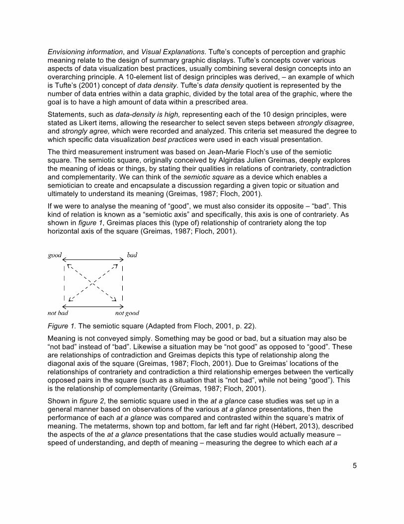
The third measurement instrument was based on Jean-Marie Floch’s use of the semiotic square. The semiotic square, originally conceived by Algirdas Julien Greimas, deeply explores the meaning of ideas or things, by stating their qualities in relations of contrariety, contradiction and complementarity. We can think of the semiotic square as a device which enables a semiotician to create and encapsulate a discussion regarding a given topic or situation and ultimately to understand its meaning (Greimas, 1987; Floch, 2001).
If we were to analyse the meaning of “good”, we must also consider its opposite – “bad”. This kind of relation is known as a “semiotic axis” and specifically, this axis is one of contrariety. As shown in figure 1, Greimas places this (type of) relationship of contrariety along the top horizontal axis of the square (Greimas, 1987; Floch, 2001).
Figure 1. The semiotic square (Adapted from Floch, 2001, p. 22).
Meaning is not conveyed simply. Something may be good or bad, but a situation may also be “not bad” instead of “bad”. Likewise a situation may be “not good” as opposed to “good”. These are relationships of contradiction and Greimas depicts this type of relationship along the diagonal axis of the square (Greimas, 1987; Floch, 2001). Due to Greimas’ locations of the relationships of contrariety and contradiction a third relationship emerges between the vertically opposed pairs in the square (such as a situation that is “not bad”, while not being “good”). This is the relationship of complementarity (Greimas, 1987; Floch, 2001).
Shown in figure 2, the semiotic square used in the at a glance case studies was set up in a general manner based on observations of the various at a glance presentations, then the performance of each at a glance was compared and contrasted within the square’s matrix of meaning. The metaterms, shown top and bottom, far left and far right (Hébert, 2013), described the aspects of the at a glance presentations that the case studies would actually measure –speed of understanding, and depth of meaning – measuring the degree to which each at a
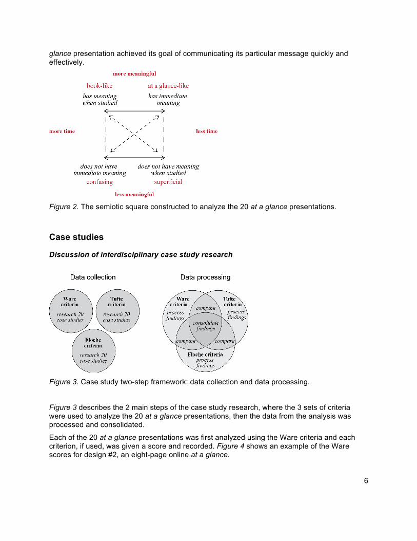
6
glance presentation achieved its goal of communicating its particular message quickly and effectively.
Figure 2. The semiotic square constructed to analyze the 20 at a glance presentations.
Case studies
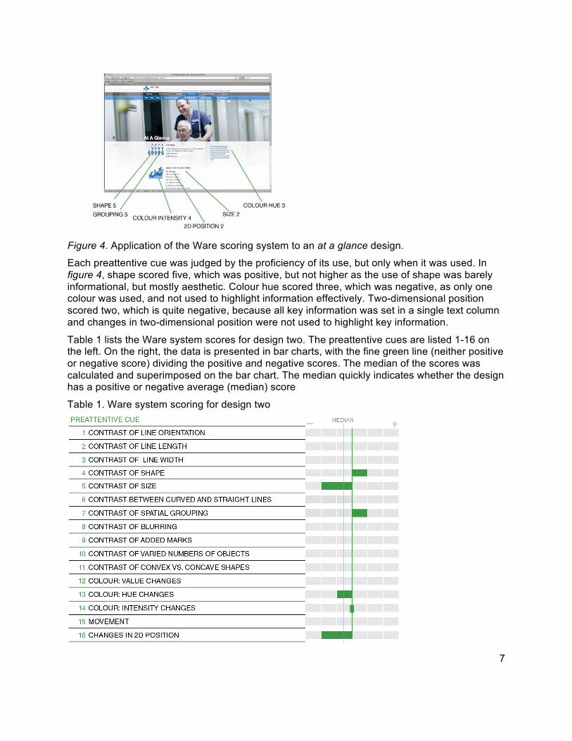
Discussion of interdisciplinary case study research
Figure 3. Case study two-step framework: data collection and data processing.
Figure 3 describes the 2 main steps of the case study research, where the 3 sets of criteria were used to analyze the 20 at a glance presentations, then the data from the analysis was processed and consolidated.
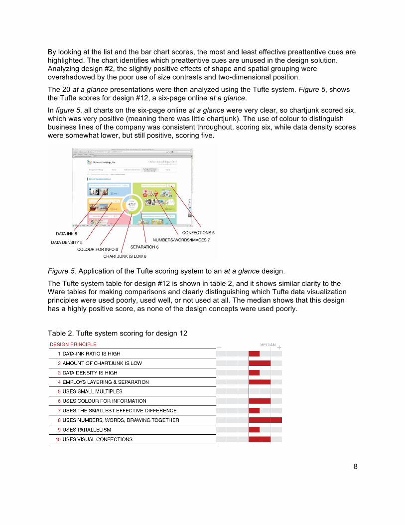
Each of the 20 at a glance presentations was first analyzed using the Ware criteria and each criterion, if used, was given a score and recorded. Figure 4 shows an example of the Ware scores for design #2, an eight-page online at a glance.
7
Figure 4. Application of the Ware scoring system to an at a glance design.
Each preattentive cue was judged by the proficiency of its use, but only when it was used. In figure 4, shape scored five, which was positive, but not higher as the use of shape was barely informational, but mostly aesthetic. Colour hue scored three, which was negative, as only one colour was used, and not used to highlight information effectively. Two-dimensional position scored two, which is quite negative, because all key information was set in a single text column and changes in two-dimensional position were not used to highlight key information.
Table 1 lists the Ware system scores for design two. The preattentive cues are listed 1-16 on the left. On the right, the data is presented in bar charts, with the fine green line (neither positive or negative score) dividing the positive and negative scores. The median of the scores was calculated and superimposed on the bar chart. The median quickly indicates whether the design has a positive or negative average (median) score
Table 1. Ware system scoring for design two
8
By looking at the list and the bar chart scores, the most and least effective preattentive cues are highlighted. The chart identifies which preattentive cues are unused in the design solution. Analyzing design #2, the slightly positive effects of shape and spatial grouping were overshadowed by the poor use of size contrasts and two-dimensional position.
The 20 at a glance presentations were then analyzed using the Tufte system. Figure 5, shows the Tufte scores for design #12, a six-page online at a glance.
In figure 5, all charts on the six-page online at a glance were very clear, so chartjunk scored six, which was very positive (meaning there was little chartjunk). The use of colour to distinguish business lines of the company was consistent throughout, scoring six, while data density scores were somewhat lower, but still positive, scoring five.
Figure 5. Application of the Tufte scoring system to an at a glance design.
The Tufte system table for design #12 is shown in table 2, and it shows similar clarity to the Ware tables for making comparisons and clearly distinguishing which Tufte data visualization principles were used poorly, used well, or not used at all. The median shows that this design has a highly positive score, as none of the design concepts were used poorly.
Table 2. Tufte system scoring for design 12
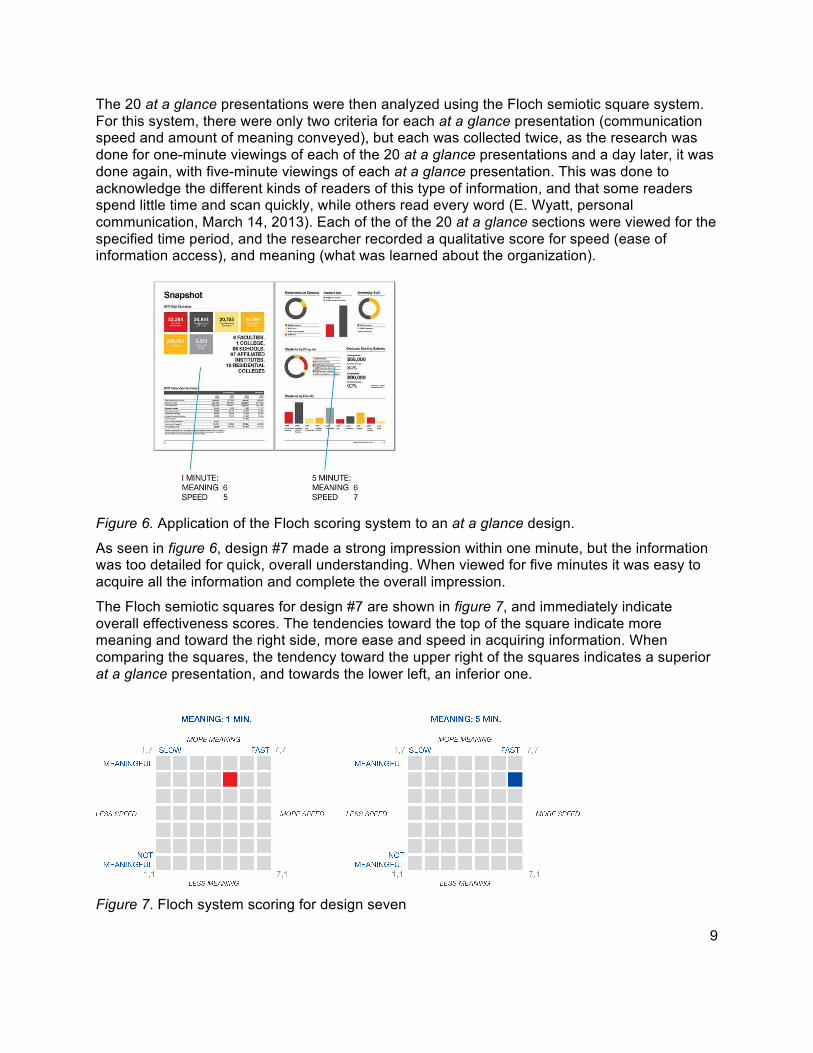
9
The 20 at a glance presentations were then analyzed using the Floch semiotic square system. For this system, there were only two criteria for each at a glance presentation (communication speed and amount of meaning conveyed), but each was collected twice, as the research was done for one-minute viewings of each of the 20 at a glance presentations and a day later, it was done again, with five-minute viewings of each at a glance presentation. This was done to acknowledge the different kinds of readers of this type of information, and that some readers spend little time and scan quickly, while others read every word (E. Wyatt, personal communication, March 14, 2013). Each of the of the 20 at a glance sections were viewed for the specified time period, and the researcher recorded a qualitative score for speed (ease of information access), and meaning (what was learned about the organization).
Figure 6. Application of the Floch scoring system to an at a glance design.
As seen in figure 6, design #7 made a strong impression within one minute, but the information was too detailed for quick, overall understanding. When viewed for five minutes it was easy to acquire all the information and complete the overall impression.
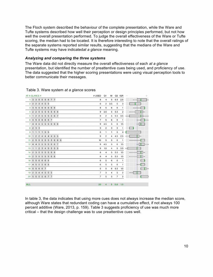
The Floch semiotic squares for design #7 are shown in figure 7, and immediately indicate overall effectiveness scores. The tendencies toward the top of the square indicate more meaning and toward the right side, more ease and speed in acquiring information. When comparing the squares, the tendency toward the upper right of the squares indicates a superior at a glance presentation, and towards the lower left, an inferior one.
Figure 7. Floch system scoring for design seven
10
The Floch system described the behaviour of the complete presentation, while the Ware and Tufte systems described how well their perception or design principles performed, but not how well the overall presentation performed. To judge the overall effectiveness of the Ware or Tufte scoring, the median had to be located. It is therefore interesting to note that the overall ratings of the separate systems reported similar results, suggesting that the medians of the Ware and Tufte systems may have indicatedat a glance meaning.
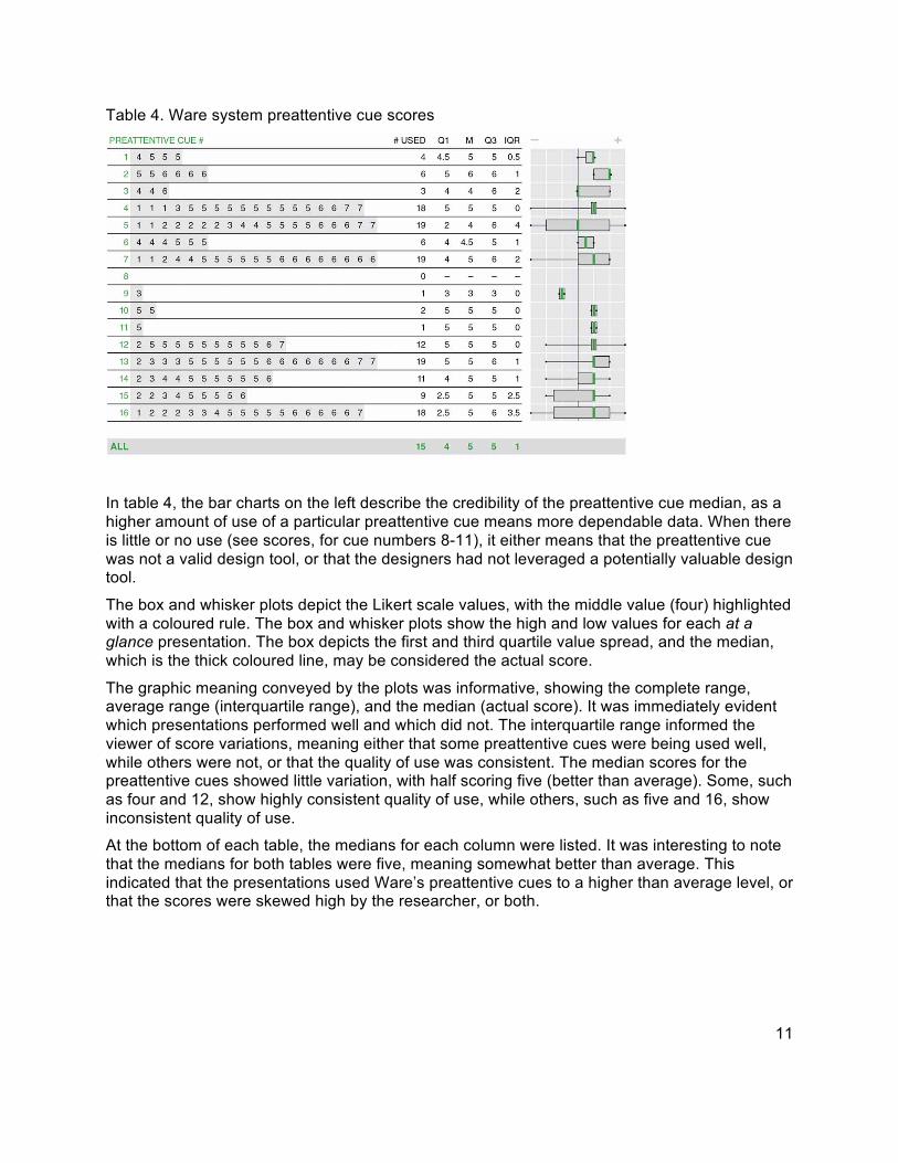
Analyzing and comparing the three systems The Ware data did not directly measure the overall effectiveness of each at a glance presentation, but identified the number of preattentive cues being used, and proficiency of use. The data suggested that the higher scoring presentations were using visual perception tools to better communicate their messages.
Table 3. Ware system at a glance scores
In table 3, the data indicates that using more cues does not always increase the median score, although Ware states that redundant coding can have a cumulative effect, if not always 100 percent additive (Ware, 2013, p. 159). Table 3 suggests proficiency of use was much more critical – that the design challenge was to use preattentive cues well.
11
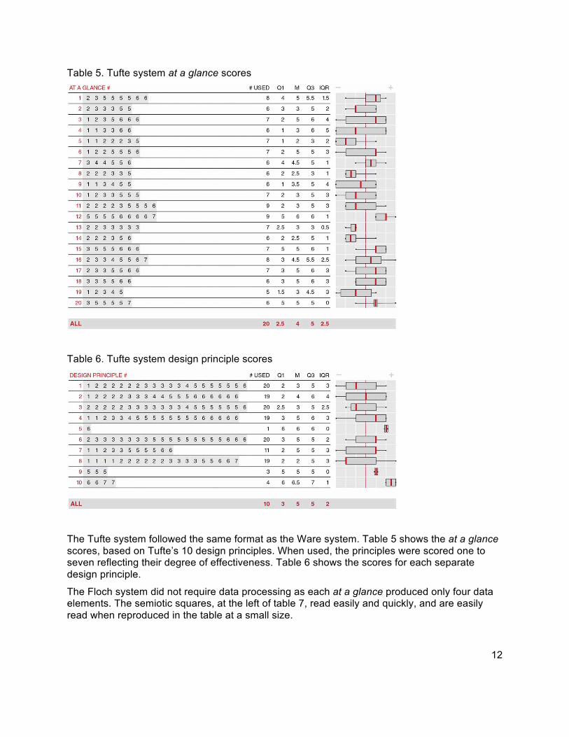
Table 4. Ware system preattentive cue scores
In table 4, the bar charts on the left describe the credibility of the preattentive cue median, as a higher amount of use of a particular preattentive cue means more dependable data. When there is little or no use (see scores, for cue numbers 8-11), it either means that the preattentive cue was not a valid design tool, or that the designers had not leveraged a potentially valuable design tool.
The box and whisker plots depict the Likert scale values, with the middle value (four) highlighted with a coloured rule. The box and whisker plots show the high and low values for each at a glance presentation. The box depicts the first and third quartile value spread, and the median, which is the thick coloured line, may be considered the actual score.
The graphic meaning conveyed by the plots was informative, showing the complete range, average range (interquartile range), and the median (actual score). It was immediately evident which presentations performed well and which did not. The interquartile range informed the viewer of score variations, meaning either that some preattentive cues were being used well, while others were not, or that the quality of use was consistent. The median scores for the preattentive cues showed little variation, with half scoring five (better than average). Some, such as four and 12, show highly consistent quality of use, while others, such as five and 16, show inconsistent quality of use.
At the bottom of each table, the medians for each column were listed. It was interesting to note that the medians for both tables were five, meaning somewhat better than average. This indicated that the presentations used Ware’s preattentive cues to a higher than average level, or that the scores were skewed high by the researcher, or both.
12
Table 5. Tufte system at a glance scores
Table 6. Tufte system design principle scores
The Tufte system followed the same format as the Ware system. Table 5 shows the at a glance scores, based on Tufte’s 10 design principles. When used, the principles were scored one to seven reflecting their degree of effectiveness. Table 6 shows the scores for each separate design principle.
The Floch system did not require data processing as each at a glance produced only four data elements. The semiotic squares, at the left of table 7, read easily and quickly, and are easily read when reproduced in the table at a small size.
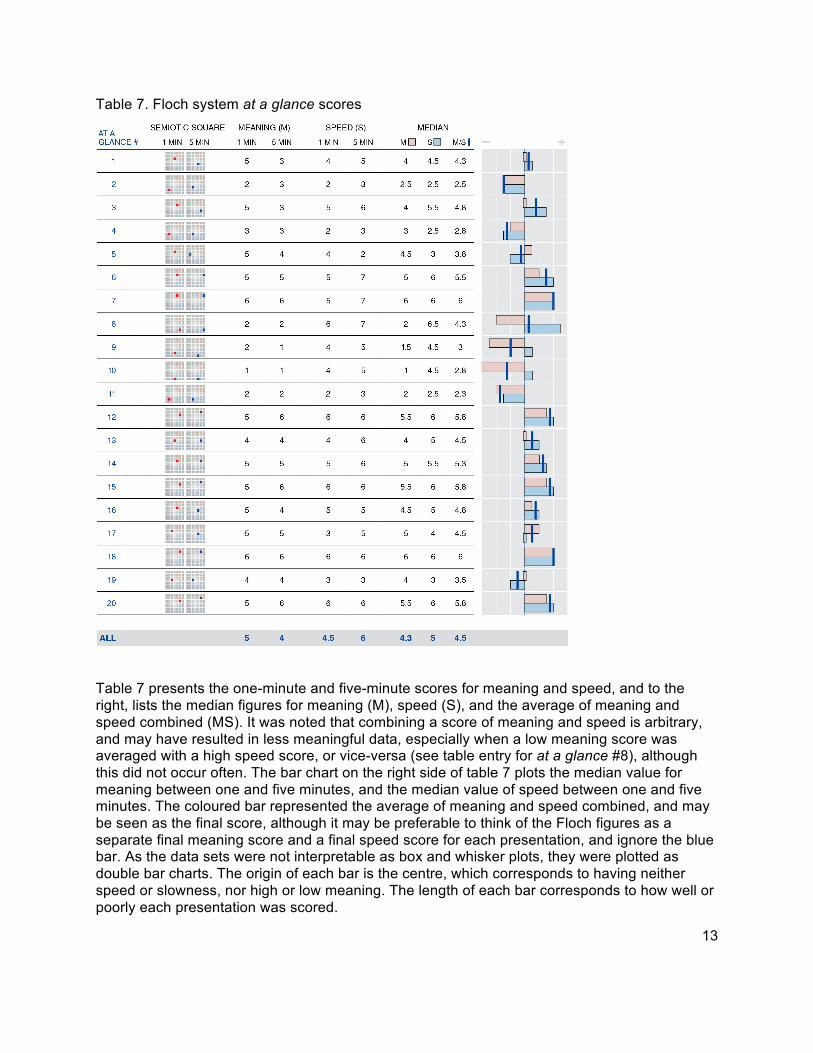
13
Table 7. Floch system at a glance scores
Table 7 presents the one-minute and five-minute scores for meaning and speed, and to the right, lists the median figures for meaning (M), speed (S), and the average of meaning and speed combined (MS). It was noted that combining a score of meaning and speed is arbitrary, and may have resulted in less meaningful data, especially when a low meaning score was averaged with a high speed score, or vice-versa (see table entry for at a glance #8), although this did not occur often. The bar chart on the right side of table 7 plots the median value for meaning between one and five minutes, and the median value of speed between one and five minutes. The coloured bar represented the average of meaning and speed combined, and may be seen as the final score, although it may be preferable to think of the Floch figures as a separate final meaning score and a final speed score for each presentation, and ignore the blue bar. As the data sets were not interpretable as box and whisker plots, they were plotted as double bar charts. The origin of each bar is the centre, which corresponds to having neither speed or slowness, nor high or low meaning. The length of each bar corresponds to how well or poorly each presentation was scored.
14
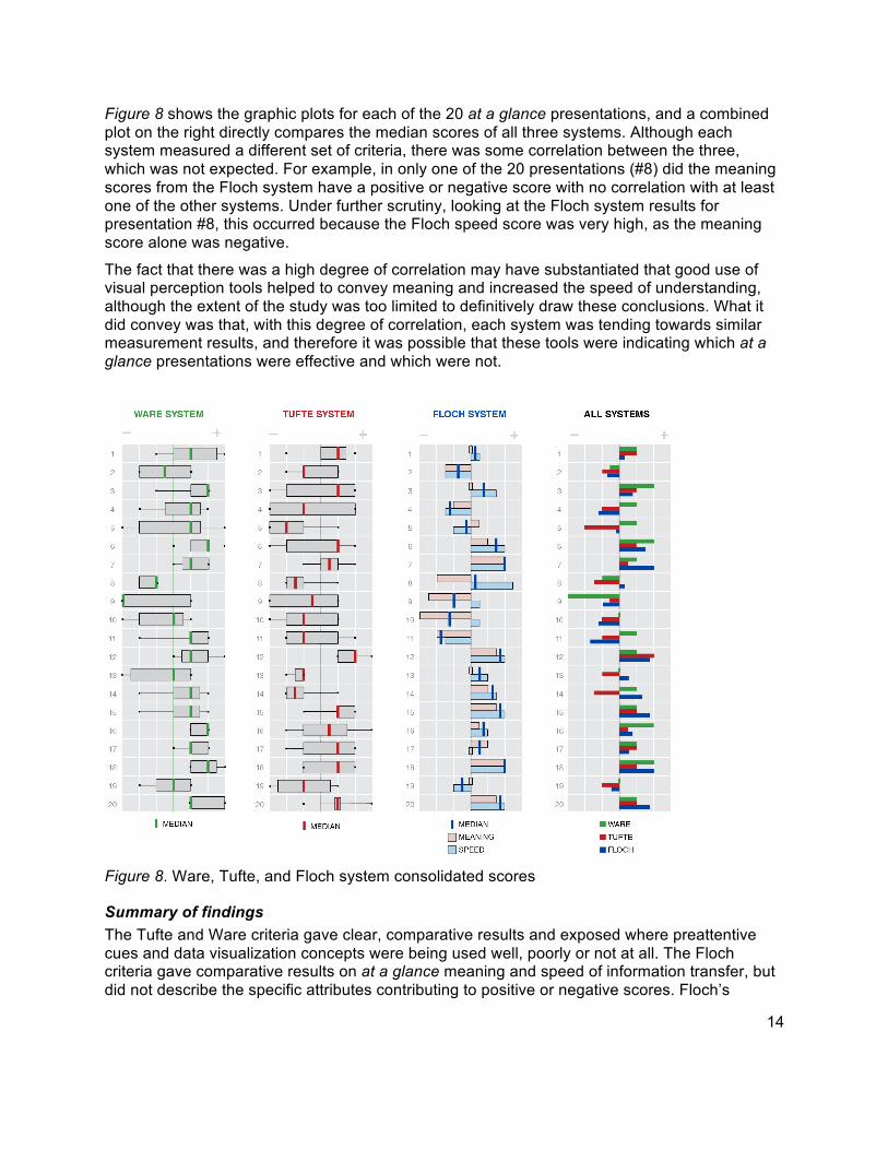
Figure 8 shows the graphic plots for each of the 20 at a glance presentations, and a combined plot on the right directly compares the median scores of all three systems. Although each system measured a different set of criteria, there was some correlation between the three, which was not expected. For example, in only one of the 20 presentations (#8) did the meaning scores from the Floch system have a positive or negative score with no correlation with at least one of the other systems. Under further scrutiny, looking at the Floch system results for presentation #8, this occurred because the Floch speed score was very high, as the meaning score alone was negative.
The fact that there was a high degree of correlation may have substantiated that good use of visual perception tools helped to convey meaning and increased the speed of understanding, although the extent of the study was too limited to definitively draw these conclusions. What it did convey was that, with this degree of correlation, each system was tending towards similar measurement results, and therefore it was possible that these tools were indicating which at a glance presentations were effective and which were not.
Figure 8. Ware, Tufte, and Floch system consolidated scores
Summary of findings The Tufte and Ware criteria gave clear, comparative results and exposed where preattentive cues and data visualization concepts were being used well, poorly or not at all. The Floch criteria gave comparative results on at a glance meaning and speed of information transfer, but did not describe the specific attributes contributing to positive or negative scores. Floch’s

15
system would ideally be supported by a system similar to the Ware or Tufte system to inform the researcher on what specific design attributes were being used well, poorly, or not at all.
All three systems could be used very quickly, and the basic analysis of a single design could be done in a few minutes. Complex research and comparisons between large sets of designs took longer. There was some indication of specific criteria from the Ware system (such as blurring) and the Tufte system (such as the use of small multiples) that may be dropped from a final criteria set. There were also various criteria that were confusing, or that seemed too similar, which may require simplification or clarification for development of a final criteria set.
As shown in figure 8, it was immediately apparent that there was correlation between the systems, and this may mean they have mutually substantiated the case study findings to some degree. It may also mean that good perception design skills enable meaning to be conveyed, or conversely, that when meaning is conveyed, it is usually supported through easy perception. Although the case study research was limited, it suggests that the design criteria can be used effectively as tools for visual communication design research, as long as the principles are clearly understood by the designer doing the testing.
Limitations The research represented an initial step in designing research tools, and exploring the feasibility of adapting criteria and tools from various disciplines outside visual communication design to use as visual communication design research instruments. As this required an in-depth knowledge of the theory, principles and tools being applied, it was necessary for the researcher to perform the case studies. Another limitation was that the study only indicated that the selected design criteria sets and tools could be developed, and had potential use, but did not consider a comprehensive selection of disciplinary theory from every communication-related discipline, or ascertain which ones were the most and least effective.
Future research Further research should be conducted with the criteria sets with design students, professional designers or other communication professionals to research their effectiveness. More research should be done to evaluate the effectiveness of the visual design criteria and tools used in the study, and to research other communication-related disciplines with potential value to visual communication design. Visual communication designers could be approached to test the usability of the design criteria in actual design projects. This process could be mutually beneficial to design research and the field of design practice, and lead towards the integration of valuable interdisciplinary communication theories into visual communication design.
The value of these interdisciplinary theories to design education should be researched. One of the issues made clear within the case studies is that prior knowledge of the various theories is required to properly use the criteria and tools. This suggests that an educational setting could offer the theory instruction and oversight required to enable students to properly apply the criteria and tools to design generation and research.
Conclusion In general, the findings indicate that there is existing theory from other disciplines that can cross-pollinate the field of visual communication design. Various theories were applied to initial design research with promising results. The case study findings indicate that theories from the communication-related fields of perception psychology, data visualization and semiotics can be used to develop effective visual communication design criteria and tools. The case study
16
findings also suggest that in order to establish visual meaning, attention must be focused on perception-enhancing design approaches.
The initial findings indicate that design effectiveness can be measured, but to use the measurement criteria and tools, it requires that the researcher, or designer, understands the theories behind them. It is therefore, necessary to build awareness within the community of visual communication design educators, practitioners and other communication professionals, of these findings, and to develop more interdisciplinary research that can inform the discipline of visual communication design, and subsequently, lead to the development of a comprehensive design, and design research, toolkit.
References Arnheim, R. (1974). Art and visual perception: A psychology of the creative eye, the new
version. Berkeley and Los Angeles: University of California Press.
Barthes, R. (1967). Elements of semiology (A. Lavers & C. Smith, Trans.). New York, NY: Hill and Wang. (Original work published 1964).
Bertin, J. (2010). Semiology of graphics: Diagrams, networks, maps. (W. J. Berg, trans.) Redlands, CA: Esri Press. (Original work published 1967).
Chandler, D. (2012, December 28). Signs. Semiotics for Beginners. Retrieved from http://users.aber.ac.uk/dgc/Documents/S4B/sem02.html
Floch, J-M. (2001). Semiotics, marketing and communication (R. O. Bodkin, Trans.). London: Palgrave Macmillan.
Gombrich, E. H., Hochberg, J. Black, M. (1972). Art, perception and reality. Baltimore, MD: The Johns Hopkins University Press.
Greimas, J., G. (1987). On meaning: Selected writings in semiotic theory. (W. J. Berg, trans.) Redlands, CA: Esri Press. (Original work published 1967).
Hébert, L. (April 17, 2013). The semiotic square. Signo: Theoretical semiotics on the web. Retrieved from http://www.signosemio.com/greimas/semiotic-square.asp
Kress, G., van Leeuwen, T. (2006). Reading images: The grammar of visual design (2nd ed.). New York, NY: Routledge.
Shannon, C. E. (1948). A mathematical theory of communication. The Bell System Technical Journal, 27 (3), 379-423
Tinker, M.A. (1963). Legibility of print. Ames, IA: Iowa State University Press.
Tufte, E. R. (1990). Envisioning information. Cheshire, CT: Graphics Press.
Tufte, E. R. (2001). The visual display of quantitative information (2nd ed.). Cheshire, CT: Graphics Press.
Tufte, E. R. (1997). Visual explanations. Cheshire, CT: Graphics Press.
Ware, C. (2013). Information visualization: Perception for design (3rd ed.). Waltham, MA: Morgan Kaufmann.
17
David Craib David has been a professional visual communication designer since graduating from Ontario College of Art in 1986, and is the owner of Parable Communications, Ottawa, Canada. Parable specializes in visual communication design, specifically in corporate identity, web and print publications such as annual reports and e-magazines, and specialty design projects such as a worlds fair, stamps, and UI design products,. Pursuing his interest in design theory, David completed his Masters in Design (Carleton University) and is currently developing new perspectives in fundamental visual communication design theory through interdisciplinary research into psychology, cognitive sciences, information theory, communications studies, data visualization, linguistics and semiotics.
Lorenzo Imbesi Lorenzo Imbesi is Professor of Industrial Design at Sapienza University of Rome (Italy) and has been a Faculty at Carleton University in Canada. Moreover, he is Architect, PhD in Environmental Design, ICCS fellow – Canada Government and member of the Research Board of Italian and European researches. He has been speaker also as keynote and coordinator for international conferences and curator of design exhibitions and events. Critic and essayist for many reviews, he has been Co-Director of the magazine “DIID – Disegno Industriale” and at the moment he is Editor of ‘Design Principles and Practices: an International Journal’ (Common Ground Publishing, Chicago) and Director of ‘FIELDS. An Interdisciplinary Design Journal’. Among his works, he is author of “InterAction by Design” (2009), “09 YoungDesign” (2009), “Ethics & Design” (2008), “D_Generation” (2007).