epubwu institutional repositoryepub.wu.ac.at/1692/1/document.pdf · epubwu institutional repository...
TRANSCRIPT
ePubWU Institutional Repository
Achim Zeileis and Kurt Hornik and Paul Murrell
Escaping RGBland: Selecting Colors for Statistical Graphics
Paper
Original Citation:Zeileis, Achim and Hornik, Kurt and Murrell, Paul (2007) Escaping RGBland: Selecting Colorsfor Statistical Graphics. Research Report Series / Department of Statistics and Mathematics, 61.Department of Statistics and Mathematics, WU Vienna University of Economics and Business,Vienna.
This version is available at: http://epub.wu.ac.at/1692/Available in ePubWU: November 2007
ePubWU, the institutional repository of the WU Vienna University of Economics and Business, isprovided by the University Library and the IT-Services. The aim is to enable open access to thescholarly output of the WU.
http://epub.wu.ac.at/
Escaping RGBland: Selecting Colorsfor Statistical Graphics
Achim Zeileis, Kurt Hornik, Paul Murrell
Department of Statistics and MathematicsWirtschaftsuniversität Wien
Research Report Series
Report 61November 2007
http://statmath.wu-wien.ac.at/
Escaping RGBland: Selecting Colors for
Statistical Graphics
Achim ZeileisWirtschaftsuniversitat Wien
Kurt HornikWirtschaftsuniversitat Wien
Paul MurrellThe University of Auckland
Abstract
Statistical graphics are often augmented by the use of color coding information containedin some variable. When this involves the shading of areas (and not only points or lines)—e.g., as in bar plots, pie charts, mosaic displays or heatmaps—it is important that the colorsare perceptually based and do not introduce optical illusions or systematic bias. Here, wediscuss how the perceptually-based Hue-Chroma-Luminance (HCL) color space can be used forderiving suitable color palettes for coding categorical data (qualitative palettes) and numericalvariables (sequential and diverging palettes).
Keywords: qualitative palette, sequential palette, diverging palette, HCL colors, HSV colors,perceptually-based color space.
1. Introduction
Color is an integral element of graphical displays in general, and many statistical graphics inparticular. It is easy to create color graphics with any statistical software package and colorimages are therefore virtually omnipresent in electronic publications such as technical reports,presentation slides, or the electronic version of journal articles (e.g., in Computational Statistics& Data Analysis) and increasingly also in printed journals. However, more often than not, colorchoice in such displays is sub-optimal because selecting colors is not a trivial task and there isrelatively little guidance about how to choose appropriate colors for a particular visualization.When selecting colors for a statistical graphic, there are three main obstacles to overcome:The colors should not be unappealing. It is not necessary for the colors in a statistical plotto reflect fashion trends, but basic principles such as avoiding large areas of fully saturated colors(Tufte 1990) should be adhered to. The requirement is not that the user should have a degree ingraphic design, but that the software should provide users with an intuitive way to select colorsand control their basic properties. Thus, it is necessary to employ a color model or color spacethat describes colors in terms of their perceptual properties: hue, brightness, and colorfulness.A color model typically supported by software packages involves the specification of colors asRed-Green-Blue (RGB) triplets. However, this specification corresponds to color generation on acomputer screen (see Poynton 2000) rather than corresponding to human color perception. Forhumans, it is virtually impossible to control the perceptual properties of a color in this color spacebecause there is no single dimension that corresponds to, e.g., the hue or the brightness of thecolor. As a consequence, various perceptually-based color spaces have been suggested, where eachdimension of the color space can be matched with a perceptual property. One approach widelyimplemented in software packages involves Hue-Saturation-Value (HSV) triplets (Smith 1978), asimple transformation of RGB triplets (see Wikipedia 2007b). Unfortunately, the dimensions inHSV space map poorly to perceptual properties and the use of HSV colors encourages the useof highly saturated colors. A perceptually based color model that avoids these problems involvesHue-Chroma-Luminance (HCL) triplets (see Ihaka 2003), which is a transformation of CIELUVcolor space (see Wikipedia 2007a). This is the color space we advocate in this article.
2 Escaping RGBland: Selecting Colors for Statistical Graphics
The colors in a statistical graphic should cooperate with each other. The typical purposeof color in a statistical graphic is to distinguish between different areas or symbols in the plot—todistinguish between different groups or between different levels of a variable. This means thatthere will typically be several colors, or a palette of colors, used within a plot and that those colorsshould be related to each other.A natural solution for this task is to vary (at least) one perceptual property of the colors, e.g.,the hue or the brightness, keeping other properties fixed. In a perceptually based color space,this corresponds to selecting colors by traversing paths through this space along its dimensions.This approach is implemented in many color picker tools (Moretti and Lyons 2002; Meier et al.2004), however, these are typically based on the HSV model. As argued above, the dimensionsin HSV space are not truly independent and hence it is not possible to vary just one perceptualproperty while keeping the others fixed. This means that it is relatively difficult to select setsof HSV coordinates that yield colors that are “in harmony” (see Munsell 1905). For statisticalgraphics, this is important because it can introduce size distortions in the perception of shadedareas and can produce optical illusions (Cleveland and McGill 1983). These problems can againbe addressed by employing the HCL color space. In addition to the earlier point that HCL spaceis useful because it allows humans to understand where within the space a particular HCL tripletis located, HCL also allows us to understand motion within the color space because distancesbetween colors have an intuitive and rational meaning.The colors should work everywhere. The final issue to deal with is that, in an ideal situation,colors should be selected so that they continue to work in any context. For example, differentareas of a plot should still be distinguishable when the graphic is displayed on an LCD projectorrather than a computer screen, or when it is printed on a grayscale printer, or when the personviewing the graphic is color-blind. These goals cannot always be attained, but attention shouldbe paid to these issues and in many situations it is also possible to resolve any problems.An example of this approach is ColorBrewer.org (Harrower and Brewer 2003), an online tool forselecting color schemes for maps. It provides a collection of prefabricated palettes, informationabout the suitability for printers or color-blind viewers, and guidance on how to choose a suitablepalette for coding various types of information. The drawback to this tool is that it only providesa fixed set of colors for each palette and there is no way to extend the existing palettes.Following Brewer (1999) and Harrower and Brewer (2003), we take a similar approach and dis-tinguish three types of palettes: qualitative, sequential and diverging. The first is tailored forcoding categorical information and the latter two are aimed at numerical or ordinal variables.Unlike ColorBrewer.org, we suggest a general principle for selecting colors by traversing pathsalong perceptual axes in HCL color space. Consequently, the user can decide which path exactlyshould be taken and how many colors should be selected. Furthermore, by matching the pathswith perceptual meaning, the suitability of a palette for color-blind viewers or grayscale printingcan be assessed.The remainder of the paper is organized as follows: Section 2 provides some motivating examples,showing how typical HSV-based graphics can be enhanced by using HCL-based palettes. Section 3gives a brief introduction to the underlying HSV and HCL color spaces before Section 4 suggestsstrategies for deriving HCL-based qualitative, sequential, and diverging palettes. Section 5 offerssome general remarks on the implementation in statistical software packages as well as some detailson the implementation in the R system for statistical computing (R Development Core Team 2007).Section 6 concludes the paper with a discussion.
2. Motivation
To show what can be gained by selecting appropriate color schemes, we present two examples fortypical color graphics, contrasting commonly-used HSV palettes with more suitable HCL palettes.Both examples and all HSV palettes are taken from (the electronic version of) recent publicationsin Computational Statistics & Data Analysis (Volume 51).
Achim Zeileis, Kurt Hornik, Paul Murrell 3
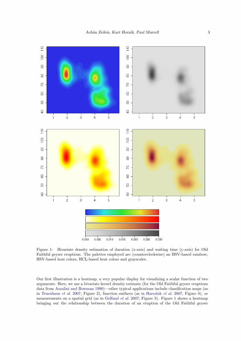
Figure 1: Bivariate density estimation of duration (x-axis) and waiting time (y-axis) for OldFaithful geyser eruptions. The palettes employed are (counterclockwise) an HSV-based rainbow,HSV-based heat colors, HCL-based heat colors and grayscales.
Our first illustration is a heatmap, a very popular display for visualizing a scalar function of twoarguments. Here, we use a bivariate kernel density estimate (for the Old Faithful geyser eruptionsdata from Azzalini and Bowman 1990)—other typical applications include classification maps (asin Tenenhaus et al. 2007, Figure 2), function surfaces (as in Harezlak et al. 2007, Figure 8), ormeasurements on a spatial grid (as in Gelfand et al. 2007, Figure 3). Figure 1 shows a heatmapbringing out the relationship between the duration of an eruption of the Old Faithful geyser
4 Escaping RGBland: Selecting Colors for Statistical Graphics
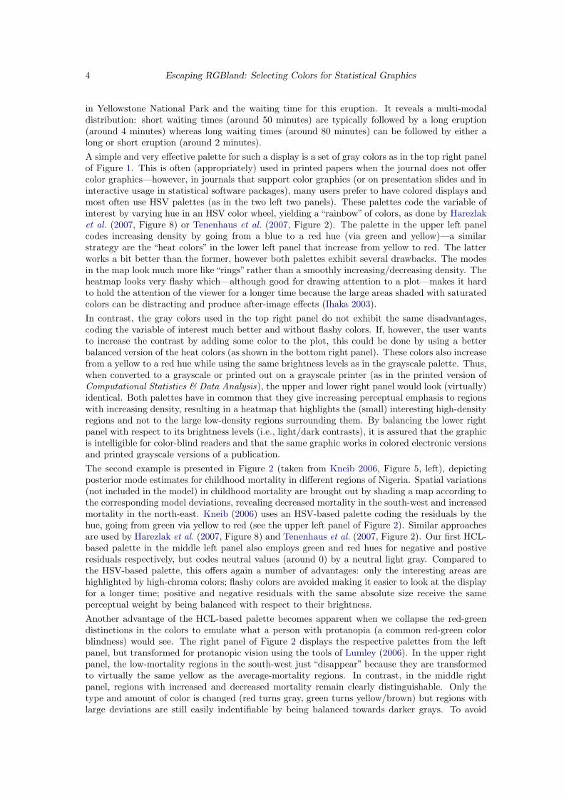
in Yellowstone National Park and the waiting time for this eruption. It reveals a multi-modaldistribution: short waiting times (around 50 minutes) are typically followed by a long eruption(around 4 minutes) whereas long waiting times (around 80 minutes) can be followed by either along or short eruption (around 2 minutes).A simple and very effective palette for such a display is a set of gray colors as in the top right panelof Figure 1. This is often (appropriately) used in printed papers when the journal does not offercolor graphics—however, in journals that support color graphics (or on presentation slides and ininteractive usage in statistical software packages), many users prefer to have colored displays andmost often use HSV palettes (as in the two left two panels). These palettes code the variable ofinterest by varying hue in an HSV color wheel, yielding a “rainbow” of colors, as done by Harezlaket al. (2007, Figure 8) or Tenenhaus et al. (2007, Figure 2). The palette in the upper left panelcodes increasing density by going from a blue to a red hue (via green and yellow)—a similarstrategy are the “heat colors” in the lower left panel that increase from yellow to red. The latterworks a bit better than the former, however both palettes exhibit several drawbacks. The modesin the map look much more like “rings” rather than a smoothly increasing/decreasing density. Theheatmap looks very flashy which—although good for drawing attention to a plot—makes it hardto hold the attention of the viewer for a longer time because the large areas shaded with saturatedcolors can be distracting and produce after-image effects (Ihaka 2003).In contrast, the gray colors used in the top right panel do not exhibit the same disadvantages,coding the variable of interest much better and without flashy colors. If, however, the user wantsto increase the contrast by adding some color to the plot, this could be done by using a betterbalanced version of the heat colors (as shown in the bottom right panel). These colors also increasefrom a yellow to a red hue while using the same brightness levels as in the grayscale palette. Thus,when converted to a grayscale or printed out on a grayscale printer (as in the printed version ofComputational Statistics & Data Analysis), the upper and lower right panel would look (virtually)identical. Both palettes have in common that they give increasing perceptual emphasis to regionswith increasing density, resulting in a heatmap that highlights the (small) interesting high-densityregions and not to the large low-density regions surrounding them. By balancing the lower rightpanel with respect to its brightness levels (i.e., light/dark contrasts), it is assured that the graphicis intelligible for color-blind readers and that the same graphic works in colored electronic versionsand printed grayscale versions of a publication.The second example is presented in Figure 2 (taken from Kneib 2006, Figure 5, left), depictingposterior mode estimates for childhood mortality in different regions of Nigeria. Spatial variations(not included in the model) in childhood mortality are brought out by shading a map according tothe corresponding model deviations, revealing decreased mortality in the south-west and increasedmortality in the north-east. Kneib (2006) uses an HSV-based palette coding the residuals by thehue, going from green via yellow to red (see the upper left panel of Figure 2). Similar approachesare used by Harezlak et al. (2007, Figure 8) and Tenenhaus et al. (2007, Figure 2). Our first HCL-based palette in the middle left panel also employs green and red hues for negative and postiveresiduals respectively, but codes neutral values (around 0) by a neutral light gray. Compared tothe HSV-based palette, this offers again a number of advantages: only the interesting areas arehighlighted by high-chroma colors; flashy colors are avoided making it easier to look at the displayfor a longer time; positive and negative residuals with the same absolute size receive the sameperceptual weight by being balanced with respect to their brightness.Another advantage of the HCL-based palette becomes apparent when we collapse the red-greendistinctions in the colors to emulate what a person with protanopia (a common red-green colorblindness) would see. The right panel of Figure 2 displays the respective palettes from the leftpanel, but transformed for protanopic vision using the tools of Lumley (2006). In the upper rightpanel, the low-mortality regions in the south-west just “disappear” because they are transformedto virtually the same yellow as the average-mortality regions. In contrast, in the middle rightpanel, regions with increased and decreased mortality remain clearly distinguishable. Only thetype and amount of color is changed (red turns gray, green turns yellow/brown) but regions withlarge deviations are still easily indentifiable by being balanced towards darker grays. To avoid
Achim Zeileis, Kurt Hornik, Paul Murrell 5
Figure 2: Posterior mode estimates for childhood mortality in Nigeria. The color palettes em-ployed are an HSV-based rainbow and two HCL-based diverging palettes. In the right panelsred-green contrasts are collapsed to emulate protanopic vision.
6 Escaping RGBland: Selecting Colors for Statistical Graphics
that one of the two “branches” of the palette is only gray in the protanopic version, we could alsoemploy a purple (rather than a red) hue for positive deviations. This is used in the lower panelsof Figure 2 showing that after collapsing red-green distinctions, a useful yellow/brown–gray–bluepalette remains from the original green–gray–purple palette. Thus, the lower left panel could beused ensuring that it works for both normal and protanopic vision. Similar arguments hold fordeuteranopic vision.
3. Color spaces
For choosing color palettes, it is helpful to have a basic idea how human color vision works.It has been hypothesized that it evolved in three distinct stages: 1. perception of light/darkcontrasts (monochrome only), 2. yellow/blue contrasts (usually associated with our notion ofwarm/cold colors), 3. green/red contrasts (helpful for assessing the ripeness of fruit). See Ihaka(2003) and Lumley (2006) for more details and references. Furthermore, physiological studieshave shown that light is captured by three distinct receptors (so-called cones) in the retina andhence coded in three dimensions by the human visual system. The perception of this coding, i.e.,the subjective experience of this light, is less well-understood; however, current psychophysicaltheories all describe perception in terms of three dimensions (Knoblauch 2002). Therefore, colorsare typically described as locations in 3-dimensional spaces.The three dimensions used by humans to describe colors are typically:
• hue (dominant wavelength),
• chroma (colorfulness, intensity of color as compared to gray),
• luminance (brightness, amount of gray).
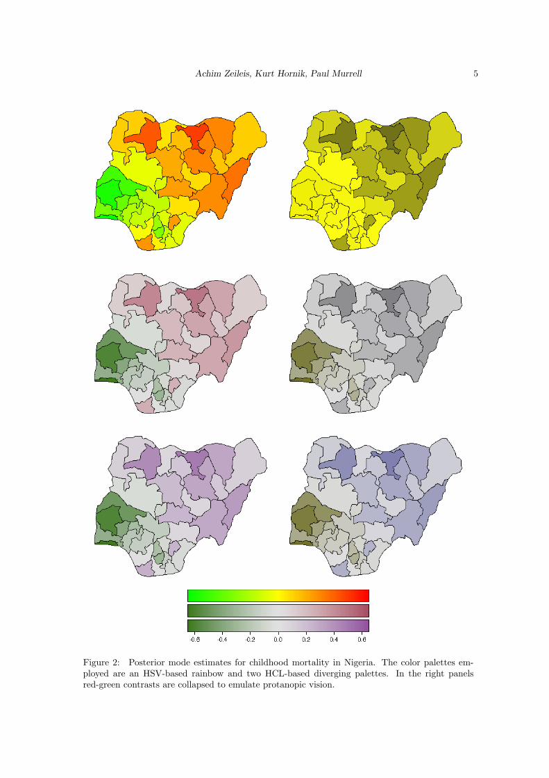
Thus, they do not correspond to the axes described above, but rather to polar coordinates in thecolor plane (yellow/blue vs. green/red) plus a third light/dark axis. Color models that attempt tocapture these perceptual axes are also called perceptually-based color spaces.A popular implementation of such a color space, available in many graphics and statistics softwarepackages, are HSV colors. They are a simple transformation of RGB colors defined by a triplet(H,S, V ) with H ∈ [0, 360] and S, V ∈ [0, 100]. Although simple to specify and easily available inmany computing environments, HSV colors have a fundamental drawback: its three dimensionsmap to the three dimensions of human color perception very poorly. The three dimensions areconfounded: The brightness of colors is not uniform over hues and saturations (given value, seeFigure 3)—therefore, HSV colors are often not considered to be perceptually based.
0
60120
180
240 300
0
60120
180
240 300
Figure 3: HSV-based and HCL-based color wheel.

Achim Zeileis, Kurt Hornik, Paul Murrell 7
To overcome these drawbacks, various color spaces have been suggested that properly map tothe perception dimensions, the most prominent of which are the CIELUV and CIELAB spacesdeveloped by the Commission Internationale de l’Eclairage (2004). Ihaka (2003) argues thatCIELUV colors are typically preferred for use with emissive technologies such as computer screenswhich makes them an obvious candidate for implementation in statistical software packages. Bytaking polar coordinates in the UV plane of CIELUV, HCL colors are obtained, defined by a triplet(H,C, L) with H ∈ [0, 360] and C, L ∈ [0, 100]. Given a certain luminance L, all colors resultingfrom different combinations of hue H and chroma C have the same level of brightness, i.e., arebalanced towards the same gray and thus look virtually identical when converted to a gray scale.However, the admissible combinations of chroma and luminance coordinates (within the space’sboundaries) depend on the hue chosen. The reason for this is that some hues lead to light andothers to dark colors, e.g., full chroma yellow is brighter (i.e., has higher luminance) than fullchroma blue.
The balancing of HCL colors gives us the opportunity to conveniently choose color palettes whichcode categorical and/or numerical information by translating it to paths along the three perceptualaxes. However, some care is required for dealing with the irregular shape of the HCL space whichwill be addressed in the following sections.
4. Color palettes
4.1. Qualitative palettes
Qualitative palettes are sets of colors for depicting different categories, i.e., for coding a categoricalvariable. Usually, these should give the same perceptual weight to each category so that no groupis perceived to be larger or more important than any other one. Typical applications of qualitativepalettes in statistics would be bar plots (see Ihaka 2003), pie charts or highlighted mosaic displays.
Ihaka (2003) describes a simple strategy for choosing such palettes: chroma and luminance are keptfixed and only the hue is varied for obtaining different colors which are consequently all balancedtowards the same gray. This effect is illustrated in Figure 3 which shows a color wheel obtained byvarying the hue only in HSV coordinates (H, 100, 100) and HCL coordinates (H, 50, 70). Clearly,not only the hue but also the amount of chroma and luminance varies for the HSV wheel.
Figure 4 depicts how the HCL-based color wheel is constructed. It shows the hue/chroma plane ofHCL space given a luminance of L = 70. Not all combinations of hue and chroma are admissible,however for a chroma of C = 50 a full color wheel can be obtained. For choosing the hues in acertain palette, various strategies are conceivable. A simple and intuitive one is to use colors asmetaphors for categories (e.g., for political parties), another approach would be to use segmentsfrom the color wheel corresponding to nearby or distant colors. The latter is shown in Figure 5which depicts examples for generating qualitative sets of colors (H, 50, 70). In the upper left panelcolors from the full spectrum are used (H = 30, 120, 210, 300) creating a ‘dynamic’ set of colors.The upper right panel shows a ‘harmonic’ set with H = 60, 120, 180, 240. Warm colors (from theblue/green part of the spectrum: H = 270, 230, 190, 150) and cold colors (from the yellow/red partof the spectrum: H = 90, 50, 10, 330) are shown in the lower left and right panel, respectively.
4.2. Sequential palettes
Sequential palettes are used for coding numerical information that ranges in a certain intervalwhere low values are considered to be uninteresting and high values are interesting. Suppose weneed to visualize an intensity or interestingness i which (without loss of generality) is scaled tothe unit interval. A typical application in statistics are heatmaps (see Figure 1).
The simplest solution to this task is to employ light/dark contrasts, i.e., rely on the most basicperceptual axis. The interestingness can be coded by an increasing amount of gray corresponding

8 Escaping RGBland: Selecting Colors for Statistical Graphics
Figure 4: Constructing qualitative palettes. In the hue/chroma plane for L = 70, the dashedcircle correponds to a radius C = 50 with chosen angles H = 0, 120, 240.
dynamic [30, 300] harmonic [60, 240]
cold [270, 150] warm [90, −30]
Figure 5: Examples for qualitative palettes. Hue is varied in different intervals for given C = 50and L = 70.
Achim Zeileis, Kurt Hornik, Paul Murrell 9
to decreasing luminance in HCL space:
(H, 0, 90− i · 60),
where the hue H used does not matter, chroma is set to 0 (i.e., no color), and luminance ranges in[30, 90] avoiding the extreme colors white (L = 100) and black (L = 0). Instead of going linearlyfrom light to dark gray, luminance could also be increased nonlinearly, e.g., by some functioni′ = f(i) that controls whether luminance is increased quickly with intensity or not. We foundf(i) = ip to be a convenient transformation where the power p can be varied to achieve differentdegrees of non-linearity.Furthermore, the intensity i could additionally be coded by colorfulness (chroma), e.g.,
(H, 0 + i′ · Cmax, Lmax − i′ · (Lmax − Lmin)).
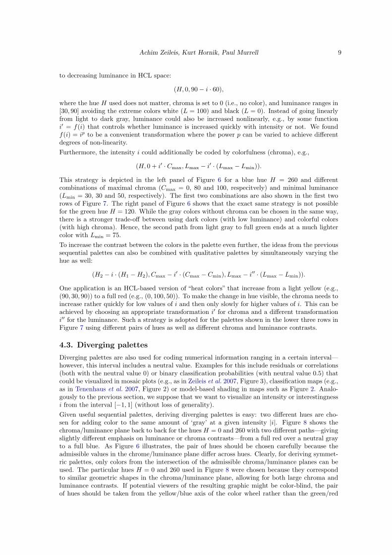
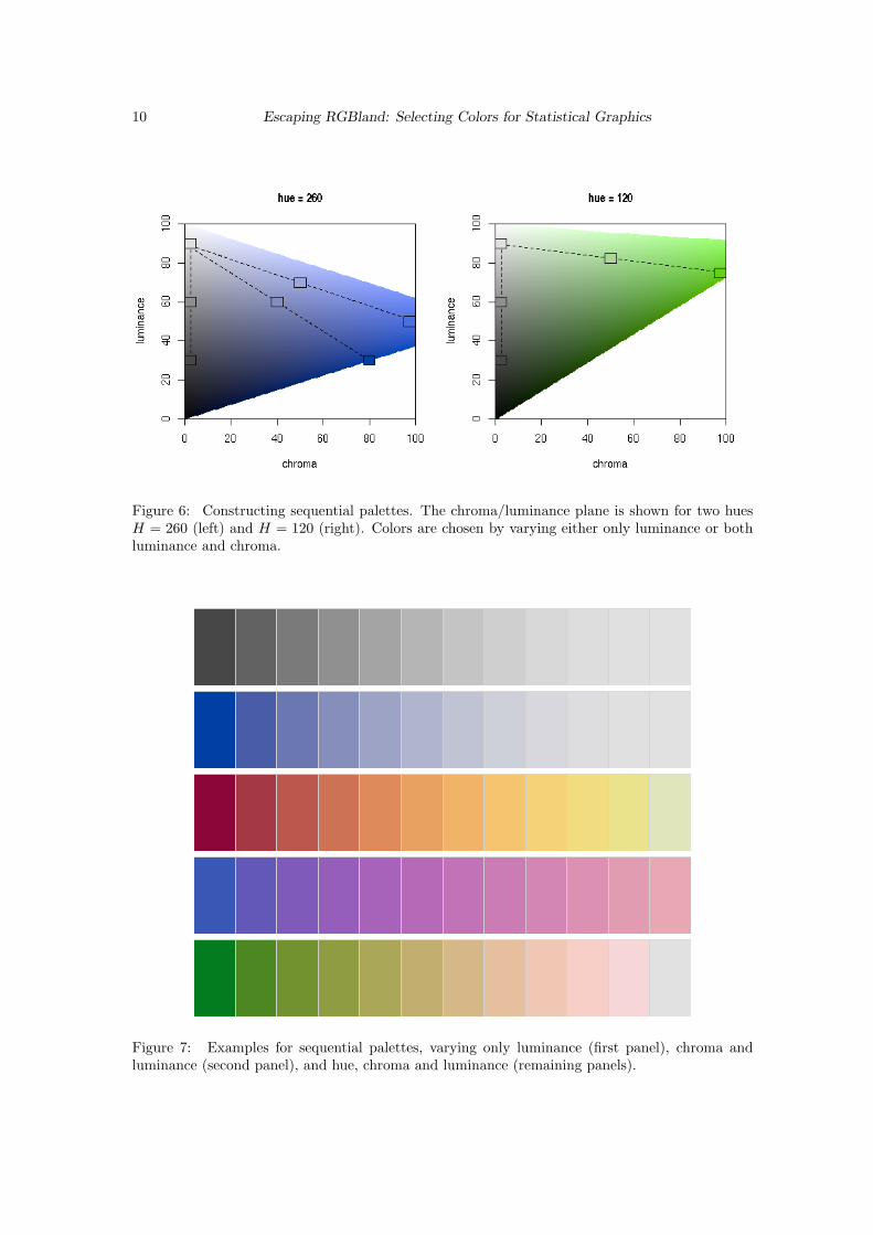
This strategy is depicted in the left panel of Figure 6 for a blue hue H = 260 and differentcombinations of maximal chroma (Cmax = 0, 80 and 100, respecitvely) and minimal luminance(Lmin = 30, 30 and 50, respectively). The first two combinations are also shown in the first tworows of Figure 7. The right panel of Figure 6 shows that the exact same strategy is not possiblefor the green hue H = 120. While the gray colors without chroma can be chosen in the same way,there is a stronger trade-off between using dark colors (with low luminance) and colorful colors(with high chroma). Hence, the second path from light gray to full green ends at a much lightercolor with Lmin = 75.To increase the contrast between the colors in the palette even further, the ideas from the previoussequential palettes can also be combined with qualitative palettes by simultaneously varying thehue as well:
(H2 − i · (H1 −H2), Cmax − i′ · (Cmax − Cmin), Lmax − i′′ · (Lmax − Lmin)).
One application is an HCL-based version of “heat colors” that increase from a light yellow (e.g.,(90, 30, 90)) to a full red (e.g., (0, 100, 50)). To make the change in hue visible, the chroma needs toincrease rather quickly for low values of i and then only slowly for higher values of i. This can beachieved by choosing an appropriate transformation i′ for chroma and a different transformationi′′ for the luminance. Such a strategy is adopted for the palettes shown in the lower three rows inFigure 7 using different pairs of hues as well as different chroma and luminance contrasts.
4.3. Diverging palettes
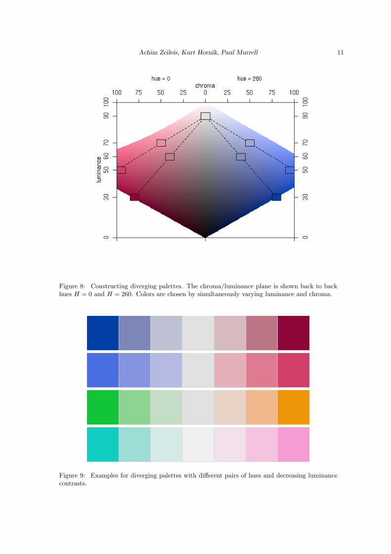
Diverging palettes are also used for coding numerical information ranging in a certain interval—however, this interval includes a neutral value. Examples for this include residuals or correlations(both with the neutral value 0) or binary classification probabilities (with neutral value 0.5) thatcould be visualized in mosaic plots (e.g., as in Zeileis et al. 2007, Figure 3), classification maps (e.g.,as in Tenenhaus et al. 2007, Figure 2) or model-based shading in maps such as Figure 2. Analo-gously to the previous section, we suppose that we want to visualize an intensity or interestingnessi from the interval [−1, 1] (without loss of generality).Given useful sequential palettes, deriving diverging palettes is easy: two different hues are cho-sen for adding color to the same amount of ‘gray’ at a given intensity |i|. Figure 8 shows thechroma/luminance plane back to back for the hues H = 0 and 260 with two different paths—givingslightly different emphasis on luminance or chroma contrasts—from a full red over a neutral grayto a full blue. As Figure 6 illustrates, the pair of hues should be chosen carefully because theadmissible values in the chrome/luminance plane differ across hues. Clearly, for deriving symmet-ric palettes, only colors from the intersection of the admissible chroma/luminance planes can beused. The particular hues H = 0 and 260 used in Figure 8 were chosen because they correspondto similar geometric shapes in the chroma/luminance plane, allowing for both large chroma andluminance contrasts. If potential viewers of the resulting graphic might be color-blind, the pairof hues should be taken from the yellow/blue axis of the color wheel rather than the green/red
10 Escaping RGBland: Selecting Colors for Statistical Graphics
Figure 6: Constructing sequential palettes. The chroma/luminance plane is shown for two huesH = 260 (left) and H = 120 (right). Colors are chosen by varying either only luminance or bothluminance and chroma.
Figure 7: Examples for sequential palettes, varying only luminance (first panel), chroma andluminance (second panel), and hue, chroma and luminance (remaining panels).
Achim Zeileis, Kurt Hornik, Paul Murrell 11
Figure 8: Constructing diverging palettes. The chroma/luminance plane is shown back to backhues H = 0 and H = 260. Colors are chosen by simultaneously varying luminance and chroma.
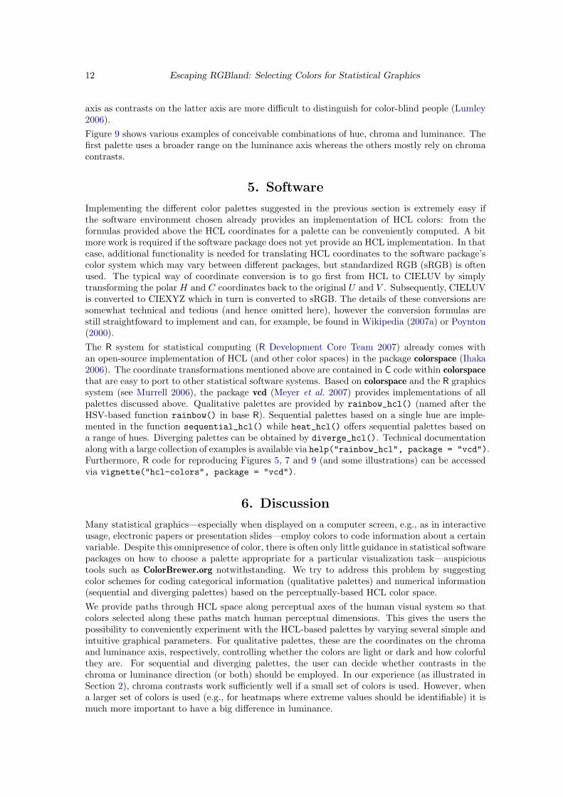
Figure 9: Examples for diverging palettes with different pairs of hues and decreasing luminancecontrasts.
12 Escaping RGBland: Selecting Colors for Statistical Graphics
axis as contrasts on the latter axis are more difficult to distinguish for color-blind people (Lumley2006).Figure 9 shows various examples of conceivable combinations of hue, chroma and luminance. Thefirst palette uses a broader range on the luminance axis whereas the others mostly rely on chromacontrasts.
5. Software
Implementing the different color palettes suggested in the previous section is extremely easy ifthe software environment chosen already provides an implementation of HCL colors: from theformulas provided above the HCL coordinates for a palette can be conveniently computed. A bitmore work is required if the software package does not yet provide an HCL implementation. In thatcase, additional functionality is needed for translating HCL coordinates to the software package’scolor system which may vary between different packages, but standardized RGB (sRGB) is oftenused. The typical way of coordinate conversion is to go first from HCL to CIELUV by simplytransforming the polar H and C coordinates back to the original U and V . Subsequently, CIELUVis converted to CIEXYZ which in turn is converted to sRGB. The details of these conversions aresomewhat technical and tedious (and hence omitted here), however the conversion formulas arestill straightfoward to implement and can, for example, be found in Wikipedia (2007a) or Poynton(2000).The R system for statistical computing (R Development Core Team 2007) already comes withan open-source implementation of HCL (and other color spaces) in the package colorspace (Ihaka2006). The coordinate transformations mentioned above are contained in C code within colorspacethat are easy to port to other statistical software systems. Based on colorspace and the R graphicssystem (see Murrell 2006), the package vcd (Meyer et al. 2007) provides implementations of allpalettes discussed above. Qualitative palettes are provided by rainbow_hcl() (named after theHSV-based function rainbow() in base R). Sequential palettes based on a single hue are imple-mented in the function sequential_hcl() while heat_hcl() offers sequential palettes based ona range of hues. Diverging palettes can be obtained by diverge_hcl(). Technical documentationalong with a large collection of examples is available via help("rainbow_hcl", package = "vcd").Furthermore, R code for reproducing Figures 5, 7 and 9 (and some illustrations) can be accessedvia vignette("hcl-colors", package = "vcd").
6. Discussion
Many statistical graphics—especially when displayed on a computer screen, e.g., as in interactiveusage, electronic papers or presentation slides—employ colors to code information about a certainvariable. Despite this omnipresence of color, there is often only little guidance in statistical softwarepackages on how to choose a palette appropriate for a particular visualization task—auspicioustools such as ColorBrewer.org notwithstanding. We try to address this problem by suggestingcolor schemes for coding categorical information (qualitative palettes) and numerical information(sequential and diverging palettes) based on the perceptually-based HCL color space.We provide paths through HCL space along perceptual axes of the human visual system so thatcolors selected along these paths match human perceptual dimensions. This gives the users thepossibility to conveniently experiment with the HCL-based palettes by varying several simple andintuitive graphical parameters. For qualitative palettes, these are the coordinates on the chromaand luminance axis, respectively, controlling whether the colors are light or dark and how colorfulthey are. For sequential and diverging palettes, the user can decide whether contrasts in thechroma or luminance direction (or both) should be employed. In our experience (as illustrated inSection 2), chroma contrasts work sufficiently well if a small set of colors is used. However, whena larger set of colors is used (e.g., for heatmaps where extreme values should be identifiable) it ismuch more important to have a big difference in luminance.
Achim Zeileis, Kurt Hornik, Paul Murrell 13
Based on these conceputal guidelines and the computational tools readily provided in the R systemfor statistical computing (and easily implemented in other statistical software packages), userscan generate palettes varying these graphical parameters and thus adapting the colors to theirparticular graphical display.
Acknowledgments
We are thankful to David Meyer, Ross Ihaka, Ken Knoblauch, Brian D. Ripley, Thomas Kneib,Michael Hohle, and Thomas Lumley for feedback, suggestions and discussions.
References
Azzalini A, Bowman AW (1990). “A Look at Some Data on the Old Faithful Geyser.” AppliedStatistics, 39, 357–365.
Brewer CA (1999). “Color Use Guidelines for Data Representation.” In “Proceedings of theSection on Statistical Graphics, American Statistical Association,” pp. 55–60. Alexandria, VA.URL http://www.personal.psu.edu/faculty/c/a/cab38/ColorSch/ASApaper.html.
Cleveland WS, McGill R (1983). “A Color-caused Optical Illusion on a Statistical Graph.” TheAmerican Statistician, 37, 101–105.
Commission Internationale de l’Eclairage (2004). Colorimetry. Publication CIE 15:2004, Vienna,Austria, 3rd edition. ISBN 3-901-90633-9.
Gelfand AE, Banerjee S, Sirmans CF, Tu Y, Ong SE (2007). “Multilevel Modeling Using SpatialProcesses: Application to the Singapore Housing Market.” Computational Statistics & DataAnalysis, 51, 3567–3579. doi:10.1016/j.csda.2006.11.019. Figure 3.
Harezlak J, Coull BA, Laird NM, Magari SR, Christiani DC (2007). “Penalized solutions tofunctional regression problems.” Computational Statistics & Data Analysis, 51, 4911–4925.doi:10.1016/j.csda.2006.09.034. Figure 8.
Harrower MA, Brewer CA (2003). “ColorBrewer.org: An Online Tool for Selecting ColorSchemes for Maps.” The Cartographic Journal, 40, 27–37. URL http://ColorBrewer.org/.
Ihaka R (2003). “Colour for Presentation Graphics.” In K Hornik, F Leisch, A Zeileis(eds.), “Proceedings of the 3rd International Workshop on Distributed Statistical Comput-ing, Vienna, Austria,” ISSN 1609-395X, URL http://www.ci.tuwien.ac.at/Conferences/DSC-2003/Proceedings/.
Ihaka R (2006). colorspace: Colorspace Manipulation. R package version 0.95, URL http://CRAN.R-project.org/.
Kneib T (2006). “Mixed Model-based Inference in Geoadditive Hazard Regression forInterval-censored Survival Times.” Computational Statistics & Data Analysis, 51, 777–792.doi:10.1016/j.csda.2006.06.019. Figure 5 (left).
Knoblauch K (2002). “Color Vision.” In S Yantis, H Pashler (eds.), “Steven’s Handbook ofExperimental Psychology – Sensation and Perception,” volume 1, pp. 41–75. John Wiley &Sons, New York, third edition.
Lumley T (2006). “Color Coding and Color Blindness in Statistical Graphics.” ASA Statisti-cal Computing & Graphics Newsletter, 17(2), 4–7. URL http://www.amstat-online.org/sections/graphics/newsletter/Volumes/v172.pdf.

14 Escaping RGBland: Selecting Colors for Statistical Graphics
Meier BJ, Spalter AM, Karelitz DB (2004). “Interactive Color Palette Tools.” IEEE ComputerGraphics and Applications, 24(3), 64–72. URL http://graphics.cs.brown.edu/research/color/.
Meyer D, Zeileis A, Hornik K (2007). vcd: Visualizing Categorical Data. R package version 1.0-6,URL http://CRAN.R-project.org/.
Moretti G, Lyons P (2002). “Tools for the Selection of Colour Palettes.” In“Proceedings of the NewZealand Symposium On Computer-Human Interaction (SIGCHI 2002),” University of Waikato,New Zealand.
Munsell AH (1905). A Color Notation. Munsell Color Company, Boston, Massachusetts.
Murrell P (2006). R Graphics. Chapmann & Hall/CRC, Boca Raton, Florida.
Poynton C (2000). “Frequently-Asked Questions About Color.” URL http://www.poynton.com/ColorFAQ.html, accessed 2007-11-06.
R Development Core Team (2007). R: A Language and Environment for Statistical Computing.R Foundation for Statistical Computing, Vienna, Austria. ISBN 3-900051-07-0, URL http://www.R-project.org/.
Smith AR (1978). “Color Gamut Transform Pairs.” Computer Graphics, 12(3), 12–19. ACMSIGGRAPH 78 Conference Proceedings, URL http://www.alvyray.com/.
Tenenhaus A, Giron A, Viennet E, Bera M, Saporta G, Fertil B (2007). “Kernel Logistic PLS: ATool for Supervised Nonlinear Dimensionality Reduction and Binary Classification.” Computa-tional Statistics & Data Analysis, 51, 4083–4100. doi:10.1016/j.csda.2007.01.004. Figure 2.
Tufte ER (1990). Envisioning Information. Graphics Press, Cheshire, CT.
Wikipedia (2007a). “CIELUV Color Space — Wikipedia, The Free Encyclopedia.” URL http://en.wikipedia.org/wiki/CIELUV_color_space, accessed 2007-11-06.
Wikipedia (2007b). “HSV Color Space — Wikipedia, The Free Encyclopedia.” URL http://en.wikipedia.org/wiki/HSV_color_space, accessed 2007-11-06.
Zeileis A, Meyer D, Hornik K (2007). “Residual-based Shadings for Visualizing (Condi-tional) Independence.” Journal of Computational and Graphical Statistics, 16(3), 507–525.doi:10.1198/106186007X237856.