evaluation 1
TRANSCRIPT
Conventions of genre and form
Charlie Whitmore
Conventions of an Underground music magazine
Magazines that explore the genres of House,Garage and Dubstep tend to sexualise women in the magazines as the genres are dominated by a more male audience in the Cross cultural Consumer characterization model of Young and Rubicam the main characterizations of those that listen to the genres is the explorer and the Reformer as they both value there own opinion. Magazines such as mine would base themselves largely around synergy marketing whereby they would offer free albums with every magazine or sponsor festivals or gigs. Digital online distribution is also a large factor within the genres of the underground as the age group that follow the genre are those that are characterised into the group of millennial’s and born around the time of a large upraise in digital content and web 2.0. Due to them being born around this time they thrive on the prospect of free content which is why synergy marketing, digital online distribution and web 2.0 are a large part in the genres marketing in and outside of the magazine.
Sexualisation of women within underground genre
Due to the dominance of men within the genre women are sexualised in magazines and other medias that represents the genre. This is highlighted in the magazine “mixmag” as they show women in a sexualised manor particularly on their contents pages. My magazine has gone against this sexualisation of women as I wanted to produce a gender neutral magazine to give it a more sophisticated look on the underground genre and to widen my audience.

Conventions of a front page The purpose of a front page of a magazine is to attract. The magazine
should entice your target audience and make them want to buy the magazine. It should highlight the main contents and other selling points of the magazine. In order to give it a unique selling point.
Throughout my research I have found that it is conventional to have a main cover line and the front page image to relate to each other. There is usually colour coordination throughout different texts and images and a large amount of text around the page promoting other aspects of the magazine.
The main image should show a man or women who is well known within the genre or popular with the target audience and should relate to some sort of article or page in the magazine.
The barcode will usually be presented amongst the price of the magazine and the issue number.
Different magazines have different layouts and designs to attract a certain audience. For an underground magazine that means a lot of text around the image promoting the contents and other information that is in the magazine.
A prominent house style is established on the front cover and usually kept throughout the magazine.
Different aspects of the front cover such as the Masthead and Cover lines are filled with bright colours to make sure that they stand out on the cover and that the magazine stands out amongst other magazines.
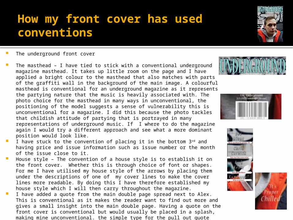
How my front cover has used conventions
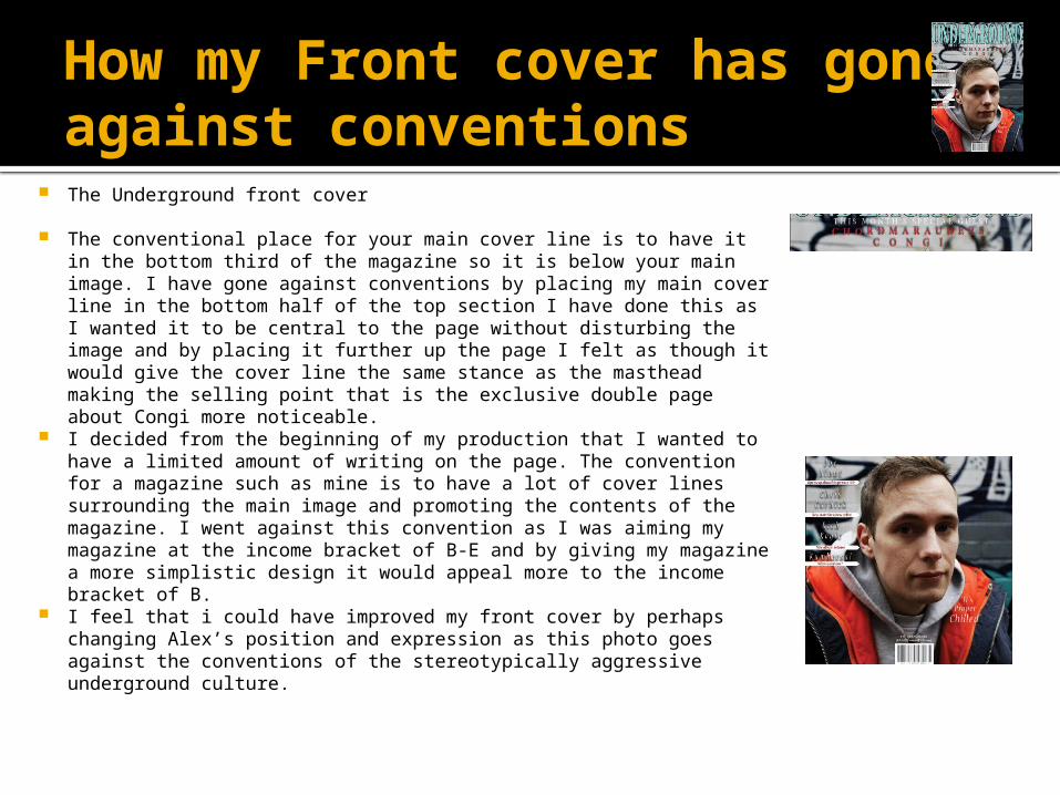
The underground front cover
The masthead – I have tied to stick with a conventional underground magazine masthead. It takes up little room on the page and I have applied a bright colour to the masthead that also matches with parts of the graffiti wall in the background of the main image. A colourful masthead is conventional for an underground magazine as it represents the partying nature that the music is heavily associated with. The photo choice for the masthead in many ways in unconventional, the positioning of the model suggests a sense of vulnerability this is unconventional for a magazine. I did this because the photo tackles that childish attitude of partying that is portrayed in many representations of underground music. If I where to do the magazine again I would try a different approach and see what a more dominant position would look like.
I have stuck to the convention of placing it in the bottom 3rd and having price and issue information such as issue number or the month of the issue close to it.
House style – The convention of a house style is to establish it on the front cover. Whether this is through choice of font or shapes. For me I have utilised my house style of the arrows by placing them under the descriptions of one of my cover lines to make the cover lines more readable. By doing this I have therefore established my house style which I will then carry throughout the magazine.
I have added a quote from the main double page spread next to Alex. This is conventional as it makes the reader want to find out more and gives a small insight into the main double page. Having a quote on the front cover is conventional but would usually be placed in a splash, making mine unconventional. the simple type for the pull out quote connotes the underground nature of the magazine.
My main image was selected carefully, I used a Nottingham based music partnership as my artists to feature within my magazine. I chose Congi as they are something that the target audience would have a particular interest to as they are a part of the underground scene and are the same age as the target audience.
How my Front cover has gone against conventions
The Underground front cover
The conventional place for your main cover line is to have it in the bottom third of the magazine so it is below your main image. I have gone against conventions by placing my main cover line in the bottom half of the top section I have done this as I wanted it to be central to the page without disturbing the image and by placing it further up the page I felt as though it would give the cover line the same stance as the masthead making the selling point that is the exclusive double page about Congi more noticeable.
I decided from the beginning of my production that I wanted to have a limited amount of writing on the page. The convention for a magazine such as mine is to have a lot of cover lines surrounding the main image and promoting the contents of the magazine. I went against this convention as I was aiming my magazine at the income bracket of B-E and by giving my magazine a more simplistic design it would appeal more to the income bracket of B.
I feel that i could have improved my front cover by perhaps changing Alex’s position and expression as this photo goes against the conventions of the stereotypically aggressive underground culture.

Conventions of a Content s page The conventions of a contents page is a
simple list of page numbers and next to that a description of what is on the that page. Next to the list is pictures that relate to some of the pages. Above the title is the date of the issue eg. January 2014Mixmag

How I have stayed with Conventions
I have followed through with my house style of arrows and established that my house colour is a deep red. I have chosen deep red as it is a rich colour that promotes sophistication to once again reach out to my audience within the income bracket of B. By adding images at the bottom of the page I have still maintained the normal convention of placing images on the contents page and have managed to stick with the trend of geometrical shapes I found within magazines related to house, garage and dubstep music by placing images into triangular shapes.
How I have gone against conventions
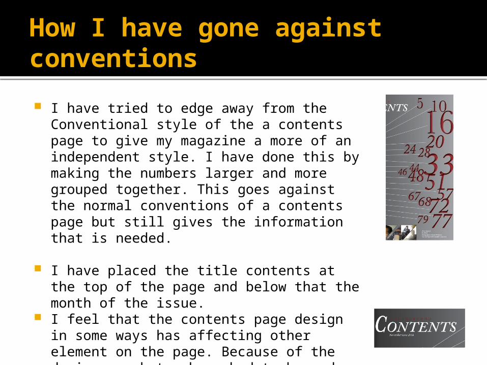
I have tried to edge away from the Conventional style of the a contents page to give my magazine a more of an independent style. I have done this by making the numbers larger and more grouped together. This goes against the normal conventions of a contents page but still gives the information that is needed.
I have placed the title contents at the top of the page and below that the month of the issue.
I feel that the contents page design in some ways has affecting other element on the page. Because of the design my photos have had to be made smaller. If i where to do the magazine again i would perhaps change the magazine whereby i could increase the size of the images on the page.

Conventions of a Double page spread
The idea of a double page spread is to give the reader information on the subject. Double page spreads are normally in the style of an interview, story or Q&A. These will take up a good proportion of the page and to accompany the writing will be a pull out quote a picture or pictures that relate to the double page.
Double page spread
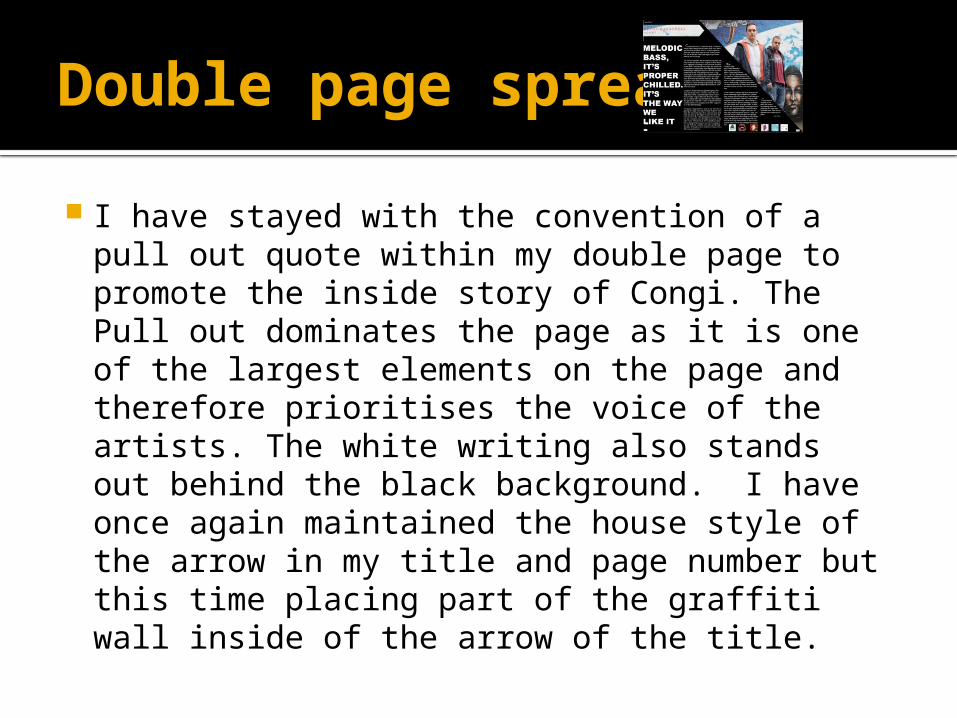
I have stayed with the convention of a pull out quote within my double page to promote the inside story of Congi. The Pull out dominates the page as it is one of the largest elements on the page and therefore prioritises the voice of the artists. The white writing also stands out behind the black background. I have once again maintained the house style of the arrow in my title and page number but this time placing part of the graffiti wall inside of the arrow of the title.
How I have gone against conventions of a double page spread
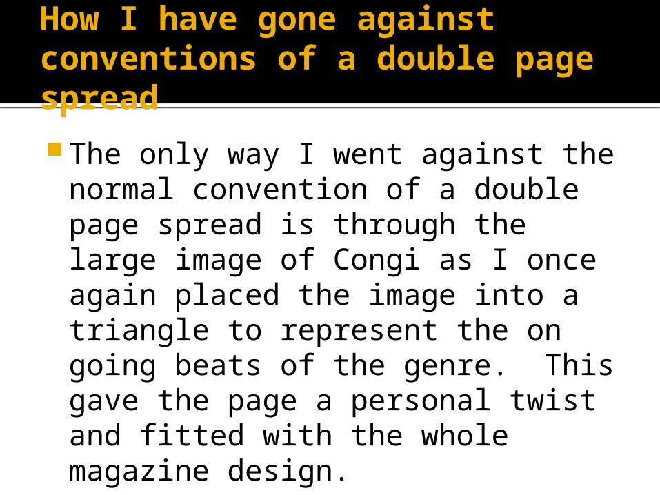
The only way I went against the normal convention of a double page spread is through the large image of Congi as I once again placed the image into a triangle to represent the on going beats of the genre. This gave the page a personal twist and fitted with the whole magazine design.
The double page spread
When planning my double page spread I wanted the page to look professional. I wanted to focus more about the story of Congi as I thought that it would be more fitting as they where an upcoming artist in the genre and people would be more interested about there story. The upcoming artist section also establishes the magazines supportive force for a niche industry that is dominated by conglomerate record labels. I wanted the page to highlight the imagery of the genre. I did this by giving the page a black background to connote the time of day that the music is usually played eg. In clubs. I made sure that i used an image of Congi that promoted the run down street scene that in often associated with underground music. This is why i chose to photograph Congi next to a graffiti wall as the imagery that is associated with underground music is street scenes. I feel as though this has worked well with the page and given made the two more recognisable with the genre.
Theories that can be found in my product Dyers star theory- This theory states that stars are
constructed to look like real people with real emotions. According to this theory stars are constructed by the media to serve a particular purpose. Dyers star theory can be seen on my front cover through the positioning, clothing and background. The facial expression and positioning of Alex suggests vulnerability and his clothing choices are of those that the average person would wear this suggests he is like the average reader and is as the theory suggests experiencing real emotions. By placing Alex in front of a graffiti wall we are increasing his identity as an artists who still remains close to the urban street life. This is all done to attract members of the target audience who will see the front cover and will immediately be able to associate themselves with it. This also helps with the personal feel that i wanted to give my magazine as people feel that they can associate themselves with the artists that are showcased.
Theories that can be found in my product When doing my theoretical research I suggested that postmodernist
theory could perhaps be a part of my magazine. I believed this as the underground combines many different genres within it and could potentially extend the bounds of genre making it a postmodern. After having a look at my final production I believe that I have tried to bring in many parts of the genres of the underground culture through different ways of photographing. Throughout the three artist I photographed each and everyone one represents a different part of the underground. I had Joe sit on a small bike in conventional riding gear representing the fun nature of the underground. I had Chris wear more formal clothing than the other three and photographed him in a studio shoot to give the feel of a more sophisticated style of the underground and finally I photographed Congi in a urban street scene as they wore informal casual street clothing to represent the wider more stereotypical underground fan base. So overall I feel that I have done my best to try and fit as many different cultures of the underground scene without effecting the magazines feel of legitimacy.