evaluation
TRANSCRIPT

EVALUATION.

FOLLOWING CONVENTIONS. Throughout the production of my pop magazine practical, I took into consideration the importance of following conventions of existing pop magazines ‘Top Of The Pops’ and ‘We Love Pop’. Without following conventions of these magazines, my brand identity and genre would not be portrayed clearly and I would lose the attraction and interest of my target audience.
Conventions are hugely important to follow, however, I wanted to create my own style to ‘Pop-Tastic’ to ensure it was not something my target audience have seen before, making my magazine stand out from the other magazines on the shelf.

FRONT COVER

FRONT COVER CONVENTIONS. Masthead; I made sure the masthead sat slightly behind my artists head, this is common in pop magazines as loyal audience members of the magazine would be able to know what their magazines signature font was and therefore would not need to even read the masthead fully. This also gives a professional appearance to my magazine as other music magazines follow this convention to, and one of my main aims was to ensure my pop magazine looked as realistic as possible and by following this simple convention, I was one step to completing this.
This convention gives a 3D look to my magazine, it makes the main artist seem to stand out compared to the rest of the magazine, giving a bold and striking appearance. This convention is effective as it also links to the personal and friendly brand identity of my magazine, making the target audience feel closer to their favourite artists.

MASTHEAD.My masthead appears bold and striking to grab the attention of my target audience. I decided to use the colour white on the masthead as I believe the font used is eye catching enough for the reader to notice. The colour also links to the costume of my artist, creating a neat and tidy layout as I did not want to use too many different colours. Furthermore, the colour white contrasts nicely with the setting of the image, as the background is pink, giving that feminine and soft touch linking to the typical femininity of the genre of pop. This allows the masthead to stand out even more, ensuring my target audience are lured in by my magazine.Also, the front cover is full of enough colour from the images of my main artist and featured artists. The bright blue from the puff and pink main sell line adds a striking touch to the front cover. The colour white was inspired from ‘Top Of The Pops’ magazines older issues as seen in these two examples, the colour white is used to outline the masthead highlighting its importance. The colour white also gives connotations of softness, innocence and youth, linking to the approachable and friendly brand identity of pop magazines.

FRONT COVER; FASHION SECTION
Another convention I followed was the use of a fashion section on my front cover. Pop magazines tend to all include this as they are aimed at a young, female audience who love to shop with their friends in their spare time. My magazine is also aimed at this similar audience, therefore I was sure to follow this convention. I also included the prices inside a purple circle, pop magazines tend to include the prices to lure in this shopaholic target audience. It also makes my magazine seem more personal as it makes ‘Pop-Tastic’ look like a personal shopper for my target audience, someone who knows what clothes she will like and where she can get it from!

FRONT COVER; LEFT HAND THIRD
Rather than including my featured artists in the left hand third, which is a common convention of pop magazines, I chose to challenge this convention and include this on the right hand side of my front cover. This is because at first, I wanted to follow this convention and include the artists on the left, however too much of my main image was hidden. This made my magazine look messy and unprofessional.

IMAGE.•Facial Expression; Kayla Kole appears smiling directly into the camera, appearing cheeky and youthful. This is another convention I made sure I followed, as if the artist does not share the same brand identity of the genre, it would seem odd and my target audience would not be attracted by an artist who seemed boring and uninteresting. Therefore, her inviting smile allows my target audience to appeal to her and see her beauty, seeing her as a happy, fun and loving character who they would be excited to read about.
•Hair and Make-up; I wanted to go for a natural look to my artist. This was to ensure her youth is shown and that her makeup and hair is not too overpowering, distracting her natural beauty. Furthermore, I wanted to push the idea that young teens do not need to wear lots of makeup to appear attractive. Therefore, by using a little mascara to elongate her eye lashes and open up her eyes, this would give a natural look, however still highlights the use of makeup. I also used a pink lip gloss to add colour and a punch of femininity, showing off her smile, as the colour pink is commonly featured in pop magazines. Therefore, from this I could show that a small amount of makeup is all my target audience would need to use to appear even more beautiful, allowing them to look up to my main artist as inspiration and an idol. Commonly, pop artist are featured with little makeup, therefore I wanted to follow this.
•Her hair is long and blonde, positioned in front of her shoulders highlighting the length and volume of her locks. This strengthens the typical femininity of the magazines genre and follows the conventions of pop magazines as the main artist is commonly seen with long, wavy hair if it is a female. This is to show how pop magazines tend to be aimed at a younger female audience who would admire the idea of beauty and appearance.

Image.• Image Fills The Frame; My main artist (Kayla Kole) appears on my front cover, she fills the frame of the front cover to ensure the target audience understand this issue of the magazine will be all about her. This is a general convention of pop magazines which is followed always. Without the use of this convention, my magazine would not be eye catching, it would seem lacking and missing something.
• Costume; Kayla Kole appears wearing a white high neck top, this makes her appear young, delicate and feminine. Sure to attract the attention of my target audience as they would see her as relatable and beautiful. The detailed texture gives an interesting funky look to the top, so that it does not appear too plain and boring. It was important for her costume to be a bright colour such as white, as pop magazines tend to use fresh, vibrant coloured costume on their chosen artists as it reflects the genre perfectly. Whereas, using colours such as black would not give the same effect.
• Direct Address; Another convention I achieved was direct address, she looks directly into the camera to ensure she is looking at the target audience, luring them in to read about her. By Kayla Kole looking directly into the camera, it gives a more personal, friendly and inviting feel to my front cover. This was the brand identity I wanted to achieve from my magazine, so that my target audience see my magazine as a friendly companion they can understand and relate to.
• Without the convention of direct address my magazine would shy away from the bubbly and fun target audience, making it seem weak compared to other pop magazines which follow this convention.

• A medium shot is used to ensure a slight amount of her costume is revealed, this would intrigue the reader as to what she is wearing and make them want to see more images of her in a long shot for example, allowing them to see her costume fully for inspiration. Commonly in pop magazines a medium shot is used, this is so that the image fills the frame in a much more neat and tidy way, however, it is common to see long shots of bands in pop magazines rather than a single artist.
•I used ambient lighting for my image on the front cover, this was to ensure her beauty is highlighted in the frame and that all elements of her costume, hair and make-up are shown. Without the use of ambient lighting my image would look dull and dim, which was not the approach I wanted to go for, to achieve a fun filled, colourful pop magazine. It is also a convention of pop magazines to use bright lighting, so that the artist is laminated, highlighting the fact they are the star of the magazine.
• The use of the pink wall background appears very effective, as it adds colour to the frame, rather than using a plain white background which is commonly featured for the use of the front cover image on pop magazines. I thought it would be better to use a pink background as her costume is white, it would make the frame appear boring, which would not suit the brand identity of my magazine ‘Pop-Tastic’ and would not attract my target audience. Through my research, I noticed it was not as common to see a coloured background in pop magazines, conventionally it is mainly a white background. Yet, my magazine challenged this convention as I wanted to be different and I believed by using a pink background it could add colour and make it seem more interesting.

INSPIRATION IDEAS.•This is the inspiration I had for the idea of my artists costume. Cheryl Cole appears young, delicate and fresh wearing a plain white top. Furthermore, it allows the target audience to be taken by the use of the other vibrant colours for the use of the font. I wanted to follow this in my magazine as I believed I could be a lot more adventurous with the use of puffs and font style and colour.
•Cheryl also uses direct address here and also smiles into the camera, this was the type of facial expression I wanted on the front of Pop-Tastic. It allows her to appear appealing, friendly and approachable, which is exactly like the brand identity of my magazine and the type of audience I would expect to purchase it.

INSPIRATION- HAIR AND MAKEUP.
•Here, Taylor Swift appears girly, innocent and sweet as her natural beauty shines throughout the front cover of ‘Top Of The Pops’ magazine. This was the inspiration I wanted to use for my magazine. Her hair is long and luxurious as it is let loose delicately over her shoulder, it highlights her femininity and adds a beautiful touch to the magazine.
•She wears only a little makeup on her lashes to give a brightness and inviting approach to the image, and a touch of colour to her lips to highlight her femininity, making her appear pretty.
•This was the image I took into consideration in the creation of my pop magazine as I believed Taylor portrayed the correct personality and approach I wanted my target audience to feel when they look at my front cover.

Examples of the inspiration for a coloured background for the use of my main artist image. I believed from the use of a coloured background, it adds interest and adds to the bubbly and exciting feel. As my target audience would pay a lot of attention to the visual appearance of my magazine before starting to read the magazine.

CONTENTS PAGE

CONTENTS PAGE
The idea for me to include an editors letter was inspiration from ‘We Love Pop’, they commonly use this feature as it gives a friendly and inviting tone for the reader. It allows them to feel closer to the magazine, feeling as if the magazine is a person. It is inviting and gives a relaxing invitation to read more about my magazine. The letter is signed at the end by ‘Anna x’ the use of leaving a name gives presence and personality to ‘Pop-Tastic’, furthermore, the use of a kiss at the end adds to the informal and chatty mode of address portrayed throughout my magazine. As another convention of pop magazines I chose to follow, is to give an informal, chatty mode of address

FONT Script- Feminine Fonts; It is a convention of pop magazines to see feminine, fonts. This femininity is usually shown through the use of a script font style, this gives a delicate touch to the fonts used and giving it a hand written effect. This again links to the friendly approach which a pop magazine tends to have with its reader. This is important as a young target audience would enjoy seeing the fonts appear like this as it is more visual and realistic, giving the magazine a chance to come to life. It is a soft touch to the magazine too, this would be effective for when the magazine gives tips to its reader as it looks like a friend writing to them, giving them ideas.
Here is an example of script font, it has been used to sign the bottom of an editors letter. This makes it seem more personal and realistic as it gives a look that someone has signed the magazine personally with a pen. From this research, I wanted to use something like this in my magazine.

CONTENTS PAGEI inserted an image of my magazine front cover with numbers besides the images and main sell line. This is commonly used in ‘Top Of The Pops’, I liked this feature as it creates a fun way for my audience to find the page they want, allowing easy access. By using numbers in a bold, yet feminine font it also gives a girly feel to my magazine. Another convention I followed is by including a header at the top of my contents page, it adds colour and status to ‘Pop-Tastic’ giving a loud and inviting effect, it allows a young, fun target audience to be taken in by the amount of exciting gossip inside!

CONTENTS PAGE
To keep my contents page structured and tidy, I included organised columns, sectioned into my target audiences favourite things; Celebrity Gossip, Boys and Fashion. Each of these elements are loved by my target audience and they would be anticipated to read about everything! Similarly, ‘Top Of The Pops’ include their content into boxes. I chose to make my boxes purple to ensure colour is perceived throughout, reflecting the pop genre.

DOUBLE PAGE SPREAD

DOUBLE PAGE SPREAD INSPIRATION

DOUBLE PAGE SPREAD Double page spreads tend to include a 50:50 ratio of text to image, as portrayed in the example featuring Jessie J. I used this as inspiration throughout the production of my Double Page Spread, I liked the use of a puff besides the image, containing a quote from the interview as it selects a particularly exciting element from the interview, making the target audience want to read on as initially they would be taken by the image.
It was important my main artist appeared happy, and excited to feature on my double page spread, so that this would reflect on the approach my target audience have on the interview.
I chose an interview form, with the questions in a different colour to Kayla Kole’s response. This was used in the double page spread featuring Jessie J, I thought it made it appear more appealing and easy to read. It also adds colour, making it visually appealing to read from a young target audience.

COLOUR Another convention I wanted to follow was the use of vibrant colour throughout. This ensures that a fun and bubbly feel to 'POP-TASTIC' would be made. As I completed a case study into 'We Love Pop' it made me understand that by using colours such as greens, pinks, purples and yellows it grabs a young audience, it was important I followed this convention as my target audience is aged 11-16. However, although using such colours would add interest and attention to my magazine, it was important these colours do not become too overpowering therefore I used simplistic colours such as black and white to balance the fun and professional feel. This is carried out in both 'Top Of The Pops' and 'We Love Pop' magazine.
Puff; I especially used colour for the use of my puff. The colour green is eye grabbing, making my target audience excited to read what’s inside. This is a quick and easy visual way of getting my target audience to read more. It is also an effective convention of pop magazines which I was sure to follow. I used a further puff inside my double page spread, quoting a line from the interview. For this puff I used purple as it reflected the young, bubbly and girly star image of my main artist.

CREATING A SYMBIOTIC LINK.
All of these pieces are from the same magazine and as you can see, the same artist, in this case The Saturdays are used. It makes the magazine look interesting and understanding as the audience can clearly see the magazine is based on The Saturdays. Also, they feature wearing the same costume and the same use of props which creates a symbiotic link, similar to the one made in my magazine. I used this example of a symbiotic link as inspiration in creating my own three magazine practical pieces.
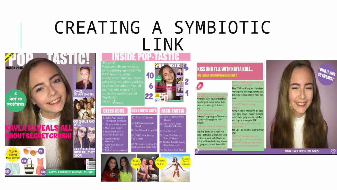
CREATING A SYMBIOTIC LINK

WHERE DID I CHOSE MY FONTS FROM? As I wanted to be adventurous and imaginative with my fonts, I did
not want to choose the fonts available from the Adobe Photoshop document, therefore, I chose my fonts from a website called ‘DaFont’ http://www.dafont.com/
This allowed me to research into hundreds of exciting fonts which would suit my magazine to the best of its ability. As one of the most important conventions I wanted to follow is that the font reflects the brand identity and genre of my magazine.

SOCIAL GROUPS REPRESENTED; GENDER.
Font: Existing pop magazines currently target the female audience. This is shown through the use of fonts. Fonts used in 'We Love Pop' and 'Top Of The Pops' are soft and delicate, this supports the stereotype that women are delicate and like pretty things. I chose to follow this typical representation in the making of my pop magazine. This is because I wanted to target a similar audience as the existing pop magazines. I would be able to achieve this through the use of delicate script fonts, as it would attract young females who would appeal to the look of a decorative font type.

SOCIAL GROUPS; GENDER
Fashion And Makeup; Pop magazines represent the female audience through the use of fashion and beauty. Both ‘We Love Pop’ and ‘Top Of The Pops’ include an entire section dedicated to fashion and makeup, highlighting how females love to look good, and care about their appearance. I chose to use this typical feature in my magazine as I wanted to target this type of female. My representation of this female is shown through a dedicated section of my magazine to fashion called ‘Fash-Tastic’ including elements such as ‘Beauty tips and secrets’ and a ‘We Love Your Style’ page, where readers of my magazine feature with images of their style.

SOCIAL GROUPS; RACE Pop magazines tend to represent a white British female, this is through the use of artists featured, the artists/ celebrities tend to be white. Stereotypically, black people are linked to the RnB/ Hip Hop genre. Pop is normally represented as a white, British genre.
The relationship couples presented to us through pop magazines tend to be white couples, it is rare to see different race couples on pop magazines.

SOCIAL GROUPS; RACE
I followed this typical representation as I wanted the pop genre to be easily recognisable through my magazine. To do this my main artist featured is a white British female, likewise are Stan Smith and Riley and Alexa (both featured on my front cover). However, my girl band is a mix of races, this is typical as we tend to see a mixture of race through pop bands, to show variety and how everyone can enjoy the pop genre.
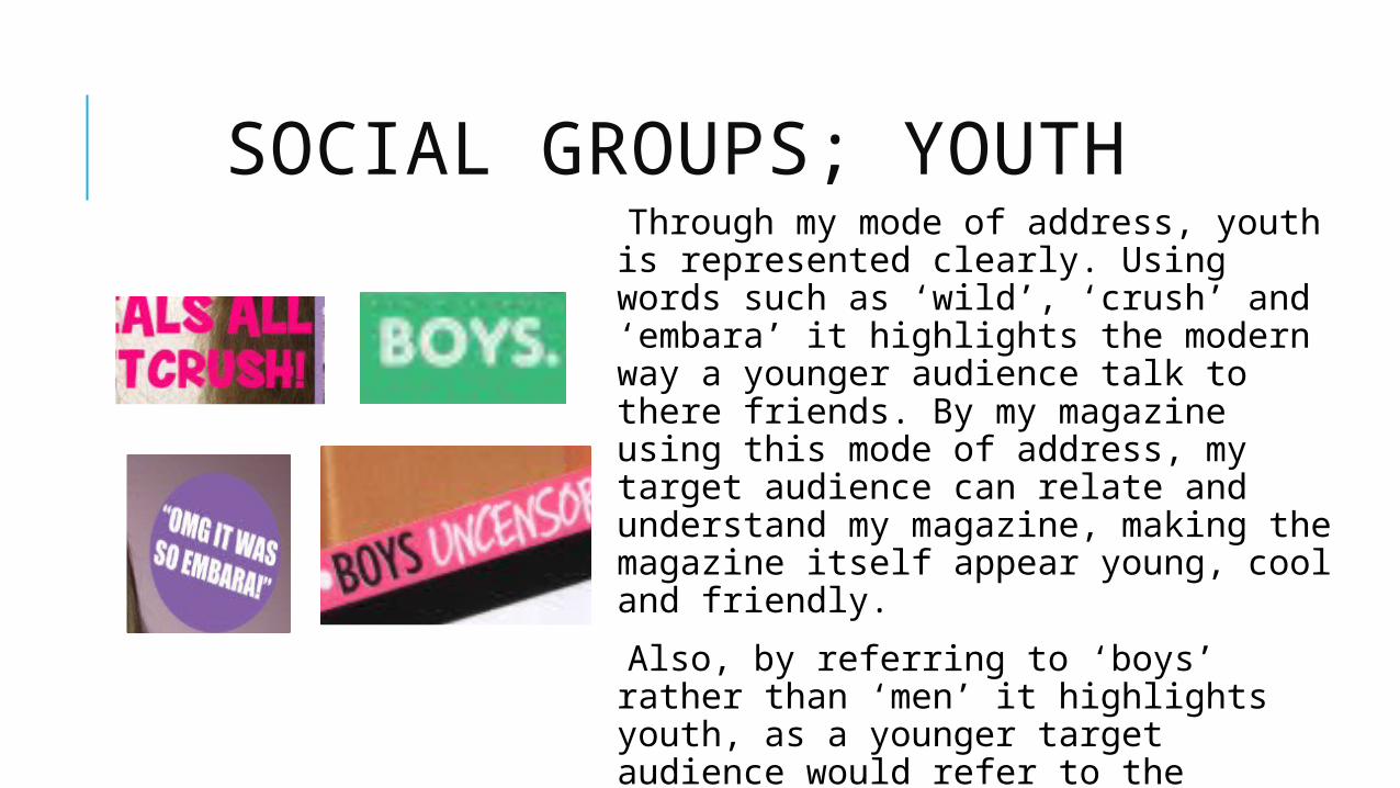
SOCIAL GROUPS; YOUTH Through my mode of address, youth is represented clearly. Using words such as ‘wild’, ‘crush’ and ‘embara’ it highlights the modern way a younger audience talk to there friends. By my magazine using this mode of address, my target audience can relate and understand my magazine, making the magazine itself appear young, cool and friendly.
Also, by referring to ‘boys’ rather than ‘men’ it highlights youth, as a younger target audience would refer to the opposite gender as boys.
This mode of address is similar to existing pop magazines as they too target a young target audience.

MEDIA INSTITUTIONS; My chosen magazine company which would distribute ‘POP-TASTIC’ would be ‘Egmont’. It is a huge successful company who have had lots of experience, they currently have 20 monthly magazines which they distribute. They focus on a young target audience and are owners of ‘We Love Pop’. This is one of the main reasons I thought ‘Egmont’ would be a perfect distributer, as it would understand the type of audience my magazine would appeal to and it would know how and where to distribute my magazine. Furthermore, they are in charge of ‘We Love Pop’ website, therefore not only do they have experience into print media, but also digital media. With technology interest rising, it would be important for ‘Pop-Tastic’ to have its own website and ‘Egmont’ would be the perfect institution to guide my magazine to success. In addition to this, ‘Egmont’ states it has a ‘close relationship with schools’ in its mission statement, this is another benefit to the institution, as my target audience are aged 11-15 and would therefore be in education.

TARGET AUDIENCE; INTERESTS My target audience is a young, bubbly female aged 11-15, attending high school, my magazine understands this as one of the articles is ‘How to glam up your school uniform’. She would enjoy spending time with her family and friends on the weekend, her favourite thing to do would be going shopping with a group of her classmates on the weekend. Her favourite shops being ‘New Look’ and ‘River Island’, she would also love ‘Superdrug’ looking at the ‘Barry M’ makeup and beauty section, trying on lots of samples with her friends and picking her favourite products. Overall, she pays attention to her appearance, as she is an overly feminine girl who fantasises at the idea of fashion and beauty. To ensure I understood the interests of my target audience I included a whole section of my magazine dedicated to fashion named ‘Fash-Tastic’ this would be a common section of ‘Pop-Tastic’ which would feature in each issue of my magazine.
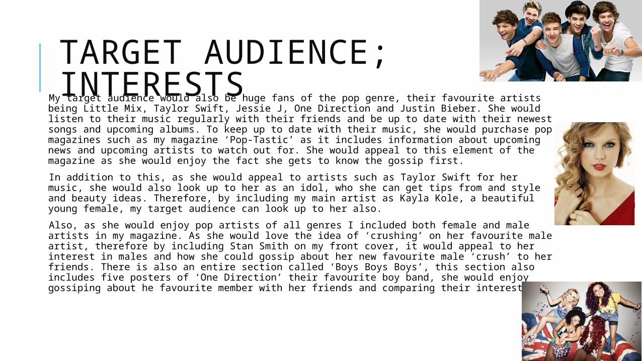
TARGET AUDIENCE; INTERESTS My target audience would also be huge fans of the pop genre, their favourite artists being Little
Mix, Taylor Swift, Jessie J, One Direction and Justin Bieber. She would listen to their music regularly with their friends and be up to date with their newest songs and upcoming albums. To keep up to date with their music, she would purchase pop magazines such as my magazine ‘Pop-Tastic’ as it includes information about upcoming news and upcoming artists to watch out for. She would appeal to this element of the magazine as she would enjoy the fact she gets to know the gossip first.
In addition to this, as she would appeal to artists such as Taylor Swift for her music, she would also look up to her as an idol, who she can get tips from and style and beauty ideas. Therefore, by including my main artist as Kayla Kole, a beautiful young female, my target audience can look up to her also.
Also, as she would enjoy pop artists of all genres I included both female and male artists in my magazine. As she would love the idea of ‘crushing’ on her favourite male artist, therefore by including Stan Smith on my front cover, it would appeal to her interest in males and how she could gossip about her new favourite male ‘crush’ to her friends. There is also an entire section called ‘Boys Boys Boys’, this section also includes five posters of ‘One Direction’ their favourite boy band, she would enjoy gossiping about he favourite member with her friends and comparing their interests.

TARGET AUDIENCE; INTERESTS
A specific element of my magazine, is the double page spread article on main artist Kayla Kole. I chose to include an interview form as my target audience would love the idea of chatting and finding out gossip first. It would make her feel special and feel as if she is getting exclusive information which she can then pass on to her friends when they next have a catch up on the weekend.
The article starts off with a general conversation with Kayla about her new make over, this would straight away appeal to my target audience as she also loves the idea of appearance and beauty and therefore, would be interested in Kayla Kole’s new look. She then talks about her new upcoming album, which features her favourite pop artists such as Jessie J, this would be exciting for my target audience to hear about this as she enjoys hearing new music and keeping up to date with upcoming albums and tours. Finally, she talks of boys and Harry Styles, another interest of my targe audience. She would be intrigued into relationships and the idea of fantasy and love. Therefore, hearing the story of Kayla Kole and Harry Styles getting together would be highly appealing for her.

TARGET AUDIENCE; NEEDS AND EXPECTATIONS As my target audience is a young, bubbly girly girl who enjoys spending time with her friends. It was important that the brand identity of my magazine is vibrant and full of fun. To do this I used bright, eye catching colours such as blue, green, pinks and purples. These colours would attract the interests of my target audience and intrigue them into buying my magazine. It makes it appear colourful and youthful, which is reflective of the personality of my target audience. ‘Pop-Tastic’ needed to be loud and attention grabbing to make sure my target audience are not distracted by other existing pop magazines. By using lots of exciting colours it also adds to the happy, friendly and inviting brand identity of ‘Pop-Tastic’, this colourful theme runs throughout my three pieces to ensure an ongoing and endless fun feel is portrayed in my magazine. This would encourage a young target audience to purchase the magazine as it would make it appear like a good friend she would want to be around.
I also made sure the colours I used in my magazine are similar on all three pieces, to ensure my work is organised and professional, as although my target audience is fun, high energy enthusiasm and bubbly, she is also professional and takes care in her appearance. Therefore I ensured I balanced these vibrant colours with the simplicity of black and white. This would appeal to my target audience as they wold see ‘Pop-Tastic’ as a professional and understanding friendly magazine.

TECHNOLOGY.
https://prezi.com/yygw9uidg4m9/technology/

WHAT HAVE I LEARNT IN THE PROGRESSION OF THE PROJECT?From carrying out post production, it gave me an insight into what I
should expect in the production of completing a magazine and how I should approach it. Furthermore, it allowed me to understand codes and conventions of magazines in general. This gave me confidence into the magazine industry and how to produce a successful and professional magazine in which I could direct to a particular target audience. From the preliminary task I was also able to understand how to use Adobe Photoshop, familiarising myself with all the tools and how to produce an interesting magazine.I took with me the skills I produced from the preliminary task into the practical production of my pop magazine, I often referred back to my school magazine ‘Student Room’ as a guide into how to follow general conventions of magazines. Yet, I have improved a lot when it coms to my final pieces for my pop magazine ‘Pop-Tastic’ both in practical skill and in confidence in the Adobe software. In the making of ‘Student Room’ I was cautious of which tools to use and how to use them, therefore I stuck to very general tools and did not take any risks. Compared to ‘Pop-Tastic. I was much more confident in playing around with different tools and also made sure it was more creative, by researching into websites such as ‘DaFont’, to ensure I pushed myself when it comes to individuality to my magazine, so I was not just using the fonts I was given.