evaluation
TRANSCRIPT
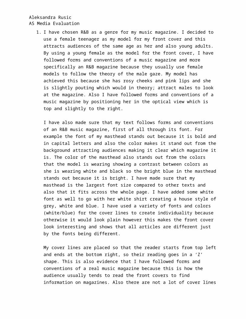
Aleksandra Rusic AS Media Evaluation
1. I have chosen R&B as a genre for my music magazine. I decided to use a female teenager as my model for my front cover and this attracts audiences of the same age as her and also young adults. By using a young female as the model for the front cover, I have followed forms and conventions of a music magazine and more specifically an R&B magazine because they usually use female models to follow the theory of the male gaze. My model has achieved this because she has rosy cheeks and pink lips and she is slightly pouting which would in theory; attract males to look at the magazine. Also I have followed forms and conventions of a music magazine by positioning her in the optical view which is top and slightly to the right.
I have also made sure that my text follows forms and conventions of an R&B music magazine, first of all through its font. For example the font of my masthead stands out because it is bold and in capital letters and also the color makes it stand out from the background attracting audiences making it clear which magazine it is. The color of the masthead also stands out from the colors that the model is wearing showing a contrast between colors as she is wearing white and black so the bright blue in the masthead stands out because it is bright. I have made sure that my masthead is the largest font size compared to other texts and also that it fits across the whole page. I have added some white font as well to go with her white shirt creating a house style of grey, white and blue. I have used a variety of fonts and colors (white/blue) for the cover lines to create individuality because otherwise it would look plain however this makes the front cover look interesting and shows that all articles are different just by the fonts being different.
My cover lines are placed so that the reader starts from top left and ends at the bottom right, so their reading goes in a ‘Z’ shape. This is also evidence that I have followed forms and conventions of a real music magazine because this is how the audience usually tends to read the front covers to find information on magazines. Also there are not a lot of cover lines so it is easier for the reader to find main articles of what they are searching for.
2. In my contents page, I have used two male models so that it is not only females and this shows diversity and also makes it so that my audience is a larger range of people. Also this shows that I have used a range of images keeping the magazine interesting. Adding on, my target audience would be a social group that listens to R&B music because of the artists I have used to advertise it and also the language used to draw the audience towards my magazine.
The model which is used mostly in my magazine is targeted at my social group also because her look will appeal to both genders and both teenagers and young adults. My tag line shows the technique of surveillance as I have written ‘bringing you the latest news’. This attracts the audience as they want to know more about celebrity life and music. The tag line would be the same throughout every issue attracting new audiences; also it is not just for fans of music but celebrities and gossip too. This technique is called surveillance. Also I think that my magazine has challenged the stereotype of there being a black model on the front cover of an R&B magazine.

Aleksandra Rusic AS Media Evaluation
3. Media institutions such as Time Inc. would distribute my music magazine because they distribute magazines such as ‘Vibe’, which is a similar magazine to mine as it attracts the same audiences. Also using a online format would be convenient for my target audiences (teenagers and young adults) because they are most likely to use the internet. It will also be ubiquitous for my audience, as they would have easy access to my magazine. This will also save me money because I would not need to pay for a distributor. I will also reach a wider audience because it is on the internet so countries other than the UK will be able to view it, also as it is online it will be free to view so this is also more convenient for audiences.
4. My target audience are most likely teenagers and young adults of both genders. I have targeted this group of audience because it is most likely you will see a teenager or young adult reading an R&B magazine depending on their music interests. For this reason I have decided to use a model of around the same age group who is a teenager to attract my target audience further. There is another use of the technique surveillance because it is a picture of someone their age, so they would want to know more about an artist their age.
5. First of all I have followed the forms and conventions by using a portrait and also by using a medium close-up and also having my model in the right place for the optical view which is slightly right and up. Also I have followed the rule of thirds. Additionally I have followed the way that cover lines are at the sides of the page and the masthead is at the top with a selling line on top of that. Also my barcode is in the right place along with the price, the date and issue number.
6. I have improved on my skills and which technologies I have used. Firstly I used to use Microsoft Word and other programs like this to create magazines such as my preliminary task. However then I began to use Photoshop. I have learnt many skills in the programme Photoshop such as manipulating images and improving them. I learnt how to take away the background of an image, and that this is easiest to do if the picture is taken in front of a green background. Also taking away imperfections using the air brush tool and also cloning places on the models face to even out their skin colour.
7. Since doing my preliminary task I have learnt many new skills and techniques that have contributed to my final product of my music magazine. I have upgraded my picture quality as in my preliminary task I used my mobile phone to take pictures whereas for my music magazine I used professional cameras for my photo shoot and a good quality camera for pictures I had taken outside of school. This showed the improvement in images as the music magazine images look much more professional than the images in my preliminary task. Also I have learnt to use a different program which is Photoshop in comparison to using Microsoft Word in my preliminary task. The differences in these programs are that I can manipulate my images and make them look more professional. I have also learnt how to follow the forms and conventions of a real magazine, which I did not know when doing my preliminary task. In my preliminary task my products looked very plain and unorganised because there were a lot of spaces and also I did

Aleksandra Rusic AS Media Evaluation
not place many features in the right places such as the date and issue number. In my music magazine I have learnt how to attract my audience and how to follow the rule of thirds, I also learnt how to fill out my page but at the same time not make it look too crowded. I have learnt how to make my music magazine look professional.
I have placed the puff in the middle of the magazine instead of at the top right hand corner like other magazines. I did this to challenge conventions
My barcode placement follows forms and conventions
My model is looking straight ahead following the male gaze to attract males. She also has pink lips and rosy cheeks supporting this

Aleksandra Rusic AS Media Evaluation
Uses the technique of surveillance because the reader wants to know more
Different categories to make it easier for the reader to find what they are looking for
Images instead of words to highlight the main articles and pages
Used a full page for an image following forms and conventions of some double page spreads
Use of pull quotes also follows the forms and conventions of a real double page spread and it highlights important information within the article and also makes the audience want to read more
The title of the article is in different sizes following forms and conventions.