evaluation of coursework
DESCRIPTION
ÂTRANSCRIPT

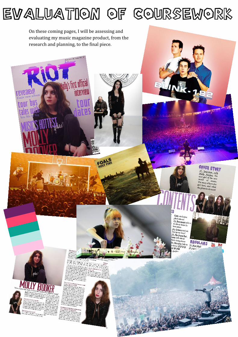
On these coming pages, I will be assessing and
evaluating my music magazine product, from the
research and planning, to the final piece.


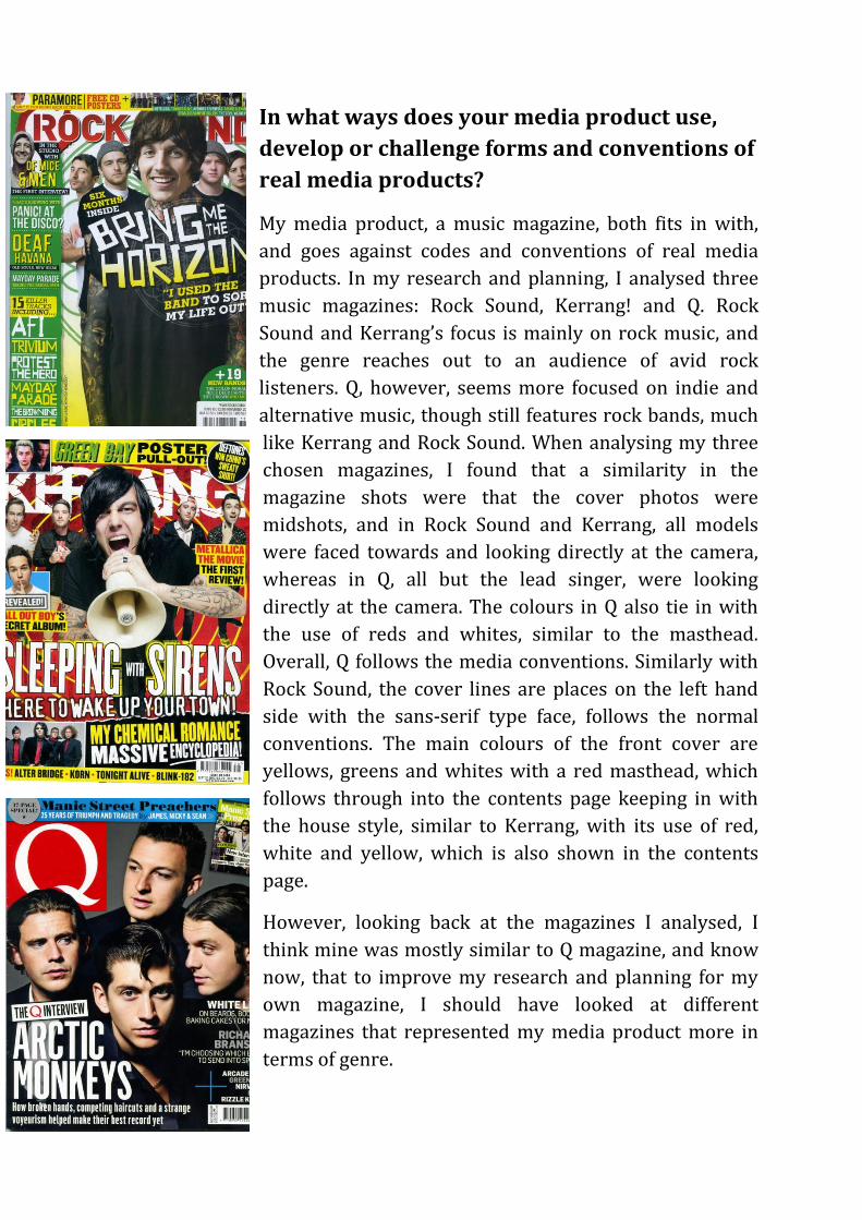
In what ways does your media product use,
develop or challenge forms and conventions of
real media products?
My media product, a music magazine, both fits in with,
and goes against codes and conventions of real media
products. In my research and planning, I analysed three
music magazines: Rock Sound, Kerrang! and Q. Rock
Sound and Kerrang’s focus is mainly on rock music, and
the genre reaches out to an audience of avid rock
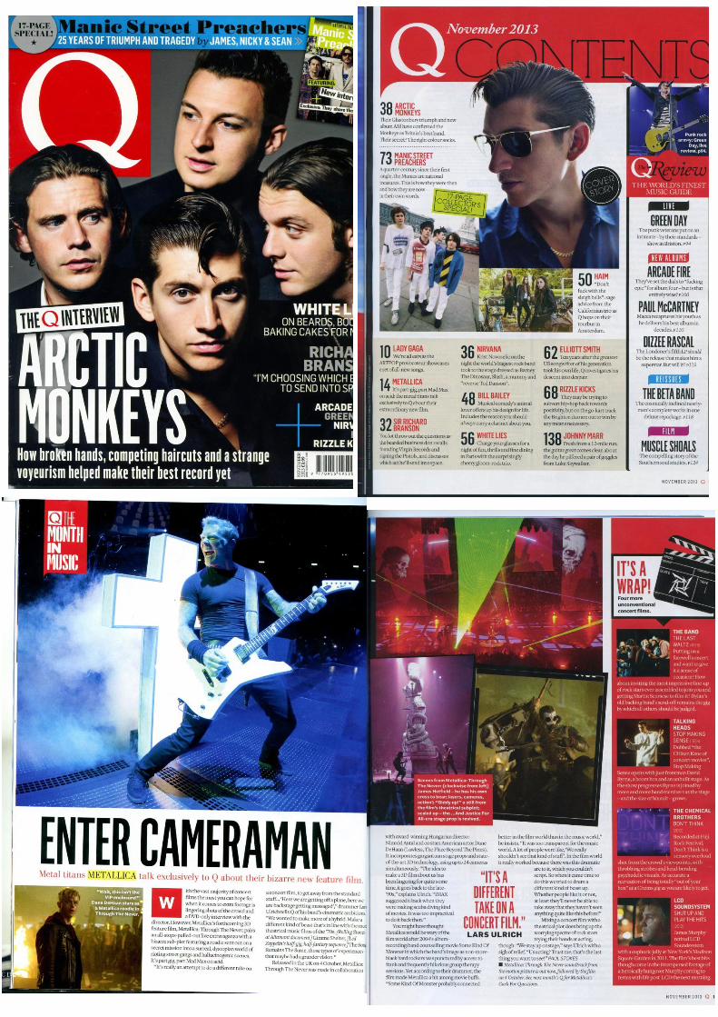
listeners. Q, however, seems more focused on indie and
alternative music, though still features rock bands, much
like Kerrang and Rock Sound. When analysing my three
chosen magazines, I found that a similarity in the
magazine shots were that the cover photos were
midshots, and in Rock Sound and Kerrang, all models
were faced towards and looking directly at the camera,
whereas in Q, all but the lead singer, were looking
directly at the camera. The colours in Q also tie in with
the use of reds and whites, similar to the masthead.
Overall, Q follows the media conventions. Similarly with
Rock Sound, the cover lines are places on the left hand
side with the sans-serif type face, follows the normal
conventions. The main colours of the front cover are
yellows, greens and whites with a red masthead, which
follows through into the contents page keeping in with
the house style, similar to Kerrang, with its use of red,
white and yellow, which is also shown in the contents
page.
However, looking back at the magazines I analysed, I
think mine was mostly similar to Q magazine, and know
now, that to improve my research and planning for my
own magazine, I should have looked at different
magazines that represented my media product more in
terms of genre.

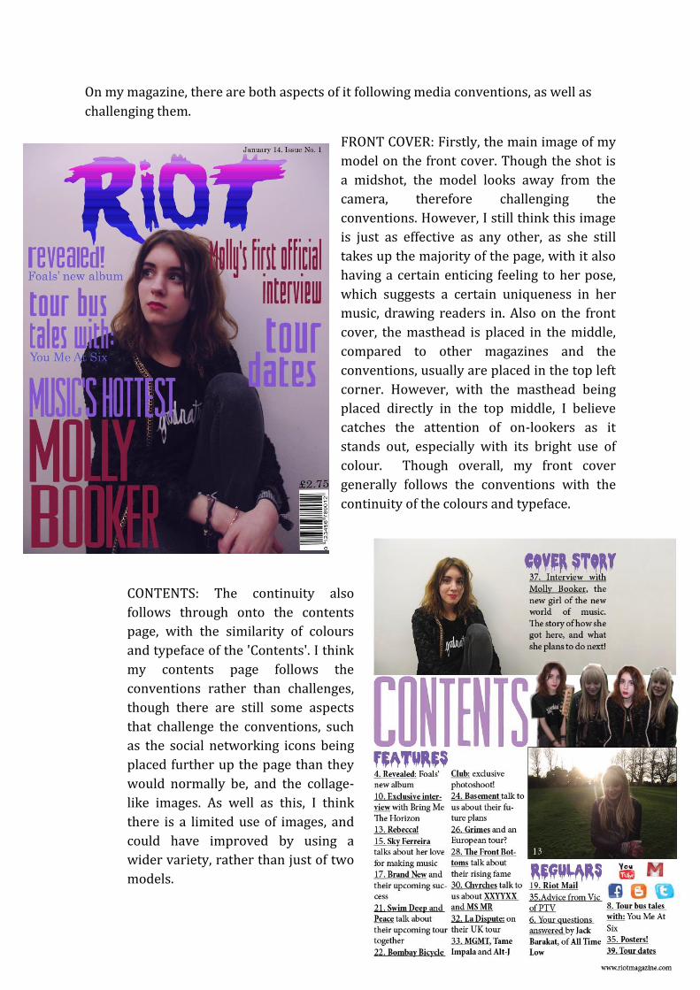
On my magazine, there are both aspects of it following media conventions, as well as
challenging them.
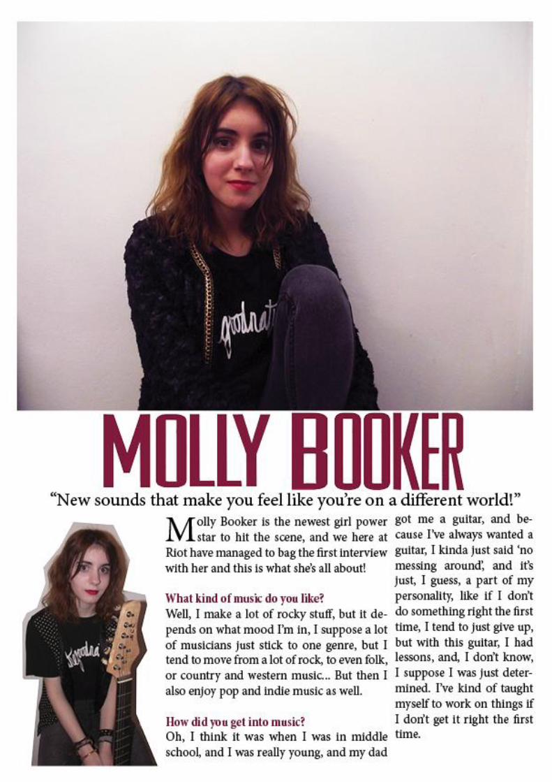
FRONT COVER: Firstly, the main image of my
model on the front cover. Though the shot is
a midshot, the model looks away from the
camera, therefore challenging the
conventions. However, I still think this image
is just as effective as any other, as she still
takes up the majority of the page, with it also
having a certain enticing feeling to her pose,
which suggests a certain uniqueness in her
music, drawing readers in. Also on the front
cover, the masthead is placed in the middle,
compared to other magazines and the
conventions, usually are placed in the top left
corner. However, with the masthead being
placed directly in the top middle, I believe
catches the attention of on-lookers as it
stands out, especially with its bright use of
colour. Though overall, my front cover
generally follows the conventions with the
continuity of the colours and typeface.
CONTENTS: The continuity also
follows through onto the contents
page, with the similarity of colours
and typeface of the 'Contents'. I think
my contents page follows the
conventions rather than challenges,
though there are still some aspects
that challenge the conventions, such
as the social networking icons being
placed further up the page than they
would normally be, and the collage-
like images. As well as this, I think
there is a limited use of images, and
could have improved by using a
wider variety, rather than just of two
models.

DOUBLE PAGE: I think the continuity of the front cover and contents page has
been slightly lost in the double page spread. I think this is mostly because the use
of colour, as it doesn't really link back to the purple/pink colours of the contents
and front cover, though the dark red of 'Molly Booker' is still present, therefore
giving is a small sense of continuity. However, I think this double page spread
mostly follows the conventions, as it contains images and pull quotes, with the
actual interview following the column layout. I think the only aspect of the
double page spread that doesn't follow the conventions is the number of images
used, and I think with mine, there are too many, and on a normal (real) media
product, the maximum number of photos would possibly be two, rather than
three. As well as this, the two collage-style images I've used could also be seen as
going against media conventions, and that the text doesn't wrap around the
images. However, I think if I had had the text wrap around the two collage-like
images, the flow of the text would be disrupted and would be harder to read and
follow. On the other hand, though they challenge the conventions, these images
could really enforce the fact that my magazine is different and unique.
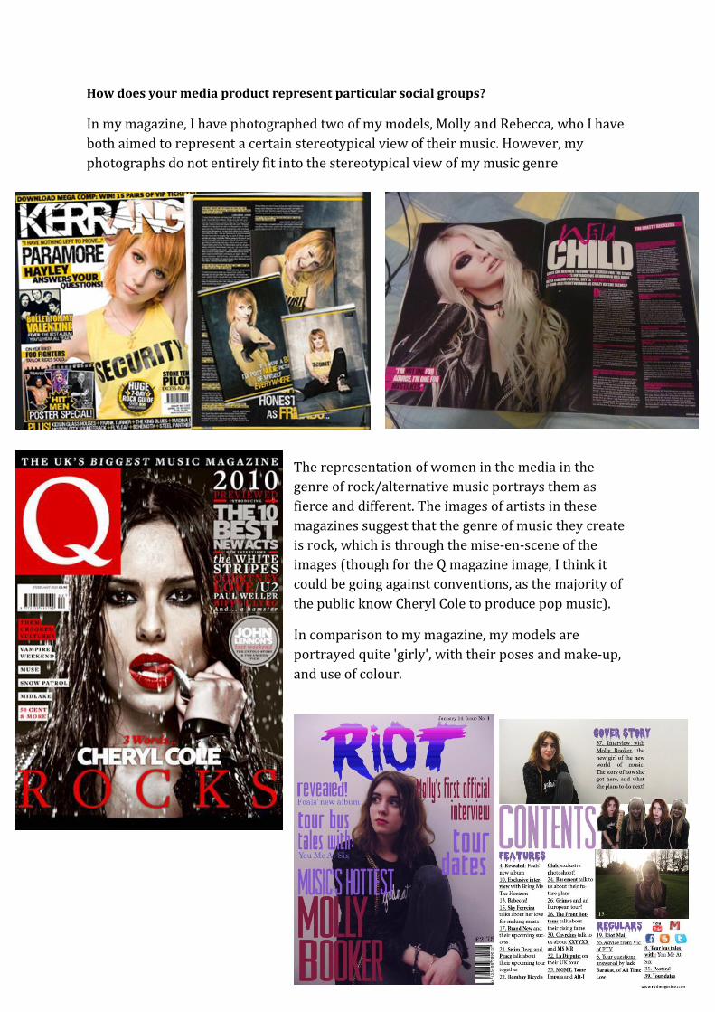
How does your media product represent particular social groups?
In my magazine, I have photographed two of my models, Molly and Rebecca, who I have
both aimed to represent a certain stereotypical view of their music. However, my
photographs do not entirely fit into the stereotypical view of my music genre
The representation of women in the media in the
genre of rock/alternative music portrays them as
fierce and different. The images of artists in these
magazines suggest that the genre of music they create
is rock, which is through the mise-en-scene of the
images (though for the Q magazine image, I think it
could be going against conventions, as the majority of
the public know Cheryl Cole to produce pop music).
In comparison to my magazine, my models are
portrayed quite 'girly', with their poses and make-up,
and use of colour.

Front Cover
The image of Molly on the front cover is a
midshot of her looking away from the camera,
and because of her pose, we see her outfit, of dark
jeans and a black jumper. I think this outfit is a
good representation of her rock style and genre.
However, I think her make-up could have been
improved to look more 'rocky', by
using darker makeup, like those
of the magazines above. As well
as this, I think her pose would
have been better if she were standing, with a closer shot, and looking
directly at the camera, because I think that would have shown a better
representation of rock. However, because this magazine is both rock
and indie/alternative, as well as her being unique in her style, is a good
representation of what Molly produces. I could have also used props,
such as an electric guitar to give more of an insight to her genre of
music, drawing in more of an audience.
This main image also uses quite
stereotypically 'girly' colours, with the
overall image having a pink and purple
tone. This contrasts to the magazine
images above, as they're quite dark.
However, this colour could also be seen
as fitting for the magazine, because Riot
also features indie/alternative music.
I think the font of the masthead 'Riot'
attracts readers as it ultimately sets out
what is in the magazine, however, the font of 'Molly Booker' contrasts to the masthead,
because it's much plainer, which again, doesn't give an insight into what genre of music
she produces. However, as it goes alongside the 'Riot' masthead, readers will still pick
up the magazine because from that, they can tell what kind of music is featured in it.

Foals the band both fit into the genre
of my magazine being alternative,
indie and rock. This particular cover's
colour is similar to mine with the
overriding tone of a cold blue (mine
having an overriding tone of pinks and
purples).

Contents page
The contents page looks different from the front cover, however still have a certain
sense of continuity due to the use of colours and fonts. The use of purples has been
carried through here, but with the absense of pinks, I feel it separates itself from the
cover. I think this contributes to the representation of the genre of the magazine.
In a rock magazine, the contents page will
be quite busy, and uses blocks of colour,
such as Kerrang magazine. Whereas other
magazines that feature more alternative
music will look much more quiet, plain
and simple, such as Q magazine.
Looking at these magazines and my own, I
feel there is a combination of both the
style of Kerrang and Q. My page has a
sense of simplicity to it, with its limited
use of colour and simple images, reflecting
the conventions of an alternative
magazine, though because of the listing of
articles and social networking icons,
there's a sense of business, which reflects
conventions of rock magazines.
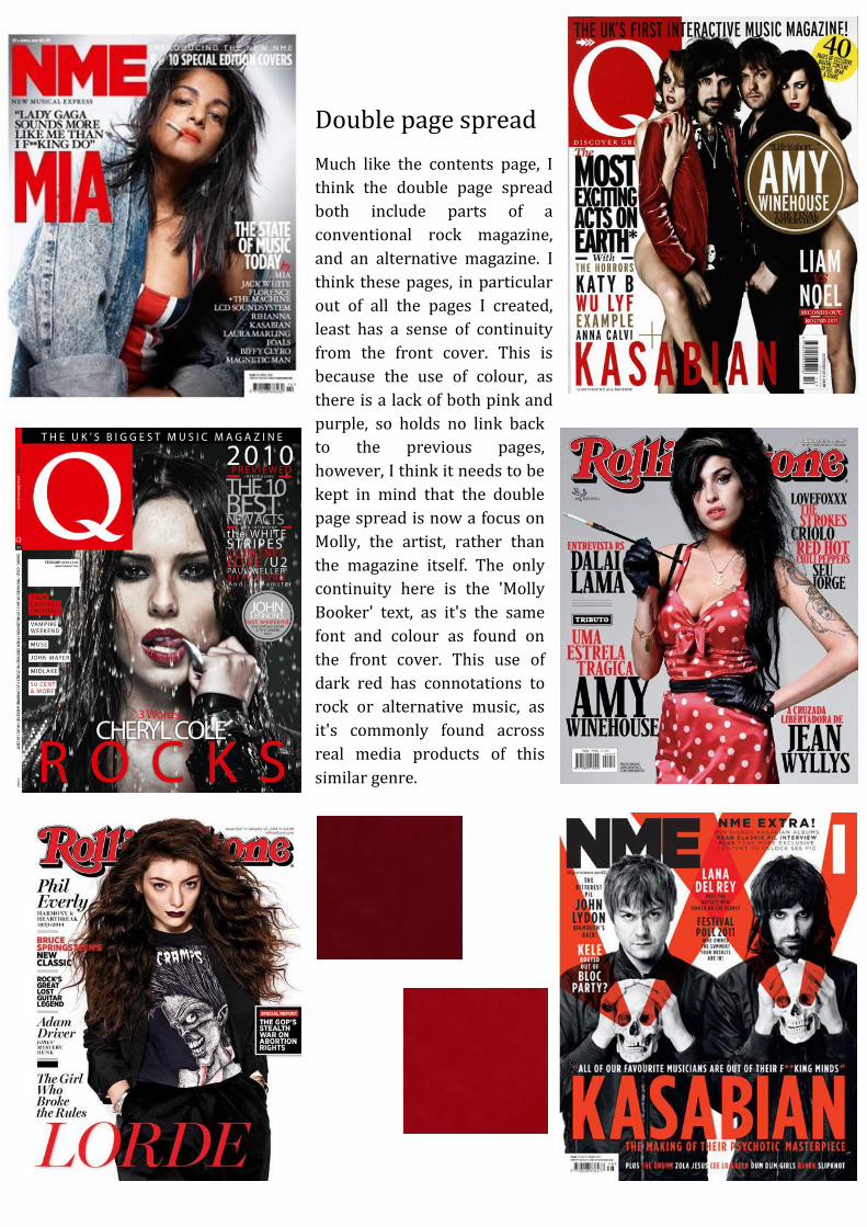
Double page spread
Much like the contents page, I
think the double page spread
both include parts of a
conventional rock magazine,
and an alternative magazine. I
think these pages, in particular
out of all the pages I created,
least has a sense of continuity
from the front cover. This is
because the use of colour, as
there is a lack of both pink and
purple, so holds no link back
to the previous pages,
however, I think it needs to be
kept in mind that the double
page spread is now a focus on
Molly, the artist, rather than
the magazine itself. The only
continuity here is the 'Molly
Booker' text, as it's the same
font and colour as found on
the front cover. This use of
dark red has connotations to
rock or alternative music, as
it's commonly found across
real media products of this
similar genre.

In comparison to my other images of my model,
on this double page spread, I have used a prop of
an electric guitar. This helps represent the rock
genre of her music. Again, the outfit is visible and
we can see the 'glamorous rock chic' style
portrayed in some of the magazines above.
The overall page again, like the contents page is
simply and plain, in an alternative magazine, this
is conventional, however, in a rock magazine, the
layout and colours are much busier. However, I
think there is less of a problem, because Molly
Booker is unique and different from the
stereotypical rock artists.

What kind of media institution might distribute your media product and why?
As said in my press release, the publisher for my
magazine will be Bauer Media Group because of their
other publishing of rock and alternative magazines,
such as Q and Kerrang. Bauer Media Group have
already set up a huge company, with a turnover of
€2.129 Billion (in 2010). They operate in 16 counties
worldwide, though my magazine would only be
published in the UK. With this, I would have it
published weekly, with an online copy available. My
audience will easily be able to have access to this
magazine at just £2.75, from a majority of shops
across the UK. These include superstores such as Tesco, Asda and Morrisons, as well as
WHSmith and small corner shops.
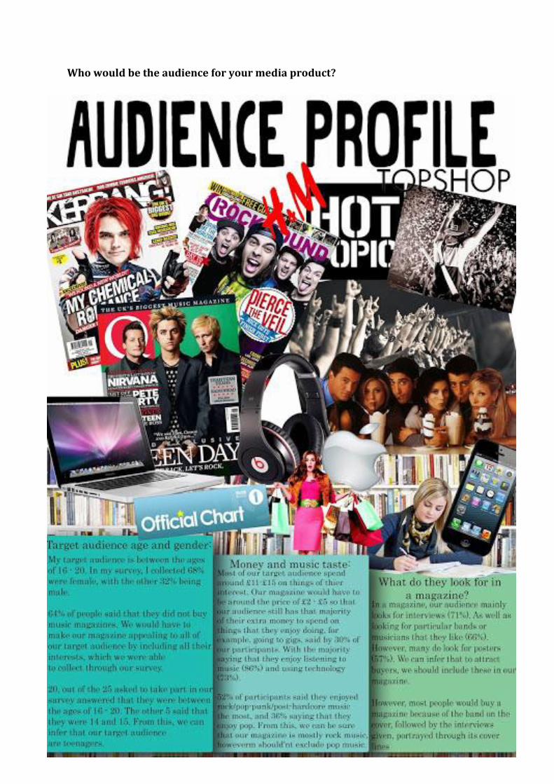
Who would be the audience for your media product?

I found out about my audience through
my audience survey early on in the
coursework. From this we found that the
audience for my media product are
males and females, though mostly
females, between the ages of 16-20. This
age also indicates to us about their spare
money and interests, which I also asked
about later on in the survey.
I also found out about how much extra
money they have to spend on things of
their interest, and found that 40% spend
£11-£15 and 13% spending between £5-
£7. From this, I could base a decision on
what kind of price to aim my magazine at,
looking at how much these participants
had.
To find out more about my audience, I
asked what they liked to do in their spare
time, which would then help me on what
kinds of other things they'd like to see in
my magazine (which would appear on my
contents page).

I found that 86% enjoyed listening to music in their free time, as well as using
technology (73%), so I knew with confidence that I could involve these things in my
magazine, and would have a selling point.
Their enjoyment of technology also
means that they can interact with Riot
magazine through their Smartphone's
as I found that 68% of the participants
have a Smartphone.
To gain some insight into what an audience looks for in a magazine, I asked them exactly
that, and found that 71% of people enjoy interviews, and that 47% of people definitely
look towards the cover lines on
whether to buy the magazine or not.
Other major things people look for is
posters and bands that they recognise
and like.
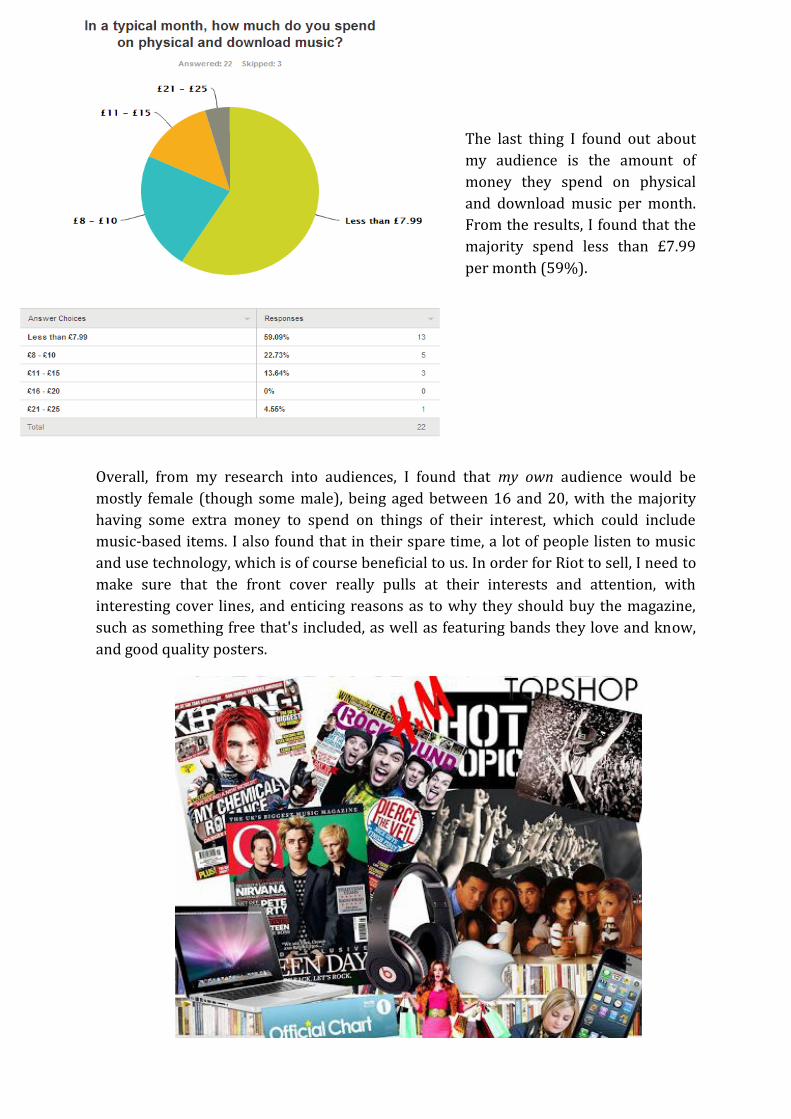
The last thing I found out about
my audience is the amount of
money they spend on physical
and download music per month.
From the results, I found that the
majority spend less than £7.99
per month (59%).
Overall, from my research into audiences, I found that my own audience would be
mostly female (though some male), being aged between 16 and 20, with the majority
having some extra money to spend on things of their interest, which could include
music-based items. I also found that in their spare time, a lot of people listen to music
and use technology, which is of course beneficial to us. In order for Riot to sell, I need to
make sure that the front cover really pulls at their interests and attention, with
interesting cover lines, and enticing reasons as to why they should buy the magazine,
such as something free that's included, as well as featuring bands they love and know,
and good quality posters.

What have you learnt about technologies from the process of constructing this
product?
Throughout this project, I have had to use many different software, hardware and
online tools to bring it all together. The majority of the online tools were for the
presentation of my posts, documents, slideshows, audience research and proof of
construction. However, I also used PhotoShop and InDesign for the actual construction
of my magazine.
Blogger
Blogger has been one of the biggest platforms in which I have had to use to
communicate, through this, I uploaded my research, planning, construction, analysis
and final product. In many occasions, I used it as a platform in which I communicate
through other online tools, however, I have uploaded post through blogger itself.
However, I uploaded much of my work through other online tools, which I then
embedded onto my blog, such as SlideShare, Scribd, Prezi, Issuu, Pinterest, Polyvore and
SurveyMonkey.

SlideShare
Through SlideShare, I uploaded posts about feedback, audience research and the
construction of my magazine. Through this site, I was able to upload slideshows with
ease.
Scribd
Scribd allowed me to upload documents easily onto my blog. However, I found that
when converting th document, Scribd doesn't completely keep the shape and set out
placement of the images, and didn't like the overall look on my blog, so used it less than
the other online tools on my blog.

Prezi
Out of all the online tools I have used for my magzine, I enojyed using Prezi the most,
because of the easy use and the quality presentation of the uploads. This different from
the previous online tools such as SlideShare and Scribd, as this donesn’t convert
documents, instead, we create our post on Prezi, then embed onto our blog. Through
this I was able to printscreen the process of how I constructed my magazine, and other
things such as my photoshoot and focus group.

Issuu
I didn’t use Issuu as much as some of the other online tools I used, however I like the
neat presentation and style of the posts. I think it clearly links in with the theme of the
coursework as it is in an magazine-style layout. This online tool, much like SlideShare
and Scribd, converts documents. This was easy to use, though there were a few
problems in converting the document, though the overall presentation looks good.

With this online tool, I only used it for the magazine flatplans, which was a good way for
presenting them because they are clear and different to look at. By this online tool, I also
added variety into the posts on my blog. This technique was easy to use, however, took
some adjustments to the sizing of the images for them all to fit into the blog post.

Polyvore
I only used Polyvore on two of my
posts, which are the posts on the
photoshoot outfit ideas. This site
enables you to make collage-like
images of clothes and make-up, as
well as other things such as furtinutre,
so is almost like a way to make a
moodbaord.

SurveyMonkey
I used SurveyMonkey as a means to get audience feedback. This site allows me to upload
and create surveys, as well as a way in which people could go and take the survey. This
allowed me to find out about my target audience.

PhotoShop
A lot of my work consisted of using
PhotoShop, the main project I
spent on PhotoShop is the
construction of my front cover. I
edited photos and adjusted them to
look the way I wanted to represent
my magazine, as well as creating
fonts, like the Riot masthead.
Through using PhotoShop, I learnt
how to use and nagivate around
the software. Using PhotoShop, I
developed my knowledge and
understanding of the software, enabling
me do use it with more depth and more
complex actions, which would therefore
improve my final magazine.

InDesign
Before constructing my music magazine contents page and double page spread, our
class were given a practise session with a professional InDesign user. This really helped
me understand InDesign and how to work my way around the software with ease,
which in turn, really helped me for constructing my contents page and double page
spread.
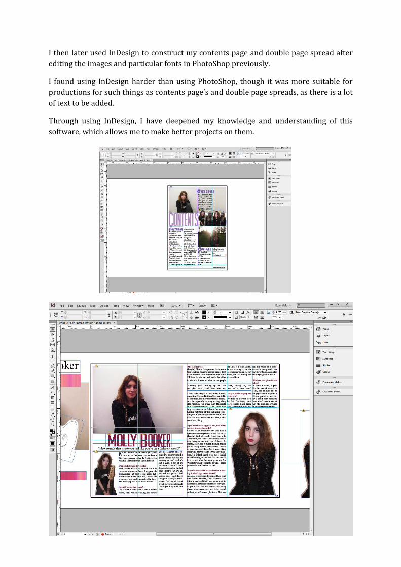
I then later used InDesign to construct my contents page and double page spread after
editing the images and particular fonts in PhotoShop previously.
I found using InDesign harder than using PhotoShop, though it was more suitable for
productions for such things as contents page’s and double page spreads, as there is a lot
of text to be added.
Through using InDesign, I have deepened my knowledge and understanding of this
software, which allows me to make better projects on them.

Looking back at your preliminary task, what do you feel you have learnt in the
progression from it to the full product?
Looking back at this music magazine project and comparing it to the college magazine
project, I feel as if I’ve progressed far in my knowledge and understanding of media
products; representations and audiences; and terminology, as well as how to use
particular software, hardware and online tools and the way in which to communicate
through them.

Looking at my college magazine, I can see that my
skills were limited, whereas, compared to my music
magazine, is much more complex and appealing,
showing I have definitely progressed in my
PhotoShop knowledge. Though both magazines have
a similar balance in colours, my music magazine has
a certain neatness to it, which makes it look
professional and real, in contrast to my college
magazine, where there are rough edges and is
unclear to read.
These contents pages are very different from each
other, and I think that my limited understanding of
InDesign is shown in my college magazine contents
page, whereas in my music magazine, the contents
page looks much more professional and neat. I think
this well portrays how far I’ve progressed in my
skills development of InDesign.
Overall, I still think I need to improve my skills on
InDesign, however, looking at my progress, I think I
have really improved and developed my knowledge
and understanding of the software we use in media
production.
Looking back at the overall project, there are some
definite improvements and clear progression of the
project as a whole, though there are also other
aspects of this project that I think I need to improve
on, such as my use of terminology, as I think it’s
been quite limited throughout, though I have
improved since my college magazine.