evaluation of my finished magazine
TRANSCRIPT

EVALUATION OF MY FINISHED MAGAZINEALEX WENMAN

1. IN WHAT WAYS DOES YOUR MEDIA PRODUCT USE, DEVELOP OR CHALLENGES FORMS AND CONVENTIONS OF REAL MEDIA PRODUCTS? COMPARISON TO NME
• Mastheads-NME and SLURR both use bold and impressive mastheads to engage the reader, with SLURR using a bright white for “Magazine” with the signature purple (Similar to how NME uses red) highlighting the logo. This is backed by a deep grey/black to add impact. It makes the magazine stand out and shows a clear contrast between NME’s wide audience due to it’s larger variety of genres.
• ‘Left Third’- Both magazines utilise this, but I chose not to stay with the current formula to make my magazine stand out on the shelf.
• Coverlines- NME uses lots of Coverlines, which nearly cover the whole of the cover, but I decided to keep a ,minimalistic look on my cover with far fewer Coverlines, focusing more on the main artist for the issue. It is far easier to quickly glance at and invites readers to purchase to see the other articles listed inside.
• Pull Quotes-I found that pull quotes were an essential part of the cover as they gave readers a quick insight to the article itself. Using a bold quote such as mine, helps communicate with the audience.
• The Main Image- I have utilised a portrait, long shot of my two models (Ivory tears) alongside a bricked background. The colours have been tuned so that only the models are in colour to add emphasis to the image. It has a similar look to NME, using the traditional “Rock” look in pose, expressions and clothing.
• Barcode- Allows the magazine to be sold in large chain stores easily with up to date technology, putting it as a direct competitor with NME and other magazines.
• Date, Issue and Pricing- Conforms to the traditional standard to ensure the magazine is easy for readers to organize and budget buy.

1. IN WHAT WAYS DOES YOUR MEDIA PRODUCT USE, DEVELOP OR CHALLENGES FORMS AND CONVENTIONS OF REAL MEDIA PRODUCTS?COMPARISON TO NME • Image Usage- I have utilised 3 images
in just my contents page, whereas NME has chose to only include a single image. I feel that the extra 2 images do create a better feel than a contents page which is mostly just words. I feel that my audience will appreciate this. They also help to showcase the feature articles which otherwise may have been overlooked by readers.
• ‘Regulars’- A feature I have included that NME do also. I feel that this is an essential segment as it allows easy navigation (or avoiding) of areas of the magazine for readers. I have developed this from NME’s standard ‘list view’ to a round graphic as I feel this adds difference and an overall look to the magazine and emphasises the importance of these sections.
• Band List/ A-Z – I’ve used a band list similar to NME to allow readers to quickly pinpoint the location of their favourite bands/artists in the issue. I think that this is a great feature and I have further developed this into a more concise list overall.
• Descriptions of articles- The two main, exclusive articles in my magazine are described in a shard sentence to draw in the readers. I feel that this will make readers want to read further, like in NME.
• The Layout- I feel that the layout of my contents is a simplistic but easily understood layout, allowing readers to quickly get to their chosen articles/ segments. I do feel though that NME’s organised layout does work better as it includes far more information than my own and really shows the full length of the magazine, unlike my own. I feel that my contents is efficient and useful, but could require some development in the future.

1. IN WHAT WAYS DOES YOUR MEDIA PRODUCT USE, DEVELOP OR CHALLENGES FORMS AND CONVENTIONS OF REAL MEDIA PRODUCTS?COMPARISON TO NME Looking at my double page spread, I feel that it clearly follows the modern conventions of a question and answer or interview. I feel that my two images relate to the article, for example the smaller image shows the two models burning literature, relating to the idea the band were originally English students and the pull quote below reflects this context also. I feel that the language used in the article is of a good standard but also is written in a casual style, reflecting the typical reader. It follows the standard subline below the article’s bold title, and adds some extra features including page numbers and logos. I did not opt for the drop cap like NME as I felt that it wasn’t suitable for the article, but it would be used otherwise in the magazine.
The article is also finished in a similar way to NME with information on album releases and tour dates to assist not only the reader but also the band. Columns have also been used to suit the traditional article layout and ensure it is easily read, with a ragged right approach. Also I have had a limited colour range/pallet which conforms to the current standard, as magazines such as NME utilise around3 or 4 colours only throughout, as it allows continuity throughout the magazine, as seen through the continued usage of purple, white and black.
Graphics: I’ve used an inventive graphic to display one of the pull quotes from the article, (The I) as I felt that it related to the band’s name (Ivory Tears) and added originality to the article and could influence other magazines to follow suit. I have also created a ‘Top tracks’ listing using varying sizes of boxes to add a personal feel as well as just an interesting addition to the page.
Compared to the NME article, my article is far less word heavy, as I feel that this allows the readers to stay more engaged and the other features help communicate with them, e.g. “Rated by You” forms a synthetic personalisation with the reader and makes it feel far more personal. Though I do feel that as an improvement I could’ve added more photographs as NME’s is nicely proportioned between images and text, though I think my article has an appropriately modern and clean look.
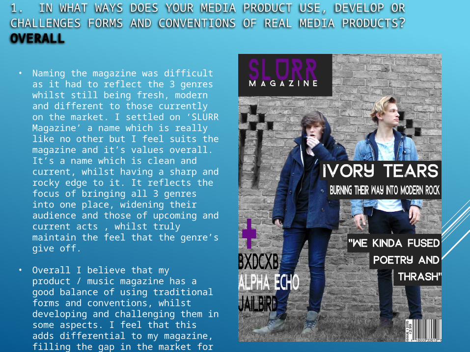
1. IN WHAT WAYS DOES YOUR MEDIA PRODUCT USE, DEVELOP OR CHALLENGES FORMS AND CONVENTIONS OF REAL MEDIA PRODUCTS?OVERALL
• Naming the magazine was difficult as it had to reflect the 3 genres whilst still being fresh, modern and different to those currently on the market. I settled on ‘SLURR Magazine’ a name which is really like no other but I feel suits the magazine and it’s values overall. It’s a name which is clean and current, whilst having a sharp and rocky edge to it. It reflects the focus of bringing all 3 genres into one place, widening their audience and those of upcoming and current acts , whilst truly maintain the feel that the genre’s give off.
• Overall I believe that my product / music magazine has a good balance of using traditional forms and conventions, whilst developing and challenging them in some aspects. I feel that this adds differential to my magazine, filling the gap in the market for a modern, genre specific music magazine (Indie, Rock & Alt).

2. HOW ARE SOCIAL GROUPS REPRESENTED IN YOUR MAGAZINE?
The social groups that my magazine represents are firstly people in the age range of 15 to 24 years old.This was first found in the results in my survey. This has influenced the style of writing in the magazine to be a far more laid back and casual approach to something found in ‘Q’ for example. I feel that this has allowed me to reflect young people’s passion for music and how important it is in their lives through my magazine, with ‘exclusive’ articles that they would love to read.
This is not saying though that the magazine is solely a representation for this age range as, older readers would be just as satisfied, but I feel that due to the large proportion of younger readers, they will have to be represented far more.

2. HOW ARE SOCIAL GROUPS REPRESENTED IN YOUR MAGAZINE?
The fonts and colour schemes I used reflect the specific genre’s but also ensure that it is not gender or ethnic specific. This allows a wider audience, for example if I had used colours such as blues, reds and blacks, it could be associated with the male gender far more than the female gender. The usage of simple but graphically interesting fonts also helps this as they cannot be truly associated to one specific social group, whereas if I had utilised a font with love hearts it could bee seen as representing solely the female social groups.

2. HOW ARE SOCIAL GROUPS REPRESENTED IN YOUR MAGAZINE?
In all of my pictures in the magazine, the models are all of white ethnicity. In an ideal world I would try to have a wide range of ethnicities in my magazine, but due to the fact that the rock, indie and alternative genres are dominated by artists and bands of white ethnicity, it’s far harder to find acts that the audience would want to read about.
I do hope though that, with one of my magazine’s aims being to open the indie, rock and alt genres up to more people and remove stigmas such as “rock music is all screaming and scary”- as heard in my interview, more people would become interested and more ethnic diversity would fill the 3 genres.
I hope that my magazine can be a platform for this to occur.

2. HOW ARE SOCIAL GROUPS REPRESENTED IN YOUR MAGAZINE?
I also chose to represent both male and female social groups as I feel that as they are both present in all 3 of my magazine's specific genres. I felt that it was important to represent both genders as it widens the audience possible as female readers will most likely not enjoy a purely male focused magazine, and vice-versa.
The balance across all images is clear cut, with two male models featured in images, and two female models represented also. I feel that this creates equality throughout and does widen the readership values compared to other magazines which solely base themselves on a specific gender, e.g. We Love Pop.
Overall I feel that social groups are equally represented throughout, with the exception of ethnicity, but this will hope to change as the focus of my magazine is to introduce more people to these genres.

3. WHAT KIND OF MEDIA INSTITUTION WOULD DISTRIBUTE YOUR MEDIA PRODUCT AND WHY?
To publish my magazine, I would have to use a large institution that has the capability of distributing and printing the magazines. The institution In have found to be the most suitable is: • Bauer Media
Currently Bauer Media Group reach over 19 million adults in the UK alone, and I feel that adding SLURR Magazine to their inventory will not only add some variety but also expand this figure to not only adults but also the younger generations (15-24 year olds)
Bauer currently have magazines such as Q, Mojo and Kerrang! for music but they do not currently cover the rock ,indie and alternative genres in great detail with only occasional segments in ‘Q’.
Adding SLURR would not only increase the current readership of Bauer’s brands, but it would also widen the social groups who currently read their products. If this was a success, then Bauer could even further the SLURR brand into other products, similarly to how Kerrang has its own radio station .
www.bauermedia.co.uk

Other Institution to consider: Another institution I would consider is:Wenner Media
Wenner Media may be a US publisher but they currently publish one of the world’s most influential magazines, Rolling Stone. I feel that SLURR Magazine is the perfect opportunity for Wenner to enter the UK market, and widen their audience hugely. SLURR will also widen the age range of Wenner’s audiences as Rolling Stone currently caters for a slightly older audience than the target audience of SLURR.
Readers will trust the Wenner media brand as they have been publishing Rolling Stone for over 50 years, and that they will deliver a high quality product.
Finally I feel that with Wenner, SLURR could become a hit in not only the UK but also in the US, due to their huge distribution empire they currently have.
www.corporate-wennermedia.icims.com

4. WHO IS THE AUDIENCE OF YOUR MEDIA PRODUCT?
To find my audience I have had to conduct a survey alongside the usage of my knowledge of the rock, indie and alternative genres (Being a fan myself).
I hope to aim SLURR Magazine at the social group of 15-24 year olds of both genders, stylising the magazine to their passion for these genres and to welcome newer listeners.
Using this knowledge I have created a reader profile for the typical reader of SLURR magazine, referencing their listening habits, spending/income, brand awareness and their usage of technology. Using this profile the magazine was easily stylised to suit this ‘typical reader’ whilst still being open to other types of readers.

4. WHO IS THE AUDIENCE OF YOUR MEDIA PRODUCT?

4. WHO IS THE AUDIENCE OF YOUR MEDIA PRODUCT?
As you can see, the reader profile I have created shows a true typical reader, in a detailed manner that not only allows me to focus the magazine in an engaging way, but also allows brands who would like to advertise in the specific segments of the magazine to see if they fit the general reader and also if they are included in some of the brands 15-24 year olds are aware of and use regularly.