evaluation question 1
TRANSCRIPT

In what ways does my magazine use, develop or challenge forms and conventions of real media products?

Use…
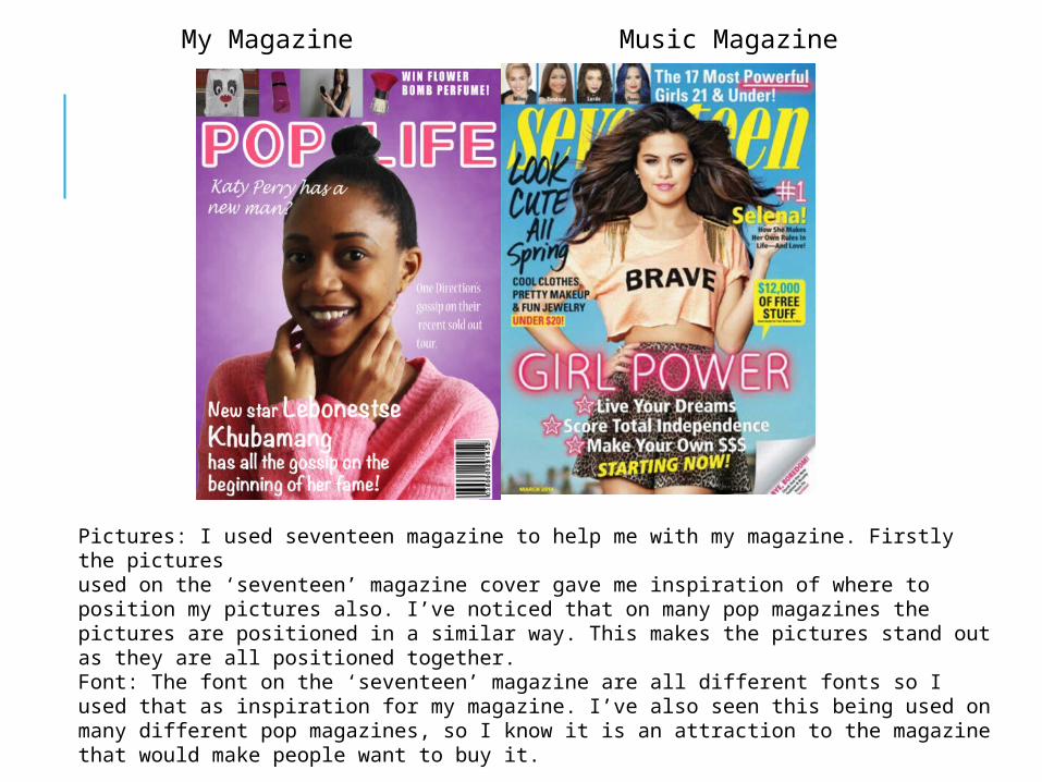
Pictures: I used seventeen magazine to help me with my magazine. Firstly the pictures used on the ‘seventeen’ magazine cover gave me inspiration of where to position my pictures also. I’ve noticed that on many pop magazines the pictures are positioned in a similar way. This makes the pictures stand out as they are all positioned together.Font: The font on the ‘seventeen’ magazine are all different fonts so I used that as inspiration for my magazine. I’ve also seen this being used on many different pop magazines, so I know it is an attraction to the magazine that would make people want to buy it.
My Magazine Music Magazine

My magazine. Music Magazine.
Background- I used ‘We Love Pop’ magazine contents to help me with mine. My background on my contents was looking plain and I wasn’t sure what to do with it, and I really liked the look on this so I thought I would use a similar design on mine too.Header- I used a similar header as the ‘We Love Pop’ magazine contents. This makes it easier to inform my reader of what they are reading.Pictures- The ‘We Love Pop’ magazine also inspired me with the positions of my pictures and page numbers on my contents. I like the look of it so thought I would go with something similar.
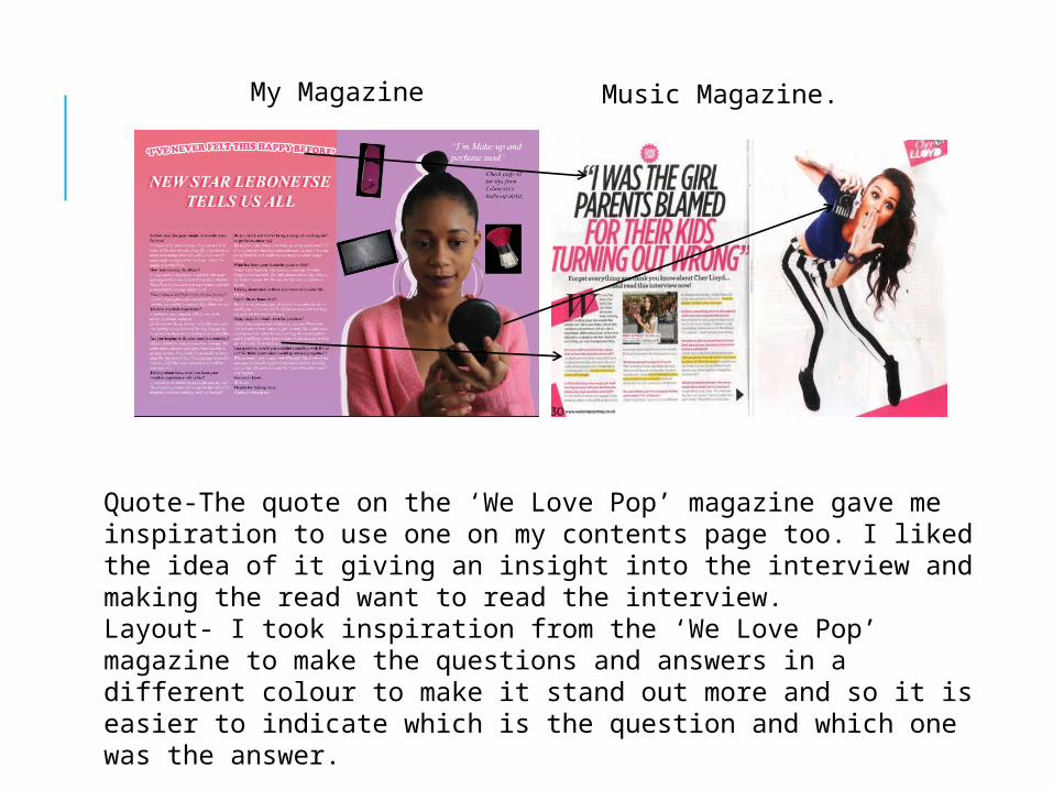
Quote-The quote on the ‘We Love Pop’ magazine gave me inspiration to use one on my contents page too. I liked the idea of it giving an insight into the interview and making the read want to read the interview.Layout- I took inspiration from the ‘We Love Pop’ magazine to make the questions and answers in a different colour to make it stand out more and so it is easier to indicate which is the question and which one was the answer.
My Magazine Music Magazine.
Develop…

Name- The name of the artist on my magazine is bigger than the name of the artist on the ‘seventeen’ magazine. I think this is important as it’s the main model on the front cover.Name of the magazine- My magazine title is bolder than the ‘seventeen’ magazine. I think making it bolder is important as it makes it stand out.Images-I’ve used a variety of pictures instead of just pictures of stars like the ‘seventeen’ magazine has. I’ve used make-up items as well as people.
My Magazine Music Magazine

Images-I’ve used a drop shadow on the pictures unlike the ‘We Love Pop’ magazine. The drop shadow makes the pictures stand out more.Colours-I’ve used more feminine colours unlike ‘We Love Pop’, which will target my female audience.Writing- My writing is more spaced out than the ‘We Love Pop’ magazine which I think makes it more appealing to read and easier to read as there isn’t so much and isn’t so cramped together.
My Magazine Music Magazine.

My Magazine Music Magazine
Image-I liked the idea of an item in the picture, I think it made it look more sophisticated and the item I used (make-up) makes it more appealing to the female audience I’m aiming towards.
Questions-We both did an interview/asked questions for the story instead of just an article but I added more questions in than the ‘We Love Pop’ magazine which is better because the there is more to read and find out about which I think would attract the female audience.

Challenge…

Background-I decided to stick with just a two coloured background. I think colour is more appealing to the female audience and I feel like the colour purple is a better colour choice than the blue used on the ‘seventeen’ magazine.Clothes-I used very feminine colours to appeal to my female audience more and to attract them whereas the ‘seventeen’ magazine don’t use as feminine colours in their clothes.Colours-Overall I use a lot more feminine colours than the ‘seventeen’ magazine which would attract females more.
My Magazine Music Magazine.

Writing- My writing font, position and colours for what is inside the magazine is very different from the ‘we love pop’ magazine. My writing is more spaced out and nearly covers the page whereas the ‘we love pop’ magazine’s is all together in one box.
Colours-I’ve used more feminine colours whereas they have added more masculine colours like the blue. I think my magazine would attract the female audience more.Font- My font is slightly bigger in places, making it easier to read.

My Magazine Music Magazine
Background-My colour is more sophisticated than the ‘We Love Pop’ magazine. I have three colours, blending in together in the background, whereas the ‘We Love Pop’ magazine has two colours which are quite plain.Images- I’ve included more images in my contents than the ‘We Love Pop’ magazine has used. Also they’re sophisticated and feminine which targets my female audience. Model-I’ve used more feminine clothes as the colours are more feminine. Also I have included a drop shadow which makes the model stand out.