evaluation- question 1
TRANSCRIPT

EVALUATI
ON
B Y EL I A
SA B B A

IN WHAT WAYS DOES YOUR MAGAZINE USE, DEVELOP OR CHALLENGE FORMS
AND CONVENTIONS OF REAL MEDIA PRODUCTS? USE
Also I kept the shot of my model centered like the Amy picture, mainly did this because it seems quite fierce and powerful, also it makes the viewer Looked straight towards the image,The background of the magazine is kept an off white colour, this is so it stands out against the text, so it isn’t hard for the viewer to read.
I took inspiration from the NME colour scheme of their front colour for, instance the title of the magazine In particular. The reason why I chose the deep redcolour scheme was because it implies Towards the audience quite dangerous and risk taking.

IN WHAT WAYS DOES YOUR MAGAZINE USE, DEVELOP OR CHALLENGE FORMS
AND CONVENTIONS OF REAL MEDIA PRODUCTS?
USE
I took the arrow leading onto the next page within my work. I did this because it makes the audience aware that the story is on the next page, so it’s visually better for a reader to read.
Here I have used the same colour scheme as the NME headline (which is of course red).The reason why I chose this colour scheme is because it’s very aggressive and harsh looking. Also that the audience recognize this colour as a more indie or grunge type of genre Also I put in a taster story just
like the NME contents page, to give the viewer a teaser of what the magazine is going to include.

IN WHAT WAYS DOES YOUR MAGAZINE USE, DEVELOP OR CHALLENGE FORMS
AND CONVENTIONS OF REAL MEDIA PRODUCTS?
USE
I took the idea of placing a quote in my magazine just like the magazine on the right because it makes the magazine look more professional. However, it gives a quick mystery on what my magazine will be about so readers are more intrigued by this.
I have used the same colour on the costumes because it ties in well with the colour scheme of my magazine and it attracts the viewer because it gives more of an indie appeal rather than a pop appeal. For instance, if this was a pop magazine, I would use very vibrant colours such as pink, purple, etc.

IN WHAT WAYS DOES YOUR MAGAZINE USE, DEVELOP OR CHALLENGE FORMS
AND CONVENTIONS OF REAL MEDIA PRODUCTS?
DEVELOP
I chose to have a strongfemale model just like Amy Whinehouse was used. However, I decided to do a mid shot of my model to view her clothing, whereas Amy is a close up of mainly her upper body because she’s a successful artist which people recognize globally.
I placed the name underneath the image so the audience are aware of who the magazine is based around in this issue. However, I changed the text, into a more stamp kind of look to get this grunge effect across. Also I changed the colour of the text because I felt if I had a red headline, it wouldn’t stand out as much as the yellow does.
I put in a barcode just like the NME magzine so it looks more legit but on mine, I’ve rotated it to a straight angle rather than it being on it’s side.

IN WHAT WAYS DOES YOUR MAGAZINE USE, DEVELOP OR CHALLENGE FORMS
AND CONVENTIONS OF REAL MEDIA PRODUCTS?
DEVELOP
I copied the layout of the contentspage, having the stories in columns because I felt like this makes my magazine look more organized rather than too busy where the viewer doesn’t know where exactly to read. I placed a sub-heading on each text and placed a short sentence to let the reader know or find out what the story is about just like the NME contents.
I placed a little title above the contents just like the NME magazine has, but I changed mine to a red colour, to fit in nicely with the masthead.

IN WHAT WAYS DOES YOUR MAGAZINE USE, DEVELOP OR CHALLENGE FORMS
AND CONVENTIONS OF REAL MEDIA PRODUCTS?
DEVELOP
This is not about the idea of having a quote, it’s having the actual quote there. However instead of placing it boldly near the model, I put it within my text, bigger than the rest so the audience are aware to read the quote but it doesn’t over power the image or headline.

IN WHAT WAYS DOES YOUR MAGAZINE USE, DEVELOP OR CHALLENGE FORMS
AND CONVENTIONS OF REAL MEDIA PRODUCTS? CHALLENGEI placed a price tag on the
corner of my magazine unlike the NME cover, I did this so the audience know how much it is.
Also, I placed special features of other artists such as The Courteeners so this widens my range of audience. However, compared to the NME magazine it doesn’t contain other artist because they have a massive artist on the cover.
The background on my magazine is left a grey tone so the picture stands out against the grey because it didn’t work as effect when the background was in white. Whereas, the background on the NME magazine has a pattern on it.
I placed a banner with “Limited Edition” wrote across it on the top and bottom of the magazine cover because it’s more to look like a trade mark of the magazine unlike the NME magazine where they use names of artist that are going to be in my magazine.
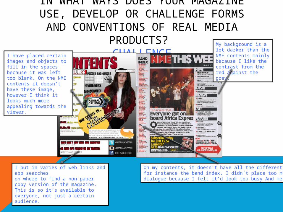
IN WHAT WAYS DOES YOUR MAGAZINE USE, DEVELOP OR CHALLENGE FORMS
AND CONVENTIONS OF REAL MEDIA PRODUCTS? CHALLENGEI have placed certain
images and objects to fill in the spaces because it was left too blank. On the NME contents it doesn’t have these image, however I think it looks much more appealing towards the viewer.
I put in varies of web links and app searcheson where to find a non paper copy version of the magazine. This is so it’s available to everyone, not just a certain audience.
My background is a lot darker than the NME contents mainly because I like the contrast from the red against the grey.
On my contents, it doesn’t have all the different topics, for instance the band index. I didn’t place too much dialogue because I felt it’d look too busy And messy.

IN WHAT WAYS DOES YOUR MAGAZINE USE, DEVELOP OR CHALLENGE FORMS
AND CONVENTIONS OF REAL MEDIA PRODUCTS? CHALLENGE
I placed a boarder around the edges of my page to make it more vibrant and alive rather than without one plus it brings out the red in my magazine.