evaluation question 1 - as media studies
TRANSCRIPT

EVALUATI
ON
Q U E S T I ON 1
- I N W
H AT WA Y S D
O E S YO U R M
E D I A
P R O D U C T US E , D
E V E L O P OR C
H A L L E N G E FO R M S
A N D CO N V E N T I O
N S OF R
E A L ME D I A
PR O D U C T S ?

FRONT COVERSell Line
Masthead
Main Image
Features
Anchor Text
Flash
Main Cover Line
Cover Line
Tag
Pull Quote

MASTHEADMy masthead follows conventions of magazines by being bold, big and in capital letters. Furthermore, the masthead is placed behind the image in order to keep attention to the main image yet at the same time still being eye-catching in itself. It’s also at the top of the page, like the vast majority of magazines and follows the house colours while still standing out against the background.Magazines that use this convention:
Vibe
Fader
Rolling Stone

SELL LINEConventionally, my sell line is on the front cover and is also near the masthead. The use of the sell line on the front cover is informative (Informative - Uses and grat. theory) as it tells the audience how frequently the magazine is published. It also stands out against the background.
Magazines that use this convention:
Q – Britain’s Biggest Music Magazine
NME – New Music Express

MAIN IMAGEFor my main cover, I went against the common convention of using a medium close up image for an artist. This was down to the image I used in my mock up as I thought it looked visually pleasing so I wanted to carry it onto my complete production. However, other than the camera angle, my main image follows other conventions, such as there being a direct mode of address (which connects the artist to the audience – uses and grat. Theory). The image is also in front of the masthead and a single person, in order to create a sense of prominence and to attract more attention.Magazines that use this convention:
NME Billboard VIBE
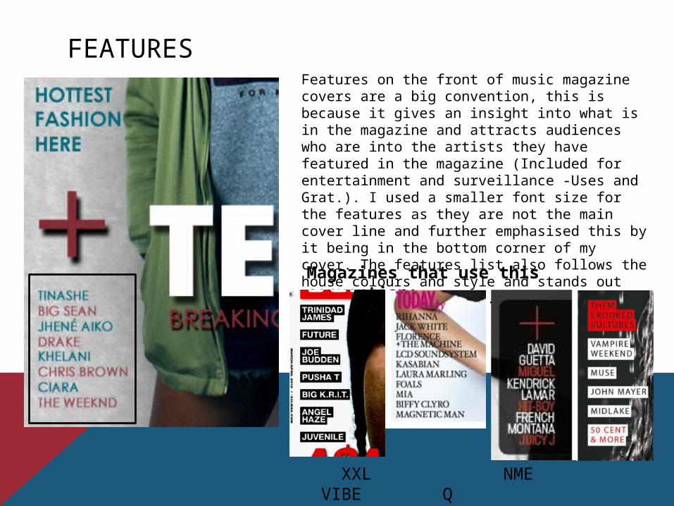
FEATURESFeatures on the front of music magazine covers are a big convention, this is because it gives an insight into what is in the magazine and attracts audiences who are into the artists they have featured in the magazine (Included for entertainment and surveillance -Uses and Grat.). I used a smaller font size for the features as they are not the main cover line and further emphasised this by it being in the bottom corner of my cover. The features list also follows the house colours and style and stands out against the background.Magazines that use this convention:
XXL NME VIBE Q

PULL QUOTEThe purpose of a pull quote creates a sense of questioning and lures the audience into the magazine in order to answer their questions (Hypodermic Needle). I have followed this popular convention which samples the interview with my double page spread artist, A.L.A. However, the pull quote is not large and is part of a cover line, which goes against convention.Magazines that use this convention:
XXL NME VIBE

ANCHOR TEXTThe reason behind having an anchor text is to show the audience who the main artist in the magazine is, which will further entice the audience, so it is a common convention. The anchor text also links with the main image and a drop shadow is used to make the text stand out against the image.Magazines that use this convention:
NME XXLVIBE Q

COVER LINESCover lines create curiosity to the reader, possibly through hermeneutic questions (pictured in my magazine), and through making the readers want to find out the answers to them by making them powerless to find out the answers (Hypodermic needle and uses and grat. – informative) making them a handy convention for music magazines.Magazines that use this convention:
Billboard NME VIBE XXL

MAIN COVER LINEThe main cover line is typically used next to/near the anchor text as they are linked. It is conventionally kept short in order to entice the reader to find out about it more and a shadow is also used to make it ‘pop’. It also fits in with the house style. It also makes people read it to create a conversation socially (Social Interaction - Uses and Grat.)Magazines that use this convention:
Billboard VIBEQ XXL

FLASHFlashes are used in order to lure the audience further into the magazine by using buzz words (such as ‘WIN’ or ‘EXCLUSIVE’). Conventionally, flashes do not follow the house style in order to stand out but I did not follow this convention. Instead I followed the house style and rather than using different colours to stand out I instead used a drop shadow.Magazines that use this
convention:
VIBE XXL Billboard Q

TAGTags are used to attract the attention of the audience to show that the article in the magazine is ‘exclusive’ and can’t be found anywhere else, this makes the reader powerless to find out what this information is (Hypodermic Needle and Uses and Grat. – Information).Magazines that use this convention:
XXL Billboard
Rolling Stone VIBE

HOUSE STYLEThe house style of my magazine is unconventional, as usually music magazines stick to blacks, whites, bright reds or blues as they all stand out. However, I chose my house style to be a burgundy red and a blue-green. The unconventional house style would be common in my magazines as it would create brand awareness for being so unusual.Magazines that use this convention:
Billboard VIBE
XXL Q

CONTENTSContents Title
Feature Titles - List
Social Media Sites
Page Numbers
Image
Issue Date
‘M’ of Meltdown
Features Intro
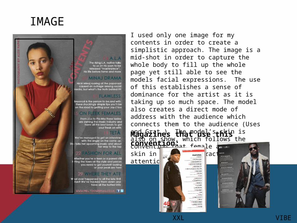
IMAGEI used only one image for my contents in order to create a simplistic approach. The image is a mid-shot in order to capture the whole body to fill up the whole page yet still able to see the models facial expressions. The use of this establishes a sense of dominance for the artist as it is taking up so much space. The model also creates a direct mode of address with the audience which connects them to the audience (Uses and Grat.). The model’s skin is also on show, which follows the convention that female artists show skin in order to attract male attention (Mulvey)Magazines that use this convention:
XXL VIBE

ISSUE DATEThe issue date follows the convention as it makes the audience feel as though they are receiving the most recent news (Informative – uses and grat.). It’s placed above the contents title in order to be seen and is just as bold and in a different colour to the contents title to further emphasise this point.Magazines that use this convention:
VIBE Q
NME

CONTENTS TITLEI made the title the same font as the masthead of my cover in order to follow the house style and the same colour (but different shade, in order to look better against the different background).Magazines that use this convention:
Q
NME
XXLVIBE

MThe use of the transparent M (From Meltdown) is something extremely unconventional. I have seen it in no magazines from all of my research and included it in my contents in order to create a sense of brand awareness, so that when people see the contents page, they can instantly know that it’s from Meltdown. It also acts as a stand for my contents title to add a dramatic effect to it. The closest thing to it I have seen is the V from Vibe Magazine (shown below)

FEATURES LISTThe titles are large and stand out against the background in order to be noticeable and to draw in the readers. The titles follow the house style however in darker shades in order to better stand out against the different background.The summaries give a taste of what the full articles provide and to entice the audience further by making them powerless to find out the full amount of information (Hypodermic Needle)
Magazines that use this convention:
XXL VIBE

PAGE NUMBERSThese help to navigate the readers across the whole magazine to get to their favourite articles. The use of the colour change is something unique to increase brand awareness but also to be seen more clearly as the background colour changes slightly the further you go down the page. A convention of page numbers is to be in different colours to the titles (which I have achieved yet still follow the house style.Magazines that use this convention:
Q VIBE Rolling Stone

SOCIAL MEDIA SITES AND A WEBSITEThis is not that typical for music contents magazine, even though it increases the popularity of the magazine by connecting to the audience by other means than just reading the magazine. It also does this even more for my magazine as the main demographic for my magazine is late teens, which stereotypically use social media a lot, so by having these social media accounts, it is possible to be noticed by more people. By having a website it can further increase the connection between audience and magazine.

DOUBLE PAGE SPREAD ImagePage Number and Date
PullQuote
Article
Drop Capital
Article Title
Anchor Text

IMAGE AND LAYOUTThe image placing for my double page spread is unconventional as it is in the centre and the image covers both pages rather than just the one side (like magazines typically do). The reason for this unconventionality stems back to my mock ups where I used an image in the centre and I liked the idea so I carried it through and I also feel as though it emphasises the importance of the artist by it being in the centre. However, I have followed convention by making my model maintain a direct mode of address which creates a link between the artist and the audience (Personal Relationship - uses and grat. Theory). The clothing and mise-en-scéne of the artist also follows convention and it’s a visual representation of what genre the artist belongs too.Magazines that use this convention:
NME

ARTICLE TITLEThe title of the article is a convention as it summarises the entire article into just a few words. I have followed this convention by stating that the artist of the double page spread has had a rise to fame from the title ‘Broke 2 Baller’. It also follows the house style of the magazine and stands out against the white background, attracting attention. It is further eye catching as it is a slightly different colour to the artists title, which breaks them up. The title presents the artist as a ‘Baller’ so the audience then perceives him to be (Dominance –Reception Theory)Magazines that use this convention:
VIBE XXL NME

ARTIST NAME/ANCHOR TEXTThe artist name is bold, large and stands out in order to attract all the attention and radiate power. It also follows the house style yet is a different shade to all the other reds in the article to break it up and establish it as the main piece of information. It is a convention among magazines as it introduces the artist to the audience.Magazines that use this convention:
NME Rolling Stone VIBE
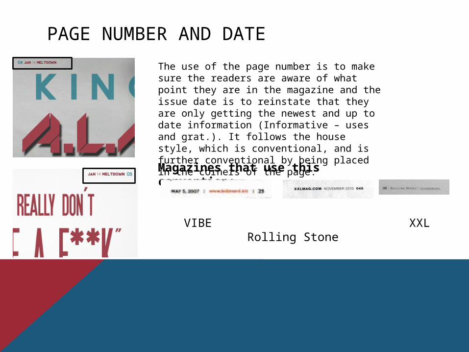
PAGE NUMBER AND DATEThe use of the page number is to make sure the readers are aware of what point they are in the magazine and the issue date is to reinstate that they are only getting the newest and up to date information (Informative – uses and grat.). It follows the house style, which is conventional, and is further conventional by being placed in the corners of the page.Magazines that use this convention:
VIBE XXL Rolling Stone

DROP CAPITALThe use of the drop capital is to mark the beginning of the article. It is conventional for it to stand out by being a different colour to the rest of the article and large to attract attention. I made the colour of my drop capital follow the house style yet it still stands out and is visually pleasing. Magazines that use this convention:
Rolling Stone NME Q

PULL QUOTEPull Quotes are enigmatic, as it not only provides shock value, it also gives the audience a taste of the article to further entice them to actually read the whole article, as they are powerless to find out the whole story and information (Hypodermic Needle). It also follows the house style yet is still eye catching and stands out.Magazines that use this convention:
VIBE NME Q