evaluation question 1 as media
TRANSCRIPT
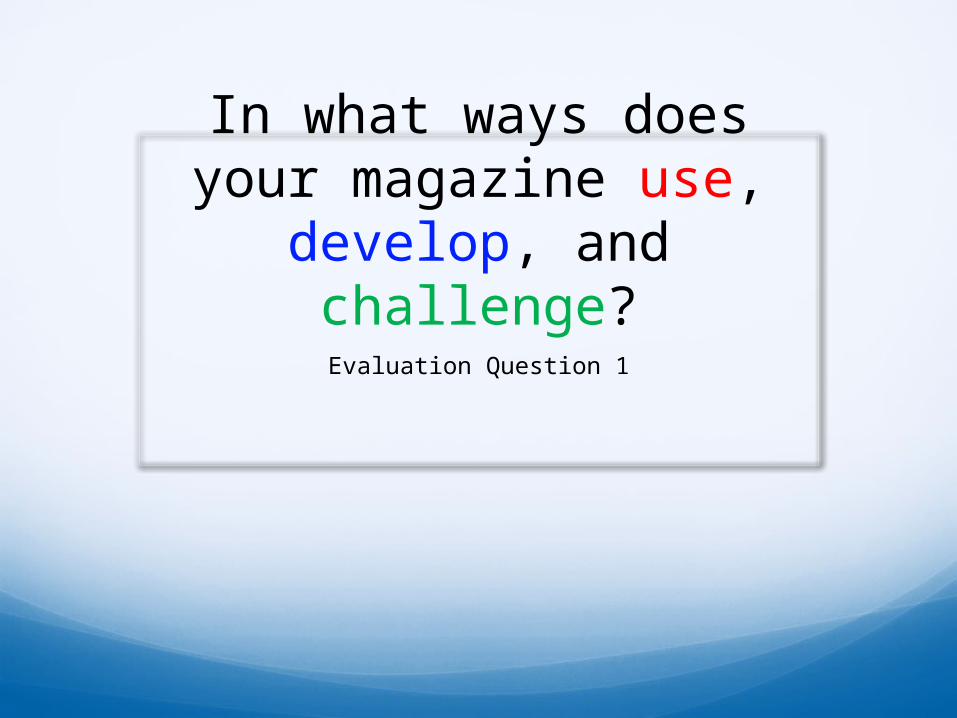
In what ways does your magazine use, develop,
and challenge?Evaluation Question 1

Key:
Use: Elements copied from other magazines.
Develop: Where does it start to look different?
Challenge: Where does it look completely different?
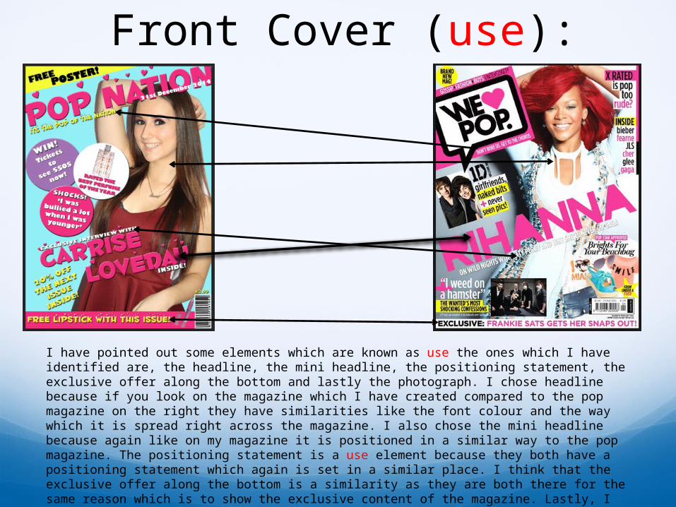
Front Cover (use):
I have pointed out some elements which are known as use the ones which I have identified are, the headline, the mini headline, the positioning statement, the exclusive offer along the bottom and lastly the photograph. I chose headline because if you look on the magazine which I have created compared to the pop magazine on the right they have similarities like the font colour and the way which it is spread right across the magazine. I also chose the mini headline because again like on my magazine it is positioned in a similar way to the pop magazine. The positioning statement is a use element because they both have a positioning statement which again is set in a similar place. I think that the exclusive offer along the bottom is a similarity as they are both there for the same reason which is to show the exclusive content of the magazine. Lastly, I think that the photograph is a use element because the photographs are arranged in a very similar way, this is because they are both located on the right hand side of the pop magazine.

Front Cover (develop):
I chose these as the develop elements because they are similar but they start to look different as if you look at this I have chose the masthead, a coverline and the offer located at the top left. I think that the masthead is a develop element because it is similar to the one which is on the pop magazine as they both have a masthead but it is different because it is layout in a much different way. I also think that the coverline is a develop element because again it is similar as they both have them and they are positioned in the same place but they are not similar with the colours or the fonts. Lastly, I think that the offer in the top left corner is a develop element because they are positioned in the same place which makes them similar but they are not the same shape which means thats where they start to look different which is what the develop element is about.
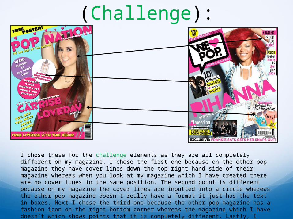
Front Cover (Challenge):
I chose these for the challenge elements as they are all completely different on my magazine. I chose the first one because on the other pop magazine they have cover lines down the top right hand side of their magazine whereas when you look at my magazine which I have created there are no cover lines in the same position. The second point is different because on my magazine the cover lines are inputted into a circle whereas the other pop magazine doesn’t really have a format it just has the text in boxes. Next I chose the third one because the other pop magazine has a fashion icon on the right bottom corner whereas the magazine which I have doesn’t which shows points that it is completely different. Lastly, I chose the bottom one because the other pop magazine has small pictures over the front cover whereas my front cover only has a main image and two other images which were also taken by me.
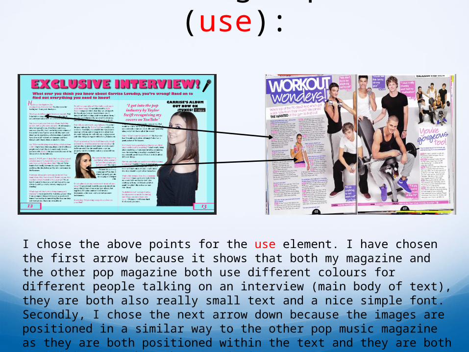
Double Page Spread (use):
I chose the above points for the use element. I have chosen the first arrow because it shows that both my magazine and the other pop magazine both use different colours for different people talking on an interview (main body of text), they are both also really small text and a nice simple font. Secondly, I chose the next arrow down because the images are positioned in a similar way to the other pop music magazine as they are both positioned within the text and they are both a mini image rather than a main image.
Double Page Spread (Develop):
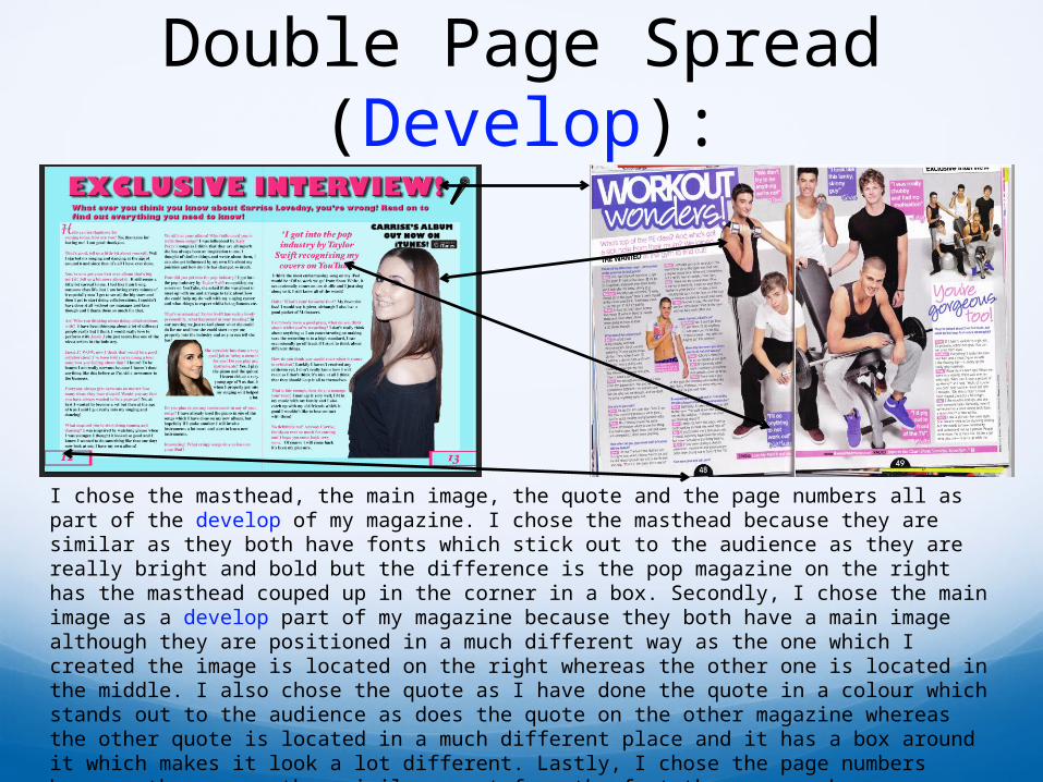
I chose the masthead, the main image, the quote and the page numbers all as part of the develop of my magazine. I chose the masthead because they are similar as they both have fonts which stick out to the audience as they are really bright and bold but the difference is the pop magazine on the right has the masthead couped up in the corner in a box. Secondly, I chose the main image as a develop part of my magazine because they both have a main image although they are positioned in a much different way as the one which I created the image is located on the right whereas the other one is located in the middle. I also chose the quote as I have done the quote in a colour which stands out to the audience as does the quote on the other magazine whereas the other quote is located in a much different place and it has a box around it which makes it look a lot different. Lastly, I chose the page numbers because they are rather similar apart from the fact the page numbers on my magazine are on either side instead of in the middle, also mine has two colours on the box around the number.
Double Page Spread (challenge):
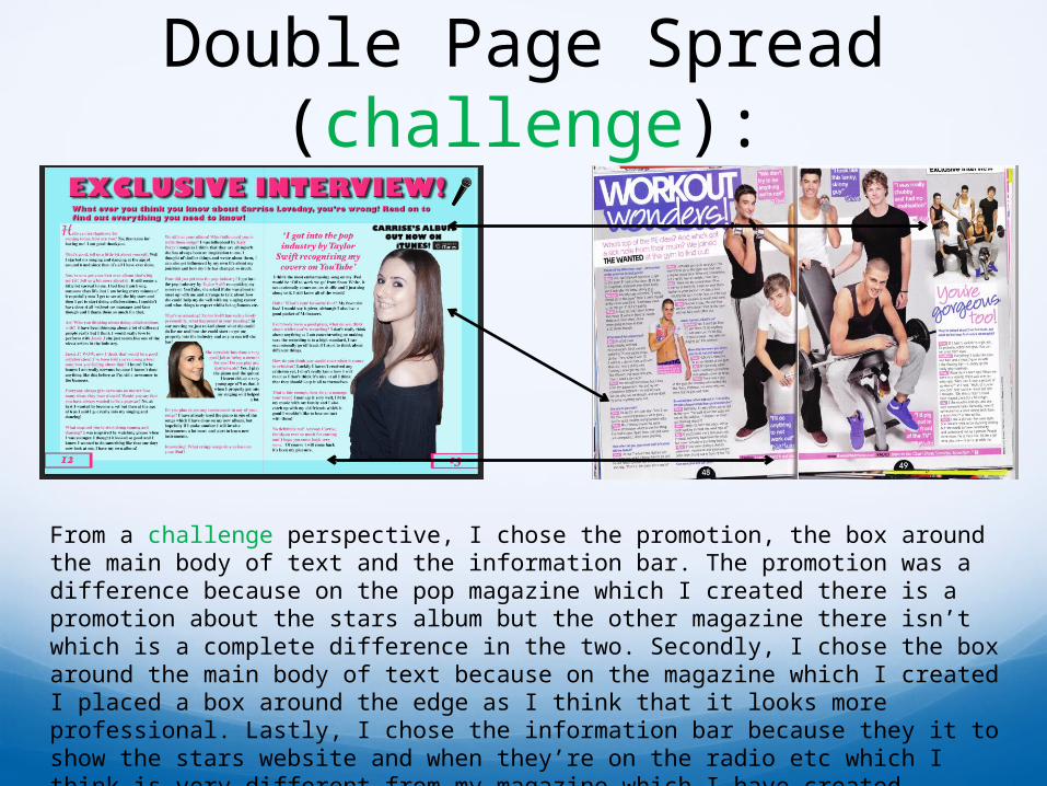
From a challenge perspective, I chose the promotion, the box around the main body of text and the information bar. The promotion was a difference because on the pop magazine which I created there is a promotion about the stars album but the other magazine there isn’t which is a complete difference in the two. Secondly, I chose the box around the main body of text because on the magazine which I created I placed a box around the edge as I think that it looks more professional. Lastly, I chose the information bar because they it to show the stars website and when they’re on the radio etc which I think is very different from my magazine which I have created therefore I think that this is a challenge element.
Contents Page (use):
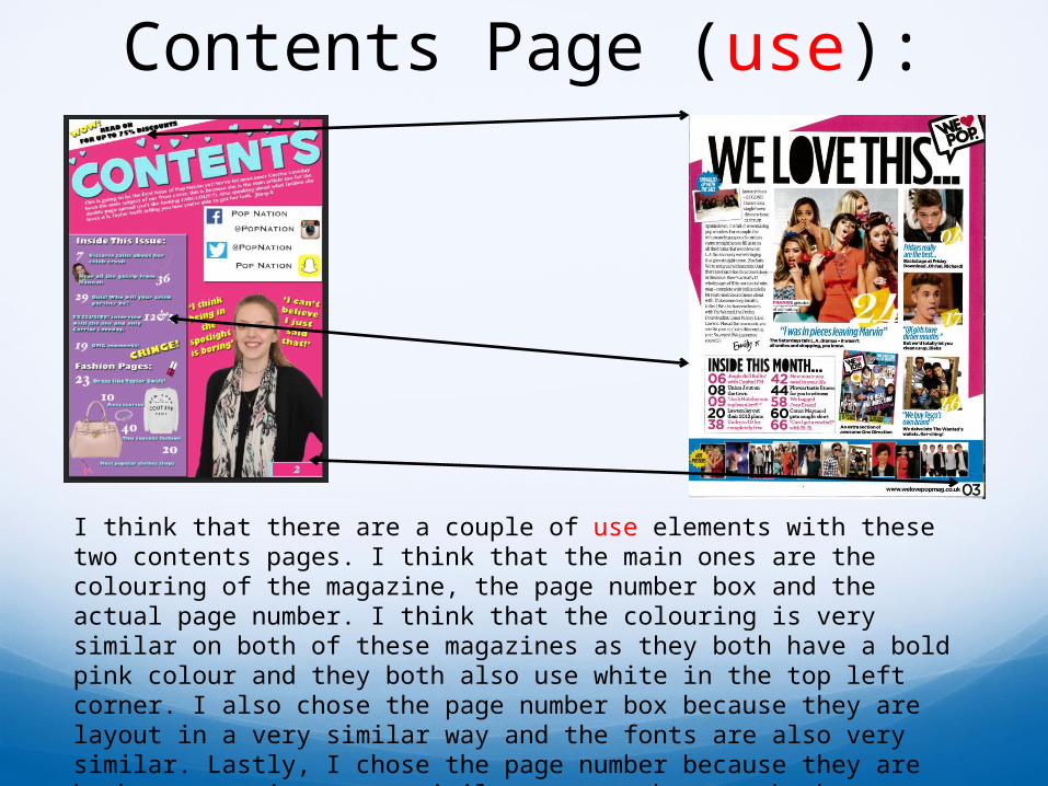
I think that there are a couple of use elements with these two contents pages. I think that the main ones are the colouring of the magazine, the page number box and the actual page number. I think that the colouring is very similar on both of these magazines as they both have a bold pink colour and they both also use white in the top left corner. I also chose the page number box because they are layout in a very similar way and the fonts are also very similar. Lastly, I chose the page number because they are both set out in a very similar way as they are both positioned in the bottom right corner. Although mine has a slight difference as I have a box around mine.
Contents Page (develop):
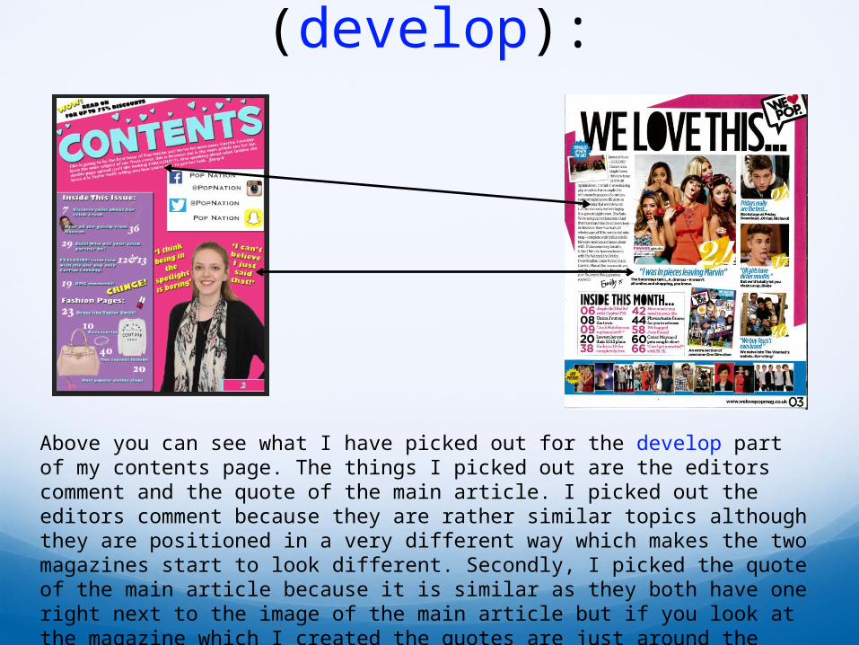
Above you can see what I have picked out for the develop part of my contents page. The things I picked out are the editors comment and the quote of the main article. I picked out the editors comment because they are rather similar topics although they are positioned in a very different way which makes the two magazines start to look different. Secondly, I picked the quote of the main article because it is similar as they both have one right next to the image of the main article but if you look at the magazine which I created the quotes are just around the main image but on the other magazine the quote is the main title and then there is a bit of description underneath it.
Contents Page (challenge):
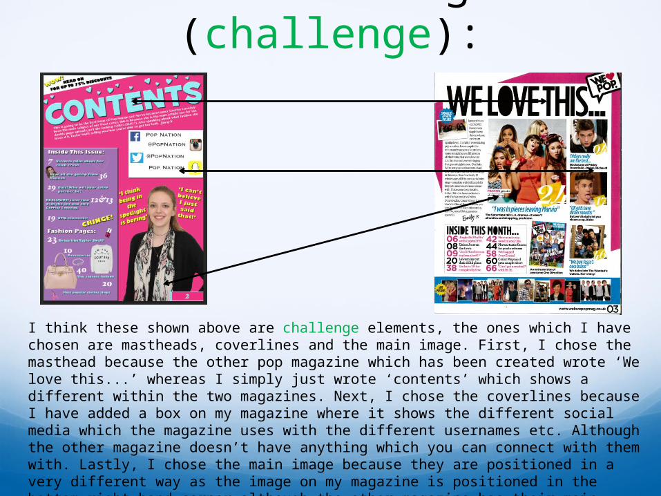
I think these shown above are challenge elements, the ones which I have chosen are mastheads, coverlines and the main image. First, I chose the masthead because the other pop magazine which has been created wrote ‘We love this...’ whereas I simply just wrote ‘contents’ which shows a different within the two magazines. Next, I chose the coverlines because I have added a box on my magazine where it shows the different social media which the magazine uses with the different usernames etc. Although the other magazine doesn’t have anything which you can connect with them with. Lastly, I chose the main image because they are positioned in a very different way as the image on my magazine is positioned in the bottom right hand corner although the other magazine has their main image right in the middle of the magazine at the top. I think the way which I have set it out looks much better.