evaluation question 1 redone
TRANSCRIPT

In what ways does your media product use, develop or challenge forms and conventions of
real media products?
Evaluation Question 1
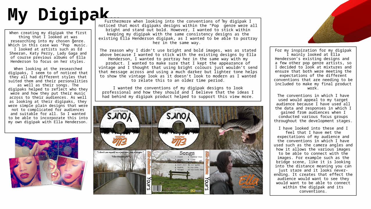
My Digipak…When creating my digipak the first thing that I looked at was researching into my
chosen genre. Which in this case was “Pop” music. I looked at artists such as Ed
Sheeran, Katy Perry, Lady Gaga and of course previous albums of Ella Henderson
to focus on her styles.
When looking at the researched digipaks, I seem to of noticed that they all had
different styles that suited them and their personalities as well as their songs. The
digipaks helped to reflect who they were and how they put their music across to
their audiences. As well as looking at their digipaks, they were simple plain designs
that were not to complicated for audiences and suitable for all. So I wanted to be able to incorporate this into my own
digipak with Ella Henderson.
Furthermore when looking into the conventions of my digipak I noticed that most digipaks designs within the “Pop” genre were all bright and stand out bold. However, I wanted to stick within keeping my digipak with the same consistency designs as the
existing Ella Henderson digipak, as I wanted to be able to portray her in the same way.
The reason why I didn’t use bright and bold images, was as stated above because I wanted to stick with the existing designs by Ella Henderson, I wanted to portray her in the same way with my product. I wanted to make sure that I kept the appearance of vintage and I thought that using bright colours just wouldn’t send that message
across and using a much darker but lighter tone helps to show the vintage look as it doesn’t look to modern as I wanted to relate this to an older time period.
I wanted the conventions of my digipak designs to look professional and how they should and I believe that the ideas I had behind my digipak product helped to
support this view more.
For my inspiration for my digipak I mainly looked at Ella Henderson’s existing designs
and a few other pop genre artists, so I decided to look at mixtures and ensure
that both were meeting the expectations of the different conventions that are
needing to be included to make my final product work.
The conventions in which I have used would appeal to my target audience because I have used all the data and
responses in which I gained from audiences when I conducted various focus
groups throughout the development stages.
I have looked into these and I feel that I have met the expectations of my audience and the conventions in which I have used
such as the camera angles and how it allows the various images to be able to connect with the images. For example
such as the bridge scene, like it is looking into the distance meaning you can just
stare and it looks never-ending. It creates that effect the audience would want to
see they would want to be able to connect within the digipak and its conventions.

Magazine Poster…When I came onto making and producing
the different stages of my magazine poster I focused on making sure I kept this as simple as possible and links in with the
personality and appearance of my artist.
This was done after researching and focusing on Ella Henderson’s previous
magazine poster as well as a few “Pop” genre posters to create a mixture of
different ideas. I came to the conclusion that the most important factor was to keep
my poster as simple as I could, with not too much to look at so that the whole
product stands out boldly at you. Making sure that it matched in with the
appearance and development of Ella Henderson as the artist and her
personality, in this case being “vintage.”
I wanted to be able to achieve the purpose of my magazine poster and after
conducting further research not just with Ella Henderson, but other pop genre posters I saw that the most common
convention was that there was a theme that matched with each artist and how
they portray themselves, they reflect on them and who they are, with the use of
simple designs such as Taylor Swift’s advert.
I like what I have done with my magazine poster and how it has come over the
different development stages, such as how I used a close up image of my artist, so that it
feels the audience can connect with her even though it is like she is looking into the distance but it allows us as the connect with
her and feel as though we are there with her.
I mainly wanted the magazine poster to reflect on the artist and the conventions as well as the genre so that it all matched up together, I then went further into this as I wanted to ensure that I was meeting my conventions and how I wanted them to
reflect on my products.
I believe that I have carried out with my convention and that my product represents
my song and the restrictions in which I wanted them to compare each with.
My magazine poster overall matches to the conventions that I need, with it being simple and bold yet effective to meet the pop genre criteria. I feel like doing this gives my poster more personality as it is unique and links in
with my digipak and magazine poster altogether and creates a feel to it that makes it belong to the artist and suits my purpose
well.
This development of form with the use of looking at existing Ella Henderson videos and other pop genre
related magazine posters it has shown the comparisons in which I need to include or even change to make my
poster fit in with the purpose and match the expectations of my target audience. I have made my
poster more to the fact of it being more to suit my music video and the way it is set out.

My Music Video…My music video included many different conventions in it as it linked with the different features
such as the different camera angles, natural lighting in which I used and how the colour and fonts linked with the past vintage personality of my artist.
For my music video I didn’t really watch a specific music video that gave me inspiration for the ideas in which I produced within this music video, except looking at the “High Hopes” by Kodaline,
which I used this to start my planning off and gain ideas for a love story theme. I looked more at the already existing Ella Henderson music video “Yours” and expanded on ideas through that. As my music video is more about love I did look at a view pop songs that were related to this and I found this quite difficult to pull out parts from it and create ideas from it, which was the main reason to why I kept looking at the existing Ella Henderson, Yours video and incorporate her
known performance and narrative across to the audience.
I wanted to ensure that my music video related to emotion and that the audience would be able to connect with this much more and this was what I did, I looked at the different angles and shots
I could use to allow me to show and establish connection between the music video and the audience viewing it.
I focused more on including a narrative within my video, such as making sure the scenes fit in with the lyrics, as well as the performance that the actress did to portray this further. Which was to portray the idea of her wanting her love (in this case the male character) to say she is his her (Yours) and I wanted this to link in with the two different location that I have used such as the
house to show present day and the Ferry Meadow scenes to show the idea of the past and that this is a place they used to go and in both locations the envelope can be seen at times to keep the consistency of the narrative all the same. As well as keeping to the performance so that it all links in together and shows the whole thing and the support from the conventions such as the angles (e.g. close ups) to allow her to connect with the audience, the performance and narrative it all
helps to create the perfect music video to the correct target audience.
The similarities between Conventions…