evaluation question 2
TRANSCRIPT

Evaluation Question 2
How effective is the combination of your main product and ancillary
product?

Continuity and house style• For my video I wanted to create a coherent house style which would link my music video,
didgipak and print advert together as one professional looking package. • After looking at similar artists to Erick Baker such as Ben Howard, I noted that certain
characteristics ran through both the video and promotional work which supported this. Ben Howard’s Old Pine video featured the outdoors and the ocean , as the main outgoing theme. His print advert and digipak then featured a shiloutte in the sea which is a bright blue the font was simplistic reflecting the genre. The CD cover features only one font, again simple and plain reflecting alternative genre. City In Colour- The girl also opted for an outdoors theme which featured lots of different locations
• I wanted to adopt this into my work, to make my work look professional and mirror the indie genre.
Creating my house style• After my initial research I set about creating my own house style to create
continuity between my three products, which the relevant audience would be able to relate to.
• We decided to use the outdoors for our theme, and chose a local woodland to shoot, I think this was a successful theme, and worked well with the emotional powerful lyrics.
• There is an ongoing theme of rustic/ laid back outdoor living, I have tried to tie this in with every aspect of my products to create a sense of continuity and professionalism.
• Our actor wore the same clothes throughout the video and the images used in the other products.
• I felt the house style I created was successful and appeared professional, ensuring my work flowed and appeared as part of one product.
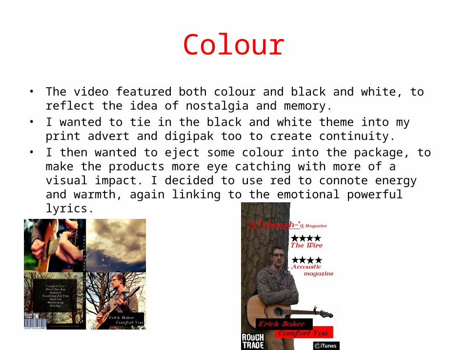
Colour• The video featured both colour and black and white, to reflect the idea of nostalgia
and memory.• I wanted to tie in the black and white theme into my print advert and digipak too
to create continuity. • I then wanted to eject some colour into the package, to make the products more
eye catching with more of a visual impact. I decided to use red to connote energy and warmth, again linking to the emotional powerful lyrics.

Use of Images• I experimented with a range of angles and different shot types• The images featured within the digipak and print advert reflect the music video, each image
contains woodland, which is the setting for our music video- again highlighting continuity through every section of my product.
• The images help determine the artist identity, and is the most key aspect of the products. I worked on creating and alternative/ indie appearance to reflect the genre of our music.
• I chose to use medium shots, to involve the backdrop to the images, tying in the out door surroundings. I also featured the guitar, as I felt this was an important part of the identity.
• I also used images of clouds and trees, again reflecting the power of the great outdoors, linking to emotional lyrics.

Font• After looking at Ben Howards Old Pine CD cover and video, I found that he
only used one font, I thought this created a very simple and plain appearance to the digipak and decided to use the same idea.
• I used Dafont to find an appropriate font, after researching a variety of fonts, I found a font called Florence I though that the font was easy to read and clear. This was essential when using for my products. I thought the curved appearance of the font linked to the creative, acoustic sound of Comfort You.
Florence
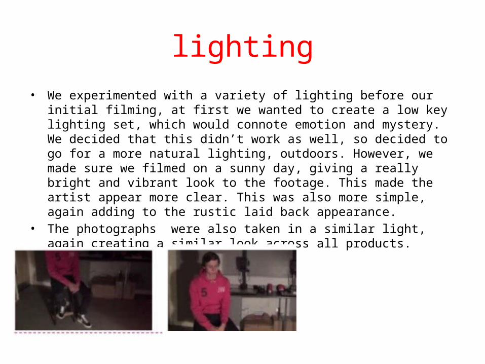
lighting• We experimented with a variety of lighting before our initial filming, at first we
wanted to create a low key lighting set, which would connote emotion and mystery. We decided that this didn’t work as well, so decided to go for a more natural lighting, outdoors. However, we made sure we filmed on a sunny day, giving a really bright and vibrant look to the footage. This made the artist appear more clear. This was also more simple, again adding to the rustic laid back appearance.
• The photographs were also taken in a similar light, again creating a similar look across all products.

Costume and props• Featuring the guitar was essential for crafting the artists identity, signifying that the
Erick Baker creates with his hands through his own music again connoting down to earth and rustic. City in Colour feature the guitar and other instruments throughout, it became an essential part of their appearance and a key part to their unique sound.
• The use of casual clothes (Check shirt, chinos, large boots) helped create an indie appearance. This connoted down to earth contrasting some of the costumes found in pop and R&B videos.

Theme• Sunlight, woodlands and outdoors- this was a strong theme throughout
the package. This theme helped tie the whole three products together and was the strongest theme running throughout my work, and helped unite it all together.