evalution of past students work
DESCRIPTION
I watched clips of past students opening sequence, and this is my evalution of thier strengths and weaknesses.TRANSCRIPT

{
Evaluation Of Past Student Work
By kalkidan Brook

The edit used, connotes how tired he is and passes time. Its very slow placedand emphasises his distress, as he is inthe same position. Its successful as its simple but very effective technique that keeps the audience interested. Moreoverits well framed and keeps to the rule ofthirds.
Example of a GOOD opening sequence: Written Syria
This was successful because the lighting (mise en scene), was very dull and gritty. It also raised questions to why he was beaten up and tied up. Also we get a sense of the theme violence already being established throughthe blood and his ripped shirt, thisconforms to the briefs instructionsof using social realism conventions. The use of mid-shotallows us to his body language,which seems worn out and tired.

The continuity editing is very clever and simple. Match on action is used when he stands up. This is effective as it helps the audience to follow the character, as well as making it more believable. Due to thesimplicity, it meets the brief of usingexcellent and appropriate.
The music ties in with characters ethnicity- Asian. Its very cultural and sets a sad atmosphere, itsslow and matches the characterssluggish movements. Moreover,it was originally created,therefore reaching the brief. In addition, the music is Islamic and instantly connotes it may beabout politics, government,terrorism, immigration etc.,which are controversial subjects,which meets the brief becausewhich British social films arewell known for touching on.

The high angle shot, makes him seem weak and this causes us to side with him. This is good as it suggests thatimmigration may be a theme as he ishugging his flag. This is one of avaries amount shots used, whichmeets the brief and added to his highmarks.
The voiceover is placed at a good time, making it feel less like a trailer. It helps set the story and helps the audience to get to know the character better. Moreover he has aBritish accent which the audiencecan relate to. In addition the way thevoiceover gets cut off, leaves aclimax and raises interest to whatmay happen next.

The close up emphasises his facial expression and causes us to concentrate on how sad and lifeless he seems. It remembersthe rule of third perfectly and theframing is very good.
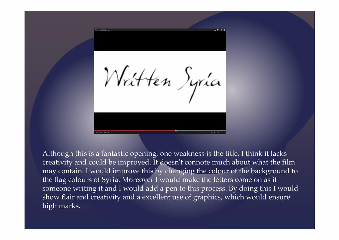
Although this is a fantastic opening, one weakness is the title. I think it lacks creativity and could be improved. It doesn't connote much about what the film may contain. I would improve this by changing the colour of the background tothe flag colours of Syria. Moreover I would make the letters come on as ifsomeone writing it and I would add a pen to this process. By doing this I wouldshow flair and creativity and a excellent use of graphics, which would ensurehigh marks.

The graphics have no style and creativity. Moreover it does notconnote anything about the filmand has no meaning. I would improve this by maybe making the writing more graffiti like and make it jerk, giving that urban and chaotic edge.
The framing of this shot is very bad. There is no technique. This is an action shot, therefore I would improve it my having lots of frantic cuts and close ups of facial reactions and them stealing the girls bag. Bydoing this if would befulfilling the brief of using avariety of shot types, thatkeep the audience wantingmore.

The brief clearly specifies to use copy right free or original music. However as you can see on the TV, music that is copy right is being played and this is not allowed. This mistake lost a great deal of marks. I would improve this by composing my own music or getting copy rightfree music. Another simplesolution may be to not usemusic at the scene as it doesdraw a distraction from thecharacters conversation.
The title is very dull and yet again no imagination has gone into it. I would improve it by changing the font to graffiti connoting teenagers are involved and how rough it will be. Then Iwould add a spray can onthe side to give it theillusion the title has been spray painted on. Then I would add arrows around the title, that would connote an on going cycle.

The framing of this shot is very bad. It stays like this and doesn't show a close up of their faces or what they may be talking about. I would improve this by adding in cuts and a variety of shots. This willensure higher marks as themark scheme specifies aexcellent variety of cameralanguage and editing.
In the first shot you can see its day light but in the second shot its night time. This breaks the conventions of continuity and confuses the audience. Therefore loosing verisimilitude. I would improve this by making sure I filmed in the same light.

This shot is unecessary and wastes time. It brings nothing to the opening and confuses the audience. It has no relevance to the brief given and doesn't make sense. I would improve this by adding scenes that have relevance and raise enigma codes. For example maybeshots of who the character isrunning a away from or aflashback of the situation thatcaused the action scene.
Although this clip has its many weaknesses, one strength is the action sequence at the start, it grabs the audiences attention and makes us think who is he running from. Moreover the music is upbeat and the cuts used are frantic, keeping up with the action and informingthe audience. This meets the mark schemesstandard of appropriate shooting material.His costume is black connoting trouble aswell as the setting - alley way, showing heis in a urban rough area, which is a typicalsetting social realism film would use.

Other students work…Battered and BruisedStrengths: Decent graphics and the music was original. Weakness: The themes were not clear and the camera work was constantly shaky. Improvements: I would stick to the conventions of social realism and pick a simple but creative storyline that leaves the audience thinking. Moreover, I would put in more detail with camera language and use a variety of movements.
Straight EdgeStrengths: Original music, interesting storyline, great camera work and creative graphics. Weakness: Graphics separate shot. Improvements: I would put title at the start and put graphics on the actual shot.
Black arrowStrengths: Decent graphics. Weakness: It didn't make sense, like the voice over didn't match the characters ethnicity. Improvements: I would improve this by making the storyline more interesting.
WastersStrengths: Good music, creative graphics, well framed shots and good storyline. Weakness: Looked like a trailer due to voice over and graphics at the end. Improvements: I would improve this by putting graphics at the start and minimise the length of the voice over.