evlauation 2
TRANSCRIPT

Evaluation part 2How effective is the combination of your main product and ancillary texts?

My poster featured key aspects such as a title text that fitted the narrative of my trailer. I created my title in the style of a gnarled tree, this reinforces the ideas behind the title of “Hanging Tree” this old and decrepit style connotes the horror feeling. I also used low-key lighting in my poster image; this not only created a contrasted and interesting image but also helped to reinforce the conventions of a horror film. Using Photoshop I also added an inverted silhouette of a tree over my main image not only did this help to obscure my image, creating a more sinister feeling and a sense of restricted narration. In terms of the overall advertising on The Hanging Tree, it foreshadows an event in the trailer when the featured character (Nicole) appears to be taken by the tree. This is similar to what is seen in the Evil Dead (2013) poster, featuring the leading female victim on the poster adds interest as the viewer wants to see what happens, this links in with the trailer when you see her being tortured. To fit the standard conventions of a billboard/one-sheet poster, I created and added a billing block to help sell the actors and artists who created the film. I included this to add prominence to the artistic and ‘classy’ sides of the film; this suggested that the viewers would not only be there to watch the film but to appreciate the auteurs with in it as well. Having studied Andrew Sarris and his Auteur Theory in “Notes on the Auteur Theory in 1962” I realized that creating iconic directors and stars could be a major part of an advertising campaign.
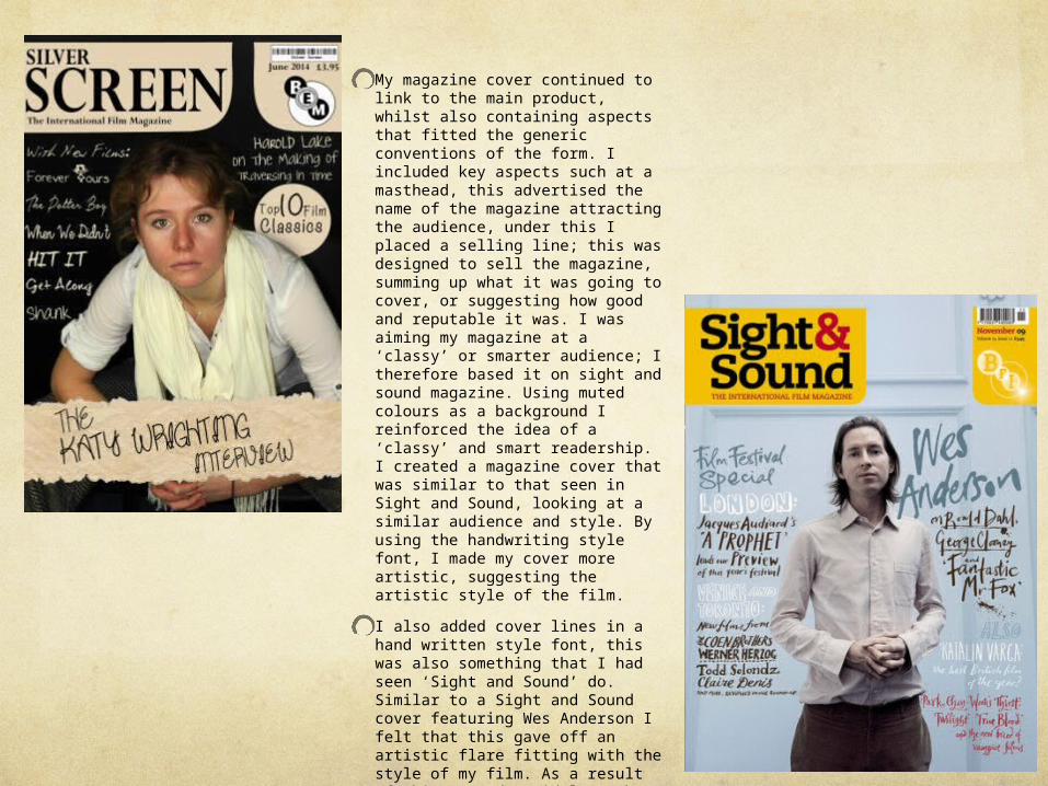
My magazine cover continued to link to the main product, whilst also containing aspects that fitted the generic conventions of the form. I included key aspects such at a masthead, this advertised the name of the magazine attracting the audience, under this I placed a selling line; this was designed to sell the magazine, summing up what it was going to cover, or suggesting how good and reputable it was. I was aiming my magazine at a ‘classy’ or smarter audience; I therefore based it on sight and sound magazine. Using muted colours as a background I reinforced the idea of a ‘classy’ and smart readership. I created a magazine cover that was similar to that seen in Sight and Sound, looking at a similar audience and style. By using the handwriting style font, I made my cover more artistic, suggesting the artistic style of the film.I also added cover lines in a hand written style font, this was also something that I had seen ‘Sight and Sound’ do. Similar to a Sight and Sound cover featuring Wes Anderson I felt that this gave off an artistic flare fitting with the style of my film. As a result of this I used a mid-long shot of the director as the main image.

Overall, the way the ancillary products and main trailer work together often means I am selling the auteur more than the film itself. I was obviously clearly influenced by the role Alfred Hitchcock and George Romero took in advertising their films. In my magazine cover, I positioned my director, with an expressionist low angle shot connoting power, in a pretentious manner so as to over emphasis the idea that it is artistic. Reinforcing this artistic style of my campaign – linking to the folk music that provides the background to the trailer - I added a ripped paper background to the main cover line.