examining relationships scatterplots and correlation
TRANSCRIPT

Examining Relationships
Scatterplots and Correlation

The “W’s”
• When you examine the relationship between two or more variables, first ask the familiar key questions about the data – Who (are the individuals described by the data)– What (are the variables and in what units)– Why (were the data collected, if possible)– When, Where, how and by whom (were the data
produced)
• Note: the answers to “who” and “what” are essential.
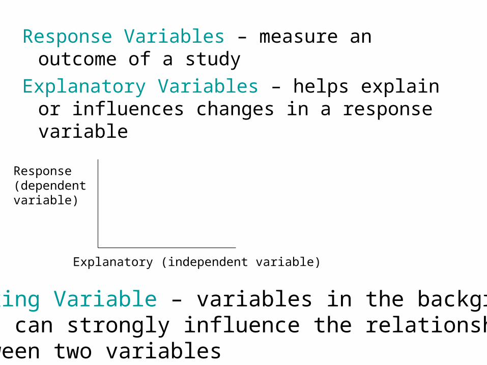
Response Variables – measure an outcome of a study
Explanatory Variables – helps explain or influences changes in a response variable
Explanatory (independent variable)
Response (dependent variable)
Lurking Variable – variables in the backgroundthat can strongly influence the relationshipbetween two variables
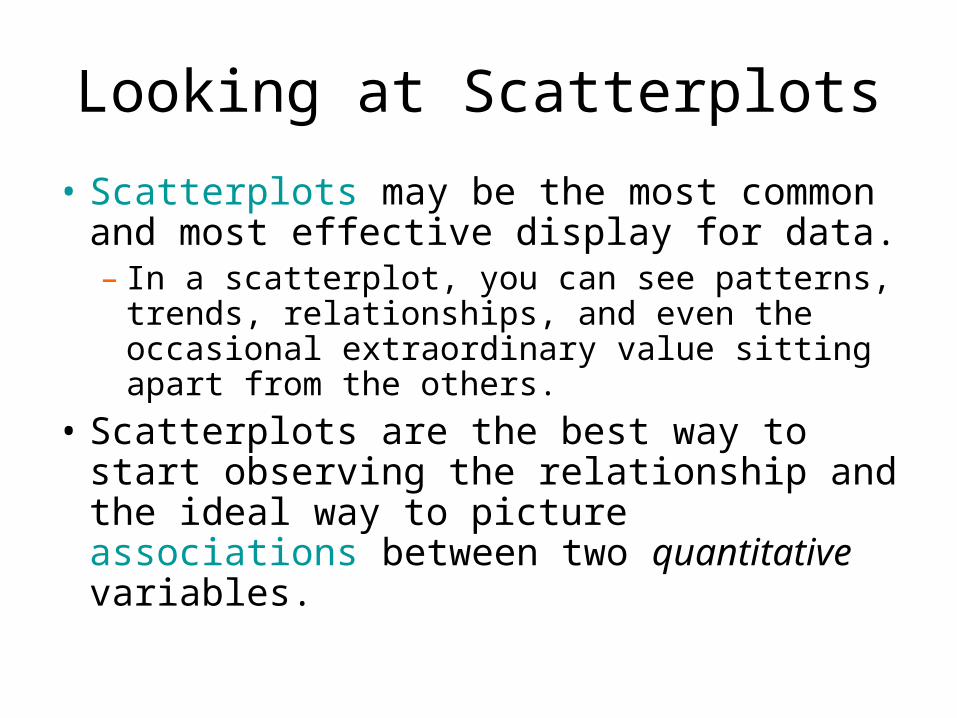
Looking at Scatterplots
• Scatterplots may be the most common and most effective display for data. – In a scatterplot, you can see patterns, trends,
relationships, and even the occasional extraordinary value sitting apart from the others.
• Scatterplots are the best way to start observing the relationship and the ideal way to picture associations between two quantitative variables.

Looking at Scatterplots (cont.)
• When looking at scatterplots, we will look for direction, form, strength, and unusual features.
• Direction:– A pattern that runs from the upper left to the
lower right is said to have a negative direction.
– A trend running the other way has a positive direction.

• Figure 3.1 from the text shows a negative association between the percent of high school seniors who take the SAT and their mean SAT math scores
Looking at Scatterplots (direction)

• This figure shows a positive association between the year since 1900 and the % of people who say they would vote for a woman president.
• As the years have passed, the percentage who would vote for a woman has increased.
Looking at Scatterplots (direction)

Looking at Scatterplots (form)• Form:
– a straight line (linear) relationship, will appear as a cloud or swarm of points stretched out in a generally consistent, straight form.

Looking at Scatterplots (form)
• Form:– Curved - the
relationship curves gently, while still increasing or decreasing steadily
or

• Clustered – when there are clear groups within the data
Looking at Scatterplots (form)
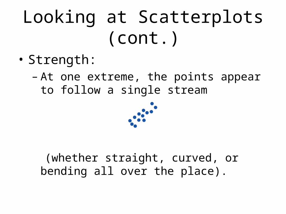
Looking at Scatterplots (cont.)
• Strength:– At one extreme, the points appear to follow a
single stream
(whether straight, curved, or bending all over the place).
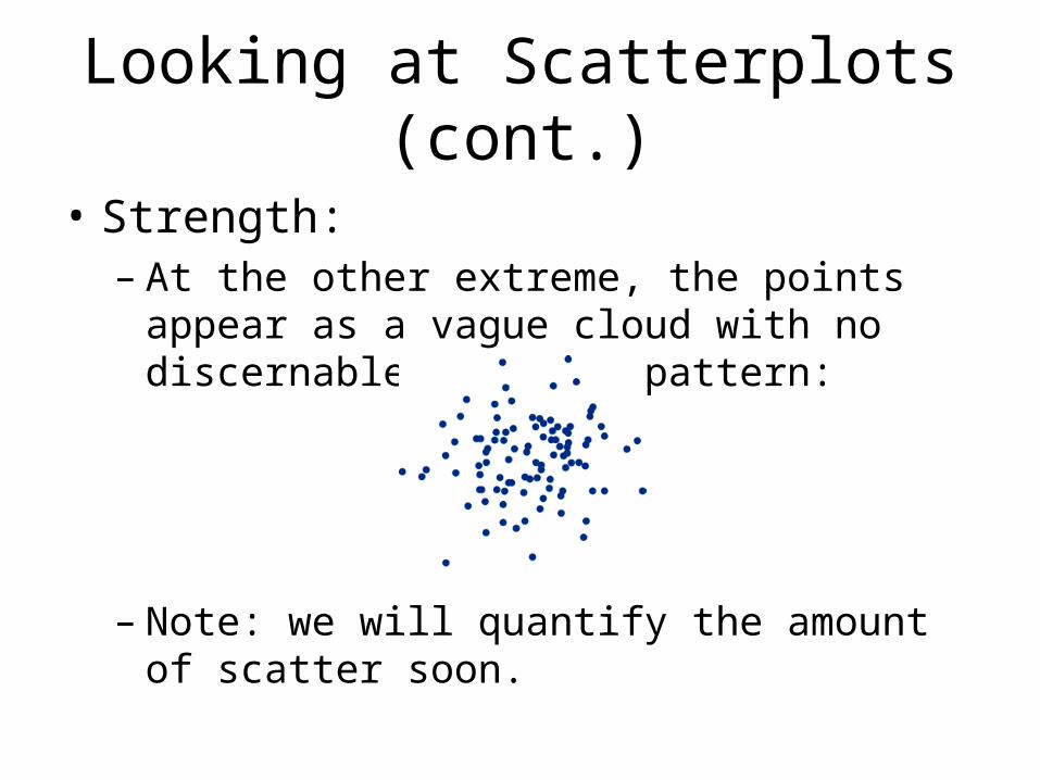
Looking at Scatterplots (cont.)
• Strength:– At the other extreme, the points appear as a
vague cloud with no discernable trend or pattern:
– Note: we will quantify the amount of scatter soon.

Interpreting a Scatterplot
The scatterplot of the mean SATMath scores in each state againstthe percent of that state’s highschool seniors who took the SAT in 2005. The dotted lines intersectat the point (9,557), the data for Colorado.
Interpret the scatterplot, look for patterns and anyimportant deviations from the pattern. See p 176 for text soln

Adding Categorical Variables to Scatterplots
Dividing the states into southern and non-southern Introduces a third variable into The scatterplot. This categorical Variable only has two values.
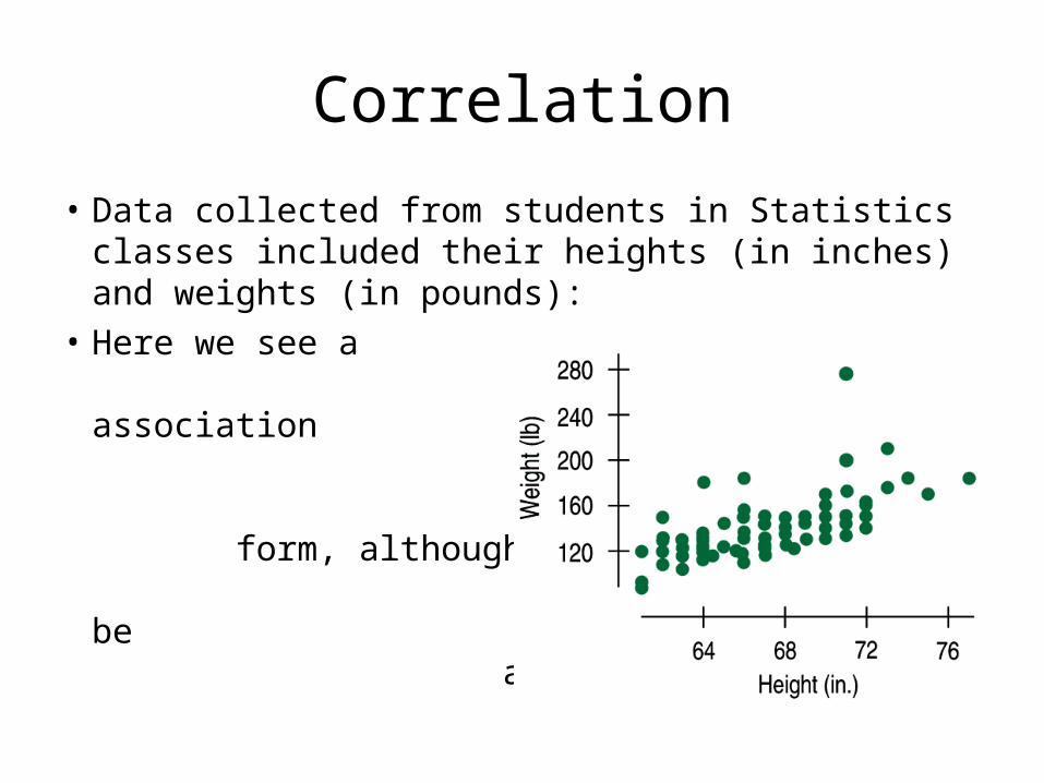
• Data collected from students in Statistics classes included their heights (in inches) and weights (in pounds):
• Here we see a positive association and a fairly straight form, although there seems to be a high outlier.
Correlation

• How strong is the association between weight and height of Statistics students?
• If we had to put a number on the strength, we would not want it to depend on the units we used.
• A scatterplot of heights (in centimeters) and weights (in kilograms) doesn’t change the shape of the pattern:
Correlation (cont.)

Correlation (cont.)• Since the units
don’t matter, why not remove them altogether?
• We could standardize both variables and write the coordinates of a point as (zx, zy).
• Here is a scatterplot of the standardized weights and heights:

Correlation
• The correlation coefficient (r) gives us a numerical measurement of the direction and strength of the linear relationship between the explanatory and response variables.
1x yz z
rn
For the students’ heights and weights, the correlation is 0.644.

How correlation measures the strength of a linear relationship. Patterns closer to a straight line have correlations closer to 1 or -1.

Correlation Cautions
• Correlation measures the strength of the linear association between two quantitative variables.
• Before you use correlation, you must check several conditions:– Quantitative Variables Condition– Straight Enough Condition– Outlier Condition

Correlation Conditions (cont.)
• Quantitative Variables Condition:– Correlation applies only to quantitative
variables. – Don’t apply correlation to categorical data
masquerading as quantitative. – Check that you know the variables’ units and
what they measure.

Correlation Conditions (cont.)
• Straight Enough Condition:– You can calculate a correlation coefficient for
any pair of variables. – But correlation measures the strength only of
the linear association, and will be misleading if the relationship is not linear.
Correlation Conditions (cont.)
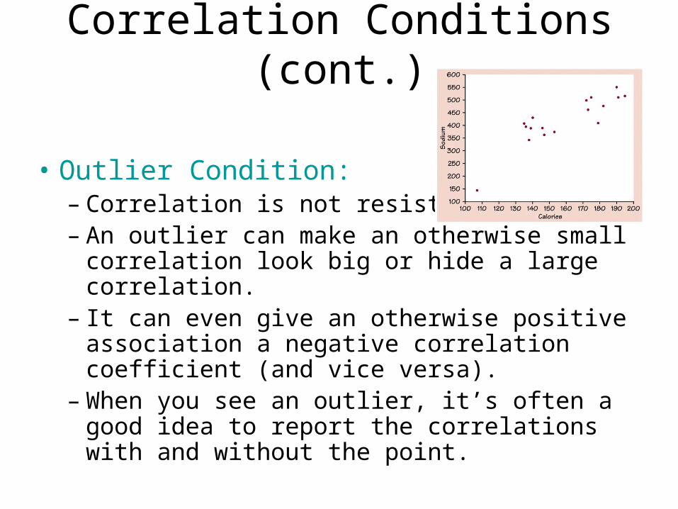
• Outlier Condition:– Correlation is not resistant. – An outlier can make an otherwise small
correlation look big or hide a large correlation. – It can even give an otherwise positive
association a negative correlation coefficient (and vice versa).
– When you see an outlier, it’s often a good idea to report the correlations with and without the point.
Variability
Correlation is given by r, indicating the strength and direction of an association.
Variability is given by r2, and it indicates that 100r2 is the percent of variability in the dependent variable that can be explained by the independent variable.
The remaining percent variability must then be explained by lurking variables.