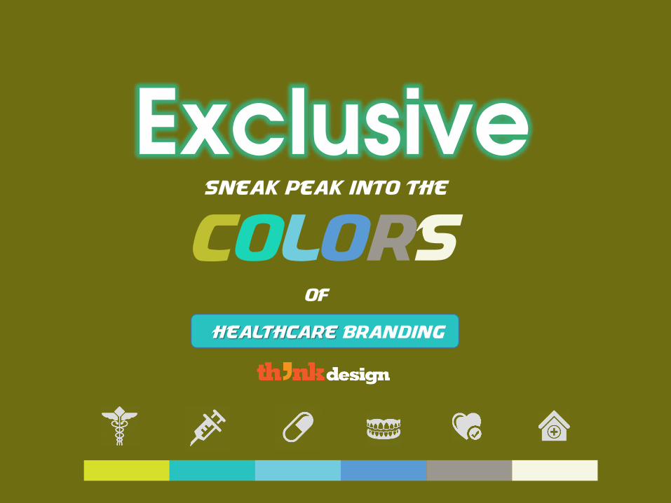
exclusive sneak peek into the colors of healthcare branding
TRANSCRIPT
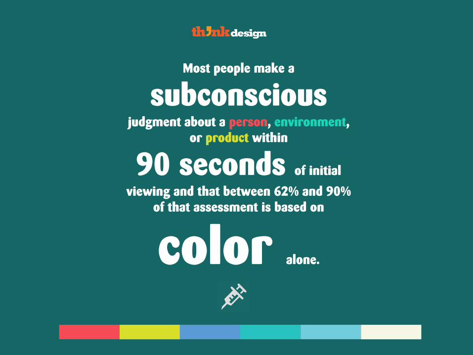
Most people make a
subconscious judgment about a person, environment,
or product within
90 seconds of initial
viewing and that between 62% and 90%
of that assessment is based on
color alone.

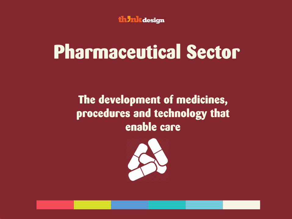
Pharmaceutical Sector
The development of medicines,
procedures and technology that
enable care
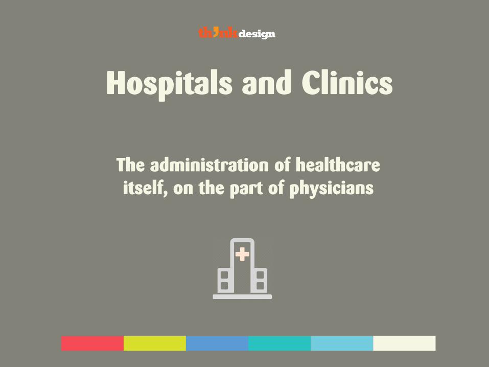
Hospitals and Clinics
The administration of healthcare
itself, on the part of physicians
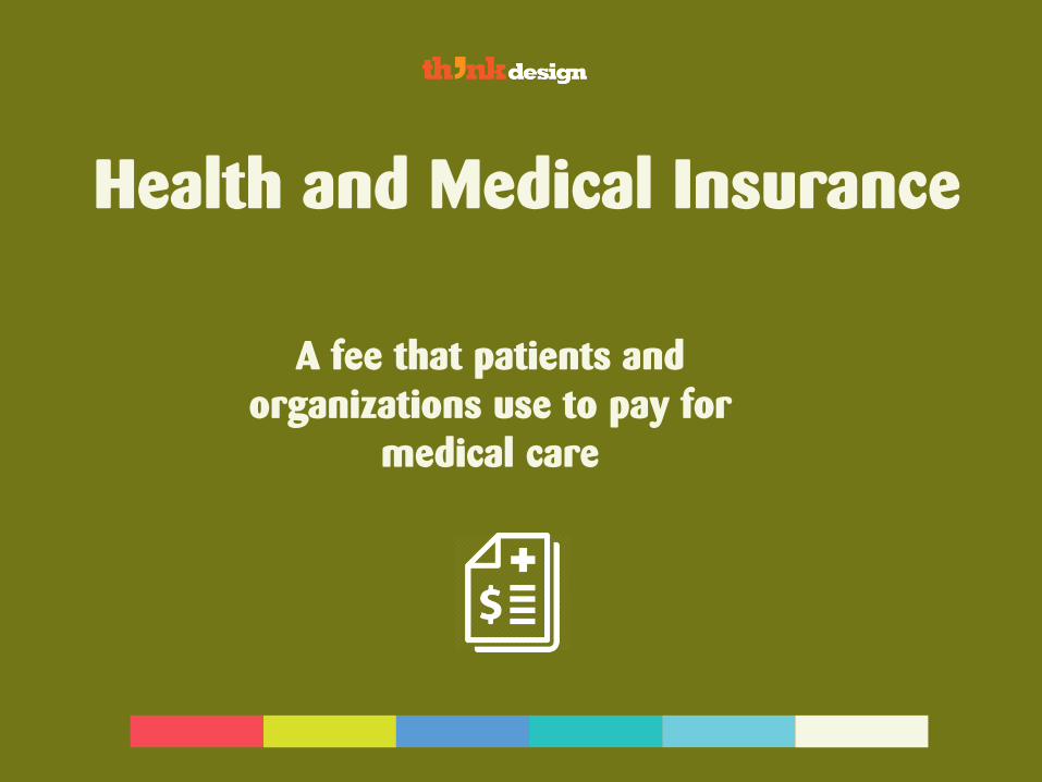
Health and Medical Insurance
A fee that patients and
organizations use to pay for
medical care
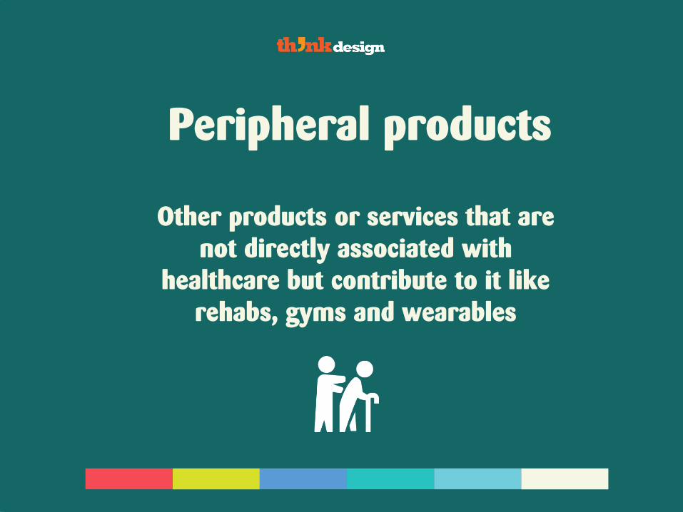
Peripheral products
Other products or services that are
not directly associated with
healthcare but contribute to it like
rehabs, gyms and wearables
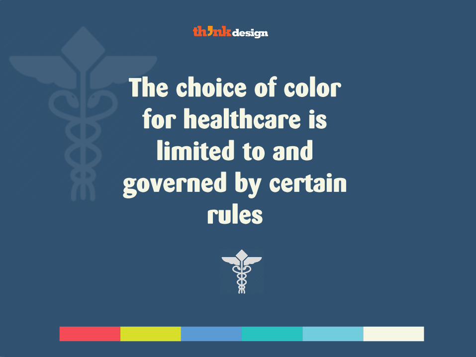
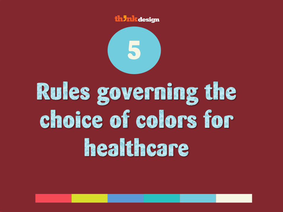
The choice of color
for healthcare is
limited to and
governed by certain
rules


Cool color 5
The colors from the cooler side of the spectrum
are used in healthcare branding and logo design

Blue is the ruling colorAll colors are from the cooler side of the spectrum
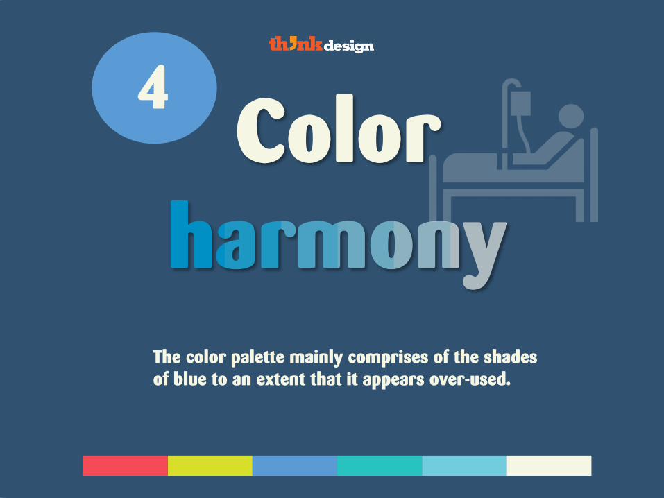
Color 4
The color palette mainly comprises of the shades
of blue to an extent that it appears over-used.


Secondary 3
The colors obtained from the combination of
primary colors
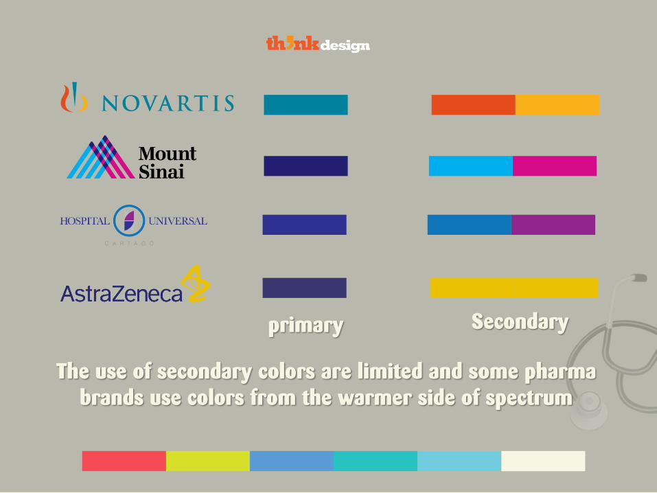
The use of secondary colors are limited and some pharma
brands use colors from the warmer side of spectrum
primary Secondary
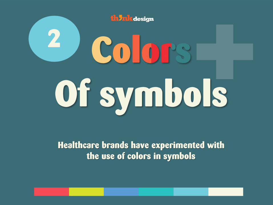
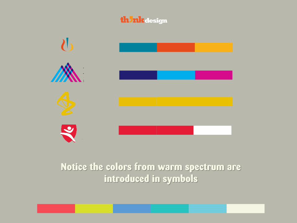
Of symbols
2
Healthcare brands have experimented with
the use of colors in symbols
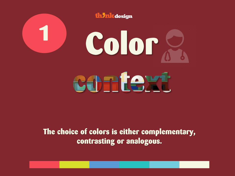
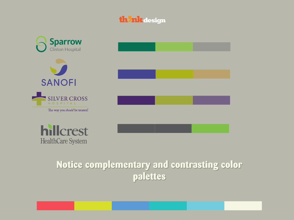
Color 1
The choice of colors is either complementary,
contrasting or analogous.

Are you looking for ways to
brand your business?
Go here