exploring polar equations with interactive spreadsheets · exploring polar equations with...
TRANSCRIPT

Exploring Polar Equations With Interactive
Spreadsheets
Andriy Didenko, David Allison, and Gary Miller
Abstract — Students who are studying calculus often find the graphing of polar equations difficult and time consuming.
Microsoft Excel is a helpful software tool for the teaching of
mathematics, and can be used to generate dynamic spreadsheets
specifically designed to make mathematical tasks more
instructive as well as visually stimulating for students.
A dynamic spreadsheet presentation can help students better
appreciate how a graph is produced from the relationship
between the polar coordinates.
Ke]wWords—mathematics education technology polar
equations Microsoft Excel spreadsheet
I. INTRODUCTION
Polar coordinates originated with the astronomical
investigations of the early Islamic scholars [1], [2].
Polar coordinates are usually presented as a distance
from a fixed point and an angle with a fixed direction.
Alternatively, we could plot the radius versus the angle on
two perpendicular axes, the way we do with rectangular
coordinates. Adopting this approach, the graph of a circle
would then appear as a straight line.
However, the standard representation of polar
coordinates, as we know and use them today, originates in
the seventeenth century, with the efforts of Isaac Newton’s
immediate predecessors. In fact Newton used the standard
polar representation as one of nine different coordinate
Manuscript received June 20, 2009: Revised version received
___________.
The authors of this paper thank the Petroleum Institute for its
support and financial assistance.
A. Didenko is in the Department of Mathematics, The College of
Arts and Sciences, The Petroleum Institute, Abu Dhabi, The
United Arab Emirates (phone: + 97 1 (0)2 607 5341; fax: +97 1
(0)2 607 5200; e-mail: [email protected]).
D. Allison is in the Department of Mathematics, The College of
Arts and Sciences, The Petroleum Institute, Abu Dhabi, The
United Arab Emirates (e-mail: [email protected]).
G. Miller is in the Advancement University Placement
Department, The Petroleum Institute, Abu Dhabi, The United
Arab Emirates (e-mail: [email protected]).
systems in the Principia. A complete and fascinating
history of the subject can be found in [3].
Before the digital era, a student’s introduction to polar
coordinates and polar graphs was necessarily restricted to a
pencil and paper approach. This made the exploration of
the subject matter somewhat tricky and error prone.
However, the advent of information technology in the
shape of the Internet, multimedia resources and
educational software has supported and greatly enhanced
the delivery of course materials at all educational levels,
from kindergarten through to university [4-8]; although the
impact of this technology has been most keenly felt within
the higher education sector [9-11].
In a review paper [12] Baker & Sugden describe the
variety of ways that spreadsheets have been useful in the
teaching of various technical subjects. A number of books
(see for example [13], [14]) have recently been published
that describe how one can use Excel to perform
mathematical modeling and charting.
In the teaching of mathematics the presentation of the
concepts via equations, diagrams and tables is often static
in style. The visual evidence available to students in
support of the mathematical ideas is frequently restricted
to a relatively small number of given textbook diagrams
accompanying the text’s examples. For students to
generate additional graphical illustrations is time intensive.
A consequence of this is that the more abstract topics of
the subject have been difficult for instructors to explain to
students. Arganbright [15], Wischniewsky [16],
Abramovich & Sugden [17] and Wetzel & Whicker [18]
have used Excel to make the teaching of mathematics more
dynamic for an audience. El-Gebeily and Yushau [19],
Didenko, Allison & Miller [20-28] have employed
animated spreadsheet presentations to help students
understand college level calculus topics.
Another issue is that of student motivation. The
emergence of digital math presentation tools has made it
easier to engage and increase the appreciation of students,
especially those who are not majoring in mathematics.
Prior to the information technology era, the static imagery
coupled with the pencil and paper computations,
INTERNATIONAL JOURNAL OF EDUCATION AND INFORMATION TECHNOLOGIES Issue 2, Volume 4, 2010
57

contributed to a larger number of students becoming
frustrated and bored. Also, it was not a simple task to
satisfy the audience’s quite reasonable demand for real-
world applications of the mathematical topics to be
demonstrated.
A particular topic that arises in the traditional college
calculus sequence is the polar coordinate system, and the
affiliated task of graphing a polar equation [27]. A
dynamic spreadsheet presentation can help the student
appreciate how a curve is generated from the relationship
between the polar coordinates.
Students who are non-math majors taking a standard
calculus I-II-III sequence, sometimes find it difficult to
make the transition from Cartesian coordinates to polar
coordinates. In particular, the relationship between a curve
and a polar equation ( )r f θ= has aspects that may elude
the neophyte. For instance the importance identifying
values of θ corresponding to 0r = or to where r attains an
extreme value may not be sufficiently appreciated. An
additional subtlety that can be missed is the range of θ -values that produces one copy of the polar curve.
Prior to age of the graphing calculator and the computer
algebra system, the student’s introduction to the sketching
of polar curves typically involved a sequence of cases:
a) The simple graphs r = constant (circle) , θ = constant (line)
b) A graph such as 2cosr θ= (circle), produced by the
student laboriously computing a table of ( ),r θ pairs by ‘hand’ and then plotting the points that arise
c) Sketching a curve such as 1 2sinr θ= − (Limacon with
a loop) by: drawing the graph of 1 2sinr θ= − in
Cartesian coordinates, and then using this to read off
the r − values that correspond to increasing values of θ . Plenty of opportunities for the unwary to err.
The advent of sophisticated hand-held and desktop
educational technology has greatly facilitated the
exploration of polar graphing: taking the tedium out of the
time intensive generation of ( ),r θ tables; allowing the student to rapidly produce graphs of stimulating and
sometimes mesmerizing complexity. That having been said
however, there are many schools and colleges whose
instructors and students do not have access to state of the
art math software tools such as Mathematica, or to high
powered graphing calculators like the Texas Instruments
TI-89. Nonetheless, there are numerous such institutions
and individuals who do have access to a PC loaded with a
version of Microsoft Office. The Excel component of this
suite is a useful instructional aid for the teaching of higher
level mathematics [28], [29], [30]. In this paper the authors
highlight the ability of Excel to effectively and rapidly
produce curves of polar equations.
II. EXCEL AS A POLAR GRAPHING TOOL
In this section of the paper the authors describe an in-
house developed Excel spreadsheet that can serve as a
graph generator for polar equations. The spreadsheet is a
cost-effective user friendly teaching tool.
The authors wish to emphasize that the development of
the spreadsheet did not require any software programming
skills (in Visual Basic for example). They set out to
develop a tool that is easy to construct and utilize. Only
certain basic features of the Excel package were needed,
such as cell referencing and table calculations. Key cells
for data entry were designed to incorporate pop-up
comments / instructions to aid the user.
The spreadsheet features a list of pre-set polar functions
of the form ( )r f θ= , typical of cases found in most
standard calculus sequence textbooks [31]. These are
accessible via a pull-down menu, and examples are shown
below.
FIGURE 1 shows the four leaf polar curve
corresponding to the selection 3 cos(2 )r a t= where the
variable t is used in the Excel spreadsheet in place of the
polar angle θ , and the coefficient a is an additional parameter appearing in the equation. The angle t and the
parameter a can be individually varied by the user by means of Excel ‘slider’ control bars.
As the value of the parameter t is altered, the point
corresponding to the t -value moves along the curve.
Fig. 1
INTERNATIONAL JOURNAL OF EDUCATION AND INFORMATION TECHNOLOGIES Issue 2, Volume 4, 2010
58

The slider bar is a useful feature since it readily allows
the student to explore functional aspects such as: the
particular values of the polar angle that correspond to a
zero value for the radius, and the ranges of the angle that
trace the polar curve.
The spreadsheet can deal with more complicated polar
graphs, as illustrated in FIGURE 2. This displays the
graphical output corresponding to the case
3 5
2sin( ) sin
tr a t a
= +
Fig 2.
When the user selects the polar equation
( )sin 2cos 4t tr e −=
the rather striking image of a butterfly is created
(see FIGURE 3).
Fig. 3
III. DATASET DESCRIPTION
The dataset in the spreadsheet is organized in the
following way.
E1:I26 is a table that contains the list of pre-set polar
functions in the text and Excel-style formats as well as
endpoints of the interval for the independent variable
and the reference number of the function. The
reference number is also used to select a function from
a drop-down list (selector - combo box). In particular,
E2:E26 is a list of pre-defined polar functions to be
displayed in the selector-combo box and G2:G26 is
the ordered list of the descriptive formulas for the
polar functions used in the calculation of the values of
r in B3:B103.
A2:B103 is a one-variable data table where the range
A2:A103 contains values of θ between α and β with the step (β - α)/n, and the range B3:B103 contains corresponding values of r calculated according to the
formula stored in the cell B2. When a function is
selected from the drop-down list, MS Excel function
INDEX helps to identify values of α and β from the table. The values of α and β are used to generate the set of values for the independent variable that are
stored in the A2:A103 array. Simultaneously, the
reference number of the function allows one to choose
a proper Excel-style formula to be stored in the cell
B2 of the one-variable data table. Actually, the cell B2
contains a look-up function that selects a polar
formula from a pre-defined list depending on the
choice made by the user.
C3:D103 contains x- and y-values of points forming the
curve. These values are calculated by the usual
formulas x = r cos t, y = r sin t .
IV. FURTHER GRAPHICAL EXPLORATIONS
A spiral shaped curve called a “lituus” appears in FIGURE
4. For some interesting historical background to this curve
see reference [32]. Mathematically [33], the word lituus
refers to a curve for which the polar equation is given by
2r kθ =
where k is a positive constant. The spiral has a pair of branches depending on the sign of r and is asymptotic to the x-axis. The points of inflection of the graph are located
at
( ) 1, 2 ,
2r kθ
=
and
INTERNATIONAL JOURNAL OF EDUCATION AND INFORMATION TECHNOLOGIES Issue 2, Volume 4, 2010
59
( ) 1, 2 ,
2r kθ − −
=
The equation for the graph in FIGURE 4 is
1
rt
=
where, in this particular case, 1k = and the spreadsheet
variable t is used in place of the polar angle θ .
Fig. 4
Students are surprised that the graph corresponding to the
linear equation
r t=
is also a spiral (see FIGURE 5). They feel that the result
runs counter to their not unreasonable expectations that the
output should be a straight line.
Fig. 5
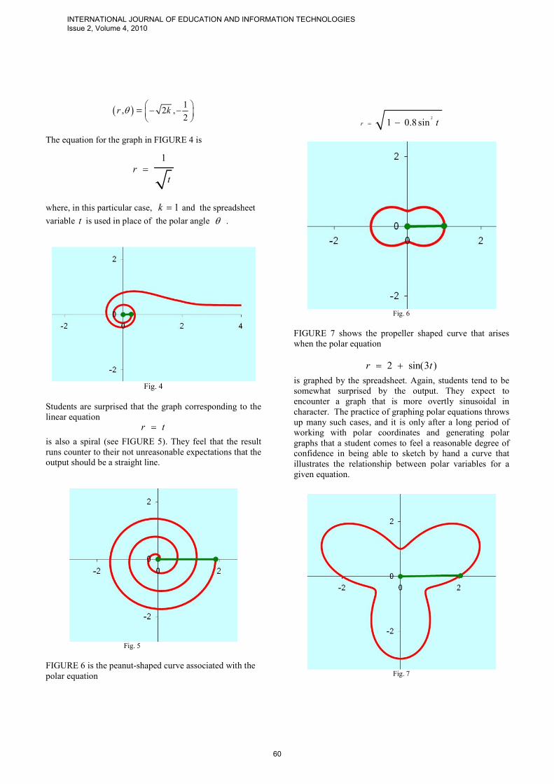
FIGURE 6 is the peanut-shaped curve associated with the
polar equation
2
1 0.8 sinr t= −
Fig. 6
FIGURE 7 shows the propeller shaped curve that arises
when the polar equation
2 sin(3 )r t= +
is graphed by the spreadsheet. Again, students tend to be
somewhat surprised by the output. They expect to
encounter a graph that is more overtly sinusoidal in
character. The practice of graphing polar equations throws
up many such cases, and it is only after a long period of
working with polar coordinates and generating polar
graphs that a student comes to feel a reasonable degree of
confidence in being able to sketch by hand a curve that
illustrates the relationship between polar variables for a
given equation.
Fig. 7
INTERNATIONAL JOURNAL OF EDUCATION AND INFORMATION TECHNOLOGIES Issue 2, Volume 4, 2010
60

A standard exercise appearing in many textbooks is the
one of graphing the equation
1 2 ( )r cos t= +
The graph for the equation is shown in FIGURE 8
Fig. 8
Once the students have performed the graphing procedures
connected to the polar equations related to FIGURES 4 –
8, it is often instructive for the teacher to ask the students
to sketch just using pencil and paper the graphs
corresponding to the equations:
1 2 sin( )r t= +
2 cos(3 )r t= +
prior to checking their results against the spreadsheet’s
outputs.
Next consider the graph appearing in FIGURE 9. The
effect of scaling the independent parameter by a third in a
cosine is shown.
cos( )3
rt
=
Fig. 9
Below (FIGURE 10.) is the graph of the straight line
whose polar equation is
2
2sin cost tr
−=
The corresponding equation in rectangular coordinates is
12
xy +=
Fig. 10
At the present time the spreadsheet described in this
paper is restricted in not being able to generate
straight line graphs corresponding to polar equations
of the form
t C=
where C is a constant.
The series of floral patterns (FIGURES 11-14) are
generated from polar equations possessing the form
( ) , 0 2sin nt tr π≤ ≤=
where n
is a constant and is associated with the
multiplicity of the polar angle. The graphical output
clearly demonstrates to the student the property that
as the multiplicity increases the number of leaves on
the curve also increases. What is also illustrated is the
interesting property that there are n leaves present when n is an odd integer, and 2n leaves appear when the multiplicity is even.
INTERNATIONAL JOURNAL OF EDUCATION AND INFORMATION TECHNOLOGIES Issue 2, Volume 4, 2010
61
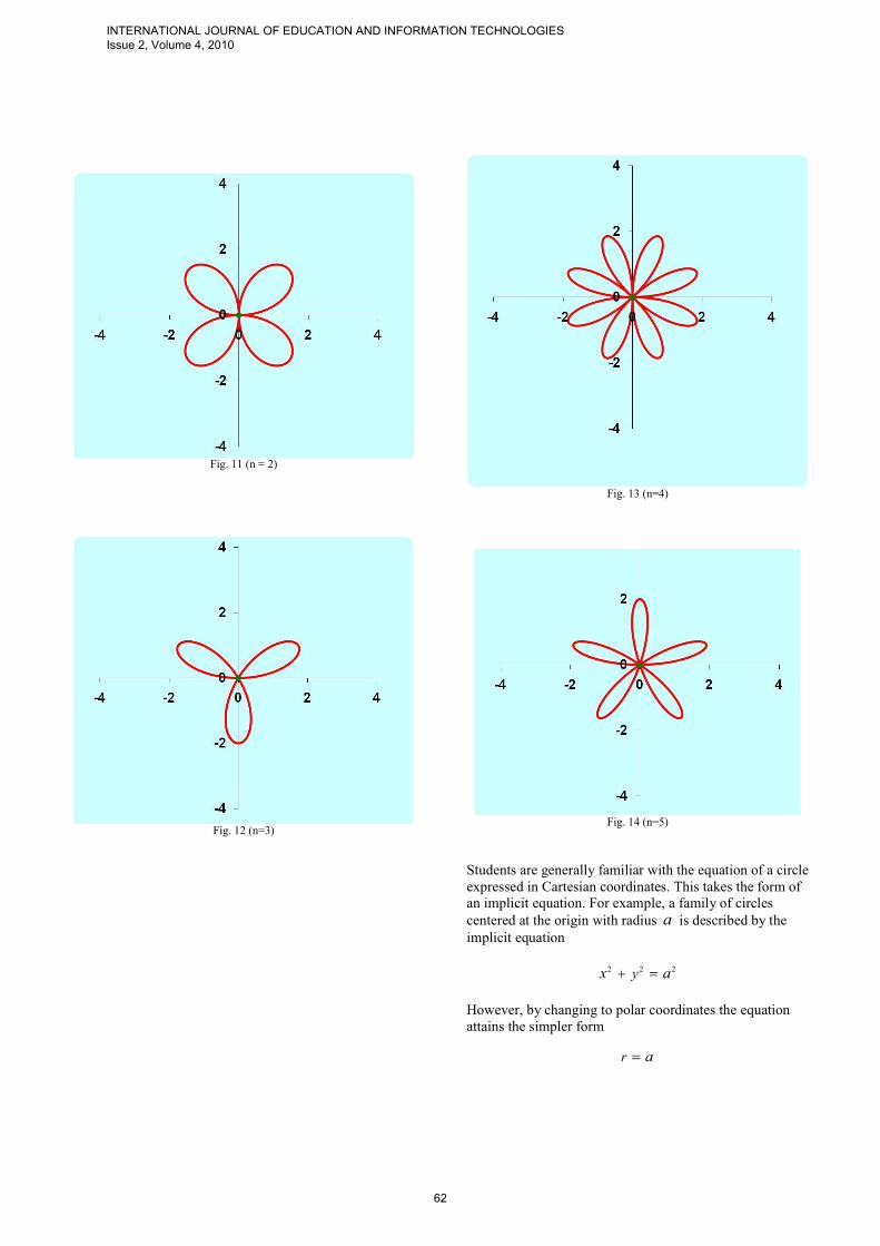
Fig. 11 (n = 2)
Fig. 12 (n=3)
Fig. 13 (n=4)
Fig. 14 (n=5)
Students are generally familiar with the equation of a circle
expressed in Cartesian coordinates. This takes the form of
an implicit equation. For example, a family of circles
centered at the origin with radius a is described by the implicit equation
2 2 2yx a+ =
However, by changing to polar coordinates the equation
attains the simpler form
r a=
INTERNATIONAL JOURNAL OF EDUCATION AND INFORMATION TECHNOLOGIES Issue 2, Volume 4, 2010
62

In effect, by the use of polar coordinates one has
parametrized the curves in a thoroughly ‘natural’ way.
FIGURE 15. shows the spreadsheet’s graphical output for
the case when r a= . The value of a can be altered by
means of a slider control.
Fig. 15
A circle whose equation depends upon the polar angle is
shown in FIGURE 16. The equation is
cosr a t=
where again the spreadsheet allows one to change the
value of the parameter a using a slider.
Fig. 16
The final diagram (FIGURE 17.) corresponds to the circle
having a polar equation
sinr a t=
Fig. 17
V. CONCLUSION
The authors of this paper have incorporated the
spreadsheet in their own teaching of the topic of polar
coordinates to undergraduate engineering students. At the
expository stage, before the students individually work
through set calculation problems, they watch an animated
spreadsheet presentation. Subsequently, the students can
access the software to further explore the mathematical
topic at their own pace and at a time convenient to them.
A poll of the students revealed that they found the software
to be simple to use and helpful to them in clarifying the
nature of polar coordinates.
ACKNOWLEDGMENT
A.Didenko, D. Allison and G. Miller wish to express
thanks to the students of the Petroleum Institute in Abu
Dhabi who took part in the calculus classes during which
the polar equation spreadsheet was utilized. The students’
input as to the effectiveness of the software as a pedagogic
tool has been very useful. Additional thanks are conveyed
to those teaching colleagues of the authors at the
Petroleum Institute who generously gave up time to ‘test
drive’ the software and record their observations.
INTERNATIONAL JOURNAL OF EDUCATION AND INFORMATION TECHNOLOGIES Issue 2, Volume 4, 2010
63

REFERENCES
[1] O'Connor, John J.; Robertson, Edmund F., "Abu Arrayhan
Muhammad ibn Ahmad al-Biruni", MacTutor History of Mathematics archive.
[2] T. Koetsier, L. Bergmans (2005), Mathematics and the Divine,
Elsevier, p. 169, ISBN 0444503285
[3] Coolidge, Julian (1952). "The Origin of Polar Coordinates". American Mathematical Monthly 59: 78–85. doi:10.2307/2307104. http://www-history.mcs.st-and.ac.uk/Extras/Coolidge_Polars.html.
[4] R.M. Reis, Development of Educational Software, International
Journal of Education and Information Technologies, Vol. 1, Iss. 3 [2007], pp. 167-171.
[5] R. Fang, H.J. Yang, H.L. Tsai, C.J. Lee and D. Li, The Digital
Instrument Support Teacher’s Instructional Innovation , International Journal of Education and Information Technologies,
Vol. 1, Iss. 4 [2007], pp. 215-222.
[6] R. Fang, H.J. Yang, H.L. Tsai, C.J. Lee, T. Tsai and D. Li, A Type of Technological Course with using Information Technology,
International Journal of Education and Information Technologies,
Vol. 1, Iss. 4 [2007], pp. 181-187. [7] I.I. Siller-Alcala, R. Alcantara-Ramirez, J. Jaimes-Ponce and J.P.
Vaca-Pliego, How to link theory and practice of control
engineering: Practices in real time and simulation, International Journal of Education and Information Technologies, Vol. 1, Iss. 2
[2007], pp. 114-120.
[8] O.V. Vejar, Implementation of Schooling Based on Technologies for Communication and Information in the Subject Physics II, Distance
Learning, Multimedia and Video Technologies, Proceedings of the
8th WSEAS International Conference on Multimedia, Internet and Video Technologies/8th WSEAS International Conference on
Distance Learning and Web Engineering, University of Cantabria,
Santander, Spain,2008, pp. 61-66. [9] H. Z. Poor, Administration of Faculties by Information and
Communication Technology and Its Obstacles, International
Journal of Education and Information Technologies, Vol. 2, Iss. 1 [2008], pp. 24-30.
[10] R. Matusu, J. Vojtesek and T. Dulik, Technology-Enhanced
Learning Tools in European Higher Education, Distance Learning, Multimedia and Video Technologies, Proceedings of the 8th WSEAS
International Conference on Multimedia, Internet and Video Technologies/8th WSEAS International Conference on Distance
Learning and Web Engineering, University of Cantabria,
Santander, Spain,2008, pp. 51-54. [11] H.M. El-Bakry and N. Mastorakis, Realization of E-University for
Distance Learning, Distance Learning, Multimedia and Video
Technologies, Proceedings of the 8th WSEAS International Conference on Multimedia, Internet and Video Technologies/8th
WSEAS International Conference on Distance Learning and Web
Engineering, University of Cantabria, Santander, Spain,2008, pp. 17-31.
[12] J. Baker and S. Sugden (2003), Spreadsheets in Education – The
First 25 Years, Spreadsheets in Education (eJSiE): Vol. 1: Iss. 1, Article 2
[13] E. Neuwirth and D. Arganbright (2004), The Active Modeler:
Mathematical Modeling with Microsoft Excel. Thompson/Brooks-Cole, Belmont, CA, USA. ISBN 0-534-42085-0.
[14] J. Walkenbach. (2003). Excel Charts, Wiley Publishing, Inc.
[15] D. Arganbright (2005). Enhancing Mathematical Graphical Displays in Excel through Animation, eJSiE 2(1), 120-147.
[16] W.A.L.Wischniewsky, Movie-like Animation with Excel’s Single
Step Iteration Exemplified by Lissajous Figures, Spreadshets in Education (eJSiE), Vol. 3, Iss. 1 [2008], Art. 4.
[17] S. Abramovich and S. Sugden (2005). Spreadsheet Conditional
Formatting: An Untapped Resource for Mathematics Education, Spreadsheets in Education (eJSiE), Vol. 1, Iss. 2 [2007], Art. 1,
p.104-124.
[18] L.R.Wetzel and P.J.Whicker, Quick Correct: A Method to Automatically Evaluate Student Work in MS Excel Spreadsheets,
Spreadsheets in Education (eJSiE), Vol. 2, Iss. 3 [2007], Art. 1.
[19] M. El-Gebeily and B. Yushau, Curve Graphing in MS Excel and
Applications, Spreadsheets in Education (eJSiE), Vol. 2, Iss. 2 [2007], Art. 6
[20] A. Didenko, D. Allison & S. M. Stewart, Using technology to forge
the link between formal mathematical definitions and related problem-solving techniques, Proceeding of the Third Annual
Conference for Middle East Teachers of Science, Mathematics and
Computing METSMaC, The Petroleum Institute, Abu Dhabi, UAE, 2007, pp. 119–126.
[21] A.Didenko, G.Miller, Algebraic and linear algebraic algorithms with
EXCEL, Proceeding of the Third Annual Conference for Middle East Teachers of Science, Mathematics and Computing METSMaC,
The Petroleum Institute, Abu Dhabi, UAE, 2007.
[22] A. Didenko, D. Allison, Using Microsoft Excel as a Tool for Teaching Calculus to Engineering Students, Proceedings of the
Third International Conference on Mathematical Sciences ICM-
2008, UAEU, Al Ain, UAE, 14pp. [23] A. Didenko, D. Allison, G. Miller, Graphing Parametric Curves
Using Spreadsheets, Proceedings of the 34th Conference on
Applications of Mathematics in Engineering and Economics AMEE 2008, Technical University of Sofia, Bulgaria, ISBN 978-0-7354-
0598-1, Publisher: American Institute of Physics, pp. 187-195; AIP
on-line Conference Proceedings #1067. [24] G. Miller, A. Didenko, D. Allison, Orthonormalization by
Spreadsheet, Proceedings of the 6th UAE Mathday, edited by A.Didenko, ISBN 978-9948-03-668-5, The Petroleum Institute, Abu Dhabi, UAE, 2008, pp. 3
[25] A. Didenko, D. Allison, G. Miller, The Technology of Drawing a Straight Line, Proceedings of the 7th UAE Mathday, Sharjah
University, Sharjah, UAE, 2009, p.19
[26] A. Didenko, D. Allison and G. Miller, Using Spreadsheets as Graphing Tools, Proceedings of the 6th UAE Mathday, edited by
A.Didenko, ISBN 978-9948-03-668-5, The Petroleum Institute, Abu
Dhabi, UAE, 2008. [27] A.Didenko, D.Allison, G.Miller., Graphing Polar Equations Using
Spreadsheets, Proceedings of the WSEAS 6th International
Conference on Engineering Education, Rodos, Greece, 2009, pp.108-110.
[28] A.Didenko, D.Allison, G.Miller., Exploring Taylor Polynomials
Using Spreadsheets, Proceedings of the International Conference on Interactive Computer Aided Learning, Villach, Austria, 2009,
pp.99-102.
[29] B.S. Gottfried, Spreadsheet Tools for Engineers Using Excel, New York: McGraw-Hill Science Engineering, 2005.
[30] S.C. Bloch, Excel for Engineers and Scientists, 2e, New York: John
Wiley & Sons, 2003. [31] J. Stewart, Calculus, California: Brooks/Cole-Thomson, 2003.
[32] http://en.wikipedia.org/wiki/Lituus [33] http://en.wikipedia.org/wiki/Lituus_(mathematics)
INTERNATIONAL JOURNAL OF EDUCATION AND INFORMATION TECHNOLOGIES Issue 2, Volume 4, 2010
64