fast and easy artistic maps in the gimp - cartographers' guild
TRANSCRIPT

Introduction
I am a big fan of the artistic style of map that is found in the front of all the fantasy novels I read while I was growing up. I like to give out maps to my players when I'm running games, and would typically spend at least an hour hand-drawing such maps. Then I started experimenting with making maps digitally. I found I could make them much, much faster on the computer. I figured I would post a tutorial so that others can find all the information in one place.
This tutorial is geared towards completely new users of GIMP. As long as you can open it up and draw a smiley face, you'll be able to use this to make a map. This method will make maps of the style seen below. These are not terribly accurate maps, these are pretty maps – the sort that would have been made in a time when maps were hand-drawn by people with more imagination than geographical knowledge.
Experienced mapmakers might also benefit from reading this. This technique is the fastest I've come up with for making maps. The example map below took about 15 minutes to make, 5 minutes of which was placing text (which I'm not very good at).
Orientation
We're basically going to make some animated brushes in GIMP and let them do most of the work for us. There are a few tutorials that make use of the normal brushes, but animating the brushes makes the whole process a lot easier, especially for trees.
A little bit of orientation. GIMP has multiple windows, called dockable dialogues. It takes a little getting used to, but I actually like this setup better than a normal Photoshop setup. It's definitely a matter of personal preference though. The most important box is the toolbox, which is the one with the buttons on it that opens when GIMP is first run.
Making a Mountain Brush
We'll start with mountains. Open a new image in GIMP of 400x400 pixels. The first thing we need to do is make this image transparent. Click on Colors → Color to Alpha. This will take one color (default white) and make it transparent. Click OK. Your white image should be replaced by the gray checker patter than represents transparency in GIMP.
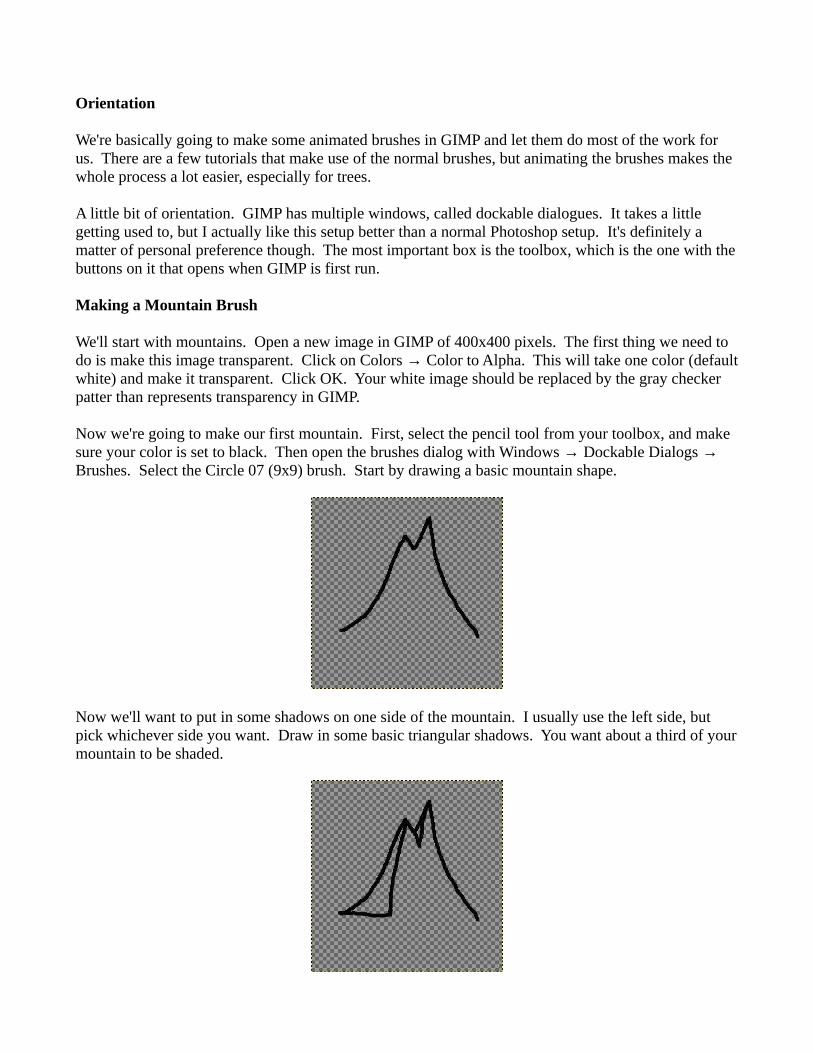
Now we're going to make our first mountain. First, select the pencil tool from your toolbox, and make sure your color is set to black. Then open the brushes dialog with Windows → Dockable Dialogs → Brushes. Select the Circle 07 (9x9) brush. Start by drawing a basic mountain shape.
Now we'll want to put in some shadows on one side of the mountain. I usually use the left side, but pick whichever side you want. Draw in some basic triangular shadows. You want about a third of your mountain to be shaded.

Now, we want our mountain to be opaque, so we'll fill in the actual mountain with white. Click the arrows to the top right of the color palette on the toolbox to switch your active color to white, and draw in a white line to seal off the rest of your mountain.
We want to fill in those areas, so pick the bucket fill tool from the toolbox and fill in your white side.
Switch your active color back to black and do the same on the black side.
Finally, switch back to your paintbrush tool and add a few lines at the base of the mountain. This will help ground the piece once it's put in the final map.

Our first mountain is done! You can, of course, make your mountain much more complex, but try not to make it too distinctive. We want all of our mountains to look pretty similar.
Our next step is to make more mountains. However, we need to make them all on the same image. To do this, we'll need to use layers. Layers are like pieces of glass placed over your base image upon which you can paint other things. You can make certain layers visible or invisible as needed. To add a layer, open the layers dialog with Windows → Dockable Dialogues → Layers. Click on the new layer button at the bottom left of the Layers dialog. Name the new layer Mountain 2, and set the radio button to transparency, so it will make a transparent layer. You should see your new layer appear in the Layers dialog. Because the new layer is transparent, you can still see your old mountain. To fix that, click on the eye icon to the left of your first layer (named Background). Now, you should once again have a completely transparent image. Use this layer to make another, slightly different but same sized mountain. Make sure that the Mountain 2 layer is highlighted – if you don't see anything happen when you're drawing on the image, you have probably highlighted (and are drawing on) the invisible first layer.
This is my second mountain. It's different, but not too distinctive.
Now, repeat the previous step about 7 or 8 times, naming subsequent layers Mountain 3, Mountain 4, etc. These simple mountains should only take a few seconds to draw once you get the hang of it. Remember to make each mountain the same size and style, and make sure you throw in a few simple, one peak mountains.
Once you've got 8 or 9 mountains, we're ready to save it. Click on Save As and navigate to your brushes folder. This should be in your main GIMP directory (in Linux, this is ~/gimp-x.x/brushes by default). Save it as Mountains Tall.gih (gih is the GIMP animated brush extension). This will bring up

another save dialog. Spacing (percent) is how far you will have to move the mouse before another image appears, relative to the size of the brush. Set this to 50. Description is the name your brush will have in the brush dialog. I'll name mine Mountains (Tall). Cell size, number of cells, and dimension are inherited from your image and shouldn't be changed. Rank determines how many images through which you wish your brush to cycle. Set this to the number of mountains you drew. Leave the option to random – this means it will randomly select one mountain each time it draws one. Click save.
Now, let's try out our new brush. Create a new image 2000 x 2000 pixels. Your brushes dialog should already be open – if not, reopen it. There is a refresh button in the bottom right corner of the dialog. This button forces GIMP to recheck its brushes folder for more brushes. Click it. If you scroll through the available brushes, you should now see one that looks like your first mountain, named Mountains (Tall). Choose this brush. If you drag the brush across your new canvas, it should create a row of spaced, random mountains. If you play around with it a while you'll see that it works best if you start at the top of the canvas and go down. If you go the other way it looks wonky.
Making a Hill Brush
Now, those mountains look a bit out of place just rising up out of nothing. Our next brush will be a set of lower mountains or hills. Open another 400 x 400 image and set the background to transparent. We'll use the same technique we used on the mountains, except this time we'll make lower, rounder ones. Make sure you use the same brush at the same scale to draw these hills – otherwise your final map will look off balance. Also remember that only about 1/3 of your hill should be in shadow. Here's a picture of the first one I made.

Repeat the procedures above and make 8 or 9 hills as well. Save it in the same manner as your mountains brush, but name it Mountains (Short) instead. Test this one out too, and see how you like it. Remember to refresh the brushes so you can see it in the brush dialog. If you don't like any of the mountains, just go back, erase the offending layer, make a new mountain, and save it again.
Making a Tree Brush
Now that we've got mountains down, the next step is trees. Create a new 200x350 pixel image, make it transparent, and draw a blobby little tree in it. Make sure you use the same brush and scale you used for your previous two brushes. Add the little ground lines around the trunk, but not around the leaves. My first tree looks like this.
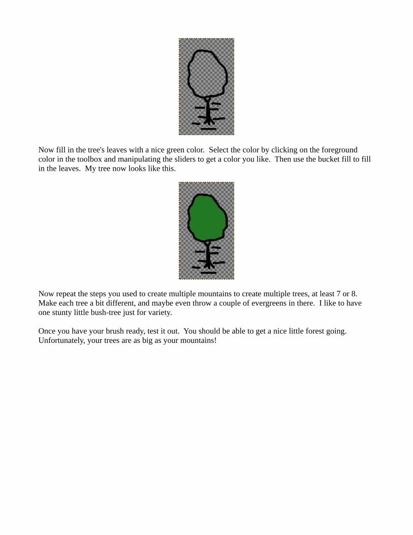
Now fill in the tree's leaves with a nice green color. Select the color by clicking on the foreground color in the toolbox and manipulating the sliders to get a color you like. Then use the bucket fill to fill in the leaves. My tree now looks like this.
Now repeat the steps you used to create multiple mountains to create multiple trees, at least 7 or 8. Make each tree a bit different, and maybe even throw a couple of evergreens in there. I like to have one stunty little bush-tree just for variety.
Once you have your brush ready, test it out. You should be able to get a nice little forest going. Unfortunately, your trees are as big as your mountains!

To fix this problem, we're going to change the scale of the brush. You can undo your previous brushstrokes and change the scale using the scale slide bar of the pencil tool, which should be docked under your toolbox. Change the scale down to about 25 and try again.
That looks much better.
Making a House Brush
Now, we're almost ready to make a map. The only other thing we need to make is a house brush so that our towns are nice and iconic. We'll make two different houses for now. Houses don't work too well as animated brushes due to their arrangement, so we'll make these into normal brushes. Start with a 300x300 px canvas, make it transparent, and draw you a little boxy house. Mine looks like this.

Save this in the same directory as your other brushes as House1.gbr. The .gbr extension is for normal (non-animated) GIMP brushes. Set the spacing to 50, but we'll not really be using this brush in strokes like the others. Repeat the process to make another house, facing the other direction. Mine looks like this.
Using Brushes to Make a Map
Now we can make a map! Start with a brand new, white background 2000x2000 pixel image. The first thing we're going to do is sketch out our map. Using a pencil with a normal round brush, put in some mountains, change your brush color to blue and stick in a lake, make some roads, and stick some towns in there. Use the spraycan tool to indicate where you want forests. It will look terrible, but this is just our template. Here's mine.

Pretty horrible, huh? But it gives an idea where we're going to place things. The first thing I like to place are the mountains. Start by creating a new, transparent layer. Name it Mountains. Make sure it's selected, and then pick your mountains brush. Use the scale slider to pick the size you want your mountains, then start filling them in, using your sketch as a template. Remember that you want to put low mountains around your high mountains. Start with the mountains that will be at the top of the image and work your way down. You may need to switch between your two mountain brushes, depending on the configuration you chose. Here's a bit of step-by-step for my map.

Next we'll put in the rivers. Make a Rivers transparent layer and draw on it with a normal round brush, using a blue color. Trace your previous river lines, paying attention now to where you've placed your hills and mountains. Remember, water flows downhill.

Roads come next. Make a Roads transparent layer and draw some black roads over your sketch. Make sure they're fairly wide.
Now go to Select->Select by Color and choose one of your black lines. Little moving selection lines should show up around every like you just make. Now go to Select → Shrink... and choose 3 pixels. This will make the selected area shrink by 3 pixels from every edge. Now choose the bucket fill tool and fill in all of the selected areas with white. This will make your roads nice, parallel lines with an organic hand drawn feel.
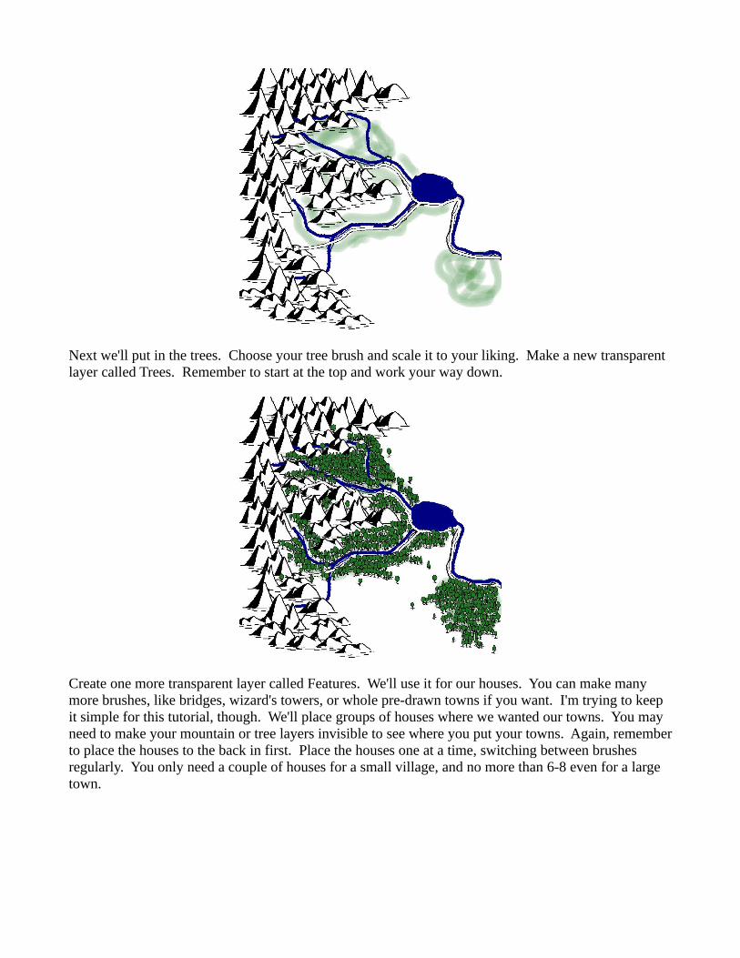
Next we'll put in the trees. Choose your tree brush and scale it to your liking. Make a new transparent layer called Trees. Remember to start at the top and work your way down.
Create one more transparent layer called Features. We'll use it for our houses. You can make many more brushes, like bridges, wizard's towers, or whole pre-drawn towns if you want. I'm trying to keep it simple for this tutorial, though. We'll place groups of houses where we wanted our towns. You may need to make your mountain or tree layers invisible to see where you put your towns. Again, remember to place the houses to the back in first. Place the houses one at a time, switching between brushes regularly. You only need a couple of houses for a small village, and no more than 6-8 even for a large town.

Now that our sketch has been converted, go back to the background layer, make sure your background color is set to white, and hit Ctrl-A and then Del to delete it. Now we can see our map in all its splendor.

Placing Decorative Text
Ok, it's not all that splendorous yet. We can't even tell the name of those quaint little mountain towns! It needs some text. Select the text tool (it looks like a big A). Pick a font from the drop down menu and make sure your active color is set to black. Then click anywhere on the canvas and type the name of one of your towns. If it is too small or too large, you can change the font size in the text toolbox area. Now select the path tool. It looks like a caligraphy pen with a strange shape to its left. Using this tool, click once on either side of the town you want to label. This should produce a thin line, a path, across the town. Now click on the middle of the path and pull up. You should see the path bend into a curve. Try to get this curve to be where you would like the text to appear near your town.
Once your curve is acceptable, select Layer → Text along Path. This will cause the path you made to contort into the shape of the name you just typed. If the name is too short for the path, it will be scrunched over on the left side of the curve you created. If the name is too long for the path, it will shoot off wildly into the upper left corner at the end. Undo and remake the path until it looks like you want it.
Once your path looks right, click on Select → From Path. This will change the path you made into a selected area. Now make a new transparent layer called Text. Make sure that Text is stacked on top of all the other layers (using the blue arrows at the bottom of the Layers dialog). Now pick the pencil tool, a normal brush, and color in the selected area with black. The area that is not selected is masked, so you will only color in the letters.
Repeat this step for all your other features – towns, roads, mountain ranges, etc. You won't be able to read the labels very well just yet – we'll fix that in our next step. When you're done, go back and delete all the text objects you made – they'll be listed as layers and you can delete them by highlighting them and hitting the trash can button at the lower right of the layers dialog. My map now looks like this.

Not too helpful, huh? We can't read our labels around all the other junk. To fix that, we'll need another layer. Create another transparent layer named Text Background. Use the blue arrows to place it directly under Text (which should be at the top of the list). Now select the Text layer and click Select → Select by Color and pick the black color from any one of your labels, which should highlight all of your text. Now click Select → Grow and pick 10 pixels. Your selection should expand. Finally, select the Text Background layer and pick your pencil with white as the active color. Color in all the selected areas. Since the Text Background layer is under the Text layer, the Text remains, but everything under it is hidden by the white masking. Now you can read the text as well as the font allows. I like using a pretty but somewhat illegible font with this kind of map because it seems to fit. If I were making a map that was geared more towards legibility I would use a nice copperplate, and probably not curve them around the towns as they are now.

Coloring your Map
Now we've got our basic map! The next step is to color it to our liking. Once you find the colors you like the best, you can just color your brushes and simplify this step. I'm going to start by coloring my mountains gray. Go to the mountains layer, use Select → Select by Color to select all the white on the layer. Then use the pencil tool, selecting a nice gray as the active color, and color in all the selected areas.
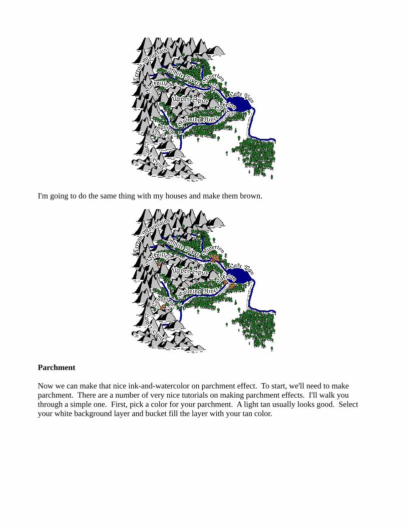
I'm going to do the same thing with my houses and make them brown.
Parchment
Now we can make that nice ink-and-watercolor on parchment effect. To start, we'll need to make parchment. There are a number of very nice tutorials on making parchment effects. I'll walk you through a simple one. First, pick a color for your parchment. A light tan usually looks good. Select your white background layer and bucket fill the layer with your tan color.

Now make a new layer and name it Texture. You should position this layer so it is under everything except the background layer using the blue arrows. Now, select Filters → Render → Clouds → Plasma... This will fill the layer with a randomly generated colored cloud. Make sure to put in some random seed (or all your parchment will look the same). Also, you'll have to fiddle around with the turbulence to find a value you like. I like 5. Once you've got your settings in, click OK.
Psychedelic! We don't need all those colors in our sober parchment map, though. Keeping the Texture layer selected, click on Colors → Colorize. All those colors should change to blue. Now find the Saturation slider in the middle and pull it all the way to the left. This will take out all the color in the layer. Now click OK.

For our final step, go back to the Layers dialog and find the pull-down menu labeled mode at the top. Right now it should say normal. Change it to grain extract, which will transfer the negative of the light-dark contrast to the underlying colored background. Now it looks like we've got some aged parchment. If the contrast of your parchment is too much for you, select the Texture layer and move the opacity slider in the Layers dialog until you're happy. I like around 50%.
Watercolor Effect
At this point it's a good idea to save your progress. We'll be merging layers and destroying information in this next step, and if you feel like you might want to go back and tweak things, now is the time to save. Save the file as a .xcf, the default GIMP project file extension. This will preserve your carefully crafted layers in all their glory.
Now, we're going to start merging layers. This basically combines two layers on top of one another. First select your top layer (this should be the Text layer). Right click on the layer and choose Merge

Down. Your image shouldn't change, but now the Text layer and Text Background layers are combined into one. Repeat this process until everything has merged down to your mountains layer. You should now have three layers in your picture – Mountains, Texture, and Background.
We'll now wash out the bright colors of our image so that the texture of the parchment can show through. With the Mountains layer still selected, use Select by Color to select everything green. Now pick the eraser tool (looks like a big eraser). Select a large, round brush and increase the scale to its maximum. Finally, change the opacity to 75%. This will replace most of the green with transparency, but leave a tinge behind. Go over all the selected images in one stroke (coloring across the image). If you use multiple strokes, you'll change the color more in some places than others. If you like that effect, go for it. I don't. Here's what mine looks like after that process.
I'm now going to repeat the same process with the mountains, rivers, and houses. I use a 50% opacity on these. I'm going to do the same thing with the white color, except I'll erase it completely (100% opacity) so that we just see the parchment background.

Finally, you'll probably want to put in title, compass rose / north arrow, and any other sundries. If the map is being used as a handout for an RPG, however, it may or may not have such extravagances... Anyway, I opted for a north arrow and no title on this one. Here's the finished product.
Further Applications
Spending a bit more time on the map will make it look a lot better. For example, spending a couple of minutes drawing a river winding through the mountains, (or just using multiple mountain layers to achieve the same effect) really improves the look of a map.
You can make brushes for anything you want. Just tune their randomness and spacing as desired. For example, sand dunes for a desert should be painted with a high spacing. The nicer your brush images look, the better your final map will be.
I like using this technique to make a purely black and white image, print it out, and then age it in the dregs of a cup of tea to use as a handout for my games. Similarly, making a black and transparent image, putting it over parchment, and then painting in the watercolors between the black and the background makes for a more realistic “watercolored” look. Experiment, and happy mapmaking!