fifa history
TRANSCRIPT


THE FIFA WORLD CUP: A GRAPHIC HISTORY


The World Cup has become one of the most anticipated and celebrated
sporting competitions on the planet, watched by about half of the world’s
population. Countries spend years and billions of dollars preparing to
compete—not to mention hosting the Cup. Brazil spent $14 billion this year.
Clearly, this is a branding success story of phenomenal proportions.
How has the World Cup brand evolved over time?
Every four years, FIFA selects a host nation and they design the event in their
vision, revealing not just how the host country views itself, but how our world
has changed—and design along with it. Believe it or not, the World Cup had no
logo until the 1950s; by 2014, the logo was created with animation in mind
demonstrating the kinetic nature of brands today. What stories do these
graphic identities tell about their moments in time and our shared global
experience? We reached back in branding history to find out.


2014 BRAZIL The logo is titled “Inspiration.” Its colors symbolize the ecology of the host nation; tropics (green) and
beaches (gold). They are also colors of the Brazilian flag. The five fingers can represent Brazil’s five World Cup
victories. Three hands are raised to form the trophy and animate together for interstitial broadcast elements.
The hands are meant to welcome everyone to the tournament but also evoke cheering and coming together
of people. This is the first World Cup logo designed with kinetics in mind. The official poster was presented
conceptually by Brazilian agency Crama as “an entire country at football’s
service—Brazil and football: one shared identity.”
TOURNAMENT BALL POSTER LOGO MASCOT
Brazuca Karen Haidinger Africa Agency Fuleco
Crama


2010 SOUTH AFRICA The slogan for the 2010 World Cup was “Ke Nako. Celebrate Africa's Humanity.” The graphic identity
features a black silhouette of a bicycle kick with African colors throughout. Ke Nako simply means 'it's
time.' And indeed Africa's time had come to use the 2010 FIFA World Cup to change perceptions of Africa
and reposition the continent in a positive light with South Africa as the theatre and Africa the stage.
Having successfully campaigned for South Africa to be granted host status, an emotional
Nelson Mandela raised the FIFA World Cup Trophy.
TOURNAMENT BALL POSTER LOGO MASCOT
Jabulani Paul Dale Gaby de Abreu Zakumi
Switch Design Switch Design


2006 GERMANY The slogan “time to make friends” is articulated graphically in an identity portraying emotions of
joy and exuberance. Two of the faces are formed from a “06.” The theme reflects our increasingly
connected planet and embodies the higher aspirations of the game to bring people together.
TOURNAMENT BALL POSTER LOGO MASCOT
Teamgeist WE DO Communication Whitestone Agency Goleo VI/Sidekick Pille


2002 JAPAN/KOREA Contemporary graphic articulation of the World Cup trophy itself evokes multiple meanings; unity
between host nations, forward movement, the literal inbounding of a ball. The poster evokes all of
these themes with the additional urgency of Asian calligraphic brush strokes. The 2002 symbol makes
appearances in 2006 and 2010.
TOURNAMENT BALL POSTER LOGO MASCOT
Fevernova Byun Choo Suk/Hirano Sogen Interbrand Ato/Kaz/Nik
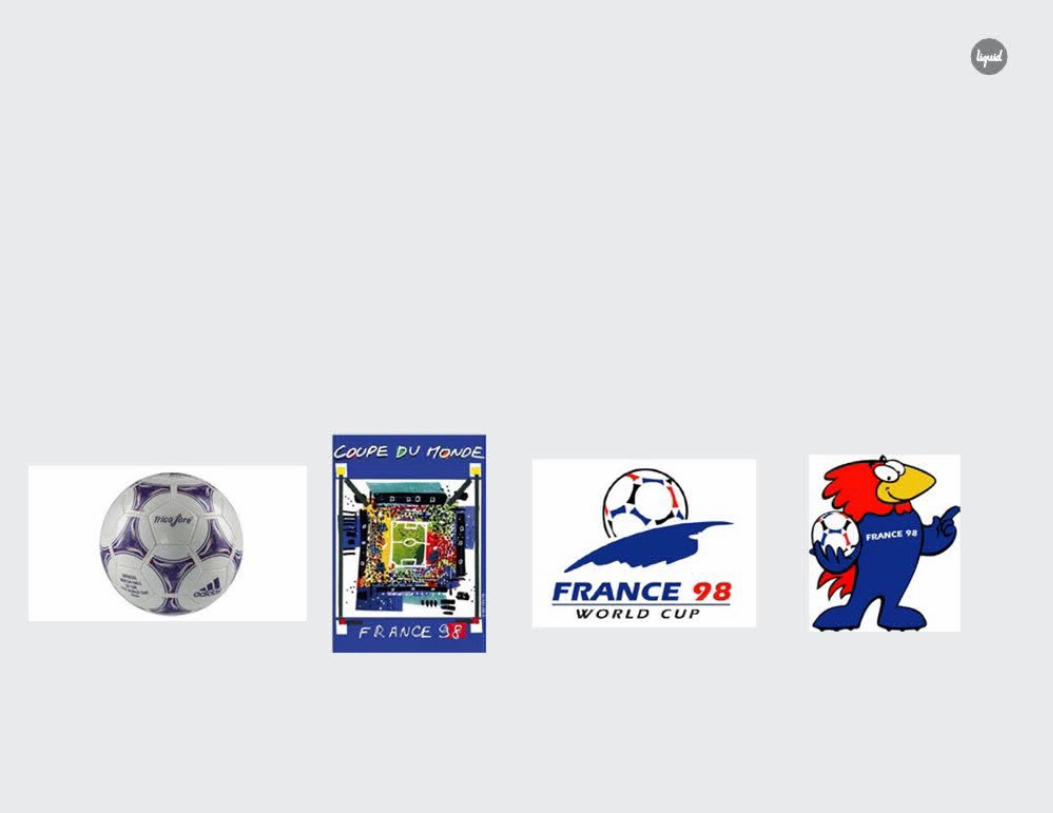

1998 FRANCE This logo is rendered in French national colors and shows the football rising over the France on the
Earth’s horizon as if it is the sun. The poster is more gestural and celebratory, suggesting the festive
blending together of many nations and football fans.
TOURNAMENT BALL POSTER LOGO MASCOT
Tricolore Natalie le Gall ADSA Company Footix


1994 UNITED STATES This bold, graphic logo represents both the host nation and the movement and energy of the sport
simultaneously. The poster is a more emotional evocation of the spirit and joy of football. The selection of
Pentagram for the logo and Peter Max for the poster demonstrates clear strategic communications
planning: graphically targeting both the heart and mind.
TOURNAMENT BALL POSTER LOGO MASCOT
Questra Peter Max Pentagram Striker


1990 ITALY The logo utilizes the colors of the Italian flag in relation to custom stencil typography to create an implied
three dimensional graphic field. Italian painter and sculptor Alberto Burri connects modern sport to the
heritage of the Roman Coliseum.
TOURNAMENT BALL POSTER LOGO MASCOT
Etrusco Alberto Burri Artist Unknown Ciao


1986 MEXICO The mark visualizes “the world united by ball" slogan by featuring both sides of the globe. The inline
Typography references the famous Lance Wyman 1968 Olympic identity, as well as the 1970 World Cup
typography, also both hosted by Mexico. Although the articulation is different, Wyman’s seminal work
cannot be ignored. The poster features a compelling photographic interplay between Aztec architectural
heritage and contemporary human forms by Annie Liebovitz, the first woman commissioned to create a
poster in the series.
TOURNAMENT BALL POSTER LOGO MASCOT
Azteca Annie Leibovitz Artist Unknown Pique

THE WORLD CUP: A GRAPHIC HISTORY
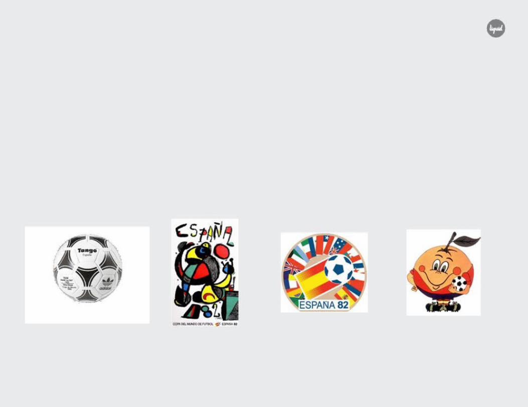
1982 SPAIN The central portion of the logo is simplified into two fundamental elements: the Spanish flag and a
football. This communicates with no letters and was pulled out as a signature in the poster. The full
version of the logo is a celebration of the flags of participating nations. The poster, created by national
treasure Joan Miró, depicts a celebratory somersault filled with Spanish colors and the declarative
statement of home “España!”
TOURNAMENT BALL POSTER LOGO MASCOT
Tango España Joan Miró Artist Unknown Naranjito


1978 ARGENTINA The logo contains a simple graphic football depicted within vertical striping in the colors of the host
nation which can represent a jersey, goal, or cupped hands. The poster utilizes a stylized halftone
screen capturing a both an emotional game moment and the media of the era.
TOURNAMENT BALL POSTER LOGO MASCOT
Tango Mandatos Internacionales Agency Artist Unknown Gauchito
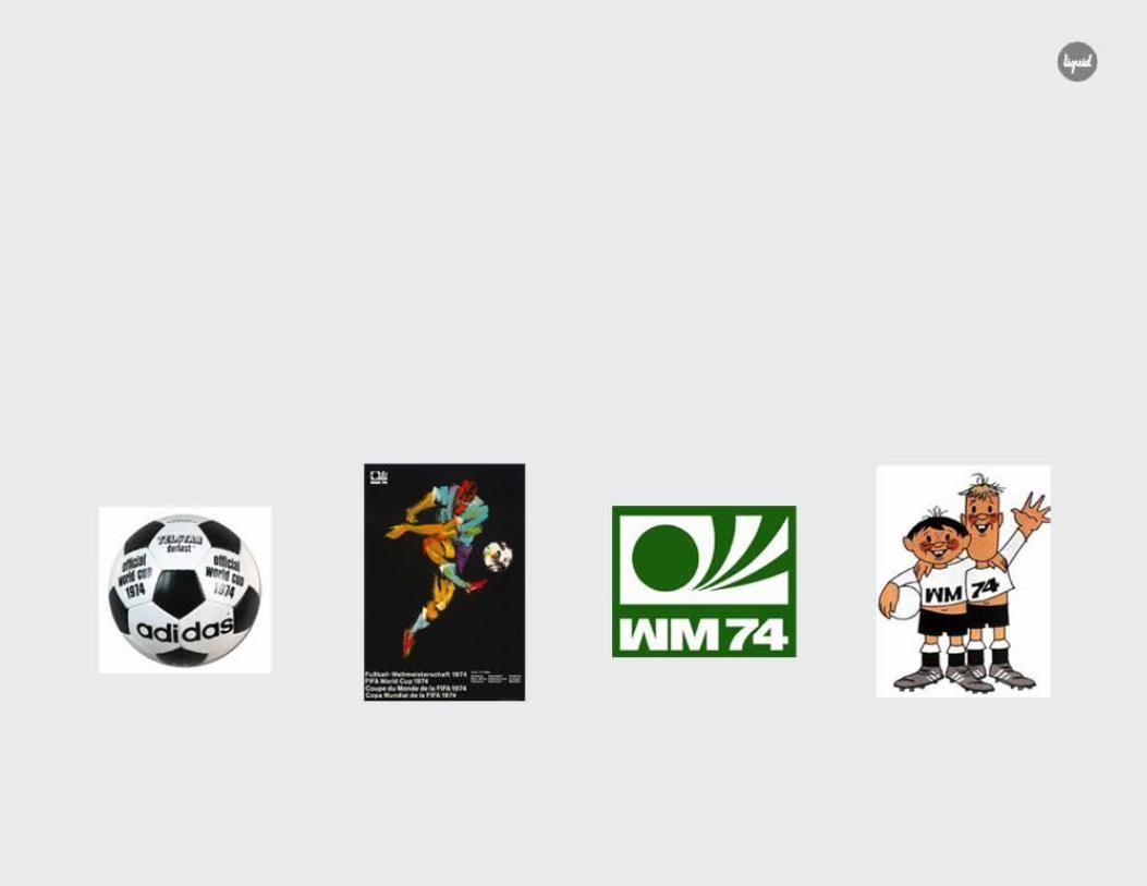

1974 WEST GERMANY The logo is very much a product of minimalist industrial age graphic design. The bold, simple forms are
evocative of a ball, the point of contact, motion, the shape of a goal. WM is short for Weltmeisterschaft
which means World Cup in German. The explicit need for a global kind of inclusiveness is evident in the
mark, however, when contextualized on other elements such as the textural poster, multicultural globalism
comes through.
TOURNAMENT BALL POSTER LOGO MASCOT
Durlast Fritz Genkinger Artist Unknown Tip/Tap


1970 MEXICO The logo and the poster are embodiments of simplicity. They both utilize simple positive and negative
forms to graphically depict a football. The inline typography was clearly an extension of Lance Wyman’s
1968 Olympic identity, which has been hailed as a pinnacle of branding and wayfinding. Taken together, the
1968 Olympics and 1970 World Cup branded Mexico itself. The bold use of color is not directly
related to host nation's national colors, however, it could be thought of as an exemplification of the
richness of color in the country itself. Brazil takes home the Jules Rimet trophy permanently.
TOURNAMENT BALL POSTER LOGO MASCOT
Telstar Lance Wyman Lance Wyman Juanito
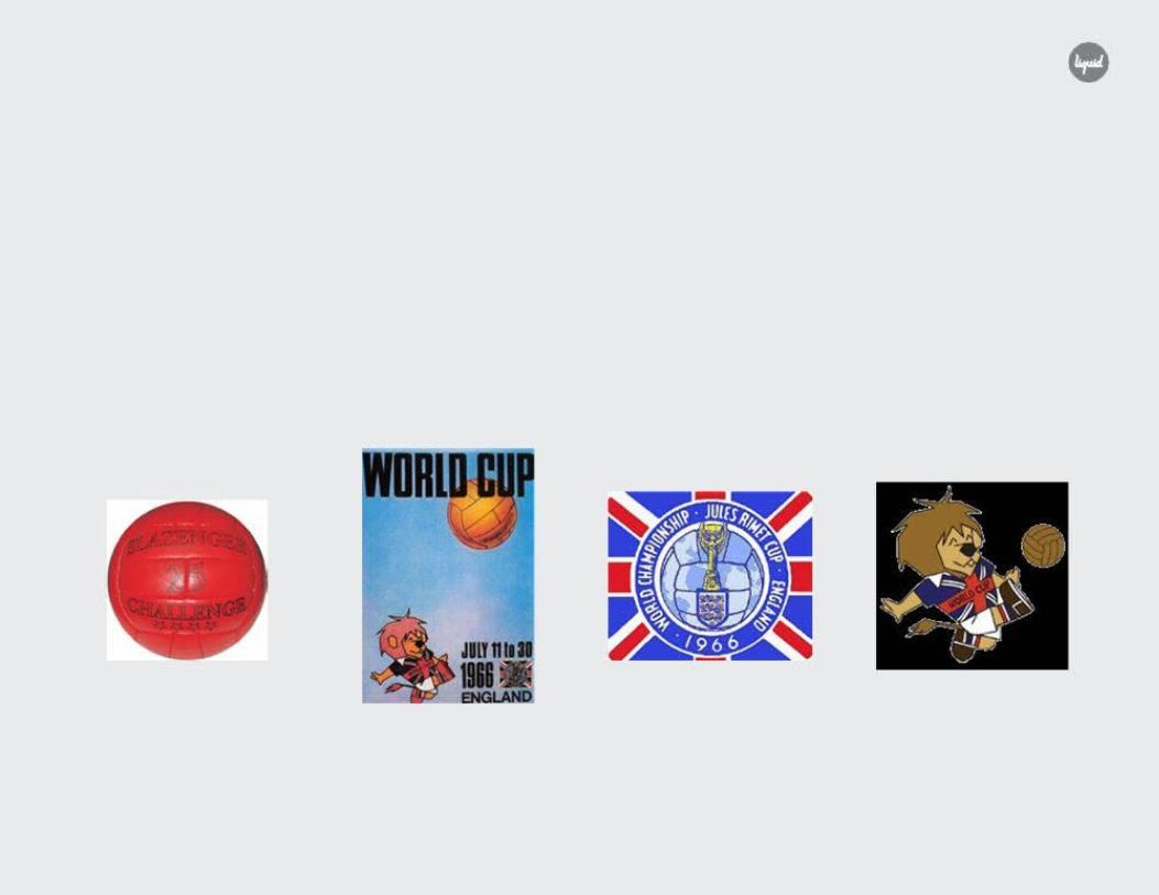

1966 ENGLAND A literal depiction of the world superimposed upon a soccer ball with Jules Rimet trophy and an English
coat of arms in the foreground. Everything is symmetrically aligned within the iconic British flag design.
Includes name of cup. Poster playfully features “Willie,” the 1966 mascot playfully booting the football
into the sky.
TOURNAMENT BALL POSTER LOGO MASCOT
Slazenger Ball Carvosso Artist Unknown Willie


1962 CHILE The logo positions Chile's national flag on the ground within a stadium, symbolizing that the World Cup is
taking place on their ground. Behind the stadium is both a globe and football. In the poster the earth and a
football are conjoined in space. The globe is turned to reveal Chile highlighted in red with the ball is perhaps
headed that direction. Translation: Football World Championship.
TOURNAMENT BALL POSTER LOGO
The Crack Galvarino Ponce Artist Unknown

1958 SWEDEN VM is an abbreviation for Varldsmasterskapet, Swedish for “World Championship.” Although it is referred to
as a “logo,” the illustration is hardly what we think of as a trademark today. Regardless, the expression of the
World Cup brand shines through very clearly: A celebration of global community through
competitive football.
TOURNAMENT BALL POSTER LOGO
Top Star Saul Bass Saul Bass


1954 SWITZERLAND The trademark is a bi-product of its era: Simple, utilitarian, and official. This is Swiss design following
Modernism in the industrial revolution. The text translates to “World Football Championship” in three
languages: French, German, and Italian—the three languages most closely related to Switzerland.
The poster captures the game’s penultimate moment: The goal. It does not utilize the trademark.
TOURNAMENT BALL POSTER LOGO
Swiss Zig-Zag Paul Werner Weisskönig Artist Unknown

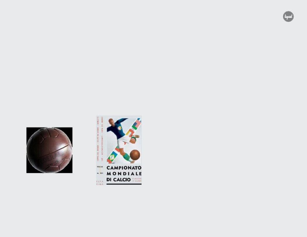
1950 BRAZIL A return to friendly competition after the horrors of World War II. Although this was the first competition to
use an actual logo, it was still very poster-like. In fact, it’s hard at first glance to tell the difference. The
“logo” incorporates Brazil’s national colors into the design, while the poster brings the flags of
participating nations into the illustration, literally on the leg of the footballer.
TOURNAMENT BALL POSTER LOGO
Tossolini Superball J. Ney Artist Unknown


1938 FRANCE A powerful articulation of confidence: A victorious figure with the world is at his feet. There may also be
some pre-WWII posturing here. The poster embodies many characteristics of Modernism from the
condensed, decorative typography to a graphical embodiment of Romanticism and a recapitulation of
Expressionism in color.
TOURNAMENT BALL POSTER
French Allen Henri Desmé

1934 ITALY Deco-era sans serif typography anchors a strong symmetrical illustration featuring an Italian player with
white and green socks crossed by the flags of competing countries. Prefiguring (or perhaps informing)
Hitler’s use of the Olympics to promote his Nazi agenda, Mussolini used the World Cup to promote
fascism with propaganda and media control.
TOURNAMENT BALL POSTER
Federale Gino Boccasile


1930 URUGUAY Guillermo Laborde’s poster for the inaugural World Cup is an elegant expression of Art Deco design.
The outstretched arms of the goalie have caught the ball at the pinnacle of the goal frame. He is dressed in
Uruguay's national colors. In contrast to the typography in 1934’s poster, the type here is on the more
decorative side of Deco.
TOURNAMENT BALL POSTER
T-Model Guillermo Laborde


USA
San Jose448 S Market StreetSan Jose, CA 95113
San Francisco251 Rhode Island Street, Ste 204 San Francisco, CA 94103
Portland910 NW Hoyt StreetPortland, OR 97209
New York85 Delancey Street, Third Floor New York, NY 10002
EUROPE LATAM
England Chile20-22 High Street Luis Pasteur 5280Ruddington OF. 203Nottingham NG11 6EH Vitacura
Santiago de Chile


Thank You