film magazine double page spread research
TRANSCRIPT

Film Magazine Double Page Spread Research

The main details of the film are at the very beginning of the double page spread; with the age rating being near the title of the article which reads ’Spider man 2.’ We expect this to be at the start of the review as it tells the reader straight away what they’re going to be reading, and they can determine whether or not they would be interested in the review.
The piece has a very clear colour scheme that
matches that of the film. The write has stuck to a
blue and red theme, matching the suit that
Spider-man wears. This is something fans would catch onto and would
appreciate as it’s something they would associate the franchise
with. It could also be argued that this colour
scheme can help to show the genre of the film, with
blue and red being quite conventional for the
action genre.
The double page spread also includes one main image; depicting the main character of the film, showing him in a heroic stance. Spider-man is certainly the direct selling point of the article, and film fans wouldn’t want to see any of the smaller characters in the main image. More invested fans would want to see details regarding his costume changes and the graphic changes of the film. It would be something that is fairly important for them. Spider-man is also creating a sense of direct mode of address to the audience, looking towards the audience. This would draw readers into the article and make them want to read more about it.
This double page spread also includes a film rating system; and they have included the more conventional 5 star rating system often seen in regards to film. Readers of the magazine most probably expect to see this within film reviews and it can help people to decide whether or not they want to see the film, depending on professional opinion.
The double page spread also contains a buzz word at the side;
including ‘film of the month’ above the
main image. This tells the reader how well
this film is expected to do and how well it has
been doing so far.
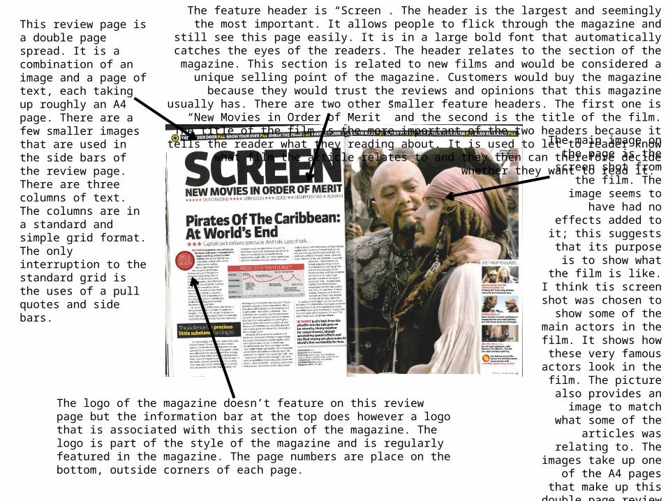
This review page is a double page spread. It is a combination of an image and a page of text, each taking up roughly an A4 page. There are a few smaller images that are used in the side bars of the review page. There are three columns of text. The columns are in a standard and simple grid format. The only interruption to the standard grid is the uses of a pull quotes and side bars.
The feature header is “Screen”. The header is the largest and seemingly the most important. It allows people to flick through the magazine and still see this page easily. It is in a large bold font that automatically catches
the eyes of the readers. The header relates to the section of the magazine. This section is related to new films and would be considered a unique selling point of the magazine. Customers would buy the magazine
because they would trust the reviews and opinions that this magazine usually has. There are two other smaller feature headers. The first one is “New Movies in Order of Merit” and the second is the title of the
film. The title of the film is the more important of the two headers because it tells the reader what they reading about. It is used to let to reader know what film the article relates to and they then can therefore
decide whether they want to read it.
The main image on the page is the screen shot
from the film. The image seems to have had no
effects added to it; this suggests that its purpose
is to show what the film is like. I think tis screen shot was chosen to show some
of the main actors in the film. It shows how these
very famous actors look in the film. The picture also
provides an image to match what some of the
articles was relating to. The images take up one of
the A4 pages that make up this double page
review spread. I think that the size of this image
indicates that it is quite important to the spread. It
also means that it is very relevant to the article.
The logo of the magazine doesn’t feature on this review page but the information bar at the top does however a logo that is associated with this section of the magazine. The logo is part of the style of the magazine and is regularly featured in the magazine. The page numbers are place on the bottom, outside corners of each page.
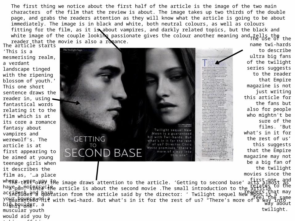
The first thing we notice about the first half of the article is the image of the two main characters of the film that the review is about. The image takes up two thirds of the double page, and grabs the readers attention as they will know what the article is going to be about immediately. The image is in black and white, both neutral colours, as well as colours fitting for the film, as it is about vampires, and darkly related topics, but the black and white image of the couple looking passionate gives the colour another meaning and tells the reader that the movie is also a romance.
The text over the image draws attention to the article. ‘Getting to second base’ acts almost as a pun, since the article is about the second movie .The small introduction to the article includes a quotation from the article said by the director: ‘ Twilight sequel New Moon is a guaranteed hit with twi-hard. But what’s in it for the rest of us? “There’s more of a way into this one”
The article starts ‘This is a mesmerising realm, a verdant landscape tinged with the ripening blossom of youth.’ This one short sentence draws the reader in, using fantastical words relating it to the film which is at its core a romance fantasy about vampires and werewolf's. The article is at first appearing to be aimed at young teenage girls when it describes the film as, ‘…a place where, were you to have a motorcycle accident and bash your bounce on a big boulder, a muscular youth would aid you by taking off his shirt.’
The use of the name twi-hards to describe
ultra big fans of the twilight series suggests
to the reader that Empire magazine is not just writing this article
for the fans but also for people who mightn't be sure of the films.
‘But what’s in it for the rest of us’ this suggests
that the Empire magazine may not be a
big fan of the twilight movies since the first
one, and relates to the readers that may feel the same way about
twilight.