final evaluation 123
TRANSCRIPT

8/6/2019 Final Evaluation 123
http://slidepdf.com/reader/full/final-evaluation-123 1/7
In what ways does your media product use, develop or challenge forms and
conventions of real media products?
Main product
When trying to create my own horror trailer, I was very aware that there are certain powerful conventions and media techniques applied specifically to the horror genre.
Through my research into similar products I gained clear understandings of what
these conventions are as well as how and why they are applied. I felt it was important
to include as many of these convention in our own original trailer to give it
authenticity and also make it instantly identifiable to the audience as being within the
horror genre.
In many of the horror trailers we looked at, we found that a strong sense of
equilibrium was present, such as in the Gothika trailer where in the opening section
we see her contented and happy in her career. This was also seen in the hide and seek
trailer were we see the father setting up home with his daughter to start a new life. In
this trailer in particular the equilibrium at the beginning was exaggerated with over saturation of colours and fade to whites used to cut the scenes together. We applied
this to our own trailer. In the opening sequences all the colours are over saturated.
Bright colours have a connotation of
happiness and enjoyment, it also makes to
character of Katie appear rosier cheeked,
which has a connotation of childhood
innocence. The effect this has on the
audience is that they empathise with the
character and see her in completely
positive way and therefore don’t want
anything bad to happen to her.
We use many close ups in the
trailer as they are very conventional of the horror genre, they are used because they
are a brilliant way of showing emotion especially fear.
In these opening sequences we applied
conventional mise-en-scene to create equilibrium.
In the opening to the hide and seek trailer we
analysed, the little girls starts of in a floral
pyjamas, flowers connote femininity and in turn
connote innocence and vulnerability. In our
original trailer we have followed this convention;Katie is wearing a long floral dress. A long
flowing dress only adds to the feminine
connotations of the flowers and the effect of this is
that the audience view her as a vulnerable
character. The vulnerable victim character is a
strong convention of the horror genre. In all of the
films we looked at, trees played an important role
in the setting as they can be both beautiful and
scary, for this reason we chose to film at a nature
reserve and attempt to pass it of as the woods.
This means that we can change the feel of the piece very quickly, for example in the beginning the saturated colour of the trees makes them appear very lush and beautiful,

8/6/2019 Final Evaluation 123
http://slidepdf.com/reader/full/final-evaluation-123 2/7
however when the mood changes the trees are darker and in stronger contrast to make
them appear more horrific.
When we are first introduced to the little girl character it was important that
the audience are aware that she is evil, but also it needs to be believable that Katie
would see her as innocent. Possessed or demonised children are common and
conventional in the horror genre. We achieved this through a combination of soundand camerawork. A close up of the little girls face is used, this shows her emotions
and shows that she is sad, the light
behind her head creates a halo effect
and her white costume connotes
innocence and it becomes believable
that Katie’s character would take pity
on her. However, this is contrasted by
the use of sounds, we used a
conventional suspense/evil non-
diagetic noise to create suspicion and
tension in the audiences mind andmake it clear that this is the turning
point in the film and that whatever the disequilibrium is, it is as a result of this strange
little girl.
Another close up is used when the two reach out to hold hands, when they
touch, the colour drains and goes into black and white, symbolic of life being drained
out, this confirms for the audience that the tone and mood of the trailer are about to
drastically change.
I also use conventional make up in the trailer to create horror, in hide and
seek when the little girl turns evil she starts wearing black and thick eye makeup, this
is a recurring convention of the horror
genre and can be seen in many horror
films wear the evil character wears
thick often gothic style make up or
clothes. I followed this convention but
it was not character appropriate for the
little girl in our story to wear proper
make up, instead with has thick lines of
make up running down her face, this
along with her tattered now tarnished
clothing gave her a connotation of being
savage or animalistic.Trailers in the horror genre have
a very specific style of editing, though
our research into similar products I
found that the clips tend to start of quite
long to establish the story, they then get
shorter and shorter until eventually right
at the end they are very short and cut
together very fast, this creates a sense of
action, danger and desperation. In these short cut together clips with see clips of Katie
running, with her dress now slightly tattered, I used a long shot of her running so that
the scare factor of the tall dark tress was present, as well as a tracking shot of her factwhilst running. This gave a blair witch, hand held style. The close up shows the terror

8/6/2019 Final Evaluation 123
http://slidepdf.com/reader/full/final-evaluation-123 3/7
on her face and the hand held style makes the helps the audience put themselves in the
action as it feels as though they are running along next to her.
These scenes are cut quickly cut together with
scenes of the little girl to give the audience and
impression of a chase. I visually edited the footage
to make it more conventional of the horror genre.High contrast and blue tinges are used on all of the
little girl’s clips and this colour scheme almost
becomes her motif. I used a blue tinge as we saw
in the Gothika trailer, blue is a colour that is very
frequently used in the horror genre as it connotes
cold, isolation and terror. I also used a jump cut
on the footage of the girl to make her movements
more fragmented and jolted to make her appear
more of an anomaly, the audience will wonder if
she is even human.
Another convention we found was having black screens with text on, this was used in both Gothika
and Hide and Seek. They are used to ask
the audience questions which help them
engage more in the onscreen action, or to
help the audience understand the premise
of the film. I used these because as well
has helping the audiences understanding
and therefore viewing pleasure they also
help the clips flow from snippet to snippet.
Ancillary tasks
Poster
Film magazine posters have many conventions that are in place to help attract
audience to the film, there are also some more genre specific conventions in place for
horror films.
Conventional colour schemes in horror
film poster tend to favour toward red
blues and blacks, these colours all have
connotations of fear and danger, andlarge black spaces are used to insinuate
the unknown. I used this colour scheme
in my horror film poster and lowered the
saturation of the face to exaggerate the
blueness off the eyes. I wanted to draw
attention to the eyes because the eyes
show fear and identify the genre as
horror. I also increased the grain levels
in the image to make her skin appear
more gritty which connotes a struggle
and suggest she has been in danger.

8/6/2019 Final Evaluation 123
http://slidepdf.com/reader/full/final-evaluation-123 4/7
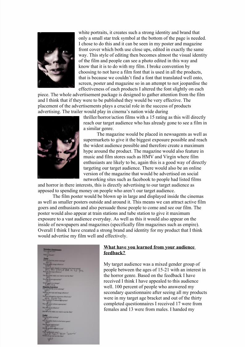
A Strong convention of horror posters is a long shot showing both the victim and the
killer or villain, however a few of the poster I saw had chosen to use close ups of
either the villain or victim. I thought that this was much more effective at identifying
the genre as horror as a close up captures strong emotions that are then easily
deciphered by the audience. In our image we chose to use the victim as when we did
our audience survey, however we did want our villain to be hinted towards so we havethe Childs hands reaching around her face, this has connotations of being trapped or
captured which are strong themes in the horror genre. We used a traditional basic
layout which is conventional of all film posters as not to detract from the image, we
chose a simple white font again so the information was presented clearly without
making the poster to complicated.
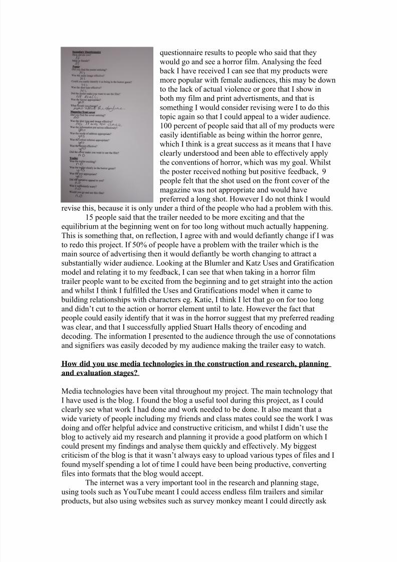
Magazine cover
I chose to stick quite rigidly to the conventions of a
magazine front cover as I think that the traditional
layout and rules in place work well when trying to present information in a simple concise way that
allows the audience to absorb it easily.
My main image is in the primary optical area which
again is a close up, this time of villain. She is
obviously a character that belongs in the horror genre
and so my target audience of horror lovers will be
instantly drawn to it. The text doesn’t cut in to the
image and the page is left hand dominant which
makes the information easier to access and read. I
have used a variety of fonts to create variety on the
page and break up the text into smaller chunks that
are easier for an audience to absorb. The mode of
address on the magazine relates directly to my target audience of young movie goers
and horror enthusiasts.
How effective is the combination of your main product and ancillary texts?
When marketing a film, I think it is important to create a brand Identity as it means
audience can recognise your product much more easily and therefore it is much easier to create a hype around your product. To create a strong brand identity I tried to keep
a sense of continuity between my pieces.
In researching film advertising I found that one of the ways to keep continuity
was to have a series of pictures, all edited in the same way, these pictures could then
be used in a variety of
media products to
advertise the film, this
technique was
employed by the 2009
version of star trek
were all the photoswere gritty black and
8/6/2019 Final Evaluation 123
http://slidepdf.com/reader/full/final-evaluation-123 5/7
white portraits, it creates such a strong identity and brand that
only a small star trek symbol at the bottom of the page is needed.
I chose to do this and it can be seen in my poster and magazine
front cover which both use close ups, edited in exactly the same
way. This style of editing then becomes almost the visual identity
of the film and people can see a photo edited in this way andknow that it is to do with my film. I broke convention by
choosing to not have a film font that is used in all the products,
that is because we couldn’t find a font that translated well onto,
screen, poster and magazine so in an attempt to not jeopardise the
effectiveness of each products I altered the font slightly on each
piece. The whole advertisement package is designed to gather attention from the film
and I think that if they were to be published they would be very effective. The
placement of the advertisements plays a crucial role in the success of products
advertising. The trailer would play in cinema’s nation wide during
thriller/horror/action films with a 15 rating as this will directly
reach our target audience who has already gone to see a film ina similar genre.
The magazine would be placed in newsagents as well as
supermarkets to give it the biggest exposure possible and reach
the widest audience possible and therefore create a maximum
hype around the product. The magazine would also feature in
music and film stores such as HMV and Virgin where film
enthusiasts are likely to be, again this is a good way of directly
targeting our target audience. There would also be an online
version of the magazine that would be advertised on social
networking sites such as facebook to people had listed films
and horror in there interests, this is directly advertising to our target audience as
apposed to spending money on people who aren’t our target audience.
The film poster would be blown up in large and displayed inside the cinemas
as well as smaller posters outside and around it. This means we can attract active film
goers and enthusiasts and also persuade those people to come and see our film. The
poster would also appear at train stations and tube station to give it maximum
exposure to a vast audience everyday. As well as this it would also appear on the
inside of newspapers and magazines (specifically film magazines such as empire).
Overall I think I have created a strong brand and identity for my product that I think
would advertise my film well and effectively.
What have you learned from your audience
feedback?
My target audience was a mixed gender group of
people between the ages of 15-21 with an interest in
the horror genre. Based on the feedback I have
received I think I have appealed to this audience
well. 100 percent of people who answered my
secondary questionnaire after seeing all my products
were in my target age bracket and out of the thirty
completed questionnaires I received 17 were fromfemales and 13 were from males. I handed my
8/6/2019 Final Evaluation 123
http://slidepdf.com/reader/full/final-evaluation-123 6/7
questionnaire results to people who said that they
would go and see a horror film. Analysing the feed
back I have received I can see that my products were
more popular with female audiences, this may be down
to the lack of actual violence or gore that I show in
both my film and print advertisments, and that issomething I would consider revising were I to do this
topic again so that I could appeal to a wider audience.
100 percent of people said that all of my products were
easily identifiable as being within the horror genre,
which I think is a great success as it means that I have
clearly understood and been able to effectively apply
the conventions of horror, which was my goal. Whilst
the poster received nothing but positive feedback, 9
people felt that the shot used on the front cover of the
magazine was not appropriate and would have
preferred a long shot. However I do not think I wouldrevise this, because it is only under a third of the people who had a problem with this.
15 people said that the trailer needed to be more exciting and that the
equilibrium at the beginning went on for too long without much actually happening.
This is something that, on reflection, I agree with and would defiantly change if I was
to redo this project. If 50% of people have a problem with the trailer which is the
main source of advertising then it would defiantly be worth changing to attract a
substantially wider audience. Looking at the Blumler and Katz Uses and Gratification
model and relating it to my feedback, I can see that when taking in a horror film
trailer people want to be excited from the beginning and to get straight into the action
and whilst I think I fulfilled the Uses and Gratifications model when it came to
building relationships with characters eg. Katie, I think I let that go on for too long
and didn’t cut to the action or horror element until to late. However the fact that
people could easily identify that it was in the horror suggest that my preferred reading
was clear, and that I successfully applied Stuart Halls theory of encoding and
decoding. The information I presented to the audience through the use of connotations
and signifiers was easily decoded by my audience making the trailer easy to watch.
How did you use media technologies in the construction and research, planning
and evaluation stages?
Media technologies have been vital throughout my project. The main technology thatI have used is the blog. I found the blog a useful tool during this project, as I could
clearly see what work I had done and work needed to be done. It also meant that a
wide variety of people including my friends and class mates could see the work I was
doing and offer helpful advice and constructive criticism, and whilst I didn’t use the
blog to actively aid my research and planning it provide a good platform on which I
could present my findings and analyse them quickly and effectively. My biggest
criticism of the blog is that it wasn’t always easy to upload various types of files and I
found myself spending a lot of time I could have been being productive, converting
files into formats that the blog would accept.
The internet was a very important tool in the research and planning stage,
using tools such as YouTube meant I could access endless film trailers and similar products, but also using websites such as survey monkey meant I could directly ask

8/6/2019 Final Evaluation 123
http://slidepdf.com/reader/full/final-evaluation-123 7/7
questions to a huge number of people and have to results fed back to me in an easy
understandable way.
During the actual production stages I used a wide range of programs and
technologies. I used a Canon Eos 550d to take the photos I required for both the
poster and the magazine front cover and then
processed the images on Adobe Photoshop.Using these helped my capture images and
then edit them in a way that I thought was
genre appropriate. I filmed on a canon video
camera using a road mic, and whilst this
camera was limited in features, the poor
quality gave a hand held Blair feel that I
think enriched the piece and made it seem
more authentic. I edited our film on I-Movie,
I-Movie was simple to use and gave a good
professional look to the finished trailer, however some techniques such as slow
motion and others were unavailable to us on this programme.