final report - blue spring...
TRANSCRIPT

1
Final Report
Integrated Impact Assessment of Climate Variability and Human Activities on the
Discharge of Blue Spring in Volusia County, Florida
Dingbao Wang and Jonathan Griffen
Department of Civil, Environmental, and Construction Engineering, University of Central
Florida

2
1. Introduction
Volusia Blue Spring is located Near Orange City, Volusia County (see
Figure 1). It is a first-magnitude spring with a single 30 foot-deep vent. It discharges
groundwater from the Upper Floridan Aquifer.
This report begins with an introduction to the methodologies used in the report and is
followed by an introduction and analysis of the data collected, modeling of the data to the
Budyko model, and modeling of the spring discharge.
Figure 1. Location of Volusia Blue Spring. USGS discharge measurement location is indicated with a green circle.
Blue Lines represent flowlines from National Hydrography Dataset (NHD).
2. Methodologies
2.1. Mann-Kendall-Sneyers test
In this report, the Mann-Kendall-Sneyers test is used to analyze trends in precipitation,
temperature, groundwater levels, and discharge and to identify possible change-points in these
trends. A detailed discussion of the Mann-Kendall-Sneyers test is available in Węglarczyk
(2009).

3
2.2. Budyko Model
In this report, a two-parameter Budyko-type equation is used to model the evaporation
ratio for the springshed (Wang, 2013):
Where P is rainfall; is water storage change; E is actual evaporation; Ep is potential
evaporation at annual or monthly scales. To model the evaporation ratio
to the observed
aridity index
, two parameters, ε and ϕ, need to be calibrated. Calibration is performed by
selecting values for both parameters such that the root mean square error (RMSE) is minimized
between the estimated (modeled) evaporation ratio and the observed evaporation ratio:
Where:
To check the goodness of fit of the model, the Nash–Sutcliffe model efficiency
coefficient (NSC) is calculated:
Where:

4
2.3. Discharge Modeling
In the two-stage discharge model (Chen and Wang, 2013), baseflow can be modeled as
follows:
And
Where:
P: Precipitation (mm)
E: Evaporation (mm)
Ep: Potential Evaporation (mm)
λb: Runoff constant (a fraction of potential evaporation that contributes to initial evaporation)
W: Soil wetting (mm)
: Change in groundwater storage (mm)
: Direct runoff (surface runoff) (mm)
Q: Total runoff (the combination of baseflow and direct runoff) (mm)
However, the model was developed for simulating stream discharge. For spring
discharge, the direct runoff component is negligible; in the case of Blue Spring, all direct runoff
generated from precipitation is expected to flow to the St. John’s River before it reaches the
spring. Thus, discharge is assumed to be composed of only baseflow. Consequently, the two-
stage discharge model becomes:

5
In this equation, the definition of W has been changed from to
(since Qd is assumed to be negligible in the spring discharge).
Similar to the Budyko model, the simulated discharge is modeled to the observed
discharge by calibrating the parameter using the RMSE:
Where:
To check the goodness of fit of the model, the Nash–Sutcliffe model efficiency
coefficient (NSC) is calculated:
Where:

6
3. Data Collection
3.1. Springshed
Three regional groundwater flow models were previously used to delineate the
springshed for Blue Spring (Shoemaker et al., 2004). The three models include: the Lake
County/ Ocala National Forest (LCONF) model, the Peninsular Florida (PF) model, and the
Volusia County (VC) model.
Figure 2(a) through (c) illustrate each of these models.
Figure 2(d) shows the composite area of these three models.
Groundwater flow west of the St. Johns River, as simulated by the VC model, is more
likely to discharge into the river, as opposed to the LCONF and PF models, where a fraction of
groundwater flow will pass under the river and discharge at Blue Spring. Consequently, leakage
rates to the Upper Floridan Aquifer west of the river are less in the VC model than in either the
PF or LCONF models.
In this report, the composite area resulting from these three models (PF, LCONF, and
VC) is used for selecting precipitation and groundwater level monitoring stations, calculating the
area for the conversion of discharge from cubic feet per second to millimeter depth, selecting the
boundaries for land use, and converting county water use and population data to the springshed
level. This area covers 330.66 km2 (127.67 mi
2).

7
Lake County/ Ocala Peninsular Florida Volusia County Composite Area
National Forest
(a) (b) (c) (d)
Figure 2. Three MODFLOW Simulated Spring Capture Zone Boundaries (Shoemaker et al., 2004).
Figure 2(d) represents the composite area of the three models. Gray represents the area delineated by one model.
Light blue represents the area delineated by any two models. Dark blue represents the area delineated by all three
models.
3.1.1. Surface runoff
As discussed previously, the contribution of the springshed’s surface runoff to the spring
discharge is negligible. Consequently, all of the surface runoff generated within the springshed
flows outside of the boundaries. The eastern watershed, which makes up about 75% of the
springshed area, primarily drains its surface runoff into Lake Monroe.
The watershed area contributing to the spring run at USGS station 02235500 is 0.35 km2
(Figure 3). Only 0.1 km2 of this area is outside of the springshed area (330.67 km
2); that is,
surface runoff contributing to the station measurements from outside of the springshed only has a
0.03% impact on the measurements and, consequently, is considered negligible.

8
Figure 3. Watershed Contributing to Spring Run. On the left, the streamlines generated from a National Elevation
Dataset (NED) Digital Elevation Model (DEM) (Gesch, 2007; Gesch et al., 2002). On the right, the watershed
contributing to the spring run at USGS station 02235500.
3.2. Discharge
3.2.1. Description
Discharge was measured from the spring run at USGS station 02235500 (Survey, 2012b).
The station is 850 ft upstream from the St. Johns River and 1300 ft downstream from the spring
head. Daily records collected begin 12/8/2001 and end 12/31/2012. Field measurement records
collected begin 3/7/1932 and end 12/18/2012.
Both field measurement data and daily data have missing records (Figure 4). Records for
field data are very sparse; on average, there is one record every 41.3 days, with a standard
deviation of 23.5 days. For daily records, there are four gaps in the dataset; the following is a list
of those missing records:
5/19/2003 to 6/13/2003 (26 days)
9/8/2004 to 3/20/2005 (194 days)
3/17/2006 to 3/23/2006 (7 days)
8/27/2008 to 11/5/2008 (71 days)

9
Figure 4. Daily Data and Field Measurement Data for Blue Spring at USGS 02235500. Daily records span from
12/8/2001 to 12/31/2012. Field measurements span from 3/7/1932 to 12/18/2012.
3.2.2. Conversion of discharge from volume to depth
For the discharge simulation and the Budyko model that follows, discharge will need to
be converted from cubic feet to millimeters. This is done by dividing the discharge (cfs) by the
springshed area (and other conversion factors).
3.2.3. Discharge Trend Analysis and MKS Analysis
Based on the annual average, the discharge decreased from 152 cfs in 1976 to 127 cfs in
2012 (1.09 mm/day to 0.93 mm/day, based on the springshed area). Based on the 10-year
moving average, the discharge declined from 158 cfs in 1976 to 146 cfs in 2012 (1.16 mm/day to
1.08 mm/day). Please see Figure 5.
0.44
0.64
0.84
1.04
1.24
1.44
1.64
60
80
100
120
140
160
180
200
220
240
Dai
ly D
isch
arge
(Q
) (m
m/d
ay)
Dai
ly D
isch
arge
(Q
) (c
fs)
Blue Spring Near Orange City, FL (USGS 02235500)
Daily Discharge (cfs) Field Measurement Discharge (cfs)

10
Figure 5. Annual Average and 10-Year Moving Average Trend Analysis for Discharge.
The Mann-Kendall-Sneyers Test was performed on the discharge dataset. In Figure 6, it
can be seen that the spring discharge had been increasing since at least 1932 until 1955. During
late 1976, however, the discharge began to decline.
120
130
140
150
160
170
180
Mean Annual Discharge 10-year Moving Average

11
Figure 6. Mann-Kendall-Sneyers Test for Discharge.
3.3. Precipitation and Temperature
Precipitation data was collected from 6 NOAA NCDC gages (Center, 2013), as illustrated
in Figure 7 (please see the appendix for station names). Temperature data was also collected
from these stations, except for station 6, which did not have any records. Available precipitation
and temperature records spanned 1892 to 2013. However, some records were highly
discontinuous (e.g. see Figure 42 in the appendix to see individual station temperature records).
These data (excluding 1892 to 1899) were aggregated to the annual scale and are illustrated in
Figure 8 and Figure 9. Figure 10 shows a comparison between precipitation and temperature
records.
-6
-5
-4
-3
-2
-1
0
1
2
3 N
orm
aliz
ed
MK
S te
st s
tati
stic
Forward Backward significance level (5% or ±1.96)
10/26/1976

12
Figure 7. Locations of Precipitation Stations Used In This Report.
Records for temperature provided the maximum and minimum temperatures for each
day; the average temperature for each day was calculated based on the average of these two
values. Overlapping records of temperature and precipitation between stations were averaged at
the daily time scale before being aggregated to longer time scales.

13
Figure 8. Annual Precipitation Records from 1900 to 2012. Records from 1892 through 1899 were not analyzed.
Figure 9. Annual Temperature Records from 1900 to 2012. Records from 1892 through 1899 were not analyzed.
0
200
400
600
800
1000
1200
1400
1600
1800
2000
2200
Pre
cip
itat
ion
(m
m)
20
20.5
21
21.5
22
22.5
23
Tem
per
atu
re (
°C)

14
Figure 10. Comparison between Precipitation and Temperature Records.
3.3.1. Precipitation MKS Analysis
From the Mann-Kendall-Sneyers Test (1900-2012), the only observed change-point
detected occurs in 1909. This change-point marks the beginning of an increasing trend which
appears to end about 1962. After this, there is no apparent trend in precipitation (Figure 11).
20
21
22
23
24
25
26
27
28
200
400
600
800
1000
1200
1400
1600
1800
2000
2200
Tem
pe
ratu
re (°
C)
Pre
cip
itat
ion
(m
m)
Blue Spring Precipitation (mm) Blue Spring Air Temperature (°C)

15
Figure 11. Mann-Kendall-Sneyers Test for Precipitation.
3.3.2. Temperature Trend Analysis and MKS Analysis
In Figure 12, a linear trend line shows that the temperature from 1976 to 2012 is
increasing at a rate of about 0.34°C every ten years.
However, analyzing a larger time period (1900 to 2012) using the MKS test (Figure 13)
indicates that there are multiple change-points in the temperature record. The most significant
one occurs in 1952, where the temperature is observed to decline until 1989. In 2002, an
increasing trend begins until the end of the data record.
-3
-2
-1
0
1
2
3 N
orm
aliz
ed M
KS
test
sta
tist
ic
Forward Backward significance level (5% or ±1.96)

16
Figure 12. Linear Trend Line of Annual Temperature Data from 1976 to 2012.
Figure 13. Mann-Kendall-Sneyers Test for Temperature.
Trendline: T(t) = 0.0338t - 45.694
17
18
19
20
21
22
23
24
Tem
per
atu
re, T
(°C
)
Blue Spring Air Temperature (°C)
-3
-2
-1
0
1
2
3
4
No
rmal
ize
d M
KS
test
sta
tist
ic
Forward Backward significance level (5% or ±1.96)

17
3.4. Land Use and Land Cover
Land use/land cover maps from 1973, 1995, 2000, 2004, and 2009 were provided by the
St. Johns River Water Management District (SJRWMD) (District, 1995). Please see Figure 15
through Figure 19. Unlike land use data, land cover data is not available before 2000. Thus, only
land use data was used to compare the land use/land cover maps for all years.
To simplify the analysis, land use categories were aggregated into 9 categories, based on
the SJRWMD’s PhotoInterpretation Key for 1973, 1995, and 2000-2009. These include the
following: Urban, Agricultural, Upland Forests, Upland Non-Forested, Water, Wetlands, and
Barren Lands. The category for “Transportation, Communication and Utilities” was included in
the definition of urban area.
An additional land use map was generated from 45 aerial photographs taken between
1941 and 1943 (Figure 14). Please see the appendix for an explanation of how the land use map
was delineated.
The percentage of land cover area for each category was calculated (Table 1). The
change in land cover for the six different time periods is displayed in Figure 20 and Figure 21.

18
Figure 14. 1941-1943 Land Use Map for Blue Spring. The western half of the springshed is based on aerial
photography from 1941 while the eastern half is based on aerial photography from 1943.
Figure 15. 1973 Land Use Map for Blue Spring.

19
Figure 16. 1995 Land Use Map for Blue Spring.
Figure 17. 2000 Land Use Map for Blue Spring.

20
Figure 18. 2004 Land Use Map for Blue Spring.
Figure 19. 2009 Land Use Map for Blue Spring.

21
Figure 20. Time Series Graph of Blue Spring Land Use Area by Percentage and Square Kilometer (1940s - 2009).
Figure 21. Bar Graph of Blue Spring Land Use Area by Percentage (1940s - 2009).
0
20
40
60
80
100
120
140
160
180
200
0%
10%
20%
30%
40%
50%
60%
1940 1945 1950 1955 1960 1965 1970 1975 1980 1985 1990 1995 2000 2005 2010
Area (km
2) %
Are
a
% Upland Forests % Upland Non-Forested % Agriculture % Wetlands
% Water % Urban % Barren
0%
10%
20%
30%
40%
50%
60%
70%
80%
90%
100%
1940 1973 1995 2000 2004 2009
% Barren
% Urban
% Agriculture
% Upland Non-Forested
% Upland Forests
% Wetlands
% Water

22
From the 1940’s to 1973, the water table declined, causing a decrease in the number of
wetlands (which have been reclassified as “Upland Forests” and “Upland Non-Forested”). This
was also accompanied by a 10.5% increase in urban area.
In the next 22 years (1973-1995), urban development accelerated from 0.35% per year
between 1943 and 1973 to 1.41% per year between 1973 and 1995, reducing forest land by
12.5% and increasing urban area by 31.1%. Upland Non-Forested area also decreased
significantly during this time period (13%).
From 1995 to 2009, the increase in urban area was followed by a similar decrease in
forest area. The change in the other five land use categories has been relatively insignificant
during this time period.
Year
Percentage Area
Water Wetlands Upland Forests
Agriculture Upland Non-Forested Urban Barren
1941-1943
5.64% 32.81% 32.07% 9.50% 16.59% 3.40% 0.00%
1973 5.01% 11.19% 42.18% 8.78% 18.90% 13.92% 0.01%
1995 4.80% 9.24% 29.69% 5.21% 5.90% 44.97% 0.19%
2000 4.94% 9.72% 27.85% 5.36% 6.34% 45.49% 0.31%
2004 4.95% 9.85% 25.93% 5.68% 3.78% 49.51% 0.31%
2009 5.62% 9.82% 22.63% 5.14% 3.66% 52.77% 0.36%
Table 1. Table of Blue Spring Land Use Area by Percentage (1940s - 2009).
3.5. Population
Population by county was acquired from the USGS (Survey, 2012a) and the US Census
Bureau (Bureau, 2013a). 2010 Population data by block group was obtained from the U.S.
Census TIGER database (Bureau, 2013b).

23
Census block group population data is more detailed than county data, providing a much
better approximation of the population distribution around the springshed (Figure 22). However,
this data is only available for several years. If it can be assumed that the ratio of the population
living in the springshed to the population living in each county remains the same throughout all
years, then block group data for 2010, used in conjunction with county data, can be used to
approximate the population distribution in the springshed from 1900 to 2012. This was done
using the following procedure:
1. Block groups in Lake County (within the springshed) were aggregated into one
group while block groups in Volusia County were aggregated into another.
2. The aggregated populations for the two groups were then divided by their
respective county populations for 2010.
This resulted in a fraction of 0.010 for Lake County and 0.273 for Volusia County (a
larger fraction of Volusia County’s population resides in the springshed compared with Lake
County). Multiplying the county data records (for all years) by these fractions and adding both
components (Lake County component and Volusia County component) together gives an
approximation of the population trend for the springshed.

24
Figure 22. U.S. Census Population Block Groups. On the left, dark gray lines represent block group boundaries. On
the right, these individual block groups were aggregated for the springshed to more accurately capture the
population distribution within the springshed.
From Figure 23, it can be seen that the population seems to show an increasing trend
beginning in 1950, then especially after 1970.
Figure 23. Projected Population of Blue Spring Springshed.
0
20,000
40,000
60,000
80,000
100,000
120,000
140,000
160,000
Po
pu
lati
on
Projected Population of Blue Spring Springshed
Total West Springshed East Springshed
25
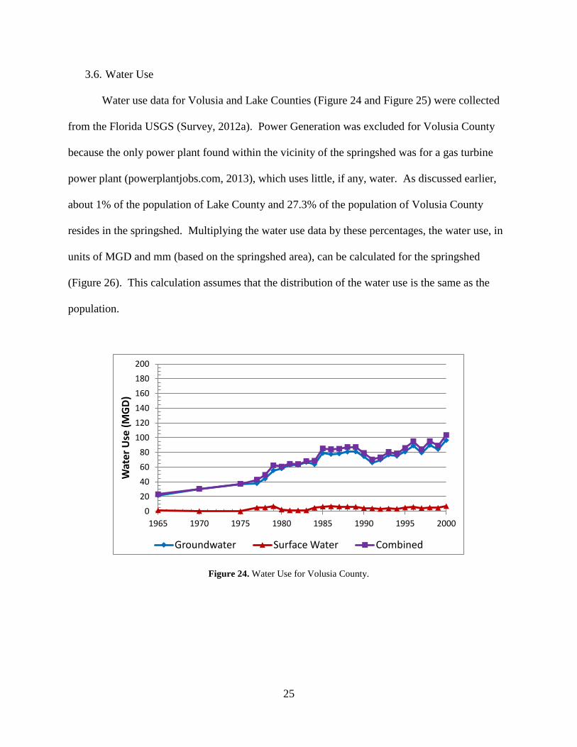
3.6. Water Use
Water use data for Volusia and Lake Counties (Figure 24 and Figure 25) were collected
from the Florida USGS (Survey, 2012a). Power Generation was excluded for Volusia County
because the only power plant found within the vicinity of the springshed was for a gas turbine
power plant (powerplantjobs.com, 2013), which uses little, if any, water. As discussed earlier,
about 1% of the population of Lake County and 27.3% of the population of Volusia County
resides in the springshed. Multiplying the water use data by these percentages, the water use, in
units of MGD and mm (based on the springshed area), can be calculated for the springshed
(Figure 26). This calculation assumes that the distribution of the water use is the same as the
population.
Figure 24. Water Use for Volusia County.
0
20
40
60
80
100
120
140
160
180
200
1965 1970 1975 1980 1985 1990 1995 2000
Wat
er U
se (
MG
D)
Groundwater Surface Water Combined

26
Figure 25. Water Use for Lake County.
Figure 26. Water Use for Blue Spring Springshed.
0
20
40
60
80
100
120
140
160
180
200
1965 1970 1975 1980 1985 1990 1995 2000
Wat
er U
se (
MG
D)
Groundwater Surface Water Combined
0
0.05
0.1
0.15
0.2
0.25
0.3
0.35
0.4
0
5
10
15
20
25
30
35
1965 1970 1975 1980 1985 1990 1995 2000
Wat
er
Use
(m
m/d
ay)
Wat
er
Use
(M
GD
)
Groundwater Surface Water Combined

27
3.7. Groundwater Levels
As mentioned earlier, the observed change-point for the discharge data occurred in late
1976. To measure the relationship that this declining trend may have with groundwater levels,
groundwater level records prior to 1976 were needed. Using groundwater level records from the
USGS and SJRWMD (District, 2013; Survey, 2013), six stations were found near the springshed
that have records before 1976 (Figure 27); no stations within the springshed boundaries met this
criteria. Please see the appendix for station names.
Figure 27. Location of USGS and SJRWMD Groundwater Level Monitoring Stations.

28
For all stations, observation data was aggregated from the daily time scale to the annual
time scale and analyzed using the Mann-Kendall-Sneyers Test. In addition, Data Series 584
(Bellino, 2011) was used in conjunction with ArcGIS’s Topo to Raster tool to help determine the
position of each well relative to the Floridan Aquifer System; Table 2 summarizes the results of
this analysis.
For the remainder of this section, each groundwater well is discussed, followed by a
conclusion regarding groundwater levels for Blue Spring.

29
Figure 28. Station 1 Water Levels and MKS Test. Figure 28a shows water levels for Station 1, Figure 28b shows the corresponding Mann-Kendall-Sneyers Test.
0
2
4
6
8
10
12
14
16
18
1965 1975 1985 1995 2005
Wat
er
Leve
l, ft
-4
-3
-2
-1
0
1
2
3
1960 1965 1970 1975 1980 1985 1990 1995 2000 2005 2010
No
rmal
ize
d M
KS
test
sta
tist
ic
Forward Backward significance level (5% or ±1.96)
0
5
10
15
20
25
30
1975 1980 1985 1990 1995 2000 2005 2010
Wat
er
Leve
l, ft
-2
-1
0
1
2
3
4
1975 1980 1985 1990 1995 2000 2005 2010
No
rmal
ize
d M
KS
test
sta
tist
ic
Forward Backward significance level (5% or ±1.96)

30
Figure 29. Station 2 Water Levels and MKS Test. Figure 29a shows water levels for Station 2, Figure 29b shows the corresponding Mann-Kendall-Sneyers Test.
Figure 30. Station 3 Water Levels and MKS Test. Figure 30a shows water levels for Station 3, Figure 30b shows the corresponding Mann-Kendall-Sneyers Test.
0
5
10
15
20
25
30
35
40
1965 1975 1985 1995 2005
Wat
er
Leve
l, ft
-3
-2
-1
0
1
2
3
1965 1970 1975 1980 1985 1990 1995 2000 2005 2010
No
rmal
ize
d M
KS
test
sta
tist
ic
Forward Backward significance level (5% or ±1.96)
33
34
35
36
37
38
39
1965 1970 1975 1980 1985 1990 1995 2000 2005 2010
Wat
er
Leve
l, ft
-5
-4
-3
-2
-1
0
1
2
3
1965 1970 1975 1980 1985 1990 1995 2000 2005 2010
No
rmal
ize
d M
KS
test
sta
tist
ic
Forward Backward significance level (5% or ±1.96)

31
Figure 31. Station 4 Water Levels and MKS Test. Figure 31a shows water levels for Station 4, Figure 31b shows the corresponding Mann-Kendall-Sneyers Test.
Figure 32. Station 5 Water Levels and MKS Test. Figure 32a shows water levels for Station 5, Figure 32b shows the corresponding Mann-Kendall-Sneyers Test.
0
5
10
15
20
25
30
35
1935 1945 1955 1965 1975 1985 1995 2005
Wat
er
Leve
l, ft
-9
-8
-7
-6
-5
-4
-3
-2
-1
0
1
2
1935 1945 1955 1965 1975 1985 1995 2005
No
rmal
ize
d M
KS
test
sta
tist
ic
Forward Backward significance level (5% or ±1.96)

32
Figure 33. Station 6 Water Levels and MKS Test. Figure 33a shows water levels for Station 6, Figure 33b shows the corresponding Mann-Kendall-Sneyers Test.
0
5
10
15
20
25
30
1970 1975 1980 1985
Wat
er
Leve
l, ft
-4
-3
-2
-1
0
1
2
3
1970 1975 1980 1985
No
rmal
ize
d M
KS
test
sta
tist
ic
Forward Backward significance level (5% or ±1.96)

33
Station Number
Distance from
Springshed (miles)
Elevation of the top of the Upper-
Floridan Aquifer (feet)
Elevation of the bottom of the
Upper-Floridan Aquifer (feet)
Elevation of the top of the
Lower-Floridan Aquifer (feet)
Elevation of the bottom of the
Lower-Floridan Aquifer (feet)
Land Surface
Elevation (feet)
Well Depth (feet)
Elevation at bottom
of well (feet)
Location of the
bottom of the well
1 0.18 0.45 -355.47 -618.95 -2060.65 41.65 500 -458.35 Middle
Confining Unit
2 1.46 -26.85 -363.34 -748.86 -2202.59 42.44 92 -49.56 Upper
Floridan Aquifer
3 2.25 -7.27 -376.25 -678.22 -2129.52 37.03 241 -203.97 Upper
Floridan Aquifer
4 3.65 -4.61 -380.10 -699.97 -2117.17 38.00 575 -537.00 Middle
Confining Unit
5 5.11 -49.17 -384.78 -699.95 -2215.85 35.90 121 -85.10 Upper
Floridan Aquifer
6 3.46 0.00 -317.67 -720.29 -2103.16 38.99 364 -325.01 Middle
Confining Unit
Table 2. Aquifer Information for Six Groundwater Level Stations.

34
3.7.1. Station 1
Station 1 is about 947.8 feet from the springshed boundary. Data records span from 1967
to 2010. From Table 2, Station 1 penetrates about 39% of the Middle Confining Unit (between
the Upper and Lower Floridan Aquifers). In Figure 28a, a slight downward trend in the
groundwater levels can be observed. To quantify the change-point, a Mann-Kendall-Sneyers test
was performed. Figure 28b shows a decreasing trend, which begins in 1973.
3.7.2. Station 2
Station 2 is about 1.46 miles (7686 ft) from the springshed boundary. Data records span
from 1965 to 2010. However, continuous records span from 1976 to 2010. From Table 2,
Station 2 is a shallow well, penetrating about 6.7% of the Upper Floridan Aquifer. This leaves it
fairly influenced by the unconfined Surficial Aquifer above. Additionally, it is in close
proximity with a group of lakes (specifically the Lake Butler Chain).
From Figure 29b, a change-point is observed for late 1977. However, discontinuous data
near the beginning of the time series prevents the record from preceding 1976. Thus, though the
change-point is approximated at 1977, it may have occurred earlier and, thus, an accurate
change-point cannot be determined.
3.7.3. Station 3
Station 3 is about 2.25 miles from the springshed boundary. Data records span from
1969 to 2010. From Table 2, Station 3 penetrates about halfway (53.3%) through the Upper
Floridan Aquifer. From Figure 30b, a large drop in the water levels occurred in 1977. However,
this decline lasted for only one year since water levels in the following years were about the
same as the years preceding 1977.

35
3.7.4. Station 4
Station 4 is about 3.65 miles from the springshed boundary. Data records span from
1969 to 2010. From Table 2, Station 4 penetrates about halfway (49.1%) through the Middle
Confining Unit. From Figure 31b, a decreasing trend is observed beginning in 1986. The results
are similar to Station 1, where the change-point occurred in 1973. This result suggests that the
factor(s) causing the decline in groundwater levels may be closer to the spring (or the St. John’s
River).
3.7.5. Station 5
Station 5 is about 5.11 miles from the springshed boundary. Data records span from
1936 to 2010. From Table 2, Station 5 penetrates 10.7% through the Upper Floridan Aquifer.
From Figure 32b, a decreasing trend is observed starting in 1978. Of the six stations, Station 5 is
the furthest from the springshed. However, it also has the longest records.
3.7.6. Station 6
Station 6 is about 3.46 miles from the springshed boundary. Data records span from
1974 to 2001. However, continuous records span from 1974 to 1986 and 1996 to 1999.
Consequently, only records from 1974 to 1986 were analyzed.
From Table 2, Station 6 penetrates 1.8% through the Middle Confining Unit. From
Figure 33b, a decreasing trend is observed in 1975.
This station is about as far from the springshed as Station 4. Station 4, however,
penetrates half-way through the Middle Confining Unit while Station 6 measures water levels
just below the Upper Floridan Aquifer. The difference between their change-points is
approximately ten years, highlighting the role that aquifer depth has on increasing response time
in groundwater levels.

36
3.7.7. Summary of results
Blue Spring, which receives its water from the Upper Floridan Aquifer, would be more
accurately evaluated if groundwater levels within the Upper Floridan Aquifer were used to
evaluate the state of its groundwater levels. Additionally, comparing results from the Middle
Confining Unit may be misleading due to the lower hydraulic conductivity in the region.
Though Stations 2 and 3 did not show a significant change-point in groundwater levels,
the longer record of Station 5 did. Consequently, the change-point for groundwater levels within
Blue Spring can be approximated to have occurred in 1978 and even possibly a year or two
earlier than this.
The results from the six stations, excluding Station 4, suggest a strong correlation
between the declining discharge from Blue Spring and the decline in groundwater levels around
the spring.
3.8. Evapotranspiration and Potential Evapotranspiration
Daily evapotranspiration (ET) and monthly potential evapotranspiration (PET) data for
the Continental United States were collected from the University of Montana (Zhang, 2010).
The data is provided at the 8-km pixel level (stored in binary data files) and ranges from January
1, 1983 to December 31, 2006.
However, there is one pixel with missing data that covers the corresponding area over the
eastern half of the springshed (see Figure 34). The records for the selected pixels were averaged
together, with each pixel being given equal weight.

37
Figure 34. The yellow outline represents the springshed boundary, the red square represents a missing pixel in the
dataset, and the green squares represent the pixels that were used to extract ET/PET data from.
4. Budyko Model and Discharge Modeling
In the following section, discharge modeling and the Budyko model will be applied using
discharge data at the monthly and annual time scales. Daily Discharge in this report is based on
the combined records of daily data and field observational data from USGS station 02235500
(Survey, 2012b).
While continuous data records are required for discharge modeling, the Budyko model
does not share this requirement. Furthermore, evaporation data is critical to this analysis and,
consequently, the Montana ET/PET dataset restricts the analysis from January 1, 1983 to
December 31, 2006.
The longest period of continuous discharge data in either dataset (daily data or field data)
between January 1, 1983 and December 31, 2006 is December 8, 2001 to May 18, 2003 (527
days, or less than 1.5 years of continuous discharge data). This does not change even after both
datasets are combined.

38
After combining both datasets, the number of missing dates between 11/27/2001 and
12/31/2012 is decreased by 13 days and the maximum gap between records is reduced from 194
days to 33 days. Furthermore, all months from November 2001 to December 2012 now have at
least one record. Please see Table 4 in the appendix for a list of missing days in each month
from January 1983 to December 2006.
Since a continuous monthly record will be needed for modeling discharge at the monthly
scale, daily records will be averaged for each month, then multiplied by the number of days in
each month:
Where:
As discussed previously, discharge modeling requires a continuous record and there is at
least one record per month between November 2001 and December 2012. Using the equation
above, a continuous monthly record is obtained between these months.
To apply the Budyko model at the annual scale, monthly records for each year are
averaged for each year and then multiplied by 12:

39
Where:
For years between 1983 to 2001, only 5 to 7 months are available (see Table 4 in the appendix).
Thus, while using discharge data aggregated to the annual scale using this method is sufficient
for the annual Budyko model, it would not be for discharge modeling, especially when
considering the effects of the seasonal variance of streamflow.
4.1. Budyko Model
4.1.1. Inter-Annual Scale, from 1983 to 2006
Using the methodologies discussed earlier and in the previous section, the Budyko model
is calibrated for the annual scale, from 1983 to 2006. In this analysis, all available records
between 1983 and 2006 are used for calibration (no validation is performed). From Figure 35, it
can be seen that the curve fits the data fairly well, with a Nash-Sutcliffe coefficient of 0.75.
However, the change-point, as indicated by the discharge records and groundwater level records,
occurs in the 1970s. Consequently, the Budyko model cannot be used to identify the impact of
human-induced and climate-induced change on the springshed. Please see the appendix for a
more detailed version of the graph, showing years and precipitation values for each point.

40
Figure 35. Graph of the Equity Equation at the Inter-Annual Time Scale.
Years where the aridity index exceeds 1 indicate dry years. Conversely, years where the
aridity index is less than 1 indicate wet years. Areas under the diagonal 1:1 line are part of the
energy-limited region because at this point the available energy (evaporation) is limited by the
potential energy (potential evaporation). Areas under the E/(P-ΔS)=1 line are part of the water-
limited region because the evaporation is limited by the available water supply (precipitation).
From the graph of the inter-annual data, data pairs of aridity index and evaporation ratio
are concentrated closely together, with evaporation ratios ranging from 0.67 to 0.76 and aridity
indices ranging from 1.06 to 1.23. That is, the springshed for Blue Spring has consistently
experienced slightly dry years from 1983 to 2006, indicating that the springshed has a slightly
water-limited climate, at least during this time period.

41
4.1.2. Inter-Monthly scale, from 1983 to 2006
The analysis in the previous section is repeated again, this time on the monthly dataset.
As before, all records between 1983 and 2006 were used for calibration. Compared with the
annual scale, the monthly observation data follows the Budyko curve much better, with a Nash-
Sutcliffe coefficient of 0.92 (see Figure 36). Excluding the record for December 1994 (bottom-
left-most point), observation data is between the ranges of 0.67 and 1.46 for the aridity index and
0.53 and 0.84 for the evaporation ratio. From Figure 36, the monthly climate varies between
water-limited and energy-limited conditions. This is expected, due to the effect of seasonality at
the monthly scale. In
Figure 37 and
Table 3, all months, excluding March and October, have NSC values between 0.81 and
0.98. March, in particular, has a very low NSC value (0.23); the cause of this deviation,
however, is not clear, but may be the result of three years of missing records between 1984 and
1988.

42
Figure 36. Graph of the Equity Equation at the Inter-Monthly Time Scale, from 1983 to 2006.

43
Figure 37. Graph of the Equity Equation at the Inter-Monthly Time Scale, from 1983 to 2006, Separated by Month.
The same line based on the monthly model in Figure 36 is used (ε=0.58 and ϕ=0.08).

44
Month NSC No. of
Records
January 0.98 15
February 0.81 12
March 0.23 13
April 0.93 16
May 0.96 16
June 0.87 16
July 0.91 13
August 0.89 18
September 0.84 16
October 0.61 16
November 0.91 12
December 0.97 16
Table 3. Individual NSC Values and Number of Records from 1983 to 2006.
4.1.3. Inter-Monthly scale, from 2002 to 2006
The analysis from the previous section is repeated, except the months analyzed are
confined to continuous monthly data (excluding November and December 2001).
As expected, the calibrated parameters did not change significantly; ε decreased by 0.01
and ϕ increased by 0.01 (Figure 38). Additionally, the NSC improved slightly (0.93).

45
Figure 38. Graph of the Equity Equation at the Inter-Monthly Time Scale, from 2002 to 2006.
4.2. Discharge Simulation
As discussed in the beginning of Section 4, November 2001 to December 2006 is the
longest continuous monthly record for discharge. Furthermore, discharge simulation can only be
performed from 2002 to 2006 (November and December 2001 data are not included since they
represent a minor fraction of 2001). As was done with the Budyko model, all available records
between 2002 and 2006 were used for calibration (no validation was performed).
Figure 39 shows the simulated discharge from 2002 to 2006. The resulting discharge
model fits the data moderately well (Figure 40). The NSC for the simulated discharge is 0.69. It
should be noted that the time period of September 2004 to March 2005 had a large number of
missing daily data —a total of 184 missing days (Table 4).

46
Figure 39. Monthly Discharge Simulation from 2002 to 2006.
Figure 40. 1:1 line showing the goodness of fit of the simulated (estimated) and observed discharge values.

47
5. Summary of Results and Conclusion
Precipitation trends were analyzed for a possible explanation of the declining discharge at
Blue Spring, but no significant decreasing trend was observed.
From the evaporation and potential evaporation data from 1983 to 2006, it could be
assumed that the increasing evaporation and potential evaporation were primary drivers in Blue
Spring's declining discharge. These records do not extend far back enough to make solid
conclusions. Thus, temperature, which correlates closely with potential evaporation and actual
evaporation (see Figure 41), was used to extend the analysis before 1983. From this record, it
was observed that the temperature trend did not correlate closely with the discharge trend.
Starting about 1952, the temperature had been on a declining trend, which ended around 1989
and began to increase in 2002. Discharge, on the other hand, had been on a declining trend since
1976. That is, though increasing temperatures may have had some impact on the declining
discharge trend, it is likely not the primary cause of the trend. Therefore, land use change and
water uses significantly contribute to the declining trend of spring discharge.

48
Figure 41. The Relationship between Temperature, Evaporation, and Potential Evaporation from 1983 to 2006.
From the population and water use data it is evident that human activities have had a
significant impact on the springshed, especially around the 1970's, as evidenced by the change in
land use which resulted in a loss of wetlands and an increase in urban area. This is further
expressed by the decreasing groundwater levels and spring discharge around this same time.
The Budyko analysis and discharge modeling could not be performed for this time
period, but as indicated in the land use data, water use data, and population data, a significant
increase in the impact of human development on the springshed was observed. First, there was a
61% increase in total water use for the springshed from 1965 to 1975, which accelerated to a
58% increase from 1975 to 1980 (which is nearly the same rate in half the time). Also, there was
a significant increase in the population growth rate beginning in 1950 and then especially after
1970. Finally, there was a significant increase in the urban area, particularly from 1973 to 1995
(31.1%).
19
19.5
20
20.5
21
21.5
22
22.5
23
23.5
24
0
200
400
600
800
1000
1200
1400
1600
1800
2000
1983 1988 1993 1998 2003
Tem
pe
ratu
re (
°C)
Evap
ora
tio
n a
nd
Po
ten
tial
Eva
po
rati
on
(m
m)
E (mm) Ep (mm) Temperature (°C)

49
The Budyko models, especially the monthly model, fit the data very well; the annual
model has a Nash-Sutcliffe coefficient of 0.75, while the corresponding value for the monthly
model is 0.92.
The discharge simulation models performed fairly well, with a Nash-Sutcliffe coefficient
of 0.69. However, it is believed that the large number of missing daily data between September
2004 and March 2005 diminishes the performance of the model.

50
6. Appendix
6.1. Precipitation and Temperature Data
Precipitation data were collected from the following stations:
Station 1 (GHCND:USC00086584)
Station 2 (GHCND:USC00082229)
Station 3 (GHCND:USC00080070)
Station 4 (GHCND:USC00087977)
Station 5 (GHCND:US1FLVL0014)
Station 6 (GHCND:USC00087982)
Temperature data were collected from these stations as well, excluding Station 6
(GHCND:US1FLVL0014), which did not have temperature data. Please see Figure 42.
Figure 42. Temperature data for individual NOAA NCDC stations. Station 6 (GHCND:USC00087982) was
excluded because no temperature data was available.
15
16
17
18
19
20
21
22
23
24
25
Tem
pe
ratu
re (
°C)
Blue Spring
USC00082229 USC00087977 USC00086584
USC00080070 USC00087982 Average Blue Spring

51
6.2. Land Use for the 1940’s
In this report, the land use map for the 1940’s is based on 45 aerial photographs taken
between 1941 and 1943, as illustrated in Figure 43. The images were obtained from the
University of Florida Map & Digital Imagery Library (Collections, 2013) and were
georeferenced using ArcGIS 10.1. Three methods were used to delineate the same land use
categories used for the 1973-2009 land use/land cover maps (excluding the “Barren” category):
(1) the SJRWMD’s 2009 Land Cover and Land Use Classification System
PhotoInterpretation Key, (2) the 1973 land use shapefile provided by the SJRWMD, and (3) the
DEM provided by the National Elevation Dataset (Gesch, 2007; Gesch et al., 2002). Land cover
was primarily determined based on the photointerpretation key while the DEM and the 1973 land
use map were used to check for consistency.

52
Figure 43. Aerial Photography of Blue Spring. The western half is based on aerial photography from 1941 while the
eastern half is based on aerial photography from 1943.
6.3. Groundwater Level Monitoring Stations
Station 1 represents both USGS Station 290138081203202 and SJRWMD Station
05831097. Stations 2, 3, 4, 5, and 6 represent USGS stations 285221081095002,
290230081123401, 290541081132902, 285745081054001, and 285028081253301, respectively.

53
6.4. Missing daily records
1 2 3 4 5 6 7 8 9 10 11 12
1983 30 All All All 30 29 All 30 All 30 All All
1984 All All 30 29 All 29 All 30 All 30 All 30
1985 All 27 All 29 All 29 All 30 29 All 29 All
1986 30 All All All 30 All 30 All 29 30 All 30
1987 All 27 All 29 All 29 All 30 29 All 29 All
1988 30 All 30 All 30 All 30 All 29 30 All 30
1989 All 27 All 29 All 29 All 30 All 30 29 All
1990 30 All 30 All 30 All 30 30 All 30 All 30
1991 All 27 All 29 30 All All 30 All 30 All 30
1992 30 All 30 All 30 All 30 30 All 30 All 30
1993 All 27 All 29 All 29 30 All 29 All 29 All
1994 30 All 30 All 30 29 All 30 29 All All 30
1995 All 27 All 29 All 29 All 30 All 28 All 30
1996 All 28 All 28 30 29 All 30 All 30 All 30
1997 30 All All 29 30 All 30 All 29 30 All All
1998 30 All 30 29 All 29 All 30 29 All All 30
1999 30 All 30 All 30 All 30 All 29 All 29 All
2000 All All All 29 All 29 All 30 29 All 29 All
2001 30 All 30 All 30 All 30 All 29 All 29 7
2002
2003
13 13
2004
22 29 28 30
2005 28 27 20
2006
7
Table 4. The number of missing daily records for each month from 1983 to 2006. Columns represent months (1-12)
and rows represent years. Cells with “All” indicate that there were no available records (all days were missing).
Blank cells represent months with no missing data.

54
6.5. Zoomed-In Version of the Equity Equation at the Inter-Annual Scale.
Figure 44. Zoomed-In Version of Figure 35. Year and annual precipitation is displayed for each point.

55
References:
Bellino, J. C. (2011). Digital surfaces and hydrogeologic data for the Floridan aquifer system in
Florida and in parts of Georgia, Alabama, and South Carolina. Retrieved from
http://pubs.usgs.gov/ds/584/.
Bureau, U. S. C. (2013a). State & County QuickFacts. from
http://quickfacts.census.gov/qfd/states/12/12127lk.html
http://quickfacts.census.gov/qfd/states/12/12069lk.html
Bureau, U. S. C. (2013b). TIGER/Line® Shapefiles and TIGER/Line® Files. Retrieved from:
http://www.census.gov/geo/maps-data/data/tiger-line.html
Center, N. C. D. (2013). Climate Data Online. from National Oceanic and Atmospheric
Administration http://gis.ncdc.noaa.gov/map/viewer/
Chen, X., & Wang, D. (2013). Seasonal Runoff Models Based on Proportionality Hypothesis,
working paper.
Collections, U. o. F. D. (2013). Aerial Photography: Florida Collection. The University of
Florida Map & Digital Imagery Library Retrieved 2013 http://ufdc.ufl.edu/aerials
District, S. J. R. W. M. (1995). SJRWMD Land Use and Land Cover (1973)
SJRWMD Land Use and Land Cover (1995)
SJRWMD Land Use and Land Cover (2000)
SJRWMD Land Use and Land Cover (2004)
2009 Land cover and land use, St. Johns River Water Management District. Retrieved from:
http://floridaswater.com/gisdevelopment/docs/themes.html
District, S. J. R. W. M. (2013). Hydrologic Data. from St. Johns River Water Management
District http://webapub.sjrwmd.com/agws10/hdsnew/map.html

56
Gesch, D. B. (2007). The National Elevation Dataset.
Gesch, D. B., Oimoen, M., Greenlee, S., Nelson, C., Steuck, M., & Tyler, D. (2002). The
National Elevation Dataset: Photogrammetric Engineering and Remote Sensing.
powerplantjobs.com. (2013). FL Power Plants. from
http://www.powerplantjobs.com/ppj.nsf/powerplants1?openform&cat=fl&Count=500
Shoemaker, W. B., O'Reilly, A. M., Sepulveda, N., Williams, S. A., Motz, L. H., & Sun, Q.
(2004). Comparison of Estimated Areas Contributing Recharge to Selected Springs in
North-Central Florida by Using Multiple Ground-Water Flow Models. (Open-File Report
03-448).
Survey, U. S. G. (2012a). Historical Water-Use in Florida - Counties - 1965-2000. from
http://fl.water.usgs.gov/infodata/wateruse/counties.html
Survey, U. S. G. (2012b). USGS 02235500 Blue Springs Near Orange City, FL. Available from
U.S. Geological Survey National Water Information System Retrieved 05/13/2013
http://waterdata.usgs.gov/usa/nwis/uv?site_no=02235500
Survey, U. S. G. (2013). USGS 290138081203202 V-0115 USGS J-24 TEST WELL,W.OF
DELAND
USGS 285221081095002 85210902 USGS TEST WELL G-2, N. OF OSTEEN, FL
USGS 290230081123401 90211203 USGS TEST HOLE 5, E. OF DELAND
USGS 290541081132902 90511304 USGS 04 DP TEST W NEAR DE LAND, FL
USGS 285745081054001 85710501 USGS OBSER WELL AT ALAMANA, FL.
USGS 285028081253301 SEMINOLE STATE FORREST L-0037. Available from U.S.
Geological Survey National Water Information System Retrieved 6/6/2013

57
http://waterdata.usgs.gov/nwis/inventory?agency_code=USGS&site_no=2901380812032
02
http://waterdata.usgs.gov/nwis/inventory?agency_code=USGS&site_no=285221081095002
http://waterdata.usgs.gov/nwis/inventory?agency_code=USGS&site_no=290230081123401
http://waterdata.usgs.gov/nwis/inventory?agency_code=USGS&site_no=290541081132902
http://waterdata.usgs.gov/nwis/inventory?agency_code=USGS&site_no=285745081054001
http://waterdata.usgs.gov/nwis/inventory?agency_code=USGS&site_no=285028081253301
Wang, D. (2013). A Single-Parameter Budyko Equation Derived from Proportionality
Hypothesis, working paper.
Węglarczyk, S. (2009). On the stationarity of extreme levels of some Polish lakes. I. Preliminary
results from statistical test. from http://ptlim.pl/lr2009/pdf/LR2009_13.pdf
Zhang, K. (2010). Remote Sensing (RS) GIMMS NDVI Based Daily ET and Monthly PET for
Continental US (CONUS) from 1983 to 2006. from Numerical Terradynamic Simulation
Group, University of Montana ftp://ftp.ntsg.umt.edu/pub/data/CONUS_ET/