flexible reports in ericsson msdppublications.lib.chalmers.se/records/fulltext/129995.pdf ·...
TRANSCRIPT

Flexible Reports in Ericsson MSDP
Master of Science Thesis in Computer Science and Engineering, Interaction Design
Patrik Björkman
Robert Krantz
Department of Computer Science and Engineering
Division of Interaction Design
CHALMERS UNIVERSITY OF TECHNOLOGY
UNIVERSITY OF GOTHENBURG
Göteborg, Sweden, 2010

The Author grants to Chalmers University of Technology and University of Gothenburg the
non-exclusive right to publish the Work electronically and in a non-commercial purpose make
it accessible on the Internet.
The Author warrants that he/she is the author to the Work, and warrants that the Work does
not contain text, pictures or other material that violates copyright law.
The Author shall, when transferring the rights of the Work to a third party (for example a
publisher or a company), acknowledge the third party about this agreement. If the Author has
signed a copyright agreement with a third party regarding the Work, the Author warrants
hereby that he/she has obtained any necessary permission from this third party to let Chalmers
University of Technology and University of Gothenburg store the Work electronically and
make it accessible on the Internet.
Flexible reports in Ericsson MSDP
P.Björkman
R.Krantz
© P.Björkman, November 2010.
© R.Krantz, November 2010.
Examiner: O.Torgersson
Chalmers University of Technology
University of Gothenburg
Department of Computer Science and Engineering
SE-412 96 Göteborg
Sweden
Telephone + 46 (0)31-772 1000
Department of Computer Science and Engineering
Göteborg, Sweden November 2010
ABSTRACT
Report Viewer in the Ericsson MSDP is in its current form not being used as intended. Customers of the system
only extract data from it to then use in their favorite data visualization tool. Additionally, a lot of users who
would benefit from using Report Viewer avoid it thinking it is too hard to use. The task of this project is to
evaluate other existing reporting systems and choose one to build a working prototype from. This prototype
should allow users to both view and create their own reports and should accommodate the current users of the
system, but also users who have no previous experience from using Report Viewer.
During evaluation both commercial and free reporting systems were looked at and in the end four were
considered for use in the final prototype, BIRT being the one eventually chosen. Designing and prototyping was
done in iterations in order to exclude as many usability problems as possible and each iteration was tested on a
set of test users. In the end a web based prototype built on the BIRT report engine was implemented and
tested.

TERMINOLOGY
Ericsson SA SD&P The name of the division of Ericsson that is responsible for the MSDP.
MSDP Mobile Service Delivery Platform A system for mobile content delivery.
jQuery A JavaScript library www.jquery.com
jQuery UI An extension to the jQuery library www.jqueryui.com
SQL Structured Query Language The language used for managing data in a relational database.
JSP Java Server Pages Java technology that allows for dynamically generated web pages.
Microsoft Expression Blend User interface design tool http://www.microsoft.com/expression/products/blend_overview.aspx

TABLE OF CONTENTS
1 Introduction .................................................................................................................................................... 1
1.1 Ericsson .................................................................................................................................................. 1
1.2 Report Systems ...................................................................................................................................... 1
1.3 Report Viewer ........................................................................................................................................ 2
1.4 Purpose .................................................................................................................................................. 4
1.5 Scope ..................................................................................................................................................... 4
2 Design Methodology ....................................................................................................................................... 5
2.1 Prestudy ................................................................................................................................................. 5
2.2 User base ............................................................................................................................................... 5
2.3 User Feedback ....................................................................................................................................... 6
2.4 Heuristic Evaluation ............................................................................................................................... 6
2.5 Design and Implementation .................................................................................................................. 9
2.6 Evaluation ............................................................................................................................................ 10
2.7 User Testing ......................................................................................................................................... 10
3 Preliminary User Study .................................................................................................................................. 11
4 Reporting system evaluation ........................................................................................................................ 12
4.1 Gathering reporting systems ............................................................................................................... 12
4.2 Comparison of final four ...................................................................................................................... 13
5 Database design and implementation .......................................................................................................... 16
5.1 Design .................................................................................................................................................. 16
5.2 Implementation ................................................................................................................................... 17
6 Interface Prototyping .................................................................................................................................... 18
6.1 Prototyping tools ................................................................................................................................. 18
6.2 The prototype ...................................................................................................................................... 19
6.3 User test 1............................................................................................................................................ 23
7 Implementation ............................................................................................................................................ 28
7.1 Technology .......................................................................................................................................... 28
7.2 Server ................................................................................................................................................... 29

7.3 Client .................................................................................................................................................... 30
7.4 User test 2............................................................................................................................................ 38
8 Discussion ...................................................................................................................................................... 42
9 Conclusion ..................................................................................................................................................... 47
Bibliography .......................................................................................................................................................... 48

1
1 INTRODUCTION
Today’s mobile phone market is more competitive than ever and operators are fighting over every last user
available. This is in many cases done by offering the best and newest phones or the cheapest subscription. But
it can also be done by offering new services and marketplaces for users to take advantage of. In order to
evaluate whether or not these investments have been successful the operators need a way to collect and
analyze user statistics.
With the amount of customers operators have this is not possible to do by hand but has to be handled by a
type of software systems called Business Intelligence (BI) Tools. They are designed to gather information from a
system, analyze the data and finally present the result to the user.
The presentation is one of its more crucial parts, since if the user is unable to comprehend or draw meaningful
conclusions from the information presented, the data is useless. There are a couple of ways this data can be
presented, first of which is long tables, which quickly become difficult to read. The more useful way is to display
the data as graphs and diagrams in which patterns and trends are much easier to spot.
1.1 ERICSSON AND MSDP
Ericsson is a world leading provider of telecommunication equipment with almost half of all mobile calls
passing through an Ericsson designed system. Though this is the area where Ericsson is the most prominent
they have many things in their portfolio. The most well known to most people is their joint venture in
consumer electronics with Sony in making mobile phones.
Among their products focused at the media industry is the Ericsson Mobile Service Delivery Platform (MSDP).
The MSDP was originally developed by Drutt Corporation which Ericsson bought in 2007. Drutt was converted
into Ericsson SA SD&P and they are still developing the MSDP.
The Ericsson MSDP is a part of Ericsson Service Delivery Platform which is a solution for service providers to be
able to act quickly to changing markets. MSDP is a product that out of the box supports all essential aspects of
running a mobile service marketplace. Through it, any type of mobile offers can be marketed, sold and
delivered to a consumer. It allows operators to deliver any type of content to any type of mobile device over
any type of network.
1.2 BUSINESS INTELLIGENCE AND REPORT SYSTEMS
The concept of report systems is a part of what is called Business Intelligence. Business Intelligence is not a new
term; it was used by an IBM researcher in an article in 1958 defining intelligence as "the ability to apprehend
the interrelationships of presented facts in such a way as to guide action towards a desired goal. (Luhn, 1958).
Howard Dresner proposed Business Intelligence as a term to cover "concepts and methods to improve business
decision making by using fact-based support systems." (Power, 2007) This meaning did not become widespread
until the late 1990s.
Today the term Business Intelligence encompasses a wide range of concepts, including business methods and
different technologies, e.g. Online Analytical Processing (OLAP) which is typically used in marketing, budgeting
and financial reporting. This has lead to BI systems that are very large and complex in order to handle all these
aspects.

2
Business intelligence consisted for a long time of only data access tools; the rest was up to the user to figure
out. In recent years more and more providers of BI systems have moved towards an ad hoc approach. This
means allowing for freer exploring of data and the creation of unique and time specific reports as opposed to
the more conventional static report. An example of an ad hoc reporting system would be TIBCO Spotfire
(Bus10).
The current MSDP report viewer only offers a set number of static reports where the only options available are
date and time. Ericsson wishes to move away from this static approach to a more dynamic, or ad hoc, solution
that enables the end users to create their own reports when they actually need them.
Since Ericsson only wants to replace the MSDP report viewer most current BI systems are too large and
complex and the companies providing BI solutions usually do not offer a single component. Another argument
against a complete BI suite is that the MSDP report viewer is part of the MSDP system which they ship to their
customers. Should they purchase a BI system it would either mean that their customers has to pay more for the
MSDP or Ericsson would have to pay license fees for each copy sold.
Report systems focus on gathering data, doing calculations on it and presenting it to the user either as text or
as charts and graphs. It enables humans to read and comprehend large amounts of information at once. Such a
system can provide the user with either detailed information about a certain aspect, e.g. day-to-day sales, or a
number of different aspects at once, i.e. a dashboard system such as TIBCO Spotfire.
Report systems focus on gathering data, doing calculations on it and presenting it to the user either as text or
as charts and graphs. It enables humans to read and comprehend large amounts of information at once. The
system can have one of two major styles to it; the traditional style of having a system where all data is available
and details is the focus, and the newer dashboard style system. The dashboard style can be like looking at a
map of an area compared to a satellite image. The map does not show you the exact details of things but is on
the other hand very easy to glance at and receive all the information you need for setting a strategy to get you
somewhere.
Much like a dashboard in a car, a dashboard collects information from many different systems and presents
them in a single place and in a cohesive format or as defined by Stephen Few (Few, 2006): “A dashboard is a
visual display of the most important information needed to achieve one or more objectives; consolidated and
arranged on a single screen so the information can be monitored at a glance.”
1.3 MSDP REPORT VIEWER
The current report viewer in MSDP is not so much a presenter of data as it is an access point to the data in the
report. As can be seen in Figure 1 it is divided into two parts, parameter settings at the top and data
presentation at the bottom. The parameter settings allow the user to select for which time span she wants to
see the data, how it should be sorted and the time resolution, e.g. hours or months.
The bottom part is where the data is shown in a table. Depending on the parameter settings and what report
the user has selected this table can be of varying length. Once the table becomes too long or divided into too
many sections (seen in the figure as bold text between the grids) it becomes almost impossible to read.

3
Figure 1. The current MSDP Report Viewer showing the top 10 pages over the year 2010.
4
1.4 PURPOSE
The purpose of this project is to analyze the current reporting tool present in the Ericsson MSDP product and to
investigate other existing reporting systems. This together with input from Ericsson’s MSDP customers will
serve as the basis for creating a new reporting tool to help customers with analyzing large amounts of mobile
user statistics.
It will be designed to empower the users and allow them to create their own reports instead of having to go
through Ericsson. This will in turn help to ease the work load on the developers, allowing them to work on
more important tasks. Also, by improving the usability from the current version it is hoped that it will extend
the user base and allow more people to access the information directly.
1.5 SCOPE
Due to the amount of data in the current Report Viewer this master thesis is only focusing on reports covering
normal mobile portal usage, e.g. what pages have been accessed the most and which service was most
popular. However, steps should be taken in the prototype to not obstruct any future development in other
areas.
The scope focuses on creating a reporting system to incorporate into Ericsson’s product instead of just finding
an existing BI system. The reasoning for this is Ericsson’s desire to preserve the completeness of the MSDP as a
standalone product and to ship it without incurring additional licensing fees.
It was also necessary to develop a new database schema to hold the report data. However, since this was not
the focus of the thesis little time was spent on it and aspects such as efficiency and space requirements was not
taken into account.

5
2 DESIGN METHODOLOGY
This chapter concerns methods applied during the project and the reason behind using them. Methods for
gathering information about the current system and user feedback were applied to provide a base to launch
the design and implementation processes from.
2.1 PRESTUDY
During the past couple of years a number of usability studies and usability work shops have been performed
with various companies that have purchased the Ericsson MSDP. A lot of the focus has been on the portal
composer and designer applications which are more widely used out at the operators. The information
regarding the Report Viewer has been used as the base feedback for the thesis since it involves several
companies and has some real world users’ thoughts and needs.
2.2 USER BASE
In order to complement the already existing information, new and more focused user feedback was needed.
The user base for the Ericsson MSDP administrative tools is currently very small, on average one or two users
per operator. These people do almost all work on the MSDP, i.e. creating and managing portals, adding content
and extracting reports. They have learned the application over a long period of time and have a large amount
of computer experience which according to Faulkner means they can be considered expert users. (Faulkner, et
al., 2005)
These users are normally the only ones working directly with the system; others are only using the results from
it. They are therefore faster at recognizing new needs and requirements than others and will in most cases be
the ones benefiting from satisfying those needs. Von Hippel calls these users 'Lead Users' and together with
Herstatt (Herstatt, et al., 1992) they recognized that 'users who have real-world experience with a need can
provide the most accurate data regarding it' and have most likely experimented with solutions to those needs.
Since the MSDP is a software system it is highly unlikely that the end-users have created anything to ease their
problems in using it. However, the fact remains that they are most likely to provide accurate and beneficial
information about the system.
Even though expert users may provide the most information about a system Faulkner and Wick discusses that
having both novice and expert users will gather information otherwise not found when only having one user
group. However, for the prestudy for this project it was determined that involving novice users to gather
feedback on the current system would prove too time-consuming for two main reasons:
1. The novice users have either never used the system or only used it a couple of times which means
they won’t know what they need.
2. The novice users are employees that Ericsson rarely has any contact with making it difficult to arrange
anything within a reasonable time span.
6
2.3 USER FEEDBACK
Karlsson talks in her paper about question based methods for information gathering; interviews, phone
interviews, focus groups and questionnaire (Karlsson, 2009). While interviews provides the most flexible
method for information gathering it also assumes the interviewer and interviewee has the time and possibility
to assemble at one location.
Questionnaire on the other hand, is very rigid, there is no possibility for probing, but it is very flexible in that
the interviewer and interviewee do not have to be at the same place and the interviewee can do the
questionnaire when it suits her. Karlsson also talks about questionnaires (or phone interviews) being of great
value for gathering information about the attitudes of the user base and its repeatability.
Due to the geographical spread of the customers a questionnaire was deemed the easiest and most efficient
method for gathering user feedback. In addition, a questionnaire can be sent to an Ericsson representative at
the customer who can then distribute it to the right people. This will minimize the administrative effort of all
parties involved, as there will be no back-and-forth communication taking time.
2.4 HEURISTIC EVALUATION
Heuristic evaluation (Nielsen, et al., 1990) is a method for finding existing usability problems in an interface
design. It involves having a few evaluators study the interface design and check how well it complies with a set
of heuristics (See 2.4.1). The evaluator performs the inspection alone and only talks to the other evaluators
once done and the results are to be collected into a set for further analysis. This is to ensure that the evaluators
do not influence each other.
Evaluation is done in several passes of the interface; the first one focusing on getting a feel for how the
interface works as a whole while the following passes goes into more detail. Although this is the recommended
approach, evaluators can choose their own way of conducting it.
Some evaluations are done on interfaces which are either not completed or operate something very complex.
For such evaluations it is useful using a technique where an observer that is familiar with the system is present.
This is to help out with problems due to lack of domain expertise and take notes when the evaluator is using
the system and commenting on how it is built. Similarly, it is possible to evaluate systems that still only exist on
paper with this method since the evaluators are not really using the system to accomplish something, but
inspecting how it works.
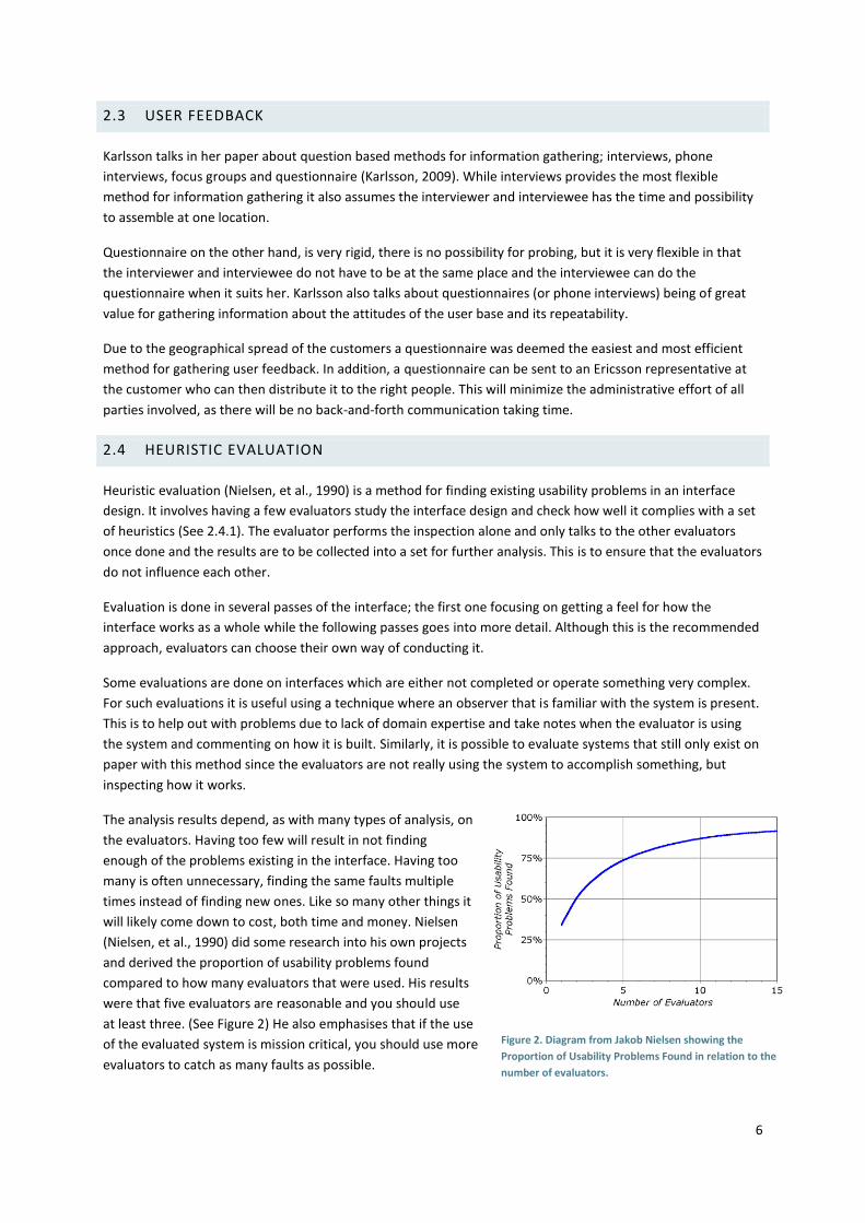
The analysis results depend, as with many types of analysis, on
the evaluators. Having too few will result in not finding
enough of the problems existing in the interface. Having too
many is often unnecessary, finding the same faults multiple
times instead of finding new ones. Like so many other things it
will likely come down to cost, both time and money. Nielsen
(Nielsen, et al., 1990) did some research into his own projects
and derived the proportion of usability problems found
compared to how many evaluators that were used. His results
were that five evaluators are reasonable and you should use
at least three. (See Figure 2) He also emphasises that if the use
of the evaluated system is mission critical, you should use more
evaluators to catch as many faults as possible.
Figure 2. Diagram from Jakob Nielsen showing the
Proportion of Usability Problems Found in relation to the
number of evaluators.

7
An add-on to the standard heuristic evaluation is to grade each violation with a severity rating on a scale of 0 to
4. This is done by all evaluators on the violations found. A 0 indicate that there is probably no usability problem
at all and a 4 indicates a catastrophe. When grading each violation the following criteria are taken into account;
frequency, impact, persistence and market impact.
The purpose of using heuristic evaluation as opposed to any other usability method is to quickly identify
shortcomings in the current user interface. This enables the project to quickly move into, and through, an
iterative design process without sacrificing usability along the way. It is also a very flexible method with regard
to the size and complexity of the interface or interface element being evaluated. Heuristic evaluation can be
used on individual interface elements such as dialog windows, e.g. a settings window. This makes it possible to
use the method throughout the development process.
The usability heuristics used in the analysis of this thesis project was the ones Jakob Nielsen developed
together with Rolf Molich and last revised for maximum explanatory power in 1994. (Nielsen, et al., 1994)
2.4.1 USABILITY HEURISTICS
Visibility of system status
The system should always keep users informed about what is going on, through appropriate feedback within
reasonable time.
Match between system and the real world
The system should speak the users' language, with words, phrases and concepts familiar to the user, rather
than system-oriented terms. Follow real-world conventions, making information appear in a natural and logical
order.
User control and freedom
Users often choose system functions by mistake and will need a clearly marked "emergency exit" to leave the
unwanted state without having to go through an extended dialog. Support undo and redo.
Consistency and standards
Users should not have to wonder whether different words, situations, or actions mean the same thing. Follow
platform conventions.
Error prevention
Even better than good error messages is a careful design which prevents a problem from occurring in the first
place. Either eliminate error-prone conditions or check for them and present users with a confirmation option
before they commit to the action.
Recognition rather than recall
Minimize the user's memory load by making objects, actions, and options visible. The user should not have to
remember information from one part of the dialog to another. Instructions for use of the system should be
visible or easily retrievable whenever appropriate.
8
Flexibility and efficiency of use
Accelerators -- unseen by the novice user -- may often speed up the interaction for the expert user such that
the system can cater to both inexperienced and experienced users. Allow users to tailor frequent actions.
Aesthetic and minimalist design
Dialogs should not contain information which is irrelevant or rarely needed. Every extra unit of information in a
dialog competes with the relevant units of information and diminishes their relative visibility.
Help users recognize, diagnose, and recover from errors
Error messages should be expressed in plain language (no codes), precisely indicate the problem, and
constructively suggest a solution.
Help and documentation
Even though it is better if the system can be used without documentation, it may be necessary to provide help
and documentation. Any such information should be easy to search, focused on the user's task, list concrete
steps to be carried out, and not be too large.

9
2.5 DESIGN AND IMPLEMENTATION
The design and implementation phases were divided into two parts, one that dealt with the database and one
with the actual prototype.
2.5.1 THE DATABASE
Since the design and development of the database was not a prioritized task for the project, there was no time
to create multiple designs or to revise the implementation once completed. This process was therefore very
straightforward, following a waterfall model-like approach (Figure 3), with one design phase and one
implementation phase followed by augmentation if necessary.
2.5.2 THE REPORT VIEWER
The design and implementation of the report viewer was done iteratively and separately. This means the initial
design together with prototyping was iterated over until a satisfactory prototype had been produced (Figure 4).
This was not done with a new interface each iteration but rather focused on individual interface controls or
elements. The advantage of this was that a great number of versions could be produced in a short amount of
time. The complete prototype was then tested with users (see chapter 6.3 and 7.4) and changes made
according to the given feedback.
Once the prototype had been properly modified it was used as the basis for the implementation. Each interface
element was implemented separately just as in the design stage. They were also informally evaluated with
respect to the ten usability heuristics (Nielsen, et al., 1994). If any element or control did not work as intended
after implementation it was redesigned one or several times before being implemented again and reevaluated.
Again, this allowed for several redesigns in a short period of time.
Once the implementation was complete it was subjected to user testing to get feedback on the function and
form of the elements and controls and also how the different elements interacted with each other in a context.
Figure 3. The workflow for the database construction.
Figure 4. Rough workflow of the design and implementation of the report viewer.

10
2.6 EVALUATION
As discussed in the previous section evaluation was done continuously throughout the design and
implementation phases in order to catch usability problems as early as possible. The method for doing this was
an informal approach to heuristic evaluation (see 2.4 Heuristic Evaluation).
It is not as rigid as a normal heuristic evaluation where the evaluator checks if the application conforms to all
usability heuristics (Nielsen, et al., 1994). As the developer designs or implements a new functionality, element
or control she should always have the heuristics in mind and make sure that they to some extent conforms to
them. In many cases this can be considered to applying common sense to the process but it serves as a
reminder that there are certain aspects that has to be considered. For example, documentation is something
that is in many cases lacking in larger projects but if the designers and developers has the heuristics in mind
they should know that documentation is a vital part of any application.
2.7 USER TESTING
The method used throughout the project for user testing was the Think-aloud protocol (TAP) introduced in
(Lewis, 1982) and later described further together in (Rieman, 1993). Using this method involves having the
user perform a set of tasks while commenting on his or her thoughts and actions while doing so. The upside of
this is that you hopefully get a picture of what goes on in the users’ mind but it is also heavily dependent on the
user taking time to describe what she is thinking as she is doing it.
During these tests there were two observers present, one for helping the user and closely observing his or her
actions and one for taking more detailed notes of the user’s comments. All users were given the same tasks for
each of the tests in order to have a way to compare the feedback between users with different skill sets.
A possibility that was not explored in the project was to record audio or video of the test session to later
analyze it. The reason for not doing so was that it was enough with two observers for getting the majority of
user feedback, both visual and verbal. Recording for later review would have doubled the time spent gathering
the information before the analysis could start. Had it only been one person carrying out the test, recording
would have been beneficial allowing the test conductor to concentrate on interacting with the tester when
needed.
The reason for using TAP as opposed to a simple observatory method is that it adds another layer of feedback
in the form of user thoughts and comments. Just observing does not give access to what the user thinks will
happen when an action is performed; it only shows what the user does next. Did the user open up a menu
expecting to find something she was looking for or was she just exploring to know what the menu contains for
future reference? These scenarios are indistinguishable if you are just observing.
While TAP will give you more information than just observing, all that information might not be valid. Maier did
a study where subjects were supposed to solve a difficult problem and "accidentally" inserted a subtle hint into
the problem in the middle of the subjects trying to solve it (Maier, 1931). The data showed that this greatly
increased the chances of a subject succeeding, but when Maier asked the subjects how they solved the
problem they did not say it was because of the hint. Looking at the statistics of who got the hint and who
solved the problem, Maier knew that it was because of the hint a large majority of the subjects succeeded but
the subjects themselves did not know that this was the case. The information gained with using Think-aloud
could very well suffer from the same problem; the user might not know precisely why she completed a task,
they might even state the wrong reason.

11
3 PRELIMINARY USER STUDY
Since the customer base of the Ericsson MSDP is quite large and spread across the world it was difficult to
arrange contact with only local companies. This meant some of the user feedback had to come from overseas
locations which made direct contact more difficult. Due to the reasons stated in 2.3 a questionnaire was
created.
In order to minimize the time needed to complete it, it was designed in an unstructured manner (Karlsson,
2009), i.e. not to gather detailed information about the user experience but rather get an idea of the extent
they used it, how they used it and whether or not they would benefit from incorporating other features into it.
Given the assumed expertise of the user base it was possible to create a more open form of questions as well,
asking the users to discuss their problems and if they could propose suggestions as to what could be done to
help them overcome them.
The finished questionnaire was sent to three different operator companies in three countries, spreading the
users over different cultures and corporate environments. Even though the questionnaire was designed to take
no more than 15 minutes to answer and contained no questions that could be deemed sensitive, only one user
answered.
This posed a problem since many of the answers were intended for developing personas that would have
needs and experiences similar to those who had received the questionnaire. It was also not a good base to
stand on when redesigning the report viewer since the user needs and requirements should be the main source
of information and having this come from real as opposed to imagined users.
Two personas were still crafted while answers were still being waited for with the information from the answer
that came in, together with internal documents. These internal documents had been researched by people wit
hin Ericsson for feedback or were documents detailing customer demands to base development on.
As the personas still could not be properly fleshed out without more answers fromthe questionnaires they had
to be scrapped in favor of just reading the internal documents.

12
4 REPORTING SYSTEM EVALUATION
This chapter details the evaluation of existing reporting systems for use in the prototype.
4.1 GATHERING REPORTING SYSTEMS
To find the best reporting system for the thesis internet search engines were used to find products related to
business intelligence. Listing sites devoted to business intelligence and through them finding popular systems
generated many results combined with searching for companies producing business intelligence products. It
was clear from the beginning that there were some market leaders that had a more widespread community.
This is a list of the Business Intelligence systems found.
Ab Initio
ActiveReports
Actuate
Adobe Flex
BIRT
COA Solutions Ltd
Comarch
Crystal Reports
CyberQuery
Data Applied
Decision Support Panel
Dimensional Insight
HP Neoview
Tableau
Informatica
Information builders
InfoZoom
Izenda
JasperReports
Jreport
Logi Report
LogiXML
LucidEra
Microsoft Office PerformancePoint Server
Microstrategy reporting suite
ProClarity
M-power
Hyperion Solutions
OLAP
Oracle BI tools
Panorama Software
Pentaho
Pervasive Software
Prelytis livedashboard
Spotfire
Ventraq
Many of these systems are either licensed, bought by other companies and merged or discontinued, have a big
lack of information on their website or on any website, or are just a BI program with no ability for
customization or use of its back-end for developing your own interface.
To make the process of removing options from the list of potential candidates for a deeper examination
smoother a criteria system was used. If a system passed a criterion the next criterion was evaluated and as
soon as the system failed at one it was discarded. The following criterion was used:
1. Does the website, or something else, describe the product well enough to get an adequate picture of
what it does?
2. Is there documentation for the system that describes things from getting started to customization?
3. Is there some sort of community around the product? E.g. is there a forum on the product website
were users can discuss problems and help each other?
4. Does the product exist in a version that you can get easy access to? E.g. is there a trial or limited free
version?
13
Using these criteria on the products in the list the systems started to fall off one by one, quickly winding them
down to a manageable few. Further evaluation, being stricter according to the criteria, removed a few more
until there were only four left.
4.2 COMPARISON OF FINAL FOUR
Having four different and large reporting systems to do a big comparison between seemed like a daunting task
that would take a lot of time. Conveniently, one of the systems' report builders (Logi Report) was very unstable
and kept crashing when trying to create new report projects rendering it impossible to have any real evaluation
done on it. Considering that the developers have not made their main program stable, the one most of their
customers will try, confidence in their entire system is hurt. This meant only three systems remained; Actuate
BIRT, Jaspersoft JasperReports and SAP Crystal Reports.
The following sections detail the areas deemed important for the development process in that they should
make the process quicker and easier. Thereby allowing focus on design rather than technical hurdles.
4.2.1 PROVIDED SOFTWARE
All three systems have a report builder and viewer available from their developers. However, there are some
differences in implementation.
BIRT, being a part of the Eclipse Foundation, uses the Eclipse IDE as its base. Eclipse uses a Perspective system
that accommodates many different developing environments. BIRT simply adds itself as a new Perspective and
operates from there. Because of this the basic functionality and look and feel are the same as the tried and
tested Eclipse IDE and should ease learning in the beginning, especially if the user is familiar with the Eclipse
IDE.
JasperReports is using NetBeans as its base when creating reports and as BIRT and Eclipse, Jasper and NetBeans
provide a familiarity when starting to use JasperReports' builder iReport if you have already used NetBeans
before. However, iReport is a standalone application which means you have to have both iReport and NetBeans
open if you are going to use both.
Crystal Reports has two versions of its report builder. One is a plug-in to Eclipse IDE that creates a new
Perspective within Eclipse that you build your reports in. This is similar to how BIRT uses Eclipse and as with
BIRT, if the user is familiar with Eclipse IDE, it might help when starting out. In addition to the Eclipse plug-in,
SAP also has a few report builders available for purchase. They provide a 30 day trial on Crystal Reports 2008
that can be evaluated. The program instantly feels like a part of the Office Suite or Visual Studio when you first
start it up. Of these, the Office Suite is a program that has likely been used by a large majority of the intended
user base of this project. You instantly connect the look of this program to the experience you have had with
Microsoft Word and Excel and would probably break through many adoption barriers.
Generally, all the different report builders the developers provide use very similar structure in how the report is
built. Moving between them, it is more a question of where different settings and tools are located rather than
having to learn a whole new way of working. You could say that report building follows its own standard way of
working much like word processors have their way and share a lot of properties. The differences lie in the
execution, how you select tables from the database, how you write functions, the flow of how the wizard build
functions and so on.
14
4.2.2 API
The Jasper and BIRT systems have complete APIs to enable developers to create their own viewers and report
designers. Crystal Reports' API suggests that you cannot build a report builder from scratch but you can instead
make a program to modify existing reports. Their viewer API, however, is comparable to the others.
Being open source, both Jasper and BIRT has spawned projects outside the main project. For Jasper, one of
these is Dynamic Jasper. It is a free, open source library that claims to hide the complexity of Jasper Reports
and help developers to save time when designing simple to medium complexity reports.
Crystal Reports has a clear disadvantage in this category as it only has an API for the viewer component of the
system and no support for creating a builder.
4.2.3 DOCUMENTATION AND SUPPORT
The documentation for BIRT is extensive in some areas while lacking in others. The quality is varying as well
with seemingly several different authors writing part of the documentation on their own.
JasperReports' help within its builder goes as far as helping you connect to a database but not further. There is
nothing about how you create or view reports. There are some tutorials on JasperReports' website but nothing
comprehensive. There are, however, buyable documents that tout that they are complete tutorials that get you
going in creating reports. There are also first and third party courses to take, all which cost a hefty sum to
partake in.
Documentation is hard to find for Crystal Reports, there are none to be found on their website. A big downside
here is that Crystal Reports share homepage with the rest of SAP's products and there does not seem to be that
much focus on Crystal Reports. In SAP Community Network it is the same. Crystal Reports is not the only
analytics tool that SAP has, their effort seems spread out and information is hard to find.
Looking at forum activity at the different websites for the systems Crystal Reports has the most activity by far.
BIRT and JasperReports both have active forums, while not as active as Crystal Reports', help can be found.
4.2.4 QUALITY IMPRESSIONS
Quality impressions are a relatively subjective evaluation but without having some experience of different
systems there might be some value in acknowledging an overall feeling of quality. It was to a high degree this
quality aspect that fell Logi Report. The fact that it was unable to connect to the database, while the other
systems connected just fine, coupled with that the report builder kept crashing sunk the perceived quality of
the entire system. The report builder would probably not be used in the final results of the project, but if Logi
Report cannot keep their front end stable, the single part that most end users see, you cannot be certain that
the rest of the product holds a certain level of quality.
Crystal Reports, being the only one you have to pay for out of the four, gives a slight sense of security since
there is a company behind it that wants it to sell, and for customers to come back and upgrade. In addition,
they have a reputation to maintain and a bad product might affect the rest of their product lineup. But this
might also mean that they are very protective about their product, which means they might not allow
developers to create their own versions of it, especially the report builder.
In contrast, both BIRT and JasperReports are open source but with companies backing them. BIRT is a part of
the Eclipse foundation's Eclipse projects. Eclipse foundation is non-profit, but supported by some major
corporations including among others IBM and Oracle. The developers of BIRT are spread out among different

15
organizations or are independent developers that volunteer their time for development. This might give a
sense of that BIRT are trying to be the best it can be, but at the same time there are not as much at stake.
Jaspersoft is selling a version of JasperReports to some customers. This version includes a Professional version
of the report builder, email support and a premium version of the documentation including guides on how to
use their builder. Essentially it seems like Jaspersoft is making it harder for the non-paying customer to get
started. If a customer looking for a reporting system starts thinking it is acceptable to pay to see how good a
solution really is, the evaluation could get really expensive, really fast considering how many products that are
out there.
4.2.5 QUICK SCORE
Having the three remaining reporting systems being seemingly so alike one, or possibly two, more had to be
discarded. A scoring system was employed where the systems were scored according to ten different criteria in
three different groups; API, Documentation and existing implementations. Scoring the systems and making a
graph (Figure 5) of the result showed that Crystal Reports was never the best at anything apart from the report
builder. It was either the same or worse. The Crystal Reports report builder can be considered better than the
others for new users with its resemblance to the Office Suite, with otherwise similar feature set as the other
systems. For more detail, see Appendix D.
Figure 5. Quick score result graph.
Based on the quick score and the API situation Crystal Reports had to be left out of the race. The result had
been the same even if the API of Crystal Reports had been comparable to the others. But considering that an
API for creating the report files and their internal structure makes the entire process of creating the new
Report Viewer with a Report Composer many times easier, it was the final nail in the coffin for Crystal Reports.
Having an API can lighten development time from just getting things to work and will allow more concentration
on the usability of the program.
4.2.6 FINAL DECISION
With having BIRT and JasperReports being almost the same the final decision could not be done objectively
since they were so alike apart from having to pay for most of the help material from Jaspersoft. Due to the help
material for JasperReports being quite expensive and because of BIRT’s integration into Eclipse it was decided
that BIRT would be the better choice for this project.
0
2
4
6
8
10
12
Crystal Report
BIRT
Dynamic Jasper

16
5 DATABASE DESIGN AND IMPLEMENTATION
In this chapter the database design and implementation is described along with why a new schema was
needed, where the data comes from and some of the constraints.
5.1 DATABASE DESIGN
The information coming from the MSDP is organized into log files which can be accessed through a public log
API. The structure of these logs was translated into a table structure. The database design was kept to a simple
relational model similar to the structure of these logs.
Below (Figure 6) is a small part of the database schema in the form of an Entity-Relationship (ER) diagram (A
complete diagram can be found in Appendix A). A request is received each time a user does something on the
mobile portal. It contains things like what time it is and if the request failed or succeeded. In almost all cases a
request is connected to a page on the mobile portal. A page has a unique identifier and a title.
They are stored in the database as tables, represented as boxes in the ER-diagram. To store the connection
between a request and a page, i.e. that a request was for a certain page, a relationship table is inserted
between them and connected with lines, represented as a rhombus in the diagram.
This allows a user of the database to access not only the information in the individual tables but also to join
them together with the help of the relationship table and then get access to the information in both tables at
the same time.
Figure 6. Example of the ER-diagram used for the database.
17
5.2 DATABASE IMPLEMENTATION
Implementation of the database schema was done on an Oracle 10g database system which means all
communication with it had to comply with the Oracle SQL standard. Such a database was provided by Ericsson
and it was outside the scope of this thesis to research other alternative databases.
In many database naming convention guides it is recommended to use descriptive names but also to use
abbreviations and prefixes for organizing the tables into groups. This could obviously not be done since the end
users would in some way come in contact with the database tables and attributes. That meant they had to be
readable, understandable and had to, as well as possible, describe what they contained.
The datetime attribute (seen in Figure 6) was added to the database at the end of the implementation as it
became clear that simply using the timestamp would mean a lot of conversion calculations. Datetime is actually
an Oracle data type designed to store all information for date and time. It contains the date, time, weekday and
more which makes it very powerful and it makes extraction of certain dates and times easier. It does, however,
have some drawbacks, most notably the fact that in its raw form it cannot be extracted as is but has to be
converted into a string of characters.

18
6 INTERFACE PROTOTYPING
In this chapter it is described what different prototyping tools and methods were used in the project and what
design decisions were made.
Prototyping is a great tool for trying out solutions without committing time and resources to implementing an
untested design. This meant that before starting to implement anything, everything was prototyped to get a
feel for how things would look and to be able to discuss solutions while having the same mental model of what
was being discussed. During the prestudy a few short paper sketching sessions were held to get a few ideas out
there and let them incubate (Araï, 2001) while continuing with the prestudy.
Continuing with the prototyping phase more sketching was performed to find the best solutions for layout and
controls. This involved focusing on one control or layout at a time and designing different solutions for it. Some
of these sketches can be seen in Appendix C. The next step was to convert these sketches into a high-fidelity
prototype that testers could interact with in a more real way. To do this a high-fidelity prototyping tool had to
be found.
6.1 PROTOTYPING TOOLS
The choice of prototyping tool depends on how complex the prototype should be and how much time is
available. There are many different tools and methods that target different levels of prototyping needs and the
following sections describe the tools and methods used for creating prototypes during the project.
6.1.1 PAPER PROTOTYPING
Paper prototyping (Nielsen, 2003) is a prototyping method where the designer creates all interface elements
using paper as the basic material. The prototyping method can be as extensive as making an entire functioning
interface with folding paper for drop-downs, etc. or it can be less complex and only involve drawing interface
elements to try out different layouts.
Paper prototyping was the go-to prototyping method of choice during the project and almost every detail of
the interface has been drawn, discussed around, modified and approved on paper before doing a more high
fidelity prototype or going straight into the code.
It was used because a lot of the components had to be explored more thoroughly and more rapidly. It was
mostly used to explore different control layouts and designs in order to find the most intuitive and easy to use.
Using paper prototyping made it possible to create several versions of the same control or layout in a short
amount of time and later to integrate it into either the prototype or the implemented version once a
satisfactory solution had been found.
6.1.2 MICROSOFT EXPRESSION BLEND
Microsoft Expression Blend is a tool for creating desktop and web applications without having to code the
interface and its behavior. It allows the developer to create a rough prototype fairly quickly and then to build
upon that until a complete application has been created. Using Blend also enabled aesthetic prototyping giving
the ability to prototype the look of the application as well as the functionality.

19
6.2 THE PROTOTYPE
The actual prototype created in Blend was done as a series of interface screens and states that could be
navigated between using the various controls available. While this will look real to the user the prototype is
actually a carefully designed flow of these screens and states. If the user strays outside this she will either not
get anywhere or end up in unexpected places.
Blend can be used to create more dynamic and fault tolerant prototypes but it was not explored due to the
time constraints of the prototype phase. Figure 7 shows the interaction flow of the constructed prototype.
Each box is an interface screen in a particular state and the lines between them denotes how the user can
move from one screen state to another. As mentioned before, should the user pick an action that does not
conform to the specified paths she will activate a state that does not correspond to the users’ expected result.
6.2.1 REPORT CONTROLS
In order for the reports to have any value to the users it must be possible to control what it shows, for this
project that means controlling over which period of time the report displays data. Apart from the standard
start and end date and time, there would also have to be predefined time spans, weekday settings and the
possibility to choose the time of day. An example of the design process is given below for a control for time
settings (Figure 8).
Creating a control for selecting time involves many different aspects, e.g. usability, understandability and
flexibility. Allowing the user full control of what time to select suggests using a simple input box where the user
writes the desired time. However, the user can input nonsensical values or if a range is required the user might
input an end time that is before the start time. This means the input has to be either checked continuously for
user errors or made in such a way that it is impossible to do it wrong.
A compromise of the two is to present the user with a list of
predefined values while still allowing for custom input. In the case of
the Report viewer it was clear that complete user control of the time
input was not required since there was no need to have that fine
detail of the data. This meant the time values could be set to fixed
time intervals, in this case 30 minutes. This also excluded a traditional
input box since no custom user input would be allowed.
Figure 8. A slider control.
Figure 7. Part of an interface flow chart from Microsoft Blend.

20
Using only a list of predefined values was also not possible since that would mean 48 rows of values which are
too many, both in screen space and work required to scroll through it. A more abstract way of representing this
list is as a slider control (Tidwell, 2005), a list of values laid out on a horizontal line with a movable pointer
which controls the selected value.
Although this was found to be the best solution it was not included in the high-fidelity prototype because of
the complexity of creating them combined with that the focus of the user tests was not on the time and date
parameters but on creating reports and report elements.
6.2.2 LAYOUT
The main layout of the application was decided to be a two panel layout with the report content in the center
and various parameters and tools off to the left side in a thinner column. This is a common web page layout
together with having the menu at the top. Placing the menu to the left, however, frees up space vertically while
using today’s widescreen resolutions more efficiently.
Tabs
The main window of the application, where the report information would be, went through two major
iterations during the prototyping phase. The first version placed all content on the page at once but separated
into frames that could be minimized if not used and resorted to place the most wanted part at the top. An
example of this can be seen in 9.
Figure 9. Prototype with minimizable frames.
However, this is not a common pattern which means users will most likely not recognize it and know what to
do with it. If the report contains data tables it could also become quite unruly and if the users do not know they
can minimize the table window they would have to perform a lot of work simply to reach what is below.
This lead to a redesign of the layout to a more conventional and recognized tab layout. The tabs allow the users
to divide the report content into different sections, e.g. graphs in one and tables in another. This can be seen in
Figure 10.

21
Report list
How the user navigates between the different reports is another issue which has gone through two major
iterations.
Having an ever present list of reports allows the user to quickly change report without having to navigate away
from the current page. However, this comes with some problems. If the number of reports in the list is great,
the list will extend the page so the user has to potentially scroll very far to find the desired report. If the list is
forced to a certain height which means the users can only a see a certain number of reports at once, it makes
searching more difficult.
In the end the report list, along with the viewer part of the application was emitted from the high-fidelity
prototype since its function is shared by the report composer. This meant it was possible to only focus on the
report composer for the user testing.
Dialogs
Dialogs are a way of grouping information and controls that are related to each other, e.g. the creation of a
graph or a table. In desktop applications the use of dialogs is wide spread but they are not so common in the
web environment. The decision to use dialogs is based on it being a desktop application pattern; it makes the
web application feel more like a standard application which might feel more familiar to some users. The other
reason is that if the user is instead taken to another page she might forget what they were doing, especially if a
task takes a long time to complete.
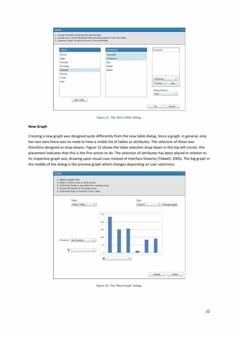
New Table
The task of creating a new table consisted of three different sub task; pick the database table in which the data
exists, choose the attributes to display in the table and possibly apply one or more functions to the selected
attributes. This was placed in a dialog window that would be shown when the user chose to create a new table.
As seen in Figure 11 the dialog consisted of three lists, the left containing database table names. The middle list
contains the attributes belonging to the selected database table in the left list. The right list shows the
functions that have been applied to the selected attributes. The button below the table list opens another
dialog that allows the user to create their own data table by joining two or more tables together.
Figure 10. Prototype with tabs.
22
Figure 11. The ‘New Table’ dialog.
New Graph
Creating a new graph was designed quite differently from the new table dialog. Since a graph, in general, only
has two axes there was no need to have a visible list of tables or attributes. The selection of those was
therefore designed as drop-downs. Figure 12 shows the table selection drop-down in the top left corner, the
placement indicates that this is the first action to do. The selection of attributes has been placed in relation to
its respective graph axis, drawing upon visual cues instead of interface linearity (Tidwell, 2005). The big graph in
the middle of the dialog is the preview graph which changes depending on user selections.
Figure 12. The ‘New Graph’ dialog.

23
6.3 USER TEST 1
The first user test was designed to test the design and capabilities of the high-fidelity prototype report builder.
It used the Talk Aloud Protocol described in 2.7. Two hypotheses were formulated with regard to the users’
knowledge and experience and were tested by having the users performing two separate tasks.
6.3.1 HYPOTHESIS
1. Users with previous knowledge in databases and SQL will be less confused about the interface than
those without previous knowledge.
2. Users with previous knowledge in databases and SQL will perform the tasks faster than those without
previous knowledge.
6.3.2 PROCESS
From the information gathered about the existing and potential users of the MSDP report viewer four types of
test subjects were identified. These test subjects are all Ericsson employees or consultants because it was not
possible to involve real MSDP users. They are listed below as what knowledge they possess.
Tester 1. SQL and MSDP
Tester 2. SQL
Tester 3. MSDP
Tester 4. None of the above
The bare minimum of test subjects for this test was two, since then it would be possible to cover the two
extremes above, i.e. number 1 and 4. However, to get a better understanding of potential problem areas,
especially those dealing with database terms and concepts, a larger group was needed. It was therefore
decided that all four types of users should be represented which meant a test group of four persons. This
number could be increased after the first four should the received feedback not garner sufficient material to
move on.
Each test subject was given two specific tasks to perform, the second of which would not be given until the first
one was completed to avoid confusing the user with too much information. The two tasks are listed below.
1. Create a graph showing the number of unique users per page.
2. Create a table showing the total number of requests per page for the last month.
6.3.3 ANALYZIS AND CONCLUSION
This first user test provided more information and insight than was predicted which may be interpreted as it
was enough with four test subjects. A lot of the received feedback dealt with more mundane, but not less
important, things such as positioning of buttons, background color and symbols. This, combined with the
general consensus from all four subjects that the interface was neatly designed, meant there were just minor
redesigns that had to be done and it was possible to move on.
While hypothesis 1 turned out to be plausible, it was not enough of a difference between the testers to call this
one confirmed. Testers that had SQL knowledge surely recognized many terms such as Table, Attribute and
Join, but the interface and the names of the used terms explained enough of this not to give them a much
greater understanding than testers without SQL knowledge of what was going on. The testers that knew SQL
could probably guess what was happening behind the scenes but that was irrelevant for the tasks performed.

24
The difference between tester 3 and 4 also shows this hypothesis to be hard to confirm. One tester without
SQL experience, but with some product experience, had a small learning curve in the start, when she realized
what the tables actually was she had no further complications. This could be because she could then connect
her mental model of the prototype interface with her mental model of Microsoft Excel and follow roughly the
same work flow.
Hypothesis 2 cannot be confirmed either. The testers with SQL experience were faster at choosing the right
things but at the same time were hesitating to confirm their choices as they knew that join can be a
complicated thing and wanted to be sure of what they did. The tasks the testers were asked to perform was
not that complex so the ones with less SQL experience chose the things that seemed logical and tried it out.
They took longer in selecting what they needed but they worked at a steadier pace with less pauses.
The time taken by each tester was between 27 and 40 minutes with the ones having SQL experience being
slower on average. They did not, however, spend much more time on the tasks. Instead, they commented
more during the process. This could likely be because they were both developers and had experience with
creating an interface and some of the thought that goes into that.
6.3.4 OUTCOME
This section describes the result of the user testing and what changes were made to the prototype.
6.3.4.1 TABLE
In the 'Add table' window (Figure 13) there was a problem with the user not being sure about what attributes
was chosen from the attribute list. It did not make sense to have the same selection indication as in the list of
tables as only one table can be selected in contrast to the limitless amount of attributes that is selectable.
The blue row markers were removed in favor of a system with checkboxes to make it totally clear which
attributes are selected (see Figure 14). As with the blue row markers the selection of attributes are cleared
when selecting a different table. While it would be a faster process if the checks are kept in memory and
rechecked when a table is chosen again after having had some of its attributes checked, it would likely lead to
confusion as to if the attributes are still selected when a different table is selected. If you do not know that you
can only select from a single table, it would seem as if they are always selected after you check them.
The 'Add table' window also got a preview of the resulting table in the same vein as its graph counterpart. This
preview will show a subset of the data source and display a preview of selected attributes and their
modifications according to what functions have been applied. It is placed below the flow of creating the table
to not have it interfere in the process if the user does not want to see it as well as to give it room to expand its
width. The width is prioritized over height because if there always is width to include all the attributes you
want there will never be any need to scroll sideways. There will almost always be a need to scroll up or down,
and having to scroll in two dimensions just to get an overview only adds additional load on the user.
During testing the 'Functions' element was not clear to the tester what it did. On the other hand if they knew
what it was supposed to do, they did not know how to do it. To alleviate this one simple change was done by
adding a word in front of each drop-down to make the two extra words and the drop-downs form a sentence
(Nielsen, et al., 1994). This makes it initially easier to understand and shows that it is separate from the other
parts of this window. In addition, the 'Add' button is now grayed out and disabled if nothing has been selected
from the two required drop-downs. Each applied function in the list also got an 'x' next to it for individual
removal of each function.

25
Figure 13. The Add table window before the user feedback changes.
Figure 14. The Add table window after the user feedback changes.

26
6.3.4.2 GRAPH
The biggest change for the 'Add graph' (Figure 15) window is the addition of a tabbed section with different
tools in each tab (Figure 16). This allows for less cluttering of the interface and lets the interface present one of
the three parts of creating a graph in more detail. The first one contains a list of different graph types the user
can select from and this tab replaces the drop-down above the graph preview in the previous version. This
allows for a tree structure of graph types as well and hovering over each type reveals further graph types
choices. The 'Data' tab has a list of available database tables that the user can choose from when creating the
graph and when hovering over each one a tooltip describes what attributes the table has. By selecting tables in
this list the contents of the X and Y drop-downs changes. These drop-downs have been moved closer together
to emphasize their connection to each other while still maintaining their separate connection to the X- and Y-
axes. The button 'Format graph' has been converted to a tab instead of a pop up window toolbox. Format
graph contains tools for customizing the look of the graph, i.e. colors, labels, etc.
Figure 15. The Add graph window before the user feedback changes.

27
Figure 16. The Add graph window after the user feedback changes.
6.3.4.3 GENERAL
The button to enter the 'New table' window has been renamed to 'Join tables' to better reflect what it actually
does and give new users a hint of what to do when the data they want is in two different tables.
An attempt to differentiate user created tables from the raw data in the database has been added by coloring
the font of the user created tables in all lists (Figure 14). Some users did not see that a new table was created
and this change might alleviate this.
The buttons for 'Cancel' and 'OK' had inadvertently been placed in an UNIX fashion with the dialogs "ending"
with the 'OK' button, i.e. Cancel on the left and OK on the right. There are arguments both for and against both
configurations but as Nielsen (Nielsen, 2008) argues, "Do what the platform owner tells you to do" and
"inconsistency costs more time than it saves", the interface now has OK on the left and Cancel on the right as it
is the Microsoft Windows standard. Nielsen also suggests that giving a more descriptive word than OK on the
button can help the user as just-in-time help. The window that has a button to apply the things you have done
in the window has the word OK on it. In the windows with all actions done and confirmed by tools within the
window, the word ‘Done’ is used instead to close the window, while keeping the ordering of Done and Cancel
the same as OK and Cancel.
28
7 IMPLEMENTATION
This chapter describes the implementation part of this project, what parts were involved in it and which
different technologies were used.
7.1 TECHNOLOGY
Bellow follows a description of some of the technologies used in this project and why they were used.
7.1.1 JSP
JSP is best described as a tag library for HTML that enables the use of Java inside regular HTML tags. It is
executed on the server and is a tool for software developers which allows them to generate content before
presenting it to the user. For this project it was used for generating the report layout from the report
configuration files and for handling information requests by the interface.
7.1.2 JQUERY
JQuery is a JavaScript library designed to speed up the development process by simplifying certain tasks such as
document traversal and manipulation. It also contains complete ‘widgets’, controls, which can be used on an
existing web page.
Both jQuery and regular JavaScript have been used extensively throughout the implementation phase of this
project since they provide a way of handling events and user interaction on the client side, greatly reducing the
need for page refresh.
7.1.3 XML
Due to the design decision to use a tabulated layout, the structure and contents of those tabs needed to be
saved somewhere. Likewise, time and date settings as well as tabs and their content made in the composer had
to be saved so that when bringing up the report in the viewer they were still the same. XML provided a
structured way of saving data in a file and was used extensively in this project.
7.1.4 JSON
JSON is a lightweight data-interchange format that is both easy to read for humans and easy to parse and
generate with another programming language. For this project it was used to handle communication and data
transfers between the client and server, allowing for data updates without reloading the page.
29
7.2 SERVER
Since most of the content in the application has to be generated from a set of report files and configuration
files when requested by the user it was necessary to use a more powerful tool than HTML, in this case JSP.
When the user requests a page the server compiles the JSP files into ordinary HTML and relays that to the user,
meaning the user does not know it is a JSP file. However, this also means that the JSP code is only run once, at
request, and the information it produces will not be updated on the page until the user requests the page
again.
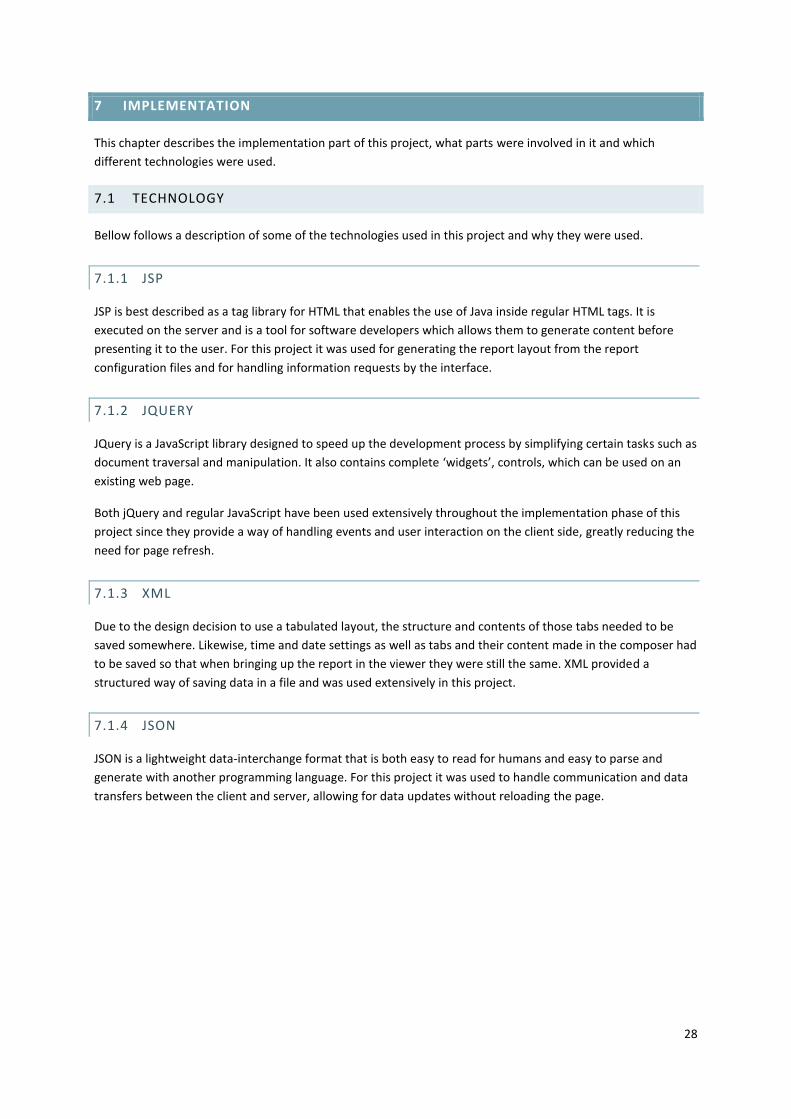
The server side of the application is divided into
several smaller chunks each of which handles a
specific task. These tasks are initiated through user
actions and relayed to the server using the JSON
data-interchange format. Each JSON request to the
server targets a specific JSP file that only does one
thing and once done it sends a JSON response to the
client, either confirming the completion of the task or
providing a set of result data. This allows updates of
certain parts of the interface without reloading the
page.
The biggest task of the server, however, is to
maintain the report files and the user generated
report structure. Each table and graph that BIRT generates is stored in an XML formatted file called rptdesign
file. And because a user created report can contain several of these elements another XML file is needed to
maintain the structure of the user report, i.e. what goes into what tab. This configuration file also holds all time
and date information specified at report creation. This means that a lot of the work on the server comes down
to file handling; reading, writing and moving.
Most of the database communication is handled internally by the BIRT Report Engine but some information has
to be retrieved manually such as database tables and their corresponding attributes. This is needed to populate
the lists of tables and attributes that the user can then choose from when creating his or her report. Because
these are simple lists of information this information can be retrieved through the JSON communication
described earlier meaning the table and attribute lists can be updated on the fly without page reload.
Figure 17. Example of the client-server communication used in the Report
Viewer.

30
7.3 CLIENT
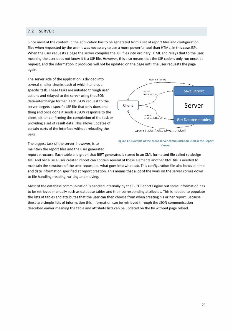
The client is the part of the Report Viewer system that the end user interacts with, i.e. the interface. It was
constructed as a web application using HTML and CSS for layout and style. All events, user or application
generated are handled by JavaScript and by jQuery, a JavaScript library. This meant that most things could be
done and updated without actually refreshing the page the user is on, making it feel more like a desktop
application. However, once a new report element is created, i.e. a BIRT report file, the page has to be updated
since the population of the interface can only be done by the server.
7.3.1 VIEWER
The Viewer application is composed of two parts; the first is the report selection screen and the second is the
report viewer itself.
Report selection screen
The reason behind having a separate report selection screen is that some of the feedback received from
customers detailed which reports they had or were interested in. This feedback showed that they had a
potentially very large number of reports. Placing a large number of items in a list will only force the user to
search the list and the longer it is, the harder it gets and the more time it takes.
A solution for this was to move all the reports to a dedicated selection screen where there were more space to
work with. The final result is shown in Figure 18. In all cases where the customers detailed their reports they
never had any logical division of their reports, it was always one long list.
Figure 18. The report selction screen.
This resulted in the idea of dividing the reports into separate categories where the reports belonging to the
same category had something in common. An example could be that all reports detailing user purchases and
transactions is put in a category called Commerce. These categories can be created from within the report
viewer when saving a report.
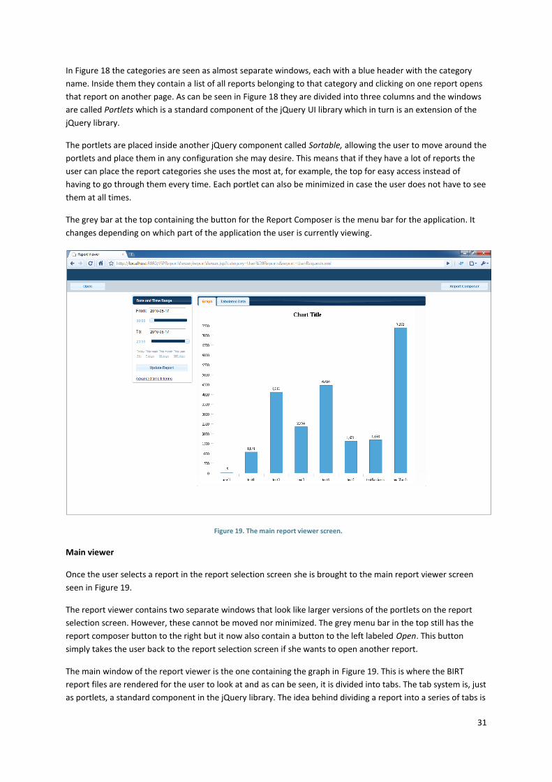
31
In Figure 18 the categories are seen as almost separate windows, each with a blue header with the category
name. Inside them they contain a list of all reports belonging to that category and clicking on one report opens
that report on another page. As can be seen in Figure 18 they are divided into three columns and the windows
are called Portlets which is a standard component of the jQuery UI library which in turn is an extension of the
jQuery library.
The portlets are placed inside another jQuery component called Sortable, allowing the user to move around the
portlets and place them in any configuration she may desire. This means that if they have a lot of reports the
user can place the report categories she uses the most at, for example, the top for easy access instead of
having to go through them every time. Each portlet can also be minimized in case the user does not have to see
them at all times.
The grey bar at the top containing the button for the Report Composer is the menu bar for the application. It
changes depending on which part of the application the user is currently viewing.
Main viewer
Once the user selects a report in the report selection screen she is brought to the main report viewer screen
seen in Figure 19.
The report viewer contains two separate windows that look like larger versions of the portlets on the report
selection screen. However, these cannot be moved nor minimized. The grey menu bar in the top still has the
report composer button to the right but it now also contain a button to the left labeled Open. This button
simply takes the user back to the report selection screen if she wants to open another report.
The main window of the report viewer is the one containing the graph in Figure 19. This is where the BIRT
report files are rendered for the user to look at and as can be seen, it is divided into tabs. The tab system is, just
as portlets, a standard component in the jQuery library. The idea behind dividing a report into a series of tabs is
Figure 19. The main report viewer screen.

32
that one report might contain several sets of data. It might have, for example, a graph showing the total
amount of purchases each day but also a table showing the same information or perhaps several graphs
showing purchases of different items. So instead of having one long page with all this information or smaller
graphs laid out in a grid pattern the tab system was used to allow for a more logical division of the data in a
report.
The layout, names and contents of these tabs are up to the designer of the report and will be covered in more
detail in 7.3.2.
The second, and smaller, window of the viewer is the Date and Time Range
window. It contains all information and parameter settings for date and time.
(Figure 20) The top input field is the date from which the report should show data
and the blue slider below it indicates from what time on that date. The same
applies to the other input field and slider, the only difference being that it is the
end date and end time of the report and consequently the time slider is mirrored.
This gives the impression of an interval between the two sliders that is intended
to be easier to understand than two text fields.
If the user clicks in one of the input fields to edit the start or end date a small
calendar pops up, shown in Figure 21. The user can still edit the text field
manually should she want to but the calendar was added to provide a more visual
selection method and help the user pick the correct date. The calendar widget is a
standard component of the jQuery library called Datepicker. To prevent the user
from picking an end date that is before the start date or vice versa the
datepicker widget disables all dates outside those limits.
Below the date and time settings is a small grid of eight links. Each of these
represent a date and time range and are presets that sets the From and To date
and time to its specific range. For example, assuming it is 2010, This year will set
the From date to 2010-01-01 and the To date to 2010-12-31 while 365 days will
set the From date to the current date minus 365 days.
This is a feature that was actually present in one of the earlier versions of the
MSDP Report Viewer but was, for reasons unknown, removed in a later release
and has ever since been requested by some customers. It provides a quick way
for the user to see the most recent data for the current report.
The Update Report button simply applies the time settings to the current report
and updates the page showing the requested data.
At the bottom of the Date and Time Range window, below the Update Report
button is a link called Advanced time filtering. It contains more specific time
filtering options like what time of the day the report should show or which
weekdays. When the user first clicks it it extends the Date and Time window and
adds what can be seen in Figure 22. The first thing one sees is the red capitalized
OFF label. It indicates that the current option is not enabled and is verified by the
fact that the accompanying checkbox is not checked.
If the user ticks one of the checkboxes the OFF-label changes to a green ON-label
to indicate that this option is now active. It also extends downward to display the
actual settings for this option. InFigure 23 Figure 23 this can be seen with both
Figure 20. Date and Time
settings.
Figure 21. Date and Time settings with the
calendar widget active.
Figure 22. Advanced time
filtering in off-mode.

33
options expanded. The Time of Day filtering is an option for selecting between which times the user wants to
see data, e.g. between 12 and 16 each day. This option has the familiar slidebar but instead of only having one
handle as the two slidebars in Figure 20 this has two handles, one on each side. The area of the slidebar
between the handles are dark blue which indicates this is the selection made and also that it is an interval that
is being selected.
The second advanced time filtering option is the Weekday-filtering which has a list of the weekdays with a
checkbox for each meaning the user can select which days of the week she wishes to include or exclude. When
the weekday-filtering checkbox is off this option defaults to all weekdays.
Above those is a dropbox labeled Resolution which is set to Hours (Figure 22 and
Figure 23), this is also the default value. The resolution controls the granularity of the
report, how fine or small time spans it should show data for. For example, if a report
is designed to show data for the past two years you might not want it set to show
data for each minute but for each month. Likewise if you have a report showing data
for the past 24 hours, having it set to a resolution of days or above will not be very
beneficial.
Figure 23. Advanced time
filtering in on-mode.

34
7.3.2 COMPOSER
The report composer looks very much like the report viewer except for some new buttons and functions which
can be seen in Figure 24. The biggest change is the Tools window to the left above the time parameter window.
This contains the tools needed to create a report, new graph, new table, new text and new tab. At the top left
of the screen there are two additional buttons, Save and New. This allows the user to save the current report
she is working on and create a new one. Open will open an existing report and allow the user to edit the report.
The time and date parameters are the same as in the report viewer, the only difference being that the creator
of the report can set them to certain values and then save the report. When it is then opened in the viewer
those time and date settings are the preset for that report. However, the user can still change them if needed.
New Tab will prompt the user for a name for the new tab and then add it to the main window. It is also possible
to remove existing tabs which is indicated by the cross icon the right of the tab name. The tab that the user has
active determines where the report content is placed when one of the other three tools is used. If the user is
not happy with the name of a tab she can double click on the tab text and a text input field will appear in its
place in which the user can specify a new name.
Using the New Text tool will open a dialog window with a text field in which the user can write anything she
wants. Its intended use, however, is to write information or comments about the report that other users can
read in order to understand the report. Once done the user selects OK and it adds the text to the active tab.
Figure 24. The main Report Composer screen.

35
Table creator
When the user chooses the New Table tool a new dialog window is opened (Figure 25). In this dialog the user
can create a new data table, i.e. a list of information, from the database tables containing the log information.
It has four major components; a list of all database tables available, a list of all attributes in the selected table,
a list of functions that the user has applied to one or more attributes and a table preview showing the users
current selection.
Both the attribute list and the function list depend on the table selected in the table list. This means that if the
user selects another table the contents in the attribute list is replaced with the correct attributes belonging to
the newly selected table. The function list on the other hand is cleared from applied functions to show that
there are no functions currently in use. The selection of attributes and creation of functions is not saved either,
meaning that if the user reselects the previous table it will not repopulate the function list with what was there
before.
This is done to prevent the user from believing she has selected things from more than one table at one time.
The user will also get visual feedback on this in the preview window since that will clear as well when the user
selects another table and display the message No attribute(s) selected, which can be seen in Figure 25. The
preview will update automatically for each new attribute or function the user adds or remove so the user will
always know what the result will be. This preview is set to only query one hundred rows from the database so
that database performance is not a reason to wait for the preview to update.
Once done, the user presses OK, the dialog closes and the active tab is updated with the new table.
Figure 25. Table creator.
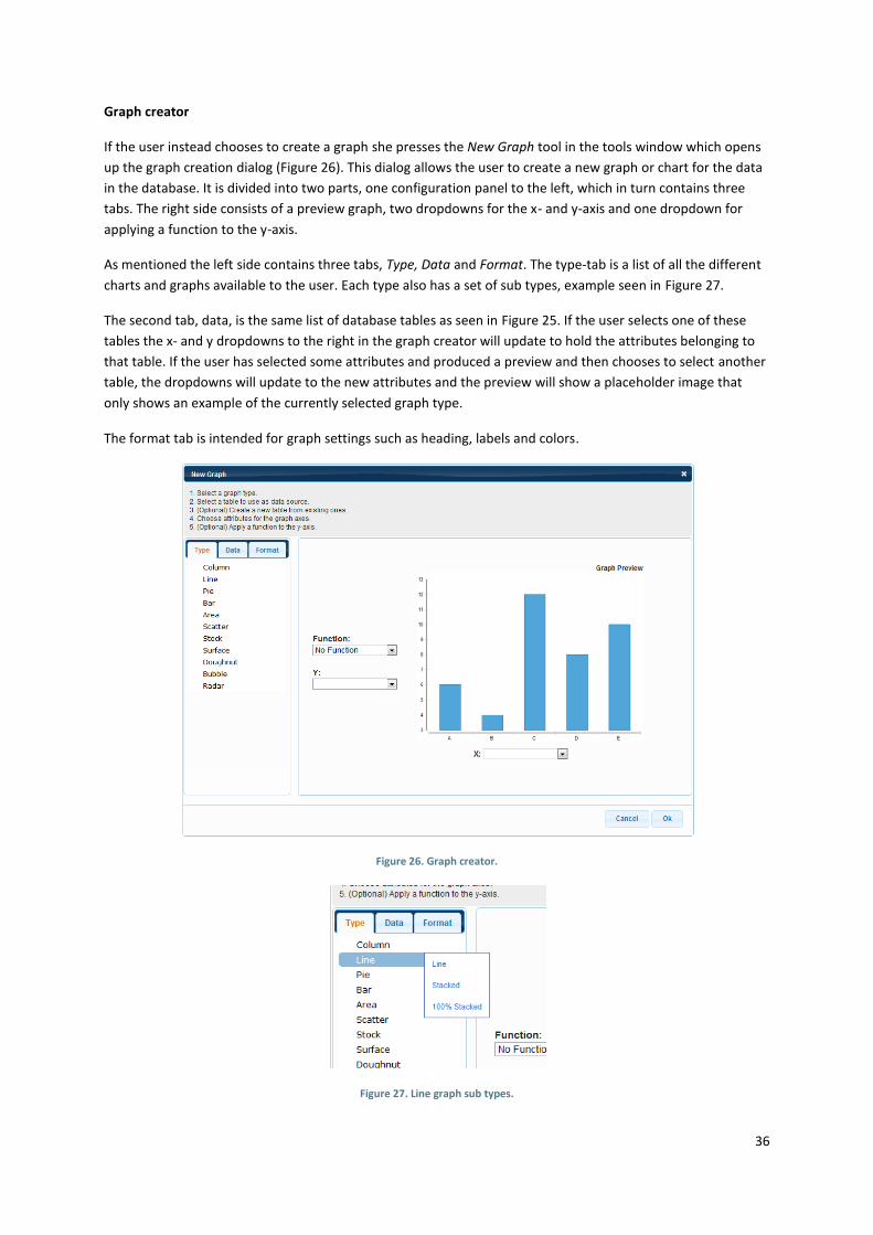
36
Graph creator
If the user instead chooses to create a graph she presses the New Graph tool in the tools window which opens
up the graph creation dialog (Figure 26). This dialog allows the user to create a new graph or chart for the data
in the database. It is divided into two parts, one configuration panel to the left, which in turn contains three
tabs. The right side consists of a preview graph, two dropdowns for the x- and y-axis and one dropdown for
applying a function to the y-axis.
As mentioned the left side contains three tabs, Type, Data and Format. The type-tab is a list of all the different
charts and graphs available to the user. Each type also has a set of sub types, example seen in Figure 27.
The second tab, data, is the same list of database tables as seen in Figure 25. If the user selects one of these
tables the x- and y dropdowns to the right in the graph creator will update to hold the attributes belonging to
that table. If the user has selected some attributes and produced a preview and then chooses to select another
table, the dropdowns will update to the new attributes and the preview will show a placeholder image that
only shows an example of the currently selected graph type.
The format tab is intended for graph settings such as heading, labels and colors.
Figure 26. Graph creator.
Figure 27. Line graph sub types.

37
Join tables
Below the lists of database tables in the create table and create graph dialogs there is a button named Join
Tables. If the user cannot find the data needed in only one table but it exists in two or more she can press this
button and open the join tables dialog (Figure 28).
This dialog consists of four lists, two named Tables and two named Attributes and one Join button. Just as in
the two previously described dialogs, the attribute lists will update according to what table is selected in the
tables list above, i.e. the lists are related vertically. The join button is by default disabled and grayed out.
Once the user has selected two tables she can choose one attribute in each list, at which point the join button
becomes enabled. If pressed the user is presented with a prompt asking for a name for the new table and when
the user confirms, it updates the lists with the new table and the user can either join more tables to the new
one or join two others. When the user presses Done it closes the join tables dialog and opens the previous
dialog, graph or table, and the user now has access to and can use the newly created tables.
Figure 28. Join tables dialog.

38
7.4 USER TEST 2
The second user test was designed to test the final prototype. As in the first user test, two hypotheses were
formulated but this time the testers were given more but smaller tasks in order to test as many of the different
aspects of the application as possible. The hypotheses have been modified to reflect hopes that the interface
has improved to a point where previous experience does not make a big difference.
7.4.1 HYPOTHESIS
1. Users with previous knowledge in databases and SQL will be equally confused about the interface as
those without previous knowledge.
2. Users with previous knowledge in databases and SQL will perform the tasks equally fast as those
without previous knowledge.
7.4.2 PROCESS
For the second test the number of test participants was kept consistent at four. Two of the testers from test
one returned for a second session and two new testers participated.
The decision to have the testers arranged in this way was because being able to compare new testers that had
not used the interface before to someone who had used it before seemed like an interesting metric. At the
same time being able to compare some users’ results from the first test with the second test to see if there
were any improvements was considered important.
1. A little SQL, knows MSDP well (new)
2. Very little SQL experience, knows MSDP well (new)
3. Knows SQL, very little MSDP experience (returning tester)
4. No SQL experience, knows MSDP fairly well (returning tester)
Experience from the first test affected how the tasks were structured in test 2. Instead of two larger tasks, as in
test 1, the testers executed six smaller tasks. This was able to be done since this time around there was a
working, implemented interface that could handle more realistic input. All parts of the interface worked and
the users could as such move more freely through the work flow.
Tasks
1. Create a table with a list of all pages.
2. Create a new tab.
3. Create a graph of number of requests over time.
4. Change the time span of the graph to the entire year.
5. Change the time filtering to only Wednesday afternoons during the last month.
6. Create a table showing the number of requests per page.

39
7.4.3 ANALYZIS AND CONCLUSION
The second user test was conducted at the very end of the implementation phase and provided a chance to see
if changes done to the prototype had had any effects and if having a functioning interface had any effects on
the testers’ success.
This time around the commenting had pretty much the same character as last time with comments about
details. Many of these details were known in advance but there had not been time fix them. One major thing
of this test however, was that SQL was a much bigger problem compared to the first test. This is believed to be
because of how the first test prototype was setup and how limited it was, there was simply less options to fail
at.
The fact that the program's work process is quite short or has intermediary steps that you complete makes it so
that mistakes are not that severe and that was noticeable during testing as the users could get back to where
they were quickly even if they did a grave mistake where they had to start over.
Hypothesis 1 turned out to be false in this test. There was really only one tester this time that had real SQL
experience and had his knowledge fresh in mind. This tester, tester 3, performed a lot better than the other
testers. He was one of the returning testers but this did not seem to have that big of an impact as the other
returning tester had the same problems as the testers that had never used the interface before. The other
tester we had with SQL experience had used SQL in past but did not use it any longer. He showed most of the
problems that testers that did not know SQL did. The hypothesis as it is phrased is true if you assume previous
knowledge is in infinite time span backwards. If you assume previous knowledge instead is recent knowledge,
the hypothesis is false; users with recent knowledge are less confused.
Hypothesis 2 has precisely the same result as hypothesis 1 in that the speed follows closely to the amount of
confusion about the interface the user has. Less confusion - less time taken.
7.4.4 OUTCOME
This section describes the result of the final user tests and in some cases proposed changes for some of the
issues. However, due to the time constraints of the project, no time was available to correct them.
7.4.4.1 TABLE
A noticeable trouble for the users was to understand what the different tables contained. Changing their
names and maybe even consolidating a few of them into the same tables could alleviate the troubles.
The disabled 'Join' button in the join window was invisible to some users under some lighting conditions,
changing its opacity or parts of its opacity might resolve this.
When a join has been made and the user returns to the 'New Table' dialog, the user does not receive any
feedback that what she has done is now active. Selecting the new table in the list will show that it is now there
and usable.
The functions part of the 'New Table' dialog caused trouble for most users and since all changes from test one
had not had time to be implemented a second redesign was done. The sketches for the redesign were looked
over and further changes were made to it. Instead of just redesigning the 'Functions' section of the dialog, the
'Attributes' list and 'Functions' section were combined into one new section taking the space of its
predecessors. When the user selects a table in the 'Tables' list the new 'Attributes and functions' list populates
with a row for each attribute in the table. Each row has the name of the attribute, the name you want on the
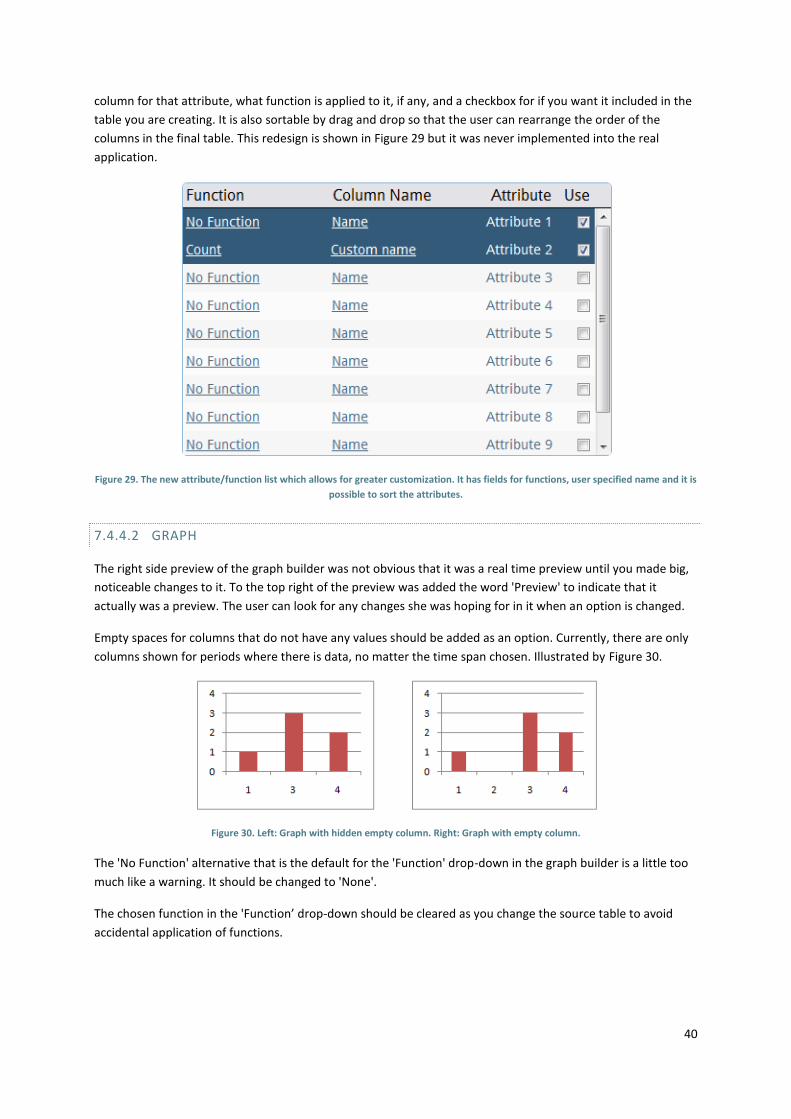
40
column for that attribute, what function is applied to it, if any, and a checkbox for if you want it included in the
table you are creating. It is also sortable by drag and drop so that the user can rearrange the order of the
columns in the final table. This redesign is shown in Figure 29 but it was never implemented into the real
application.
Figure 29. The new attribute/function list which allows for greater customization. It has fields for functions, user specified name and it is
possible to sort the attributes.
7.4.4.2 GRAPH
The right side preview of the graph builder was not obvious that it was a real time preview until you made big,
noticeable changes to it. To the top right of the preview was added the word 'Preview' to indicate that it
actually was a preview. The user can look for any changes she was hoping for in it when an option is changed.
Empty spaces for columns that do not have any values should be added as an option. Currently, there are only
columns shown for periods where there is data, no matter the time span chosen. Illustrated by Figure 30.
Figure 30. Left: Graph with hidden empty column. Right: Graph with empty column.
The 'No Function' alternative that is the default for the 'Function' drop-down in the graph builder is a little too
much like a warning. It should be changed to 'None'.
The chosen function in the 'Function’ drop-down should be cleared as you change the source table to avoid
accidental application of functions.

41
7.4.4.3 GENERAL
The users would like more tooltips and other just-in-time help. Tooltips could be used e.g. for explaining what
different functions actually do.
The button for regenerating the report after changing time settings stays in the same place when you extend
the advanced settings. Either it needs to follow the advanced settings and have a new place at the bottom of
the advanced settings, or there needs to be a second button at the bottom of the advanced settings.
Adding a new tab should be able to be done in the tab bar containing the tabs, as in most modern web
browsers. This can be done by always having a small tab in the tab bar be the button for new tab as if there is
always a clean tab available to be named and used. Returning from either creating a graph or table should
leave the tab you added the new element to as the active tab.
Right now, all dialogs are immovable objects that can’t be dragged around. Several users expressed desire to
be able to move them and peek at what they had done behind it.
There is no undo feature. Supporting undo in the current system structure would be a huge undertaking as
some things are done on the server, some in the client and some on both. Instead, the interface has short
intermediary steps to doing a task and each step can easily be deleted and redone. So there is a kind of undo,
but not a chronological history that you can traverse.
There was a request for more "flashy" charts. When the export feature of BIRT is implemented, enabling
exporting to CSV there should not be any problem implementing Open Flash Charts and having nicer looking
charts.

42
8 DISCUSSION
Existing users
Our first, intermediate goal with the project was to gather feedback from real users at the MSDP customers.
This was supposed to help us develop a set of user needs and requirements into personas that we would then
use in the design of the application. Together with our supervisor at Ericsson we decided on three different
operators from three different countries.
However, as an interaction design student you become a bit naïve, thinking people will want to help if it could,
in any way, help them. It turns out this is not the case, at least not for some of them. One of the customers was
very happy to help us and got back with answers to our questionnaire in a few days. However, the other two
never got back to us with answers, even after some inquiring into why it was taking so long. The reason for this
is unknown but we suspect they forgot about it, did not have time or simply did not want to.
At this point we did not really have a backup plan for gathering information for personas since we assumed the
questionnaires would not be such a problem. We could have asked three more customers but we felt that we
did not have time to go through it all again. So we started looking at existing studies done by Ericsson to try to
learn about the users that way and we also sent out a number of emails to various Ericsson employees who
have frequent customer contact. It did not give us much new information but rather cemented what we
already knew from talking with our supervisor and other employees.
Consequently, the idea of using real users from a local customer for the final user test was scrapped early in the
project. This was very unfortunate since they were the ones that would potentially benefit from a redesigned
report viewer. But as an interaction designer you are counting on their goodwill and willingness to help, and if
they do not want to or do not care there is not much you can do about it especially if it is in another company
and it is “just” for a thesis.
The backup plan for user testing was to try to match the user profiles with employees at Ericsson. This seemed
to turn out quite well, we had a broad spectrum of people and skills and they provided good feedback on the
prototypes. However, the take-away point is: plan for at least two scenarios. It will not hurt to spend some time
to create a backup test, possibly by finding people outside the organization that match the real users. Using
people who you know or that belongs to the same organization introduces bias and social restrictions. One
group do not want to hurt your feelings by telling exactly what they think and one group has a stake in what
you are doing and might hold back critical information because of it.
Easy to use vs. easy to learn
The user base for this application was divided into two distinct camps, those who would use the application
regularly and learn everything that is to learn and those who rarely use it. The skills of the two groups were also
very distinct, one very knowledgeable with the MSDP and system administration, the other group have no
knowledge with the MSDP and do no administration or development. That meant designing for any of these
groups would mean alienating the other since it would either be too hard to use for the novices or not efficient
enough and too abstract, i.e. lack of details, for the experts. But that also meant designing an application that
could satisfy both of these extremes, which meant compromises had to be made.
We decided on designing an application that would be primarily easy to learn and easy to remember with a few
distinct features. It is a bit like Microsoft Excel, if you are a new user you do not really know how to create a
nice looking graph but you can try it out and you grasp the basics quite fast. To support this previews were
added to give immediate feedback to the user about his or her action and most tasks are cancelable.
43
Existing reporting system vs. custom system
Was it worth using an existing system as opposed to creating one? Since we did not explore creating a custom
system it is a difficult thing to answer. However, during the course of the thesis there have been numerous
occasions where we have wondered if a certain feature or function wouldn’t have been easier to do by
ourselves. BIRT is such a large system that it is sometimes hard to understand what to do or how to do it. And
for a prototype of the scale created during this project it would certainly have been possible to create a custom
report system.
However, there are a lot of advantages to using an existing system, especially if it is free. Perhaps the most
compelling reason is that you do not have to invent stuff that has already been done by someone else. This will,
in the long run, save development time and money. However, if the time limit on the project is short, learning
the system might take up a large portion of the development time, which was the case with this thesis.
A related issue was if the choice of BIRT was the right one. In the end of the evaluation process the choice of
reporting system came down to us placing more trust in the Eclipse Foundation than any of the other
companies. We think the Eclipse IDE is a very good development environment and there was no reason to think
BIRT would be any different. And thanks to it being part of Eclipse it also became part of the Eclipse
community, which was as far as we could understand, the largest of the reporting systems evaluated.
In the end we do not believe any of the other systems would have been better than BIRT and we are pleased
with the relatively short learning curve for a system of BIRTs size. However, for this thesis it would probably
have been easier to create a new system due to the limitations of the final application.
In the end we were satisfied with the choice of BIRT, not because it was better than the other systems, we
cannot guarantee that, but because BIRT was not bad at anything.
Blend vs. Paper Prototyping
We have our doubts whether prototyping in Blend was worth the effort. Maybe we could have just used paper
prototyping and used Paint.net or Adobe Photoshop to do a mock up of some aesthetics prototypes for
choosing colors, borders, fonts and so on. While Blend is an excellent prototyping tool for creating interactive
prototypes that can behave as a real application, for someone who does not know it, it might be a bit
hindering. But so is doing a non interactive mockup in Photoshop if you do not know that program.
In retrospect it might have been beneficial to only use paper prototyping since learning to use Blend took quite
some time. It was easy to start off with but the details took time and we would have had time to do more
iterations and versions of the interface if we had used paper prototyping. From purely a prototyping
perspective this is very likely the case since we, ourselves, did not really use the interactivity to evaluate our
own designs. The interactivity was mostly tested by the testers in the user tests.
Testing on a high-fidelity prototype
The first user testing was done on a prototype made to look like the real thing in Microsoft Blend. Making the
prototype like this took quite some time and we had to learn Blend to make it happen. If the prototype we
tested instead would have been a paper prototype with pages upon pages of screens and the options of them,
the creation time would have been shorter. The preparation before the test itself would have been greater as
you have to know the prototype better when you yourself are the one “acting” as the interfaces logic. The fact
that it is you that “are” the interface has a very big advantage compared to a high fidelity computer driven
prototype, you can adapt.

44
If the user wants to try something that you have not prepared or have not thought about you can adapt to that.
You know roughly what would happen and can as such just draw up a screen as it would have looked. If
something is unclear about it, all the better, you can discuss changes with the tester immediately. A computer
made prototype would have to have coded logic in behind the interface to accommodate for this and if this is
done, it would be more of an implemented solution than a prototype you had done for the reason to not have
to do a time consuming implementation.
This happened with the prototype we had done. Several users did minor things wrong but clicking OK produced
the same result as the prototype could not actually process any information and just went to the next step as if
the user had done roughly the right thing. We did not really think this would be that big of a deal and that we
would get valuable data anyway. While there still was useful data extracted from the testing it is our feeling
that more and/or better data could have been produced with a prototype that responded better to what the
tester did.
Something the high fidelity prototype did very well, however, was that many of the testers commented on how
good the design looked. Prototyping the aesthetics in paper is a lot harder than on a computer since that is the
natural environment of the final program and has the power to display a 1:1 representation of the sought after
design.
If you are prepared in the sense that you know your interface and what it should do, using a paper prototype
for the first user test is the way to go.
SQL – layering
One aspect of having the users create their own reports that proved very difficult was making them
understand, or at least be able to use, SQL. When dealing with simple SQL queries like selecting a number of
attributes from one table or even applying a function to one or more of them it is possible to hide that with
some kind of interface. But if the user is to be allowed to retrieve information from more than one table at a
time she needs to be able to join tables together and this is where things become tricky.
We tried to explore several ways of doing this, both text based and visual, and there is probably a few good
ways of doing it. But we also considered in what environment and by whom should this application be used and
realized that a visual approach was probably out of the question due to it being slower and more inefficient. A
potential user of the application was also the current users who actually know a great deal about the system
and some might even have knowledge in SQL. We did not want to alienate those users by creating an interface
that hides what is happening, making them less likely to understand the application and frustrate them
because of lack of fine-control.
On the other side of the spectrum is creating an SQL editor where the user simply enters the SQL code and
retrieves exactly the information she wants. Consequently this alienates more people than the previous version
since more people are likely to not know SQL than know it. The compromise between the two is the version
seen in the final implementation, two table lists and two attribute lists and the ability to join on two tables that
share an attribute.
Our final user test showed that most users would probably have trouble with grasping the whole concept of
joining tables but they expressed an understanding of it once they had tried it once. This brings us back to the
concept of not necessarily easy to use but easy to learn.

45
The database
As was mention in chapter 1.5 the creation of a new database was necessary but not a focus of the project
which meant we would try to not spend as much time on it. However, designing the database proved quite
tricky since the MSDP logs contains so much different information that is connected to each other.
In most, if not all, cases when designing a database you have to adhere to certain naming restrictions and
conventions, especially if the database is part of a large company. This database, however, was going to have
tables read by users not familiar with databases which meant the names of both the tables and their attributes
had to make sense, i.e. be readable and also give a hint to its content.
As a consequence to this it is not really possible to use just any database with this application since you won’t
be able to read the database and attribute lists. One possible solution, which we did not explore, is to save a
humanly readable name of the table inside it or possibly a reference table for both table and attribute names.
In that case it would be possible to save formatting of the name as well, i.e. spaces and capital letters. That
could also lead to having an initial setup that only consists of supplying the application with this reference table
to get access to the other tables.
The final aspect of the database that we discussed at great lengths during the project was performance. With
our design it will grow very fast, in fact it would probably hold several million, possibly billions, rows of data for
each table since it is saving the raw data. This means that performing calculations and joins on those tables
would be extremely slow and probably be even slower than the current solution.
JavaScript/JQuery
JavaScript is, for someone who knows at least Java, easy to learn and get started with but it is not easy to use
to do useful things, e.g. the tabs in the report viewer. We had not planned on using jQuery to help us with our
JavaScript, in fact we had never heard of it before this project. When we started implementing the application
we were looking for a way to create a pop-out calendar for date selection and we came across the calendar
widget on the jQuery UI site. For some time afterwards we only utilized the widgets provided by this extension
library without paying much attention to the core jQuery library.
However, it was not long until we realized the potential of the library and started using it extensively. It makes
HTML element selection very easy and provides a multitude of methods and events for manipulating such
elements. Consequently, a large part of the final application is controlled by JavaScript functions and events
through the use of jQuery and allows most of it to run on the client.
Another part of the application that comes from using jQuery is most of the visual style. The jQuery UI library
comes with a number of different complete visual styles and we felt that instead of putting a lot of time into
creating those things ourselves we used one of these premade styles.
There is no real downside with using jQuery; it is a solid library that really does what it claims. The real problem
lies with JavaScript. Since it is a client side scripting language it is disconnected from what is happening on the
server. For our application, that has to do quite a lot of file handling, it means JavaScript has to continuously
send information to the server and wait for response, which can potentially take some time. Luckily jQuery has
a built in function to communicate with the server using the JSON protocol.
The use of dialogs
Dialogs are, as have been mentioned before, used extensively in the desktop application world but not so on
the web. In many cases the dialogs that we do come across are browser related asking if we want to navigate
away from a page or that some form content is being resent to the server. The other type of window that many

46
would label as dialogs and vice versa are pop-ups, of which very nearly all are ads. In a web environment these
pop-ups interrupt what we are doing and are generally considered a nuisance.
We chose to use dialogs because they are a great way of isolating specific functions and tasks, such as creating
a new graph, while still keeping the user in the same place. The idea was to transfer the feel of a desktop
application to the web environment to make users feel more at home. But also to move away from the
interruptive nature of normal web pages, the reloading of content each time the user navigates to another
page or performs an action. This is why such a large portion of the application is JavaScript based, it allows for
content manipulation at the client side without contacting the server.
A way of helping the users accept the use of dialogs in that environment is to make sure it fits into the rest of
the application, not stand out by having a different style or different colors. The jQuery library was a great help
in that the dialog components it provides are not actually real dialog windows generated by the browser but in-
page dialogs, they are part of the content on the page. These dialogs therefore only exists on the page they are
a part of, they are not separate windows, which has the advantage of not jumping out at the user. But as any
dialog, they can be moved, although only within the browser window.
However, in our case we felt that they would be too big to move, it wouldn’t make any sense but also that it
might be possible to place them outside of the page, making them impossible to get to. However, this decision
was probably not completely correct since testers during the last user test tried to move them to see what was
behind, a way of reminding them what they were doing or what they should do.
In the end we believe that the use of web applications will increase and that many of the design guidelines
specified by companies such as Microsoft for desktop applications will either be transferred to or adopted for
the web. We, as end users, expect the same, or close to, the same functionality from web applications as from
desktop applications. In some cases it will not be possible to create an application as a web application simply
because the server-client architecture cannot support it and because we are, so far, limited by what we can do
in terms of interfaces and performance on the web.

47
9 CONCLUSION
If you are in the market for a reporting system and do not need 100% control of its internal functions then it is
recommended to go with an existing system instead of creating one by yourself. The main reason for doing this
is to cut development time. An existing system will still take time to learn but most likely not nearly as much as
creating one from scratch with equal functionality. Secondly, as long as you are not aiming to develop a new
reporting system, it is not likely that you ever can match the functionality of an existing system that has been
developed solely for this purpose.
On the other hand, if you want or need complete control over your reporting system using an existing
framework depends on your systems size and complexity. If you are going to create a limited system with few
functions it is probably better to create that system from scratch instead of first learning to use the framework.
If your intention instead is to create a feature rich and powerful report creator you will save time in the long
run by using a framework.
If you are going to create a fairly large and complex reporting application and have the time to learn an existing
framework BIRT is a good choice. After using it in this project we cannot recommend against because of a
number of reasons. It is open source and free, it is extensive and has a large community. The reports it creates
can be highly customized to fit into your application and the reports can be exported to a number of different
formats, either for direct use or to use in another library or application.
In the struggle between making the interface easy to learn or harder to learn but effective to use, our
conclusion for this type of interface where many people will use it infrequently you have to go for easy to learn
first. This should not rule out that the interface can be made effective for the frequent user as well, but easy to
learn should have priority when you have to choose.

48
BIBLIOGRAPHY
Araï Dariush Introduktion till kognitiv psykologi [Book]. - Lund : [s.n.], 2001.
Business Intelligence Analytics Software & Data Visualization [Online] // Business Intelligence Analytics
Software & Data Visualization. - TIBCO. - den 27 09 2010. - http://spotfire.tibco.com/.
Faulkner Laura and Wick David http://usableconnections.com/papers/Cross_user_analysis.pdf [Online] //
Laura Faulkner, PhD. - July 5, 2005. - June 28, 2010. -
http://usableconnections.com/papers/Cross_user_analysis.pdf.
Few Stephen Information dashboard design: the effective visual communication of data [Book]. - Sebastopol :
O'Reilly Media Inc, 2006.
Herstatt Cornelius and von Hippel Eric Developing New Product Concepts Via the Lead User Method: A Case
Study in a "Low Tech" Field" [Journal] // Journal of Product Innovation Management. - 1992. - pp. 213-221.
Karlsson Marianne [Online] // DATA- OCH INFORMATIONSTEKNIK. - 2009. - March 15, 2010. -
http://www.cs.chalmers.se/idc/ituniv/kurser/06/analys/kompedie.pdf.
Lewis C H Using the "Thinking Aloud" Method In Cognitive Interface Design [Report]. - [s.l.] : IBM, 1982.
Luhn H P A Business Intelligence System [Online] // IBM Research. - October 1958. - 03 05, 2010. -
http://www.research.ibm.com/journal/rd/024/ibmrd0204H.pdf.
Maier N R.F Reasoning in humans: II. The solution of problem and its appearance in consciousness [Journal] //
Journal of Comparative Psychology. - 1931. - pp. 181-194.
Miller George A The Magical Number Seven, Plus or Minus Two: Some Limits on our Capacity for Processing
Information [Journal] // Psychological Review. - 1956. - 63. - pp. 81-97.
Nielsen Jakob and Molich Heuristic Evaluation [Online] // useit.com: Jakob Nielsen's Website. - 1990. - June 28,
2010. - http://www.useit.com/papers/heuristic/.
Nielsen Jakob and Molich Rolf Ten Usability Heuristics [Online] // useit.com: Jakob Nielsen's Website. - 1994. -
June 28, 2010. - http://www.useit.com/papers/heuristic/heuristic_list.html.
Nielsen Jakob OK–Cancel or Cancel–OK? [Online] // useit.com: Jakob Nielsen's Website. - May 27, 2008. - June
29, 2010. - http://www.useit.com/alertbox/ok-cancel.html.
Nielsen Jakob Paper Prototyping: Getting User Data Before You Code [Online] // useit.com: Jakob Nielsen's
Website. - den 2003 April 2003. - den 15 July 2010. - http://www.useit.com/alertbox/20030414.html.
Power Dan J A Brief History of Decision Support Systems [Online] // Decision Support Systems Resources. -
March 10, 2007. - June 28, 2010. - http://dssresources.com/history/dsshistory.html.
Rieman Task-Centered User Interface Design [Online] // HCI Bibliography : Human-Computer Interaction
Resources. - 1993. - June 29, 2010. - http://hcibib.org/tcuid/.
Tidwell Jenifer Designing Interfaces [Book]. - Sebastopol : O'Reilly Media Inc, 2005. - Vol. First Edition.

49
ntered User Interface Design [Online] // HCI Bibliography : Human-Computer Interaction Resources. - 1993. -
June 29, 2010. - http://hcibib.org/tcuid/.
Tidwell Jenifer Designing Interfaces [Book]. - Sebastopol : O'Reilly Media Inc, 2005. - Vol. First Edition.
Centered User Interface Design [Online] // HCI Bibliography : Human-Computer Interaction Resources. - 1993. -
June 29, 2010. - http://hcibib.org/tcuid/.
Tidwell Jenifer Designing Interfaces [Book]. - Sebastopol : O'Reilly Media Inc, 2005. - Vol. First Edition.

i
APPENDIX A DATABASE SCHEMA
Figure 31. The complete database schema used in the new database.

ii
APPENDIX B USER TESTING FEEDBACK
This appendix contains the result from the user test sessions. They are based on the notes taken during the test
sessions and in some cases there are few or even no notes.
B.1 TEST 1 - 2010-05-04
This is the results for user test 1. Below are the two tasks the users were asked to perform.
1. Create a graph showing the number of unique users per page.
2. Create a table showing the total number of requests per page for the last month.
B.1.1 TESTER 1
Time: 30 minutes
Gender: Male
Knowledge: SQL and MSDP
Task 1
The user has no trouble finding the graph builder. Here he spends some time going through the User and Page
tables to see if they contain what he needs and if he can use them. They appear to hold the correct data but he
can't get information from two tables in the graph as it is. He then tries the "New Table" button.
At this point he sees the radio buttons for inner- and outer join and comments that he recognizes them but
can't remember the difference. It is apparent he only partially reads the instructions; he keeps reading a bit,
trying something and then continues reading. He thinks the instructions are good but thinks a wizard might be
better if a user should really follow it. He also commented on how he avoided the instructions due to the gray
background and that he found it harder to read. Thinks the instructions can be highlighted depending on where
the user is. Comments on the order of the done and cancel buttons in the bottom right corner and that maybe
they should be switched to comply with the Windows standard.
Task 2
Starting out on the second task the user takes some time to read the instructions on the top of the screen
wanting to avoid further complications. The same problem as in task one shows itself again with the user not
remembering what an inner or outer join is. On the 'Add table' screen the user struggles with the belief that
there are some interaction connections between the attribute list and the functions section. The grouping
function is misunderstood to control the time span of the report rather than its actual function. The user did
not fully understand how to choose attributes to include in the result list from the 'Add table' screen. It was not
clear if an attribute was selected for this or not and the user thinks a preview would have helped here.

iii
B.1.2 TESTER 2
Time: 40 minutes
Gender: Male
Knowledge: SQL
Task 1
When given the task the first thing the user did was to check the report viewer to see if there was already an
existing report that showed the information he wanted. In the 'Add graph' screen the user almost immediately
realized that he had to click 'New table' to produce what he needed for the graph. When in the 'New Table'
screen the user went through most of the tables to look at the attributes, but cannot find one to join on due to
the low fidelity of the mockup. The user gave several comments on the interface in general. Some feedback in
the graph builder when a table has been selected is needed such as with a preview. It is strange that you are
able to select the same attribute for both the X and the Y axis. The function drop-down is well placed, felt
connected to the Y axis. Connection between X and Y is not that good. It is not obvious that they are as
dependant on each other as they are. The 'New table' button could be an entry ion the drop-down instead of
situated next to it, feels more intuitive. The flow of the graph builder is OK, but maybe move 'graph type' and
'format graph' to the diagonal flow. The radio buttons should probably have a default selected. The interface as
a whole is very clean and nice. The 'New table' button is the biggest issue but the window it opens is good.
Task 2
When the user is trying to select attributes to include in the attribute list there is not an obvious indication of
them being selected, the user wants to double click them to place a guaranteed selection. The user did not
grasp the connection between the attribute list and the function list and tries to move attributes from the
attribute list to the function list by selecting them from the attributes list and clicking the 'Add' button. The
user wonders about removing functions from the function list, there is no button for it. The problem of
arranging functions in order, does it matter what order they are in? The user wants the possibility of seeing the
SQL code here to better be able to decide if the order will matter. He comments on that arrows or '<'s might be
useful for showing what different elements affect what others.
B.1.3 TESTER 3
Time: 27 minutes
Gender: Female
Knowledge: MSDP
Task 1
The user starts the test with writing down the task so as not to forget it. The user starts up the report composer
and starts with entering the table creator instead of the graph creator. She comments on this as this is basically
how it is done in Microsoft Excel, you need a table before you can create a graph. When the user tries the 'Add
Graph' option instead she reaches the correct screen for the task and continues with reading through the
instructions thoroughly. Once the user understands how to create a graph she selects the user table from the
table drop-down and picks username from the y-axis drop-down. The user then chooses the page table from
the table drop-down and proceeds to set the x-axis to page name. The user believes this is correct because the

iv
mockup did not clear the y-axis drop-down as intended and it therefore, wrongly, matched her mental model
of how the task can be solved.
After the user understands this is incorrect she tries the 'New Table' option. The user now understands that the
existing tables are raw data tables and proceeds to select the user and page tables from the table lists and
clicks join. The mockup produces a new table containing the combined attributes and the user clicks done.
After this the user has no trouble creating a graph from the newly joined table.
Task 2
Since the initial part of the two tasks is almost identical, the user has no trouble creating a joined table with the
information she needs. The user understands the instructions for selecting one or more attributes but is unsure
whether or not she has actually selected an attribute. The time grouping dropdown continues to confuse and
the user picks month from it thinking it means the last month. The user comments on that the instructions are
good to have the first few times but that they might interfere once you know what to do.
B.1.4 TESTER 4
Time: 30 minutes
Gender: Female
Knowledge: None
Task 1
The user started with choosing the report viewer first since she thought it meant that a viewer is a viewer of a
page, i.e. a user. After the user finds her way into the report composer and the graph creator she reads through
the instructions and comments on how the controls need to match the instructions. This means the choice of
graph should be moved to the left instead of having it on the right side. The user comments on how she does
not understand what the 'New Table' button does or might do and does not understand what the function
drop-down is related to. The user tries to select one attribute on one axis from one table and another attribute
from another table on the other axis.
Once the user reaches the new table windows she wonders if it matters in what order you pick the tables when
joining. When the user joins two tables she does not see that a new table appeared in the table lists at the top
of the window and is therefore confused as to what happened. The user comments on how she found the
instructions helpful but that they could be more elaborate and that there might be a separate help section with
much more detail.
Task 2
The user still has problems understanding that she can join two tables together to access the data in both
tables. The time grouping is once again mistaken for time span. She had problems understanding that more
data can be accessed by joining tables and asked for help when creating a new table. Even when given some
instructions the user did not fully understand the concept. This user also used time grouping to try to solve the
subtask of just showing the last month.

v
B.2 TEST 2
Test results from the second test on the final prototype. In this test the testers were asked to grade their
knowledge in SQL and the Ericsson MSDP from 1 to 5.
B.2.1 TESTER 1
Gender: Male
SQL: 2
MSDP: 4
Task 1
The user starts out with clicking New Report to know he starts fresh. He then chooses New Table from the tools
menu and becomes a bit overwhelmed with the dialog popping up. The user then starts to scan through all of
the tables available before deciding trying to select one. He hesitates between page and forpage before
choosing page and is satisfied with his choice. The attributes are not entirely clear if they are selected or not.
The Add button is unclear as well as to what it will do if pressed. Selecting multiple attributes were no problem
as the user found the shift/ctrl modifier for multi-selection, though he did not find it entirely obvious that that
was how you were supposed to do it.
Task 2
The user does not find New Tab immediately; he was looking for it in the tab bar before looking anywhere else.
He also renames the tab.
Task 3
He assumes that the preview would change to reflect what you are hovering over in the graph type menu. The
user thoroughly goes through that table list as he did for adding a table to the report. When going to select to
plot time on one axis he chooses timestamp instead of datetime. He does not realize the need of applying a
function to the y-axis.
Task 4
The user immediately goes for the calendar, but does not spot the quick links. He found them eventually and
commented that they might have to be in another color for him to spot them. Otherwise he really liked the
time and date controls.
Task 5
At first the user tried selecting several dates by using ctrl as a modifier when clicking in the calendar. He soon
found the advanced settings when he noticed that it did not work.
Task 6
He started with checking in the requests table again but did not find anything useful in the attributes. While
checking the drop-boxes he commented on that the drop-box with the selected function should probably be
cleared as you switch around attributes.
After a hint he found the join button and tried to join page and request.
vi
In the end he thought it was kind of a hard process, but the problems he had came from not knowing SQL. He
would like more tooltips and more previews to alleviate this and explain what the different things mean. He
would also like to be able to look behind the dialogs that come up and see what he had already done.
B.2.2 TESTER 2
Gender: Female
SQL: 1
MSDP: 4
Task 1
Starts out with clicking on New Table and thinks it is alot of things in the new dialog that comes up so she feels
she needs to read the instructions. To select multiple attributes she would have liked to have ssome sort of
checkbox system instead of using ctrl. Since the list for functions was empty she thought that there were
nothing available.
Task 3
Starting up the New Graph window she sees a big graph greeting her and feels that she has come to the right
place. She would like the graph type menu show which graph was selected in the list as well as showing how it
would look like. She wonders about the meaning of table, not sure about a if what she thinks is a table is the
same thing in SQL. The user tries moving the dialog. She is not sure about what to do but tries looking for time
in the list of tables. The user does not find anything referring to time and instead looks around in the drop-
downs. She gets a bit confused when the graph disappears due to the database not returning anything from
the current query.
She tries thinking about the last task and tries with a new table. The attributes could be named a bit simpler.
No Function does not sound so good. The user now moves outside the task and tries to get requests per page
instead. There is a problem with differentiating between Sum and Count. The database had an error in the
query she made and that error text was not any good at all for her. She then thought about using another
attribute instead and tried portal version. She wondered about the format on datetime when it was printed out
on the graph. It would be nice if the tab selected when you were done in the Graph builder was the one you
placed the tab on so you can see that it had been created.
Task 4
The user begins by going to date settings and chooses last year in the calendar drop down. She updates the
report and it satisfied with the result. She would like to be able to save the report now but does not see any
save down to the right where she thought it was.
Task 5
She had already seen the advanced time settings while doing the last task so there was no need to start looking
for anything else. She skips the resolution drop-down and instead manipulates time of day filtering and
weekday filtering. The sliders were very nice, she likes that the on and off indicators on the filers are in color to
be more clear. She misses the time links and did not immediately find Update Report when the advanced time
settings were expanded.

vii
Task 6
It took a little while for her to find Join Tables and she thought it was a bit unexpected to get an entirely new
dialog when she clicked it. As she inspected the new dialog she was a bit surprised that attributes were below
their tables instead of to the right of them as in the previous dialog. The Join button was almost invisible to her
and she was looking for it to the bottom right. As she returned to the previous dialog she would have liked the
table she had just created to be selected and ready for use.
A comment included that it was a bit complicated due to the SQL and she had an interface mishap with
accidentally closing a tab.
B.2.3 TESTER 3
Gender: Male
This tester did not have any major problems at all. On task 4 he tried using multiple selections to get several
months instead of picking a year long time span.
He commented on the difference of implicit and explicit joins and that some users might have one or the other
as a mental model and using the other than the one you are used to can be somewhat harder.
B.2.4 TESTER 4
Gender: Female
Task 1
This is a returning user and to refresh her memory she reads through the instructions before whe sets off. She
comments on how nice it is with a preview now in the implemented version. A problem arises when she wants
to name the tables name and uses the box for naming functions to do it.
Task 3
At first she does not read the instructions but reads them later. She has some problems finding the right things,
does not really know what she is looking for and never tries the function drop-down. There are SQL problems
with Sum and Count.
Task 4
At first she went for the calendar and completed the task there but afterwards she saw the quick links.
Task 5
She comments on that advanced settings sounds advanced, but has no problem completing the task.
Task 6
After trying a bit she reads the instructions but are still unclear on whom you know when you are supposed to
use Join Table.

viii
APPENDIX C SKETCHES
This appendix contains the various interface control sketches done in order to explore some of the designs.
Figure 32. This sketch shows the various designs for handling functions in a table. The top left is the one used in the prototype. Since
that caused confusions during testing a number of other designs were done in order to rectify the problem. Sadly these did not make it
into the final prototype.
Figure 33. Figure contains sketches for grouping-, sorting and top result controls. Only grouping made it into the final prototype.

ix
Figure 34. An early exploration of the report selection list. The idea was to have this to the left in the report viewer so the user had easy
access to the reports. This did not work since it should be able to hold a great number of reports while still being usable.
Figure 35. The sketch is showing the various designs for a time span selector. It details some of the disadvantages for using the designs.
The top design is one that was present in an earlier version of the MSDP report viewer but that was removed. That feature has later
been requested by the customers.
Figure 36. An exploration of time and date selection controls. It contains the controls from the current report viewer (top left) and also
examples from various online services.

x
APPENDIX D QUICK SCORE OF REPORT SYSTEMS
Below follows the result from the quick score evaluation of the final reporting systems. The score is based on
the information readily available on the internet.
Crystal Report BIRT Dynamic Jasper
Viewer API 10 10 10
Designer API 5 10 10
Documentation
How-to's 5 8 6
Tutorials 0 9 5
Forums 0 10 5
Books/E-Book 5 5 10
Existing Implementation
Report Builder 7 6 6
Web Builder 0 0 0
Web Viewer 7 8 4
Perceived Quality 6 7 7
Sum 45 73 63
Table 1. The quick score results from the evaluation.
Graph 1. A graph showing the quick score result for the documentation.
0
2
4
6
8
10
12Documentation
Crystal Report
BIRT
Dynamic Jasper
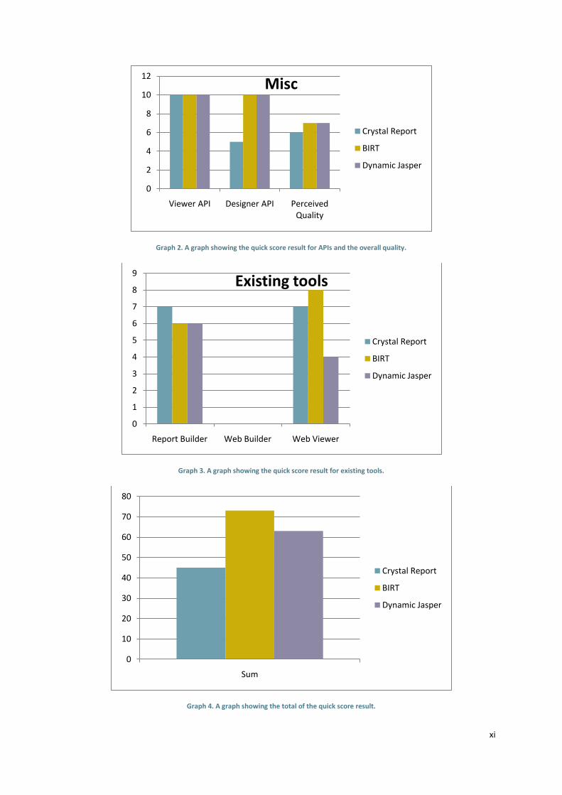
xi
Graph 2. A graph showing the quick score result for APIs and the overall quality.
Graph 3. A graph showing the quick score result for existing tools.
Graph 4. A graph showing the total of the quick score result.
0
2
4
6
8
10
12
Viewer API Designer API Perceived Quality
Misc
Crystal Report
BIRT
Dynamic Jasper
0
1
2
3
4
5
6
7
8
9
Report Builder Web Builder Web Viewer
Existing tools
Crystal Report
BIRT
Dynamic Jasper
0
10
20
30
40
50
60
70
80
Sum
Crystal Report
BIRT
Dynamic Jasper