focus on gentrification - furman...
TRANSCRIPT
4 NYU Furman Center • @FurmanCenterNYU
Given the mounting concern about housing affordability
in New York City, for the purpose of this study, we define
“gentrification” as rapid rent growth in low-income neigh-
borhoods. Using this definition, we quantify the scale and
map the geography of rent increases in New York City’s
low-income neighborhoods. We also identify and analyze
other shifts that have accompanied these rent increases;
most notably, changes in the characteristics of residents. We
hope that by better understanding patterns of neighborhood
change—and how rapidly-rising rents affect residents—
policymakers will be better informed and able to design
appropriate policy responses.
Summary of Findings To more clearly define “gentrification” in the context of New
York City’s neighborhoods, we establish a classification sys-
tem with three categories, which are referenced throughout
the chapter. We divide New York City’s 55 sub-borough areas
(SBAs) into three types: “gentrifying neighborhoods” consist
of SBAs that were low-income in 1990 and experienced rent
growth above the median SBA rent growth between 1990 and
2010-2014 1; “non-gentrifying neighborhoods” are those that
also started off as low-income in 1990 but experienced more
modest growth; and “higher-income neighborhoods” are the
city’s remaining SBAs, which had higher incomes in 1990.
We use these three neighborhood classifications to
explore and compare the patterns of change in New York
City’s neighborhoods. In particular, we compare changes
over time in housing costs, population, housing stock, resi-
dent characteristics, and rental affordability.
1 Throughout this chapter, we use the American Community Survey 2005-2009 and 2010-2014 five-year estimates. These data are period estimates and should be inter-preted as a measure of the conditions during the whole range. For more information, see the Methods section.
We find that:
• While rents only increased modestly in the 1990s, they
rose everywhere in the 2000s, most rapidly in the low-
income neighborhoods surrounding central Manhattan.
• Most neighborhoods in New York City regained the popu-
lation they lost during the 1970s and 1980s, while the
population in the average gentrifying neighborhood in
2010 was still 16 percent below its 1970 level.
• One third of the housing units added in New York City
from 2000 to 2010 were added in the city’s 15 gentrify-
ing neighborhoods despite their accounting for only
26 percent of the city’s population.
• Gentrifying neighborhoods experienced the fastest
growth citywide in the number of college graduates,
young adults, childless families, non-family households,
and white residents between 1990 and 2010-2014. They
saw increases in average household income while most
other neighborhoods did not.
• Rent burden has increased for households citywide since
2000, but particularly for low- and moderate-income
households in gentrifying and non-gentrifying neigh-
borhoods.
• The share of recently available rental units affordable to
low-income households declined sharply in gentrifying
neighborhoods between 2000 and 2010-2014.
• There was considerable variation among the SBAs clas-
sified as gentrifying neighborhoods; for example, among
the SBAs classified as gentrifying, the change in average
household income between 2000 and 2010-2014 ranged
from a decrease of 16 percent to an increase of 41 percent.
“Gentrification” has become the accepted term to describe neighborhoods that start off predominantly occupied by households of relatively low socioeconomic status, and then experience an inflow of higher socioeconomic status households. The British sociologist Ruth Glass coined the term in 1964 to describe changes she encountered in formerly working-class London neighborhoods, and sociologists first began applying the term to New York City (and elsewhere) in the 1970s. Since entering the mainstream lexicon, the word “gentrification” is applied broadly and interchangeably to describe a range of neighborhood changes, including rising incomes, changing racial composition, shifting commercial activity, and displacement of original residents.
Focus on Gentrification
PAR
T 1: FOC
US O
N G
EN
TRIFIC
ATIO
N
State of New York City’s Housing and Neighborhoods in 2015 5
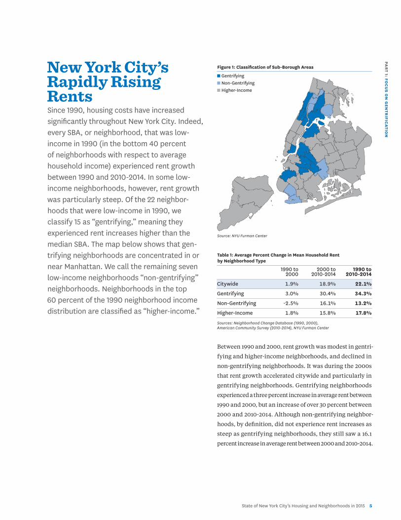
New York City’s Rapidly Rising Rents Since 1990, housing costs have increased significantly throughout New York City. Indeed, every SBA, or neighborhood, that was low-income in 1990 (in the bottom 40 percent of neighborhoods with respect to average household income) experienced rent growth between 1990 and 2010-2014. In some low-income neighborhoods, however, rent growth was particularly steep. Of the 22 neighbor-hoods that were low-income in 1990, we classify 15 as “gentrifying,” meaning they experienced rent increases higher than the median SBA. The map below shows that gen-trifying neighborhoods are concentrated in or near Manhattan. We call the remaining seven low-income neighborhoods “non-gentrifying” neighborhoods. Neighborhoods in the top 60 percent of the 1990 neighborhood income distribution are classified as “higher-income.”
Figure 1: Classification of Sub-Borough Areas
n Gentrifying n Non-Gentrifying n Higher-Income
Source: NYU Furman Center
Table 1: Average Percent Change in Mean Household Rent by Neighborhood Type
1990 to 2000 to 1990 to 2000 2010-2014 2010-2014
Citywide 1.9% 18.9% 22.1%
Gentrifying 3.0% 30.4% 34.3%
Non-Gentrifying -2.5% 16.1% 13.2%
Higher-Income 1.8% 15.8% 17.8%
Sources: Neighborhood Change Database (1990, 2000), American Community Survey (2010-2014), NYU Furman Center
Between 1990 and 2000, rent growth was modest in gentri-
fying and higher-income neighborhoods, and declined in
non-gentrifying neighborhoods. It was during the 2000s
that rent growth accelerated citywide and particularly in
gentrifying neighborhoods. Gentrifying neighborhoods
experienced a three percent increase in average rent between
1990 and 2000, but an increase of over 30 percent between
2000 and 2010-2014. Although non-gentrifying neighbor-
hoods, by definition, did not experience rent increases as
steep as gentrifying neighborhoods, they still saw a 16.1
percent increase in average rent between 2000 and 2010-2014.
6 NYU Furman Center • @FurmanCenterNYU
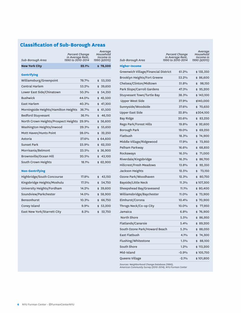
Average Percent Change Household in Average Rent, Income in Sub-Borough Area 1990 to 2010-2014 1990 ($2015)
New York City 22.1% $ 78,500
Gentrifying
Williamsburg/Greenpoint 78.7% $ 53,550
Central Harlem 53.2% $ 39,650
Lower East Side/Chinatown 50.3% $ 54,350
Bushwick 44.0% $ 42,500
East Harlem 40.3% $ 47,300
Morningside Heights/Hamilton Heights 36.7% $ 61,500
Bedford Stuyvesant 36.1% $ 46,150
North Crown Heights/Prospect Heights 29.9% $ 56,600
Washington Heights/Inwood 29.3% $ 55,650
Mott Haven/Hunts Point 28.0% $ 32,250
Astoria 27.6% $ 64,600
Sunset Park 23.9% $ 62,550
Morrisania/Belmont 23.5% $ 36,900
Brownsville/Ocean Hill 20.5% $ 43,100
South Crown Heights 18.1% $ 62,900
Non-Gentrifying
Highbridge/South Concourse 17.8% $ 43,150
Kingsbridge Heights/Moshulu 17.5% $ 54,750
University Heights/Fordham 14.2% $ 39,600
Soundview/Parkchester 14.0% $ 58,900
Bensonhurst 10.3% $ 66,750
Coney Island 9.9% $ 53,200
East New York/Starrett City 8.2% $ 52,750
Average Percent Change Household in Average Rent, Income in Sub-Borough Area 1990 to 2010-2014 1990 ($2015)
Higher-Income
Greenwich Village/Financial District 61.2% $ 132,350
Brooklyn Heights/Fort Greene 53.2% $ 86,600
Chelsea/Clinton/Midtown 51.8% $ 98,150
Park Slope/Carroll Gardens 47.3% $ 95,200
Stuyvesant Town/Turtle Bay 38.3% $ 143,100
Upper West Side 37.9% $ 140,000
Sunnyside/Woodside 37.6% $ 70,650
Upper East Side 22.8% $ 204,100
Bay Ridge 20.6% $ 83,250
Rego Park/Forest Hills 19.8% $ 92,600
Borough Park 19.0% $ 69,250
Flatbush 18.3% $ 74,900
Middle Village/Ridgewood 17.9% $ 73,950
Pelham Parkway 16.6% $ 68,850
Rockaways 16.5% $ 71,000
Riverdale/Kingsbridge 16.3% $ 86,700
Hillcrest/Fresh Meadows 13.8% $ 92,350
Jackson Heights 12.5% $ 73,150
Ozone Park/Woodhaven 12.3% $ 80,750
Bayside/Little Neck 11.3% $ 107,300
Sheepshead Bay/Gravesend 11.1% $ 80,400
Williamsbridge/Baychester 11.0% $ 73,900
Elmhurst/Corona 10.4% $ 70,900
Throgs Neck/Co-op City 10.0% $ 77,950
Jamaica 6.8% $ 76,900
North Shore 5.5% $ 86,950
Flatlands/Canarsie 5.4% $ 89,200
South Ozone Park/Howard Beach 5.3% $ 88,050
East Flatbush 4.1% $ 74,300
Flushing/Whitestone 1.5% $ 88,100
South Shore 1.2% $ 113,200
Mid-Island -0.9% $ 105,750
Queens Village -2.1% $ 101,800
Sources: Neighborhood Change Database (1990), American Community Survey (2010-2014), NYU Furman Center
Classification of Sub-Borough Areas

PAR
T 1: FOC
US O
N G
EN
TRIFIC
ATIO
N
State of New York City’s Housing and Neighborhoods in 2015 7
Changes In Population Levels and In the Supply of HousingBetween 1970 and 1980, New York City experienced a stark population loss of over 800,000 people—10.4 percent of its popula-tion. Since 1980, the city’s population levels have rebounded, and rapid population growth led to the city reaching its all-time popula-tion high in 2010. Following the mass exodus of population from New York City in the 1970s, the city’s higher-income and non-gentrifying neighborhoods regained their 1970 popula-tion levels by 1990 and 2000, respectively. The population in gentrifying neighborhoods in 2010, however, was still roughly 16 percent below its population in 1970.
As the city experienced population growth in the past few
decades, the demand for housing also increased. However,
the supply of additional housing units has not kept pace,
nor have new units been evenly distributed among the city’s
neighborhoods. Since 2000, the majority of housing units
added to New York City have been located in gentrifying
neighborhoods, even though the population increase in
this set of neighborhoods has not been as large as in the
rest of the city.
1. Gentrifying neighborhoods have not gained back population lost in the 1970s. New York lost about 822,000 people (Figure 2), between
1970 and 1980. The loss was heaviest in the low-income
neighborhoods that would gentrify by 2014; nearly 80 per-
cent of the population loss came from neighborhoods that
would gentrify (Figure 2). By 2010, the population in higher-
income neighborhoods was 13.6 percent higher than in 1970;
the population in non-gentrifying neighborhoods was just
over eight percent higher than in 1970. Despite the popula-
tion growth in gentrifying neighborhoods, their aggregate
population was still 15.8 percent lower in 2010 than it had
been in 1970. As shown in Figure 2, 22.7 percent of the net
population increase in New York City between 2000 and 2010
was in gentrifying neighborhoods (16.5% in non-gentrifying
neighborhoods and 60.8% in higher-income neighborhoods).
Table 2: Percent Change in Population by Decade and Neighborhood Type
% % % % % Change Change Change Change Change 1970- 1980- 1990- 2000- 1970- 1980 1990 2000 2010 2010
Citywide -10.4% 3.6% 9.4% 2.1% 3.6%
Gentrifying -25.9% 5.6% 5.7% 1.8% -15.8%
Non-Gentrifying -6.8% 3.1% 9.8% 2.8% 8.4%
Higher-Income -2.3% 2.8% 10.9% 2.1% 13.6%
Sources: Neighborhood Change Database (1970, 1980, 1990, 2000, 2010), NYU Furman Center Figure 2: Net Change in Population by Neighborhood Type and Decade
n Gentrifying n Non-Gentrifying n Higher-Income Sources: Neighborhood Change Database (1970, 1980, 1990, 2000, 2010), NYU Furman Center
-1000
-800
-600
-400
-200
0
200
400
600
800
TOTA
L PO
PULA
TIO
N C
HAN
GE
(1,0
00S
PEO
PLE)
Net Change 1970-80
Net Change 1980-90
Net Change 1990-2000
Net Change 2000-10
79.6%
41.3% 16.5%60.8%16.5%22.7%
47.8%
70.5%
10.8% 13.0%
7.8%12.6%
8 NYU Furman Center • @FurmanCenterNYU
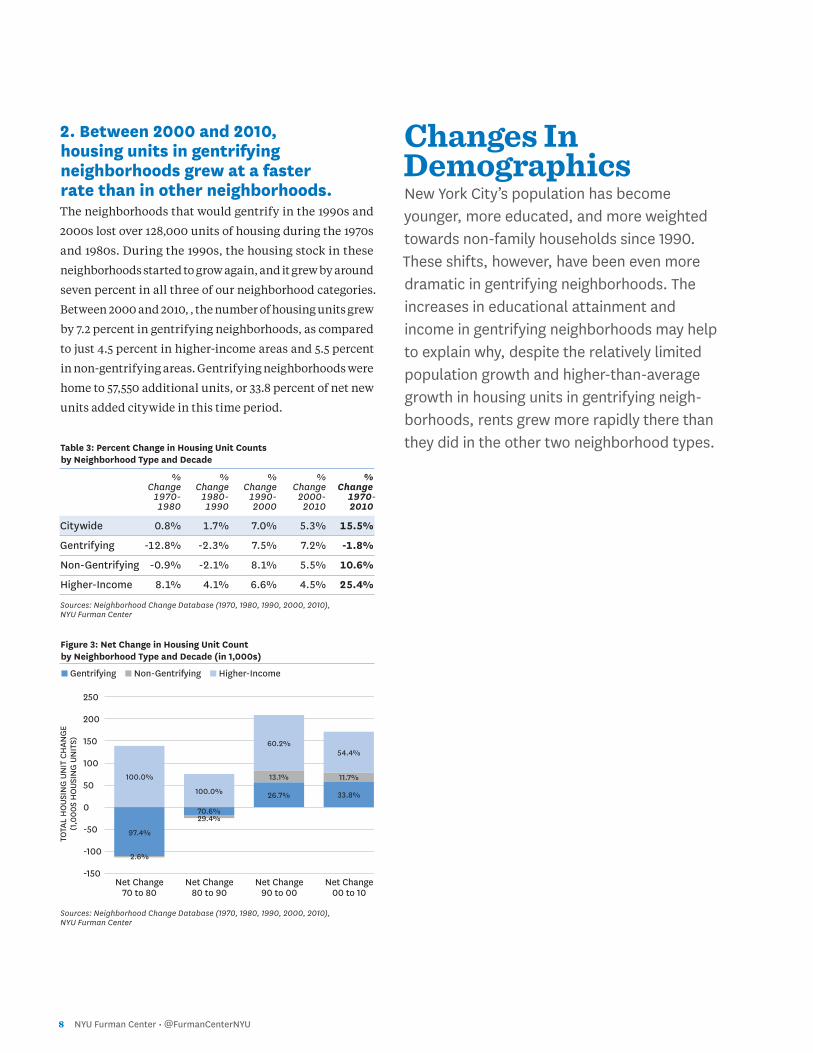
2. Between 2000 and 2010, housing units in gentrifying neighborhoods grew at a faster rate than in other neighborhoods.The neighborhoods that would gentrify in the 1990s and
2000s lost over 128,000 units of housing during the 1970s
and 1980s. During the 1990s, the housing stock in these
neighborhoods started to grow again, and it grew by around
seven percent in all three of our neighborhood categories.
Between 2000 and 2010, , the number of housing units grew
by 7.2 percent in gentrifying neighborhoods, as compared
to just 4.5 percent in higher-income areas and 5.5 percent
in non-gentrifying areas. Gentrifying neighborhoods were
home to 57,550 additional units, or 33.8 percent of net new
units added citywide in this time period.
Table 3: Percent Change in Housing Unit Counts by Neighborhood Type and Decade
% % % % % Change Change Change Change Change 1970- 1980- 1990- 2000- 1970- 1980 1990 2000 2010 2010
Citywide 0.8% 1.7% 7.0% 5.3% 15.5%
Gentrifying -12.8% -2.3% 7.5% 7.2% -1.8%
Non-Gentrifying -0.9% -2.1% 8.1% 5.5% 10.6%
Higher-Income 8.1% 4.1% 6.6% 4.5% 25.4%
Sources: Neighborhood Change Database (1970, 1980, 1990, 2000, 2010), NYU Furman Center Figure 3: Net Change in Housing Unit Count by Neighborhood Type and Decade (in 1,000s)
n Gentrifying n Non-Gentrifying n Higher-Income Sources: Neighborhood Change Database (1970, 1980, 1990, 2000, 2010), NYU Furman Center
Changes In Demographics New York City’s population has become younger, more educated, and more weighted towards non-family households since 1990. These shifts, however, have been even more dramatic in gentrifying neighborhoods. The increases in educational attainment and income in gentrifying neighborhoods may help to explain why, despite the relatively limited population growth and higher-than-average growth in housing units in gentrifying neigh-borhoods, rents grew more rapidly there than they did in the other two neighborhood types.
TOTA
L H
OUS
ING
UN
IT C
HAN
GE
(1,0
00S
HO
USIN
G U
NIT
S)
-150
-100
-50
0
50
100
150
200
250
100.0%
100.0%
60.2%
70.6%
13.1% 11.7%
54.4%
26.7% 33.8%
29.4%
97.4%
2.6%
Net Change 70 to 80
Net Change 80 to 90
Net Change 90 to 00
Net Change 00 to 10
PAR
T 1: FOC
US O
N G
EN
TRIFIC
ATIO
N
State of New York City’s Housing and Neighborhoods in 2015 9
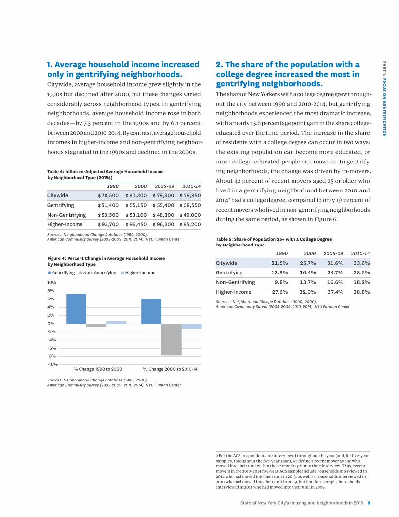
1. Average household income increased only in gentrifying neighborhoods. Citywide, average household income grew slightly in the
1990s but declined after 2000, but these changes varied
considerably across neighborhood types. In gentrifying
neighborhoods, average household income rose in both
decades—by 7.3 percent in the 1990s and by 6.1 percent
between 2000 and 2010-2014. By contrast, average household
incomes in higher-income and non-gentrifying neighbor-
hoods stagnated in the 1990s and declined in the 2000s.
Table 4: Inflation-Adjusted Average Household Income by Neighborhood Type (2015$)
1990 2000 2005-09 2010-14
Citywide $ 78,500 $ 80,300 $ 79,900 $ 79,950
Gentrifying $ 51,400 $ 55,150 $ 55,400 $ 58,550
Non-Gentrifying $ 53,500 $ 53,100 $ 48,300 $ 49,000
Higher-Income $ 95,700 $ 96,450 $ 96,300 $ 95,200
Sources: Neighborhood Change Database (1990, 2000), American Community Survey (2005-2009, 2010-2014), NYU Furman Center
Figure 4: Percent Change in Average Household Income by Neighborhood Type
n Gentrifying n Non-Gentrifying n Higher-Income
Sources: Neighborhood Change Database (1990, 2000), American Community Survey (2005-2009, 2010-2014), NYU Furman Center
2. The share of the population with a college degree increased the most in gentrifying neighborhoods.The share of New Yorkers with a college degree grew through-
out the city between 1990 and 2010-2014, but gentrifying
neighborhoods experienced the most dramatic increase,
with a nearly 15.6 percentage point gain in the share college-
educated over the time period. The increase in the share
of residents with a college degree can occur in two ways:
the existing population can become more educated, or
more college-educated people can move in. In gentrify-
ing neighborhoods, the change was driven by in-movers.
About 42 percent of recent movers aged 25 or older who
lived in a gentrifying neighborhood between 2010 and
20142 had a college degree, compared to only 19 percent of
recent movers who lived in non-gentrifying neighborhoods
during the same period, as shown in Figure 6.
Table 5: Share of Population 25+ with a College Degree by Neighborhood Type
1990 2000 2005-09 2010-14
Citywide 21.5% 25.7% 31.6% 33.6%
Gentrifying 12.9% 16.4% 24.7% 28.5%
Non-Gentrifying 9.8% 13.7% 16.6% 18.2%
Higher-Income 27.6% 32.0% 37.4% 38.8%
Sources: Neighborhood Change Database (1990, 2000), American Community Survey (2005-2009, 2010-2014), NYU Furman Center
2 For the ACS, respondents are interviewed throughout the year (and, for five-year samples, throughout the five-year span), we define a recent mover as one who moved into their unit within the 12 months prior to their interview. Thus, recent movers in the 2010-2014 five-year ACS sample include households interviewed in 2014 who had moved into their unit in 2013, as well as households interviewed in 2010 who had moved into their unit in 2009, but not, for example, households interviewed in 2011 who had moved into their unit in 2009.
-10%
-8%
-6%
-4%
-2%
0%
2%
4%
6%
8%
10%
% Change 1990 to 2000 % Change 2000 to 2010-14
1 0 NYU Furman Center • @FurmanCenterNYU
Figure 5: Percentage Point Change in Share of Population 25+ with a College Degree by Neighborhood Type
n Gentrifying n Non-Gentrifying n Higher-Income
Sources: Neighborhood Change Database (1990, 2000), American Community Survey (2010-2014), NYU Furman Center
Figure 6: Educational Attainment Among Recent Movers Aged 25+ by Neighborhood Type, 2010-2014
n No College Degree n College Degree
Sources: American Community Survey (2010-2014), NYU Furman Center
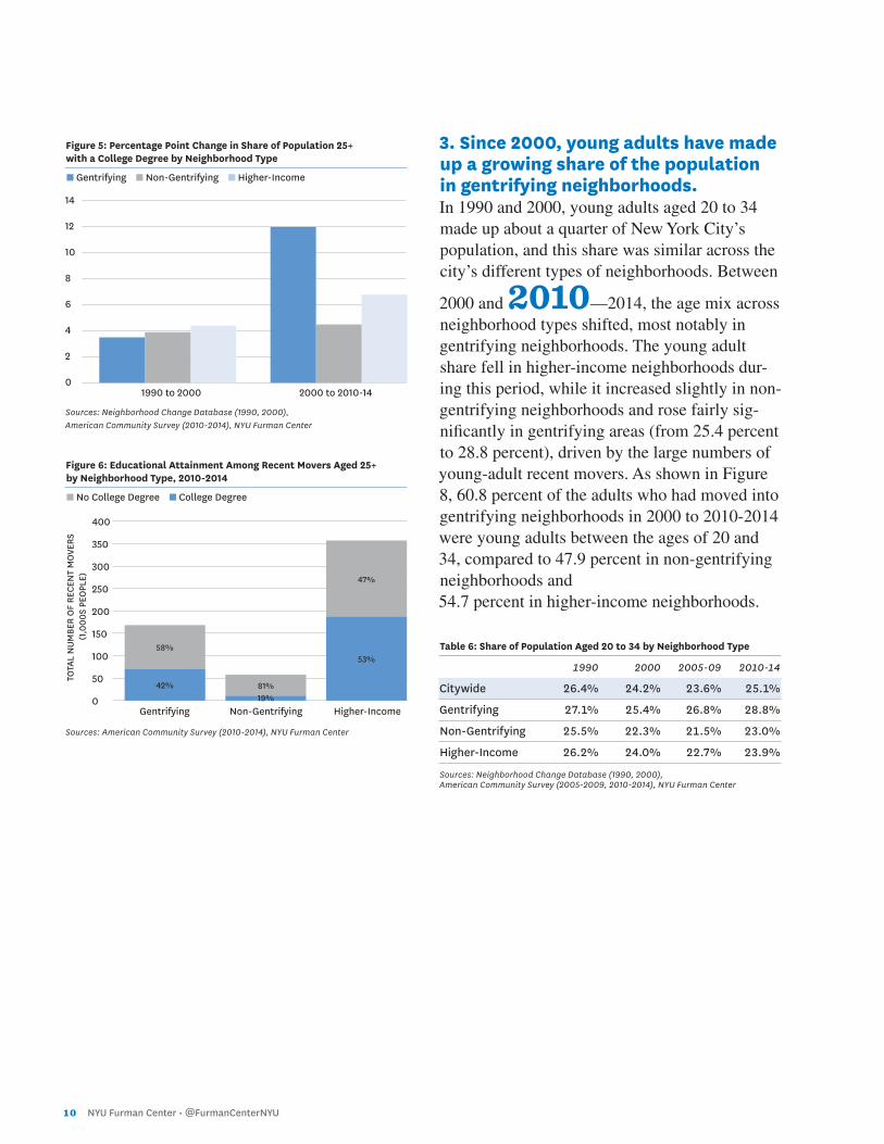
3. Since 2000, young adults have made up a growing share of the population in gentrifying neighborhoods. In 1990 and 2000, young adults aged 20 to 34 made up about a quarter of New York City’s population, and this share was similar across the city’s different types of neighborhoods. Between
2000 and 2010—2014, the age mix across neighborhood types shifted, most notably in gentrifying neighborhoods. The young adult share fell in higher-income neighborhoods dur-ing this period, while it increased slightly in non-gentrifying neighborhoods and rose fairly sig-nificantly in gentrifying areas (from 25.4 percent to 28.8 percent), driven by the large numbers of young-adult recent movers. As shown in Figure 8, 60.8 percent of the adults who had moved into gentrifying neighborhoods in 2000 to 2010-2014 were young adults between the ages of 20 and 34, compared to 47.9 percent in non-gentrifying neighborhoods and 54.7 percent in higher-income neighborhoods.
Table 6: Share of Population Aged 20 to 34 by Neighborhood Type
1990 2000 2005-09 2010-14
Citywide 26.4% 24.2% 23.6% 25.1%
Gentrifying 27.1% 25.4% 26.8% 28.8%
Non-Gentrifying 25.5% 22.3% 21.5% 23.0%
Higher-Income 26.2% 24.0% 22.7% 23.9%
Sources: Neighborhood Change Database (1990, 2000), American Community Survey (2005-2009, 2010-2014), NYU Furman Center
0
2
4
6
8
10
12
14
0
50
100
150
200
250
300
350
400
TOTA
L N
UMBE
R O
F RE
CEN
T M
OVE
RS
(1,0
00S
PEO
PLE)
1990 to 2000 2000 to 2010-14
Gentrifying Non-Gentrifying Higher-Income
58%
81%
47%
42%19%
53%
PAR
T 1: FOC
US O
N G
EN
TRIFIC
ATIO
N
State of New York City’s Housing and Neighborhoods in 2015 1 1
Figure 7: Percentage Point Change in Share of Population Aged 20 to 34 by Neighborhood Type
n Gentrifying n Non-Gentrifying n Higher-Income
Sources: Neighborhood Change Database (1990, 2000), American Community Survey (2010-2014), NYU Furman Center
Figure 8: Age Composition of Recent Movers by Neighborhood Type, 2010-2014
n 20-34 n 35-54 n 55 and older
Sources: American Community Survey (2010-2014), NYU Furman Center
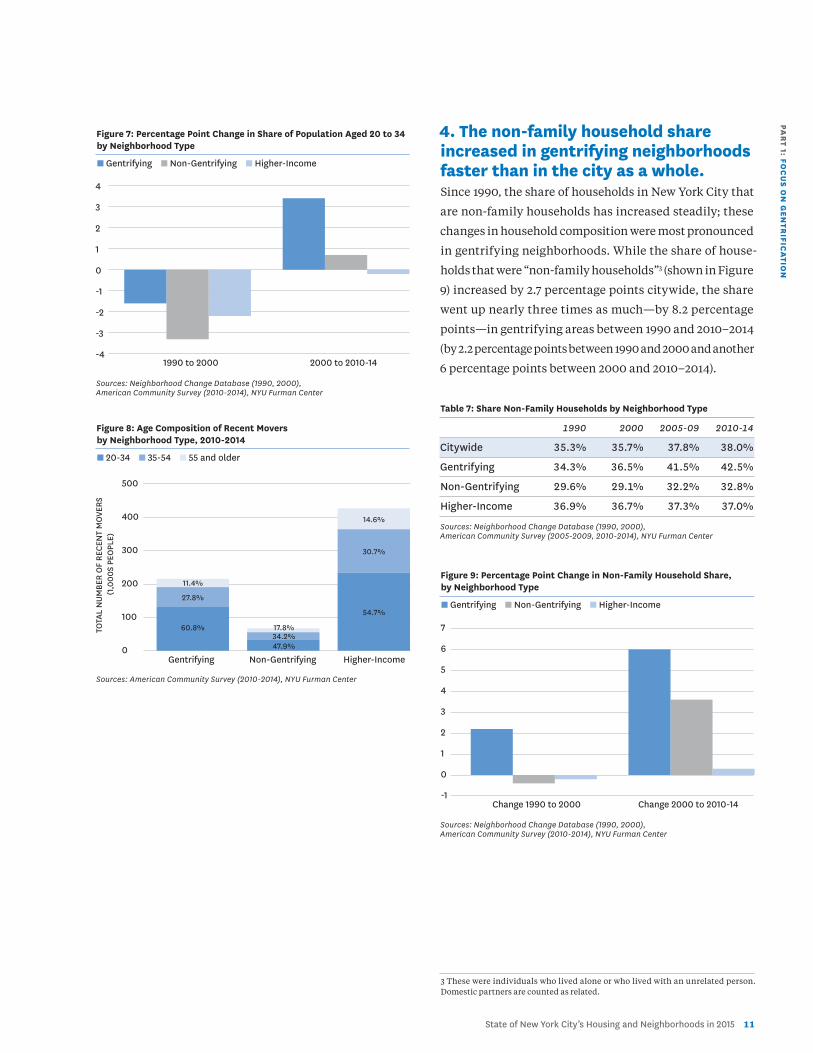
4. The non-family household share increased in gentrifying neighborhoods faster than in the city as a whole.Since 1990, the share of households in New York City that
are non-family households has increased steadily; these
changes in household composition were most pronounced
in gentrifying neighborhoods. While the share of house-
holds that were “non-family households”3 (shown in Figure
9) increased by 2.7 percentage points citywide, the share
went up nearly three times as much—by 8.2 percentage
points—in gentrifying areas between 1990 and 2010–2014
(by 2.2 percentage points between 1990 and 2000 and another
6 percentage points between 2000 and 2010–2014).
Table 7: Share Non-Family Households by Neighborhood Type
1990 2000 2005-09 2010-14
Citywide 35.3% 35.7% 37.8% 38.0%
Gentrifying 34.3% 36.5% 41.5% 42.5%
Non-Gentrifying 29.6% 29.1% 32.2% 32.8%
Higher-Income 36.9% 36.7% 37.3% 37.0%
Sources: Neighborhood Change Database (1990, 2000), American Community Survey (2005-2009, 2010-2014), NYU Furman Center
Figure 9: Percentage Point Change in Non-Family Household Share, by Neighborhood Type
n Gentrifying n Non-Gentrifying n Higher-Income
Sources: Neighborhood Change Database (1990, 2000), American Community Survey (2010-2014), NYU Furman Center
3 These were individuals who lived alone or who lived with an unrelated person. Domestic partners are counted as related.
1990 to 2000 2000 to 2010-14
Change 1990 to 2000 Change 2000 to 2010-14
Gentrifying Non-Gentrifying Higher-Income
-4
-3
-2
-1
0
1
2
3
4
0
100
200
300
400
500
TOTA
L N
UMBE
R O
F RE
CEN
T M
OVE
RS
(1,0
00S
PEO
PLE)
-1
0
1
2
3
4
5
6
7
14.6%
11.4%
17.8%
30.7%
27.8%
34.2%
54.7%
60.8%
47.9%
1 2 NYU Furman Center • @FurmanCenterNYU
Table 8: Share of Families with Children by Neighborhood Type
1990 2000 2005-09 2010-14
Citywide 48.3% 50.7% 48.2% 47.0%
Gentrifying 55.6% 55.7% 51.7% 49.6%
Non-Gentrifying 55.5% 57.2% 53.9% 51.8%
Higher-Income 43.5% 47.3% 45.6% 44.9%
Sources: Neighborhood Change Database (1990, 2000), American Community Survey (2005-2009, 2010-2014), NYU Furman Center
Figure 10: Percentage Point Change in Share of Families with Children, by Neighborhood Type
n Gentrifying n Non-Gentrifying n Higher-Income
Sources: Neighborhood Change Database (1990, 2000), American Community Survey (2010-2014), NYU Furman Center
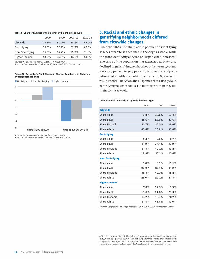
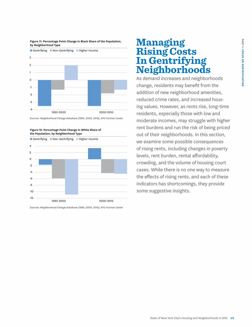
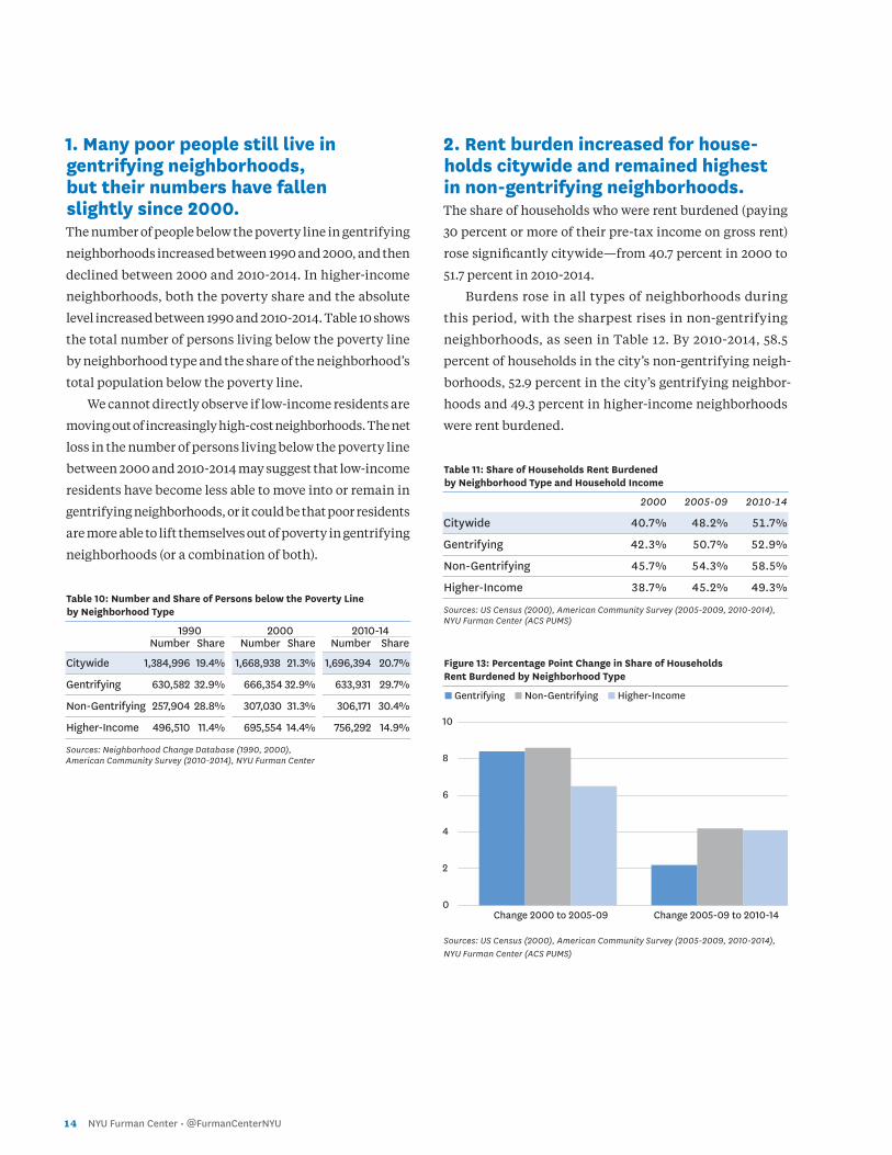
5. Racial and ethnic changes in gentrifying neighborhoods differed from citywide changes. Since the 1990s, the share of the population identifying
as black or white has declined in the city as a whole, while
the share identifying as Asian or Hispanic has increased.4
The share of the population that identified as black also
declined in gentrifying neighborhoods between 1990 and
2010 (37.9 percent to 30.9 percent), but the share of popu-
lation that identified as white increased (18.8 percent to
20.6 percent). The Asian and Hispanic shares also grew in
gentrifying neighborhoods, but more slowly than they did
in the city as a whole.
Table 9: Racial Composition by Neighborhood Type
1990 2000 2010
Citywide
Share Asian 6.8% 10.6% 13.4%
Share Black 25.6% 25.6% 23.6%
Share Hispanic 23.7% 27.0% 28.6%
Share White 43.4% 35.8% 33.4%
Gentrifying
Share Asian 5.3% 7.5% 8.7%
Share Black 37.9% 34.4% 30.9%
Share Hispanic 37.3% 40.1% 39.2%
Share White 18.8% 17.1% 20.6%
Non-Gentrifying
Share Asian 5.0% 8.1% 11.1%
Share Black 28.0% 26.7% 24.9%
Share Hispanic 38.4% 42.0% 45.2%
Share White 28.0% 22.1% 17.8%
Higher-Income
Share Asian 7.8% 12.5% 15.9%
Share Black 19.6% 21.6% 20.3%
Share Hispanic 14.7% 18.4% 20.7%
Share White 57.5% 46.6% 42.0%
Sources: Neighborhood Change Database (1990, 2000, 2010), NYU Furman Center
4 Citywide, the non-Hispanic black share of the population declined from 25.6 percent in 1990 and 23.6 percent in 2010. The non-Hispanic white share has declined from 43.4percent to 33.4 percent. The Hispanic share increased from 23.7 percent to 28.6 percent; and the Asian share about doubled, from 6.8 percent to 13.4 percent.
-8
-6
-4
-2
0
2
4
Change 1990 to 2000 Change 2000 to 2010-14
PAR
T 1: FOC
US O
N G
EN
TRIFIC
ATIO
N
State of New York City’s Housing and Neighborhoods in 2015 1 3
Figure 11: Percentage Point Change in Black Share of the Population, by Neighborhood Type
n Gentrifying n Non-Gentrifying n Higher-Income
Sources: Neighborhood Change Database (1990, 2000, 2010), NYU Furman Center
Figure 12: Percentage Point Change in White Share of the Population, by Neighborhood Type
n Gentrifying n Non-Gentrifying n Higher-Income
Sources: Neighborhood Change Database (1990, 2000, 2010), NYU Furman Center
Managing Rising Costs In Gentrifying Neighborhoods As demand increases and neighborhoods change, residents may benefit from the addition of new neighborhood amenities, reduced crime rates, and increased hous- ing values. However, as rents rise, long-time residents, especially those with low and moderate incomes, may struggle with higher rent burdens and run the risk of being priced out of their neighborhoods. In this section, we examine some possible consequences of rising rents, including changes in poverty levels, rent burden, rental affordability, crowding, and the volume of housing court cases. While there is no one way to measure the effects of rising rents, and each of these indicators has shortcomings, they provide some suggestive insights.
-4
-3
-2
-1
0
1
2
3
-12
-10
-8
-6
-4
-2
0
2
4
1990-2000 2000-2010
1990-2000 2000-2010
1 4 NYU Furman Center • @FurmanCenterNYU
1. Many poor people still live in gentrifying neighborhoods, but their numbers have fallen slightly since 2000. The number of people below the poverty line in gentrifying
neighborhoods increased between 1990 and 2000, and then
declined between 2000 and 2010-2014. In higher-income
neighborhoods, both the poverty share and the absolute
level increased between 1990 and 2010-2014. Table 10 shows
the total number of persons living below the poverty line
by neighborhood type and the share of the neighborhood’s
total population below the poverty line.
We cannot directly observe if low-income residents are
moving out of increasingly high-cost neighborhoods. The net
loss in the number of persons living below the poverty line
between 2000 and 2010-2014 may suggest that low-income
residents have become less able to move into or remain in
gentrifying neighborhoods, or it could be that poor residents
are more able to lift themselves out of poverty in gentrifying
neighborhoods (or a combination of both).
Table 10: Number and Share of Persons below the Poverty Line by Neighborhood Type
1990 2000 2010-14 Number Share Number Share Number Share
Citywide 1,384,996 19.4% 1,668,938 21.3% 1,696,394 20.7%
Gentrifying 630,582 32.9% 666,354 32.9% 633,931 29.7%
Non-Gentrifying 257,904 28.8% 307,030 31.3% 306,171 30.4%
Higher-Income 496,510 11.4% 695,554 14.4% 756,292 14.9%
Sources: Neighborhood Change Database (1990, 2000), American Community Survey (2010-2014), NYU Furman Center
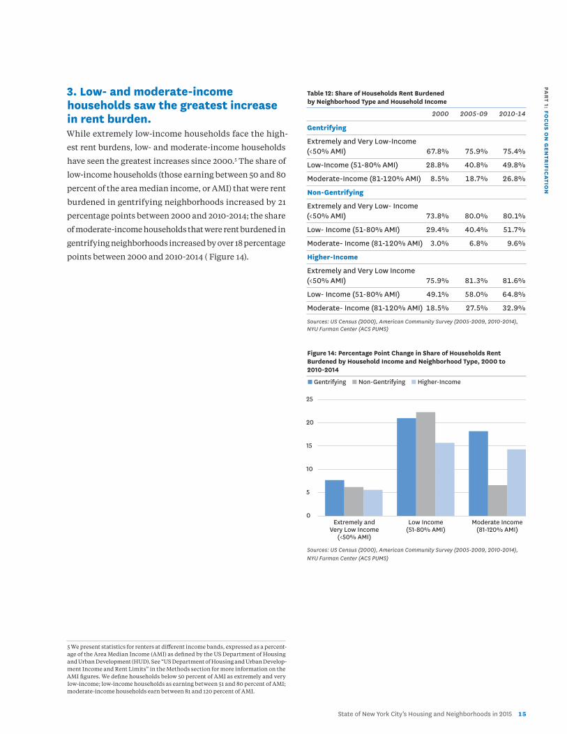
2. Rent burden increased for house-holds citywide and remained highest in non-gentrifying neighborhoods.The share of households who were rent burdened (paying
30 percent or more of their pre-tax income on gross rent)
rose significantly citywide—from 40.7 percent in 2000 to
51.7 percent in 2010-2014.
Burdens rose in all types of neighborhoods during
this period, with the sharpest rises in non-gentrifying
neighborhoods, as seen in Table 12. By 2010-2014, 58.5
percent of households in the city’s non-gentrifying neigh-
borhoods, 52.9 percent in the city’s gentrifying neighbor-
hoods and 49.3 percent in higher-income neighborhoods
were rent burdened.
Table 11: Share of Households Rent Burdened by Neighborhood Type and Household Income
2000 2005-09 2010-14
Citywide 40.7% 48.2% 51.7%
Gentrifying 42.3% 50.7% 52.9%
Non-Gentrifying 45.7% 54.3% 58.5%
Higher-Income 38.7% 45.2% 49.3%
Sources: US Census (2000), American Community Survey (2005-2009, 2010-2014),NYU Furman Center (ACS PUMS)
Figure 13: Percentage Point Change in Share of Households Rent Burdened by Neighborhood Type
n Gentrifying n Non-Gentrifying n Higher-Income
Sources: US Census (2000), American Community Survey (2005-2009, 2010-2014), NYU Furman Center (ACS PUMS)
0
2
4
6
8
10
Change 2000 to 2005-09 Change 2005-09 to 2010-14
PAR
T 1: FOC
US O
N G
EN
TRIFIC
ATIO
N
State of New York City’s Housing and Neighborhoods in 2015 1 5
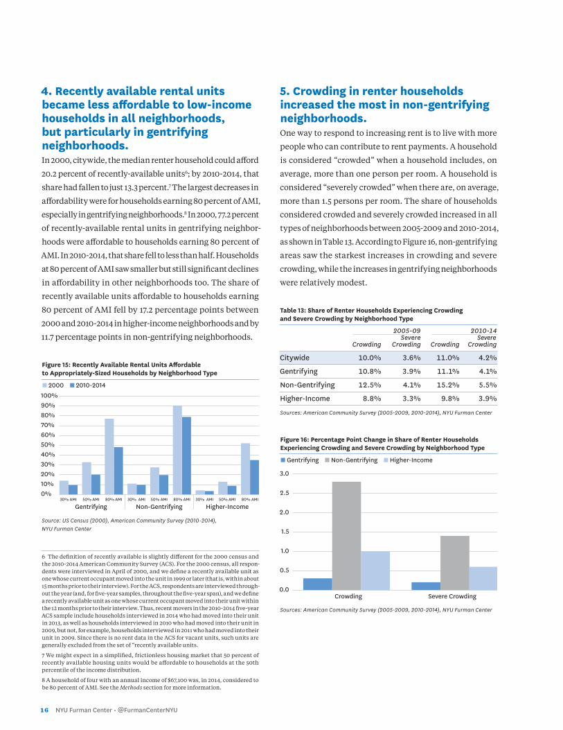
3. Low- and moderate-income households saw the greatest increase in rent burden. While extremely low-income households face the high-
est rent burdens, low- and moderate-income households
have seen the greatest increases since 2000.5 The share of
low-income households (those earning between 50 and 80
percent of the area median income, or AMI) that were rent
burdened in gentrifying neighborhoods increased by 21
percentage points between 2000 and 2010-2014; the share
of moderate-income households that were rent burdened in
gentrifying neighborhoods increased by over 18 percentage
points between 2000 and 2010-2014 ( Figure 14).
5 We present statistics for renters at different income bands, expressed as a percent-age of the Area Median Income (AMI) as defined by the US Department of Housing and Urban Development (HUD). See “US Department of Housing and Urban Develop-ment Income and Rent Limits” in the Methods section for more information on the AMI figures. We define households below 50 percent of AMI as extremely and very low-income; low-income households as earning between 51 and 80 percent of AMI; moderate-income households earn between 81 and 120 percent of AMI.
Table 12: Share of Households Rent Burdened by Neighborhood Type and Household Income
2000 2005-09 2010-14
Gentrifying
Extremely and Very Low-Income (<50% AMI) 67.8% 75.9% 75.4%
Low-Income (51-80% AMI) 28.8% 40.8% 49.8%
Moderate-Income (81-120% AMI) 8.5% 18.7% 26.8%
Non-Gentrifying
Extremely and Very Low- Income (<50% AMI) 73.8% 80.0% 80.1%
Low- Income (51-80% AMI) 29.4% 40.4% 51.7%
Moderate- Income (81-120% AMI) 3.0% 6.8% 9.6%
Higher-Income
Extremely and Very Low Income (<50% AMI) 75.9% 81.3% 81.6%
Low- Income (51-80% AMI) 49.1% 58.0% 64.8%
Moderate- Income (81-120% AMI) 18.5% 27.5% 32.9%
Sources: US Census (2000), American Community Survey (2005-2009, 2010-2014),NYU Furman Center (ACS PUMS)
Figure 14: Percentage Point Change in Share of Households Rent Burdened by Household Income and Neighborhood Type, 2000 to 2010-2014
n Gentrifying n Non-Gentrifying n Higher-Income
Sources: US Census (2000), American Community Survey (2005-2009, 2010-2014), NYU Furman Center (ACS PUMS)
0
5
10
15
20
25
Extremely and Very Low Income
(<50% AMI)
Low Income (51-80% AMI)
Moderate Income (81-120% AMI)
1 6 NYU Furman Center • @FurmanCenterNYU
0.0
0.5
1.0
1.5
2.0
2.5
3.0
4. Recently available rental units became less affordable to low-income households in all neighborhoods, but particularly in gentrifying neighborhoods. In 2000, citywide, the median renter household could afford
20.2 percent of recently-available units6; by 2010-2014, that
share had fallen to just 13.3 percent.7 The largest decreases in
affordability were for households earning 80 percent of AMI,
especially in gentrifying neighborhoods.8 In 2000, 77.2 percent
of recently-available rental units in gentrifying neighbor-
hoods were affordable to households earning 80 percent of
AMI. In 2010-2014, that share fell to less than half. Households
at 80 percent of AMI saw smaller but still significant declines
in affordability in other neighborhoods too. The share of
recently available units affordable to households earning
80 percent of AMI fell by 17.2 percentage points between
2000 and 2010-2014 in higher-income neighborhoods and by
11.7 percentage points in non-gentrifying neighborhoods.
Figure 15: Recently Available Rental Units Affordable to Appropriately-Sized Households by Neighborhood Type
n 2000 n 2010-2014
Source: US Census (2000), American Community Survey (2010-2014), NYU Furman Center
6 The definition of recently available is slightly different for the 2000 census and the 2010-2014 American Community Survey (ACS). For the 2000 census, all respon-dents were interviewed in April of 2000, and we define a recently available unit as one whose current occupant moved into the unit in 1999 or later (that is, within about 15 months prior to their interview). For the ACS, respondents are interviewed through-out the year (and, for five-year samples, throughout the five-year span), and we define a recently available unit as one whose current occupant moved into their unit within the 12 months prior to their interview. Thus, recent movers in the 2010-2014 five-year ACS sample include households interviewed in 2014 who had moved into their unit in 2013, as well as households interviewed in 2010 who had moved into their unit in 2009, but not, for example, households interviewed in 2011 who had moved into their unit in 2009. Since there is no rent data in the ACS for vacant units, such units are generally excluded from the set of “recently available units.
7 We might expect in a simplified, frictionless housing market that 50 percent of recently available housing units would be affordable to households at the 50th percentile of the income distribution.
8 A household of four with an annual income of $67,100 was, in 2014, considered to be 80 percent of AMI. See the Methods section for more information.
5. Crowding in renter households increased the most in non-gentrifying neighborhoods.One way to respond to increasing rent is to live with more
people who can contribute to rent payments. A household
is considered “crowded” when a household includes, on
average, more than one person per room. A household is
considered “severely crowded” when there are, on average,
more than 1.5 persons per room. The share of households
considered crowded and severely crowded increased in all
types of neighborhoods between 2005-2009 and 2010-2014,
as shown in Table 13. According to Figure 16, non-gentrifying
areas saw the starkest increases in crowding and severe
crowding, while the increases in gentrifying neighborhoods
were relatively modest.
Table 13: Share of Renter Households Experiencing Crowding and Severe Crowding by Neighborhood Type
2005-09 2010-14 Severe Severe Crowding Crowding Crowding Crowding
Citywide 10.0% 3.6% 11.0% 4.2%
Gentrifying 10.8% 3.9% 11.1% 4.1%
Non-Gentrifying 12.5% 4.1% 15.2% 5.5%
Higher-Income 8.8% 3.3% 9.8% 3.9%
Sources: American Community Survey (2005-2009, 2010-2014), NYU Furman Center
Figure 16: Percentage Point Change in Share of Renter Households Experiencing Crowding and Severe Crowding by Neighborhood Type
n Gentrifying n Non-Gentrifying n Higher-Income
Sources: American Community Survey (2005-2009, 2010-2014), NYU Furman Center
0%10%20%30%40%50%60%70%80%90%100%
30% AMI 50% AMI 80% AMI 30% AMI 50% AMI 80% AMI 30% AMI 50% AMI 80% AMI
Gentrifying Non-Gentrifying Higher-Income
Crowding Severe Crowding
PAR
T 1: FOC
US O
N G
EN
TRIFIC
ATIO
N
State of New York City’s Housing and Neighborhoods in 2015 1 7
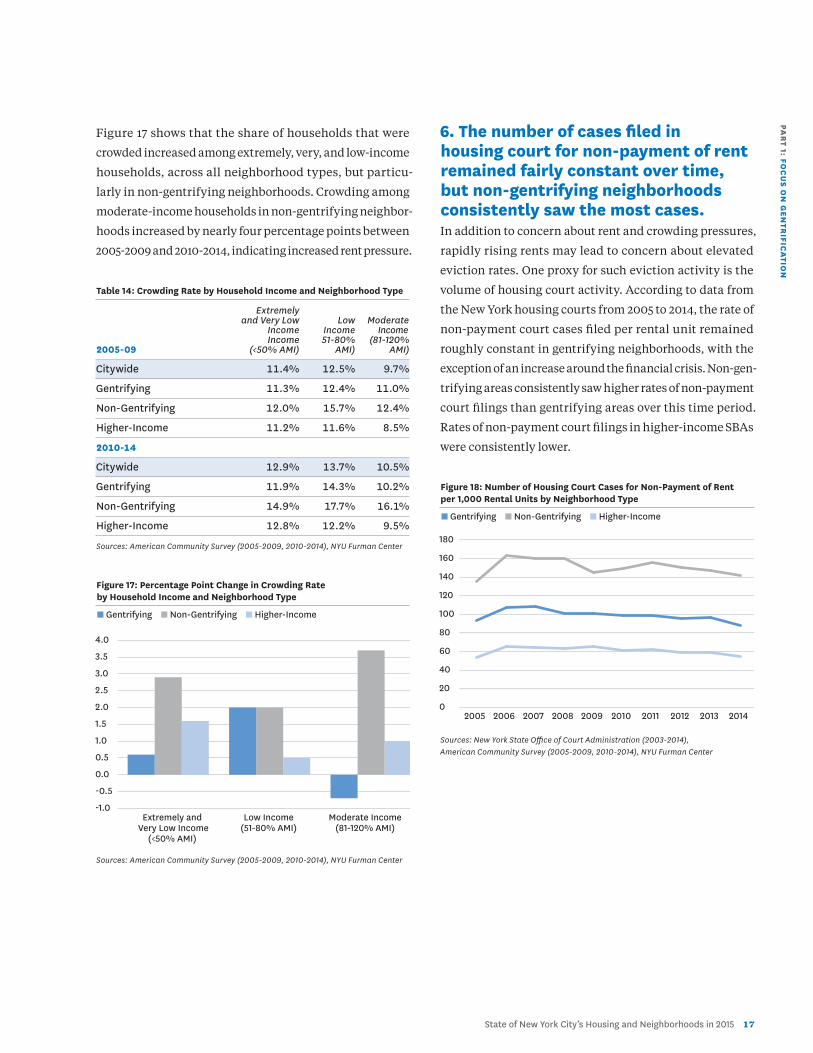
Figure 17 shows that the share of households that were
crowded increased among extremely, very, and low-income
households, across all neighborhood types, but particu-
larly in non-gentrifying neighborhoods. Crowding among
moderate-income households in non-gentrifying neighbor-
hoods increased by nearly four percentage points between
2005-2009 and 2010-2014, indicating increased rent pressure.
Table 14: Crowding Rate by Household Income and Neighborhood Type
Extremely and Very Low Low Moderate Income Income Income Income 51-80% (81-120%2005-09 (<50% AMI) AMI) AMI)
Citywide 11.4% 12.5% 9.7%
Gentrifying 11.3% 12.4% 11.0%
Non-Gentrifying 12.0% 15.7% 12.4%
Higher-Income 11.2% 11.6% 8.5%
2010-14
Citywide 12.9% 13.7% 10.5%
Gentrifying 11.9% 14.3% 10.2%
Non-Gentrifying 14.9% 17.7% 16.1%
Higher-Income 12.8% 12.2% 9.5%
Sources: American Community Survey (2005-2009, 2010-2014), NYU Furman Center
Figure 17: Percentage Point Change in Crowding Rate by Household Income and Neighborhood Type
n Gentrifying n Non-Gentrifying n Higher-Income
Sources: American Community Survey (2005-2009, 2010-2014), NYU Furman Center
6. The number of cases filed in housing court for non-payment of rent remained fairly constant over time, but non-gentrifying neighborhoods consistently saw the most cases.In addition to concern about rent and crowding pressures,
rapidly rising rents may lead to concern about elevated
eviction rates. One proxy for such eviction activity is the
volume of housing court activity. According to data from
the New York housing courts from 2005 to 2014, the rate of
non-payment court cases filed per rental unit remained
roughly constant in gentrifying neighborhoods, with the
exception of an increase around the financial crisis. Non-gen-
trifying areas consistently saw higher rates of non-payment
court filings than gentrifying areas over this time period.
Rates of non-payment court filings in higher-income SBAs
were consistently lower.
Figure 18: Number of Housing Court Cases for Non-Payment of Rent per 1,000 Rental Units by Neighborhood Type
n Gentrifying n Non-Gentrifying n Higher-Income
Sources: New York State Office of Court Administration (2003-2014), American Community Survey (2005-2009, 2010-2014), NYU Furman Center
Extremely and Very Low Income
(<50% AMI)
Low Income (51-80% AMI)
Moderate Income (81-120% AMI)
2005 2006 2007 2008 2009 2010 2011 2012 2013 2014
-1.0
-0.5
0.0
0.5
1.0
1.5
2.0
2.5
3.0
3.5
4.0
0
20
40
60
80
100
120
140
160
180
1 8 NYU Furman Center • @FurmanCenterNYU
Conclusion In the past decade and a half, rent growth has been especially high in the gentrifying neighborhoods immediately surrounding central Manhattan, particularly in northern Brooklyn. Many of these neighborhoods still had both low rents and high rates of poverty in 2000. By 2014, however, these areas experi-enced rising rents and incomes relative to the rest of the city. These changes were accom-panied by demographic changes as well: residents of gentrifying neighborhoods in 2014 were more likely to have college degrees, and to live in a non-family household com-pared to the residents of the same neighbor-hoods in 1990. While many of these trends occurred citywide, they were more dramatic in gentrifying neighborhoods.
A closer look at affordability indicators provides insight into
how households at different income levels experienced the
pressures of rapidly rising rents. The number of people who
lived in poverty in gentrifying neighborhoods decreased
slightly over the last decade, though poverty rates remained
high. Both rent burden and crowding rates increased in
gentrifying areas, but did not increase as rapidly as they did
in non-gentrifying neighborhoods. However, the share of
recently available rental units that were affordable to low-
income households declined the most in gentrifying areas.
Housing courts did not see an increase in non-payment cases
as rent pressures increased, and filings for non-payment
were highest in non-gentrifying neighborhoods.
In short, households across New York City are experi-
encing significant rent pressures and shifts in household
composition. Rent is going up everywhere in New York City,
and at a rate faster than incomes. New Yorkers overall have
become younger, more educated, and more likely to live in
non-family households since 1990. These changes, however,
are magnified in the city’s gentrifying neighborhoods.
From a policy perspective, the unintended effects
of gentrification on existing residents may be cause for
attention and policy solutions. As this chapter illustrates,
however, households throughout the city are feeling
increased housing affordability pressure. Therefore, dis-
cussions around mitigating the effects of rapidly rising rents
should arguably not be confined to specific neighborhoods,
but applied more broadly to the city.
PAR
T 1: FOC
US O
N G
EN
TRIFIC
ATIO
N
State of New York City’s Housing and Neighborhoods in 2015 1 9
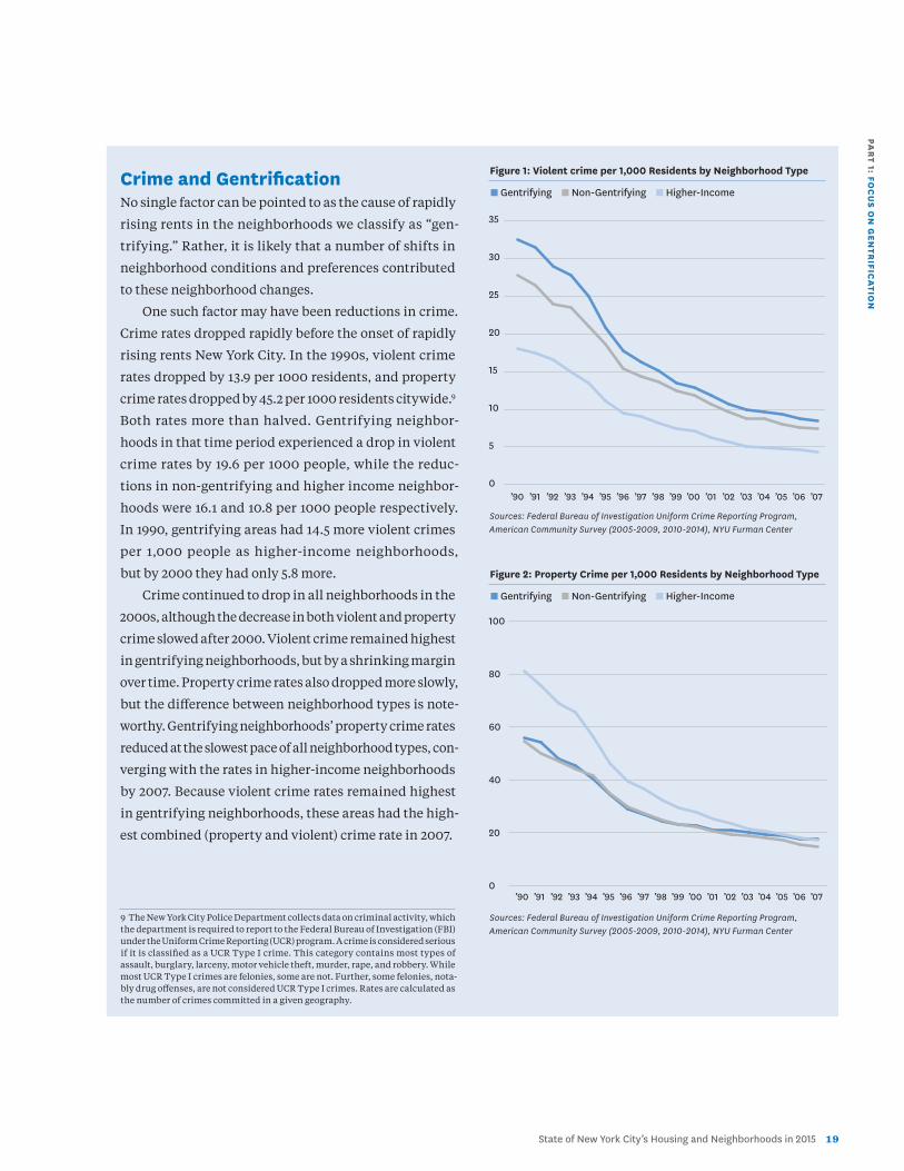
Crime and GentrificationNo single factor can be pointed to as the cause of rapidly
rising rents in the neighborhoods we classify as “gen-
trifying.” Rather, it is likely that a number of shifts in
neighborhood conditions and preferences contributed
to these neighborhood changes.
One such factor may have been reductions in crime.
Crime rates dropped rapidly before the onset of rapidly
rising rents New York City. In the 1990s, violent crime
rates dropped by 13.9 per 1000 residents, and property
crime rates dropped by 45.2 per 1000 residents citywide.9
Both rates more than halved. Gentrifying neighbor-
hoods in that time period experienced a drop in violent
crime rates by 19.6 per 1000 people, while the reduc-
tions in non-gentrifying and higher income neighbor-
hoods were 16.1 and 10.8 per 1000 people respectively.
In 1990, gentrifying areas had 14.5 more violent crimes
per 1,000 people as higher-income neighborhoods,
but by 2000 they had only 5.8 more.
Crime continued to drop in all neighborhoods in the
2000s, although the decrease in both violent and property
crime slowed after 2000. Violent crime remained highest
in gentrifying neighborhoods, but by a shrinking margin
over time. Property crime rates also dropped more slowly,
but the difference between neighborhood types is note-
worthy. Gentrifying neighborhoods’ property crime rates
reduced at the slowest pace of all neighborhood types, con-
verging with the rates in higher-income neighborhoods
by 2007. Because violent crime rates remained highest
in gentrifying neighborhoods, these areas had the high-
est combined (property and violent) crime rate in 2007.
9 The New York City Police Department collects data on criminal activity, which the department is required to report to the Federal Bureau of Investigation (FBI) under the Uniform Crime Reporting (UCR) program. A crime is considered serious if it is classified as a UCR Type I crime. This category contains most types of assault, burglary, larceny, motor vehicle theft, murder, rape, and robbery. While most UCR Type I crimes are felonies, some are not. Further, some felonies, nota-bly drug offenses, are not considered UCR Type I crimes. Rates are calculated as the number of crimes committed in a given geography.
Figure 1: Violent crime per 1,000 Residents by Neighborhood Type
n Gentrifying n Non-Gentrifying n Higher-Income
Sources: Federal Bureau of Investigation Uniform Crime Reporting Program, American Community Survey (2005-2009, 2010-2014), NYU Furman Center
Figure 2: Property Crime per 1,000 Residents by Neighborhood Type
n Gentrifying n Non-Gentrifying n Higher-Income
Sources: Federal Bureau of Investigation Uniform Crime Reporting Program, American Community Survey (2005-2009, 2010-2014), NYU Furman Center
0
5
10
15
20
25
30
35
0
20
40
60
80
100
’90 ’91 ’92 ’93 ’94 ’95 ’96 ’97 ’98 ’99 ’00 ’01 ’02 ’03 ’04 ’05 ’06 ’07
’90 ’91 ’92 ’93 ’94 ’95 ’96 ’97 ’98 ’99 ’00 ’01 ’02 ’03 ’04 ’05 ’06 ’07
2 0 NYU Furman Center • @FurmanCenterNYU
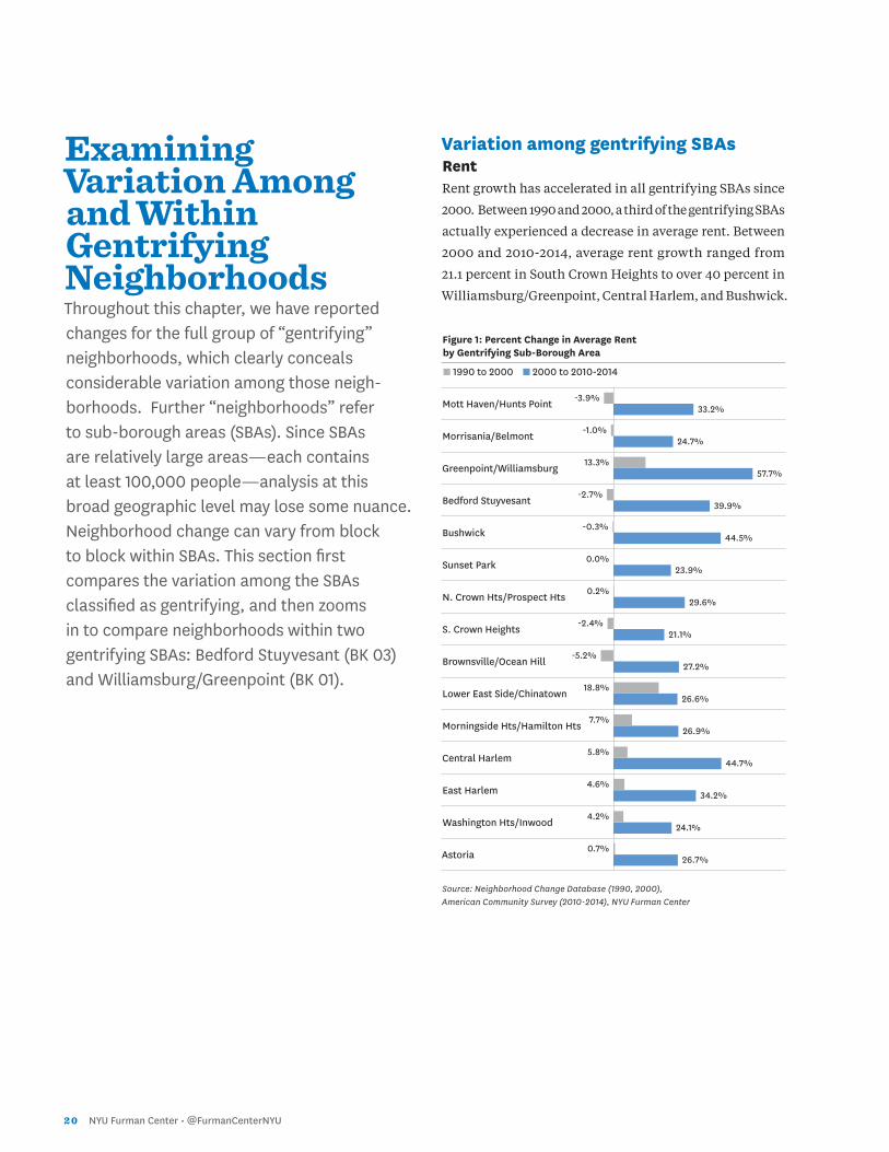
Examining Variation Among and Within Gentrifying NeighborhoodsThroughout this chapter, we have reported changes for the full group of “gentrifying” neighborhoods, which clearly conceals considerable variation among those neigh-borhoods. Further “neighborhoods” refer to sub-borough areas (SBAs). Since SBAs are relatively large areas—each contains at least 100,000 people—analysis at this broad geographic level may lose some nuance. Neighborhood change can vary from block to block within SBAs. This section first compares the variation among the SBAs classified as gentrifying, and then zooms in to compare neighborhoods within two gentrifying SBAs: Bedford Stuyvesant (BK 03) and Williamsburg/Greenpoint (BK 01).
Variation among gentrifying SBAs RentRent growth has accelerated in all gentrifying SBAs since
2000. Between 1990 and 2000, a third of the gentrifying SBAs
actually experienced a decrease in average rent. Between
2000 and 2010-2014, average rent growth ranged from
21.1 percent in South Crown Heights to over 40 percent in
Williamsburg/Greenpoint, Central Harlem, and Bushwick.
Figure 1: Percent Change in Average Rent by Gentrifying Sub-Borough Area
n 1990 to 2000 n 2000 to 2010-2014
Mott Haven/Hunts Point
Morrisania/Belmont
Greenpoint/Williamsburg
Bedford Stuyvesant
Bushwick
Sunset Park
N. Crown Hts/Prospect Hts
S. Crown Heights
Brownsville/Ocean Hill
Lower East Side/Chinatown
Morningside Hts/Hamilton Hts
Central Harlem
East Harlem
Washington Hts/Inwood
Astoria
Source: Neighborhood Change Database (1990, 2000), American Community Survey (2010-2014), NYU Furman Center
-3.9%
-1.0%
13.3%
-2.7%
-0.3%
0.0%
0.2%
-2.4%
-5.2%
18.8%
7.7%
5.8%
4.6%
4.2%
0.7%
33.2%
24.7%
57.7%
39.9%
44.5%
23.9%
29.6%
21.1%
27.2%
26.6%
26.9%
44.7%
34.2%
24.1%
26.7%
PAR
T 1: FOC
US O
N G
EN
TRIFIC
ATIO
N
State of New York City’s Housing and Neighborhoods in 2015 2 1
23.8%
6.5%
1.0%
6.1%
-1.0%
21.0%
18.1%
3.0%
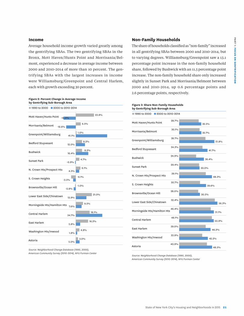
Income Average household income growth varied greatly among
the gentrifying SBAs. The two gentrifying SBAs in the
Bronx, Mott Haven/Hunts Point and Morrisania/Bel-
mont, experienced a decrease in average income between
2000 and 2010-2014 of more than 10 percent. The gen-
trifying SBAs with the largest increases in income
were Williamsburg/Greenpoint and Central Harlem,
each with growth exceeding 30 percent.
Figure 2: Percent Change in Average Income by Gentrifying Sub-Borough Area
n 1990 to 2000 n 2000 to 2010-2014
Mott Haven/Hunts Point
Morrisania/Belmont
Greenpoint/Williamsburg
Bedford Stuyvesant
Bushwick
Sunset Park
N. Crown Hts/Prospect Hts
S. Crown Heights
Brownsville/Ocean Hill
Lower East Side/Chinatown
Morningside Hts/Hamilton Hts
Central Harlem
East Harlem
Washington Hts/Inwood
Astoria
Source: Neighborhood Change Database (1990, 2000), American Community Survey (2010-2014), NYU Furman Center
Non-Family Households The share of households classified as “non-family” increased
in all gentrifying SBAs between 2000 and 2010-2014, but
to varying degrees. Williamsburg/Greenpoint saw a 13.1
percentage point increase in the non-family household
share, followed by Bushwick with an 11.5 percentage point
increase. The non-family household share only increased
slightly in Sunset Park and Morrisania/Belmont between
2000 and 2010-2014, up 0.6 percentage points and
2.6 percentage points, respectively.
Figure 3: Share Non-Family Households by Gentrifying Sub-Borough Area
n 1990 to 2000 n 2000 to 2010-2014
Mott Haven/Hunts Point
Morrisania/Belmont
Greenpoint/Williamsburg
Bedford Stuyvesant
Bushwick
Sunset Park
N. Crown Hts/Prospect Hts
S. Crown Heights
Brownsville/Ocean Hill
Lower East Side/Chinatown
Morningside Hts/Hamilton Hts
Central Harlem
East Harlem
Washington Hts/Inwood
Astoria
Source: Neighborhood Change Database (1990, 2000), American Community Survey (2010-2014), NYU Furman Center
-16.0%
-12.6%
41.1%
12.0%
16.4%
-0.9%
4.5%
-3.5%
-2.8%
13.9%
7.6%
34.7%
5.8%
1.8%
5.0%
8.2%
8.2%
4.7%
-6.1%
9.5%
16.2%
4.8%
28.7%
30.1%
38.7%
34.3%
24.9%
29.4%
39.1%
30.7%
28.0%
52.4%
46.4%
48.1%
39.0%
33.9%
40.9%
32.5%
32.7%
51.8%
41.7%
36.4%
30.0%
48.3%
39.6%
30.5%
56.3%
51.1%
50.9%
46.2%
42.2%
48.5%
2 2 NYU Furman Center • @FurmanCenterNYU
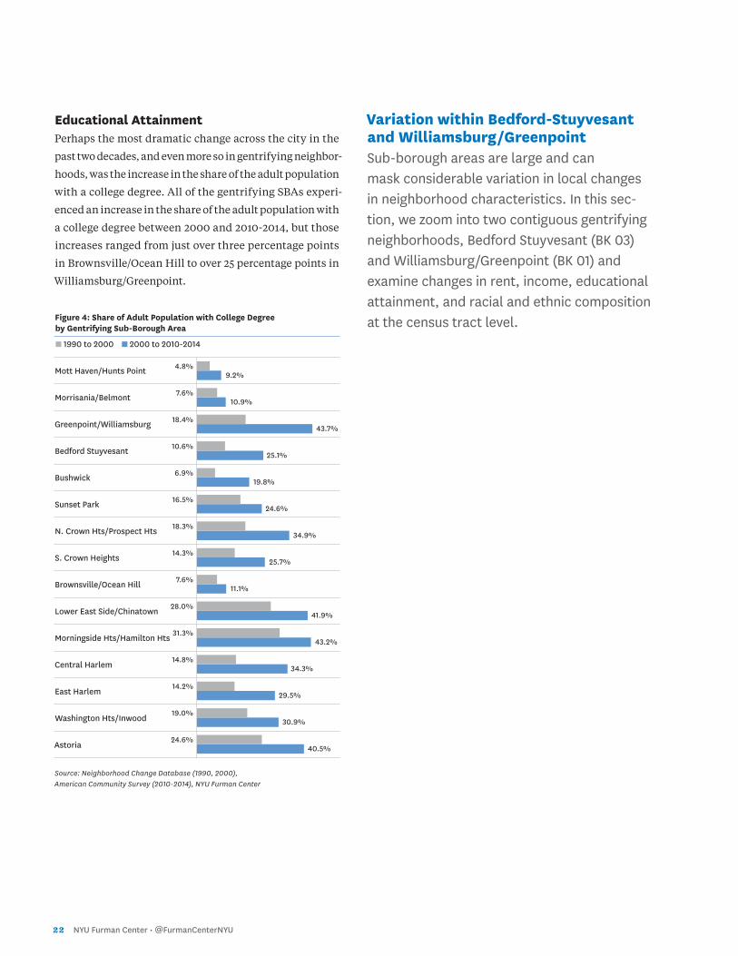
Educational Attainment Perhaps the most dramatic change across the city in the
past two decades, and even more so in gentrifying neighbor-
hoods, was the increase in the share of the adult population
with a college degree. All of the gentrifying SBAs experi-
enced an increase in the share of the adult population with
a college degree between 2000 and 2010-2014, but those
increases ranged from just over three percentage points
in Brownsville/Ocean Hill to over 25 percentage points in
Williamsburg/Greenpoint.
Figure 4: Share of Adult Population with College Degree by Gentrifying Sub-Borough Area
n 1990 to 2000 n 2000 to 2010-2014
Mott Haven/Hunts Point
Morrisania/Belmont
Greenpoint/Williamsburg
Bedford Stuyvesant
Bushwick
Sunset Park
N. Crown Hts/Prospect Hts
S. Crown Heights
Brownsville/Ocean Hill
Lower East Side/Chinatown
Morningside Hts/Hamilton Hts
Central Harlem
East Harlem
Washington Hts/Inwood
Astoria
Source: Neighborhood Change Database (1990, 2000), American Community Survey (2010-2014), NYU Furman Center
Variation within Bedford-Stuyvesant and Williamsburg/Greenpoint Sub-borough areas are large and can mask considerable variation in local changes in neighborhood characteristics. In this sec-tion, we zoom into two contiguous gentrifying neighborhoods, Bedford Stuyvesant (BK 03) and Williamsburg/Greenpoint (BK 01) and examine changes in rent, income, educational attainment, and racial and ethnic composition at the census tract level.
9.2%
10.9%
43.7%
25.1%
19.8%
24.6%
34.9%
25.7%
11.1%
41.9%
43.2%
34.3%
29.5%
30.9%
40.5%
4.8%
7.6%
18.4%
10.6%
6.9%
16.5%
18.3%
14.3%
7.6%
28.0%
31.3%
14.8%
14.2%
19.0%
24.6%
PAR
T 1: FOC
US O
N G
EN
TRIFIC
ATIO
N
State of New York City’s Housing and Neighborhoods in 2015 2 3
RentIn 1990, most census tracts in Bedford-Stuyvesant and Wil-
liamsburg/Greenpoint had average rents between $751 and
$1,000. By 2000, rents had started rising in some census
tracts in Williamsburg/Greenpoint, but only few in Bedford-
Stuyvesant. In 2010-2014, the average rent in virtually all
tracts in Williamsburg/Greenpoint was greater than $1,250.
In Bedford-Stuyvesant, rents rose, but many tracts still had
average rents of less than $1,000.
IncomeAverage household income has steadily increased for most
census tracts in Bedford-Stuyvesant and Williamsburg/
Greenpoint in the past two decades. The census tracts in
Williamsburg/Greenpoint generally have had consistently
higher incomes than those in Bedford-Stuyvesant. The
lowest income census tracts in 2010-2014 in Williamsburg/
Greenpoint were those along the Bedford-Stuyvesant border.
Figure 5: Average Rent by Census Tract in Bedford-Stuyvesant and Williamsburg/Greenpoint
Average Rent n Less than $750
n $751–$1,000
n $1,001–$1,250
n Greater than $1,250
Sources: Neighborhood Change Database (1990, 2000), American Community Survey (2010-2014), NYU Furman Center
Figure 6: Average Household Income by Census Tract in Bedford-Stuyvesant and Williamsburg/Greenpoint
Average Household Income n Less than $40,000
n $40,001–$60,000
n $60,001–$80,000
n Greater than $80,000
Sources: Neighborhood Change Database (1990, 2000), American Community Survey (2010-2014), NYU Furman Center
1990
1990
Williamsburg - Greenpoint
Williamsburg - Greenpoint
Williamsburg - Greenpoint
Williamsburg - Greenpoint
Williamsburg - Greenpoint
Williamsburg - Greenpoint
Bedford-Stuyvesant
Bedford-Stuyvesant
Bedford-Stuyvesant
Bedford-Stuyvesant
Bedford-Stuyvesant
Bedford-Stuyvesant
2000
2000
2010-14
2010-14
2 4 NYU Furman Center • @FurmanCenterNYU
Figure 7: Share College Graduate by Census Tract in Bedford-Stuyvesant and Williamsburg/Greenpoint
Share College Graduate n Less than 10%
n 10–30%
n 30–50%
n Greater than 50%
Sources: Neighborhood Change Database (1990, 2000), American Community Survey (2010-2014), NYU Furman Center
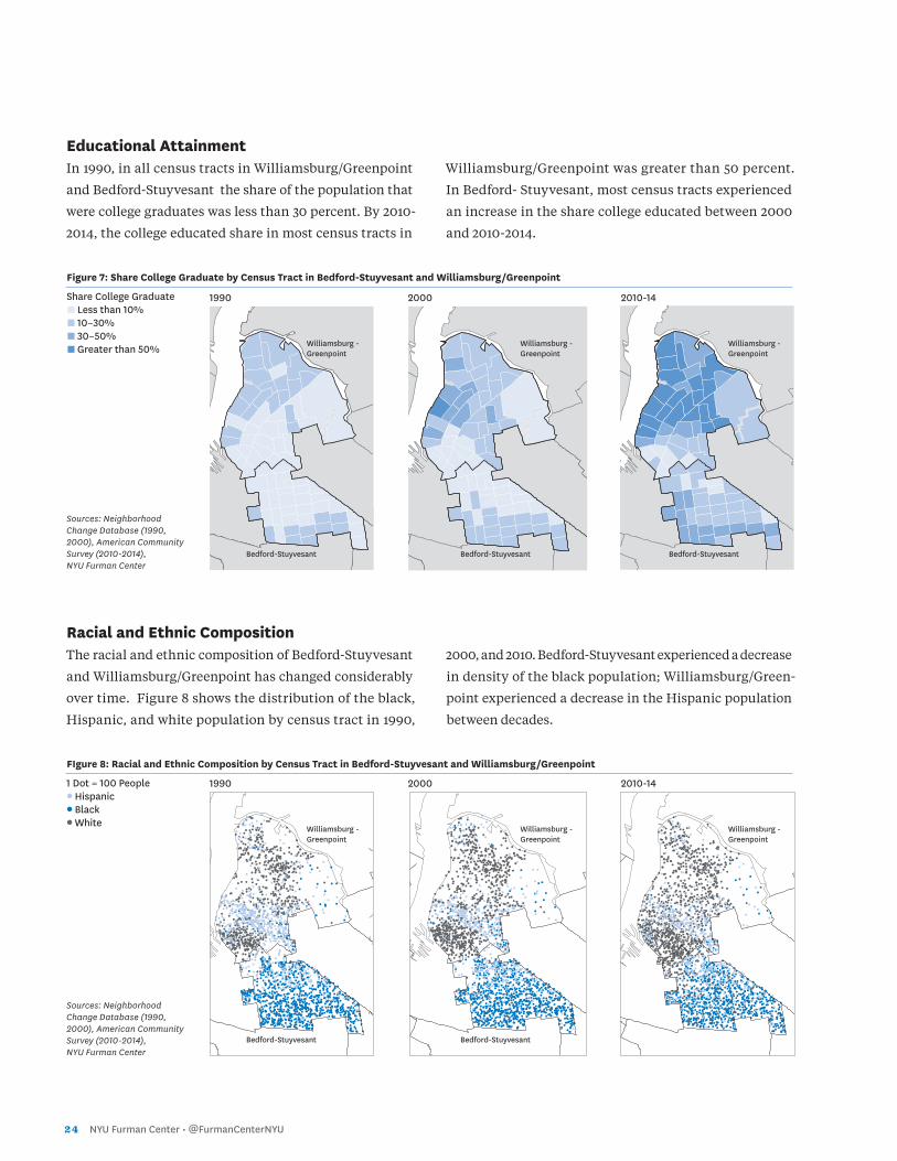
Educational AttainmentIn 1990, in all census tracts in Williamsburg/Greenpoint
and Bedford-Stuyvesant the share of the population that
were college graduates was less than 30 percent. By 2010-
2014, the college educated share in most census tracts in
Williamsburg/Greenpoint was greater than 50 percent.
In Bedford- Stuyvesant, most census tracts experienced
an increase in the share college educated between 2000
and 2010-2014.
Racial and Ethnic CompositionThe racial and ethnic composition of Bedford-Stuyvesant
and Williamsburg/Greenpoint has changed considerably
over time. Figure 8 shows the distribution of the black,
Hispanic, and white population by census tract in 1990,
2000, and 2010. Bedford-Stuyvesant experienced a decrease
in density of the black population; Williamsburg/Green-
point experienced a decrease in the Hispanic population
between decades.
FIgure 8: Racial and Ethnic Composition by Census Tract in Bedford-Stuyvesant and Williamsburg/Greenpoint
1 Dot = 100 People ● Hispanic
● Black
● White
Sources: Neighborhood Change Database (1990, 2000), American Community Survey (2010-2014), NYU Furman Center
1990
1990
Williamsburg - Greenpoint
Williamsburg - Greenpoint
Williamsburg - Greenpoint
Williamsburg - Greenpoint
Williamsburg - Greenpoint
Williamsburg - Greenpoint
Bedford-StuyvesantBedford-Stuyvesant
Bedford-Stuyvesant
Bedford-Stuyvesant
Bedford-Stuyvesant
2000
2000
2010-14
2010-14