font basics - a small introduction
DESCRIPTION
This is a small introduction that deals with Fonts and Typefaces. It is released as a companion to an Open Talk event which took place in late December, 2010 in Syros island, by students of the University of the Aegean, Greece.TRANSCRIPT
FontBasics
Font
In typography, a font (also fount) is traditionally defined as a quantity of sorts composing a complete character set of a single size and style of a particular typeface.
After the introduction of computer fonts based on fully scalable outlines, a broader definition evolved.
Font is no longer size-specific, but still refers to a single style.
Bulmer regular, Bulmer italic, Bulmer bold and Bulmer bold italic are four fonts, but one typeface.
Font characteristics
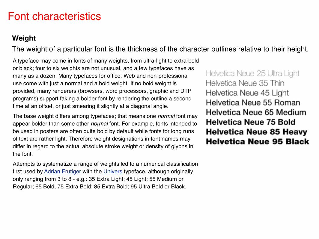
WeightThe weight of a particular font is the thickness of the character outlines relative to their height.A typeface may come in fonts of many weights, from ultra-light to extra-bold or black; four to six weights are not unusual, and a few typefaces have as many as a dozen. Many typefaces for office, Web and non-professional use come with just a normal and a bold weight. If no bold weight is provided, many renderers (browsers, word processors, graphic and DTP programs) support faking a bolder font by rendering the outline a second time at an offset, or just smearing it slightly at a diagonal angle.The base weight differs among typefaces; that means one normal font may appear bolder than some other normal font. For example, fonts intended to be used in posters are often quite bold by default while fonts for long runs of text are rather light. Therefore weight designations in font names may differ in regard to the actual absolute stroke weight or density of glyphs in the font.Attempts to systematize a range of weights led to a numerical classification first used by Adrian Frutiger with the Univers typeface, although originally only ranging from 3 to 8 - e.g.: 35 Extra Light; 45 Light; 55 Medium or Regular; 65 Bold, 75 Extra Bold; 85 Extra Bold; 95 Ultra Bold or Black.
Font -
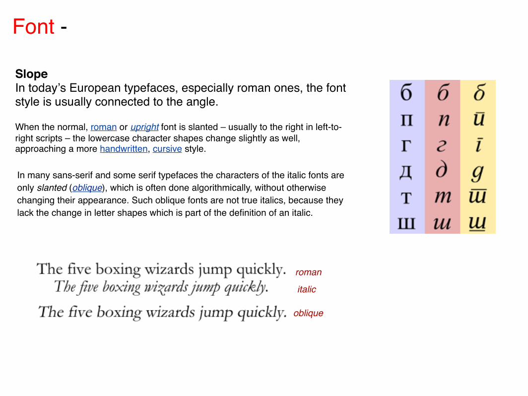
SlopeIn todayʼs European typefaces, especially roman ones, the font style is usually connected to the angle.
When the normal, roman or upright font is slanted – usually to the right in left-to-right scripts – the lowercase character shapes change slightly as well, approaching a more handwritten, cursive style.
In many sans-serif and some serif typefaces the characters of the italic fonts are only slanted (oblique), which is often done algorithmically, without otherwise changing their appearance. Such oblique fonts are not true italics, because they lack the change in letter shapes which is part of the definition of an italic.
roman
italic
oblique
Font -
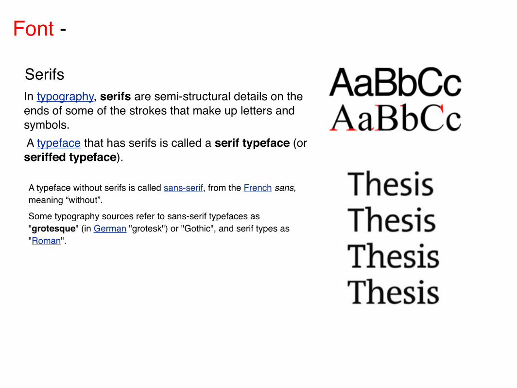
SerifsIn typography, serifs are semi-structural details on the ends of some of the strokes that make up letters and symbols. A typeface that has serifs is called a serif typeface (or seriffed typeface).
A typeface without serifs is called sans-serif, from the French sans, meaning “without”. Some typography sources refer to sans-serif typefaces as "grotesque" (in German "grotesk") or "Gothic", and serif types as "Roman".
Font -
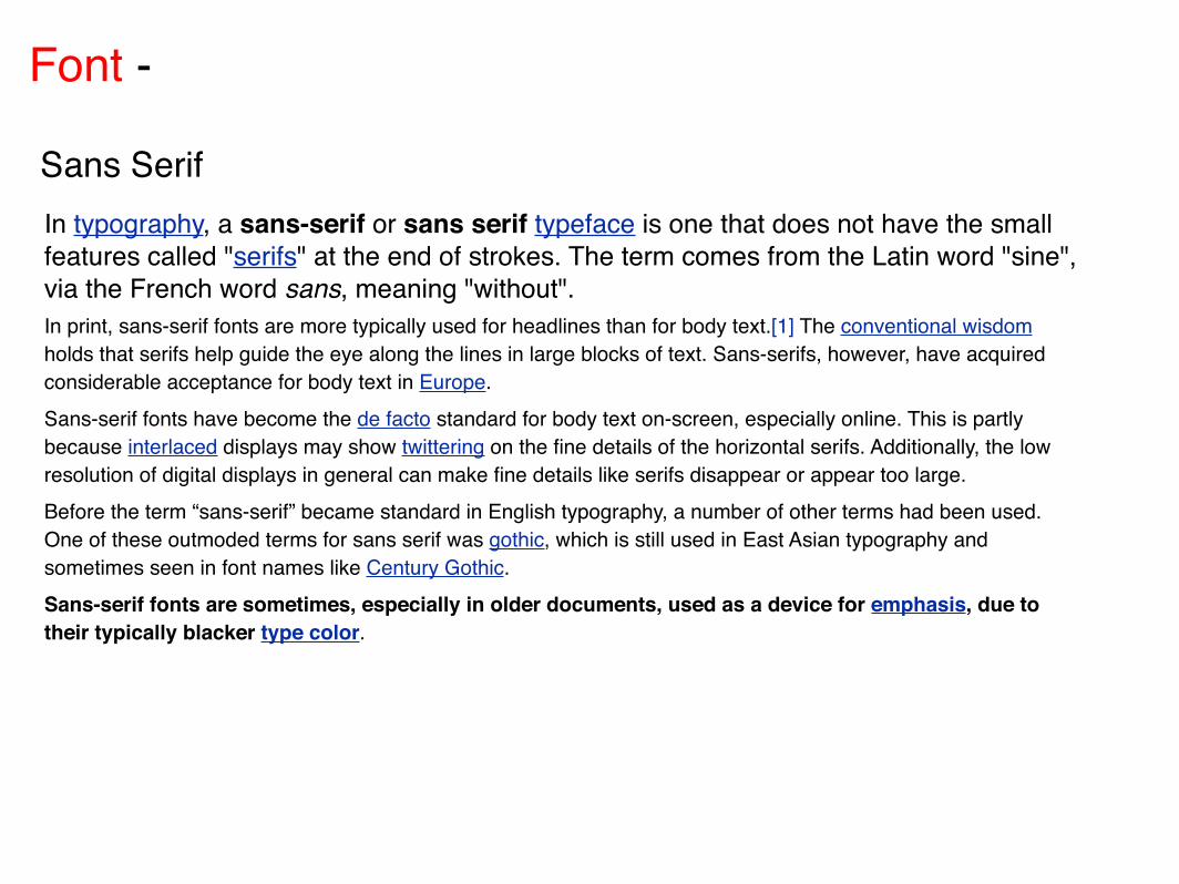
Sans SerifIn typography, a sans-serif or sans serif typeface is one that does not have the small features called "serifs" at the end of strokes. The term comes from the Latin word "sine", via the French word sans, meaning "without".In print, sans-serif fonts are more typically used for headlines than for body text.[1] The conventional wisdom holds that serifs help guide the eye along the lines in large blocks of text. Sans-serifs, however, have acquired considerable acceptance for body text in Europe.Sans-serif fonts have become the de facto standard for body text on-screen, especially online. This is partly because interlaced displays may show twittering on the fine details of the horizontal serifs. Additionally, the low resolution of digital displays in general can make fine details like serifs disappear or appear too large.Before the term “sans-serif” became standard in English typography, a number of other terms had been used. One of these outmoded terms for sans serif was gothic, which is still used in East Asian typography and sometimes seen in font names like Century Gothic.Sans-serif fonts are sometimes, especially in older documents, used as a device for emphasis, due to their typically blacker type color.

Font -
San-Serifs■ Grotesque, early sans-serif designs, such as Grotesque, Akzidenz
Grotesk, and Franklin Gothic.■ Neo-grotesque or Transitional or Realist, modern designs such as
Standard, Bell Centennial, MS Sans Serif, Helvetica, Univers, Highway Gothic, and Arial. These are the most common sans-serif fonts. They are relatively straight in appearance and have less line width variation than Humanist sans-serif typefaces. Transitional sans-serif is sometimes called "anonymous sans-serif" due to its relatively plain appearance.
■ Humanist (Calibri, Johnston, Lucida Grande, Segoe UI, Gill Sans, Myriad, Frutiger, Trebuchet MS, Tahoma, Verdana and Optima, a.k.a. Zapf Humanist). These are the most calligraphic of the sans-serif typefaces, with some variation in line width and more legibility than other sans-serif fonts.
■ Geometric (Futura, ITC Avant Garde, Century Gothic, Gotham, or Spartan). As their name suggests, Geometric sans-serif typefaces are based on geometric shapes. Note the optically circular letter "O" and the simple construction of the lowercase letter "a". Geometric sans-serif fonts have a very modern look and feel. Of these four categories, geometric fonts tend to be the least useful for body text.
Note that in some sans-serif fonts, such as Arial, the capital-i and lowercase-L appear identical. Verdana, however, keeps them distinct because Verdana's capital-i, as an exception, has serifs. Other fonts may have two horizontal bars on the capital-i, a curved tail on the lowercase-L, or both.
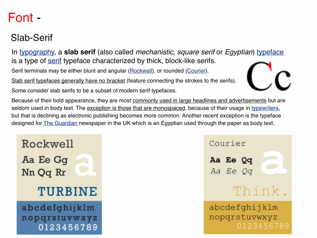
Font - Slab-SerifIn typography, a slab serif (also called mechanistic, square serif or Egyptian) typeface is a type of serif typeface characterized by thick, block-like serifs. Serif terminals may be either blunt and angular (Rockwell), or rounded (Courier). Slab serif typefaces generally have no bracket (feature connecting the strokes to the serifs). Some consider slab serifs to be a subset of modern serif typefaces.Because of their bold appearance, they are most commonly used in large headlines and advertisements but are seldom used in body text. The exception is those that are monospaced, because of their usage in typewriters, but that is declining as electronic publishing becomes more common. Another recent exception is the typeface designed for The Guardian newspaper in the UK which is an Egyptian used through the paper as body text.
Font - Slab-Serif
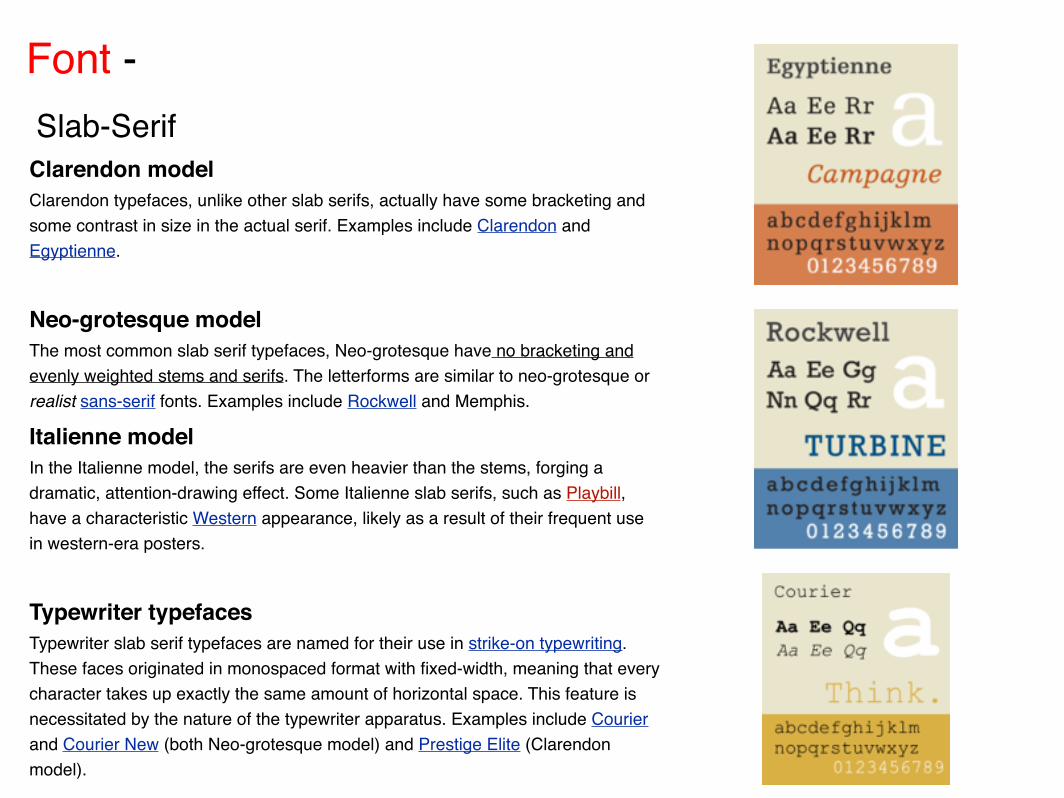
Clarendon modelClarendon typefaces, unlike other slab serifs, actually have some bracketing and some contrast in size in the actual serif. Examples include Clarendon and Egyptienne.
Neo-grotesque modelThe most common slab serif typefaces, Neo-grotesque have no bracketing and evenly weighted stems and serifs. The letterforms are similar to neo-grotesque or realist sans-serif fonts. Examples include Rockwell and Memphis.
Italienne modelIn the Italienne model, the serifs are even heavier than the stems, forging a dramatic, attention-drawing effect. Some Italienne slab serifs, such as Playbill, have a characteristic Western appearance, likely as a result of their frequent use in western-era posters.
Typewriter typefacesTypewriter slab serif typefaces are named for their use in strike-on typewriting. These faces originated in monospaced format with fixed-width, meaning that every character takes up exactly the same amount of horizontal space. This feature is necessitated by the nature of the typewriter apparatus. Examples include Courier and Courier New (both Neo-grotesque model) and Prestige Elite (Clarendon model).
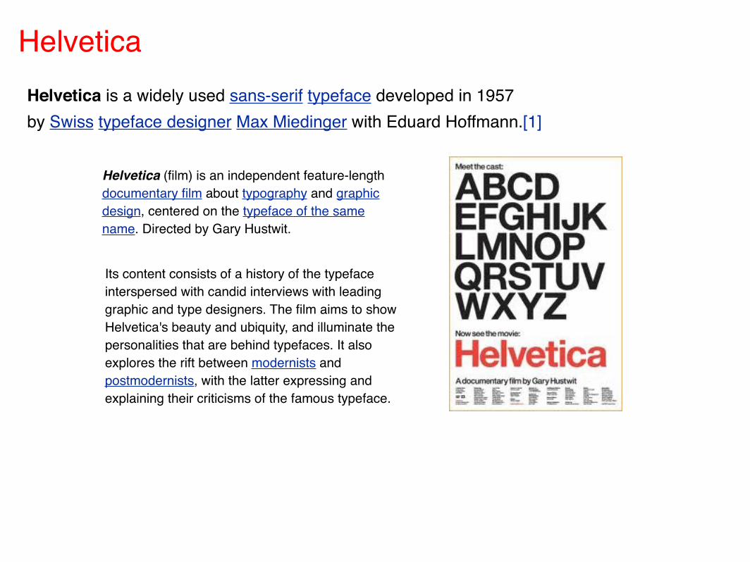
Helvetica Helvetica is a widely used sans-serif typeface developed in 1957 by Swiss typeface designer Max Miedinger with Eduard Hoffmann.[1]
Its content consists of a history of the typeface interspersed with candid interviews with leading graphic and type designers. The film aims to show Helvetica's beauty and ubiquity, and illuminate the personalities that are behind typefaces. It also explores the rift between modernists and postmodernists, with the latter expressing and explaining their criticisms of the famous typeface.
Helvetica (film) is an independent feature-length documentary film about typography and graphic design, centered on the typeface of the same name. Directed by Gary Hustwit.
2010, “dpsd
Beyond”
student initiative & “MyAegean”
team
University of the Aegean, Greece
Released under Creative Commons BY-SA license
{ Some registered trademarks are “©
All Rights Reserved”
and used with respect to owners & contributors }
C by a
proudly supported byresources / content via:::: credits:::: info