font trends survey report
TRANSCRIPT

Survey Results TYPOGRAPHIC TRENDS
2
Font Trends Survey Results ..................................................... 3Who took the survey? .............................................................................3
How Fonts Are Used ................................................................................7
The Interesting Section ............................................................8Font Favorability .....................................................................................8
Overall Positive & Negative ....................................................................8
Most Loved & Hated .............................................................................. 9
Most Overused ...................................................................................... 10
Additional Free-Flowing Thoughts ......................................... 11High Contrast Script .............................................................................. 12
Slab Serif .............................................................................................. 13
Distressed ............................................................................................. 14
Chalkboard ............................................................................................ 15
Wood Block ........................................................................................... 16
Handwriting .......................................................................................... 17
Rounded ................................................................................................ 18
Art Nouveau .......................................................................................... 19
Icon ...................................................................................................... 20
Ball Terminal ......................................................................................... 21
Curly Script Typeface ............................................................................ 22
Wedge Serif ........................................................................................... 23
Layered .................................................................................................24
Double/Extra Crossbars ........................................................................ 25
What About the Future? ........................................................ 26Finding Fonts For New Projects ............................................. 27
Buying New Licenses ............................................................................28
How Fonts Are Licensed ........................................................................29
Favorite Type Designer .........................................................................30
Conclusion .............................................................................31About Extensis .......................................................................31
Survey Results TYPOGRAPHIC TRENDS
3
Font Trends Survey ResultsFonts play a critical role in projects of all type. As paints are to the painter, fonts are to the graphic designer. I like to say that fonts are the creative palette of the designer.
I’ve wanted to peer into the mind of the creative professional for quite some time to see what’s going on in there. Much of the creative work in the world relies upon text and type to communicate a message. A typeface or type style can even be at the core of an entire creative movement.
In designing the survey, I selected a number of type styles that I’ve seen in the market, curious to see how the creative community was responding to specific styles and trends. The creative community tends to be at the leading edge of the curve of change, and I wanted to test the assumptions that type foundries seem to be making with their new and promoted releases.
One thing became incredibly clear to me in analyzing the data from our recent font trends survey. Passion. My, oh my, the passion.
Hopefully you and your creative team will find this data interesting and useful. Maybe it’ll help you decide which type styles are worth your time investigating for future licensing? If not, I hope that it’s at least an interesting read. So, let’s get to the analysis!
Who took the survey?
I decided that I wanted a wide variety of users in the creative fields to take the survey. I wanted people who live and breathe typography for their creative work.
To connect with these folks I sent an email to the entire Extensis database. Most of our font management users are in the creative fields and really love type. I also posted notices on forums, reached out to the press, and shared on social media.
We got a really great response, with over 1900 people taking the survey. If you took the survey, I’d like to thank you for your time again!
I asked users to share a little bit about themselves, so we could best understand the their feedback.

Survey Results TYPOGRAPHIC TRENDS
4
Not surprisingly, most of the respondents were in the field of graphic design, with print, publishing, marketing, adverting coming in with strong responses. This was precisely the audience that I wanted to capture.
What industry do you work in?
GraphicDesign41.9%
Print8.4%Other7.9%
Advertising7.8%
Publishing7.4%
Education6.4%
Marketing4.8%
Branding3.9%
Web3.2%
Manufacturing2.0%

Survey Results TYPOGRAPHIC TRENDS
5
And, as I’d hoped the specific types of jobs were primarily those on the front lines of creativity. So I definitely found the right, knowledgeable folks for this survey.
How would you most accurately classify your work life?
CreativeManager16.2%
GraphicDesigner57.1%
IT3.7%
Other14.1%
PurchasingManager0.4%
SeniorManagement5.6%
Typographer2.9%
CreativeManager16.2%

Survey Results TYPOGRAPHIC TRENDS
6
And, to top it off, I got a pretty wide spectrum of experience in the field. In previous surveys I learned that when people choose a creative career they typically fall in love and stick with it for many years. So, I expanded the “top end” to include new 20-24 and 25+ brackets. To my surprise, quite a few people have been in their careers even more than 25 years!
How long have your been in this career?
25+Years35.8%
15-19Years16.8%
20-24Years16.5%
10-14Years14.4%
5-9Years9.2%
2-4Years5.7%

Survey Results TYPOGRAPHIC TRENDS
7
How Fonts Are Used
As expected, print, packaging and PDF uses are still most common. I’d also like to point out that web font usage is now above 50%. In a survey that I did two years ago, only about 35% of the same type of respondents were using web fonts.
90
80
70
60
50
40
30
20
10
0
Logo
s
Embe
dded
intoPDFs
Using
Web
Fon
tsOn
Web
sites
Packag
eDesign
Embe
dded
Into
eBoo
ks
Embe
dded
Into
App
lications
Embe
dded
IntoFlash
Files
PrintDesign
81.6%
66.2%
53.9%
46.2%
13.4%
11.4% 6.8%
94.5%
In what ways do you use fonts in your creative work?

Survey Results TYPOGRAPHIC TRENDS
8
The Interesting Section
Font Favorability
Type styles and their use can be very specific to a project. That being said, a project direction can be based around and even lead by a specific typeface or style.
I presented many different font styles to get a gut feeling about each. Respondents could choose from a spectrum of choices from very positive to very negative.
1. Love them! Keep ‘em coming
2. They’re pretty good
3. They’re OK
4. Overused and probably time to move on
5. Ick, I would never use that
HighContrastScript
SlabSerif
Distressed
Chalkboard
ChromaticWoodBlock
Handwriting
Rounded
ArtNouveau
Icon
BallTerminal
CurlyScript
WedgeSerif
Layered
Double/ExtraCrossbars
0 10 20 30 40 50 60 70 80 90 100
65% 35%
91% 9%
56% 44%
67% 33%
61% 39%
78% 22%
80% 20%
48% 52%
87% 13%
85% 15%
81% 19%
85% 15%
56% 44%
47% 53%
OverallPositive OverallNegative
The styles that I selected to survey were incredibly diverse. I includes some styles that I have seen in font marketplace, as well as some that have been prominently used for creative projects in the US and Europe.
Overall Positive & Negative
Looking at the spectrum of styles it’s easy to get a sense of the positive and negative feelings for each style. In this case, I compared the first three relatively positive responses (Love, Pretty Good, and OK) to the final two, mostly negative responses (Overused and Ick).
It is interesting to note which styles have the most significant upside without a large overall downside. Slab Serif faces stand out as our top performing style when analyzed this way.
Type Trends:Positive and Negative

Survey Results TYPOGRAPHIC TRENDS
9
Most Loved & Hated
Since creative individuals tend to also be very passionate people, creative selections can also illicit extreme passions. When comparing styles, I compared which styles received the most high praise (Love) and derision (Ick).
Slab Serif faces also come out on top here with 30% loving them, followed closely by Icon, Curly Script and Ball Terminal styles.
What’s definitely notable is how much people detest specific styles. Art Nouveau, Extra Crossbars, Layered and Chromatic Wood Block styles all garnered more than 25% of the respondents’ ire.
HighContrastScript
SlabSerif
Distressed
Chalkboard
WoodBlock
Handwriting
Rounded
ArtNouveau
Icon
BallTerminal
CurlyScript
WedgeSerif
Layered
DoubleCrossbars
0 5 10 15 20 25 30 35 40
LoveThem! Ick!
Type Trends:Most Loved & Hated

Survey Results TYPOGRAPHIC TRENDS
10
Most Overused
I also realized that one of the negative selections could be indicative of trends in that it points directly to the state of that type style in the marketplace, and that’s whether something is overused.
Distressed typefaces came out listed as the most overused with over a third of responses, followed by chalkboard fonts at over a quarter. I would have expected the Double Crossbar type style to be listed as more overused, but when you consider how many people listed that style even lower, it’s not too surprising. The same thing applies to the Chromatic Wood Block style as it seems to be everywhere recently, but is also more highly disliked.
HighContrastScript
SlabSerif
Distressed
Chalkboard
WoodBlock
Handwriting
Rounded
ArtNouveau
Icon
BallTerminal
CurlyScript
WedgeSerif
Layered
DoubleCrossbars
0 5 10 15 20 25 30 35
14%
8%
36%
25%
11%
15%
12%
13%
8%
7%
13%
5%
12%
11%
MostOverused
Type Trends:Most Overused

Survey Results TYPOGRAPHIC TRENDS
11
Additional Free-Flowing ThoughtsIn addition to the multiple-choice selections, I purposely gave the opportunity for open, unfiltered thoughts for every type style, and was not at all disappointed. Strong feelings - from love to outright detest - were common on each and every typeface selection.
Due to the number of explanatory comments, it’s clear to me that creative users felt that further explanation was necessary to effectively explain their opinions and selections.
For this section, I think that it’s important to identify each type style used, and the font example used in the survey.
As much as the type selections were meant to be representative of an overall style of implementation, there is the likelihood that one selection could affect a respondent’s entire feeling of the style in general. I do understand that this is potential source for skewed results, but still feel that the overall ratings are valid.
So, on to the written feedback. Bring it on!

Survey Results TYPOGRAPHIC TRENDS
12
High Contrast Script
Whomp by Alejandro Paul from Sudtipos
1. Too hard to read easily.
2. They feel pretty trendy at the moment.
3. Poor understanding of form void relationships that make type legible are being ignored by the inept who cry “its creative”
4. Sudtipos is an awesome foundry.
5. To me, there’s a very big trend in advertising, lately, looking back to styles and designs from the 60’s. This font, to me, is strongly reminiscent of that time. I always hated the style and look of the 60’s - so, honestly, this does nothing for me.
6. This script is trending now but that could not be the case a year from now
7. There is a proper time and place for use of bold script typefaces … one has only to find where it works with the design and copy AND pick the right one.
8. They’re very 70’s and that love is fading.
9. High contrast is in!
10. They fit the current trend for retro styling.

Survey Results TYPOGRAPHIC TRENDS
13
Slab Serif
Museo Slab by Jos Buivenga of exljbris
1. My students LOVE these faces, even though I think they’re old-fashioned.
2. Clean, easy to read & use, especially for titling and signage.
3. I love the variety of lighter slab faces and the personality that they bring to the table.
4. Love slab serifs but feel that they are everywhere right now, so something new will be coming along.
5. Reminds me of Serifa, and old font used by Montgomery Ward in 1984.
6. These are great, and I have a feeling they will move into the field of classic fonts.
7. There a hipster overtone to slab serifs nowadays.
8. My go-to type style because it’s more traditional.
9. Slab Serif typefaces are great for bold statements and logos.
10. Text friendly slab serif fonts, esp Caecilia and Chaparral, are old favorites of mine.

Survey Results TYPOGRAPHIC TRENDS
14
Distressed
Frankie by Laura Meseguer and Juan Davila from Type-Ø-Tones
1. Hard to place for “professional” clients.
2. Type used as an illustration always has a short shelf life. Cool until the third time you see it.
3. I’d prefer to you do my own distressing.
4. They only work if: 1) the distressing is organic and NOT uniform 2) the distressing is detailed and holds at large sizes/closer inspection.
5. Some texture works, too much is irritating. Distressing works best on sans serif with little or no contrast between thick and thin strokes (grotesks). It seems out of place on fat faces.
6. Why use them at all? It reminds me of the day I was working as slot man at the Bangkok World and noticed at 2 a.m. in proofing the front page, an error in one headline: It said something about the flood being waste deep. When I asked the production manager if he could change it, he said no, but he could rough it up a little so people wouldn’t notice it. He did, but it looked so bad everyone looked twice as hard at it, wondering what had happened. It looked like one of these distressed faces. Ugh!
7. I like them, but suspect they’ll quickly become overused.
8. Fun to play with. It’s a trend now in Scandinavian countries. I call it a trash fashion style.
9. 1992 called and wants its fonts back.
10. I’m a fan of these when they’re appropriate and not overly-distressed. Too many marks on a font can easily render it illegible.

Survey Results TYPOGRAPHIC TRENDS
15
Chalkboard
Various Examples
1. Nostalgic and fun in the right context.
2. Suitable for a few designs, menus, sandwich boards, educational material. There is a contradiction between the ephemerality of chalk and the time spent making ornate but clumsy lettering like Handy George.
3. I love, love, love these, but I see them EVERYwhere. Definitely time to move on.
4. Similar to the inflated script; individual letterforms seem more engaging than set strings.
5. I’m old school - I prefer the chalkboard to the new slick whiteboards.
6. The style is great, but not for a typeface. Hire a hand-letterer rather than buying the font!
7. Oh PLEASE destroy all of these. I cannot wait for the chalkboard phase to be over. It’s so overused and it’s rarely done well.
8. Once a year I look at chalkboard faces and chalkboard substrate for one solution or another.
9. It’ll be a trend for others. A few of us who love and are committed to lettering will keep taking it up to many levels. Computers can’t match the human touch!
10. They’ve been around a while, but I’m a sucker for them. I’ve not seen them as often in my industry so I may still try to work them in to concepts. I appreciate the human aspect, the hand-made quality, when so much design work is clean to the point of sterile and antiseptic.

Survey Results TYPOGRAPHIC TRENDS
16
Wood Block
Thirty Line Chromatic from Wm. H. Page Co specimen book
1. In my opinion they’re old fashioned, but I’m always surprised at what can be done with them.
2. Not unless I’m trying to make something look like it came from the circus.
3. I hate anything that looks like western fonts. I have a casino we work with and I have to use it sometimes. I look at these and imagine how long it takes to design a font and wonder how anyone ever got to a place where they said, yes I want to spend 100 hours designing something like this.
4. Don’t get to use these much, don’t do that many Wanted posters, but they do come in handy once in a blue moon.
5. Classic typeface built on pure aesthetics.
6. 1800’s is the new future. Maybe...?
7. From a time when letter forms were still artistic embellishments in and of themselves.
8. Atmospheric and quasi-historical.
9. I love them but think they’re nearing the top of their popularity. Still have more time though before the peak is reached.
10. Fine for a “frontier” theme. Nothing else. Howdy!

Survey Results TYPOGRAPHIC TRENDS
17
Handwriting
Ride My Bike by designed by Guisela Mendoza from Latinotype
1. They are poor seconds to actually handwriting your copy.
2. Need good ones that look natural, probably with lots of OpenType alternates and ligatures.
3. Only suitable for amateur ransom notes. It fails to look like the handwriting of anyone old enough to be that careful. Part of the “let’s make an edgy mockup that’s bad enough to lose us the job” trend.
4. I think there will always be room for these fonts, I use them (have even designed a couple ratty ones myself for personal use), and there are some projects that just cry out for something like this.
5. Heavy weight ones would be nice for package design that will hold up on the flexo press.
6. Best for conveying more emotive ideas; escape from the too-technical world with which we are consumed and locked into interacting.
7. I love a good handwritten font. They can used to convey a personal, home grown or honest feel to a project.
8. Every industry is always looking for really good handwriting fonts. There are lots out there, but not lots of good ones.
9. I would appreciate more adult style handwriting fonts. Kiddie styles or someone with juvenile skills isn’t something I want to use.
10. Again, I think I would only use a font like this if the project loudly called out for it. Otherwise, it can easily send the wrong signals. For many, this sort of thing can be easily interpreted as “childish” or “lightweight”, as I found out once when I tried to use something similar on the cover of an adult novel.

Survey Results TYPOGRAPHIC TRENDS
18
Rounded
FF DIN Rounded by Albert-Jan Pool from FontFont
1. I always think I’m going to like this kind of font, but a text-heavy document never looks right with a rounded type family.
2. Every damn baby brand uses these.
3. Not a fan but this is a subjective call; rarely used in my 30-year career as designer/art director/professor.
4. I rarely used rounded typefaces, not since the 60-70’s
5. Underused but attractive.
6. Trouble is they are hurt by associations with Ariel Rounded the favourite unusual face for headings in documents from the office.
7. This is the next thing!
8. I feel these are doughy and not crisp enough for many uses. Limited use, like a cartoon bubble font.
9. Typefaces like these, to me, are like a straighter version of comic sans. Overused, and often used in applications where they are not appropriate. Seeing fonts like these used for large bodies of text in business use is a turn off.
10. Oddly good for web.

Survey Results TYPOGRAPHIC TRENDS
19
Art Nouveau
Elsewhere by John Roshell from Comicraft
1. Love Art Nouveau, but it can go creepy really easily.
2. Too themed, unless you are going for a period look or mashup.
3. Like the more mid-nineteenth century typeface above, this is an atmospheric font but one that spanned a shorter time period. It is more graceful than a lot of the fonts that are from the turn of the century period and better executed that many as they were often made quickly to fit a certain area of a layout.
4. I would not use these except in very appropriate projects. I can see them for book covers and posters, but not mainstream commercial use. I love Art Nouveau design (Mucha, Lautrec) where lettering was done by hand and was integrated with the illustration. Typography is not lettering. I see a lot of “retro” design where type such as this is not unified with the design very well.
5. Certainly useful if you’re recreating an Art Nouveau poster. Not much use beyond that given the era-specific style.
6. Massive fan of art nouveau but not sure it is trending at present
7. On it’s own merits this example is a good typeface but the usage will be limited by the subject-matter. There is a place for location and historic specific typefaces especially for travel magazines.
8. That would be an intersecting trend. Won’t find a pretentious UX designer blogging about them on Medium any time soon, so yes, go nouveaux!
9. Save us from the overdecorative.
10. I love Art Nouveau, but very limited use. The example for this question is well hideous and I wouldn’t use it. I like the more elegant Art Nouveau fonts.

Survey Results TYPOGRAPHIC TRENDS
20
Icon
Iconic Stroke by PJ Onori aka Somerandomdude
1. Icons are great for eLearning and I wish there were a lot more to choose from
2. If a client needs an icon, they want an original one, not one anybody can have.
3. Extremely helpful as web fonts! And if one type designer creates the one font, very cohesive, as shown in Onori’s example.
4. HTML is driving a great need for these. We convert vector files to font for interactives often.
5. I use dingbats daily. They make a great substitute for illustrations for budget or other reasons.
6. Interesting to see if emojis do indeed become and established short hand or just a flash in the pan, The font above is just clip art for icons.
7. Pi fonts always have their place. Don’t expect the “icons” to be cross-culturally understandable.
8. Communication is key. Icons evolve very quickly. Symbols have taken over the role as signs of our times, that used to be done by fonts.
9. Because I design primarily for sites on the Bootstrap framework, I try to use FontAwesome icons as often as possible, but they are a pain to use in Photoshop. Would love web icon fonts that are easy to use with css/html and in Photoshop.
10. Becoming more used and versatile with being able to use icon font family typefaces in modern web design.
Survey Results TYPOGRAPHIC TRENDS
21
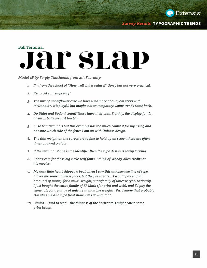
Ball Terminal
Model 4F by Sergiy Tkachenko from 4th February
1. I’m from the school of “How well will it reduce?” Sorry but not very practical.
2. Retro yet contemporary!
3. The mix of upper/lower case we have used since about year 2000 with McDonald’s. It’s playful but maybe not so temporary. Some trends come back.
4. Do Didot and Bodoni count? Those have their uses. Frankly, the display font’s ... ahem ... balls are just too big.
5. I like ball terminals but this example has too much contrast for my liking and not sure which side of the fence I am on with Unicase design.
6. The thin weight on the curves are to fine to hold up on screen these are often times avoided on jobs,
7. If the terminal shape is the identifier then the type design is sorely lacking.
8. I don’t care for these big circle serif fonts. I think of Woody Allen credits on his movies.
9. My dark little heart skipped a beat when I saw this unicase-like line of type. I loves me some universe faces, but they’re so rare... I would pay stupid amounts of money for a multi-weight, superfamily of unicase type. Seriously. I just bought the entire family of FF Mark ( for print and web), and I’d pay the same rate for a family of unicase in multiple weights. Yes, I know that probably classifies me as a type freakshow. I’m OK with that.
10. Gimick - Hard to read - the thinness of the horizontals might cause some print issues.

Survey Results TYPOGRAPHIC TRENDS
22
Curly Script Typeface
Mulberry by Cindy Kinash from Cultivated Mind
1. These are my favorite!!!
2. I avoid using Shelley anything at all costs!
3. I love this one...but there are a ton of curly script faces that are just awful, so they can be tricky to use.
4. As long as the capital T does not look like the number 7! ( refer to Brush Script ) - yuk!
5. I obsessively buy these...
6. While they are all the trend now, I wonder if these are just getting a bit overused now?
7. Repeatability issue goes back to the handwriting font above. Rather hire a calligrapher/letterer. Also, possible limit on target audience, I feel, as this imposes a feminine quality to the project.
8. Handwriting, Scripts and styles that mimic hand lettering are very hot and I expect they will be for quite some time to come.
9. The young generation in Sweden can’t read this. It is a nice typeface, perhaps as decoration for non-important text.
10. These have their place in the world of typefaces but I would limit their use to wine bars, menu headings, delis, etc.
Survey Results TYPOGRAPHIC TRENDS
23
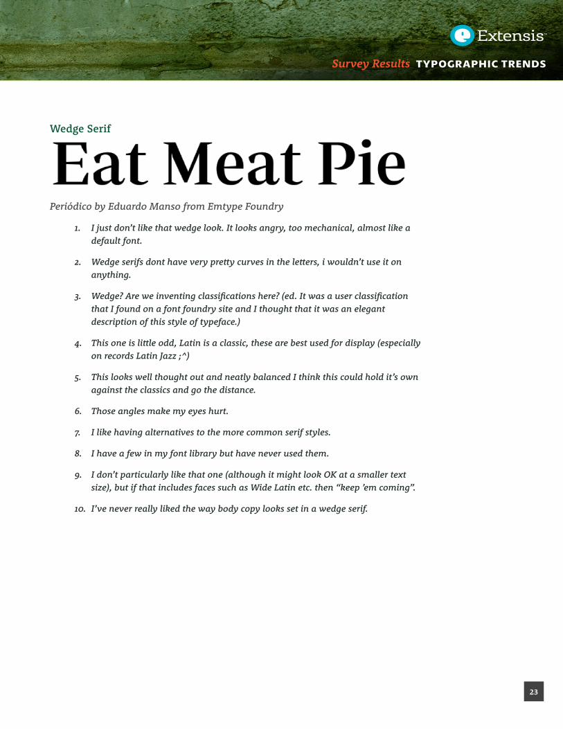
Wedge Serif
Periódico by Eduardo Manso from Emtype Foundry
1. I just don’t like that wedge look. It looks angry, too mechanical, almost like a default font.
2. Wedge serifs dont have very pretty curves in the letters, i wouldn’t use it on anything.
3. Wedge? Are we inventing classifications here? (ed. It was a user classification that I found on a font foundry site and I thought that it was an elegant description of this style of typeface.)
4. This one is little odd, Latin is a classic, these are best used for display (especially on records Latin Jazz ;^)
5. This looks well thought out and neatly balanced I think this could hold it’s own against the classics and go the distance.
6. Those angles make my eyes hurt.
7. I like having alternatives to the more common serif styles.
8. I have a few in my font library but have never used them.
9. I don’t particularly like that one (although it might look OK at a smaller text size), but if that includes faces such as Wide Latin etc. then “keep ’em coming”.
10. I’ve never really liked the way body copy looks set in a wedge serif.

Survey Results TYPOGRAPHIC TRENDS
24
Layered
Prismatic by Alex Sheldon from Match & Kerosene
1. If you are an intelligent Illustrator user, you can do it yourself in those limited applications for which you might choose them.
2. Don’t like this particular face much but like the layered concept.
3. I love having the layer options in fonts!
4. I make my own effects.
5. Very interesting as I have never used a layered font before!
6. The above example is overused and extreme, but in general, type with dimension is necessary to stand out in many cases. Versatile, contemporary color choices can keep them fresh.
7. Rare use situation but time saving.
8. This example is kinda fugly but I do like having layered options
9. Interesting display subgenre, hard to do well
10. In a knowledgable hand, these can be very effective.

Survey Results TYPOGRAPHIC TRENDS
25
Double/Extra Crossbars
Kontanter by Kash Singh from FontFabric
1. I don’t design album covers, but if I did...
2. Getting a bit stereotypical, but clean.
3. Not sure why anyone would want to emulate Cyrillic.
4. This category totally depends on if the font still communicates. I have no idea what the above example means. If the intention means to convey a foreign language or ancient text, modify the actual glyphs/accented characters perhaps, then balance the look with the other characters. Shouldn’t be so hard to figure out if the viewer is meant to read it! If meant to be obscure, this designer won.
5. Would work great for a piece about Alchemy or witchcraft. It’s interesting but seems limited.
6. Unique and different - most people would take a “double-take” to actually read it - so, overall, it might make the message secondary to the type design - SOME applications out there, but limited.
7. Neville Brodey circa 84. Too distinctive
8. Not quite overused yet but getting close.
9. I really like this look although most of my clients probably wouldn’t “get” it.
10. This will die quickly, but there are still 6 months left to play with this typeface style.

Survey Results TYPOGRAPHIC TRENDS
26
What About the Future?As well as digging into the love/hate of specific styles, I asked the direct question about what styles they were looking to see more of in the future. Users could select as many options as they wanted.
The clear favorites are not surprisingly the most widely usable Serif and Sans Serif styles. With how mixed the response was for the specific script and handwriting fonts, it is interesting to see that over 50% indicated a desire for more script faces. Yet it is possible that this is an indication of the lack of quality in the existing selection available, as many users pointed out.
80
70
60
50
40
30
20
10
0
SansSerif
Serif
SlabSerif
Script
Blackletter
ArtNouveau
Distressed
Icon
Round
ed
Shadow
ed
Stencil
WoodBlock
Whattypestyleswouldyouliketoseemoreofinthenearfuture?
What type styles would you like to see more of in the near future.

Survey Results TYPOGRAPHIC TRENDS
27
Acquiring New Fonts
Finding Fonts For New Projects
Designers are always challenged to find new and creative ways to differentiate a project from others on the market. That being said, I understand that many designers will frequently find a new favorite typeface and look for opportunities to use it. Think back to the huge wave of Gotham use following that typeface’s use in the 2008 Barack Obama presidential campaign materials.
To see if this still stands, I asked where people looked to find fonts to use in new projects. Respondents could choose as many options as they want.
80
70
60
50
40
30
20
10
0 88.7
%
56.3
%
58.7
%
18.5
%
BrowsefontsthatIalreadyhave Downloadnewfreefonts
Browsemyfavoritefontstoretoseewhat'snew
Perusesocialmediasites
Howdoyoufindfontsfornewprojects?
How do you find fonts for new projects?

Survey Results TYPOGRAPHIC TRENDS
28
Buying New Licenses
There are a number of font retailers on the market. For this question I left it entirely open to see what came to mind first. I filtered out foundries & locations that were only mentioned once or twice. The result is an interesting spectrum of retailers.
Many are the standard locations mostly owned by Monotype – the powerhouse that has been gobbling up quality font retailers worldwide for some time now (MyFonts, FontShop, Linotype, FontFont, Fonts.com).
I was also interested to note that a number of respondents indicated in the comments their desire to purchase directly from the font designer or type foundry where possible.
Adobe
Blambot
ChankFonts
CommercialType
CreativeMarket
DaFont
DaltonMaag
DesignCuts
Émigré
FontBros
FontBureau
FontSquirrel
Fontfabric
FontFont
FontHaus
Fonts.com
FontShop
Fontsmith
Fontspring
GoogleFonts
Hoefler&Co
HouseIndustries
HypeForType
KlimTypeFoundry
LetterheadFonts
Linotype
LostType
MightyDeals
Monotype
MyFonts
P22
Phil'sFonts
ProcessType
Sudtipos
T26
Typotheque
UrbanFonts
Veer
YouWorkForThem
0 2 4 6 8 10 12 14 16 18 20 22 24 26
FontRetailers
Percentage
BuyingNewLicenses
Preferred Place To License Font

Survey Results TYPOGRAPHIC TRENDS
29
How Fonts Are Licensed
I was also interested to see how individuals and companies license their fonts. Do they license entire font libraries in one full set (such as those sold by Adobe and Monotype) or do they pick and choose their font licensing based on their current needs?
While many will choose the convenience of licensing an entire library, the vast majority (66%) license fonts one family at a time.
14.1%
66.2%
13.5%
6.2%
Ilicensefulllibraries-likeAdobe,LinotypeorAscenderlibraries.
IlicensefontsonefamilyatatimeasIneedthem.
Ionlyusefreeopensourcefonts. Idon'tlicensefonts.
Whenyoulicensefonts,howdoyoubuythem?
When you license fonts, how do you do it?

Survey Results TYPOGRAPHIC TRENDS
30
Favorite Type Designer
The design community would be nothing without the hard work of type designers to build high quality, long lasting designs. While I would like to applaud every type designer for their long efforts pouring over the details to bring a typeface to life, the best that I can do is ask which designers are favorites in the field.
Since this was an open-ended question, many people responded saying that there were too many favorites to mention, or at the opposite end, that they couldn’t remember the names of the designers of their favorite typefaces. That being said, as expected many of the current and historical greats of the field ranked highly in the list.
AdrianFrutiger
Albert-JanPool
CarolTwombly
ChankDiesel
ClaudeGaramond
DavidBerlow
DavidCarson
EdouardHoffman
EricGill
EricSpiekermann
FredericGoudy
GerardUnger
GiambattistaBodoni
HannesvonDöhren
HerbLubalin
HermannBerthold
HermannZapf
JacksonCavanaugh
JessicaHische
JohnBaskerville
JohnathanHoefler
LauraWorthington
MarkSimonson
MassimoVignelli
MatthewCarter
MaxMiedinger
MorrisFullerBenton
NevilleBrody
PaulRenner
RobertSlimbach
SumnerStone
TobiasFrere-Jones
WilliamAddisonDwiggins
ZuzanaLicko
0 5 10 15 20 25 30 35 40 45 50
FavoriteTypeDesigners
Favorite Type Designers

Survey Results TYPOGRAPHIC TRENDS
31
©2015 Celartem, Inc. d.b.a. Extensis All rights reserved. This document and the software described in it are copyrighted with all rights reserved. This document or the software described may not be copied, in whole or part, without the written consent of Extensis, except in the normal use of the software, or to make a backup copy of the software. This exception does not allow copies to be made for others. Licensed under U.S. patents issued and pending.
About ExtensisExtensis® is a leading developer of software and services for creative professionals and workgroups. Their solutions streamline workflows, securely manage digital assets and fonts, and control corporate typographic branding. Used by hundreds of Fortune 5000 companies, Extensis’ award-winning server, desktop, and web service products include: Portfolio for digital asset management, Universal Type Server® for server-based font management, and Suitcase Fusion® for single-user font management. Founded in 1993, Extensis is based in Portland, Oregon, and the United Kingdom. For additional information, visit www.extensis.com
ConclusionThanks again to everyone who took a few minutes out of their day to share their thoughts on type trends survey.
The answers and actions from this survey can be argued in many ways. I believe that type foundries, design shops and corporate purchasing departments will all have different takeaways from this report.
One thing that I can definitely say for sure is that slab serif typefaces are sure hot right now. Don’t you agree?
FM-Doc-FontTrendSurveyReport-20150910