fo'ohkkjr@tdil - tdil.meity.gov.in · (postscript), tt (truetype) and ot (opentype) ......
TRANSCRIPT

18
@tdilfo'oHkkjr
Structure – Part A (General Introduction)
A1 - What is a type font, a type face, how does itdiffer from Art lettering and Calligraphy ?.
Type font is a set of letters having some commonelements resulting into a distinctive style of lettering,and is used to compose a linguistic text.
A standardized digital version of a typefont is usuallydesigned by a type designer and released or marketedby a type founding firm. The terms typefont and atypeface represent a common concept of prefabricatedlettering styles.
The difference in type font and type face is oftechnological nature. In early days of hot metaltechnology an image of a letterform had to betransferred on to the top (face) of a rectangular metalpiece called a type. Hence the term the typeface. Theterm typefont is indicative of the typeface createdthrough using digital technology consisting of bitsand bytes. It also reflects the new profile of a typefacewhich contains, digital information of a lettering style,and is not an object or an analog image of a letterform.An operating system stores the information of digitalfonts through an application such as a word processor.A user can select a typefont of his/her choice andgenerate, view, edit, process, print and transmitlinguistic text.
The difference between Art lettering and a type facecan be at two levels. Art lettering is constructed by alettering artist for a given purpose and for single usein short headline. It is not a permanently documentedlettering style, whereas a type face is a design activityof a permanent nature and can be used for variouspurposes. A variety of documents can be created usingtypefaces.
Calligraphy is handwriting as an Art. The expressiveand aesthetic visual qualities can be associated withCalligraphed lettering as compared to hand drawnlettering. Calligraphed letters are usually the authenticoutcome of writing tools and the sensitivity of aCalligrapher. Once manifested, Calligraphy cannot be(or should not be) retouched or modified.
What is the difference between type design andtypography ?
Typography is a discipline – It is the Art and Scienceof laying out the text as per the requirement of thecontent/theme. Various type faces are used in a printeddocument to create the required effects throughtypographic design. Typography will make use ofprefabricated type faces/fonts. Type design is adiscipline which deals with planning, designing,executing and testing letter forms for a given purposein a required script. Type design activity requires thesensitivity towards aesthetics of letterforms, as well asknowledge of type face production technology.
What is the difference between type designer,typographer and Calligrapher ?
A type designer is a professional responsible for thetype designs. A typographer uses his understandingabout type faces and technology of text composing.He is responsible for designing the text. A calligrapherthrough his or her commitment to the aesthetics ofletterforms, draws/paints spontaneously letters, words,sentences and/or statements; with maximum expressivequality using appropriate writing tools and writingsurfaces. He or she would produce a single master ofartistic work.
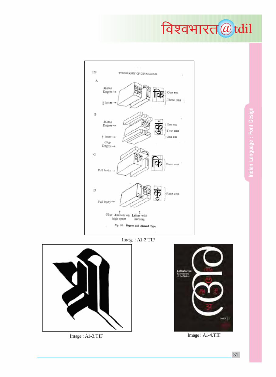
(Appendix : Images: A1-1.TIF, A1-2.TIF, A1-3.TIFand A1-4.TIF).
A2 - What is the role of type fonts incommunication, printing, publishing andinformation industries?
Without a type font, no printed text will ever exist.The effectiveness of written communication willdepend upon the visual qualities of a written text. Theproper use of type fonts and effective typographywould result into an effective piece of writtencommunication, in any language, in any script,anywhere, anytime. The role played by type fonts inprinting is at its maximum level. Printing technologycaters to both text and images. In context to textcomposition and text printing, type fonts are vitalinput elements. The publishing industry can establishits unique identity, if needed; through a specific type
5. Indian Language : Font Designing and Font TechnologyProf. R. K. Joshi, Visiting Design Specialist, C-DAC-Mumbai
Ind
ian
Lan
gu
age
: F
on
t D
esig
n

19
@tdilfo'oHkkjr
font style. Reputed newspapers have initiated typedesigns according to their requirements. For example:Times Roman designed by Stanley Morrison wasinitiated by Times London as their new identity.
Information technology and information design aretwo vital sides of the information industry. The usageof innovative ideas in information technology, as wellas creatively designed and typographically wellpresented text/images as part of information design;are the two key factors that enhance the quality ofcontent marketed by the information industry. Wellchosen type fonts as well as well presented visuals,play an important role in information design.
A3 - What are the different categories of Fonts?
There are different categories of fonts which aredesigned to suit different purposes. These can beclassified briefly as follows:
1. Text fonts (for continuous text)
1a. System font
1b. Application font
2. Headline Fonts (for short text)
2a. For headlines in text
2b. For signage
3. Fonts based on Indian historical Landmarks suchas Brahmi letters, Gupta letters, Chalukya letters,Mughal letters, Bhoja letters, Peshwa letters etc.(for typical ancient/period based text)
4. Indian Fonts based on Roman script fonts suchas: Times Roman, Arial etc. (for text used inAdvertising & Communication industry)
5. Specialized Fonts:
5a. Transliteration fonts (to rendertransliterated text from any Indian languageto Devanagari Script)
5b. Mathematical fonts. Special font inDevanagari to take care of advance math signs(including Greek marks such as theta etc.)
5c. Fonts for composing text related to aspecific faith (such as Jainism, Buddhismetc.)
5d. Multilingual Technology Model fonts todemonstrate oddities, features, rules in allIndian scripts.
5e. Comprehensive fonts for reproducingVedic text in Sanskrit (includingSamaveda).
6. Bilingual fonts
Devanagari font based on another Indian scriptsuch as BengNagari, NandNagariMalayaNagari etc.
7. New era – Computer technology fonts
7a. Dot matrix – bitmap fonts scalablenonscalable (with one or many passes)
7b. Segmentation fonts (where each segmentwill be of varied type)
7c. Digital fonts using formats such as PS(postscript), TT (TrueType) and OT(OpenType) etc.
8. Calli Fonts (based on Calligraphic styles ofIndian scripts)
8a. Personalised fonts (based on thehandwriting based on the legendarypersonalities such as Sant Tukaram, JaojeeDadajee etc.)
9. Decorative fonts
9a. Script fonts – (based on running style ofhandwriting or cursive calligraphy)
9b. Initial letters/fonts (to be used at thebeginning of a text or a para)
9c. Fancy decorative fonts (for festive text).
10. Machine readable fonts in Devanagari andother Indian Scripts
11. Corporate fonts (to be used in all levels ofCommunications in/for a corporation,industry, institute, company, organization).
In the above categories, many typefont families needto be designed to create an exhaustive repertoire oftypefonts for Indian Languages/Scripts. Suchactivity has already been undertaken and being
Ind
ian
Lan
gu
age
: F
on
t D
esig
n

20
@tdilfo'oHkkjr
recognized as a profession in the Western as well as farEastern countries.
What is a typefont family?
Typefont family consists of typefont members. Thetypefont family can be identified through its stylisticrenderings of elements, weights, transformationvariations and sizes. For example: Times Roman hasthin smooth serifs at the end of vertical strokes, sothis stylistic feature will be observed in all its familymembers. Different weights of a letterform such asextra light, light, medium, demi-bold, bold, extra boldcan expand a given type family. The angular slopegiven to vertical strokes would result into italicvariation of the same font. Extra condensed,condensed, expanded, extra expanded proportions ofa letterform would form another feature of a typefacefamily. For example: Universe designed by AdrianFrutiger is an excellent example of a Sans Serif typefontfamily in Latin script. Nirnaysagar typeface - apioneering style in Balabodh Devanagari is an excellentexample of a typeface family in India.
Generally a light, medium and bold weight typefacealong with its slant (Italic) versions are designed as aminimal font family.
(Appendix : Images: A3-1.TIF).
A4 - Typefaces in Latin Script and DevanagariScript + Other Indian Scripts.
Many excellent examples of typefaces exist in the Latinscript. Some of them have been designed by greatdesigners such as: Caslon, Baskerville, Goudy, Bodini.Their typeface family is known by their names. Dueto the available font design and production technologyat those times, they could produce only one typefacefamily as their lifetime achievement and as a missionof artistic endeavours. Such pioneering examples willalways be remembered in the history of type designing.
In recent times companies like Linotype, Monotype,Itek, Compugraphics, Bitstream etc. have contributedtowards redesigning of typefaces from hot metal eraand making them available in photo typesetting aswell as on digital text setting. IKARUS, Bitstream,created their own type designing environment basedon an outlined letter shape approach, whereas Dr. D.Knuth of Stanford University introduced metafont
concept of designing fonts, and LaTeX text creationenvironment of a generic nature.
We see all around us in print media examples of suchand similar typefonts using various surfaces.Newspapers, magazines, printed books are the livecarriers of typefonts. New media through its digitaltechnology; exhibits, displays and prints arrays oftypefonts for specific communication objectives.Typefonts if appropriately chosen can reflect thetheme and the mood of the contents in informationdesign.
On the Indian scene, Institutes such as Nirnaysagartype foundry, Saraswati press, Gujarati type foundry,Aryabhushan Press, National Foundry, Mauj typefoundry have contributed significantly towards theactivities of type designing and type founding. Inrecent times ITR, NCSDCT (TIFR), Modularsystems, C-DAC, have contributed and enricheddigital designing of fonts and font technology.NCSDCT pioneered digital fontdesigning activitythrough its software called PaLatino (1980) whichwas further consolidated by NCST through the fontdesign package called Vinyas using skeletal approach(1985). The sample of fonts designed by thefoundries/institutes are available through theircatalogues and promotional material.
(Appendix : Images: A4-1.TIF, A4-2.TIF)
The following two examples reflect the typefontdesigning and font technology activity at O/S level.
1. Windows environment (Windows 2000onwards) introduced Indian languagecapabilities through a series of fonts at O/Slevel. Mangal (Hindi), Latha (Tamil), Tunga(Kannada), Gautami (Telugu) are some of thefonts (designed by Prof. R. K. Joshi) that areavailable.
2. Under IndiX project at C-DAC, Mumbai(formerly NCST) series of Opentype fonts suchas SaralHindi, SaralMarathi, SaralTamil,SaralSanskrit etc. have been designed by Prof.R. K. Joshi and his team. This would facilitateIndiX text processing in the GNU Linuxenvironment.
Ind
ian
Lan
gu
age
: F
on
t D
esig
n

21
@tdilfo'oHkkjr
(Appendix : Images: A4-3.TIF, A4-4.TIF)
Structure – Part B (Historical Background)
B1 - Invention of Movable types and its effect onhuman civilization.
It is a well known fact that copper plates, litho stonesand or wooden blocks with images of pictures orlinguistic signs were used as reproduction tools in earlydays. The concept of using an individual letter of ascript again and again, as an individual master tool,was initiated by Guttenberg in Meinz, Germany inthe mid 15th Century. This revolutionary conceptto compose text was handled in a soft material likewood. After many experiments movable types inmetal were introduced using hot metal technology.The original image of a letter had to be engraved ontop of a steel punch. This engraving activity in actualsize and shape of a letter on a hard steel was a laboriousand painstaking, yet artistic achievement. This punchwas to be struck into the side of a metal piece (calledMatrix). Then hot metal was poured into such matrixmoulds, resulting into individual type metal pieces.On the top face of such metallic rectangular piecesthe impression of a letter would emerge as a mirrorimage. When such pieces were composed together ina linear fashion, smeared with ink, pressed and printedon paper, it was called letter press printing technology.From this brief description, one would conclude thatit was indeed a long drawn and an individualisticapproach to design and to produce a typefont in theearly days of printing.
Inspite of such pioneering and revolutionary efforts,printing was treated as black magic and learned peopledid not accept this process of reproducing a text ascompared to a handwritten text or Calligraphed text.Yet the art of printing caught on and helped to spreadthe written words all around. It helped the society ingeneral to get literate faster by reading readymadeprinted text. Economy and speed of this printed textwere two crucial factors. It is now obvious thatGuttenberg as well as printers, designers who followedhim designed typefonts based on handwritten models,as if the text was handwritten and not printed.“Gothic” styled typefaces were the outcome. Fracturand Swachbacher, German text fonts would reflectthe same spirit. When the typefaces were designed
on the basis of “Gothic Calligraphy”, in England theywere loosely called old English typefaces. The usageof such and similar typefaces still gives us the ambienceand aura of the olden times.
B2 - The Indian Scene – PreNiranayasagar,Niranayasagar and Post Niranayasagar
The type design activity on Indian scene was also basedon the handwritten styles (Calligraphy) from oldmanuscripts. Many European Scholars andMissionaries such as Dr. William Carey, Sir CharlesWilkins, Thomas Graham etc. had engagedthemselves in creating typefaces and developingcomposing technology for Indian texts. This era wasquite important and relevant for the spread of literacyin the Indian continent. Some attempts of typedesigning and printing are also observed in theEuropean Countries. (i.e. V&J Figgins London 1884(Devanagari), Tamil type cut in Germany (1716),Schlegel’s Devanagari, Bonnae 1848, Devanagaritypecast in Rome (1771). Printing machine arrivedin Goa in the mid 15th Century by accident. Indianfont designing and text composing activity startedon the Malabar coast, then Madras in early 18thCentury, and established its strong identity atSerampore Press near Calcutta in the early 19thCentury. Then it shifted to Bombay. Influenced bysuch activities, Indian printers such as GanpatKrishnaji in Mumbai and others, followed the trendof type designing and text printing in Indianlanguages. This era can be described as thePreNirnayasagar era.
((Appendix : Image: B2-1.TIF)
The dedicated all round efforts to design typefaceswas truly introduced by Nirnayasagar typefontfoundry in Bombay in early 19th Century. This allround activity included typedesigning, contentcreation in Sanskrit Language, casting typefaces,printing and publishing books in Sanskrit and otherIndian Languages; was undertaken by a great pioneerby name Jaojee Dadajee. He established theNirnayasagar type foundry, Nirnayasagar printingpress and Nirnayasagar publishing house. This greatinstitution was a centre of a scholarly linguisticactivities guided by Sanskrit Scholars and Shastris.The publications printed in Sanskrit by this
Ind
ian
Lan
gu
age
: F
on
t D
esig
n

22
@tdilfo'oHkkjr
institution are still treated as the most authenticprinted editions of the ancient text from India, allover the world. The Punchcutter by name Aaru, wasat the helm of type design activity at the institute.The efforts of Jaojee Dadajee and Aaru have createdan unparallel instance of a type family whichcomprises of different weights and variations, in early19th Century. This Nirnayasagar era is a golden erain Indian Language fontdesigning and text printingusing hot metal technology with internationalstandards. Unfortunately very little documentedarchives of this activity are available apart from thetype catalogues and the printed books.
((Appendix : Image: B2-2.TIF)
Post Nirnayasagar era marks the emergence of manydedicated printers and publishers equipped withmodern technology for type foundry and textprinting. This printing and publishing activity spreadall over India and contributed towards creating contentin various fields of Art, Science and other disciplines.The exposure to western technologies made many ofthem adopt modern facilities to reproduce IndianLanguages and scripts. Linear composition of text inthe Latin script was the basis of the development oftechnologies for type designing and text composing/printing in the West. This forced Indian printers andpublishers to consider changes in Indian scripts, andthus script reform activity took roots in Indian soil.Many Indian engineers, linguists, politicians andenthusiasts have contributed their bit since 1884 tillthe end of 20th Century. Some of the script reformswere incorporated on mechanical machines in orderto get faster reproduction of Indian text.
B3 - Type faces for mechanical composing –Typewriter, Monotype, Linotype
Typefaces for Indian Languages on manual typewriterswere very limited in quantity and quality. Since thefunctioning of the qwerty keyboard was adopted forIndian scripts, input in linear composition had to befollowed. Therefore, only 96 glyphs could be put onIndian manual typewriters. However, this quantityof glyphs was not adequate to create the exhaustiverange of Indian syllables. The three tier structure ofIndian script orthography also suffered in the process.
In short, the output of manual typewriter was notsatisfactory.
In the case of Linotype, a full line was composed at atime using pre-fabricated metal matrices. Thecomposing speed of this mechanical typesettingmachine was suitable for composing mass text fornewspapers. Linotype mechanics was developed forlinear single tier structure of Latin script. Therefore,the Indian language syllables with three tier structurehad to be split vertically into two or three parts tocompose a single syllable. The type faces for Linotypewere based on the styles of hot metal technology fontsand were mostly designed by western type designerssuch as Dr. Fiona Ross, (Bengali) et al. The technologyused in Monotype demanded the set of glyphs in amatrix of 16 x 16 and facilitated the composing ofindividual letters at a faster speed than manualtypewriters. In the case of Indian languages, thistechnology provided a good feature of kerningthrough overhanging. Therefore, the output ofMonotype looked similar to the output from manualtext composing. Monotype operated in two stages(input device machine of punched tapes and typecasting machine) and was popular in the bookpublishing industry of the Indian Languages. Thusmechanical composing devices such as type writer,Monotype and Linotype catered to the needs ofcomposing text in Indian Languages in an officeenvironment, the newspaper industry and in bookpublishing respectively. The role of Indian typedesigners in these technologies was minimal and ofcollaborative nature.
(Appendix : Images: B3-1.TIF, B3-2.TIF)
B4 - Photocomposing (Predigital era) early digitalera
Photocomposing was at an advanced stage of textcomposing in Latin script in the early 20th Century.In this technology photographic materials - such asnegatives, sensitive papers; as well as photographictechniques of projecting and developing images inenlarged or reduced sizes; were used very effectivelyin the place of hard/hot metal technology. Thisdevelopment took place in the western world for adefinite reason - economics. The investment of time,money and manpower was far too much to create a
Ind
ian
Lan
gu
age
: F
on
t D
esig
n

23
@tdilfo'oHkkjr
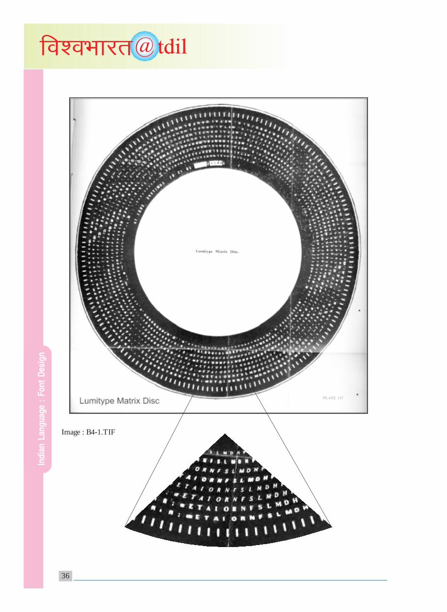
typeface in hot metal technology, and the type industrywas not sure whether newly introduced typefaceswould be successful in the market or not. To avoidsuch heavy investment, a trial run of a font designcreated through a cheaper and more convenient waywas needed. This was the reason for developing thephotocomposing technology. Many font designswere easily introduced through this technology andin the process it was found that these techniques couldalso be effectively used for composing text. One byone, four generations of photo composing (Photoimaging, photooptics, photoscan, digital scan) cameout in the western market, and were adopted forIndian Language text composing too.Photographically operated transformations from amaster type design, was an attractive proposition ofthis technology. On the Indian scene this technologyfacilitated crisper images of types, creation of typefamilies and most importantly, the positioning ofvowel marks using the kerning (+/- offset) feature.
In the third and fourth generation ofphototypesetting technology, scanning of images, andstoring information of images was introduced as aninitial ‘digital’ approach to letterforms and theircompositions. Therefore this technology can beidentified as a predigital era. Many westernmanufactured phototypesetting machines such asPhoton/Lumitype, Compugraphics, Mono-Foto,Linotron etc. were adopted for Indian Languagephotocomposing. These proprietary technologiesdemanded following their own closed unit systemsfor designing types in Indian scripts.
(Appendix : Images: B4-1.TIF)
B5 Different glyph sets designed under differenttechnologies for Devanagari.
Hot Metal Technology No of Glyphs
1. Nirnayasagar Type (Akhand System)Including 115 Conjuncts 609With vedic sign cominations
For Vedic Sanskrit 1000+
2. Sanskrit font set by V & 811
J Figgins London
3. Degree System to compose text 155in 3 tiers, separately
4. Devanagari Manual Type Writer 9244 to 46 keys
5. Monotype 255with Diacase of 17 x 15
6. Linotype 134Main keyboard: 90 + Side keyboard: 34+ Hand sort tray: 10 +
Photo Typesetting Technology
1. Monotype 255Negative case 17 x 15
2. Linofilm 90With fount grid18 font x 6pt sizes x 90 characters=7720 possibilities of letterforms
3. Photon (the lumitype) 90With matrix disc-8" dia16 fonts x 12 lenses x 90=17280 possibilities of letterforms
Digital Technology
7 bit overlay on ASCII characters 127
8 bit formats (PS and others) 255
Unicode standard Opentype fonts
SaralHindi 650
SaralMarathi 660
SaralSanskrit 921
SaralTamil 193
SaralTelugu 351
SaralKannada 555
SaralOriya 463
SaralBengali 621
SaralAssamese 621
SaralGurumukhi 313
SaralGujarati 739
RaghuVaidika (with Vedic signs) 1172
Ind
ian
Lan
gu
age
: F
on
t D
esig
n

24
@tdilfo'oHkkjr
Structure Part C (Digital Font Designing andDigital Font Technology)
C1 - Difference between digital and analog types– scope and challenges
The basic difference in digital types and analog types,is in their physical, internal structure. Analog typefaceswould be either objects (in case of hot metaltechnology) or images (in case of phototypesettingtechnology). Digital fonts would primarily consist ofinformation about the shape and the structure of aletterform. With such information, a typeface objectand or a typeface image could be created as and whenrequired and in different formats to suit a digitaloperating system, to compose text. Therefore thescope and challenges involved in creating,manipulating, storing and transferring of digital typefonts are manifold. A typographic design created byusing analog types would always remain static, whereasa typographic design created by digital types wouldalways be dynamic, everchanging, interactive andimmersive.
C2 - Varing glyph sets for various formats/purpose
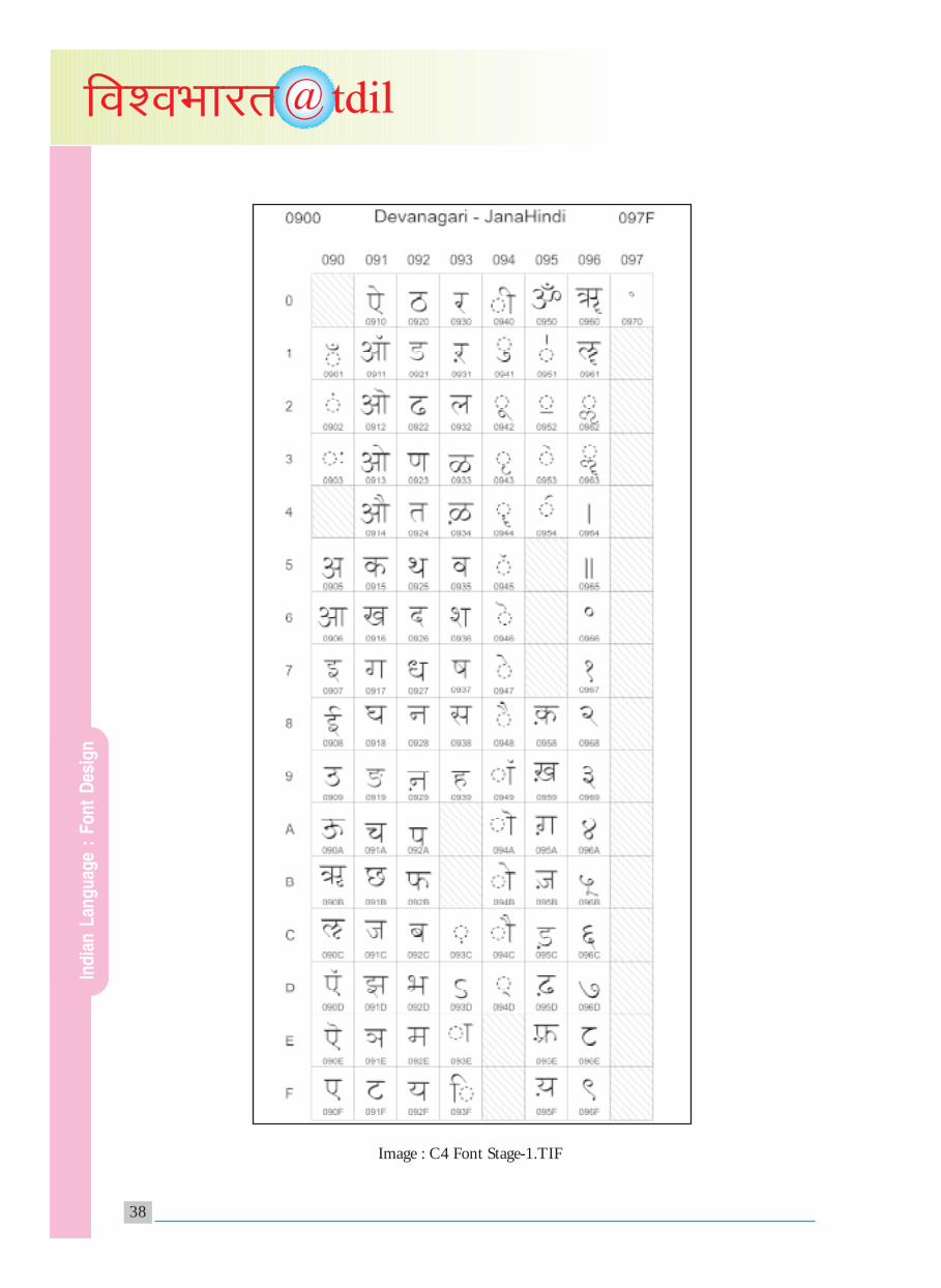
Visual glyphs are linguistic marks orthographed in acertain fashion. Such glyphs put together fabricate astructure of linguistic words. Linguistic words puttogether in a systematic way would create a meaningfulsentence. A bunch of sentences planned in a propersequence/order would create sensible text. For writingsensible text in a given script associated with a givenlanguage, one would need a set of glyphs which wouldbe a basic repertoire of linguistic marks. Text for ahighly specialized area or an ancient text, would needan adequate range of glyphs. The quantitative andqualitative requirement of a glyph set would defer asper the task to be achieved in a given language. Forexample – In an initial letter font, (Category 9B)number of glyphs to be designed will depend uponthe frequency of syllables, at the start of words in agiven language. In digital technology, the profile of aglyph set would vary as per the formats used for varioustextual tasks. For example: the glyph set identifiedto represent character codes in the Unicode standardfor Devanagari script, would be less than the glyphset in a typefont designed in Devanagari. The Unicodechart shows 108 characters (Refer to Image: C4-1.TIF)whereas the Saral Hindi font (IndiX project) contains
650 glyphs (Refer to Image: C4-2.TIF). The linguisticglyphset required to compose text in Hindi languageusing extended Devanagari script is shown in Image:C2-1.TIF.
(Appendix : Images : C2-1.TIF)
C3 - Coding standardization – regional, national,global and their effect on type designing andtechnology.
In hot metal technology the storage of text was aphysical activity in terms of compositions of metaltypefaces. In early photo typesetting era, the analogimages of composed text were stored. In the digitalera storage the information of type font and composedtext is of vital importance. This stored data can berevised, updated, modified, transmitted using varioussoft tools. In order to have authentic, in exchange ofsuch data of a text document, the standardization ofcodes assigned to each element of the text is ofparamount importance.
In the days of DTP, many private vendors developedand sold proprietary applications for text composingin Indian scripts. They had their own coding schemeand standards. Therefore various types of codingstandards did exist, which made the exchange of dataof text extremely difficult. At the National level,ISCII standard (parallel to ASCII standard) wasintroduced as The Indian Script Codes forInformation Interchange in 1983, 1988,1991; as theIndian standard for storing information data. On theglobal scale, The Unicode introduced unique identitycodes for writing systems/scripts from all over theworld. This facilitated unambiguous informationexchange globally, especially for network operations.Many Indian scripts have been allotted Unicodes asper version 3.0 and version 4.0. Indic textcomposition and storage of data in Unicode standardshas created a new dimension in Indian script, fontdesigning and font technology.
C4 - Planning and process of designing a digitalfont using different font formats and fontgeneration technologies.
Planning a digital font in a Indian script is the firstbasic step. For this code standardization, format andthe objective of the design is important. The lookand feel of letters inbuilt unique stylistic elements,
Ind
ian
Lan
gu
age
: F
on
t D
esig
n

25
@tdilfo'oHkkjr
appropriate features to enhance visual/aestheticqualities are some of the primary considerations. Therequired quantity of glyphs are to be designed in theirappropriate outlines, proportions and an appropriatelettering style in a digital font is to be created. Thedesigned outlined shape is broken into pixels. Thedigital data is used for display on screen, transmissionor print on paper. The following five steps werefollowed in designing the Saral series at C-DAC,Mumbai under the type font design directorship ofProf. R. K. Joshi.
Step1 - Planning the lettering style of the typefont.Identifying and designing outlines of the glyphs asper the character codes of Unicode.
(Appendix : Image : C4-1.TIF)
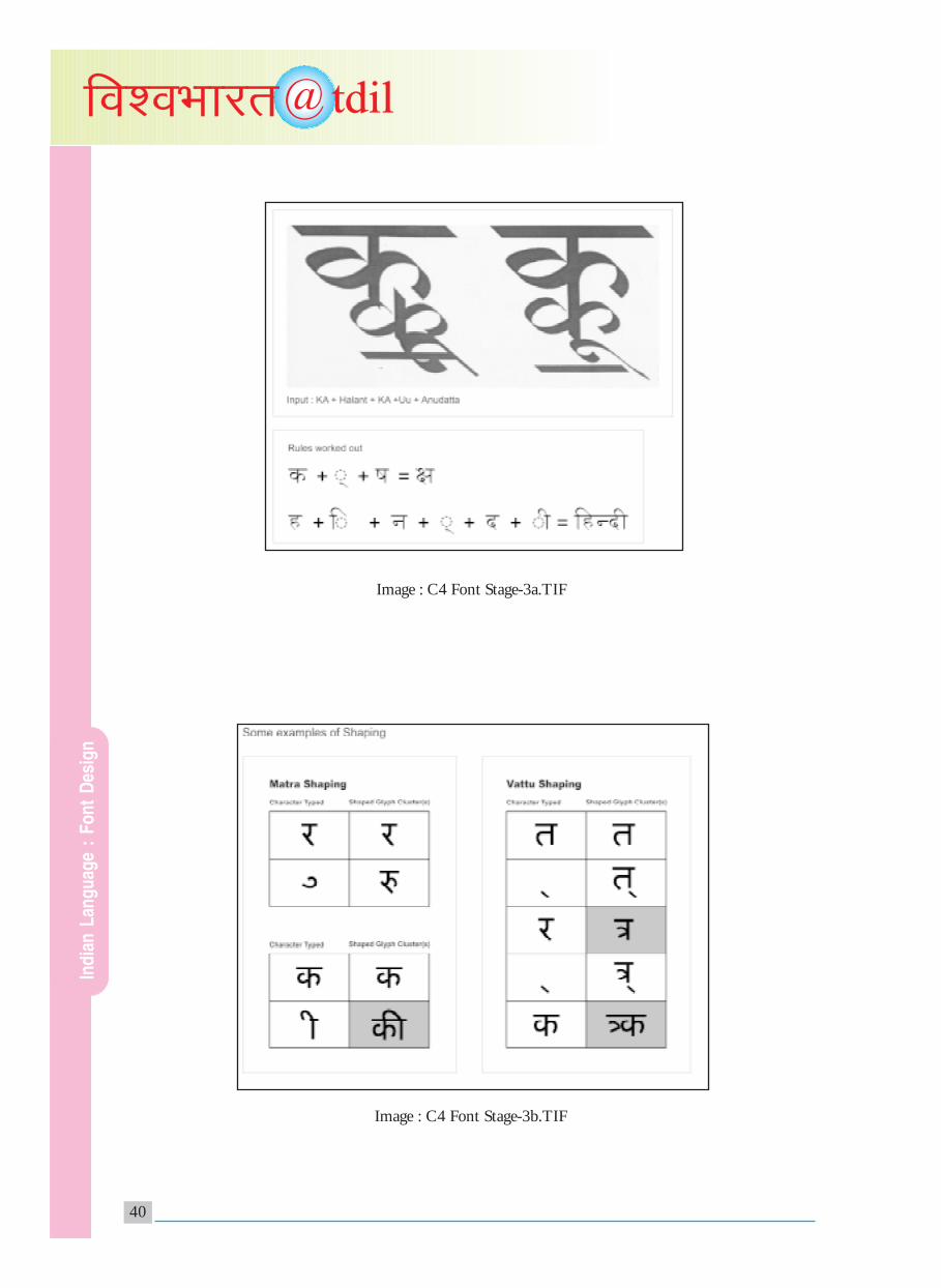
Step2 - Identifying and designing outlines of thetotal glyph set as per the linguistic and typographicrequirement of a language/script.
(Appendix : Image : C4-2.TIF)
Step3 - Writing adequate number of compositionrules and tables to support the correct constructionof syllables and text.
(Appendix : Image : C4-3.TIF)
Step4 - Integrating the tables and the font into theoperating system/application.
(Appendix : Image : C4-4.TIF)
Step5 -Testing of the glyphs and linguistic syllablesusing the font, tables, input and output devices andO/S. Release of the font.
PROJECT INDIX2Glyphs set - Font documentation8 levels Testing of an Indian Language Font incontext to glyph set.
L1 - A glyphs set containing the requisite number ofglyphs of vowels, vowel matras, vowel modifiers,consonants, consonant modifiers, numerals,punctuation marks and other required symbols/signsas per requirement of a given script/language.
(Appendix : Image : C4-5.TIF).
L2 - The glyphs set as in L1, but presented andarranged in the requisite code standard/s i.e. Unicode,ISCII, ISFOC, INSFOC, VIVIDHA, Private and/or proprietary. (Refer to C4-1.TIF).
L3 - Typical vowels, vowel matras, vowel modifiers,
typical consonants and their syllabic combinationin a “Barakhadi” pattern of the consonants arrangedas per phonatic classification in a given script for givenlanguage i.e.
Ka Khaa Gi Ghii Ngu d [kk fx ?kh Äq
Cuu Chri Je Jhai Nyo pw N` ts >S ×kks
Ttou Ttha Ddaa Ddhi Nnii etc. VkS B Mk <S
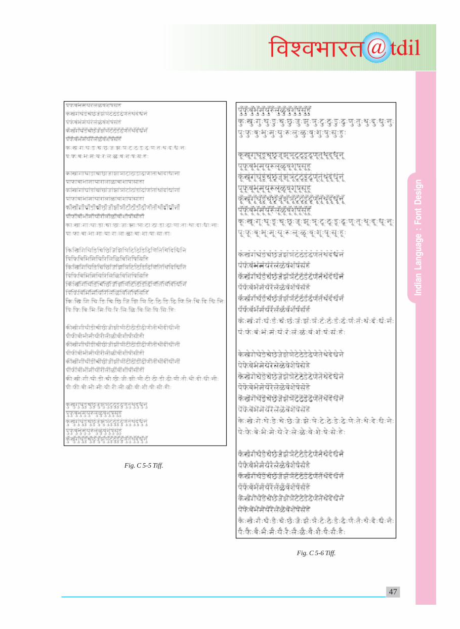
L4 - Typical vowels, vowel matras, vowel modifiers,typical consonants and their syllabic combinationsincluding syllables of frequently used conjuncts. I.e.In Devanagari Script. (Refer to C5-1.TIF to C5-11.TIF for mono consonant syllables).
L5 - Typical vowels, extended vowels, vowelmodifiers, extended vowel modifiers, consonants,extended consonants, consonant modifiers, extendedconsonant modifiers and their syllabic combinationsincluding syllables of all possible conjuncts.i.e. Extended Devanagari.
L6 - The glyphs set as in L7 + with all tonal marksas provided in, for the text in Vedic Sanskritlanguage.
(Appendix : Image : C4-6.TIF).
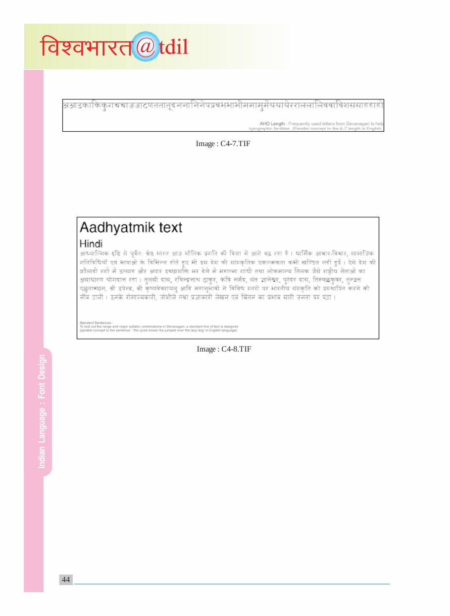
L7 - A set of most frequently used syllables froma given script for a given language and arranged in alinear way without any letter space in betweensyllables i.e. AHO length developed by Prof.R.K.Joshi in Devanagari Script for Hindi andMarathi languages.
(Appendix : Image : C4-7.TIF).
L8 - A typical standard test text in a given scriptfor a given language. This test text for Indianlanguages will include samples of representative andfrequently used syllables forming words andmeaningful sentences. I.e. The brown fox jumpedover a lazy dog – A standard test text used in LatinScript for English language. The “Aadhyatimika” testtext designed and developed by Prof. R.K.Joshi inDevanagari Script for Hindi and Marathi languages.
(Appendix : Image : C4-8.TIF).
Eight level glyph sets for Indian Languages
(AashtaStariiya Bhashik ChinhaSanch)
C5 - Glyph set – parameters and testing of adigital font.
(Appendix : Image : C5-1.TIF to C5-11.TIF).
Ind
ian
Lan
gu
age
: F
on
t D
esig
n

26
@tdilfo'oHkkjr
Modules Plan: 12 Indian Languages
Eka Vyanjan AksharMala
Monoconsonant syllables
Modules M1, M2, M3, M4, M5, M6, M7, M8,M9, M10, M11, M12, M13, M14, M15, M16.
Module1 (M1):
(34 consonants + 10 vowels)
The Module0 (M1) is applied to the following 11languages:
HIN (Hindi), MAR (Marathi), SAN (Sanskrit),ASM (Assamese), BEN (Bengali),
GUJ (Gujarati), PAN (Punjabi), ORI (Oriya), KAN(Kannada), MAL (Malayalam), TEL (Telugu).
Ind
ian
Lan
gu
age
: F
on
t D
esig
n

27
@tdilfo'oHkkjr
SanyuktaAksharMalaMulticonsonant syllables
Modules:
M17.1 to M17.16M18.1 to M18.16M19.1 to M19.16M20.1 to M20.16M21.1 to M21.16
• Module17.1 (M17.1) to Module17.16(M17.16)
Multilingual conjunct syllable (i.e, K + Ka)
The Module17.1 (M17.1) to Module17.16(M17.16) is applied to the following 12 languages:
HIN (Hindi), MAR (Marathi), SAN (Sanskrit),ASM (Assamese), BEN (Bengali), GUJ (Gujarati),PAN (Punjabi), ORI (Oriya), KAN (Kannada),MAL (Malayalam), TAM (Tamil), TEL (Telugu).
• Module18.1 (M18.1) to Module18.16(M18.16)
Multilingual conjunct syllable (i.e, K + Ra)
The Module18.1 (M18.1) to Module18.16(M18.16) is applied to the following 12 languages:
HIN (Hindi), MAR (Marathi), SAN (Sanskrit),ASM (Assamese), BEN (Bengali), GUJ (Gujarati),PAN (Punjabi), ORI (Oriya), KAN (Kannada),MAL (Malayalam), TAM (Tamil), TEL (Telugu).
• Module19.1 (M19.1) to Module19.16(M19.16)
Multilingual conjunct syllable (i.e, R + Ka) Reph
Module19.1 (M19.1) to Module19.16 (M19.16)is applied to the following 8 languages:
HIN (Hindi), MAR (Marathi), SAN (Sanskrit),ASM (Assamese), BEN (Bengali),
GUJ (Gujarati), ORI (Oriya), KAN (Kannada).
• Module20.1 (M20.1) to Module20.16(M20.16)
Multilingual conjunct syllable (i.e, EyelashR + Ka)
Ind
ian
Lan
gu
age
: F
on
t D
esig
n

28
@tdilfo'oHkkjr
Module20.1 (M20.1) to Module20.16 (M20.16)is applied to the following 2 languages:
MAR (Marathi), SAN (Sanskrit).
• Module21.1 (M21.1) to Module21.16(M21.16)
Multilingual conjunct syllable (i.e KSsa and/or JNya)
Module21 (M21) to Module21.16 (M21.16) isapplied to the following 11 languages:
HIN (Hindi), MAR (Marathi), SAN (Sanskrit),ASM (Assamese), BEN (Bengali), GUJ (Gujarati),ORI (Oriya), KAN (Kannada), MAL (Malayalam),
TAM (Tamil), TEL (Telugu).
C6 - Digital fonts and the challenges ofmultilingual, multimodal and multilayered digitalcompugraphy as a part of knowledge andinformation exchange.
Visualization of Texta – the text “beyond”
Digital technology through efficient competingtechniques has helped in creating and processingmultilingual, multilevel textual and visualinformation as part of globalization activity. Yet,the text generation / creative writing activity islimited to writing text on visualized events / objects/ experiences, the visualization activity is yet to beexplored in the context of text itself either 2D, 3Dor virtual. For this purpose there is a need to thinkabout the linguistic signs as a potential vehiclebeyond mere linguistic expressions. The computervision activity could play a vital role in taking textbeyond text.
The following 5 explorations are intended to bepresented at the conference at the conceptual level.
1. Texta 1: Kaala Paath
The text on the selected themes related to dynamics,will be programmed for its structure to get changedevery time in time. This will create the concept ofever changing text (visually) to be seen andexperienced by the reader.
2. Texta 2: Trimiti Paath
Reading a non-linear text as a journey, with 3D letterobjects as landmarks is expected to create a new typeof semiotic experience.
3. Texta 3: Paraa Paath
There would be virtual Texta structure in which oneenters and while having a digital walk, various layeredinformation is exposed which can be interactive modeas events.
4. Texta 4: Apaath
The text and de-text has to be composed anddecomposed programmatically as a phenomenaobserved in the nature. The event will involve creatinga structure of words related to construction anddeconstruction activity achieved through theassemblage of pixels into a text and then the textturning into a heap of pixels.
5. Texta 5: Naad Paath
The non-linear multi-layered and multi-dimensionaltext will be read by robo machine converting the sameinto appropriate sound tracks. The phonetic basedlinguistic sound can be entered with a graphic mark-up language. This graphic mark-up language willspecify the higher level text capable of conversion fromgraphic mode to speech mode.
Letterforms need not exist as the lowest element of achain in human communication, but could serve asan ‘organic’ element in the text, which changes itsphysical appearance in ‘time’.
On one hand it should be liberated from this age-oldfunctional demand and be treated as mere objects ofa new type which can be made – unmade, constructed– deconstructed as a part of public place environment.
And on the other hand one could be able to enterinto such alphastructures and gain synaestheticexperience from such an inward journey.
Letterform designers and new technologists togethershould demand of each other such a new role andwork towards fulfilling the new task ahead.
Ind
ian
Lan
gu
age
: F
on
t D
esig
n

29
@tdilfo'oHkkjr
Not just generating and processing texts of a givenlength but go beyond.
as Texta 1 (with letters having their own dynamics)
as Texta 2 (letters changing form in time)
as Texta 3 (letters as objects)
as Texta 4 (letters as experience)
for this, the third eye, addressing the sixth sense andsinging the 8th note; must be opened up.
References/Acknowledgements
1. ISCII.1991, Bureau of Indian Standards, NewDelhi (1991)
2. Donald E. Knuth, The Metafont Book, AddisonWesley Publishing Company (1986)
3. Laxmi Parida, Vinyas User Manual, NCSTInternal report, Graphics & CAD Division,NCST (1989)
4. The Unicode Standard
Version 3.0 and Version 4.0, The UnicodeConsortium (1991, 2004)
5. Vividha 1: Users Reference Manual, NCST,Mumbai (1986)
6. S. P. Mudur, Niranjan Nayak, ShrinathShanbhag, R. K. Joshi, An architecture for theshaping of Indic texts, Computer Graphics, Vol23, No. 1, February 1999-P7 to P24.
7. Bapurao S. Naik, Typography of Devanagari VolI, II, III, Directorate of Languages, Bombay 1971
8. R. K. Joshi, position statement mode at theannual conference of Association TypographiqueInternationale (ATYP1), Reading University, UK(1997)
I gratefully acknowledge Jui Mhatre and Gracy Abreoof C-DAC Mumbai, for their help to put this articletogether.
Courtesy/Source:Prof. R.K. Joshi
Visiting Design SpecialistC-DAC Mumbai (formerly NCST)
Ind
ian
Lan
gu
age
: F
on
t D
esig
n

30
@tdilfo'oHkkjr
Image : A1-1.TIF
Appendix
Ind
ian
Lan
gu
age
: F
on
t D
esig
n
31
@tdilfo'oHkkjr
Image : A1-4.TIF
Image : A1-2.TIF
Image : A1-3.TIF
Ind
ian
Lan
gu
age
: F
on
t D
esig
n

32
@tdilfo'oHkkjr
Image : A3-1.TIFImage : A4-1.TIF
Image : A4-2.TIF Image : A4-3.TIF
Ind
ian
Lan
gu
age
: F
on
t D
esig
n

33
@tdilfo'oHkkjr
Image : A4-4.TIF
Image : B2-1.TIF
Ind
ian
Lan
gu
age
: F
on
t D
esig
n

34
@tdilfo'oHkkjr
Image : B2-2.TIF
Ind
ian
Lan
gu
age
: F
on
t D
esig
n

35
@tdilfo'oHkkjr
Image : B3-2.TIF
Image : B3-1.TIF
Ind
ian
Lan
gu
age
: F
on
t D
esig
n
36
@tdilfo'oHkkjr
Image : B4-1.TIF
Ind
ian
Lan
gu
age
: F
on
t D
esig
n

37
@tdilfo'oHkkjr
Image : C2-1.TIF
Ind
ian
Lan
gu
age
: F
on
t D
esig
n
38
@tdilfo'oHkkjr
Image : C4 Font Stage-1.TIF
Ind
ian
Lan
gu
age
: F
on
t D
esig
n

39
@tdilfo'oHkkjr
Image : C4 Font Stage-2.TIF
Ind
ian
Lan
gu
age
: F
on
t D
esig
n
40
@tdilfo'oHkkjr
Image : C4 Font Stage-3b.TIF
Image : C4 Font Stage-3a.TIF
Ind
ian
Lan
gu
age
: F
on
t D
esig
n

41
@tdilfo'oHkkjr
Image : C4 Font Stage-4.TIF
Ind
ian
Lan
gu
age
: F
on
t D
esig
n

42
@tdilfo'oHkkjr
Image : C4-5.TIF
Ind
ian
Lan
gu
age
: F
on
t D
esig
n

43
@tdilfo'oHkkjr
Image : C4-6.TIF
Ind
ian
Lan
gu
age
: F
on
t D
esig
n
44
@tdilfo'oHkkjr
Image : C4-7.TIF
Image : C4-8.TIF
Ind
ian
Lan
gu
age
: F
on
t D
esig
n

45
@tdilfo'oHkkjr
Fig. C 5-1 Tiff.
Fig. C 5-2 Tiff.
Ind
ian
Lan
gu
age
: F
on
t D
esig
n

46
@tdilfo'oHkkjr
Fig. C 5-3 Tiff.
Fig. C 5-4 Tiff.
Ind
ian
Lan
gu
age
: F
on
t D
esig
n
47
@tdilfo'oHkkjr
Fig. C 5-5 Tiff.
Fig. C 5-6 Tiff.
Ind
ian
Lan
gu
age
: F
on
t D
esig
n

48
@tdilfo'oHkkjr
Fig. C 5-7 Tiff.
Fig. C 5-8 Tiff.
Ind
ian
Lan
gu
age
: F
on
t D
esig
n

49
@tdilfo'oHkkjr
Fig. C 5-9 Tiff.
Fig. C 5-10 Tiff.
Fig. C 5-11 Tiff.
Ind
ian
Lan
gu
age
: F
on
t D
esig
n