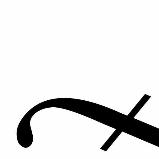
form/counterform book
DESCRIPTION
This was an assignment for my Typography 1 class. Using 6 different fonts you were to create a book of cropped letterforms. I also included a brief history of each font within my book.TRANSCRIPT

FORM & COUNTERFORM

BaskervilleDesigned by John Baskerville1757, Birmingham, England
Transitional Serif

Baskerville was developed in the 18th century by John Baskerville (1706–1775). Its clear, sharp design set it apart from others of its time. His font increased the
contrast between thick and thin strokes, making the serifs sharper and more tapered. He also shifted the axis of
rounded letters to a more vertical position and changed the curved strokes so they are more circular in shape.
Baskerville’s typeface was the culmination of a larger series of experiments to improve legibility. The result was a typeface that reflected Baskerville’s ideals of perfection, where he chose simplicity and quiet refinement over the
ostentatious ornamental style of his generation.
John Baskerville was a writing master. This skill is evident in the distinctive swash tail on the uppercase Q and in the
cursive serifs in the Baskerville Italic.
The refined feeling of this typeface makes it an excellent choice to convey dignity and tradition.


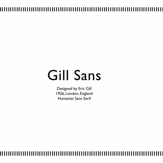
Gill SansDesigned by Eric Gill1926, London, EnglandHumanist Sans Serif

The original design of Gill Sans appeared in 1926. At a lo-cal bookstore, Eric Gill painted the fascia over a window in sans-serif capitals. Stanly Morison saw the letters and
commissioned the development of the font. He wanted a truly modern typeface. One that could compete with the
sans serif designs being released by German foundries, such as Futura. Eric Gill attempted to make the ultimate legible sans-serif text face. Monotype Corporation of-
ficially released Gill Sans in 1928.
Gill Sans has a relatively small x-height, smaller than Futura. A large x-height is usually considered one of the prerequisites for a typeface to rank high on the legibility scale, but Gill Sans is an exception. Because the charac-ters of the Gill Sans alphabet are based on classic roman letterforms and not geometric shapes, they are remark-ably legible. Gill Sans also has a more pronounced con-trast in stroke widths than most sans serif fonts, making
the design more appealing to the eye, and ultimately more readable than its mono-weight relatives. Gill Sans
was designed to function equally well as a text face and for display.


BemboDesigned by Francesco Griffo
1495, Venice, ItalyOld Style Serif
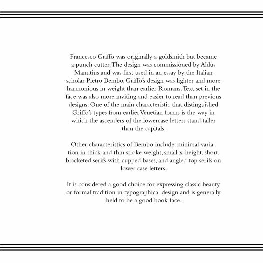
Francesco Griffo was originally a goldsmith but became a punch cutter. The design was commissioned by Aldus Manutius and was first used in an essay by the Italian
scholar Pietro Bembo. Griffo’s design was lighter and more harmonious in weight than earlier Romans. Text set in the face was also more inviting and easier to read than previous designs. One of the main characteristic that distinguished Griffo’s types from earlier Venetian forms is the way in which the ascenders of the lowercase letters stand taller
than the capitals.
Other characteristics of Bembo include: minimal varia-tion in thick and thin stroke weight, small x-height, short,
bracketed serifs with cupped bases, and angled top serifs on lower case letters.
It is considered a good choice for expressing classic beauty or formal tradition in typographical design and is generally
held to be a good book face.


FuturaDesigned by Paul Renner
1927, GermanyGeometric Sans Serif

Paul Renner was commissioned by the Bauer type foundry to create the font Futura. It is based on
geometric shapes that became representative visual elements of the Bauhaus design style of 1919–1933.
Although Renner was not associated with the Bau-haus, he shared many of its idioms and believed that a modern typeface should express modern models,
rather than be a revival of a previous design.
Futura has an appearance of efficiency and forward-ness. The typeface is derived from simple geometric
forms (near-perfect circles, triangles and squares) and is based on strokes of near-even weight, which are
low in contrast. In designing Futura, Renner avoided the decorative, eliminating non-essential elements. The lowercase has tall ascenders, which rise above the cap line. The uppercase characters present pro-portions similar to those of classical Roman capitals.


BodoniDesigned by Giambattista Bodoni
1798, Parma, ItalyDidone Serif

Bodoni admired the work of John Baskerville and studied in detail the designs. Bodoni’s font was in-
spired by Baskerville’s ideas of increased stroke con-trast and a more vertical, slightly condensed, upper
case. He took these ideas to the extreme when design-ing. His typeface had narrower underlying structures
with flat, unbracketed serifs, extreme contrast between thick and thin strokes, and an overall geo-
metric construction.
Some digital versions of Bodoni are said to suffer from a particular kind of legibility degradation known as
“dazzle.” It is caused by the alternating thick and thin strokes, particularly from the thin strokes being very
thin at small point sizes.
Bodoni has been used for a wide variety of material, ranging from 18th century Italian books to 1960’s
periodicals. In the 21st century, the late manner ver-sions continue to be used in advertising, while the early
manner versions are occasionally used for fine book printing.


MemphisDesigned by Rudolph Wolf
1930, GermanySlab Serif

Rudolph Wolf was the advertising manager for the Stempel Foundry, a foundry renowned for its
typographic skills and multitude of typefaces. Memphis is one of their most famous. It was de-signed with the original slab serif faces in mind. Wolf reinvented the slab serif by simplifying the overly complex type style and using the famed
Futura as a framework for Memphis.
Memphis is a typeface that is very geometric in shape, It is weighted virtually the same through-out the letterform. Memphis is intended to make
a rational, purposeful impression and is typically used for headlines, advertising or short text
blocks. Memphis is often thought of as a font for technical fields, making a rational, purposeful
impression. This emphasis on objectivity is well-suited to technical texts, but Memphis is appro-priate for any text which should exhibit a clear,
neutral character.


Melanie Dyson 2010