front cover analysis
TRANSCRIPT

Front Page Analysis

Presentational features of front cover• NME is a hugely popular music magazine, that’s aimed at
indie music listeners. The front cover shows the musician Nick Cave in a medium close up image. This can immediately grab a select audience, as the people that know who he is will want to know what he has done to be on the front cover of NME. The image itself has a black and white filter applied, to the exception of Cave’s Rose tinted glasses. The black and white image compliments the style of NME’s font, white text surrounded by a red box, it allows all of the text to clearly stand out from the image. There is no left hand third on this particular front cover. There is a brief description of what is in the magazine in the top right corner. In this corner, there is also a ‘splash’, where there the words “FREE POSTERS” are written, this will give the buyer an added desire to buy the magazine.
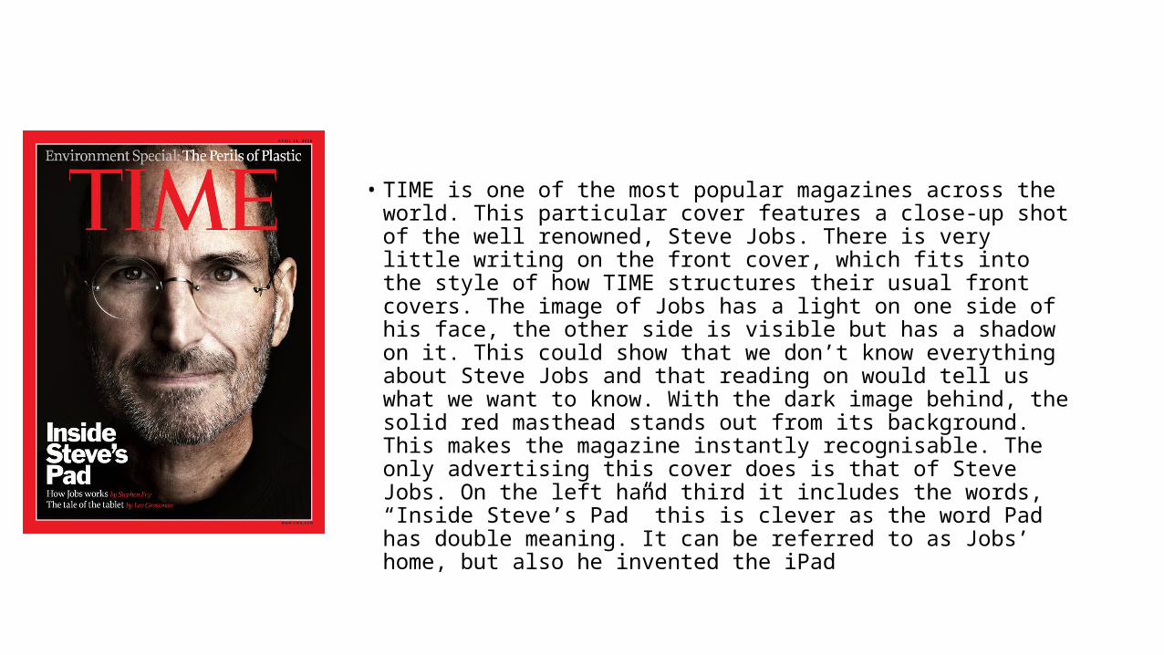
• TIME is one of the most popular magazines across the world. This particular cover features a close-up shot of the well renowned, Steve Jobs. There is very little writing on the front cover, which fits into the style of how TIME structures their usual front covers. The image of Jobs has a light on one side of his face, the other side is visible but has a shadow on it. This could show that we don’t know everything about Steve Jobs and that reading on would tell us what we want to know. With the dark image behind, the solid red masthead stands out from its background. This makes the magazine instantly recognisable. The only advertising this cover does is that of Steve Jobs. On the left hand third it includes the words, “Inside Steve’s Pad” this is clever as the word Pad has double meaning. It can be referred to as Jobs’ home, but also he invented the iPad

• “Film” is a magazine dedicated to all the latest block busters. The masthead in this edition is designed in the shape of buildings, which has relevance to the film, inception. This front cover shows Leonardo DiCaprio playing his role in the film. The image is taken from the film and shows him in a medium shot. He is dressed in a black suit. The text on the cover is mostly in the middle of the page. The text is in bright colours, white and red, this allows it to stand out well on the black background. The Splash in the middle of the page states “The 27 most mind-blowing movies ever!” this is a splash because it will interest the buyer and will make them want to buy the magazine to see what the movies are. The picture of Leonardo DiCaprio itself will also attract readers as he is loved by a large amount of the world, especially women.

• This issue of NME features Jamie T on the front cover in a medium shot. The image shows him dressed in a way in which he would wear in general day-to-day life, a white shirt and navy jacket, which is how he is known by the world. The colour scheme of the cover is white, black and red, a typical NME uniform. The left hand third of the page features information about Paramore and Liam Gallagher. This could also widen the interest for members of the public as they could have an interest in the other band members as well. There is a splash at the top of the page saying “Slicing up Brixton! Pixies Live” this has the ability to draw in readers in a number of ways, from the confusion leading them onto wanting to find out more.

• This is an issue of a magazine called Billboard. The feature of this front cover is Eminem, he is shown dressed in black in a medium shot with his hand on his heart. The hand on the heart could be linked to the headline “In Recovery” after his 2010 album called “Recovery”. The colour scheme of this front cover is undoubtedly black, white and yellow. Billboard magazine doesn’t have a uniform colour scheme, like magazines such as NME do, so this isn’t unexpected. There is a left hand third present on this cover. It includes font that is all the same type, it only differs from white to yellow and a slight size change. On the right hand side of the cover, we can see a splash that mentions other big musician. I think they have put this there because it will help increase sales by grabbing peoples attention, making them read the splash, and then hopefully then buying the magazine.

• This magazine is very plain and includes a very small amount of information on it. It literally only tells the basics. The magazine is called “Sport” and features a medium shot of Usain Bolt on the cover. He is dressed in his Jamaican running kit, this has been done due to the fact that it is what many people first saw him wearing back in 2012 when he won gold at the Olympics. The colour scheme of the cover is yellow, black and green. This has been done because they are the colours of Jamaica and that is where Bolt is from. The left hand third only includes the headline “One-Man Show”, referring to Bolt. Under that it includes a small line on the fact Sport has had an interview with him. The font of the headline is a tall and skinny one, this could be compared to Bolt as at 6 foot 4 he isn’t the smallest of 100 meter runners.
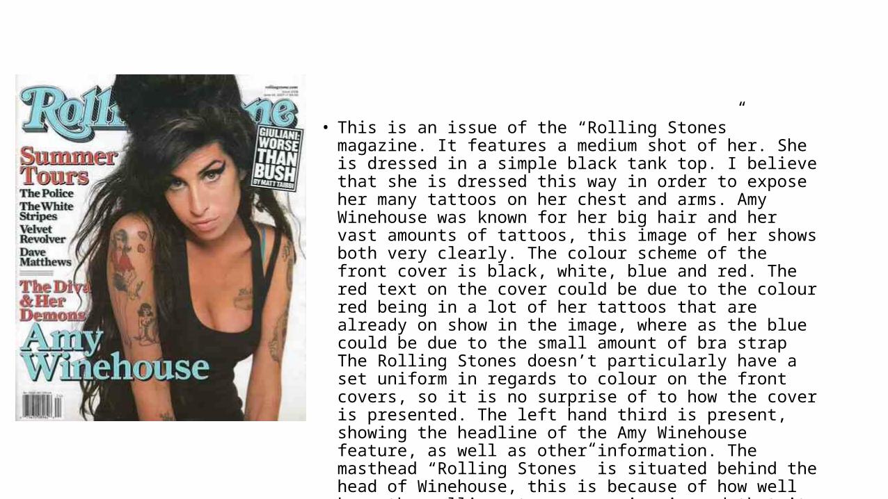
• This is an issue of the “Rolling Stones” magazine. It features a medium shot of her. She is dressed in a simple black tank top. I believe that she is dressed this way in order to expose her many tattoos on her chest and arms. Amy Winehouse was known for her big hair and her vast amounts of tattoos, this image of her shows both very clearly. The colour scheme of the front cover is black, white, blue and red. The red text on the cover could be due to the colour red being in a lot of her tattoos that are already on show in the image, where as the blue could be due to the small amount of bra strap The Rolling Stones doesn’t particularly have a set uniform in regards to colour on the front covers, so it is no surprise of to how the cover is presented. The left hand third is present, showing the headline of the Amy Winehouse feature, as well as other information. The masthead “Rolling Stones” is situated behind the head of Winehouse, this is because of how well know the rolling stones magazine is and that it doesn’t have to be the centre of attention on the front page in order to sell copies. There is a splash on the right hand side of the page that is a small headline, I believe it has been placed in a splash because its not got relevance to the Winehouse front cover, but can still be used as an advert for the reader to read on.

• This edition of Q features Paolo Nutini on the front cover. The page has quite a busy layout, with a lot of things going on at the same time. There is an image of Paolo in a medium shot, he is shown with his head held high, giving the impression that he is confident in himself and his music that he is producing. The main headline of the cover simply says “Paolo Nutini” with a sub heading under it telling the reader a bit about what will be in the article. There also features information on the left hand third of the page, calling itself a “Motown Special” this includes smaller headline, splash's and images of musicians. This would draw in an interest from the audience that have an interest in Motown music, as it is not often featured in magazines, let alone the front covers. The instantly recognisable masthead “Q”, stands out in its uniform and bold design of a white Q in a red box. This allows buyers to be able to see this particular magazine at a quick glance. There is also things going on in the top right hand corner of the page. It clearly states in bold letters the headlines “Arctic Monkeys”, “Britpop” and “Metronomy” this again will widen the target audience even wider from what it already was, drawing in fans of another 3 topics of interest. There is also a small splash at the bottom of the page telling the reader that there are “30 pages of reviews!”. To finish off, there is no particular colour scheme on this front cover as there are a lot of different colours spread all across the cover, from whites and blacks, to yellows and greens. This could be because the magazine has a wide range of target audiences and each sets of colours are individual to each musical interest.