front end frameworks - are they accessible
TRANSCRIPT
FrontFrameworks
ARE THEY ACCESSIBLE?
End

Over the last 5 years or so there has been a rapid rise in the use of HTML/CSS and/or JavaScript frameworks.
Developers often choose to use frameworks as they have many benefits:
• They save re-invention• They are ready-to-use • They provide cross browser stability • They allow quick prototyping • They promote consistency

However, this reliance on frameworks has some downsides.
1. Many developers who have grown up only using frameworks have a total lack of understanding about the fundamentals of HTML such as valid and semantic markup.
This is of great concern as semantic markup is one of the core principles of an accessible web.

2. There is a widespread assumption that most of these frameworks are “accessible out of the box” and don’t need any further work.
3. Even when frameworks do have inbuilt accessibility, many developers do not understand how to implement these accessibility features.

We’re now going to look at some examples using the Bootstrap Framework. (And this is not to say that Bootstrap is inaccessible)

Bad buttons
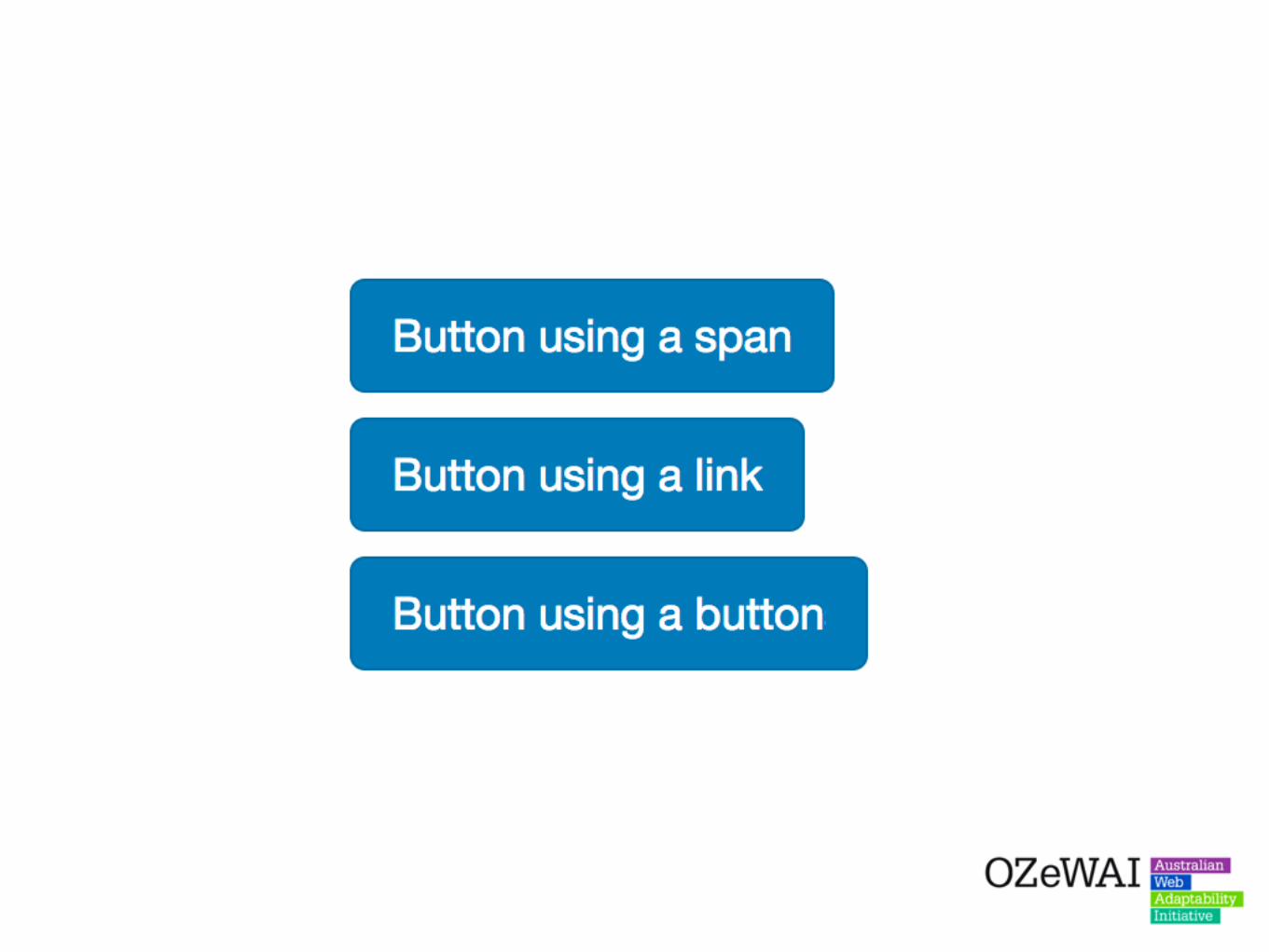

The Bootstrap button classes allow developers to make any element appear like a button even if these elements have no semantic meaning.

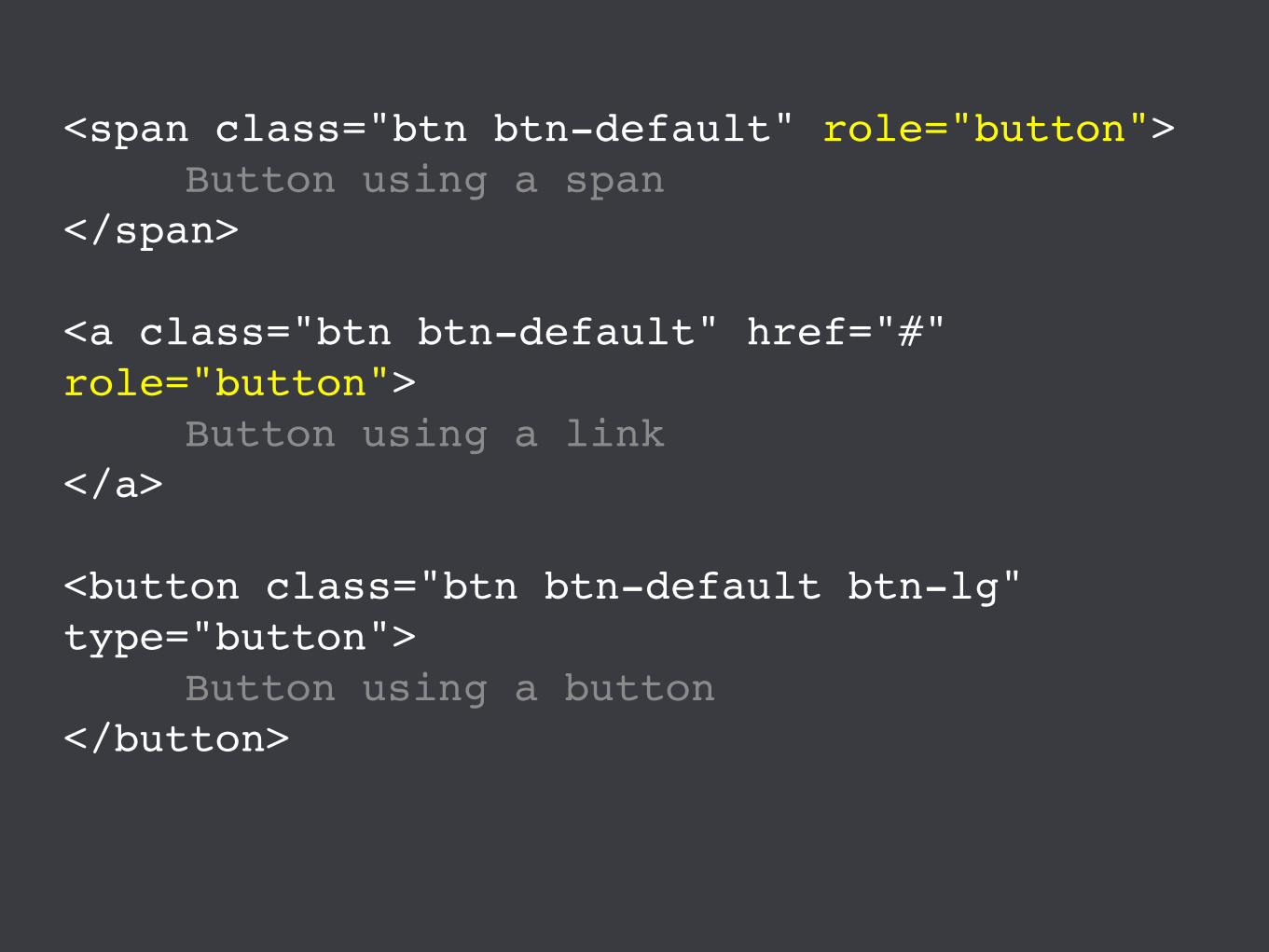
<span class="btn btn-default" role="button">Button using a span
</span>
<a class="btn btn-default" href="#" role="button">
Button using a link</a>
<button class="btn btn-default btn-lg" type="button">
Button using a button</button>

Some developers have a tendency to throw the role=“button” attribute onto span and link elements, assuming that this makes it alright.
<span class="btn btn-default" role="button">Button using a span
</span>
<a class="btn btn-default" href="#" role="button">
Button using a link</a>
<button class="btn btn-default btn-lg" type="button">
Button using a button</button>
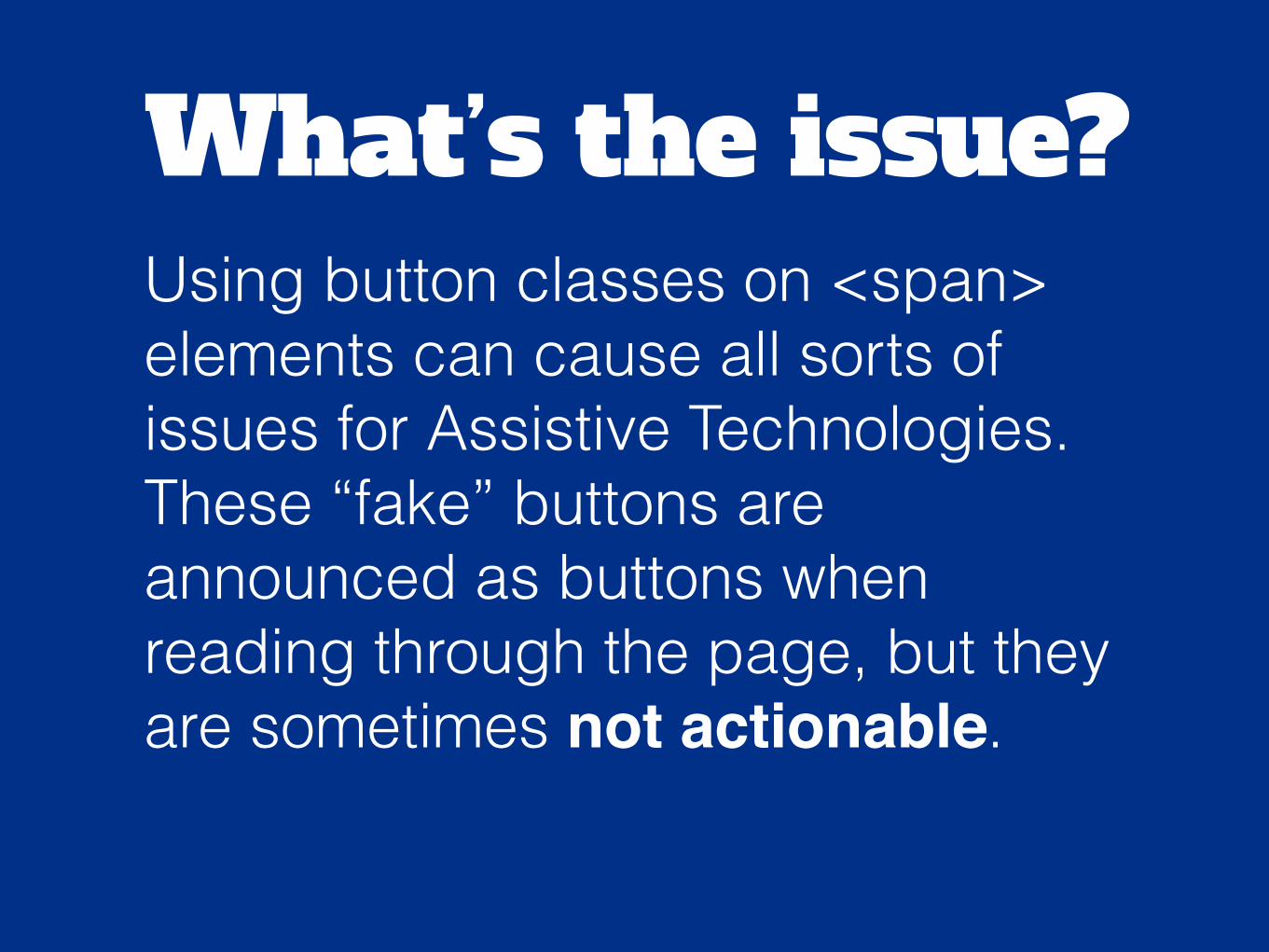
What’s the issue?Using button classes on <span> elements can cause all sorts of issues for Assistive Technologies. These “fake” buttons are announced as buttons when reading through the page, but they are sometimes not actionable.
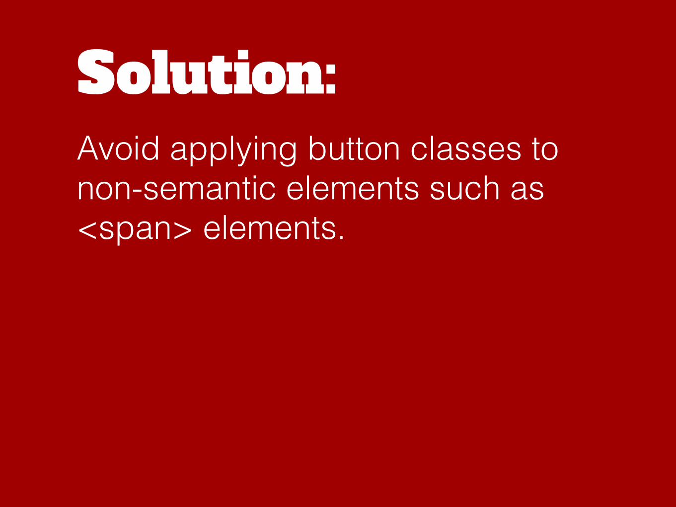
Solution:Avoid applying button classes to non-semantic elements such as <span> elements.

Links or buttons?

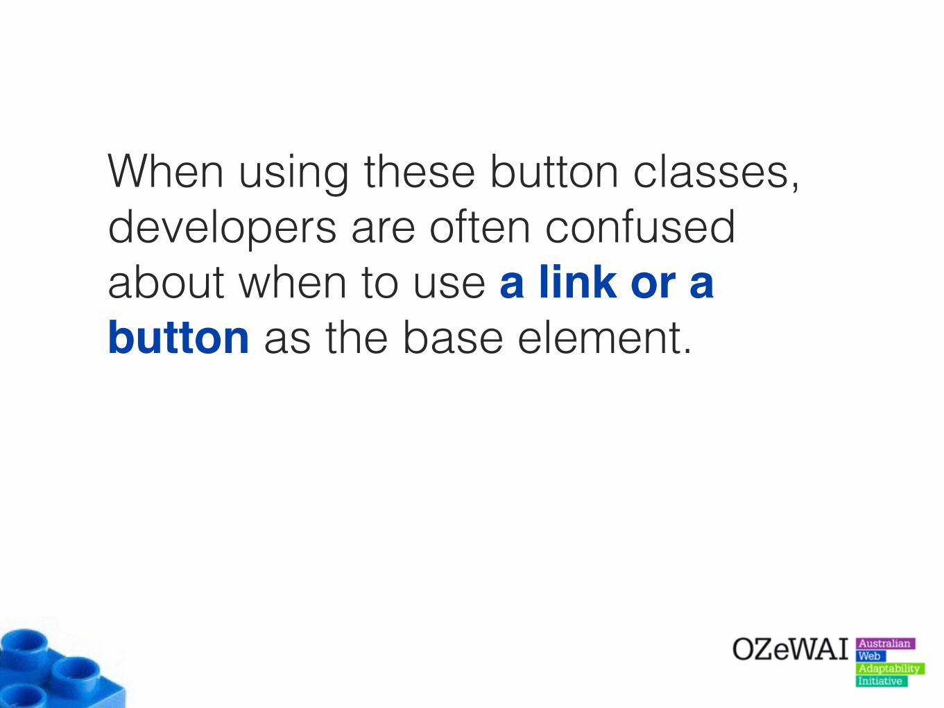
When using these button classes, developers are often confused about when to use a link or a button as the base element.

What’s the issue?When the incorrect element is used, this can confuse Assistive Technology users who expect links and buttons to behave in specific ways.
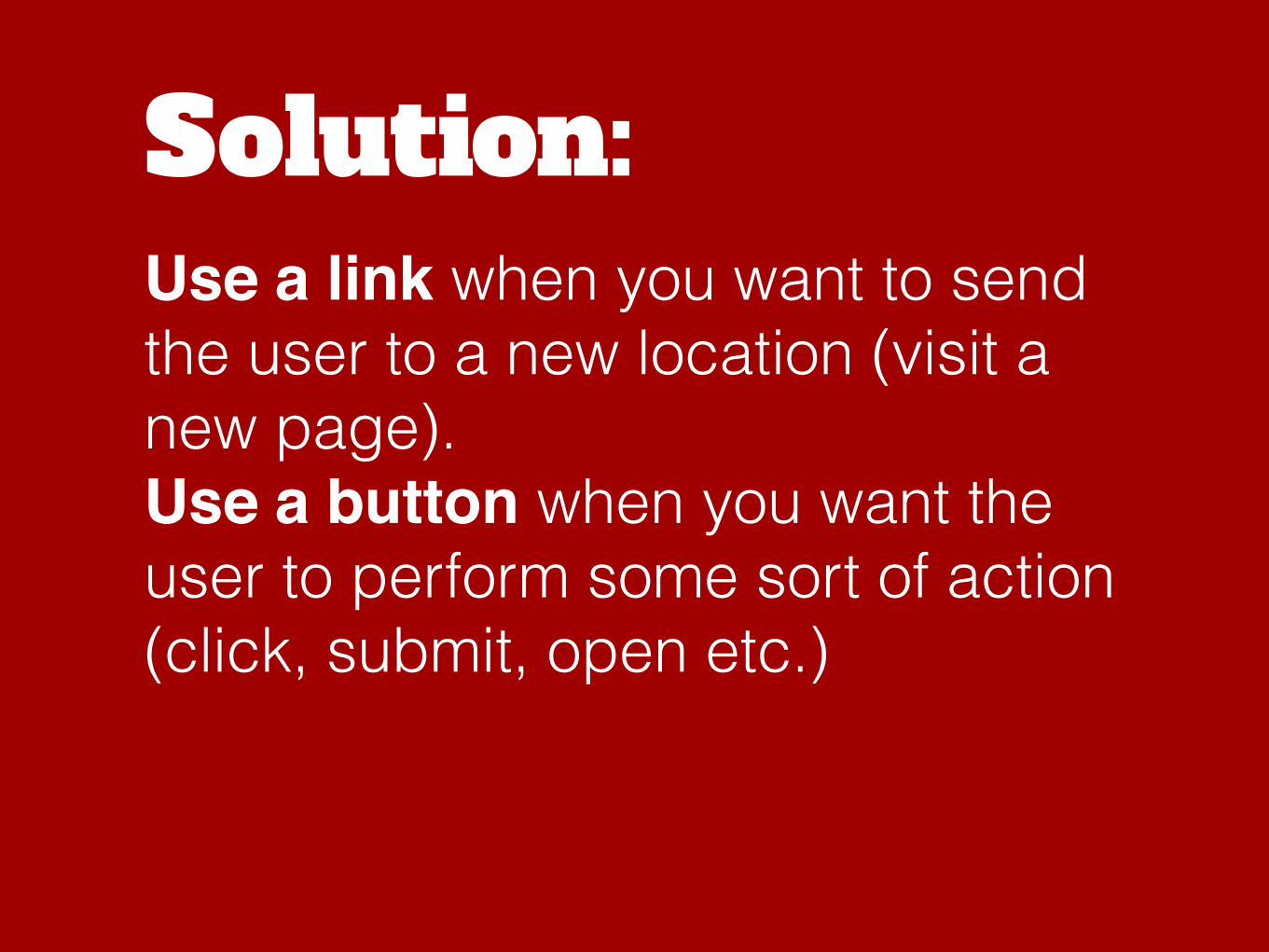
Solution:Use a link when you want to send the user to a new location (visit a new page). Use a button when you want the user to perform some sort of action (click, submit, open etc.)
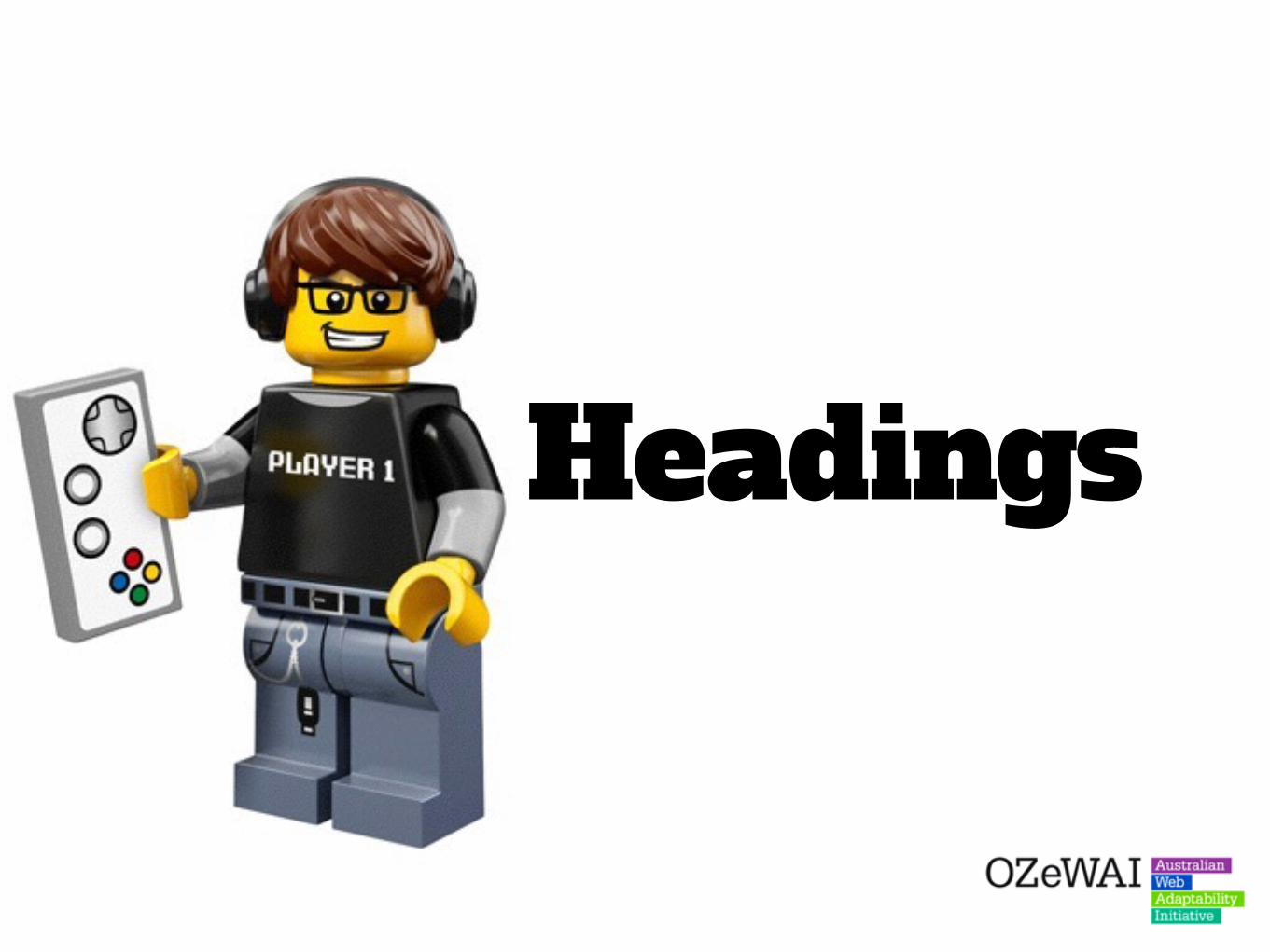
Headings
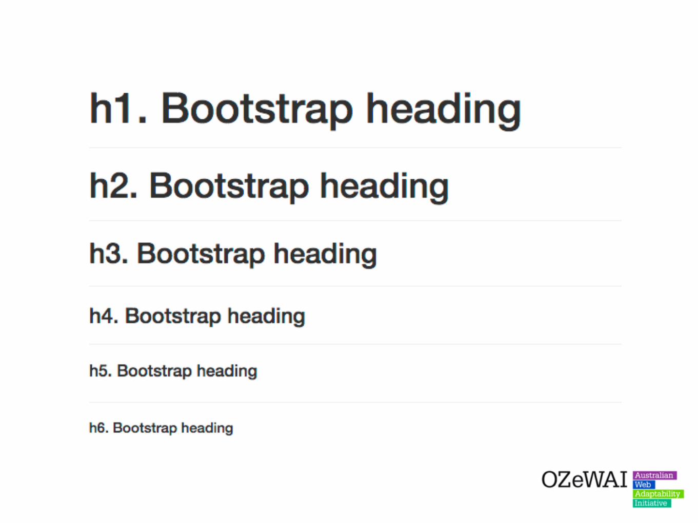

Bootstrap allows developers to add classes to any elements and make them appear like a heading.
This is quite common in complex layouts, such as application interfaces, where developers ignore heading hierarchy and apply “visual headings” to span or paragraph elements instead.
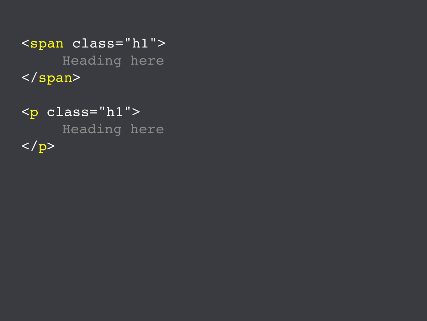
<span class="h1">Heading here
</span>
<p class="h1">Heading here
</p>
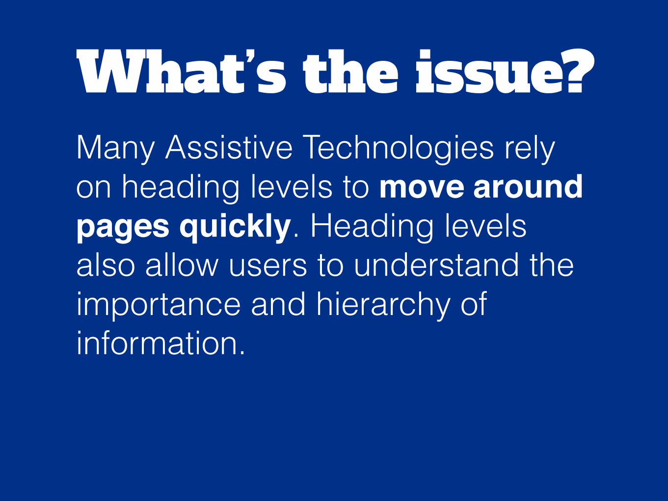
What’s the issue?Many Assistive Technologies rely on heading levels to move around pages quickly. Heading levels also allow users to understand the importance and hierarchy of information.

Solution:Where possible, avoid styling non-heading elements to appear like headings if a heading would be more appropriate.
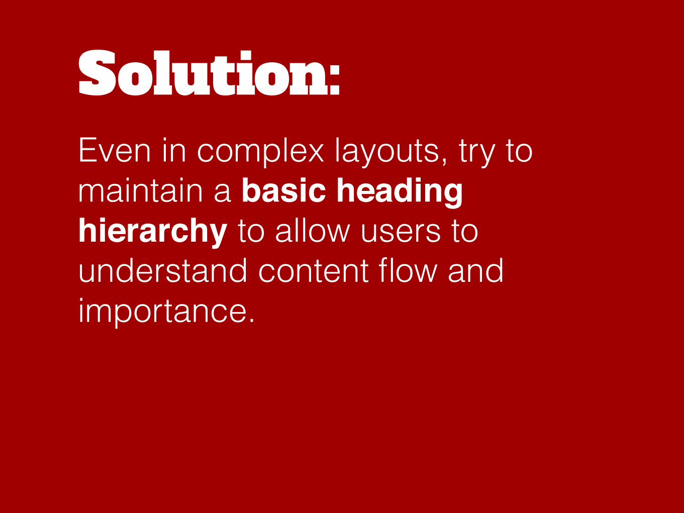
Solution:Even in complex layouts, try to maintain a basic heading hierarchy to allow users to understand content flow and importance.

Badges


Badges allow developers to insert specially-styled number values into links, buttons and other elements.
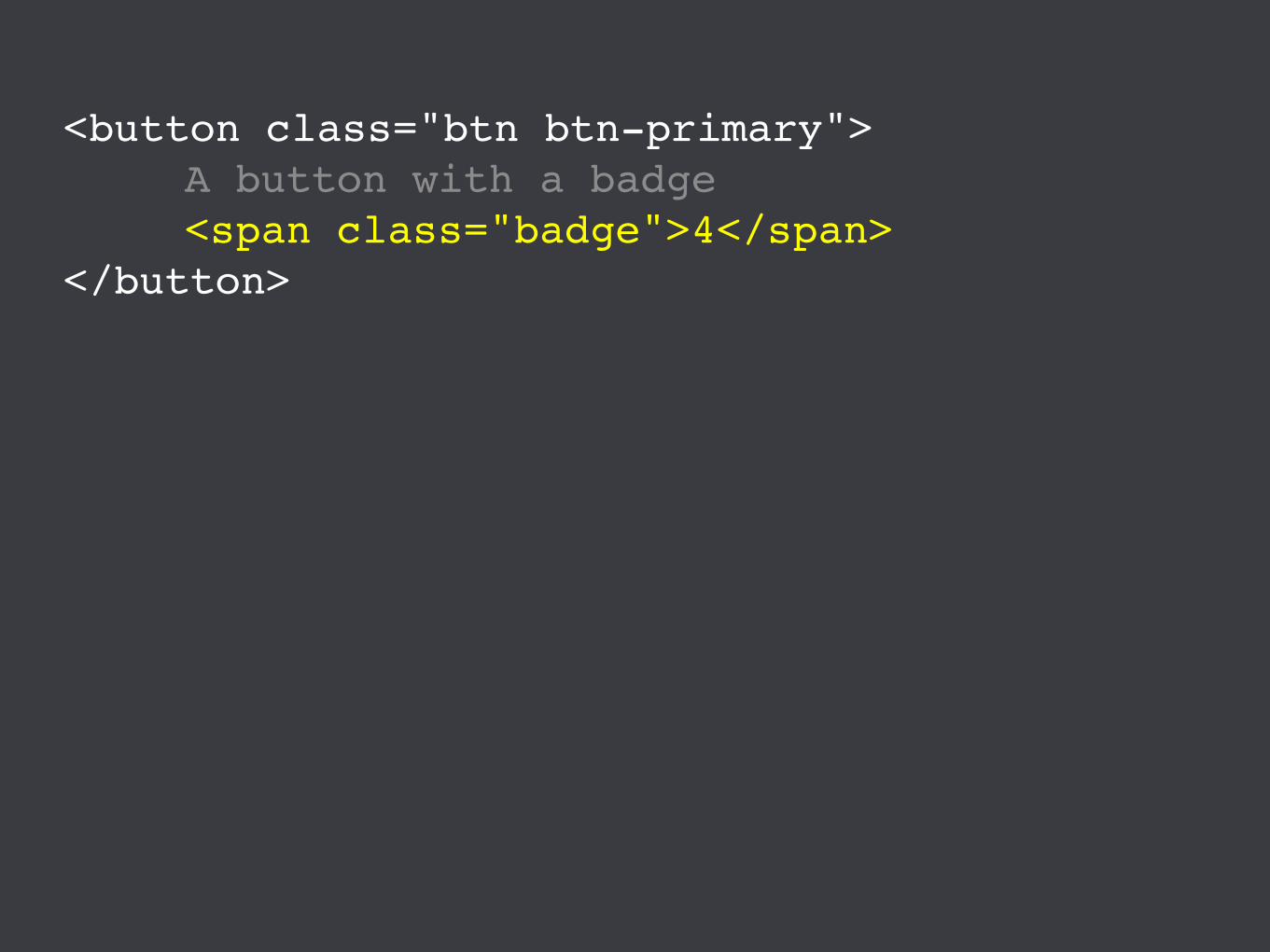
<button class="btn btn-primary">A button with a badge <span class="badge">4</span>
</button>

These numbers are often used to indicate a dynamic number value such as the number of messages in an inbox.
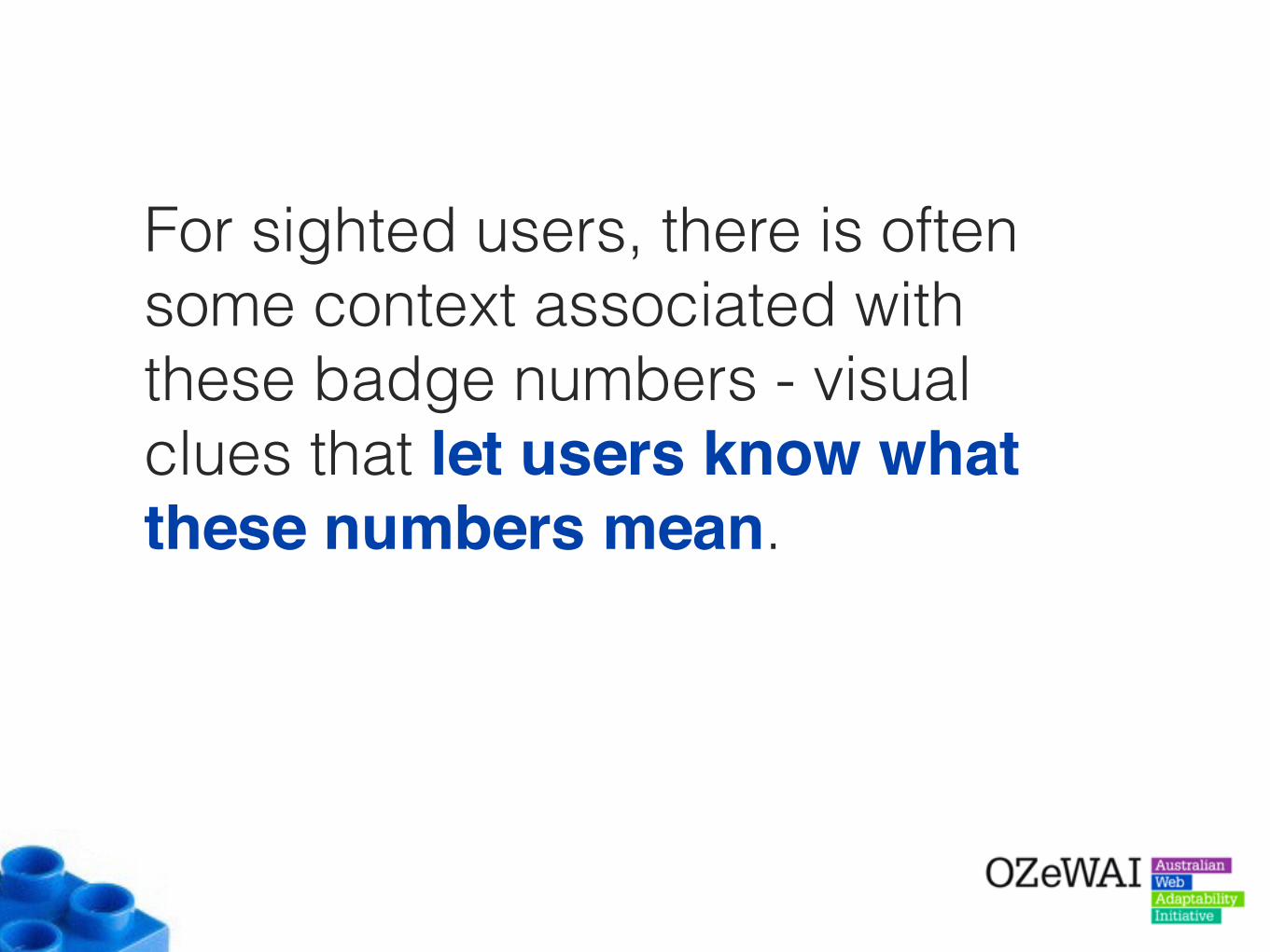
For sighted users, there is often some context associated with these badge numbers - visual clues that let users know what these numbers mean.

What’s the issue?For Screen Reader users, these badge numbers can sometimes be confusing as they seem to be random numbers that do not have any additional context.
Solution:Try to provide some additional context for Screen Reader users, such as additional hidden information.

<button class="btn btn-primary">A button with a badge <span class="badge">
4<span class="sr-only">
Messages</span>
</span></button>
Dropdowns

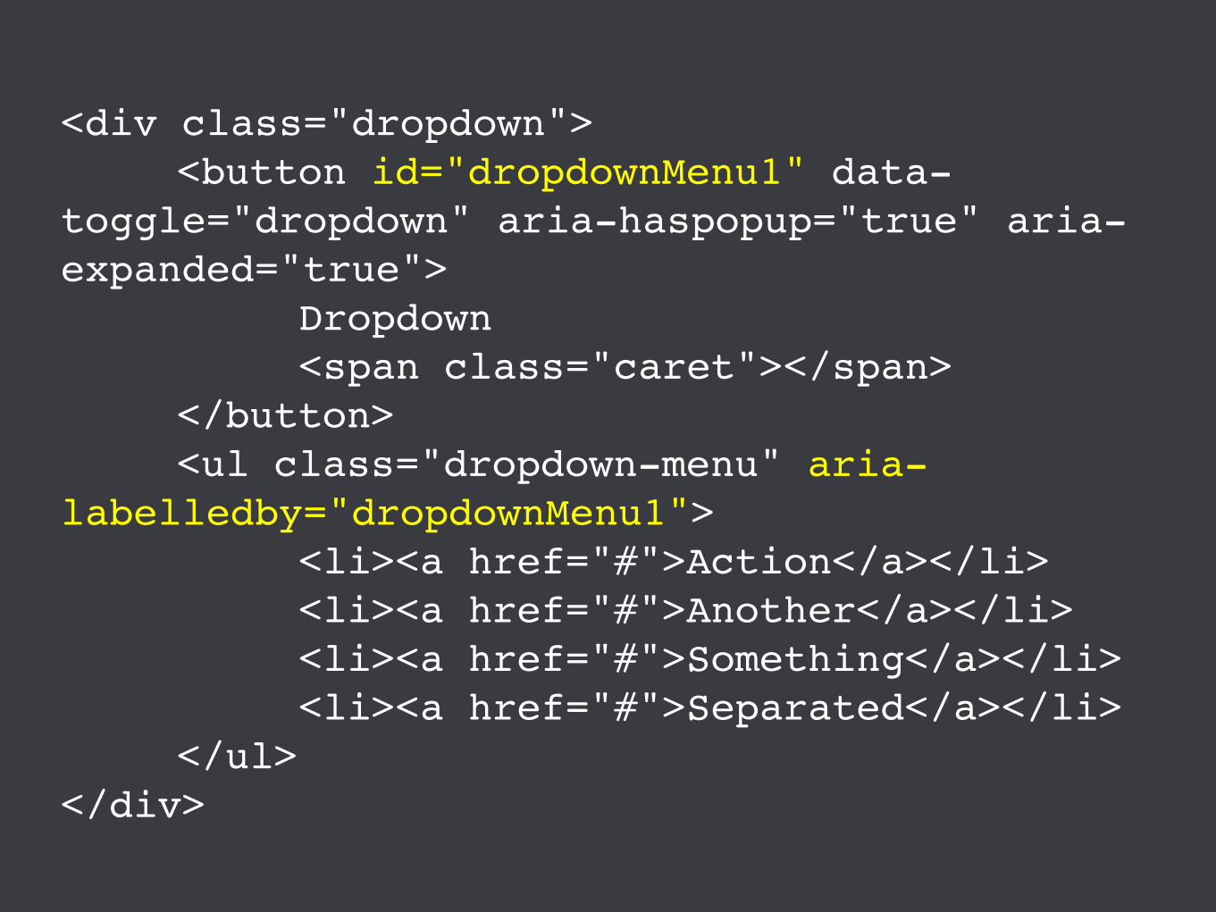
<div class="dropdown"><button id="dropdownMenu1" data-
toggle="dropdown" aria-haspopup="true" aria-expanded="true">
Dropdown<span class="caret"></span>
</button><ul class="dropdown-menu" aria-
labelledby="dropdownMenu1"><li><a href="#">Action</a></li><li><a href="#">Another</a></li><li><a href="#">Something</a></li><li><a href="#">Separated</a></li>
</ul></div>

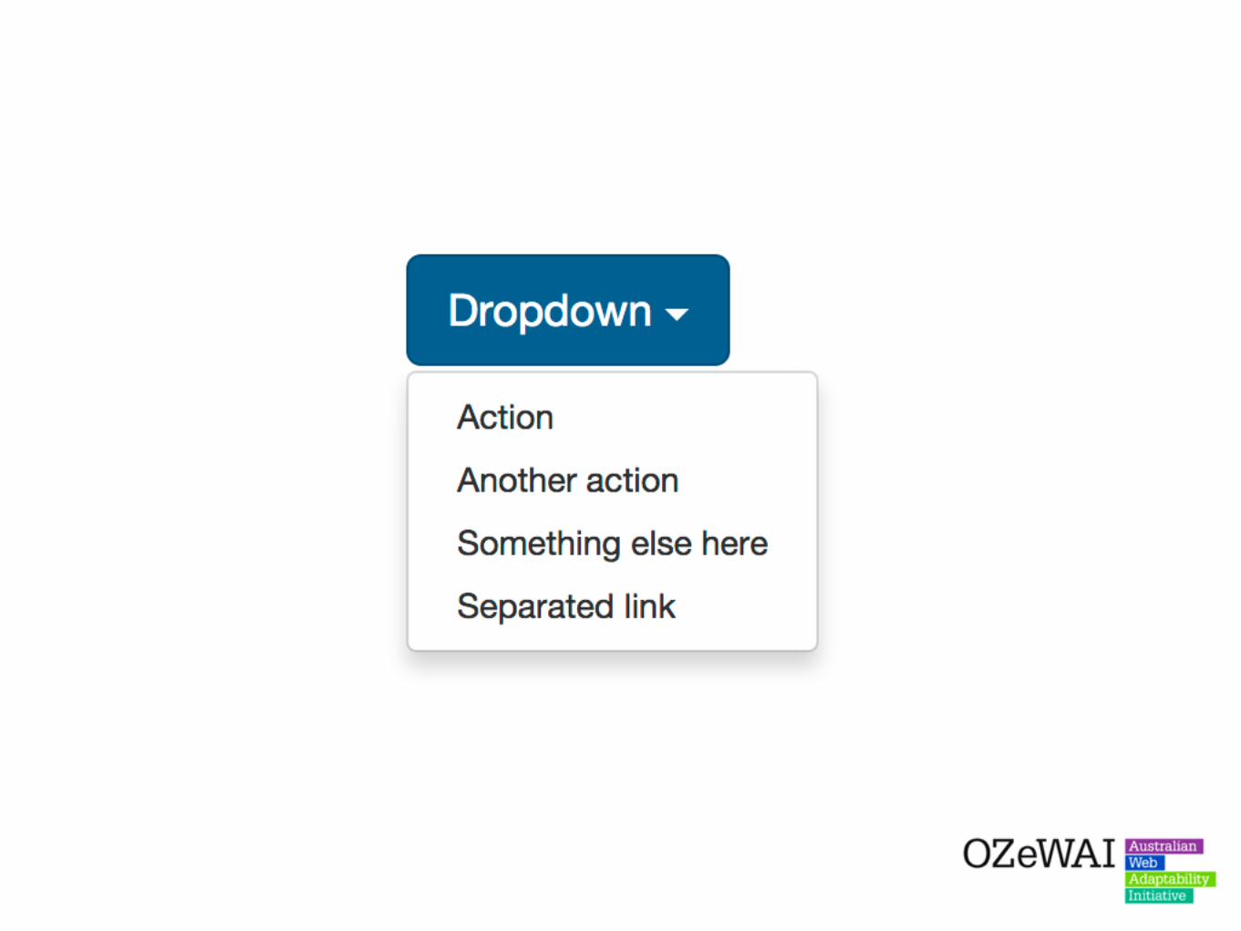
The Bootstrap dropdown module allows developers to use dropdown functions attached to button elements.
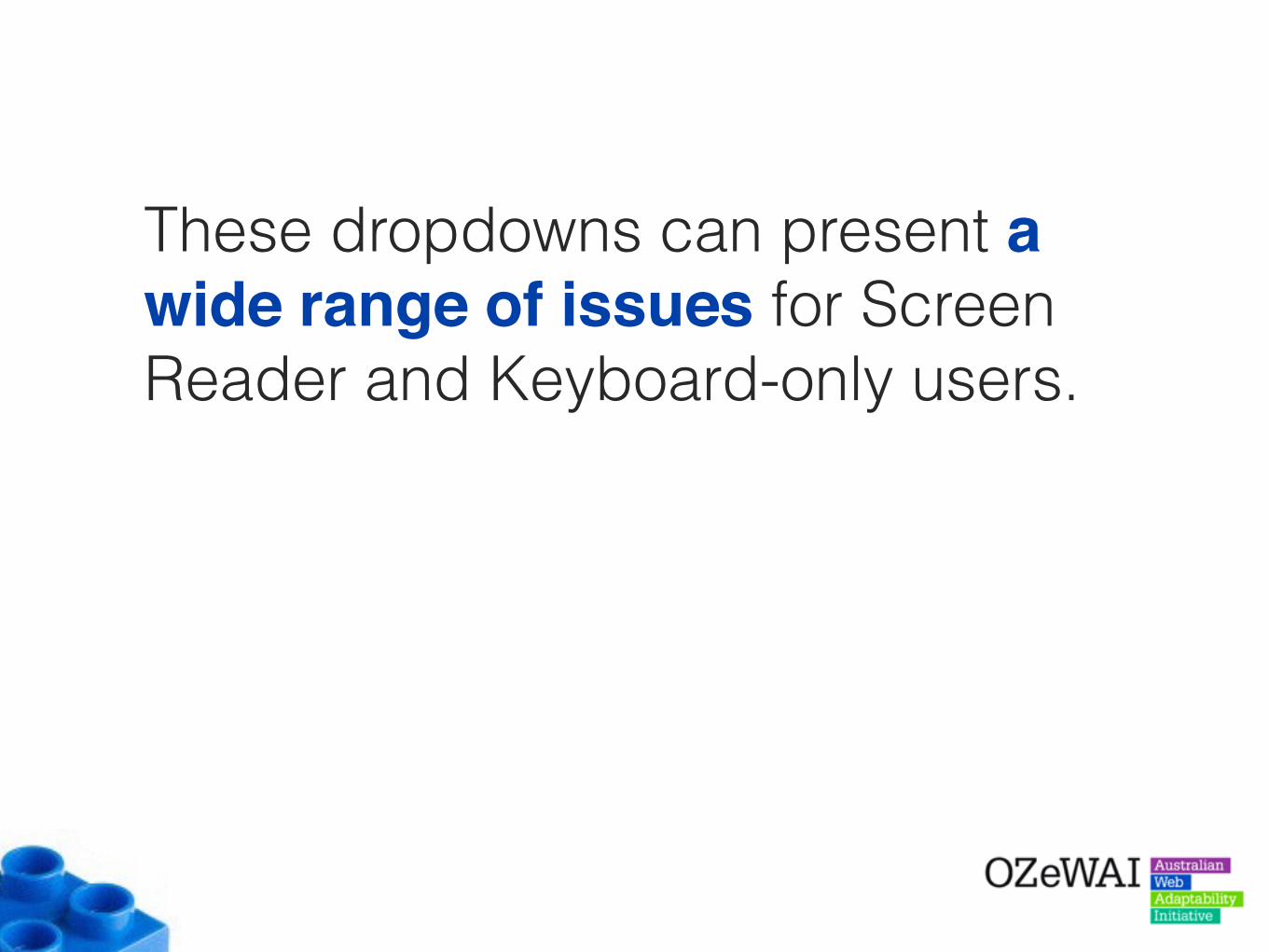
These dropdowns can present a wide range of issues for Screen Reader and Keyboard-only users.
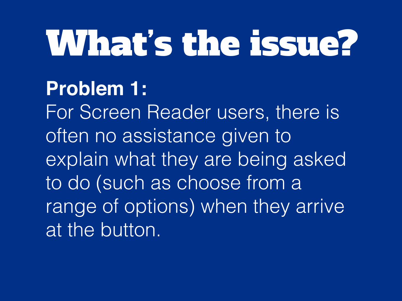
What’s the issue?Problem 1:For Screen Reader users, there is often no assistance given to explain what they are being asked to do (such as choose from a range of options) when they arrive at the button.

Solution:Provide some additional context inside the button so Screen Reader users understand the purpose of the dropdown.
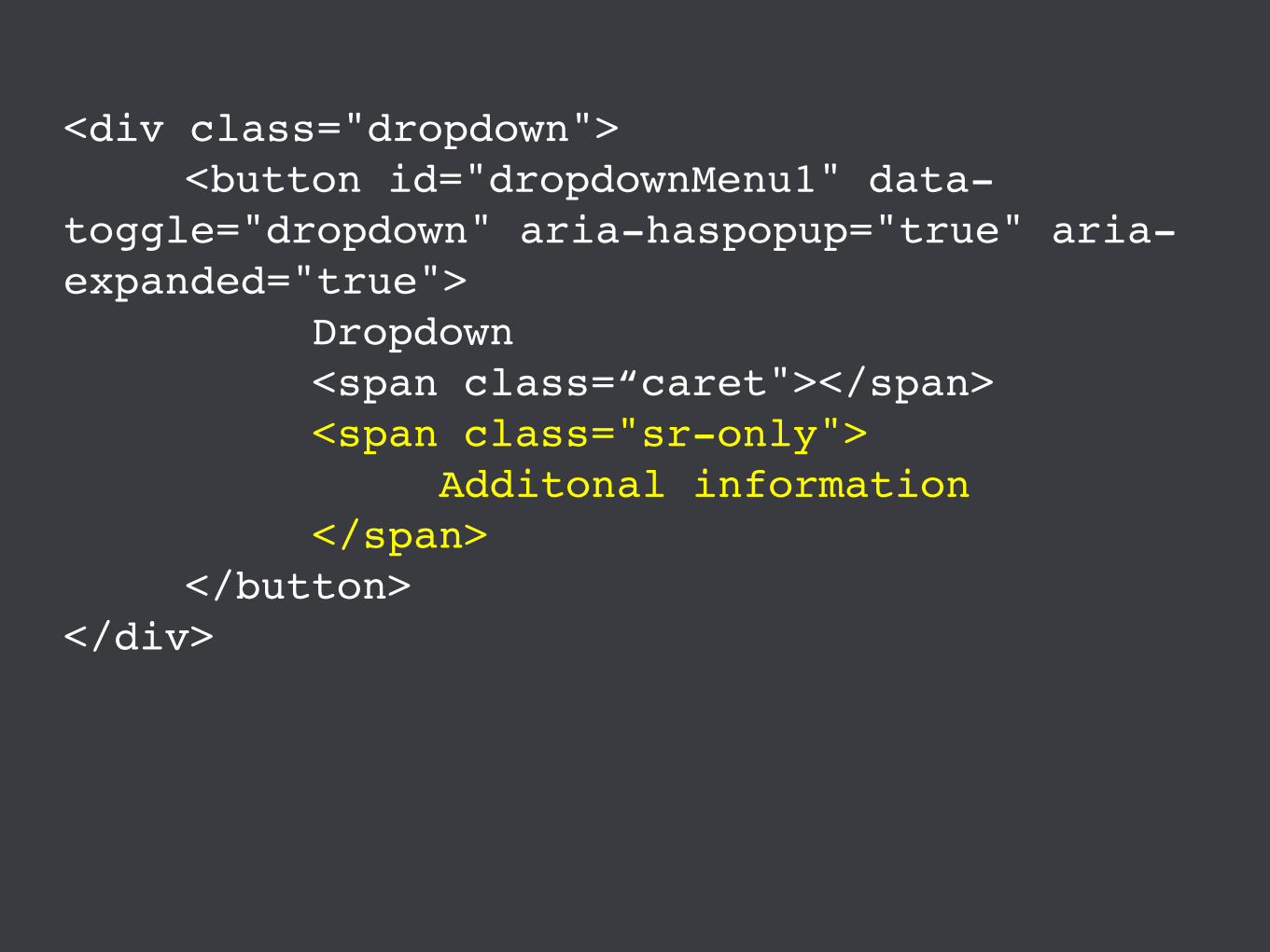
<div class="dropdown"><button id="dropdownMenu1" data-
toggle="dropdown" aria-haspopup="true" aria-expanded="true">
Dropdown<span class=“caret"></span><span class="sr-only">
Additonal information</span>
</button></div>
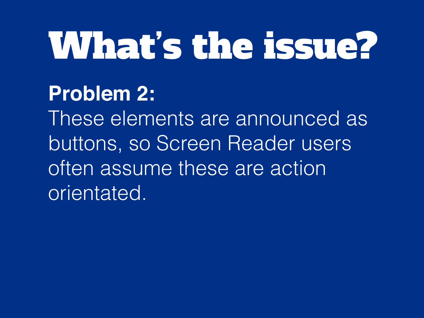
What’s the issue?Problem 2:These elements are announced as buttons, so Screen Reader users often assume these are action orientated.
What’s the issue?However, when these buttons are activated, Screen Reader users are then presented with silence. There is nothing to tell them that the dropdown has now visually opened and options are now available.
Solution:When the button is activated, focus can be shifted to the list so that the list is announced.
What’s the issue?Problem 3:For keyboard-only users, these dropdowns look similar to select menus, however the dropdown options cannot be accessed by standard select menu keystrokes - like the ARROW keys.
Solution:Possibly add ARROW key functionality to these elements so they can be accessed using the ARROW keys as well?
What’s the issue?Problem 4: When Keyboard-only users activate the dropdown, then tab through the dropdown, the dropdown remains “open” even after they leave. These dropdowns only close via the button element.
Solution:Add functionality that closes the dropdown when users tab out of the dropdown options.
What’s the issue?Problem 5: One problem for ALL users is that when users choose an item from the dropdown list, this choice is not reflected in the button. So, there is no feedback for users as to what choice they have made.
Solution:This could possibly be resolved by changing the button value using JS and displaying the choice the user has made.
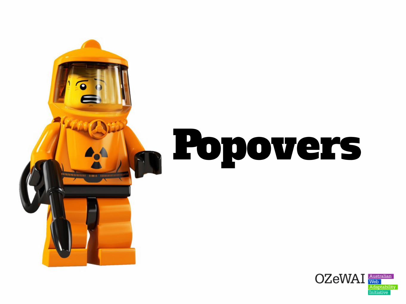
Popovers
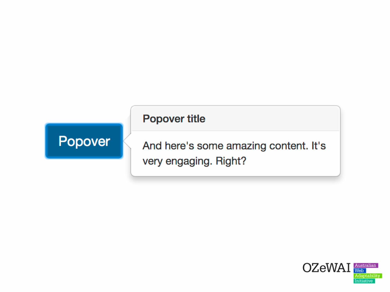
Popovers are often used by developers who want to provide extra information to elements. These are similar to tooltips but often have much more detailed, on often more important, information.
These popovers can be triggered via focus, hover or click events.
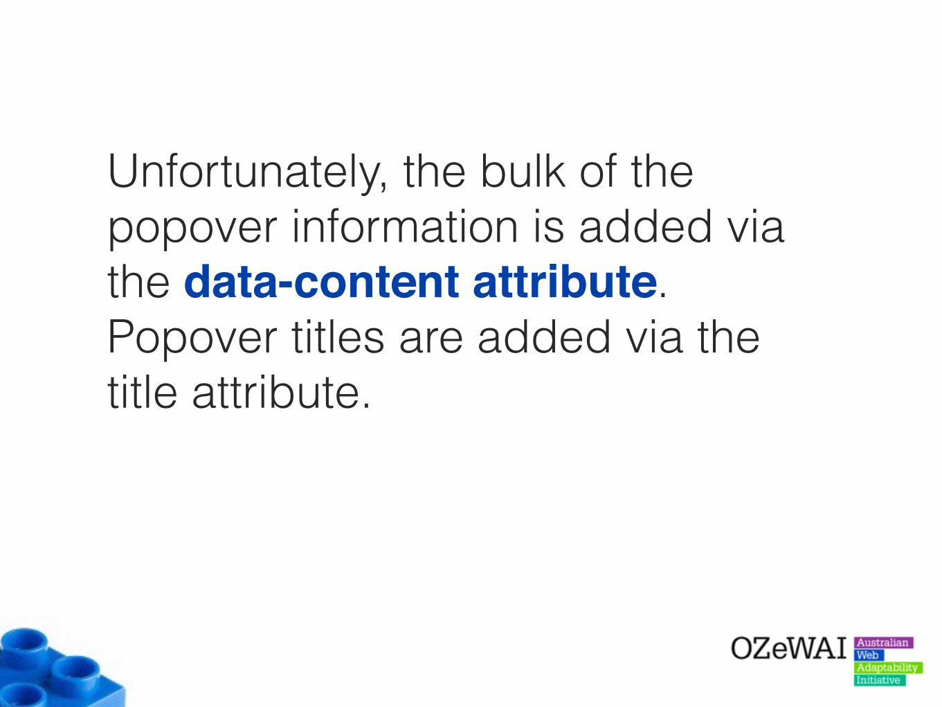
Unfortunately, the bulk of the popover information is added via the data-content attribute. Popover titles are added via the title attribute.
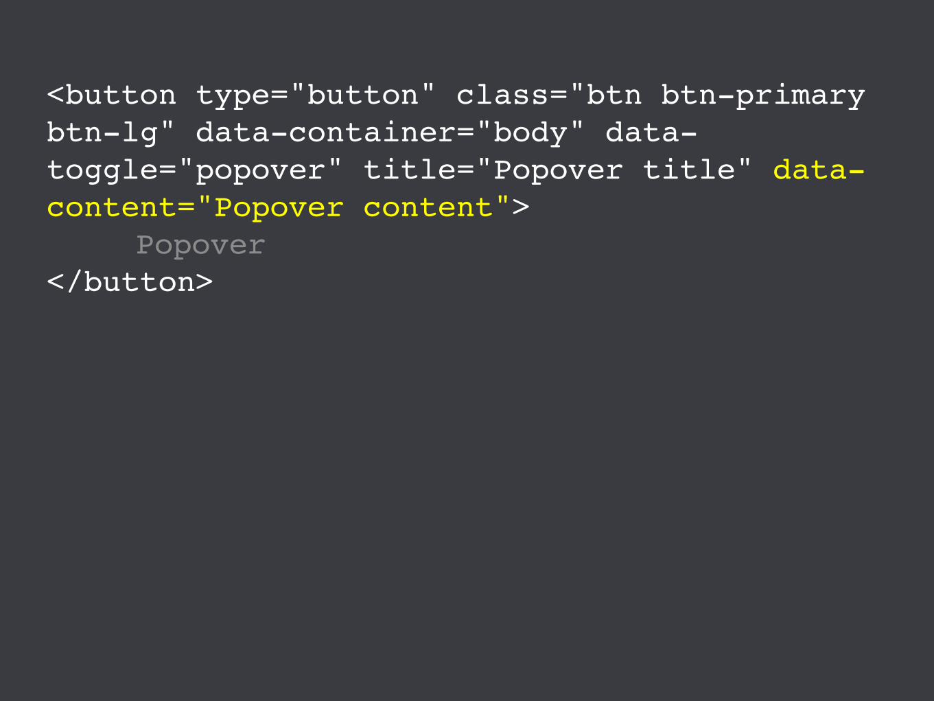
<button type="button" class="btn btn-primary btn-lg" data-container="body" data-toggle="popover" title="Popover title" data-content="Popover content">
Popover</button>
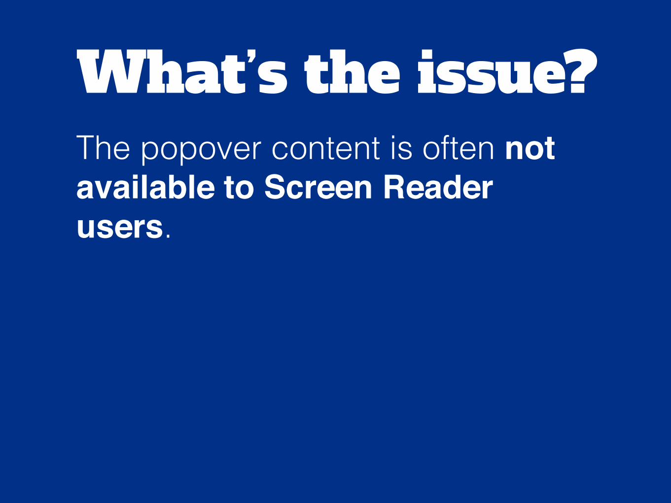
What’s the issue?The popover content is often not available to Screen Reader users.
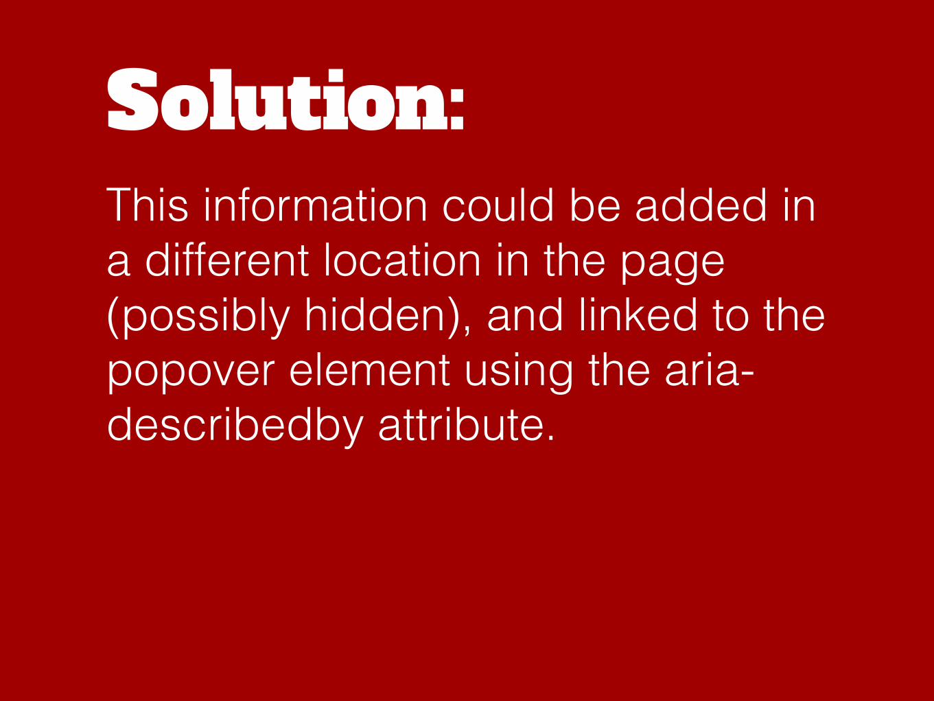
Solution:This information could be added in a different location in the page (possibly hidden), and linked to the popover element using the aria-describedby attribute.

<button type="button" aria-describedby="popover1" class="btn btn-primary btn-lg" data-container="body" data-toggle="popover" title="Popover title" data-content="Popover content">
Popover</button>
<p id="popover1">Popover content
</p>
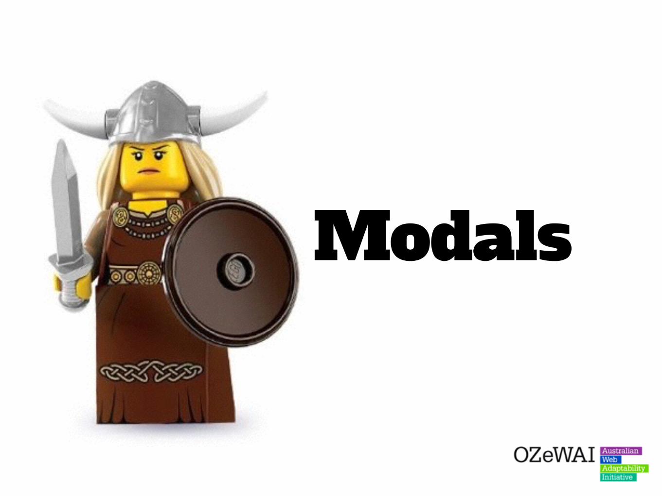
Modals
While Bootstrap modals are quite accessible, many other modals in frameworks are far less accessible. Some common issues include:
What’s the issue?Problem 1:Some modals allow TAB keystrokes to proceed outside the modal (into the page behind). This can be extremely confusing for both Screen Reader and Keyboard-only users.
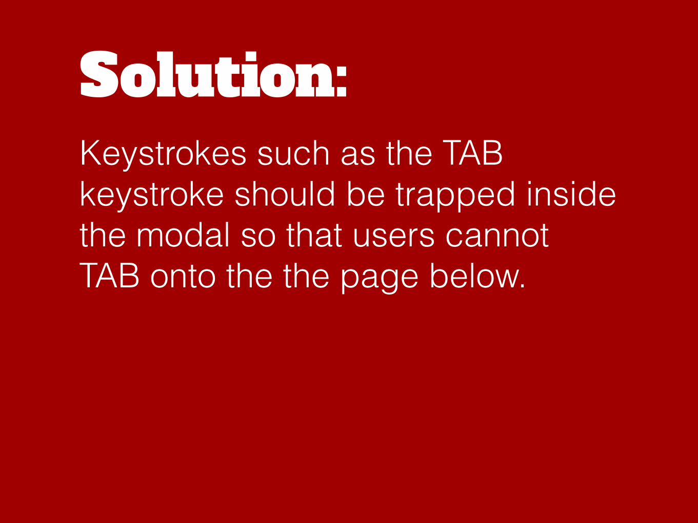
Solution:Keystrokes such as the TAB keystroke should be trapped inside the modal so that users cannot TAB onto the the page below.

What’s the issue?Problem 2:Some modals failing announce the modal purpose when the modal is fired.This can be confusing for Screen Reader users who may not know that a modal has been fired, or the purpose of the modal.
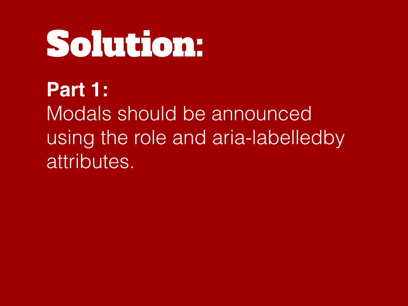
Solution:Part 1:Modals should be announced using the role and aria-labelledby attributes.

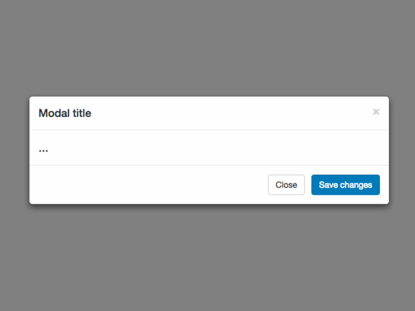
<div class="modal fade" id="myModal" tabindex="-1" role="dialog" aria-labelledby="myModalLabel">
<h4 id="myModalLabel">Modal title
</h4>
</div>
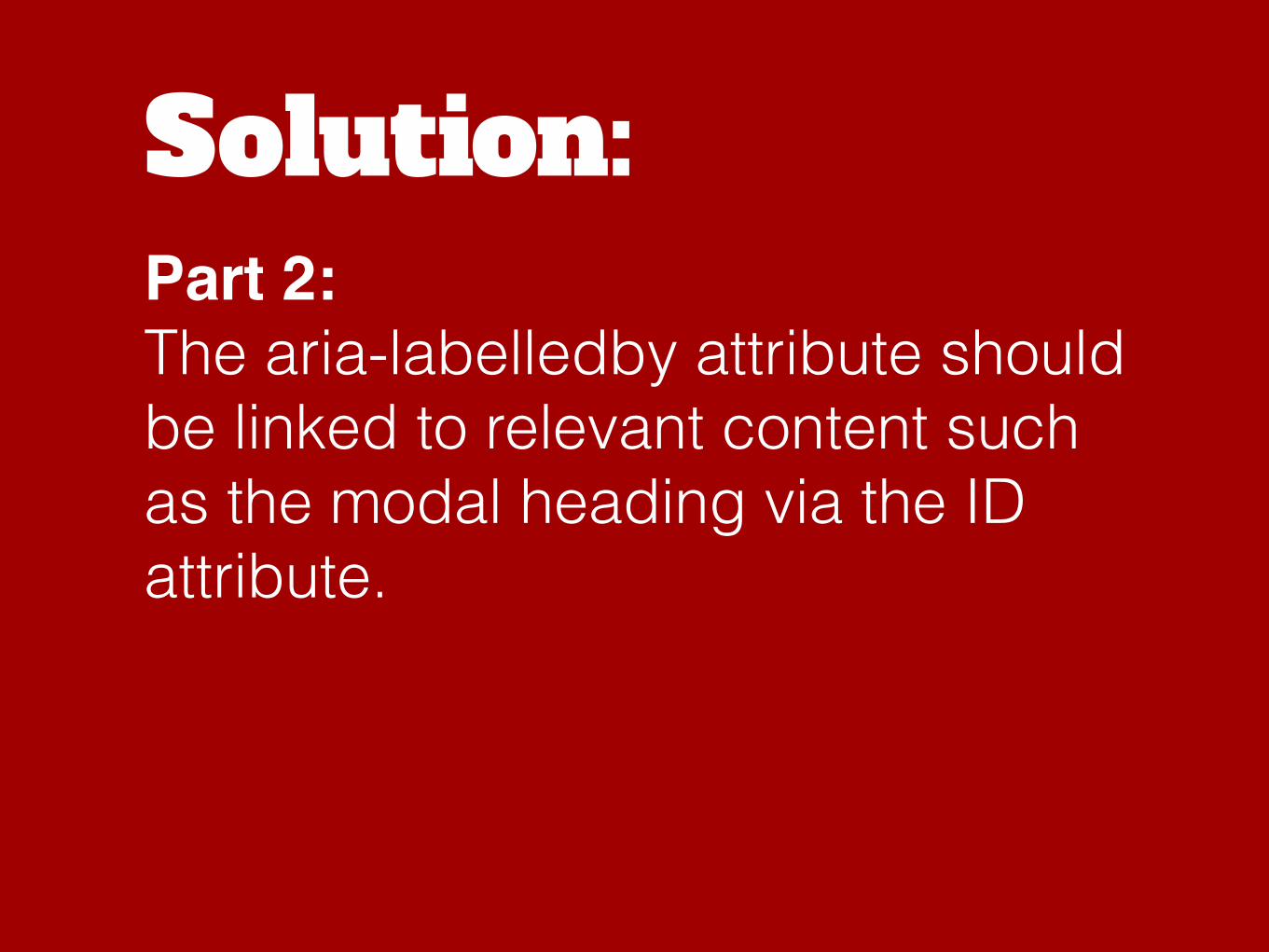
Solution:Part 2:The aria-labelledby attribute should be linked to relevant content such as the modal heading via the ID attribute.
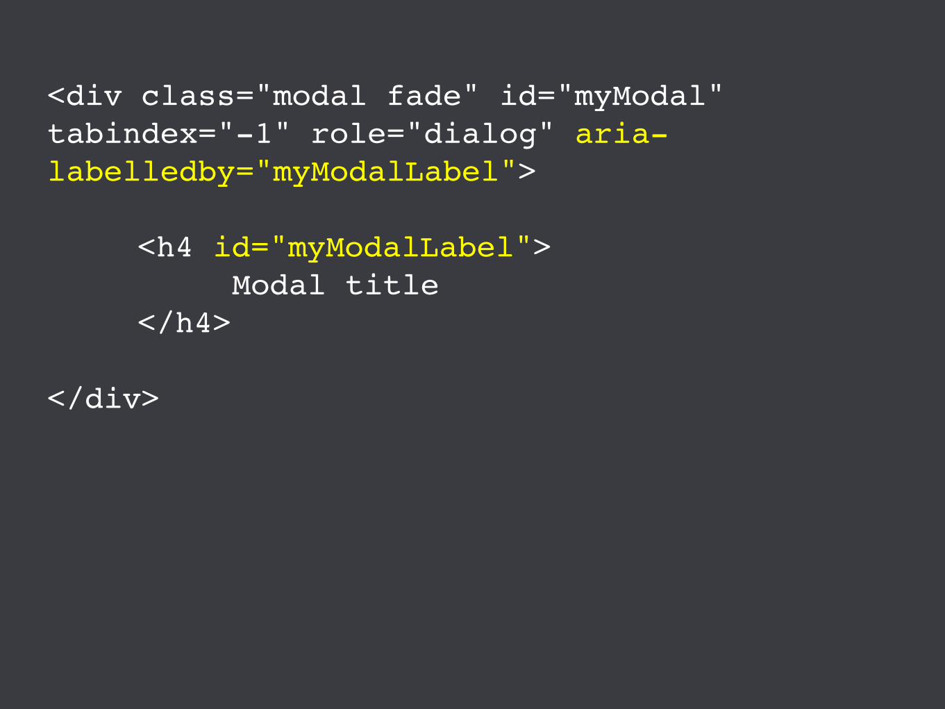
<div class="modal fade" id="myModal" tabindex="-1" role="dialog" aria-labelledby="myModalLabel">
<h4 id="myModalLabel">Modal title
</h4>
</div>
What’s the issue?Problem 3: Some modals don’t provide descriptive information about closing the modal. This can be confusing for Screen Reader users who may not understand how to close/escape the modal.
Solution:Modal close buttons should be placed first in tab order, and provide clear instructions as to what the purpose is.
Copy & paste

Bootstrap provides a range of ARIA attributes with some of the more complex modules such as dropdowns and modals - to make them more accessible.

However, some developers simply copy and paste the Bootstrap example modules and do not edit the ARIA attributes.
This can mean that ARIA attributes point to non-existent elements, or to the wrong elements.

What’s the issue?This can sometimes confuse Screen Reader users as they are provided with incorrect or inaccurate labels for elements.
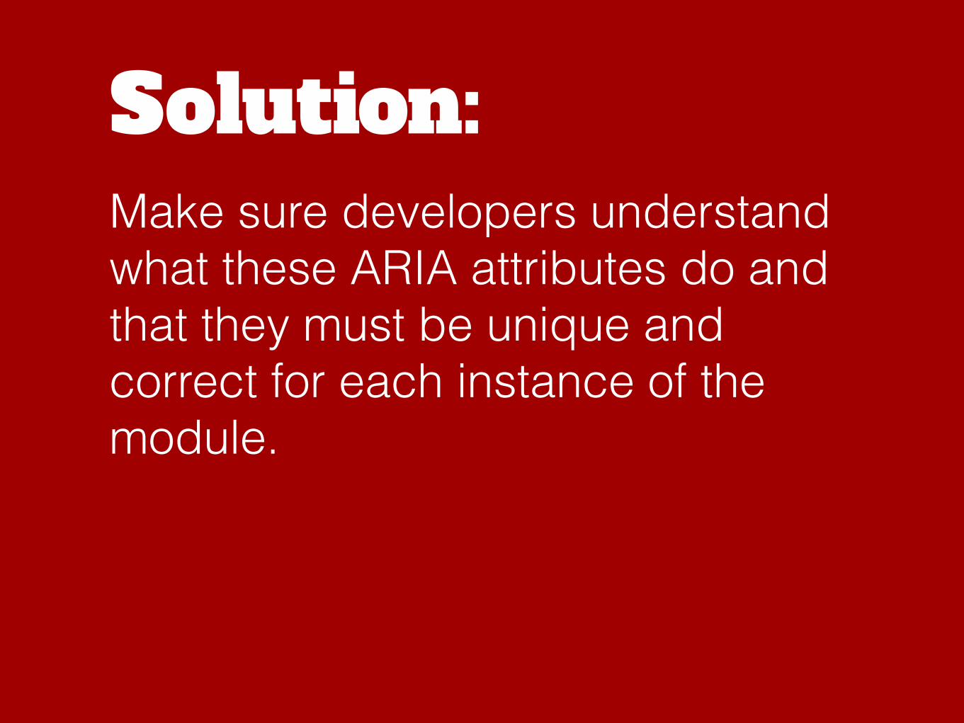
Solution:Make sure developers understand what these ARIA attributes do and that they must be unique and correct for each instance of the module.

Repeating content

Bootstrap, like most frameworks, provides developers with powerful class names that allow developers to adjust the column layout at different screen sizes.

This means a layout could appear as four columns at wide screen, two columns at medium screen and one column at extra-small.
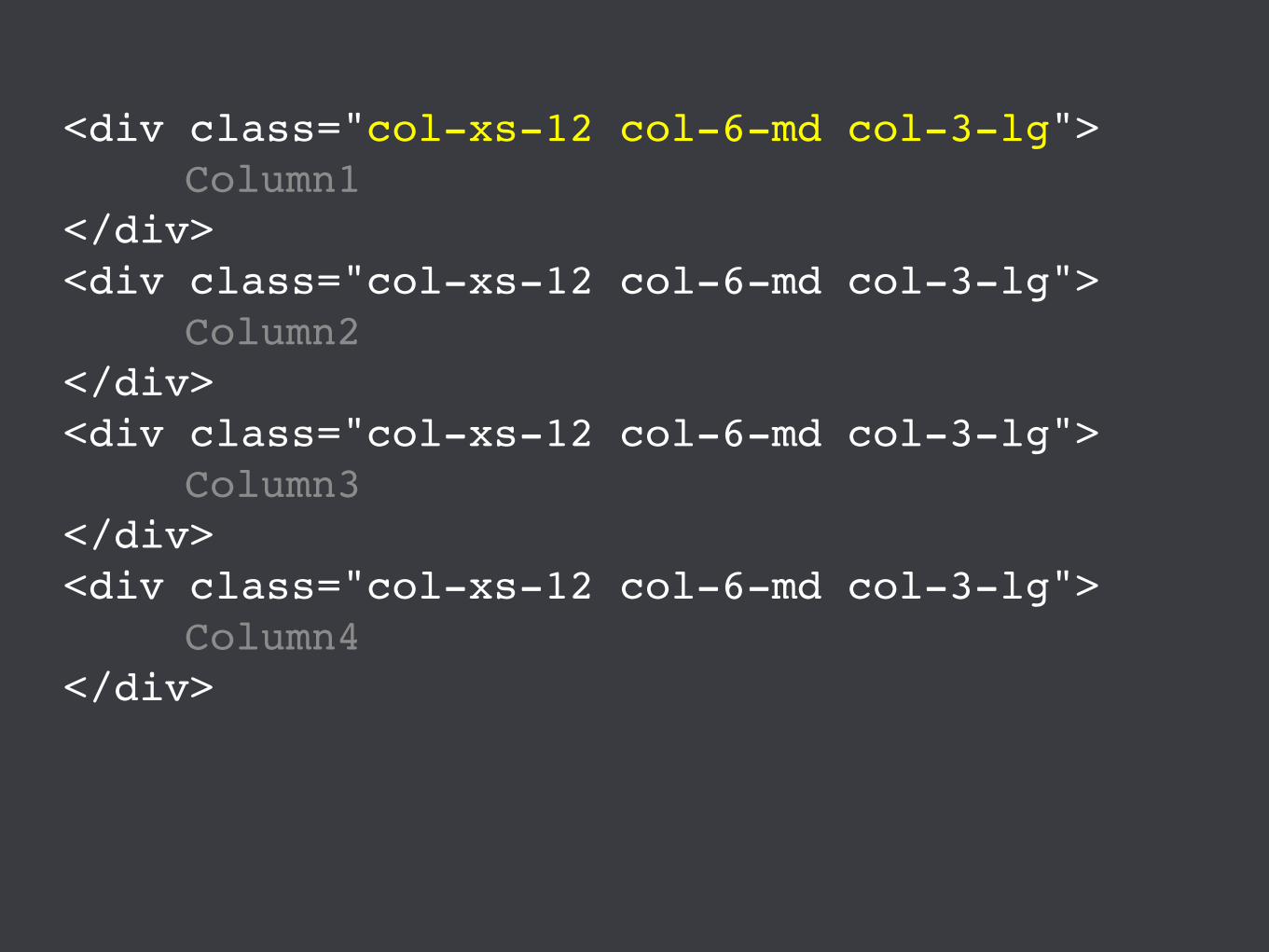
<div class="col-xs-12 col-6-md col-3-lg">Column1
</div><div class="col-xs-12 col-6-md col-3-lg">
Column2</div><div class="col-xs-12 col-6-md col-3-lg">
Column3</div><div class="col-xs-12 col-6-md col-3-lg">
Column4</div>

Column1 Column2 Column3 Column4
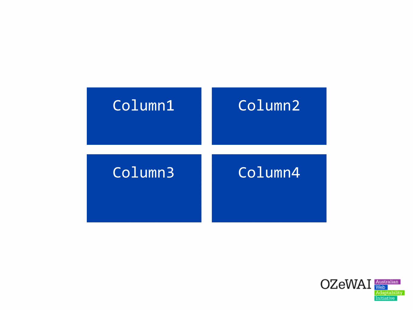
Column1 Column2
Column3 Column4
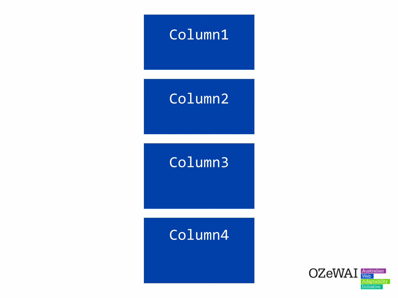
Column1
Column2
Column3
Column4
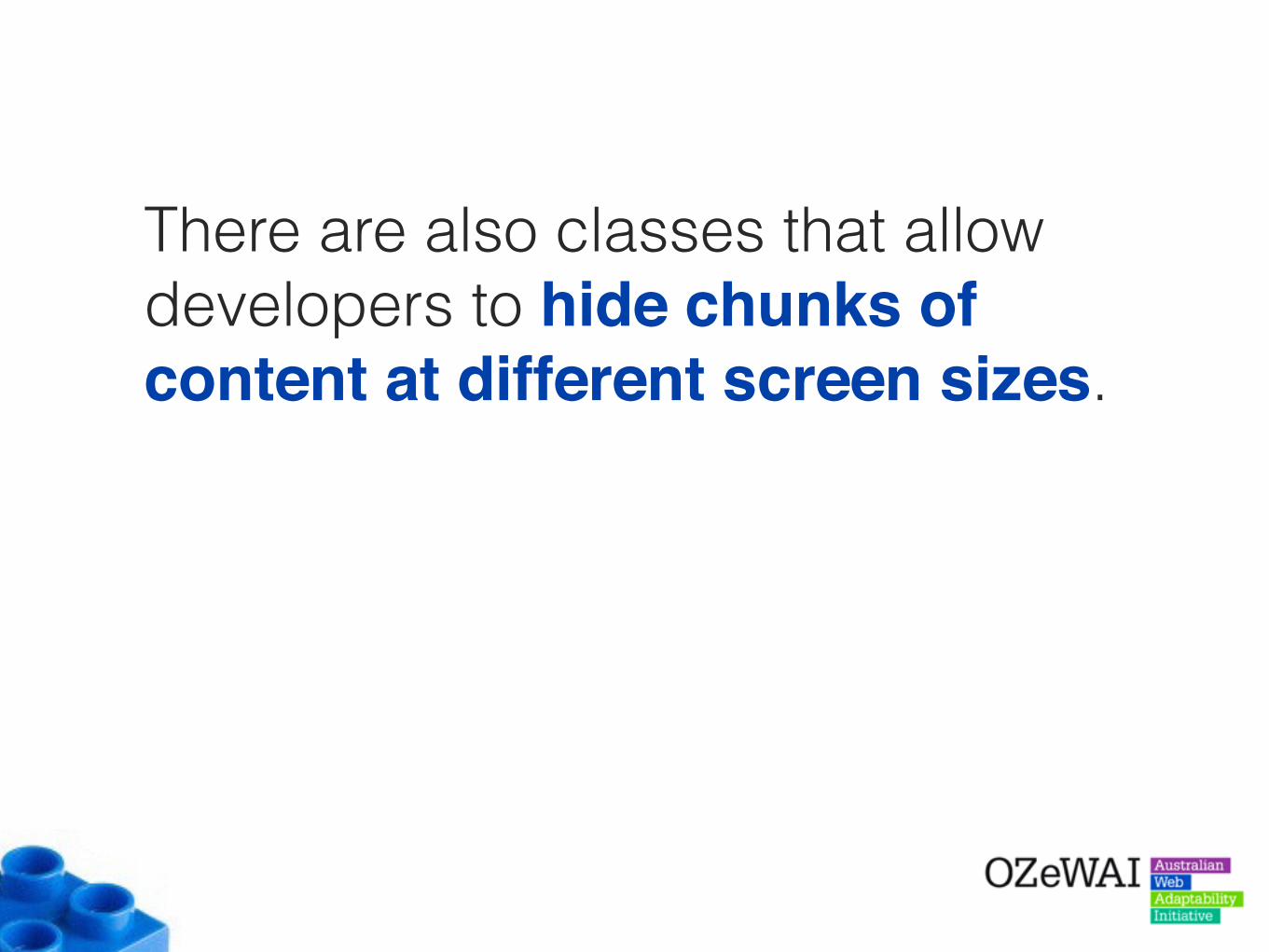
There are also classes that allow developers to hide chunks of content at different screen sizes.
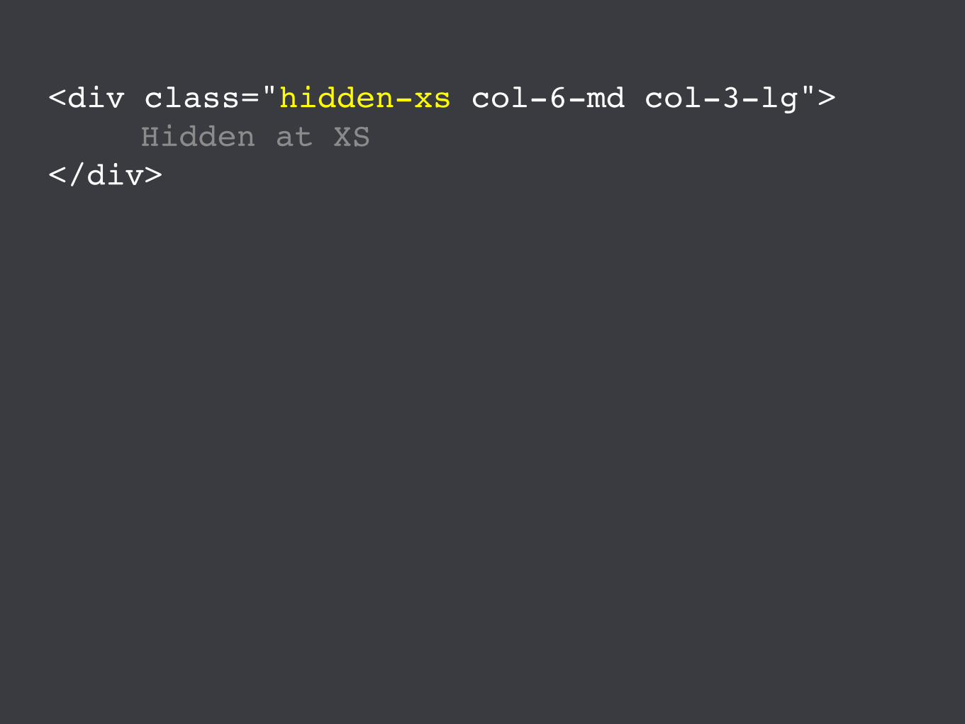
<div class="hidden-xs col-6-md col-3-lg">Hidden at XS
</div>

Unfortunately, these “hidden-” classes allow developers to add two sets of content into the layout.
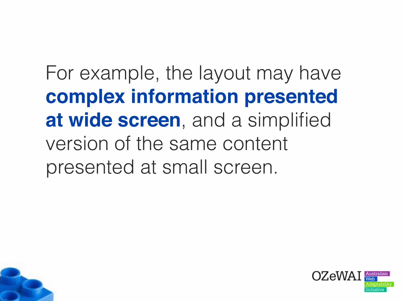
For example, the layout may have complex information presented at wide screen, and a simplified version of the same content presented at small screen.

<div class="hidden-xs col-6-md col-3-lg">Wide screen content
</div><div class="hidden-sm hidden-md hidden-lg">
Narrow screen content</div>
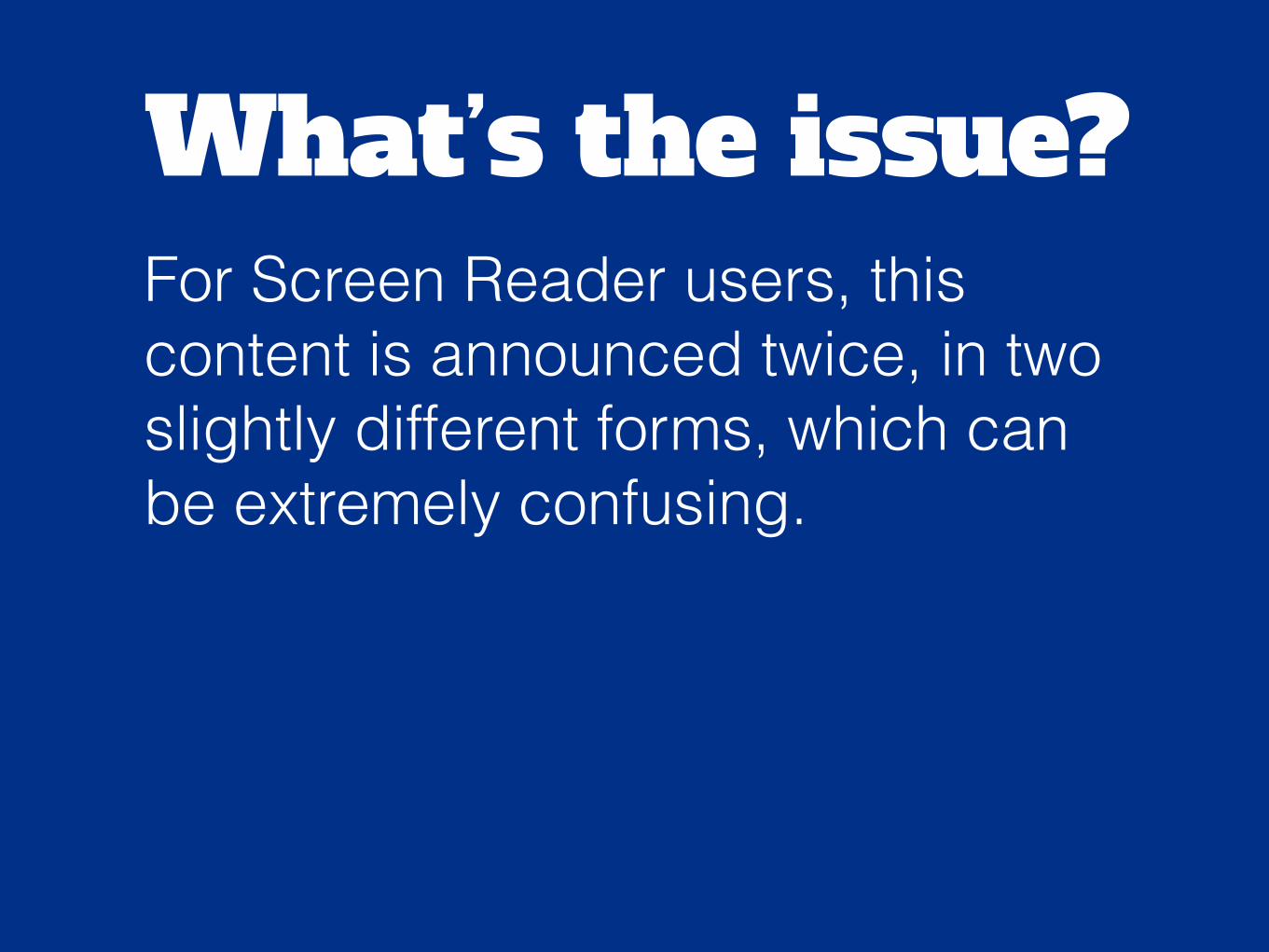
What’s the issue?For Screen Reader users, this content is announced twice, in two slightly different forms, which can be extremely confusing.

Solution:Try to use other methods to provide modified content for different screen sizes - even modifying within the one block of content if needed.

<h2>Heading <span class="hidden-xs">
with additional info</span>
</h2><p>
Paragraph<span class="hidden-xs">
with additional info</span>
</p>
Conclusion

Developers often have a tough job. They are being asked to develop sites and applications at an ever-increasing speed.
They are also being asked to learn new technologies at an ever increasing rate.
So, it is often hard to focus on things that may seem non-critical - like accessibility.
However, in many cases accessibility could be included in the development cycle without too much additional work.
Developers need to be made aware of the accessibility features that are available in many frameworks.
They also need to understand how these inbuilt features work - how to use them and not break them.
And finally, they need to know where these accessibility features fall short, and additional work may be needed.
How? Well, it is the job of anyone who is passionate about accessibility - to help spread the word.
Like you!
Russ WeakleyMax Design
Site: maxdesign.com.au
Twitter: twitter.com/russmaxdesign
Slideshare: slideshare.net/maxdesign
Linkedin: linkedin.com/in/russweakley