geo 465/565 - lectures 11 and 12 - spatial analysis · geo 465/565 - lectures 11 and 12 -...
TRANSCRIPT
GEO 465/565 - Lectures 11 and 12 - "Spatial Analysis"
(from Longley et al., GI Systems and Science, 2001)
12.2, 12.3 Visualization and interaction
A geographic information system provides a rich and flexible medium for
visualizing and interacting with geographic data. A GIS includes a variety of
functions for portraying attribute distributions and transforming spatial objects.
You can also interact with a GIS to turn raw data into information useful for
answering spatial and temporal questions.
When portraying information, attributes (or classes of attributes) can be displayed
with a variety of graphic symbols and used as labels to communicate information.
Additionally, you can manipulate the shape of spatial objects to enhance
interpretability.
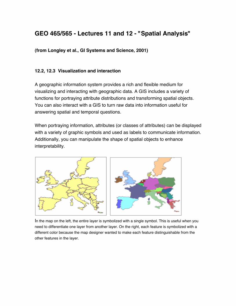
In the map on the left, the entire layer is symbolized with a single symbol. This is useful when you
need to differentiate one layer from another layer. On the right, each feature is symbolized with a
different color because the map designer wanted to make each feature distinguishable from the
other features in the layer.
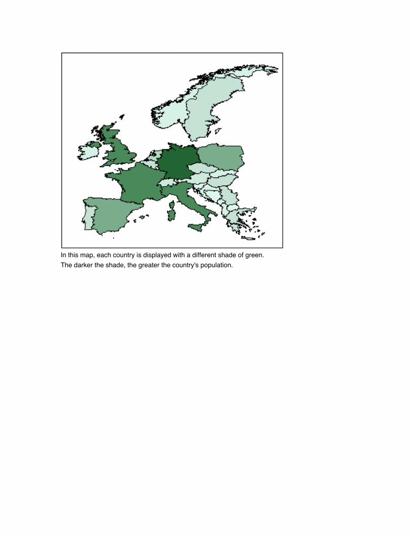
In this map, each country is displayed with a different shade of green.
The darker the shade, the greater the country's population.

Here, each country was placed into one of five groups based on its population. Each circle
represents the country's population relative to the other countries.
13.1 What is Spatial Analysis?
Through spatial analysis you can interact with a GIS to answer questions,
support decisions, and reveal patterns. Spatial analysis is in many ways the crux
of a GIS, because it includes all of the transformations, manipulations, and
methods that can be applied to geographic data to turn them into useful
information.
While methods of spatial analysis can be very sophisticated, they can also be
very simple. The approach this course will take is to regard spatial analysis as
spread out along a continuum of sophistication, ranging from the simplest types
that occur very quickly and intuitively when the eye and brain look at a map, to
the types that require complex software and advanced mathematical knowledge.
There are many ways of defining spatial analysis, but all in one way or another
express the fundamental idea that information on locations is essential. Basically,
think of spatial analysis as "a set of methods whose results change when the
locations of the objects being analyzed change."
For example, calculating the average income for a group of people is not spatial
analysis because the result doesn't depend on the locations of the people.
Calculating the center of the United States population, however, is spatial
analysis because the result depends directly on the locations of residents.
13.1-13.4, 14.2-14.4 Types of Spatial Analysis
Types of spatial analysis vary from simple to sophisticated. In this course, spatial
analysis will be divided into six categories: queries and reasoning,
measurements, transformations, descriptive summaries, optimization, and
hypothesis testing.
Queries and reasoning are the most basic of analysis operations, in which the
GIS is used to answer simple questions posed by the user. No changes occur in
the database and no new data are produced.
Measurements are simple numerical values that describe aspects of geographic
data. They include measurement of simple properties of objects, such as length,
area, or shape, and of the relationships between pairs of objects, such as
distance or direction.
Transformations are simple methods of spatial analysis that change data sets
by combining them or comparing them to obtain new data sets and eventually
new insights. Transformations use simple geometric, arithmetic, or logical rules,
and they include operations that convert raster data to vector data or vice versa.
They may also create fields from collections of objects or detect collections of
objects in fields.

Descriptive summaries attempt to capture the essence of a data set in one or
two numbers. They are the spatial equivalent of the descriptive statistics
commonly used in statistical analysis, including the mean and standard deviation.
Optimization techniques are normative in nature, designed to select ideal
locations for objects given certain well-defined criteria. They are widely used in
market research, in the package delivery industry, and in a host of other
applications.
Hypothesis testing focuses on the process of reasoning from the results of a
limited sample to make generalizations about an entire population. It allows us,
for example, to determine whether a pattern of points could have arisen by
chance based on the information from a sample. Hypothesis testing is the basis
of inferential statistics and forms the core of statistical analysis, but its use with
spatial data can be problematic.
The District Video (5 minutes)
Now let's examine three spatial analysis examples and explore the resulting
information.
(1) Examine land use and flood zone using simple overlay analysis - find
residential parcels that are inside a flood zone area. Applicable to Corvallis as we
are right along the Willamette River (Dr. Wright's house was endangered by the
big flood of 1996)
Insurance companies examine flood zone areas to locate buildings and other
assets susceptible to flood damage. Their predictions can be used to target
insurance sales. Ideally, insurance companies would like to target individuals
who perceive they are at risk to flooding, but in practice are unlikely to be
flooded. This allows the insurance company to receive the premium but not pay
any claims.

Of course, this approach poses some issues of risk and ethics. Refer to Chapters
17 - 19 in Longley et al. for a discussion of risk and ethics when practicing GIS.
For this exercise, you will focus on finding any residential areas within the flood
zone.
Examine data The map contains flood zone and land use layers. Turn on the
flood zone layer and notice that the flood zone affects many of the land use
areas.
create a statistical summary table to report the amount of each land use type
inside the flood zone area.

zonal stats dialogue
result
The table should have four records, one for each land use type in the flood zone.
Each field contains statistical information about that land use type's presence
within the flood zone.
Which land use types are in the flood zone?
Vacant, Agriculture, Residential, and Open space
Which one has the greatest area in the flood zone?
Agriculture
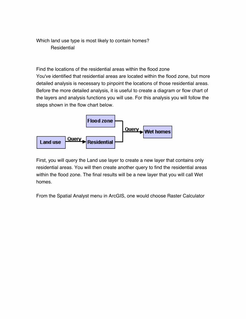
Which land use type is most likely to contain homes?
Residential
Find the locations of the residential areas within the flood zone
You've identified that residential areas are located within the flood zone, but more
detailed analysis is necessary to pinpoint the locations of those residential areas.
Before the more detailed analysis, it is useful to create a diagram or flow chart of
the layers and analysis functions you will use. For this analysis you will follow the
steps shown in the flow chart below.
First, you will query the Land use layer to create a new layer that contains only
residential areas. You will then create another query to find the residential areas
within the flood zone. The final results will be a new layer that you will call Wet
homes.
From the Spatial Analyst menu in ArcGIS, one would choose Raster Calculator
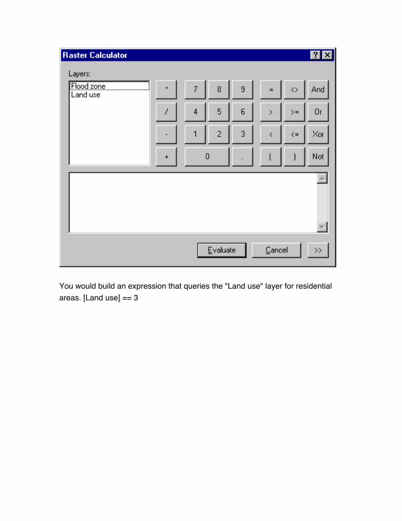
You would build an expression that queries the "Land use" layer for residential
areas. [Land use] == 3

Values of 1
change layer properties to show residential only
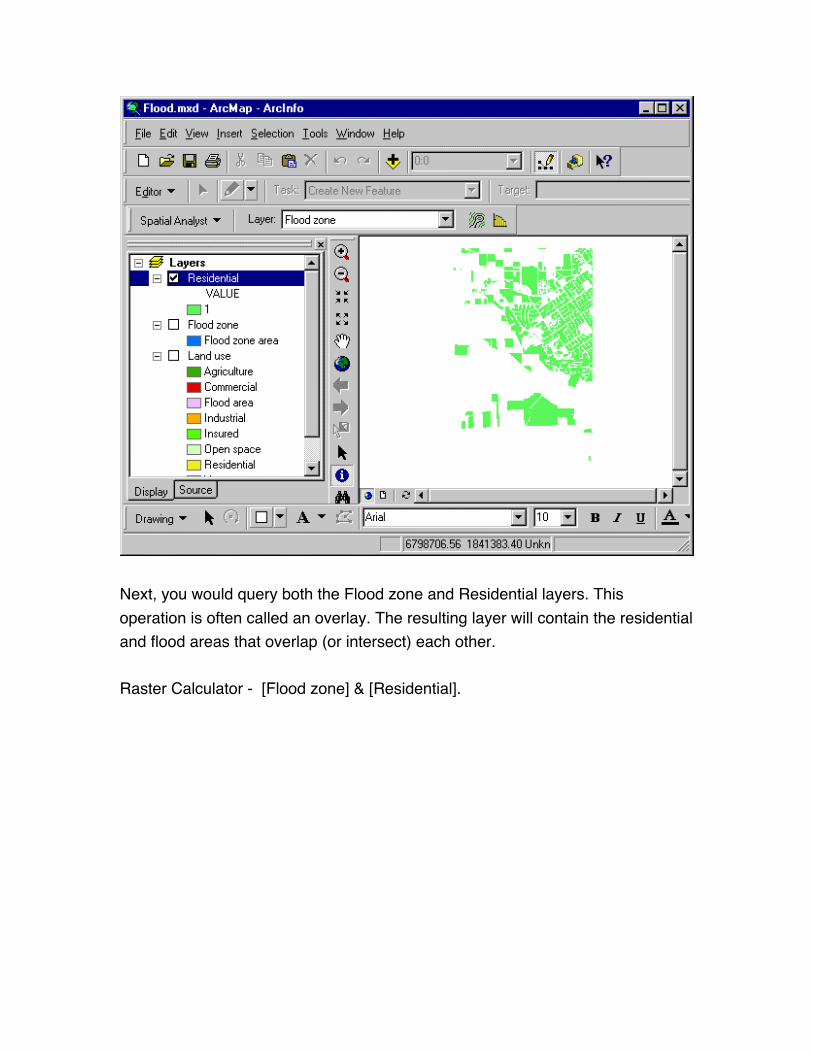
Next, you would query both the Flood zone and Residential layers. This
operation is often called an overlay. The resulting layer will contain the residential
and flood areas that overlap (or intersect) each other.
Raster Calculator - [Flood zone] & [Residential].
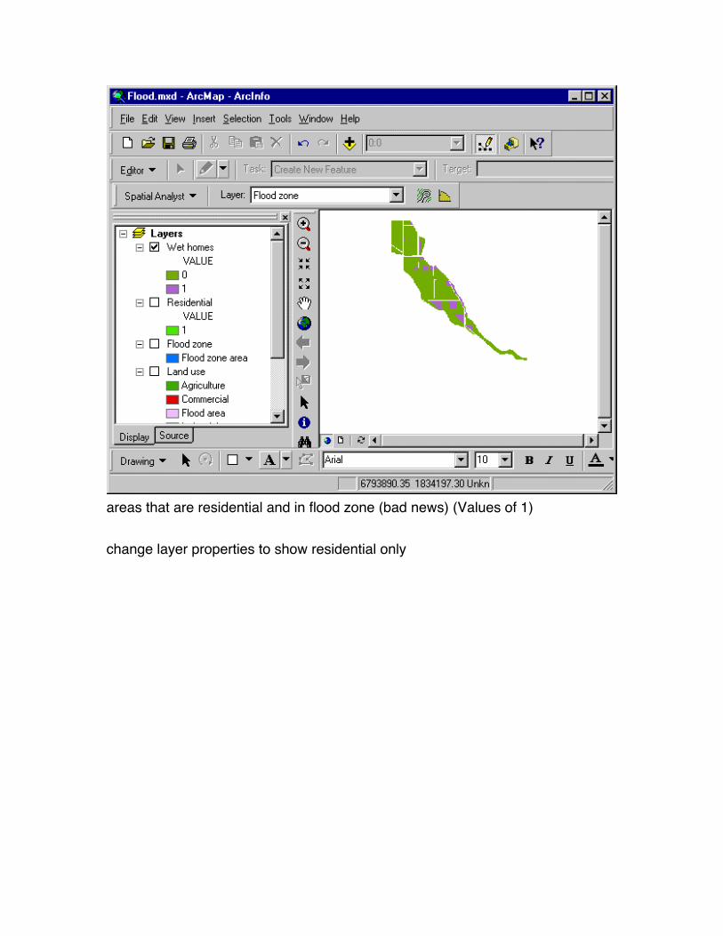
areas that are residential and in flood zone (bad news) (Values of 1)
change layer properties to show residential only
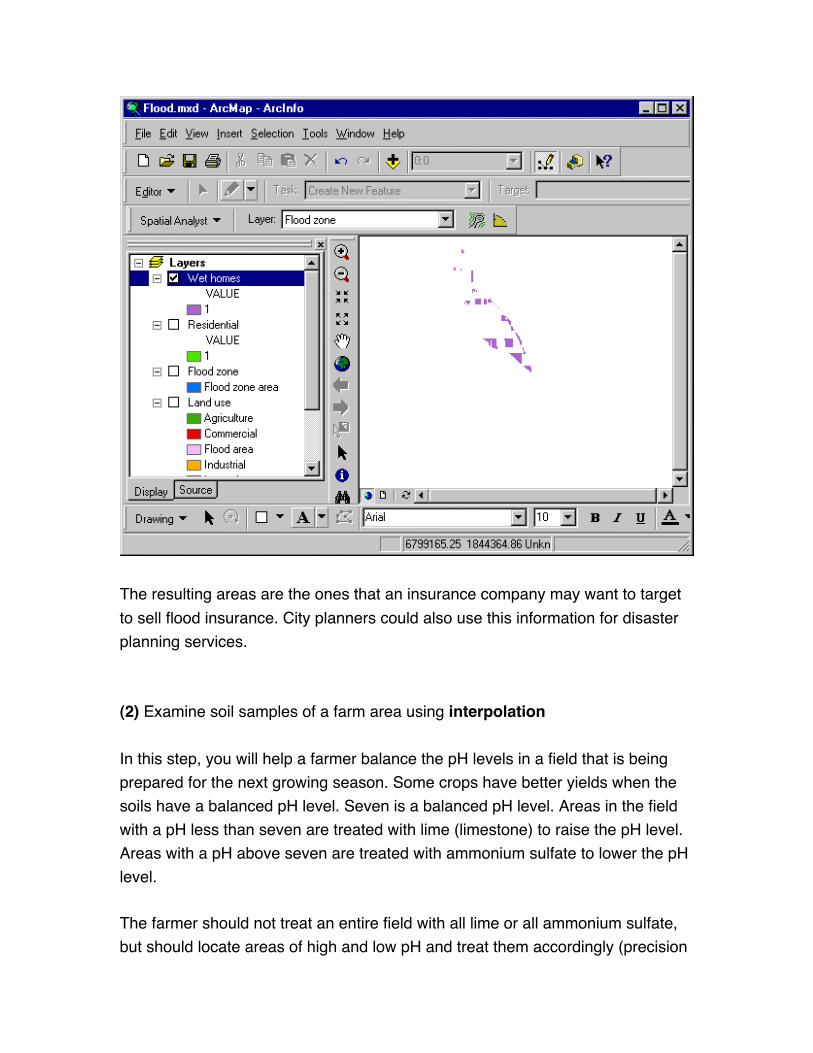
The resulting areas are the ones that an insurance company may want to target
to sell flood insurance. City planners could also use this information for disaster
planning services.
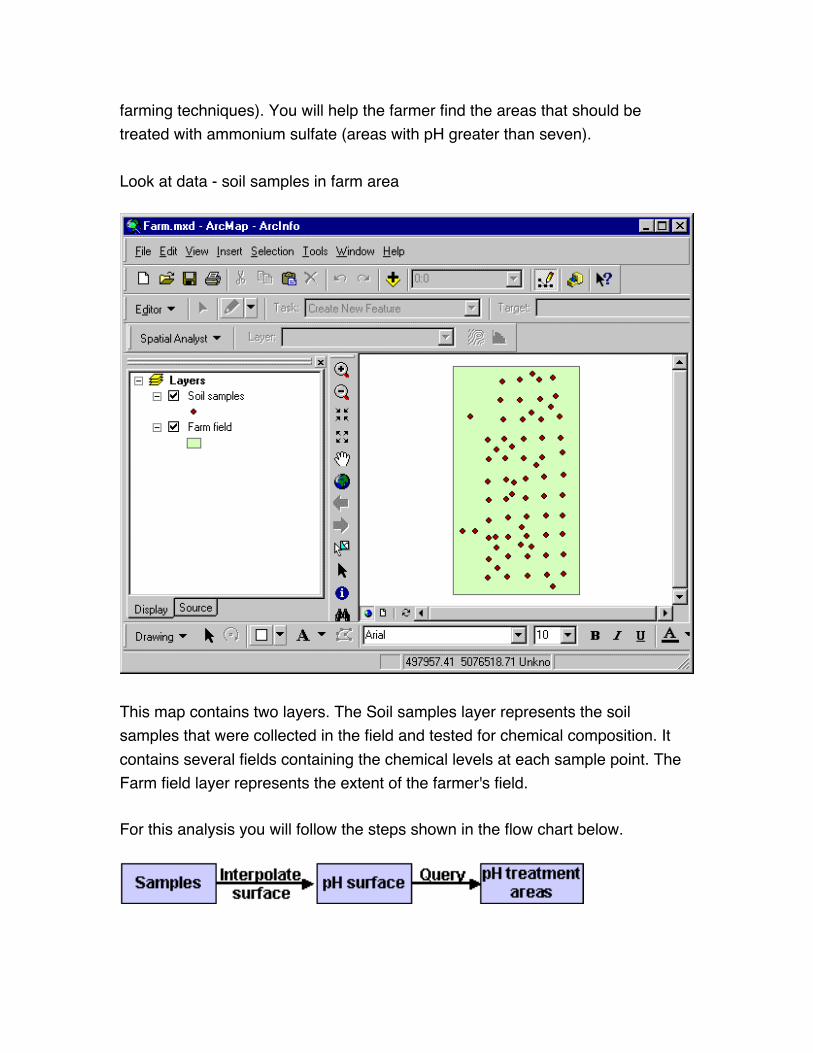
(2) Examine soil samples of a farm area using interpolation
In this step, you will help a farmer balance the pH levels in a field that is being
prepared for the next growing season. Some crops have better yields when the
soils have a balanced pH level. Seven is a balanced pH level. Areas in the field
with a pH less than seven are treated with lime (limestone) to raise the pH level.
Areas with a pH above seven are treated with ammonium sulfate to lower the pH
level.
The farmer should not treat an entire field with all lime or all ammonium sulfate,
but should locate areas of high and low pH and treat them accordingly (precision
farming techniques). You will help the farmer find the areas that should be
treated with ammonium sulfate (areas with pH greater than seven).
Look at data - soil samples in farm area
This map contains two layers. The Soil samples layer represents the soil
samples that were collected in the field and tested for chemical composition. It
contains several fields containing the chemical levels at each sample point. The
Farm field layer represents the extent of the farmer's field.
For this analysis you will follow the steps shown in the flow chart below.

You will interpolate a surface of pH values from the samples. You will then query
the surface to find areas with pH greater than seven. The final results will be the
areas the farmer needs to treat with ammonium sulfate.
Set up IDW dialog
Resulting interpolation is a "pH surface" - The dark green areas have low pH
values, while the light pink areas have high pH values.
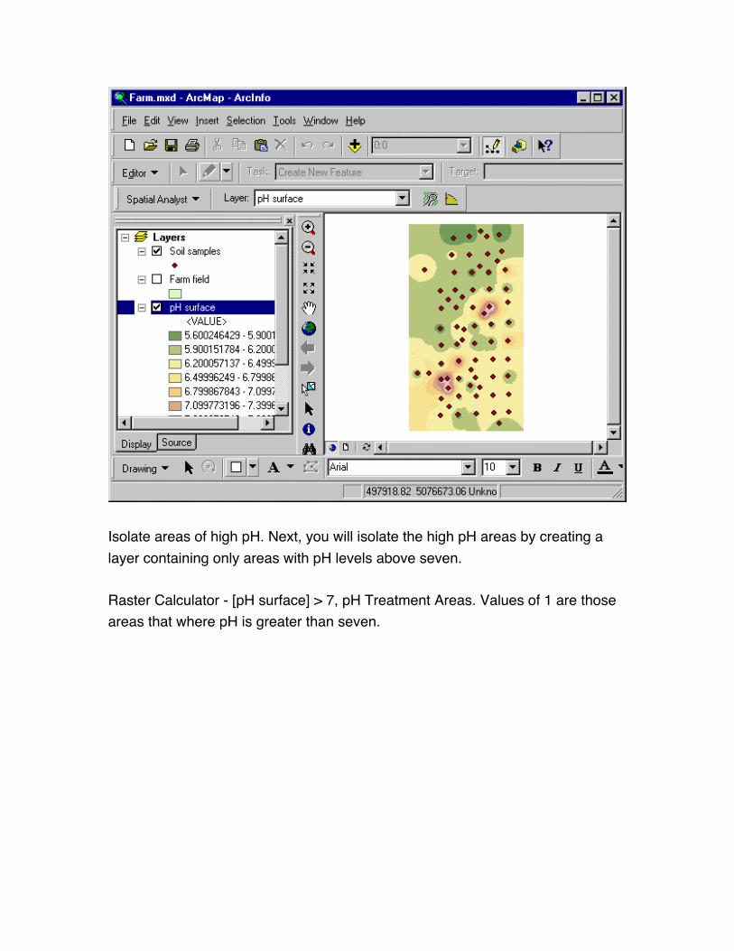
Isolate areas of high pH. Next, you will isolate the high pH areas by creating a
layer containing only areas with pH levels above seven.
Raster Calculator - [pH surface] > 7, pH Treatment Areas. Values of 1 are those
areas that where pH is greater than seven.

values of 1 already isolated
The pH treatment areas are the areas that the farmer should treat with
ammonium sulfate to lower the pH to seven so that it is balanced. The farm size
is about 5.35 acres (233,046 square feet or 21,650 square meters) and the
combined size of the newly defined treatment areas is about 0.145 acres (6,338
square feet or 588 square meters).
If the ammonium sulfate treatment costs $50.00 per acre, treating the entire 5.35
acres costs about $267.50, while treating 0.145 acres costs about $7.25.
Treating only the areas that actually need it results in a possible savings of
$260.25. Imagine if the farmer had several fields.
Farmers may use similar techniques when applying fertilizers and pesticides to
their fields. Also, histories of crop yield and treatment can be mapped over time
and used for future planning.
(3) Examine coffee shops and their customers using location (distance anddensity) analysis.
In this step, you will examine existing coffee shops and their customers to find a
good location for opening a new coffee shop.
In order to find a good location for a new shop, you will need to answer several
questions: Is the new location too close to existing shops? Does the new location
have similar characteristics to existing locations? Where are the competitors?
Where are the customers? Where are the customers that are spending the most
money at the store?
In a complete location analysis study, you might also consider other factors,
including the average traffic flow near the new location, land costs, zoning
concerns, and planning rules.
Examine data

The map contains three layers: Shops, Customers, and Streets. The Shops layer
contains the locations of existing coffee shops. The Customers layer is not turned
on; you will turn it on later.
Examine the locations of the existing shops. For this analysis, you will assume
that any shops within 1 mile of each other will compete for customers. Potential
sites for a new shop should therefore be more than 1 mile from any existing
shops.
For this analysis you will follow the steps shown in the flow chart below.
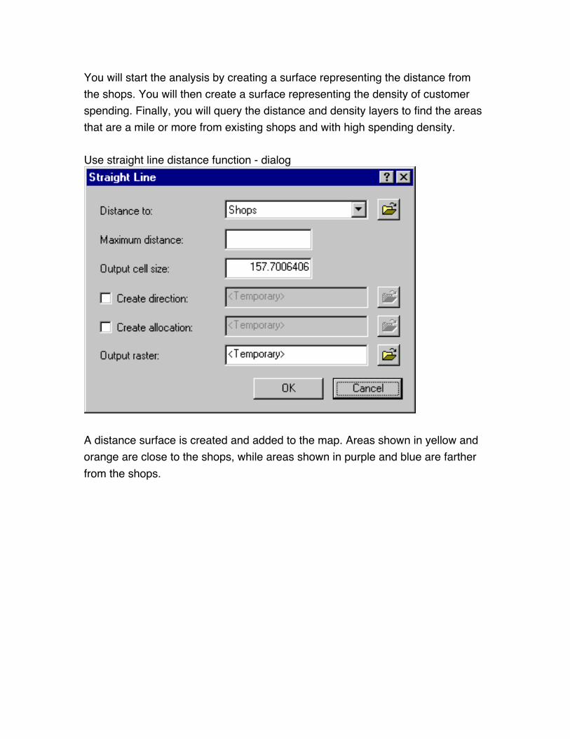
You will start the analysis by creating a surface representing the distance from
the shops. You will then create a surface representing the density of customer
spending. Finally, you will query the distance and density layers to find the areas
that are a mile or more from existing shops and with high spending density.
Use straight line distance function - dialog
A distance surface is created and added to the map. Areas shown in yellow and
orange are close to the shops, while areas shown in purple and blue are farther
from the shops.
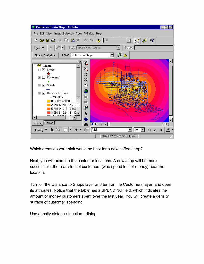
Which areas do you think would be best for a new coffee shop?
Next, you will examine the customer locations. A new shop will be more
successful if there are lots of customers (who spend lots of money) near the
location.
Turn off the Distance to Shops layer and turn on the Customers layer, and open
its attributes. Notice that the table has a SPENDING field, which indicates the
amount of money customers spent over the last year. You will create a density
surface of customer spending.
Use density distance function - dialog
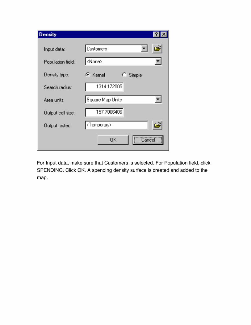
For Input data, make sure that Customers is selected. For Population field, click
SPENDING. Click OK. A spending density surface is created and added to the
map.
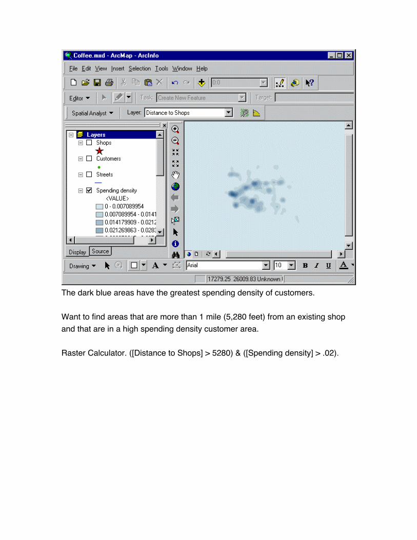
The dark blue areas have the greatest spending density of customers.
Want to find areas that are more than 1 mile (5,280 feet) from an existing shop
and that are in a high spending density customer area.
Raster Calculator. ([Distance to Shops] > 5280) & ([Spending density] > .02).
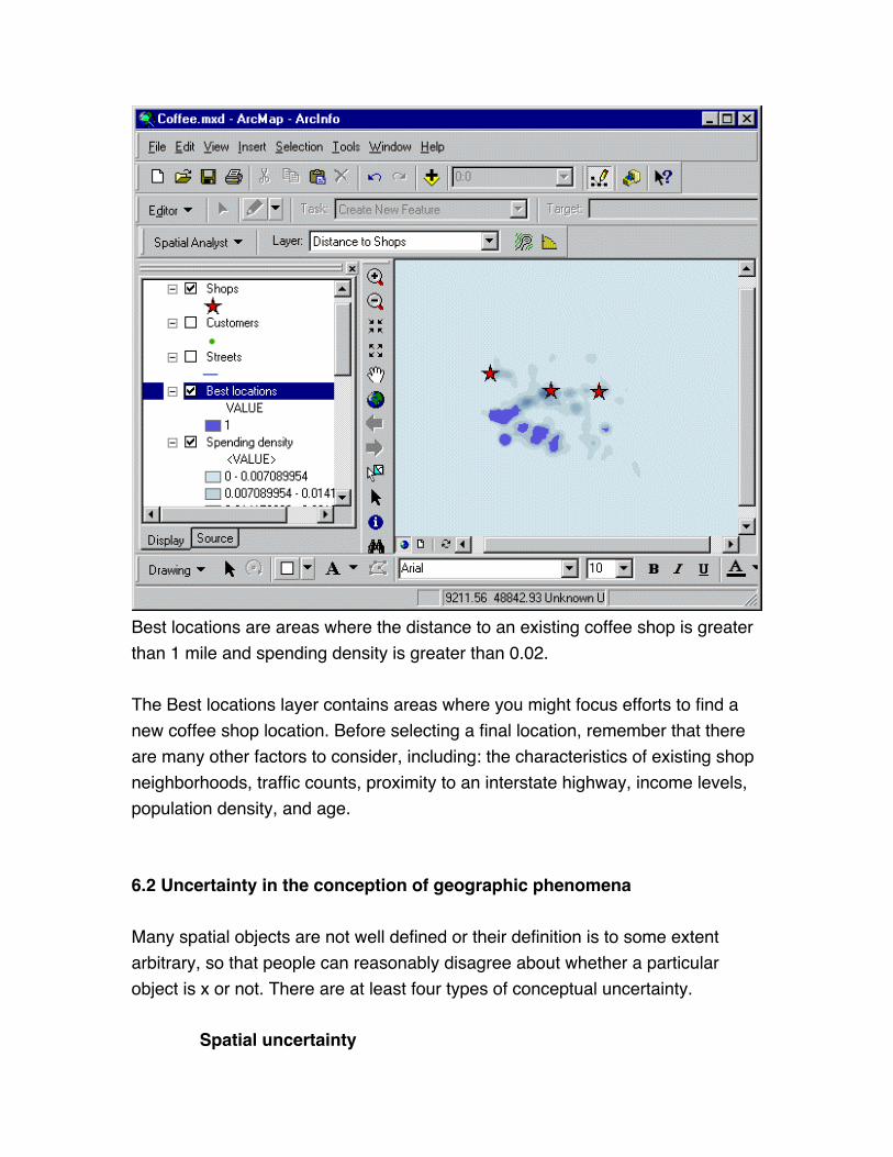
Best locations are areas where the distance to an existing coffee shop is greater
than 1 mile and spending density is greater than 0.02.
The Best locations layer contains areas where you might focus efforts to find a
new coffee shop location. Before selecting a final location, remember that there
are many other factors to consider, including: the characteristics of existing shop
neighborhoods, traffic counts, proximity to an interstate highway, income levels,
population density, and age.
6.2 Uncertainty in the conception of geographic phenomena
Many spatial objects are not well defined or their definition is to some extent
arbitrary, so that people can reasonably disagree about whether a particular
object is x or not. There are at least four types of conceptual uncertainty.
Spatial uncertainty
Spatial uncertainty occurs when objects do not have a discrete, well
defined extent. They may have indistinct boundaries (where exactly does a
wetland end?), they may have impacts that extend beyond their boundaries
(should an oil spill be defined by the dispersion of pollutants or by the area of
environmental damage?), or they may simply be statistical entities. The attributes
ascribed to spatial objects may also be subjective—for example, the spatial
distributions of poverty and biodiversity depend on human interpretations of what
these things mean.
Vagueness Vagueness occurs when the criteria that define an object as x are not
explicit or rigorous. In a land cover analysis, how many oaks (or what proportion
of oaks) must be found in a tract of land to qualify it as oak woodland? What
incidence of crime (or resident criminals) defines a high crime neighborhood?
Ambiguity Ambiguity occurs when y is used as a substitute, or indicator, for x
because x is not available. The link between direct indicators and the
phenomena for which they substitute is straightforward and fairly unambiguous.
Soil nutrient levels (y) are a direct indicator of crop yields (x). Indirect indicators
tend to be more ambiguous and opaque. Wetlands (y) are an indirect indicator of
animal species diversity (x). Of course, indicators are not simply direct or indirect;
they occupy a continuum. The more indirect they are, the greater the ambiguity
and the less certain it is that an object being approximated using y really is x.
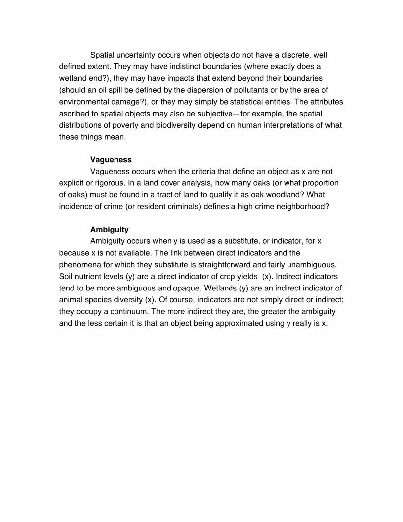
Salinity (x) as a direct, unambiguous indicator of number of species (y), freshwater and marine.
But could you correctly estimate the ocean salinity, just from the number of species?? Quite
ambiguous.Figure courtesy of Jay Austin, Ctr. For Coastal Physical Oceanography, Old Dominion
Univ.
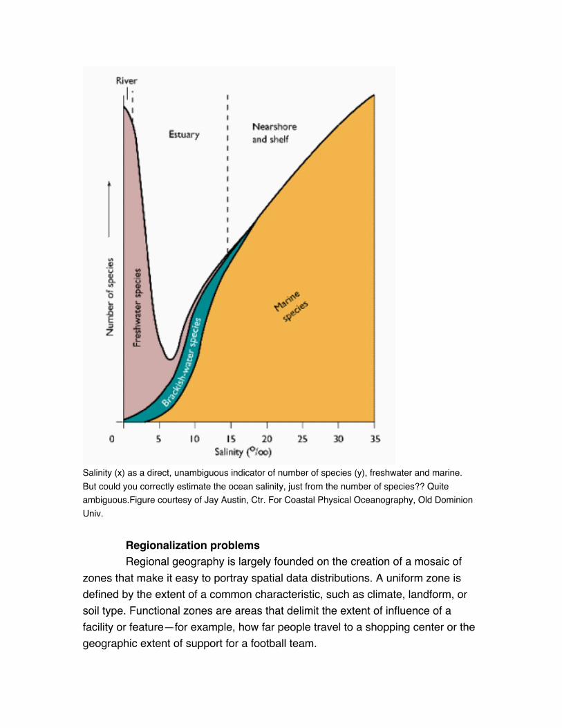
Regionalization problems Regional geography is largely founded on the creation of a mosaic of
zones that make it easy to portray spatial data distributions. A uniform zone is
defined by the extent of a common characteristic, such as climate, landform, or
soil type. Functional zones are areas that delimit the extent of influence of a
facility or feature—for example, how far people travel to a shopping center or the
geographic extent of support for a football team.

Regionalization problems occur because zones are artificial. In the
development of climate zones, for instance, experts may disagree on what
combination of characteristics defines a zone, how these characteristics should
be weighted to create a composite indicator, and what the minimum size
threshold for a zone is. This should not be surprising: after all, spatial
distributions tend to change gradually, while zones imply that there are sharp
boundaries between them.
6.3 Uncertainty in the measurement of geographic phenomena
Error occurs in physical measurement of objects, in the recording of
socioeconomic attributes, and in digital data capture. This error creates further
uncertainty about the true nature of spatial objects.
Physical measurement errorInstruments and procedures used to make physical measurements are not
perfectly accurate. For example, a survey of Mount Everest might find its height
to be 8,850 meters, with an accuracy of plus or minus 5 meters.

In addition, the earth is not a perfectly stable platform from which to make
measurements. Seismic motion, continental drift, and the wobbling of the earth's
axis cause physical measurements to be inexact.
Digitizing error A great deal of spatial data has been digitized from paper maps.
Digitizing, or the electronic tracing of paper maps, is prone to human error. Lines
may be drawn too far, not far enough, or missed entirely. Errors caused by
digitizing mistakes can be partially, but not completely, fixed by software.
Line segment A overshoots the polygon boundary. Line segment B undershoots it.
Additional error occurs because adjacent data digitized from different maps may
not align correctly. This problem can also be partially corrected through a
software technique called rubbersheeting.
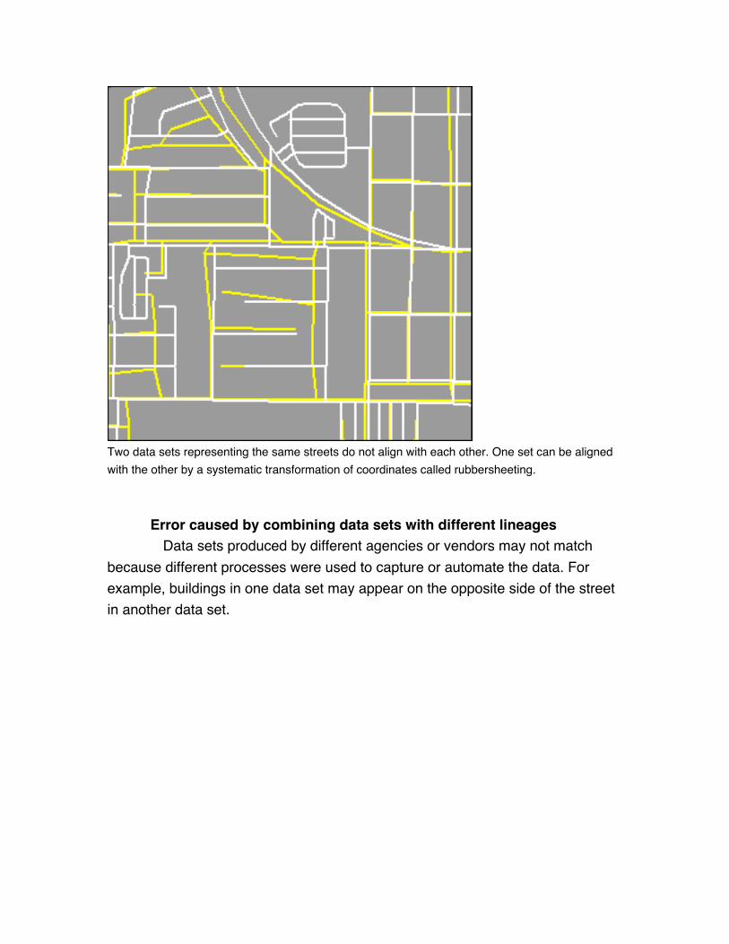
Two data sets representing the same streets do not align with each other. One set can be aligned
with the other by a systematic transformation of coordinates called rubbersheeting.
Error caused by combining data sets with different lineages Data sets produced by different agencies or vendors may not match
because different processes were used to capture or automate the data. For
example, buildings in one data set may appear on the opposite side of the street
in another data set.

Fig. 1.22. Two street data sets for part of Goleta, California, USA. The red and green lines fail
to match by as much as 100 meters.
Error may also be caused by combining sample and population data or by using
sample estimates that are not robust at fine scales. "Lifestyle" data are derived
from shopping surveys and provide business and service planners with up-to-
date socioeconomic data not found in traditional data sources like the census.
Yet the methods by which lifestyle data are gathered and aggregated to zones as
compared to census data may not be scientifically rigorous.
6.3 Uncertainty in the representation of geographic phenomena
Representation is closely related to measurement. Representation is not just an
input to analysis, but sometimes also the outcome of it. For this reason, we
consider representation separately from measurement.
Uncertainty in the raster data structure The raster structure partitions space into square cells of equal size (also
called pixels). Spatial objects x, y, and z emerge from cell classification, in which
Cell A1 is classified as x, Cell A2 as y, Cell A3 as z, and so on, until all cells are
evaluated. A spatial object x can be defined as a set of contiguous cells classified
as x.
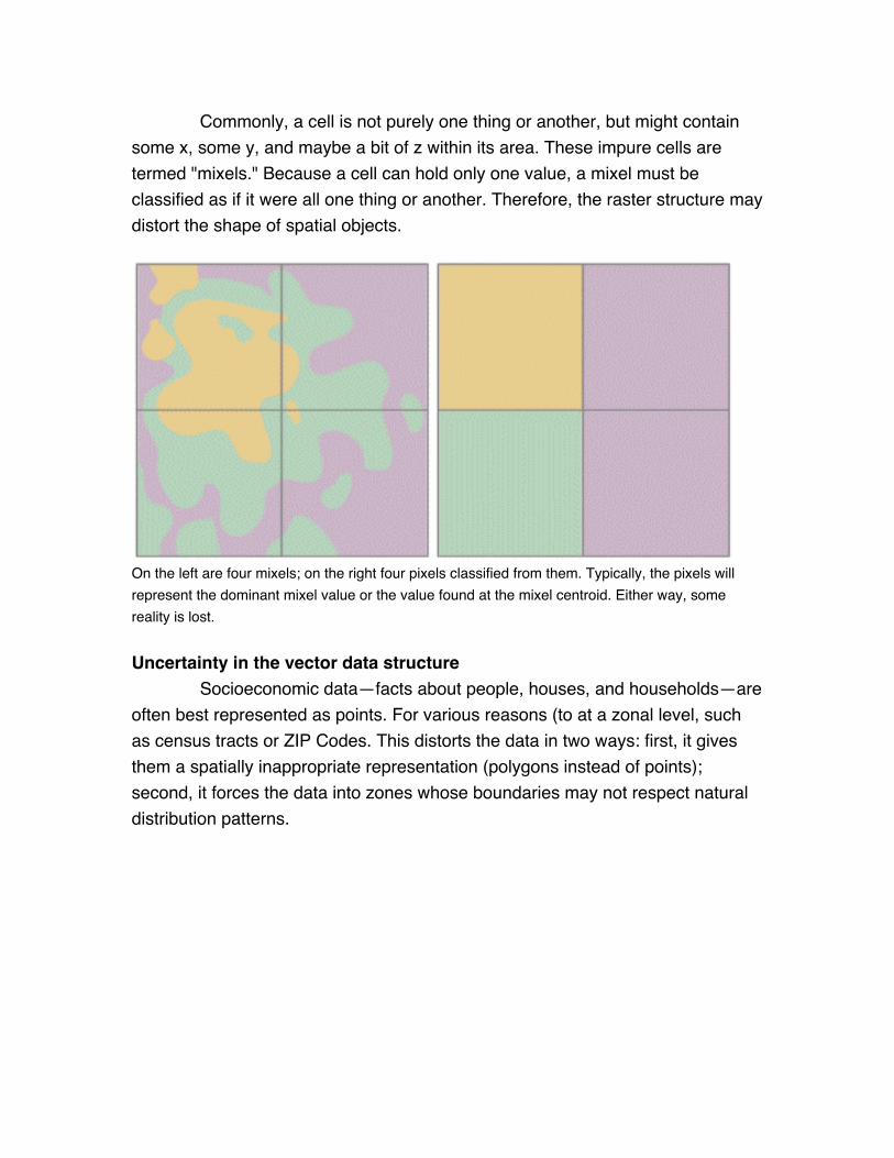
Commonly, a cell is not purely one thing or another, but might contain
some x, some y, and maybe a bit of z within its area. These impure cells are
termed "mixels." Because a cell can hold only one value, a mixel must be
classified as if it were all one thing or another. Therefore, the raster structure may
distort the shape of spatial objects.
On the left are four mixels; on the right four pixels classified from them. Typically, the pixels will
represent the dominant mixel value or the value found at the mixel centroid. Either way, some
reality is lost.
Uncertainty in the vector data structure Socioeconomic data—facts about people, houses, and households—are
often best represented as points. For various reasons (to at a zonal level, such
as census tracts or ZIP Codes. This distorts the data in two ways: first, it gives
them a spatially inappropriate representation (polygons instead of points);
second, it forces the data into zones whose boundaries may not respect natural
distribution patterns.
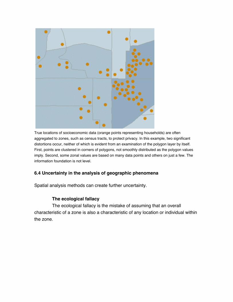
True locations of socioeconomic data (orange points representing households) are often
aggregated to zones, such as census tracts, to protect privacy. In this example, two significant
distortions occur, neither of which is evident from an examination of the polygon layer by itself.
First, points are clustered in corners of polygons, not smoothly distributed as the polygon values
imply. Second, some zonal values are based on many data points and others on just a few. The
information foundation is not level.
6.4 Uncertainty in the analysis of geographic phenomena
Spatial analysis methods can create further uncertainty.
The ecological fallacy The ecological fallacy is the mistake of assuming that an overall
characteristic of a zone is also a characteristic of any location or individual within
the zone.
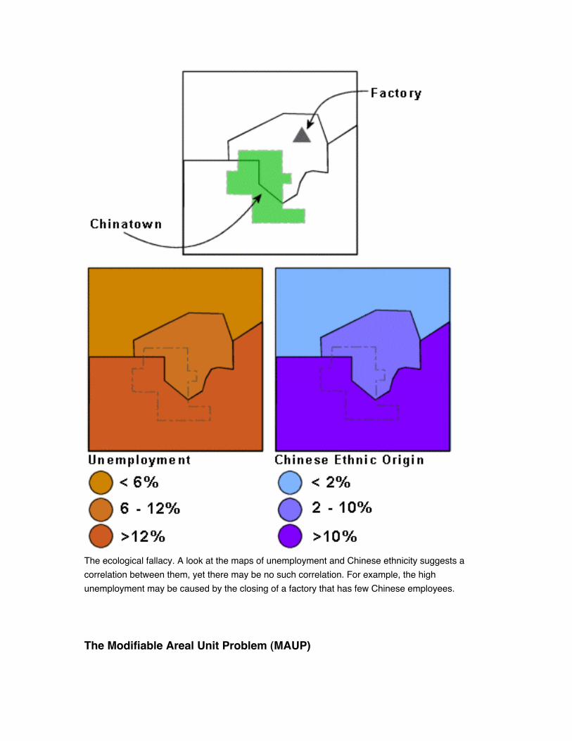
The ecological fallacy. A look at the maps of unemployment and Chinese ethnicity suggests a
correlation between them, yet there may be no such correlation. For example, the high
unemployment may be caused by the closing of a factory that has few Chinese employees.
The Modifiable Areal Unit Problem (MAUP)
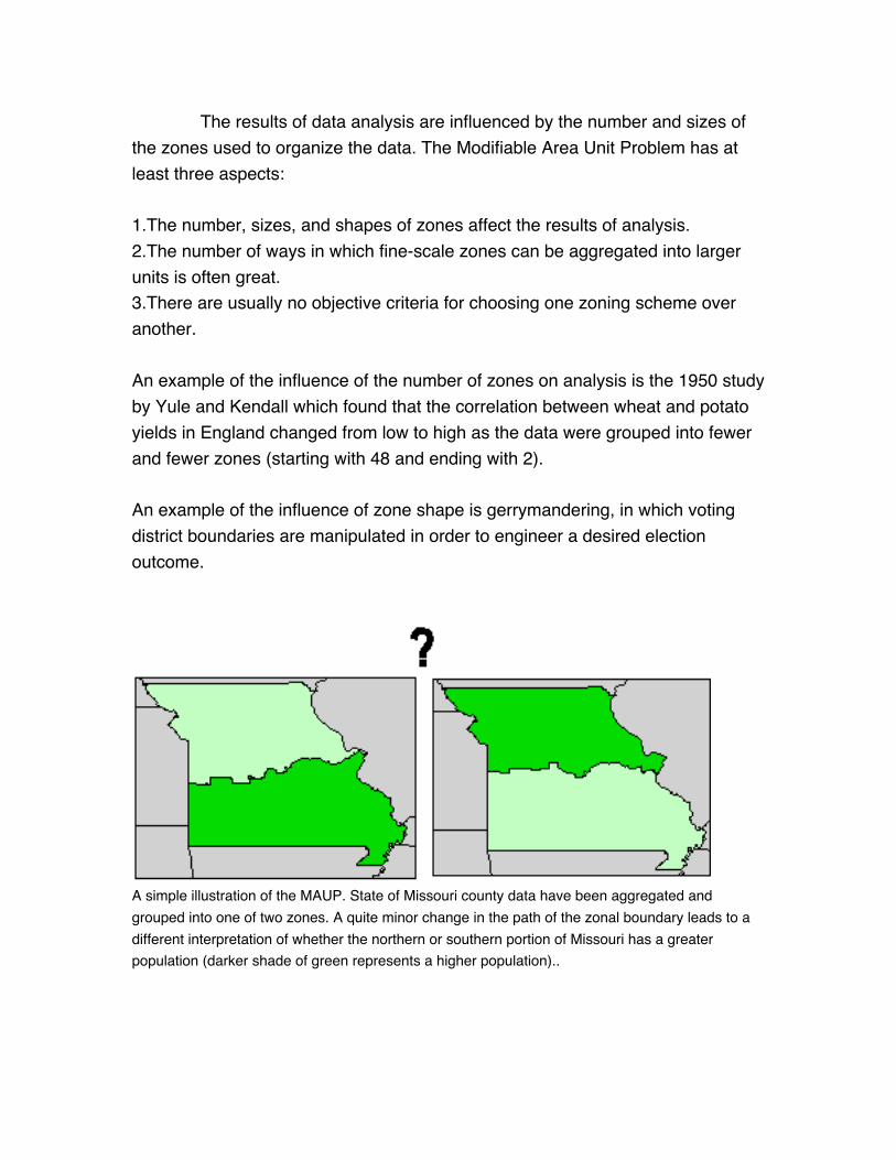
The results of data analysis are influenced by the number and sizes of
the zones used to organize the data. The Modifiable Area Unit Problem has at
least three aspects:
1.The number, sizes, and shapes of zones affect the results of analysis.
2.The number of ways in which fine-scale zones can be aggregated into larger
units is often great.
3.There are usually no objective criteria for choosing one zoning scheme over
another.
An example of the influence of the number of zones on analysis is the 1950 study
by Yule and Kendall which found that the correlation between wheat and potato
yields in England changed from low to high as the data were grouped into fewer
and fewer zones (starting with 48 and ending with 2).
An example of the influence of zone shape is gerrymandering, in which voting
district boundaries are manipulated in order to engineer a desired election
outcome.
A simple illustration of the MAUP. State of Missouri county data have been aggregated and
grouped into one of two zones. A quite minor change in the path of the zonal boundary leads to a
different interpretation of whether the northern or southern portion of Missouri has a greater
population (darker shade of green represents a higher population)..
Summary
Methods of spatial analysis are often used to produce new information from
geographic data. There are several spatial analysis techniques available, ranging
from simple to complex.
Visualization of spatial data is a simple method for gaining information. GIS offers
many capabilities for displaying data at differing scales and based on various
attributes. Spatial analysis is also a source of information from a GIS and is
defined by any set of methods whose results change when the locations of the
objects being analyzed change. Six types of spatial analysis are queries and
reasoning, measurements, transformations, descriptive summaries, optimization,
and hypothesis testing.
Uncertainty enters GIS at every stage. It occurs in the conception or definition of
spatial objects. For example, what exactly defines the boundary of a desert? It
also occurs in the conception of attributes. For example, what incidence of crime
qualifies a neighborhood as "high crime"?
Uncertainty occurs in the measurement of data. It is caused by imperfect
instruments, errors in the conversion of non-digital data to digital form (digitizing),
and the combination of data sets with different characteristics (different datums,
different scales, different data processing histories).
Uncertainty occurs in the structural representation of data as either vectors or
rasters. In the vector data structure, distortion is caused by the common practice
of aggregating point data to polygons. In the raster structure, it is caused by data
generalization.
Uncertainty in the analysis of data is manifested in the ecological fallacy and the
Modifiable Area Unit Problem.
Geographic Information Systems and Science by Paul A Longley, Michael F Goodchild, David J Maguire
and David W Rhind (c) 2001 John Wiley & Sons Ltd. Reproduced by permission: