geographic patterns of disability in the united states · geographic patterns of disability in the...
TRANSCRIPT

Geographic Patterns of Disability in the United States by John L. McCoy, Miles Davis, and Russell E. Hudson *
Geographic patterns of county prevalence rates of disability benefit receipt are shown for the Social Security Administration’s Disability Insurance (DI) and Supplemental Security Income (SSI) programs. Prevalence rates were calcu- lated bq’ dividing each count$s December 1990 DI and S S I disability caseloads by the population aged IS-64 for that year in that county. Separate maps were also constructed for men and women recipients. Areas with the highest overall DI prevalence rates included Appalachia, the Southeast Coastal Plains, the Mid- south, northwestern Montana, the coastal counties of Washington, and isolated counties of the Southwest. Areas with the highest SSI prevalence rates included the Mississippi Delta, scattered counties in Oklahoma, the Missouri “Boot Heel,” parts of Appalachia, isolated counties in South and North Dakota, the “Four Comers” region of the Southwest, the Sacramento and San Joaquin Valley regions of California, isolated parts of the upper Great Lakes States, northern Maine, and the coastal region of soutlnvestem Alaska. Disability prevalence rates were also calculated for the overall population and by sex for each of the 10 U.S. Depart- ment of Health and Human Services administrative regions.
*John McCoy is with the Program Analysis Staff, Office of Research and Statistics (ORS). Miles Davis and Russell Hudson are with the Division of Statistical Operations and Services, ORS.
This article provides an overview of the geographic distribution of county prevalence rates of disability benefit re- ceipt under the Social Security Admin- istration’s Disability Insurance (DI) and Supplemental Security Income (SSI) pro- grams. The accompanying maps and tables, which contain the supporting evi- dence for this article. represent counties ranked according to the prevalence of disability benefit receipt for men and women. In addition to the geographic distributions shown, tabular data are presented representing county distribu- tions of the prevalence of disability by Department of Health and Human Ser- vices administrative regions.
The purpose of this article is to high- light local areas (counties) with high and low concentrations (prevalence rates) of disability program recipients. The maps and accompanying tables provide an indi- cation of current and potential burdens for Social Security Administration (SSA) planners and program administrators. For example, knowledge of areas with high concentrations of DI and SSI disabil- ity beneficiaries could be used by agency administrative personnel and by public health officials to assess needs and avail- ability of appropriate service modalities.
Research and Policy Issues
The geographic patterns shown are designed to raise both epidemiologic and policy questions. Why, for example, do certain areas of the United States have a relatively higher prevalence of disability and program participation than other areas? What are some of the contextual or geographic correlates of disability that may explain these patterns? Are there underlying sociodemographic explana- tions? Are certain employment patterns or mitigating ecological factors, including management practices, associated with certain industries and occupations that suggest higher or lower probabilities of disability? Are “pockets of poverty” and areas with above average unemployment associated with high rates of disability? Are differences in the prevalence of dis- ability explained by local variations in the way SSA administers the DI and SSI programs? Are cyclical factors associated
Social Security Bulletin l Vol. 57. No. 1 l Spring 1994 2s
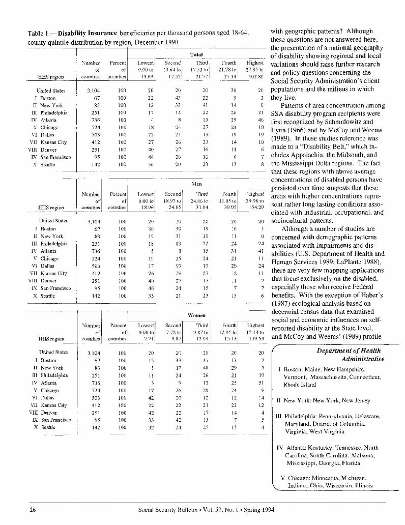
Table l.-Disability Insurance beneficiaries per thousand persons aged 18-64, county quintile distribution by region, December 1990
I Boston 67
II New York 83 III Philadelphia 251 IV .4tlanta 736 V Chicago 524
VI Dallas 503
VII Kansas City 412 VIII Denver 291
IX San Francisco 95 x Seattle 142
22 43 22 9 12 33 41 14
17 I3 22 26 4 8 13 29
18 24 27 21
22 21 18 I9
27 26 23 14
40 27 16 11 44 26 16 6
36 20 23 13
3 0
21
46 10 19
10 6
7 x
United States
I Boston
II New York III Philadelphia IV Atlanta
V Chicago VI Dallas
VII Kansas City VIII Denver
IX San Francisco X Seattle
3,104 100 20 20 20 20 20
67 100 30 39 19 10 1
83 100 19 31 39 11 0
251 100 18 13 22 24 24
736 100 5 x 15 31 41
524 100 19 25 24 21 11
503 100 17 19 19 20 24
412 100 26 29 22 12 11
291 100 40 27 15 11 7
95 100 46 24 15 7 7
142 100 35 21 23 15 6
HHS region
United States 3,104 100 20 20 20 20 20 I Boston 67 100 15 33 31 13 7
II New York 83 100 1 17 48 29 5 III Philadelphia 251 100 11 24 26 21 19
IV Atlanta 736 100 3 3 13 25 51
V Chicago 524 100 12 26 23 24 9
VI Dallas 503 100 42 20 12 12 14
VII Kansas City 412 100 22 22 21 22 12 VIII Denver 291 100 42 22 17 14 4
IX San Francisco 95 100 33 42 13 7 5 X Seattle 142 100 32 24 25 15 4
with geographic patterns? Although these questions are not answered here, the presentation of a national geography of disability showing regional and local variations should raise further research and policy questions concerning the Social Security Administration’s client populations and the milieus in which they live.
Patterns of area concentration among SSA disability program recipients were first recognized by Schmulowitz and Lynn (1966) and by McCoy and Weems (1989). In these studies reference was made to a “Disability Belt,” which in- cludes Appalachia, the Midsouth, and the Mississippi Delta regions. The fact that these regions with above average concentrations of disabled persons have persisted over time suggests that these areas with higher concentrations repre- sent rather long lasting conditions asso- ciated with industrial, occupational, and sociocultural patterns.
Although a number of studies are concerned with demographic patterns associated with impairments and dis- abilities (U.S. Department of Health and Human Services 1989; LaPlante 1988), there are very few mapping applications that focus exclusively on the disabled, especially those who receive Federal benefits. With the exception of Haber’s (1987) ecological analysis based on decennial census data that examined social and economic influences on self- reported disability at the State level, and McCoy and Weems’ (1989) profile
Department of Health Administrative
I Boston: Maine, New Hampshire, Vermont, Massachusetts, Connecticut, Rhode Island
II New York: New York, New Jersey
III Philadelphia: Pennsylvania, Delaware, Maryland, District of Columbia, Virginia, West Virginia
IV Atlanta: Kentucky, Tennessee, North Carolina, South Carolina, Alabama, Mississippi, Georgia, Florida
V Chicago: Minnesota, Michigan. Indiana, Ohio, Wisconsin, Illinois
Social Security Bulletin l Vol. 57, No. 1 l Spring 1994

analysis of disability program recip- ients, which included State level maps of prevalence rates, there are no other studies to our knowledge concerned with the regional geography and relative concentration of persons with disabili- ties at the county level of observation.
Mapping Applications -
Mapping technology has been ap- plied in a number of public health areas and for the purpose of showing geo- graphic distributions of agricultural, natural, and economic resources. The U.S. Public Health Service (PHS) has used mapping applications to identify areas with above average rates of cancer morbidity and mortality and areas with high rates of non-neoplastic diseases (Mason et al. 1975, 1981). More re- cently. the Centers for Disease Control of PHS used computer mapping to illus- trate geographic patterns of major in- jury-related causes of mortality (Devine et al. 1991). Another application is used by the U.S. Department of Commerce (1990) to feature various characteristics of rural and farm populations. The Social Security Administration is cur- rently using computer mapping to iden- tify local (ZIP Code) concentrations of Old-Age, Survivors. and Disability In- surance (OASDI) beneficiaries who use the direct deposit program to send their benefit payments directly to financial institutions (Davis et al. 199 I), and to demonstrate optimal allocations of man-
and Human Services Regions
VI
VII
m
lx
X
Dallas: New Mexico, Texas, Oklahoma, Arkansas, Louisiana
Kansas City: Nebraska, Iowa, Kansas, Missouri
Denver: Montana, North Dakota, South Dakota, Wyoming, Utah, Colorado
San Francisco: California, Nevada, Arizona, Hawaii
Seattle: Washington, Oregon, Idaho, Alaska
!
Table 2.--Supplemental Security Income recipients per thousand persons
aged l S-64, county quintile distribution by region, December 1990
United States 3,104 100 20 20 20
I Boston 67 100 19 27 24
II New York 83 100 11 17 42
III Philadelphia 251 100 12 19 25
IV Atlanta 736 100 4 9 12 V Chicago 524 100 25 24 28
VI Dallas 503 100 13 18 20
VII Kansas City 412 100 33 31 19
VIII Denver 291 100 49 24 14
IX San Francisco 95 100 20 I.5 19
X Seattle 142 100 30 36 25
United States 3,104 100 20 20 20 I Boston 67 100 16 31 19
II New York 83 100 7 20 37
III Philadelphia 251 100 14 20 23
IV Atlanta 736 100 4 10 14 V Chicago 524 100 24 23 27
VI Dallas 503 100 14 18 21
VII Kansas City 412 100 35 27 20 VIII Denver 291 100 48 23 13
IX San Francisco 95 100 22 11 17
X Seattle 142 100 30 39 24
20 31
29
21 26
21
25
10
22 7
6
23
46 6
21
x
x
2x
United States
I Boston
II New York
III Philadelphia
IV .4tlanta V Chicago
VI Dallas VII Kansas City
VIII Denver
IX San Francisco
X Seattle
3,104 100 20 20 20
67 100 24 27 19
83 100 12 20 39
251 100 14 18 25
736 100 4 9 10 524 100 26 24 28
503 100 13 IX 22
412 100 33 30 20 291 100 45 27 16
95 100 19 21 14
142 100 35 27 23
211
21
27
22 2x
18
26
10 6
21
I3
Social Security Bulletin l Vol. 57, No. 1 l Spring 1994 27

power and other resources for its district offices.
Program Overviews
The 1956 amendments to the Social Securil!, Act provided for Disability Insurance benefits starting in 1957. The Dl program assists primarily the work- ing population aged 1 S-64, and survi- vors of lvorkers who meet SSA’s defini- tion of disability and insured status requirements. Dl beneficiaries are a categorically distinct population with severe physical and mental limitations that have been medically and clinically documented in accordance with program eligibility criteria. To receive benefits, a disabled worker must be unable to en- gage in any substantial gainful activity by reason of any medically determinable physical or mental impairment that is expected to result in death or to last for a continuous period of not less than 12 months. Eligible applicants must be fully and currently insured. Persons aged 3 1 or older, must have at least 1 quarter of coverage for each year after age 2 1, and must have at least 20 quar- ters of coverage in the last 40 quarters. (or 5 of the last 10 years).
The Supplemental Security Income program, which was implemented in 1974, provides cash assistance for aged, blind, and disabled persons who have very little income and resources. The same definition of disability used to determine Dl eligibility is also used to determine disability under the SSI pro- gram, after the income and resource requirements have been met. The two major important differences between the programs are that SSI is means-tested and does not require prior work experi- ence, whereas Dl is not means-tested and does require prior work experience. Unlike Dl beneficiaries who are paid as retired workers once they reach age 65, disabled SSI recipients remain classified as disabled regardless of age.
Methods and Procedures
We used the rate of Dl and SSI dis- ability program participation observed at
the county level as the unit of presenta- tion. As Hoover et al. (1975) have noted, data aggregated at the county level rather than the State level are pref- erable because of the paucity of variation as a result of greater heterogeneity at the State level. Counties represent a com- promise between units small enough to be demographically and ecologically homogeneous and those that are large enough to provide stable estimates.
There are approximately 3,125 coun- ties in the United States, depending on how independent cities-which are primarily located in Virginia-are clas- sified. In the present analysis, all inde- pendent cities in Virginia were merged with their contiguous counties, and this resulted in a final total of 3,104 coun- ties. For example, in northern Virginia, data pertaining to the independent cities of Falls Church and Fairfax City were merged with that of Fairfax County.
County disability prevalence rates were calculated by dividing each county’s Dl or SSI disability caseload that was in active payment status in December 1990, by the county’s popula- tion of persons aged 18-64 for that year. Beneficiaries who were concurrently receiving benefits because of their eligi- bility in both programs are represented here with the SSI-only population. All denominator data are based on the latest population estimates derived from the decennial census of 1990. Prevalence rates for each county were calculated separately for the DI and disabled SSI populations (total, men, women).
The SSI disability caseload distribu- tion used in the calculations was limited to the population aged 18-64 for compa- rability with the DI program guidelines, and, as noted above, includes persons who were concurrently receiving ben- efits under both programs. Concurrent beneficiaries represent approximately 30 percent of the disabled SSI population aged 18-64. As noted, Dl beneficiaries who reach age 65 are automatically transferred to the OASI part of the pro- gram, whereas disabled SSI recipients remain categorically disabled regardless of their age.
Each county was subsequently as- signed a national quintile rank score for
each of the aforementioned groups. Quintile scores are shown in the maps ranging from the highest ranked coun- ties-that is, from the heaviest concen- trations of disability program partici- pants (shown by the darkest contrast), to the lowest ranked counties with the lowest rates of program participation (shown by the lightest contrast). Sepa- rate maps based on quintile ranks are also presented for men and women who receive disability benefits under the SSA programs.
The tables contain quintile rank distributions for the overall disabled populations (DI and SSI) and distribu- tions by sex for each of the 10 U.S. De- partment of Health and Human Services administrative regions. Quintile “cut- ting point” ranges vary for each pro- gram category according to the national distribution of cases. For example, for the overall Dl prevalence rates shown in table 1, the lowest quintile group in- cluded counties with rates ranging from 0.0-13.63 per thousand. In contrast, counties ranked in the highest quintile had rates ranging from 27.35 per thou- sand to 102.80 per thousand. For fur- ther information concerning cutting point quintile ranges for each program category, see the legend information accompanying the maps.
Geographic Distributions
County concentrations showing regional disability prevalence rates for the Dl population are presented in charts l-3. Areas with the highest over- all prevalence rate included: Appalachia (parts of West Virginia, Virginia, Ken- tucky, and Tennessee), counties scat- tered throughout the Southeast Coastal Plains (parts of North and South Caro- lina), and areas of the Midsouth, (in- cluding Arkansas, Mississippi, the “Boot Heel” of southeastern Missouri, and counties in southeastern Oklahoma). In the West, areas of high Dl prevalence were located in northwestern Montana, the coastal counties of Washington, and in isolated counties of the Southwest, primarily in Arizona, New Mexico, and Colorado.
28 Social Security Bulletin l Vol. 57, No. 1 l Spring 1994
The distribution of areas with a low disability prevalence are in sharp contrast to those with a high disability prevalence. Low prevalence rates were found in many of the counties in the Western United States including those in the Dakotas, Wyoming, Utah, and Colorado, as well as the Midwestern States of Kansas and Nebraska, and most of Texas. There were no discern- ible differences in county patterns of DI benefit receipt by sex.
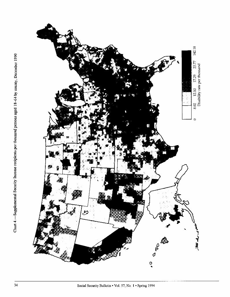
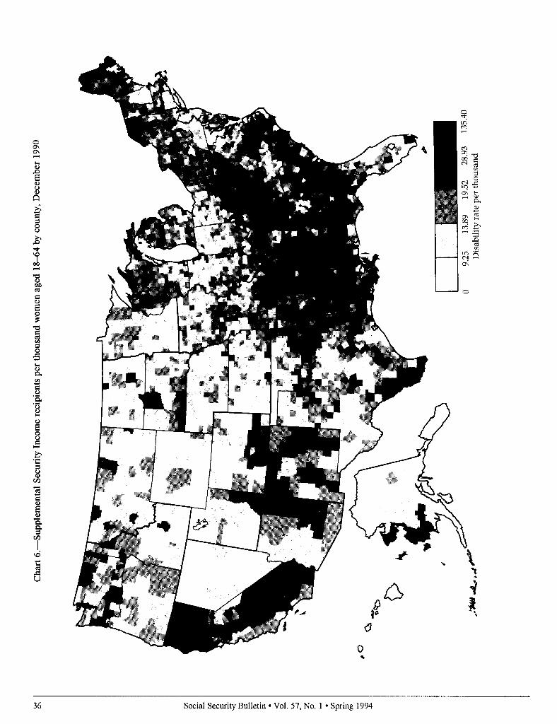
County distributions of the SSI dis- abled population are shown in charts 4- 6. Areas with the highest prevalence rates were located in the Mississippi Delta in counties adjacent to the Missis- sippi River in Arkansas, Louisiana, and in most of the counties of Mississippi; in scattered counties of Oklahoma; and the “Missouri Boot Heel.” Other high prevalence areas include the Kentucky, West Virginia, and southwestern coun- ties of Virginia in Appalachia; parts of Alabama and Georgia; and isolated counties in South and North Dakota including reservations for Native Ameri- cans. Other high prevalence areas are represented in the “Four Corners” re- gion of the Southwest for adjacent coun- ties of New Mexico, Arizona, Colorado, and Utah; in the far West by the Sacra- mento and San Joaquin Valley regions of California southward to Fresno; in isolated parts of the upper Great Lakes States; and in northern Maine and the coastal region of southwestern Alaska.
There are some interesting pattern differences between DI and SSI disabil- ity prevalence. The central valley area of California, for example, emerges as a region with high SSI prevalence but contrastingly low DI prevalence. A similar pattern was also observed for Alaska. In contrast, the disability belts of Appalachia and selected areas of the Eastern United States continue to have parallel patterns for both DI and SSI prevalence.
Federal Region Distributions
Quintile rank comparisons distrib- uted by Federal region for the DI pro- gram are shown in table 1. The Atlanta region outranked all others in the per- centage of counties with the highest
prevalence rates of DI beneficiaries. Almost half (46 percent) of this region’s counties were in the highest quintile for the overall DI caseload. In contrast, both the San Francisco and Denver regions had the largest proportions of counties ranked in the lowest quintile- 44 percent and 40 percent, respectively. Seattle was also among the lowest ranked regions of DI prevalence, with approximately a third of its counties ranked in the lowest quintile (36 per- cent).
There were also some interesting contrasts in the distributions by sex. The Atlanta region outranked all other regions in the percentage of counties with the highest prevalence rate for female recipients. About half (5 1 per- cent) of its counties were ranked in the highest quintile, compared with four in ten (41 percent) ranked in the high-est quintile for men. In sharp contrast, almost half (46 percent) of San Francisco’s counties were ranked in the lowest quintile for male beneficiaries, compared with about a third (33 per- cent) ranked in the lowest quintile for women. The Dallas region also had a striking contrast by gender with 42 percent of its counties ranked in the lowest quintile for women, compared with 17 percent for men.
Quintile rank distributions for the SSI disability program are shown in table 2. Paralleling the DI quintile dis- tributions, almost half (48 percent) of the Atlanta region’s counties were also ranked in the highest quintile of SSI disabled beneficiaries. The Atlanta region also has a large proportion of counties ranked in the highest quintile among female beneficiaries (50 per- cent), although the rate for men ranked in the highest quintile was somewhat lower (46 percent). In contrast, the region with the highest proportion of counties in the lowest quintile was Den- ver (49 percent), followed by Kansas City (33 percent), and Seattle (30 per- cent). There were no differences in geographic patterns by gender, except for the Boston region in which 24 per- cent of its counties were ranked in the lowest quintile for women, compared with 16 percent for men.
Discussion
Rates of disability are affected by both the size of the numerators used in the calculations (that is, active DI and SSI disability program recipients) and the size of the total population (that is, county population and the number of men and women aged 18-64). Sc\,cral things can determine the size and com- position of the active caseload in a local area. Among these, for example. are employment in hazardous or physicall\ demanding occupations, coun? concentration of extractive industries (such as mining), certain types of manu- facturing (such as food processing and meat packing), agricultural production. and local economic conditions (such as pervasive and chronic poverty). Factors that may also influence the size and composition of an area’s population at a given point in time include the in and out migration of certain groups (such as younger, more functionally able pcr- sons), and recent retirees, including persons nearing retirement age.
An equally important consideration is the overall stability of area disabilit! prevalence over time. Many areas of the United States have consistently mani- fested high rates of disability that corre- spond to areas representing long lasting “pockets of poverty” and chronic under- employment. The “Disability Belt” of the Eastern United States perhaps best illustrates a persistent lack of economic progress and development that has come
to characterize Appalachia and the Mis- sissippi Delta.
Furthermore, as noted earlier. there is a parallel distribution of Dl and SSI disability program prevalence rates in many parts of the country. This parallel structure is most immediately recogniz- able in the Atlanta region in lvhich 46 percent and 48 percent of its counties were ranked in the highest quintilc for DI and SSI disability, respectively. It is interesting to note that in this region there are large parts of the aforemen- tioned disability belt that includes the States of Kentucky, Mississippi, Ala- bama, and the Carolinas. In sharp contrast is the parallel distribution at the other end of the disability continuum of
-
Social Security Bulletin l Vol. 57, No. 1 l Spring 1994 29

very low prevalence rates typified by the Denver region with 49 percent of its counties in the lowest quintile of SSI disabled recipients and 40 percent in the lowest quintile of DI beneficiaries.
Further mapping applications and epidemiologic investigations could possibly uncover some of the probable correlates of disability. Carefully de- signed epidemiologic and comparative studies of residents of the high and low prevalence areas or studies of areas where there is a divergence of patterns between the programs could potentially prove very useful to further the understanding of the causal nexus of the impairment process, and the local contextual circumstances of the disabled population.
Rgferences
Davis, Miles, Russell Hudson; John McCoy; and Rudolph E. Schwartz. 199 1. “Statisti- cal Maps of Social Security in the U.S.A.” In Proceedings of the Graphics Section of the Amen’can Statistical Association,
Devine, Owen J.; Joseph L. Annest; Marilyn L. Kirk; Patricia Holmgreen, and Sandra S. Emrich. 1991. Injury Mortality Atlas of the United States, 1979-1987. U.S. Public Health Service, Atlanta.
Haber, Lawrence D. 1987. State Disability Prevalence Rates: An Ecological Analysis ofSocial and Economic Influence on Disability. National Institute on Disability and Rehabilitation. Washington, DC.
Hoover, Robert; Thomas J. Mason; Frank W. McKay; and Joseph F. Fraumeni. 1975. “Geographic Patterns of Cancer Mortality in the United States.” In Persons at High Risk of Cancer: An Approach to Cancer Etiology and Control. Academic Press, New York.
LaPIante, Mitchell P. 1988. Data on Disabil- @from the National Health Interview Survey, 1983-1985. National Institute on Disability and Rehabilitation Research, U.S. Department of Education Washing- ton, DC.
Mason, Thomas J.; J. F. Fraumeni; R. Hoover; and W. J. Blot. An Atlas ofMor- tality from Selected Diseases. 198 1. Na- tional Institutes of Health, U.S. Govem- ment Printing Office, Washington, DC.
Mason, Thomas J.; F. W. McKay, R. Hoover, W. J. Blot; and J. F. Fraumeni. 1975. Atlas of Cancer Mortalig$or U.S. Coun- ties: 19X-1969 (DHEW Publication No. NIH 75-780) National Institutes of Health, Bethesda, MD.
John L. McCoy and Kerry Weems. 1989. “Disabled-Worker Beneficiaries and Disabled SSI Recipients: A Profile of Demographic and Program Characteris- tics,” Social Security Bulletin, Vol. 52, No. 5 (May).
Schmulowitz, Jacob and Henry D. Lynn, 1966. Insured and Disabled Workers under the Social Secun’ty Disability Pro- gram: Charactetistics and Benefit Pay- ments, 1957-1963, Social SecurityAd- ministration (Research Report No. 1 I), U.S. Government Printing Office, Wash- ington, DC.
U.S. Department of Commerce, Bureau of the Census. 1990. Agricultural Atlas of the United States, 1987 Census of Agricultum, vol. Subject Series (Part 1). U.S. Govem- ment Printing Off&, Washington, DC.
U.S. Department of Health and Human Ser- vices. 1989. Task I: Population Profile of Disability, Office of the Assistance Secre- tary for Planning and Evaluation, Wash- ington, DC. October
30 Social Security Bulletin l Vol. 57, No. 1 l Spring 1994

Cha
rt l.-
Disa
bility
In
sura
nce
bene
ficia
ries
per
thou
sand
pe
rson
s ag
ed 1
8-64
by
cou
nty,
Dec
embe
r 19
90
0 13
.64
17.5
3 21
.78
27.3
5 10
2.80
D
isab
ility
rate
per
tho
usan
d

32 Social Security Bulletin l Vol. 57, No. 1 l Spring 1994

.
Social Security Bulletin l Vol. 57, No. 1 l Spring 1994
Cha
rt 4.
-Sup
plem
enta
l Se
curit
y In
com
e re
cipie
nts
per
thou
sand
pe
rson
s ag
ed 1
84i4
by
cou
nty,
D
ecem
ber
1990
0 8.
02
12.1
0 17
.29
25.7
7 14
2.18
Dis
abilit
y ra
te
per
thou
sand

Cha
rt 5.
-Sup
plem
enta
l Se
curit
y In
com
e re
.cip
icnt
s pe
r th
ousa
nd
men
age
d 18
-64
by c
ount
y,
Dec
embe
r 19
90
0 6.
80
10.6
7 15
.26
22.7
1 14
8.74
D
isab
ility
rate
pe
r th
ousa
nd
36 Social Security Bulletin l Vol. 57, No. 1 l Spring 1994