goodman, a (2013) walking, cycling and driving to work in
TRANSCRIPT

Goodman, A (2013) Walking, cycling and driving to work in the en-glish and welsh 2011 census: trends, socio-economic patterning andrelevance to travel behaviour in general. PLoS One, 8 (8). e71790.ISSN 1932-6203 DOI: 10.1371/journal.pone.0071790
Downloaded from: http://researchonline.lshtm.ac.uk/1179130/
DOI: 10.1371/journal.pone.0071790
Usage Guidelines
Please refer to usage guidelines at http://researchonline.lshtm.ac.uk/policies.html or alterna-tively contact [email protected].
Available under license: http://creativecommons.org/licenses/by/2.5/

Walking, Cycling and Driving to Work in the English andWelsh 2011 Census: Trends, Socio-Economic Patterningand Relevance to Travel Behaviour in GeneralAnna Goodman*
Faculty of Epidemiology and Population Health, London School of Hygiene and Tropical Medicine, Keppel Street, London, United Kingdom
Abstract
Objectives: Increasing walking and cycling, and reducing motorised transport, are health and environmental priorities. Thispaper examines levels and trends in the use of different commute modes in England and Wales, both overall and withrespect to small-area deprivation. It also investigates whether commute modal share can serve as a proxy for travelbehaviour more generally.
Methods: 23.7 million adult commuters reported their usual main mode of travelling to work in the 2011 census in Englandand Wales; similar data were available for 1971–2001. Indices of Multiple Deprivation were used to characterise socio-economic patterning. The National Travel Survey (2002–2010) was used to examine correlations between commute modalshare and modal share of total travel time. These correlations were calculated across 150 non-overlapping populationsdefined by region, year band and income.
Results: Among commuters in 2011, 67.1% used private motorised transport as their usual main commute mode (21.8percentage-point change since 2001); 17.8% used public transport (+1.8% change); 10.9% walked (20.1% change); and3.1% cycled (+0.1% change). Walking and, to a marginal extent, cycling were more common among those from deprivedareas, but these gradients had flattened over the previous decade to the point of having essentially disappeared for cycling.In the National Travel Survey, commute modal share and total modal share were reasonably highly correlated for privatemotorised transport (r = 0.94), public transport (r = 0.96), walking (r = 0.88 excluding London) and cycling (r = 0.77).
Conclusions: England and Wales remain car-dependent, but the trends are slightly more encouraging. Unlike many healthbehaviours, it is more common for socio-economically disadvantaged groups to commute using physically active modes.This association is, however, weakening and may soon reverse for cycling. At a population level, commute modal shareprovides a reasonable proxy for broader travel patterns, enhancing the value of the census in characterising backgroundtrends and evaluating interventions.
Citation: Goodman A (2013) Walking, Cycling and Driving to Work in the English and Welsh 2011 Census: Trends, Socio-Economic Patterning and Relevance toTravel Behaviour in General. PLoS ONE 8(8): e71790. doi:10.1371/journal.pone.0071790
Editor: Harry Zhang, Old Dominion University, United States of America
Received February 12, 2013; Accepted July 4, 2013; Published August 21, 2013
Copyright: � 2013 Anna Goodman. This is an open-access article distributed under the terms of the Creative Commons Attribution License, which permitsunrestricted use, distribution, and reproduction in any medium, provided the original author and source are credited.
Funding: AG is funded by a National Institute of Health Research (NIHR) post-doctoral fellowship. The funders had no role in study design, data collection andanalysis, decision to publish, or preparation of the manuscript. The views and opinions expressed in this article are those of the author and do not necessarilyreflect those of the NIHR, the Department of Health or the NHS.
Competing Interests: The author has declared that no competing interests exist.
* E-mail: [email protected]
Introduction
In recent years, promoting walking and cycling for transport
(‘active travel’) has moved up multiple policy agendas, including in
relation to health, transport and climate change. Active travel
provides one route whereby people can integrate moderate-to-
vigorous intensity physical activity into their everyday lives [1–3],
and participating in active travel is independently associated with a
wide range of health benefits [4–7]. Active travel is also more likely
than recreational physical activity to displace journeys by cars [8],
which in turn is expected to reduce noise, congestion, road traffic
crashes, urban air pollution and the emission of greenhouse gases
[9–11].
Despite these potential benefits, levels of walking and cycling
declined in the second half of the twentieth century in Britain,
while motorised transport increased [12]. The past two decades
have, however, seen some hints that these trends may be at least
partially reversing. The UK is one of various high-income
countries in which levels of car use have flattened or slightly
declined, as have the proportion of adults holding a driving licence
[13–15]. Simultaneously, much greater policy focus has been given
to promoting and investing in active travel, often particularly in
relation to cycling [3,16–21]. In London, successive Mayors have
launched initiatives both to encourage cycling (e.g. a bicycle
sharing system) and to discourage driving (e.g. the introduction of
a ‘congestion charge’ for cars entering central London). Nation-
ally, initiatives have included the publication of an Active Travel
Bill in Wales and an Active Travel Strategy for the UK [19,21];
the allocation of £1 billion to local sustainable transport initiatives;
and the implementation of town-wide initiatives in 18 ‘cycling
PLOS ONE | www.plosone.org 1 August 2013 | Volume 8 | Issue 8 | e71790

towns’ [22]. Such interventions may explain the upward trend in
cycling reported in London [23] and in the original six cycling
towns [22]. The first aim of this paper is to contextualise these
setting-specific findings using newly-released census 2011 data.
Specifically, I aim to examine national and regional levels and
trends of walking, cycling and driving to work in England and
Wales.
A second aim is to examine changes in the distribution of these
different commute modes with respect to small-area deprivation.
In 2010, the Strategic Review of Health Inequalities in England
called for research to monitor the social gradient of active travel
[24]. This call was prompted by data in the original six ‘cycling
towns’ indicating that higher social grade was associated with a
higher probability of reporting any past-week cycling [22].
Similarly in London, higher household income is positively
associated with making at least one trip by bicycle on any given
day [25], while higher area affluence is positively associated with
using the bicycle sharing system [26]. In a previous analysis of
census data from 1971–2001, individuals from lower social classes
were more likely to walk or cycle to work but this effect became
less strong over time [27]. This paper examines whether this trend
has continued, and therefore whether changes in commuting
patterns might tend towards widening health inequalities.
The final aim of this paper is methodological. The UK census is
publically available and provides a uniquely large and represen-
tative source of information, with very high geographical
resolution. It therefore provides one potentially powerful means
of examining trends in travel behaviour and/or evaluating the
impact of interventions, particularly those made at a sub-regional
or local level. The census is, however, severely limited in including
only one question on travel behaviour, namely ‘usual main
commute mode’. By contrast, most research studies and policy
evaluations are more interested in total travel behaviour. The
value of the census data therefore depends considerably on how far
it can be used as a proxy for total travel behaviour, at least at the
population level. This paper uses National Travel Survey data to
examine this issue, as well as to contextualise the census data in
other ways.
Methods
Census Data on main Commute Mode in England andWalesThe British census happens every ten years and is compulsory
for all residents. In England and Wales, the estimated proportion
of people covered by the census was 96% in 1991, 94% in 2001
and 94% in 2011 [28,29] This paper takes the 2011 census as its
starting point (data available from www.ons.gov.uk/ons/guide-
method/census/2011/index.html) and makes comparisons with
previous censuses (data available from http://casweb.mimas.ac.
uk). Ethical approval was not required as all data are fully in the
public domain.
For all respondents aged 16–74 with a current job, the 2001 and
2011 census data includes responses to the question ‘‘How do you
usually travel to work? (Tick one box only, tick the box for the
longest part, by distance, of your usual journey to work)’’. This
data is also available for a 10% random sample of the 1971, 1981
and 1991 censuses (see File S1 for details of minor differences in
the 1971 and 1981 response options). I categorised responses into
five commute modes: cycling; walking; public transport; private
motorised transport (car, van or motorcycle, as a driver or
passenger); and other modes. I calculated the modal share of each
of these modes as a proportion of all commuters, i.e. excluding
people not in work or people working at or from home. All adults
reporting that their home address was also their place of work
were treated as non-commuters. Note that this final decision was
necessary to allow comparable analyses across the censuses, but
differs from some previous stand-alone analyses of census 2011
data ([30], see File S1 for details).
Small-area Deprivation, Adjusting for GeographicalRemotenessThe 2010 English Index of Multiple Deprivation (IMD) [31] is a
weighted composite of small-area data relating to seven depriva-
tion domains, assigned at the level of lower super output areas
(LSOA, average population around 1500). There is also a 2011
Welsh IMD [32], but differences in the constituent domains and
variables mean that the two scores are not directly comparable. I
therefore created hundredths of deprivation separately in England
and Wales and combined these into a single variable capturing
each LSOA’s ranking within its country.
The standard IMD score includes a small number of indicators
capturing distance to services (e.g. distance to the nearest post
office). This complicates interpretations of associations with
commute mode, since these indicators may serve as a straightfor-
ward proxy for average commute distance. I therefore created an
‘IMD-minus-distance to services’ score, employing an approach
that has been used elsewhere to remove particular domains from
the overall score [33,34] (see File S1 for details). All substantive
findings were unchanged in sensitivity analyses which used only
the income deprivation domain.
To adjust for geographical remoteness in the equity analyses, I
used rankings on the IMD ‘distance to services’ subdomain. I also
used the 2004 Rural and Urban Area Classification [35] to assign
settlement type (three-level categorical variable: urban area with a
population .10,000; smaller towns and fringe areas; and villages,
hamlets and isolated dwellings); and to assign sparseness (binary
variable denoting whether the LSOA was in the bottom 5% for
population density in the surrounding 30 km).
The National Travel SurveyThe National Travel Survey is a continuous, population-based
survey of households in Britain (annual sample size around 8100
households in recent years, household participation rate around
60% [36]). This paper uses National Travel Survey data for fully-
participating adults (aged 16 years or over) from 2002 to 2010
(available from http://www.esds.ac.uk). All members of partici-
pating households complete questionnaires, which cover the usual
main commute mode for all working participants. These
questionnaires are also used to create fifths of real household
income equivalised for household composition [37]. All partici-
pants additionally complete one-week travel diaries that include
the time taken and distance travelled for all stages of most trips.
Motor vehicle trips off the road network are excluded (e.g. on
private land), as are walking and cycling trips where the surface is
unpaved or access is restricted (e.g. on private land, across open
countryside or in a park that is closed at night) [38].
I first used data from trip stages in the National Travel Survey
to examine what proportion of total travel time in each mode was
captured directly by the question on ‘main mode to work’. For
example, I calculated what proportion of the total time spent
cycling by adults was accounted for by commute trips made by
individuals who reported cycling as their usual main mode. I then
created 150 non-overlapping subpopulations within the National
Travel Survey based on 10 regions (9 standard English regions
plus Wales), three time periods (2002–2004, 2005–2007 and
2008–2010) and the five income fifths (10*3*5= 150). For each
subpopulation, I calculated the proportion of participants report-
Travel to Work in the 2011 Census
PLOS ONE | www.plosone.org 2 August 2013 | Volume 8 | Issue 8 | e71790

ing each mode as their usual main method of travelling to work
(‘commute modal share’). I also used data from trip stages to
calculate the proportion of total travel time spent in each mode
(‘total modal share’). This allowed me to examine how far the
commuting data available in the census predicted the more
general outcome of ‘total travel’.
Statistical AnalysesMost analyses rely on the presentation of raw percentages (plus
binomial proportion confidence intervals) or raw Pearson corre-
lation coefficients. When analysing the National Travel Survey
data, I calculated commute modal share and total modal share for
each subpopulation using the household-, individual- and trip-level
weights provided. These weights adjust for factors such as
differential non-response rates by age, sex and region, and for
the fact that participants only reported short walks (,1 mile) on
the final day [36]. I then present raw correlation coefficients
between commute and total modal share for these 150 subpop-
ulations. The results were very similar if each subpopulation was
weighted for its population size (mean 830 commuting adults,
range 231–1765).
For the equity analyses using census data, I fitted linear
regression models with commute modal share as the outcome (e.g.
proportion commuting by bicycle) and with twentieth of small-
area deprivation as the main predictor variable. LSOAs were the
unit of analysis, and I accounted for spatial autocorrelation by
fitting two-level random intercept models of LSOAs nested within
local authorities (equation in File S1). I adjusted these models for
settlement type, sparseness and IMD ‘distance to services’ rank,
entering the former two as categorical variables and the latter one
using linear plus quadratic terms. I used Stata 12 for all statistical
analyses, and used ArcGIS 10.1 to create maps.
Results
National Levels and Trends in the 2011 Census41.1 million adults aged 16–74 took part in the 2011 English
and Welsh census, of whom 14.6 were not in employment, 2.8
million worked at or from home, and 23.7 million commuted to
work. Table 1 presents the distribution of their usual main
commute modes, while Figure 1 compares these to the previous
four censuses. Commute modal share was dominated by private
motorised transport: cars, vans or motorcycles represented the
usual main mode of 67.1% of commuters (66.4% in England,
79.4% in Wales). This was followed by public transport (17.8%)
and walking (10.9%), and finally by cycling (3.1%) and ‘other’
modes (1.1%).
Although most commuters still reported using private motorised
transport, the trends suggested that this mode might be reaching
saturation and perhaps starting to decline. In England, the decade
between 2001 and 2011 saw a modest decrease in private
motorised transport (21.9 percentage points) and a concomitant
increase in public transport (+1.9%, with this effect being driven
by an increase in train commuting: see Table 1). Although these
changes are relatively small in absolute terms, they acquire some
additional importance when considered in light of the longer-term
trends in the opposite directions (Figure 1). In this context, even
the marginal changes in walking (20.07%) and cycling (+0.09%)
are somewhat encouraging when compared to the comparatively
large declines in previous decades. As for Wales, it differed from
England in that private motorised transport continued to increase
and walking showed a more marked decrease. These changes
occurred at a slower rate than in previous decades, however,
suggesting that in future years these trends may stabilise or even
reverse in Wales (as already appears the case for public transport).
Finally, it is worth noting that decreases in private motorised
transport were largely or entirely confined to commuting as a car/
van passenger or by motorcycle (Table 1). Driving oneself to work
by car or van (which accounted for the vast majority of private
motorised transport) showed only a very small decrease in England
(20.3%) and a notable increase in Wales (+3.6%). This suggests
that changes in the proportion of commuters putting cars on the
road (and therefore contributing to congestion, air pollution and
road traffic crashes) have been less favourable than the changes in
overall private motorised commuting presented in Figure 1.
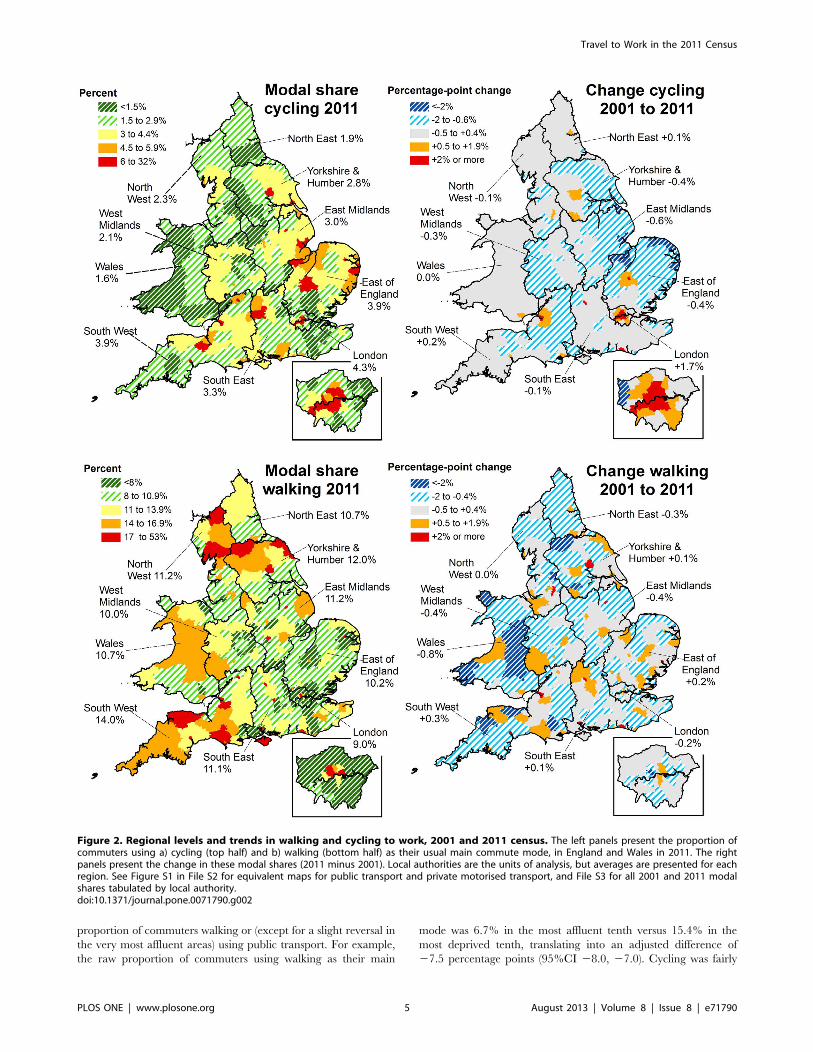
Regional Levels and Trends in the 2011 CensusFigure 2 shows how these overall levels and trends in cycling
and walking to work varied across England and Wales, and also
which areas showed the greatest increases relative to 2001. For
cycling, London stood out as the only region to have experienced a
marked increase (+1.7%, versus 20.6% to +0.2% in all other
regions), an increase largely concentrated in inner London. This
led London to overtake the East of England as the region with the
highest cycle commute modal share. For walking there was less
variation at the regional level, both in absolute walking levels and
in the change since 2001. At a local level, the highest levels of
walking and cycling (both 60%) were in the only two local
authorities with a commuting population under 5000 (the Isles of
Scilly and the City of London). Apart from these, the local
authorities with the highest levels of cycling were the university
towns of Cambridge (32.6%, 4.2 percentage point increase from
2001) and Oxford (19.1%, 2.8% increase) and the London
borough of Hackney (15.4%, 8.5% increase). Bristol also stood out
alongside London as a large city (population 430,000) which had
substantially increased its modal share (8.2%, 3.3% increase from
2001). The local authorities with the highest levels of walking were
the small, historic cities of Norwich (24.8%, 0.5% increase from
2001) and Exeter (24.1%, 3.8% increase).
Equivalent maps for travel by private motorised transport and
public transport are presented in Figure S1 in File S2, while File
S3 tabulates all 2001 and 2011 commute modal shares for all local
authorities. At a regional level, London was an outlier, with much
higher levels of commuting by public transport than other regions
(53%, vs. 7–14% elsewhere) and much lower levels of private
motorised transport (32%, vs. 71–79% elsewhere). This difference
was more pronounced in 2011 than a decade previously, reflecting
the fact that London had showed the largest regional increases in
public transport commuting since 2001 (+7.3%) and the largest
decreases in private motorised transport (28.8%). Yet while these
changes were largest in London, the other southern regions also
showed increases in public transport (+0.2 to +2.0%) and decreases
in private motorised transport (20.6 to 21.9%). By contrast the
opposite was generally true in the Midlands, Wales and the North
of England. At the local authority level, the highest levels of
commuting by private motorised transport were all in rural areas,
with the highest proportion in East Dorset (88.5%, 0.8% increase
since 2001).
Equity Analyses: Socio-economic Distribution ofCommute ModesAcross the entire gradient for small-area deprivation, greater
affluence was associated with a higher proportion of commuters
using cars, vans or motorcycles as their main mode (see Figure S2
in File S4 for raw data, see the left panel of Figure 3 for multi-level
models adjusting for geographical remoteness). Simultaneously,
greater affluence was progressively associated with a lower
Travel to Work in the 2011 Census
PLOS ONE | www.plosone.org 3 August 2013 | Volume 8 | Issue 8 | e71790

Figure 1. National levels and trends in usual main commute modes across the English andWelsh censuses 1971–2011. Data tabulatedin Table S1 in File S2, along with subcategories of motorised modes and 95% confidence intervals. Confidence intervals are not presented here asthey are too narrow to be visible.doi:10.1371/journal.pone.0071790.g001
Table 1. Modal share of usual main commute modes among commuters in the 2011 English and Welsh censuses, and changesince 2011.
England (N=22,484,295) Wales (N=1,213,283) England & Wales (N=23,697,578)
Modal share2011
Change since2001
Modal share2011
Change since2001
Modal share2011
Change since2001
Cycling 3.20% 0.09% 1.57% 0.04% 3.11% 0.08%
Walking 10.93% 20.07% 10.66% 20.80% 10.91% 20.11%
Public transport 18.33% 1.92% 7.32% 0.07% 17.77% 1.82%
Bus 8.17% 20.10% 5.05% 20.77% 8.01% 20.14%
Train or underground 10.16% 2.02% 2.27% 0.84% 9.76% 1.95%
Car, van or motorcycle 66.46% 21.94% 79.43% 0.82% 67.13% 21.78%
Car or van driver 60.11% 20.34% 71.41% 3.58% 60.69% 20.13%
Car or van passenger 5.46% 21.26% 7.41% 22.54% 5.56% 21.32%
Motorcycle 0.89% 20.33% 0.61% 20.22% 0.87% 20.33%
Taxi or other 1.08% 0.00% 1.02% 20.14% 1.08% 20.01%
See Table S1 in File S2 for confidence intervals and for modal share tabulated since 1971. All changes between 2001 and 2011 are significant (all p,0.05, almost allp,0.001) except the change in ‘taxi or other’ commuting in England.doi:10.1371/journal.pone.0071790.t001
Travel to Work in the 2011 Census
PLOS ONE | www.plosone.org 4 August 2013 | Volume 8 | Issue 8 | e71790
proportion of commuters walking or (except for a slight reversal in
the very most affluent areas) using public transport. For example,
the raw proportion of commuters using walking as their main
mode was 6.7% in the most affluent tenth versus 15.4% in the
most deprived tenth, translating into an adjusted difference of
27.5 percentage points (95%CI 28.0, 27.0). Cycling was fairly
Figure 2. Regional levels and trends in walking and cycling to work, 2001 and 2011 census. The left panels present the proportion ofcommuters using a) cycling (top half) and b) walking (bottom half) as their usual main commute mode, in England and Wales in 2011. The rightpanels present the change in these modal shares (2011 minus 2001). Local authorities are the units of analysis, but averages are presented for eachregion. See Figure S1 in File S2 for equivalent maps for public transport and private motorised transport, and File S3 for all 2001 and 2011 modalshares tabulated by local authority.doi:10.1371/journal.pone.0071790.g002
Travel to Work in the 2011 Census
PLOS ONE | www.plosone.org 5 August 2013 | Volume 8 | Issue 8 | e71790

equal across the socio-economic gradient but was also slightly
more common in deprived areas, with an adjusted difference of
20.60% (95%CI 20.77, 20.44) between the most affluent versus
the most deprived tenth. Very similar patterns of commute modal
share were seen across fifths of household income in the National
Travel Survey in 2008–2010, the only notable exception being a
more marked increase in public transport commuting among the
most affluent income fifth (see Figure S2 in File S4). This broad
similarity suggests that the associations observed in the census with
respect to small-area deprivation may also apply with respect to
individual-level measures of socio-economic position.
Although greater affluence predicted lower walking, public
transport use and cycling in the 2011 census, this was less true than
it had been a decade earlier. As shown in the right-hand panel of
Figure 3, increasing affluence progressively predicted an increase
in these three modes between 2001 and 2011, and a decrease in
private motorised transport. These findings were unchanged when
using earlier IMD versions, all of which were highly correlated
(e.g. r = 0.98 between the 2004 and 2010 versions).
The pattern of findings was very similar when analysing
England and Wales separately, and these gradients were also
generally apparent within local authorities. For example, the
average within-local-authority association between commute
mode and affluence was significantly positive for private motorised
transport, significantly negative for walking and public transport,
and marginally-significantly negative for cycling (see Table S2 in
File S4). For cycling, however, Cambridge, Oxford and Hackney
were notable exceptions and showed strong positive associations
between greater affluence and greater cycle commuting (see
Figure 4). Similarly, Greater London was the only region of
England or Wales where the average within-local-authority
gradient was significantly positive, and there was also a modest
positive gradient in Bristol (the largest city to have experienced a
substantial cycling increase). Thus not only had the negative socio-
economic gradient for cycling flattened over time, but it was
inverted in England’s highest-cycling areas and in its highest-
cycling region.
Setting the Census Findings in Context: Data from theNational Travel SurveyThus far, this paper has made comparisons across years, across
regions and across socio-economic groups with respect to the only
travel data available in the census, namely usual main mode for
commuting to work. This final section uses National Travel Survey
data to examine how these findings can be expected to reflect
differences in travel behaviour more widely. A useful starting point
is to consider what proportion of total travel time in each mode is
directly captured by the census. Among adult participants in
2008–2010, 31% of all cycling time was reported during commute
trips by individuals who stated that cycling was their ‘usual main
commute mode’. A further 10% of all cycling time was reported
during commute trips made by adults who gave a different usual
main mode, i.e. capturing people who used cycling as part of a
multi-modal trip or who cycled only occasionally. The remaining
59% of all cycling time was reported during non-commute trips
(this includes any cycling by adults not in employment).
The cycling picked up by the census question therefore
corresponds to around a third of total adult cycling time. This
proportion was similar for public transport (30% vs. 4% during
other commute trips and 66% during non-commute trips), but was
lower for car use (20% vs. 2% and 78%) and very low for walking
(6% vs. 8% and 86%). Indeed, slightly less time was reported
walking in commute trips where walking was the usual main mode
than was reported during other commute trips (6% vs. 8%). Two-
thirds of this ‘other commute’ walking were accounted for by
multimodal public transport trips. Both here and for the analyses
reported below, these findings were very similar when using travel
distance instead of time.
Although capturing only a minority of total travel time, the
census question served as a reasonably good proxy measure for
total modal share at the population level. This is indicated in
Figure 3. Associations between small-area deprivation and levels and trends in commute mode, 2001 and 2011 censuses. The leftpanel presents associations with main commute mode in 2011 (England and Wales combined), the right panel presents associations with change inusual main commure mode (2011 minus 2001). Analyses are from eight separate multi-level linear regression models, adjusting for three measures ofgeographical remoteness and using Lower Super Output Areas as the unit of analysis (population around 1500). Deprivation is measured in country-specific twentieths.doi:10.1371/journal.pone.0071790.g003
Travel to Work in the 2011 Census
PLOS ONE | www.plosone.org 6 August 2013 | Volume 8 | Issue 8 | e71790

Figure 5, which presents correlation coefficients of 0.77–0.96
between the commute modal share and the proportion of total
travel time spent in that mode. These correspond to R2 values of
0.59–0.92, i.e. across these 150 populations commute modal share
explained between 59% and 92% of the variance in total modal
share. Visual inspection indicated that populations defined by
region, year band or income all seemed to share broadly the same
distribution (see Figures S3 and S4 in File S5). The only major
exception was that high levels of public transport meant that total
walking levels were higher than expected in London, hence the
decision to highlight correlation coefficients excluding London in
Figure 5.
Interestingly, over the observed range of commute modal shares
for public transport and car use, the line of best fit of the scatter
graphs in Figure 5 was reasonably similar to the line of identity (i.e.
intercept zero, gradient one: see Table S3 in File S5 for equations
for lines of best fit). In other words, if 20% of a population used
public transport as their usual main commute mode, that
population also spent approximately 20% of its total travel time
in public transport. By contrast, for cycling and walking the lines of
best fit differed more markedly from the line of identity. Instead a
given commute modal share predicted a smaller share of total
travel time for cycling and a larger share for walking.
Relative versus Absolute Measures of Travel TimeIt is important to remember that the findings presented in the
previous section all relate to modal share, i.e. the relative
proportion of travel by different modes. A final contribution of
National Travel Survey data is to caution that such relative
differences do not necessarily correspond to equivalent absolute
differences, because populations may differ in their absolute trip
rates or travel time. This is not a major issue for the regional and
temporal comparisons because average daily travel times showed
relatively little variation across regions (e.g. ranging from 55–
65 min across all regions in 2008–2010, except in London where it
is up to 69 min) or over time (e.g. ranging from 64 min in 2002–
2004 to 62 min in 2008–2010). It is, however, very important for
the socio-economic comparisons because total travel time showed
a strong dose-response association with income. For example, total
daily travel time ranged from an average of 51 min/day among
adults living in the lowest income fifth in 2008–2010 to 59 min/
day in the middle fifth and 77 min/day in the highest fifth.
As a result, although the proportion of active travel time was
greatest in low income groups (24%, 18% and 15% among the
lowest, middle and highest fifths), absolute active travel time
showed much less difference (15 min/day, 12 min/day and
13 min/day among the lowest, middle and highest fifths: see
Table S4 in File S5 for analyses treating walking and cycling
separately). Conversely, the association between high income and
percentage travel time in private motorised modes became even
larger when converted into absolute travel times (50%, 67% and
70% for the proportion of travel time among the lowest, middle
and highest fifths; 25 min, 39 min and 53 min for absolute daily
travel time). A similar point can be made in relation to the 2011
census. Although this paper always uses ‘all commuters’ as a
denominator, one could instead use ‘total adult population’ if one
wanted to focus on absolute volumes of commuting travel. Given
that the proportion of adults in employment was higher in more
affluent areas (e.g. 70% vs. 54% in the most vs. least affluent fifth),
Figure 4. Association between cycle modal share in each local authority and the within-local-authority relationship betweenaffluence and cycle commuting. The x-axis presents the cycle modal share in each local authority in the 2011 census (England and Walescombined). The y-axis presents regression coefficients capturing the percentage increase in commute modal share within that local authority (2011minus 2001) for each percentile increase in affluence, adjusting for three measures of geographical remoteness. These regression analyses wereconducted for each local authority separately (N = 346), using Lower Super Output Areas as the unit of analysis (population around 1500). Two verysmall local authorities (N,5000 commuters) were excluded.doi:10.1371/journal.pone.0071790.g004
Travel to Work in the 2011 Census
PLOS ONE | www.plosone.org 7 August 2013 | Volume 8 | Issue 8 | e71790

using this alternative denominator would attenuate the socio-
economic gradient in active commute modes and strengthen the
gradient in private motorised transport.
Discussion
The 2011 census indicates that private motorised transport
continues to dominate commuting in England and Wales,
representing 67% of usual main commute modes. This contrasts
with modal shares of 18% for public transport, 11% for walking,
and 3% for cycling. Somewhat more encouragingly, the long-term
increase in private motorised commuting has halted across
England and Wales as a whole (and even shown a small decline),
while public transport, walking and cycling have risen or remained
relatively stable for the first time in decades. With respect to socio-
economic position, higher affluence continues to predict a lower
commute modal share of walking and, to a marginal extent,
cycling. Nevertheless these negative gradients have flattened over
time and the gradient for cycling is reversed in the highest cycling
locations. Because affluent individuals travel more in total, these
socio-economic associations with commute modal share cannot be
assumed to correspond directly to associations with absolute travel
times or distances. Nevertheless, commute modal share does
generally appear to be a reasonably good proxy measure (at the
population level) for the relative proportion of travel time spent in
different modes.
Strengths and LimitationsIn interpreting these findings, it is important to consider this
paper’s strengths and limitations. A key strength is the integration
of data from complementary sources. The census represents a
national sample with a uniquely high response rate, and therefore
maximises power and generalisability. By contrast, alternative data
sources such as the National Travel Survey or London Travel
Demand Surveys have smaller sample sizes (18,000–19,000
individuals in 2009/10) and more potential for participation bias
(response rates 52–60%) [36,39]. These other datasets do provide
much richer travel information, however, hence my use of
Figure 5. Associations between commute modal share and total modal share, National Travel Surveys 2002–2010. These panelspresent raw associations between commute modal share (based on usual main commute mode) and modal share of total travel time in 150 non-overlapping populations. These populations were defined by region, year band and income fifth, using data from the National Travel Surveys 2002–2010.doi:10.1371/journal.pone.0071790.g005
Travel to Work in the 2011 Census
PLOS ONE | www.plosone.org 8 August 2013 | Volume 8 | Issue 8 | e71790

National Travel Survey data to contextualise and partially
overcome some of the census’s limitations.
The greatest limitation of the census is that it only covers travel
for commuting and only covers the ‘usual main mode of travel’ for
these commute trips. As I demonstrate using National Travel
Survey data, this only captures a minority of total travel time (6–
31%, depending on mode). Even when considering only commute
journeys, the census question captures less than half of all
commute walking time and only three-quarters of all commute
cycling time. Although I demonstrate that commute modal share
generally provides a reasonable proxy for total modal share, this
may not be true in settings with distinctive transport characteristics
(e.g. a high density of park-and-ride facilities, and therefore many
multi-modal commute journeys).
Another limitation is that the British census is only conducted
every ten years, and therefore cannot be used to examine the
precise timing of changes in commuting patterns. In addition, the
census 2011 data is currently only available at the small-area level,
meaning I could only present equity analyses with respect to area
deprivation. Reassuringly, this showed a broadly similar pattern to
individual-level analyses of income in the National Travel Survey.
Nevertheless, other socio-economic indicators may show different
patterns of association [40], and multiple indicators may be
needed to characterise fully the socio-economic structure of
commuting [41]. It would therefore be valuable to complement
the equity analyses presented here with an examination of
individual socio-economic and demographic predictors of com-
mute modal share, once samples of individual anonymised records
are released. In addition, individual-level analyses could build
upon this paper by examining who is changing their travel
behaviour, for example whether middle-aged men show the largest
increases in cycling, as suggested by previous national surveys
[27,42]. Future analyses could also explore associations with
geographic factors such as hilliness, climate and land use patterns;
although outside the scope of this paper, these may play a key role
in explaining local and regional variation [43].
Implications of Levels and Trends in Different CommuteModesThis paper adds to the evidence that, after increasing for
decades, levels of car use in England and Wales may now
flattening or declining [13–15]. If so, this suggests that forecasts by
the Department for Transport may overestimate future demand
for car travel by assuming that this demand will continue to
increase [14]. This finding also offers some hope for the prospect
of creating a more physically active and less environmentally
polluting transport system. Nevertheless, the 2011 census under-
lines the scale of the challenge faced in achieving this, with two-
thirds of the working population currently using cars, vans or
motorcycles as their usual main commute mode.
An equivalently mixed picture is offered with respect to cycling
levels. On the one hand, even the very small national increase in
cycling is something to celebrate when compared to previous
decades of decline. London in particular stands out as a region that
has achieved an impressive increase in its cycle commute modal
share over the past decade. Nevertheless cycling continues to be
very rare in most parts of England and Wales, and so is not
realising its potential to confer substantial health and environ-
mental benefits [44,45]. Among other things, this suggests that the
examination of relative inequalities in this and other reports should
not distract from the fact that cycling is (too) rare (and driving (too)
common) in all socio-economic groups. Similarly, although cycling
often gets more attention from policy-makers and academics, these
census data serve as a reminder that walking is a far more common
source of active commuting. This is particularly the case given the
evidence in this and previous [46] reports indicating the large
volume of walking accumulated during multimodal public
transport trips.
Implications of the Socio-economic Patterning ofDifferent ModesThis paper confirms previous research indicating that motorised
transport (and associated carbon emissions) are higher among
socio-economically advantaged groups [47–49]. This may be
relevant when considering the best policy options to shift to a low-
carbon transport economy. For example, it might be that fuel or
parking charges would have to rise considerably to have a
substantial effect upon travel demand in these more affluent
groups [47], and that effective and equitable policies would also
need to include other measures (e.g. increasing the supply of
attractive alternative commute options) [49].
By contrast, the modal share for active commuting was lower in
more affluent areas, thereby contrasting with many other health
behaviours such as smoking, poor diet or leisure-time physical
activity [40,50–52]. This at first seems at odds with the concern
raised in the recent Strategic Review of Health Inequalities in
England that differential participation in active travel might tend
to widen health inequalities [24]. One reason for this difference is
that the Strategic Review focussed on cycling, which showed a
much flatter socio-economic gradient in the census. This therefore
again highlights the importance of considering walking when
looking at population-level sources of active travel, and particu-
larly when considering more deprived areas [53]. Secondly, some
previous studies have considered recreational as well as transport
walking and cycling [22,26]; these two may have different
correlates, with the former being more likely to show a positive
association with affluence [40]. Thirdly, some previous evaluations
have focussed on locations like Cambridge (e.g. [41]), which this
paper shows to be atypical in having a higher cycle modal share
among people from more affluent areas.
A final, key factor is that the focus in this paper has been the
relative measure of ‘modal share’, whereas previous studies have
examined absolute measures such as ‘total travel time’ or ‘any
participation’ [22,25,26]. As demonstrated in this paper, these two
approaches may generate qualitatively different associations with
socio-economic position, and research in this field therefore needs
to distinguish clearly between travel modal share and total travel
volume. A focus on modal shares is likely to be more meaningful
for some research questions, for example when evaluating the
impacts of interventions targeting modal choice. From a broader
perspective, however, it is important not to lose sight of socio-
economic differences in total travel time. Ignoring these differences
may risk overstating the physical activity benefits accruing to the
poor or understating the harms generated by motorised transport
among the rich.
Creating an equitable transport system therefore needs to focus
not only on equalising access to different modes, but also on
equalising access to the potential for travel in general [49]. This is
arguably particularly important given that the 2011 census
suggests a continuation of the trend for the modal shares of
walking and cycling to increase more rapidly among socio-
economically advantaged groups [27]. Moreover, those areas that
have successfully attained or maintained a high cycling modal
share are also precisely the areas where cycling is most
concentrated among the affluent. These two findings suggest that
in the future cycling may become increasingly concentrated
among more affluent groups, both in terms of modal share and, to
an even greater extent, in terms of time spent cycling. To the
Travel to Work in the 2011 Census
PLOS ONE | www.plosone.org 9 August 2013 | Volume 8 | Issue 8 | e71790
extent that transport policies accelerate or diffuse these and other
trends outlined in this paper, they may widen or narrow
inequalities with respect to a range health and social outcomes
[54,55].
Methodological ImplicationsBesides highlighting the need to distinguish between relative and
absolute measures of travel, this paper makes a methodological
contribution through examining correlations between commute
modal share and total modal share. It is important to stress that
this paper only examines the strength of these associations at the
population level. At the individual level the associations may be
weaker, particularly as the individual-level determinants of modal
choice for commuting often differ in important ways from those
governing other journey purposes (e.g. [56,57]).
Nevertheless, except when comparing walking levels between
London and elsewhere, population-level commute modal share
does appear a reasonable proxy for the proportion of total travel
time that adults in that population spend in that mode. This
suggests that the census data can cautiously be used as an indicator
for travel behaviour in general, which in turn enhances their value
for evaluating transport interventions implemented at the local or
regional level. This paper therefore highlights the potential power
of the census not only to characterise ‘the state of the nation’, but
also to evaluate attempts to shift that ‘state’ to one which is better
for public health and the environment.
Supporting Information
File S1 Further details on methods.(DOC)
File S2 Tabulation of results and additional analyses:national and regional trends. This file contains Table S1 and
Figure S1. Table S1, Modal share of usual main commute modes
among commuters in England and Wales (percent and 95%
confidence interval). Figure S1, Regional levels and trends in
taking a) public transport and b) private motorised transport to
work, 2001 and 2011 census.
(DOC)
File S3 Tabulation of modal shares in 2001 and 2011,for all local authorities in England and Wales.
(XLS)
File S4 Additional analyses: equity. This file contains TableS2 and Figure S2. Table S2, Average adjusted change in commute
modal share per percentile increase in affluence, in 346 local
authorities of England and Wales. Figure S2, Comparison of
commute modal share a) in the census by small area deprivation
and b) in the National Travel Survey by equivalised household
income.
(DOC)
File S5 Additional analyses: data from the NationalTravel Survey. This file contains Table S3, Table S4, Figure S3,and Figure S4. Table S3, Parameters of lines of best fit (univariable
regression) between commute modal share (x variable) and share
of total travel time (y variable). Table S4, Distribution across fifths
of equivalised household income of a) the relative proportion of
total travel time in different modes and b) the absolute average
daily travel time in different modes: data from the National Travel
Survey 2008–2010. Figure S3, Association between commute
modal share and modal share of total travel time in 150
populations defined by region, year band and income fifth,
distinguishing sub-populations by year. Figure S4, Association
between commute modal share and modal share of total travel
time in 150 populations defined by region, year band and income
fifth, distinguishing sub-populations by income.
(DOC)
Acknowledgments
Many thanks to Darren Williams at the Department for Transport for
advice and assistance in relation to the National Travel Survey data.
Thanks also for helpful comments from Alex Macmillan, Jenny Mindell,
Jenna Panter, John Parkin, James Woodcock and colleagues at the
Transport Studies Unit, Oxford University. Census output is Crown
copyright and is reproduced with the permission of the Controller of Her
Majesty’s Stationary Office and the Queen’s Printer for Scotland.
Author Contributions
Conceived and designed the experiments: AG. Analyzed the data: AG.
Wrote the paper: AG.
References
1. American Public Health Association (2012) Promoting active transportation: an
opportunity for public health. Washington: American Public Health Association.
2. WHO (2002) A physically active live through everyday transport. Copenhagen:World Health Organisation Regional Office for Europe.
3. Chief Medical Officers of England, Scotland, Wales, and Northern Ireland
(2011) Start active, stay active: a report on physical activity for health from thefour home countries’ Chief Medical Officers. London: Department of Health.
4. Hamer M, Chida Y (2008) Active commuting and cardiovascular risk: a meta-
analytic review. Prev Med 46: 9–13.
5. Lindstrom M (2008) Means of transportation to work and overweight and
obesity: a population-based study in southern Sweden. Prev Med 46: 22–28.
6. Gordon-Larsen P, Boone-Heinonen J, Sidney S, Sternfeld B, Jacobs DR, Jr., etal. (2009) Active commuting and cardiovascular disease risk: the CARDIA study.
Arch Intern Med 169: 1216–1223.
7. Garrard J, Rissel C, Bauman A (2012) Health benefits of cycling. In: Pucher J,Buehler R, editors. City Cycling. Cambridge, MA: MIT Press.
8. Goodman A, Brand C, Ogilvie D (2012) Associations of health, physical activity
and weight status with motorised travel and transport carbon dioxide emissions:
a cross-sectional, observational study. Environmental Health 11: 52.
9. Woodcock J, Aldred R (2008) Cars, corporations, and commodities: conse-quences for the social determinants of health. Emerg Themes Epidemiol 5: 4.
10. Kahn Ribeiro S, Kobayashi S, Beuthe M, Gasca J, Greene D, et al. (2007)
Transport and its infrastructure. In: Metz B, Davidson OR, Bosch PR, Dave R,Meyer LA, editors. Climate Change 2007: Mitigation Contribution of working
group III to the fourth IPCC assessment report. Cambridge: Cambridge
University Press.
11. Rabl A, de Nazelle A (2012) Benefits of shift from car to active transport.
Transport Policy 19: 121–131.
12. Department for Transport (2013) Road traffic (vehicle miles) by vehicle type in
Great Britain, annual from 1949 to 2011 (Table TRA0101): Available: http://
assets.dft.gov.uk/statistics/tables/tra0101.xls.Accessed 2013 May 5.
13. Metz D (2012) Demographic determinants of daily travel demand. Transport
Policy 21: 20–25.
14. Goodwin P (2012) Three views on peak car. World Transport, Policy & Practice
17: 8–17.
15. Millard-Ball A, Schipper L (2011) Are we reaching peak travel? Trends in
passenger transport in eight industrialized countries. Transport Reviews 31:
357–378.
16. Department for Transport (2011) Creating growth, cutting carbon (Cm 7996).
London: The Stationery Office.
17. Department for Transport (1996) National Cycling Strategy. London:
Department for Transport.
18. Department for Transport (2004) The future of transport–a network for 2030.
Transport White Paper. London: Department for Transport.
19. Welsh Government (2012) White Paper: Consultation on Active Travel (Wales)
Bill. Cardiff: Transport Policy and Legislation, Welsh Government.
20. Department of Health (2010) Healthy lives, healthy people: our strategy for
public health in England. London: The Stationery Office.
21. Department of Health and Department for Transport (2010) Active Travel
Strategy. London: Department for Transport/Department of Health.
Travel to Work in the 2011 Census
PLOS ONE | www.plosone.org 10 August 2013 | Volume 8 | Issue 8 | e71790
22. Sloman L, Cavill N, Cope A, Muller L, Kennedy A (2009) Analysis and synthesis
of evidence on the effects of investment in six cycling demonstration towns.England: Department for Transport and Cycling England.
23. Transport for London (2010) Travel in London, Report 3. London: Transport
for London.24. Marmot M (2010) Fair society, healthy lives. A strategic review of health
inequalities in England post-2010. London: Department of Health.25. Green J, Steinbach R, Datta J, Edwards P (2010) Cycling in London: a study of
social and cultural factors in transport mode choice. London: LSHTM.
26. Ogilvie F, Goodman A (2012) Inequalities in usage of a public bicycle sharingscheme: Socio-demographic predictors of uptake and usage of the London (UK)
cycle hire scheme. Prev Med 55: 40–45.27. Crosby L, Grundy E (2011) Historical changes to the social distribution of active
commuting in England and Wales 1971–2001, and its effect on health andmortality: LSHTM MSc in Demography and Health thesis, candidate
no. 100750. Available: http://www.lshtm.ac.uk/library/MSc_DH/2010-11/
100750.pdf. Accessed 2013 May 5.28. Office for National Statistics (2011) Response rates - summary from Available:
http://www.ons.gov.uk/ons/guide-method/census/census-2001/data-and-products/quality-of-the-census-data/response-rates/summary/index.
html.Accessed 2013 Jun 27.
29. Office for National Statistics (2012) 2011 Census: Local authority response andreturn rates: Available: http://www.ons.gov.uk/ons/guide-method/census/
2011/census-data/2011-census-data/2011-first-release/first-release-quality-assurance-and-methodology-papers/census-response-rates.xls.Accessed 2013
Jun 27.30. Leveson Gower T (2013) 2011 census analysis - method of travel to work in
England and Wales report. London: Office for National Statistics.
31. DCLG (2011) The English Indices of Deprivation 2010. London: Departmentfor Communities and Local Government.
32. Statistics for Wales (2011) Welsh Index of Multiple Deprivation 2011: technicalreport. Cardiff: Welsh government and Statistics for Wales.
33. Goodman A, Wilkinson P, Stafford M, Tonne C (2011) Characterising socio-
economic inequalities in exposure to air pollution: a comparison of socio-economic markers and scales of measurement. Health and Place 17: 767–774.
34. Adams J, White M (2006) Removing the health domain from the Index ofMultiple Deprivation 2004-effect on measured inequalities in census measure of
health. J Public Health 28: 379–383.35. Bibby P, Shepherd J (2004) Developing a new classification of urban and rural
areas for policy purposes – the methodology. London: DEFRA.
36. Rofique J, Humphrey A, Pickering K, Tipping S (2011) National Travel Survey2010 technical report. London: Department for Transport.
37. Department for Transport (2009) Transport statistics bulletin: National TravelSurvey: 2008. London: National Statistics.
38. Department for Transport (2011) National Travel Survey: 2010. Notes and
definitions. Available: http://assets.dft.gov.uk/statistics/releases/national-travel-survey-2010/nts2010-notes.pdf. Accessed 2013 May 5.
39. Transport for London (2011) Travel in London, supplementary report: LondonTravel Demand Survey (LTDS). London: Transport for London.
40. Beenackers MA, Kamphuis CB, Giskes K, Brug J, Kunst AE, et al. (2012)Socioeconomic inequalities in occupational, leisure-time, and transport related
physical activity among European adults: A systematic review. Int J Behav Nutr
Phys Act 9: 116.
41. Goodman A, Guell C, Panter J, Jones NR, Ogilvie D (2012) Healthy travel and
the socio-economic structure of car commuting in Cambridge, UK: a mixed-
methods analysis. Soc Sci Med 74: 1929–1938.
42. Stamatakis E, Chaudhury M (2008) Temporal trends in adults’ sports
participation patterns in England between 1997 and 2006: the Health Survey
for England. Br J Sports Med 42: 901–908.
43. Parkin J, Wardman M, Page M (2008) Estimation of the determinants of bicycle
mode share for the journey to work using census data. Transportation 35: 93–
109.
44. Jarrett J, Woodcock J, Griffiths UK, Chalabi Z, Edwards P, et al. (2012) Effect of
increasing active travel in urban England and Wales on costs to the National
Health Service. Lancet 379: 2198–2205.
45. Woodcock J, Edwards P, Tonne C, Armstrong BG, Ashiru O, et al. (2009)
Public health benefits of strategies to reduce greenhouse-gas emissions: urban
land transport. Lancet 374: 1930–1943.
46. Rissel C, Curac N, Greenaway M, Bauman A (2012) Physical activity associated
with public transport use–a review and modelling of potential benefits.
Int J Environ Res Public Health 9: 2454–2478.
47. Brand C, Boardman B (2008) Taming of the few: The unequal distribution of
greenhouse gas emissions from personal travel in the UK. Energy Policy 36:
224–238.
48. Brand C, Goodman A, Rutter H, Song Y, Ogilvie D (2013) Associations of
individual, household and environmental characteristics with carbon dioxide
emissions from motorised passenger travel. Applied Energy 104: 158–169.
49. Sustainable Development Commission (2011) Fairness in a car-dependent
society. London: Sustainable Development Commission.
50. Giskes K, Avendano M, Brug J, Kunst AE (2010) A systematic review of studies
on socioeconomic inequalities in dietary intakes associated with weight gain and
overweight/obesity conducted among European adults. Obes Rev 11: 413–429.
51. Stringhini S, Sabia S, Shipley M, Brunner E, Nabi H, et al. (2010) Association of
socioeconomic position with health behaviors and mortality. JAMA 303: 1159–
1166.
52. Craig R, Mindell J, editors (2012) Health Survey for England 2011: Health,
social care and lifestyles. Volume 1: Health, social care and lifestyles. Leeds:
Health and Social Care Information Centre.
53. Turrell G, Haynes M, Wilson LA, Giles-Corti B (2013) Can the built
environment reduce health inequalities? A study of neighbourhood socioeco-
nomic disadvantage and walking for transport. Health and Place 19: 89–98.
54. Markovich J, Lucas K (2011) The social and distributional impacts of transport:
A literature review (Working Paper No. 1055). Oxford: Transport Studies Unit,
School of Geography and the Environment.
55. Social Exclusion Unit (2003) Making the connections: final report on transport
and social exclusion. London: Office of the Deputy Prime Minister.
56. Salomon I, Benakiva M (1983) The use of the life-style concept in travel demand
models. Environment and Planning A 15: 623–638.
57. Bhat CR, Singh SK (2000) A comprehensive daily activity-travel generation
model system for workers. Transportation Research Part A: Policy and Practice
34: 1–22.
Travel to Work in the 2011 Census
PLOS ONE | www.plosone.org 11 August 2013 | Volume 8 | Issue 8 | e71790