graph writing (lý thuyết)
DESCRIPTION
My essayTRANSCRIPT

GRAPH WRITING REVIEW
This is part of a short introduction to writing about Graphs. Overview: Graphs: Getting the Main Idea Graphs: Grouping Information Graph Vocabulary: Words Graph Vocabulary: Numbers Types of Graphs
I. WRITING ABOUT GRAPHS: OVERVIEW 1. Before you Begin- Underline key words. Write related words – turn nouns into verbs, verbs into nouns, adjectives into adverbs, etc. Write opposite words, similar words, synonyms, etc.- Circle and highlight the graph. Use arrows. Make notes. Circle the biggest, the smallest. stable or unchanging parts, sudden increases, etc.- Identify trends. A trend is the overall idea of the graph
what is happening/what happened the main change over time the most noticeable thing about the graph the pattern over time the pattern for different places or groups or people.
Note: Most graphs will have two trends, or there will be two graphs with a trend in each. You could write about the two trends in two separate paragraphs. Make sure you have identified the trends in the graph. If you don’t, you can’t get IELTS Band 6.
2. While you Write: Layout Introduction
First sentence: Describe the graph. You can use some slightly different words or word forms from those on the question paper, but be careful to give the full information. Start “The graph shows ……“
Second sentence: This gives the trend or trends. You can put two trends in this sentence or only one – you could keep the other one for the conclusion. Start “Overall, …”
Body:Paragraph 1: Trend 1 Start with a sentence with no number. “City size increased sharply over
the period.” “The most obvious trend in the graph is that women are having fewer babies.” “Oil production has increased slightly in all the countries in the graph”
Follow this sentence with an example (sentence with number) and perhaps another example (another sentence with number). Keep alternating.
Paragraph 2: Trend 2 Start with a sentence with no number. “City size increased sharply over
the period.” Give an example (sentence with number) and perhaps another example
(Sentence with number)Conclusion Finish by repeating the main trends, or identify a second trend. Use
different vocabulary. Don’t have any numbers in the conclusion (you could use words like
“most”, “the majority” “a minority”, “a small number”). Don’t give an opinion.
NOTE: a. While You Write: Some Don’ts
Don’t describe the X and Y axis. Give the information. Don’t write about everything on the graph. Pick the biggest, the smallest,
the main points, the main trends. Group similar things together Don’t write about the line or the bar: “The line went up,” “The bar went
down.” Instead, write about the idea. “The number of people going to work by train increased gradually.” “Oil production shot up in 1965”
Make sure you write about the idea. Don’t use shorthand: “Men went up.” “Women went down.” Instead, write about the real data: “The number of men at university fell dramatically,” “The percentage of female students getting a degree rose suddenly.”
Don’t use “I feel”, “as I have written,” “as you can see,” etc. Keep it academic. In IELTS, you can give your opinions in Task 2. In Task 1 (writing about a graph or visual data) you just report what you see.
Don’t start sentences with But, So, Also, And, For, Since, Because, Although
Do you really need four paragraphs in IELTS Task 1? No! (You definitely need them for Task 2). But it’s good to think about four paragraphs. It will help you to organize your writing. So go ahead and write four paragraphs, or at least three (intro, body, conclusion).
b. Word Length and Sentence LengthMake sure you have 150 words. You should have some short sentences (about 6-10 words) and some long ones (12-18) words, but your average should be about 12 or 13 words per sentence.A sentence without a number will usually be short. Use a mix – a sentence without a number followed by a sentence or two with a number.
II. GRAPHS: MAIN IDEA

One of the most important things to do is get the main idea of the graph.First, identify the main features of the graph. What is happening? What are the biggest numbers? If it is a time graph, what are the biggest changes? What are the trends?Use a Pen!Ideally you need to find one main idea and, if possible, one or two more smaller ideas. Don’t have too much information Don’t analyze or explain everything in the graph Don’t go from left to right, explaining everything. Instead pick the main ideas. Use the biggest and next biggest – don’t mention everything in between. Don’t mention the small or unimportant stuff Pick an idea and find information that supports it Study the graph below. Print it out. Write on it. Circle the important points – beginnings, endings, sudden changes, low points, high points, trends, averages, differences between lines, differences over time
The graph shows US sports players’ salaries in dollars.In 1970, baseballers earned $125,000 a year, footballers’ salaries averaged $99,000 a year, and basketball players earned about $43,000 annually.Main ideas All salaries increased Big differences between 1970 and 2000 for all sports Basketball was biggest in 2000, followed by baseball In 1970, basketball was the lowest, baseball was the highest There was a sudden rise beginning in 1980 There was another sharp rise for all sports in 1990 Salaries in football began to level off or even fall from 1995 onwardsIII. GRAPHS: GROUPING INFORMATION Sometimes there is just too much information in a graph. You may need to group information. Grouping information means putting two or three similar or related things together. This makes it easier for the reader to understand. It is also less work for you, because you can put more than one piece of information in a sentence.Use a Pen! Make Groups! For example, you might be able to divide a list into three groups. Often there is one group at the top, one in the middle, and one at the bottom. Look at the graph below, which shows the number of Internet users in European countries in 2000.

Possible groups could be Top: Finland, Sweden, Netherlands, and Denmark (about 40 users per hundred) Group 2: Germany, Austria, UK (about 20 to 25 users per hundred) Group 3: Ireland, Belgium, France and Italy (14-16 users) Group 4: Spain, Portugal, Greece (less than 10% Internet users)
IV. GRAPHS: VOCABULARYYou need to know some special vocabulary for graphs.In the IELTS exam, you have to write only 150 words, so show how much vocabulary you know. You don’t need to repeat the same words!Movement (Verbs): Up Rose Went up Increased Grew Shot up Surged RocketedMovement (Verbs): Down Fell Declined Dropped Decreased Sank Went down Plunged PlummetedPrepositions Between 1995 and 2000 From 1995 to 2000 Sales rose from 200 to 250 Sales fell to 150 in March Sales fell by 50%Adverbs and intensifiers slightly a little a lot sharply suddenly steeply

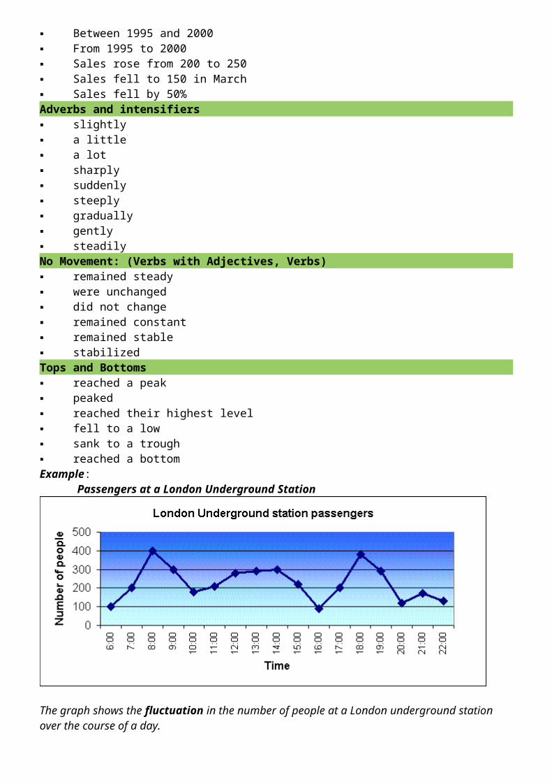
gradually gently steadilyNo Movement: (Verbs with Adjectives, Verbs) remained steady were unchanged did not change remained constant remained stable stabilizedTops and Bottoms reached a peak peaked reached their highest level fell to a low sank to a trough reached a bottomExample: Passengers at a London Underground Station
The graph shows the fluctuation in the number of people at a London underground station over the course of a day.
The busiest time of the day is in the morning. There is a sharp increase between 06:00 and 08:00, with 400 people using the station at 8 o’clock. After this the numbers drop quickly to less than 200 at 10 o’clock. Between 11 am and 3 pm the number rises, with a plateau of just under 300 people using the station.
In the afternoon, numbers decline, with less than 100 using the station at 4 pm. There is then a rapid rise to a peak of 380 at 6pm. After 7 pm, numbers fall significantly, with only a slight increase again at 8pm, tailing off after 9 pm.
Overall, the graph shows that the station is most crowded in the early morning and early evening periods.
Vocabulary Tips Don’t repeat verbs Before you start to write, make a list of synonyms (words with the same meaning) See how many ways you can rephrase the title of the graph. Use one in the introduction and
another in the conclusion with the same meaning Be careful with prepositions. They can make a big difference in meaning. For example, “rose by”
is very different from “rose to.” Learn your verbs with the preposition that goes with them.
V. GRAPHS: THE VOCABULARY OF NUMBERS There are some special words for numbers, fractions and percentages. Look at the following table which shows a number in different years (1990-1995) :
1990
1995
1200
1800
You could describe the above table using numbers, fractions or percentages: The number went up by 600, from 1200 to 800. (Number) The number went up by half, from 1200 to 1800. (Fraction) The figure went up by 50%, from 1200 to 1800. Percentage) The figure went up 150%, to 1800. (Percentage)
1992
1994
1996
1998
500
1000
3000
12000
Use “trebled,” “-fold,” and “times:” The number doubled between 1992 and 1994. The number trebled between 1994 and 1996. The figure quadrupled from 1996 to 1998 There was a twofold increase between 1992 and 1994. The figure went up sixfold between 1992 and 1996. The figure in 1996 was three times the 1992 figure. The figure in 1998 was four times the 1996 figure.
1992
1994
1996
1998
1000
800
400
100
Use Fractions: Between 1992 and 1994, the figure fell by one-fifth. Between 1994 and 1996, the number dropped by a half. The figure in 1998 was one-tenth the 1992 total.
VI. GRAPHS: TYPES OF GRAPHS
You are likely to meet only two types of graphs in IELTS or other intermediate English tests – time and comparison graphs. (Sometimes you can get both in the same test!)
In time graphs you have to describe changes over time. In comparison graphs you have to compare different items – countries, people, products, places,
etc.The vocabulary for each kind of graph is different:

In time graphs you use time vocab to describe change: rose, fell, declined, shot up, increased, remained steady, etc.
In comparison graphs you compare: twice as much as, more than, less than, the same amount, both X and Y have the same figure, while / whereas, etc.
1. Time Graphs (Here is a time graph).
You have to compare different methods of transport used in the US over the last century – train, bus and air.
You could start with train (because it is the oldest method) by air (because it is the biggest method of public transport today.) However, don’t start with bus because it is very small and not the main idea
The main trend with rail transport is that it rose to a peak in the 1920s and 1930s and then declined.The main trend with air is that it started late, in the 1960s, but it has shot up to become by far the biggest carrier of passengers.
2. Comparison Graphs (Here is a comparison graph).
You have to compare the amount of water used for domestic, agricultural and industrial purposes.There are two ways to write about this graph:
by country (make groups, e.g. Saudi Arabia and Oman, which have mainly agricultural use, then Bahrain and Kuwait which have mainly domestic use, etc)
by use (Agriculture, then Domestic, then Industrial.)
If you decide to write by describing use, you could start with Agriculture because it is the biggest user. Group together Saudi Arabia and Oman as the top users, and then group UAE and Qatar as the middle group of users, using 60% of water for agriculture. Finally mention Bahrain and Kuwait.

Your second paragraph should be about Domestic use, the use of water in the home, because it is the second biggest use. Start with Kuwait and Bahrain (grouped together) (more than 50%) and then write about Qatar and the UAE.