graphic aids 1. chart a lecture by allah dad khan vp the university of agriculture peshawar
TRANSCRIPT


Graphic Aids 1. Chart A Lecture
ByMr. Allah Dad Khan Visiting Professor The University of
Agriculture Peshawar
1, Chart

Types of Charts 1.Narrative Chart 2.Tabulation
Chart3.Chain Chart 4. Bar Charts
5.Pie Chart 6.Flow Chart 7.Evolution Chart 8.Pull Chart9.Line Chart 10.Tree Chart 11. Spline Chart 12. Area chart13.Column Chart 14. Scattered
Chart 15.Polar Chart 16.Stock Chart
17.Radar Chart 18.Doughnut Chart
19.Bubble chart 20.Angular Gauge
21,Range Series 22.Candle stick chart
23.OHLC chart 24.Flag Series

1.Narration Chart

2.Tabulation Chart
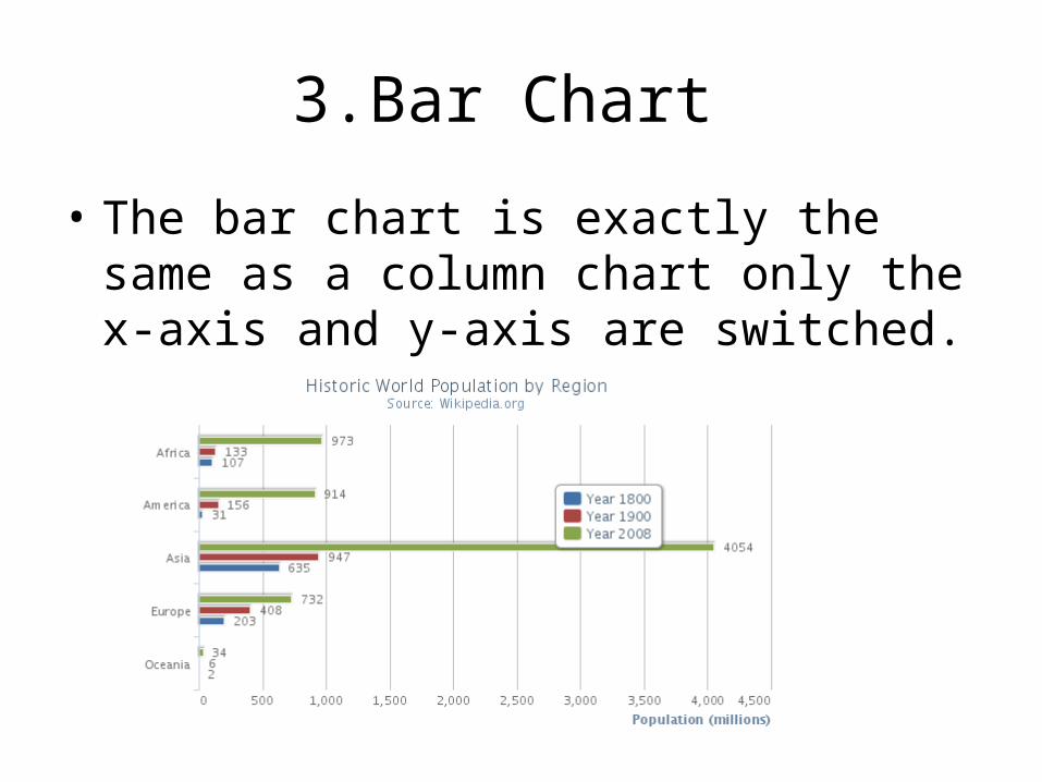
3.Bar Chart
• The bar chart is exactly the same as a column chart only the x-axis and y-axis are switched.

4.Pie ChartA pie chart is a circular chart divided into sectors which is proportional to the quantity it represents

5.Flow Chart

6.Evolution Chart

7.Pull Chart

8.Line Chart
• The line chart is represented by a series of datapoints connected with a straight line. Line charts are most often used to visualize data that changes over time.

9.Tree Chart

Spline Chart
• The spline chart draws a curved line between the points in a data series.

10.Area Chart
• The area chart functions the same way as a line chart only it fills the area between the line and the threshold, which is 0
by default.

11.Column Chart
• A column chart displays data as vertical bars.

12.Scatter Chart
• A scatter chart draw a single point for each point of data in a series without connecting them.

13.Net Charts • A net chart is similar to polar or radar chart. They are useful for comparing data
that are not time series, but show different circumstances, such as variables in a scientific experiment or direction. The poles of the net chart are equivalent to the y-axes of other charts

14.Pollar Chart • We took great care to reuse existing options and patterns when designing
the option set of polar charts. The result is one single switch to turn a regular X-Y chart into a polar chart. Add the chart.polar option, and the X axis is wrapped around the perimeter while the Y axis extends from the
center to the top.

15.Stock Chart
• Stock Charts Stock charts are used to illustrate the fluctuation of stock prices.

16.Surface Chart • A surface chart shows a three-dimensional surface that connects a set of
data points. Surface charts do not use colors to distinguish data series, but rather to distinguish values. Surface charts are often used for topographic
maps. In this example, the surface chart displays quantum wave values.

17.Radar Chart
• Radar charts compare the aggregate values of several data series by plotting the values of each category along a separate axis that starts in the center of the chart and ends on the outer ring.

18.Doughnut Chart
• Like a pie chart, a doughnut chart shows the relationship of parts to a whole, but it can contain more than one data series

19.Bubble Chart • A bubble chart is a variation of a scatter chart in which the data points are
replaced with bubbles. An additional dimension of the data is represented in the size of each bubble

20.Angular Gauges • Angular gauges are also known as dials or speedometer-like widgets, and
provide a great visualisation for dashboards. Like with polar charts, we extended the already existing series/points/axis model, and implemented the gauges as a new series type with one value axis, the yAxis. Which means that everything you learned about working dynamically and statically with other Highcharts series types, also applies to the angular gauges.
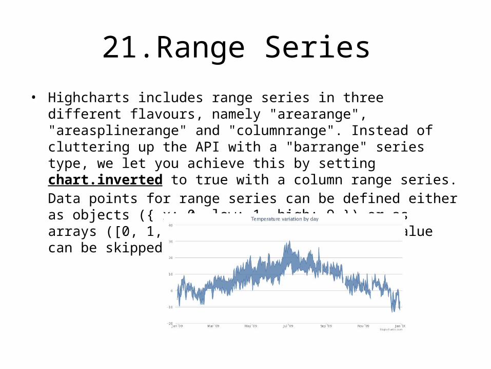
21.Range Series • Highcharts includes range series in three different flavours, namely
"arearange", "areasplinerange" and "columnrange". Instead of cluttering up the API with a "barrange" series type, we let you achieve this by setting chart.inverted to true with a column range series. Data points for range series can be defined either as objects ({ x: 0, low: 1, high: 9 }) or as arrays ([0, 1, 9]). In either case, the x value can be skipped
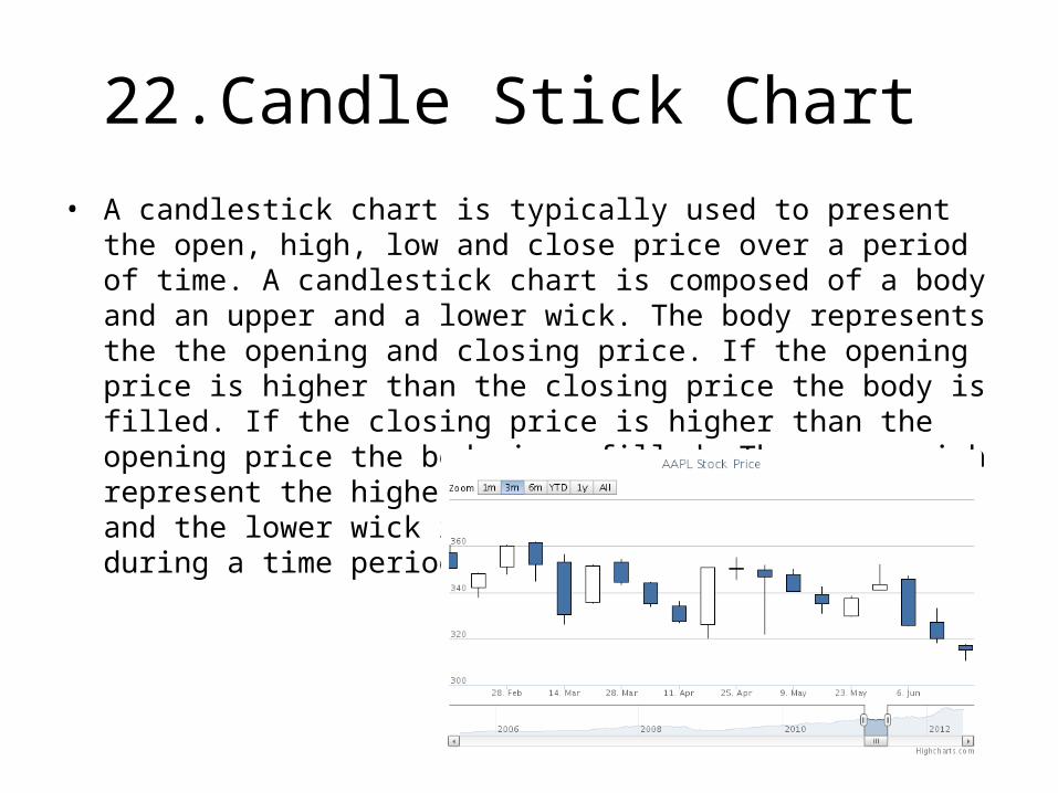
22.Candle Stick Chart • A candlestick chart is typically used to present the open, high, low and
close price over a period of time. A candlestick chart is composed of a body and an upper and a lower wick. The body represents the the opening and closing price. If the opening price is higher than the closing price the body is filled. If the closing price is higher than the opening price the body is unfilled. The upper wich represent the highest price during a time period and the lower wick represents the lowest price during a time period.

23.OHLC Chart • The Open-High-Low-Close chart is typically used to show the change in
price over a period of time. A vertical line shows the range of the price change where the top of the line is the highest and the bottom is the lowest. A tickmark on the left side of the chart indicates the opening price and a tickmark on the rightside indicates the closing price.

24.Flag Series • A flag series consists of flags marking events or points of interests. Used
alone flag series will make no sense. Flags can be placed on either the serie of the chart or on the axis.
• Flag series belong to Highstock, but they can also be applied to a regular Highcharts chart created with the Highcharts.Chart() constructor as long as the highstock.js file is loaded in the page

