houston investors assn the top just ahead july 10, 2015
TRANSCRIPT
Houston Investors Assn
THE Top Just
Ahead
July 10, 2015

BOTTOM LINE
We are in the final weeks of this bull market, which we expect to end with a top around the first week of August. The last few months of 2015 are going to see big rouble. We are seeing it in leading indications, and also in the weakness of the A-D data.
Bond funds are acting particularly weak, and they are the real canaries in the coal mine where liquidity is concern.
Crude oil should see an upturn now that July is here, and 3 weeks later we should see an equivalent upturn for T-Bond yields.
Gold is still headed lower toward a major 13-1/2 month cycle lowdue in August, but should see a brief upturn ahead of the final plunge to that cycle low.
What To Expect
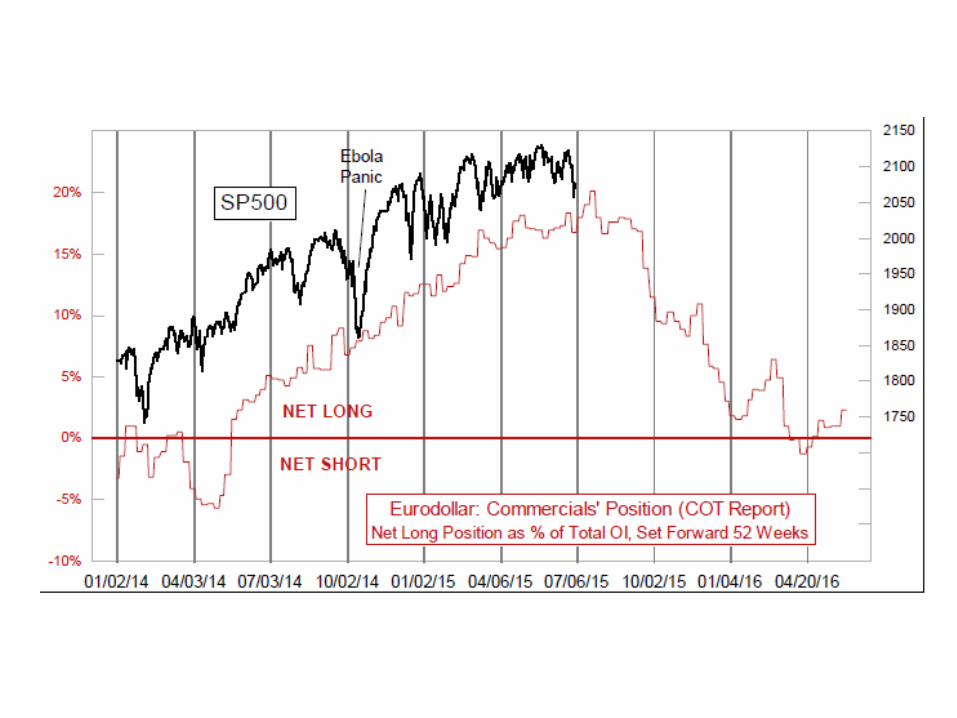
Stocks should do some more mucking around in search of a bottom, then head upward toward the early August top described by the eurodollar COT leading indication shown on page 1.
T-Bonds show a pair of tops due July 10 and 13, which with a weekend in between them are only one trading day apart. But the leading indication for long term rates given by crude oilprices offers little hope of a trending move any time soon.
Gold’s signals still have not revealed a big bottom signal to confirm the expectation of the big 13-1/2 month cycle low ideally due in August.
THE Top Just Ahead
Back in 2010, we figured out that the COT Report data on eurodollarfutures made for a great leading indicator for how stock prices were going to behave a year later. This was a huge epiphany. HUGE! It led to us being named as Timer Digest’s #1 Long Term Stock Market Timer for both 2011 and 2012, because we had a cheat sheet giving us the answers ahead of time.
Then 2013 arrived, and it all went kablooie. The Fed decided that QE1,QE2, and Operation Twist were not enough, and they needed to start QE3 which injected $85 billion per month into the banking system. That effort had an understandably positive effect on stock prices, but it disrupted the very nice leading indication from the eurodollarCOT data.
The commercial traders of eurodollar futures did not know in 2012 that the Fed was going to do this in 2013. So their net positions in 2012 did not accurately reflect what the stock market was going to do under the effects of all of that excessive stimulus.
This sudden shift admittedly fooled us for a while, as we tried to grapple with the fact that what had been almostfthe holy grail leading indication was suddenly not working worth a potter’sdam at all in 2013. In fact, stock prices seemed to be doing almost the perfect inverse of our great leading indicator.
And then in late 2013, it flipped back to positive correlation again. Evidently, the commercial traders of eurodollar futures by late 2012 had figured out what future liquidity flows would look like again, and it worked again.

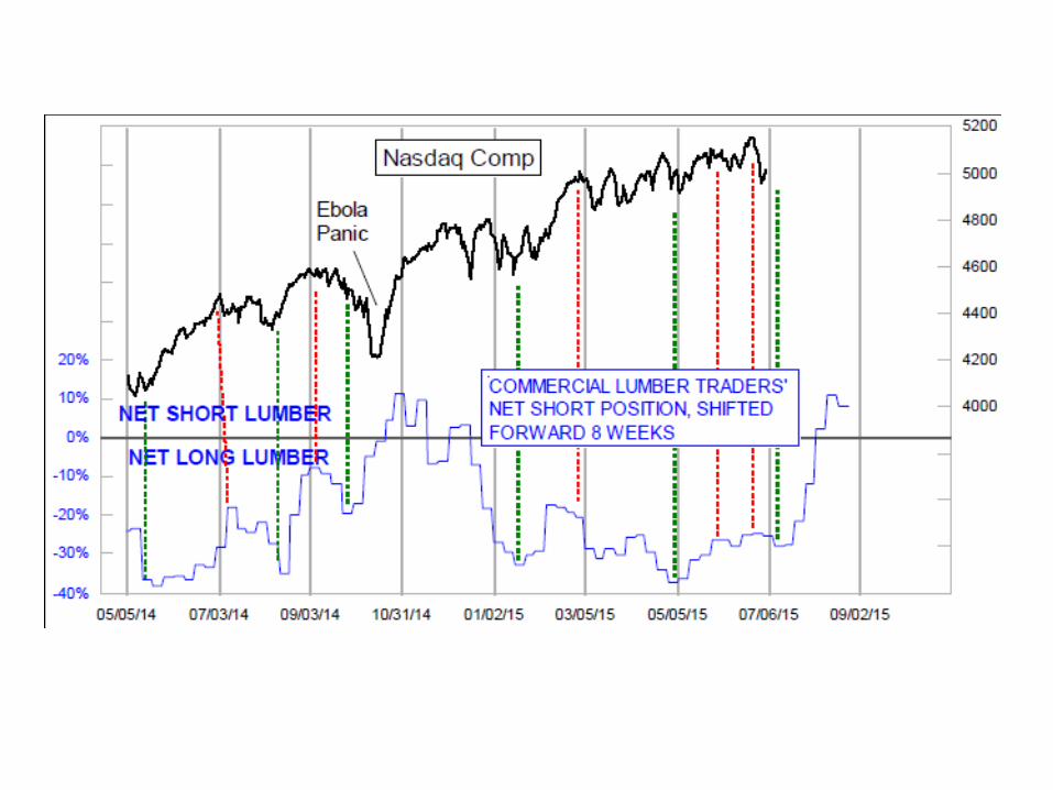
That is all especially important right now because this leading indication has been working really well in 2015, and because it says we should expect a major price top for the SP500 in early August. We are already seeing confirming signs of liquidity problems inthe weakening A-D Line, which topped back in April and appears to be setting up for a major divergence, similar to2000 or 2007.But first we have a little bit of bull market left to squeeze out before thatearly August top. And that idea is also confirmed by the wholly independent leading indication shown in the top chart on page 2. The COT Report data on lumber futures also seems to foretellthe dance steps of stock prices with an 8-week lead time.
We show that in the chart here on page 2, this time using the NasdaqComposite Index. The magnitudes of the price movements do not always match up with the leading indication, but the timing of the turns is there. This is relevant because just ahead of us is a call for a powerful up move into August, just as the COT Report calls for. We don’t know yet whether the lumber COT data are going to confirm the big down move for stock prices that the eurodollar COT indicator shows.Bottom Line: It is time to prepare ourselves for a big price drop for the stock market after a top in early August. That top is not here yet, and there is more upside movement still to harvest. But get ready.
Gold Repeating A Prior Price Pattern
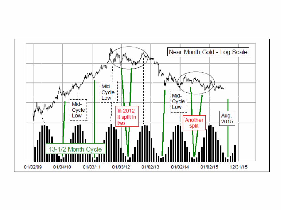
We covered the 13-1/2 month cycle in gold prices in our last Report, and how it calls for a major low in gold prices ideally due in August 2015. These cycle lows do not always behave themselves properly, sometimes arriving a month early or late, or as was the case in 2012 and 2014, they sometimes split into twin bottoms. Usually thosesplit-cycle instances are centered on the ideal cycle bottom date, but that does not make them easy to figure out what is going on as it is happening.In looking at the 2012 instance of a split cycle low versus the 2014 instance, there are similarities of structure in each case which jump out. So that led us to take a look at a comparison of the two more directly, as shown in the middle chart.
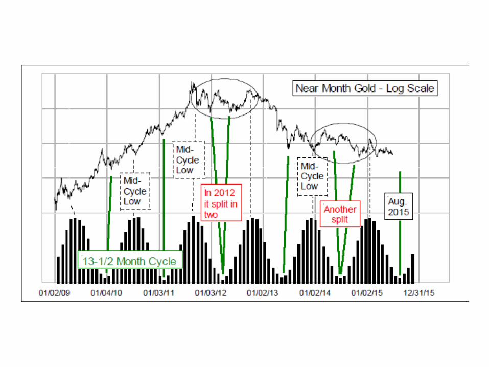
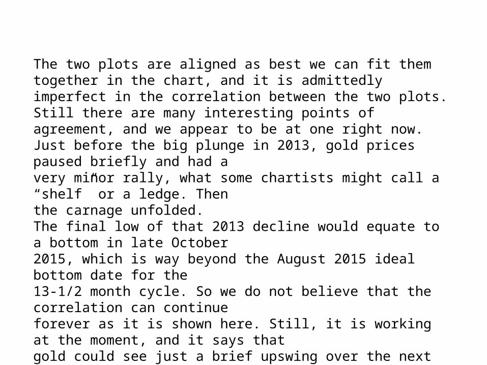
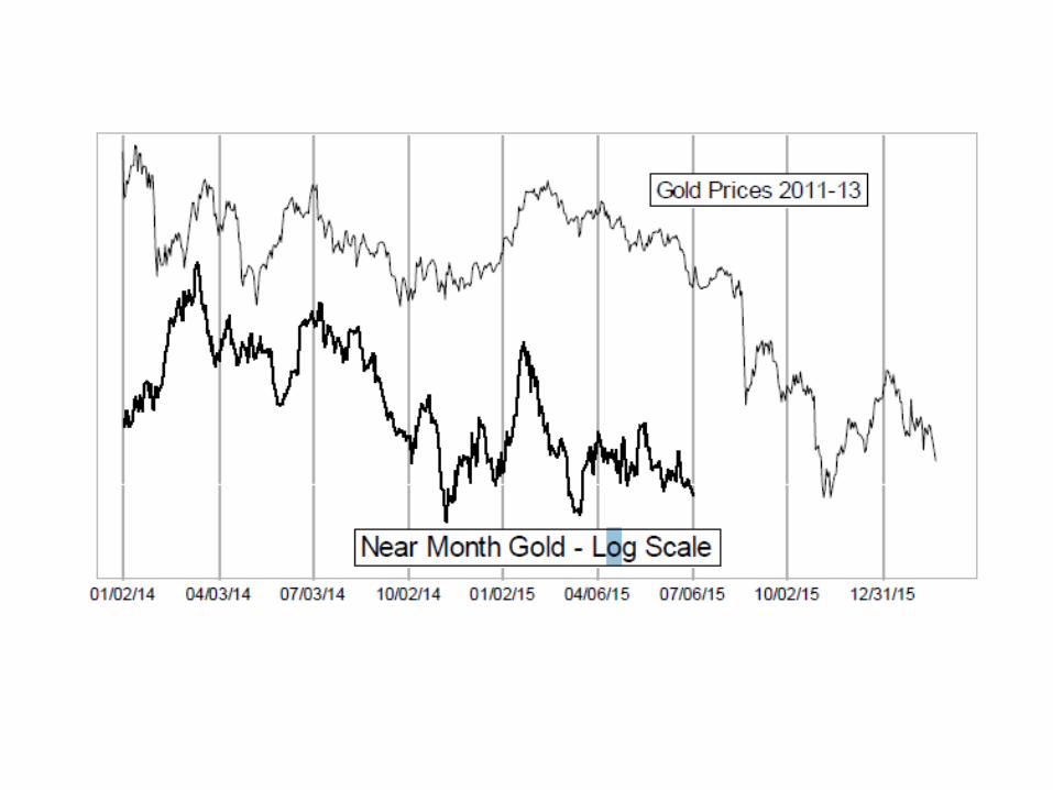
The two plots are aligned as best we can fit them together in the chart, and it is admittedly imperfect in the correlation between the two plots. Still there are many interesting points of agreement, and we appear to be at one right now.Just before the big plunge in 2013, gold prices paused briefly and had avery minor rally, what some chartists might call a “shelf” or a ledge. Thenthe carnage unfolded.The final low of that 2013 decline would equate to a bottom in late October2015, which is way beyond the August 2015 ideal bottom date for the13-1/2 month cycle. So we do not believe that the correlation can continueforever as it is shown here. Still, it is working at the moment, and it says thatgold could see just a brief upswing over the next 2-3 weeks, perfect for suckering in the eager gold bulls, only to disappoint them even more in a few weeks.
Gold and Crude Oil, Another Analog
In past newsletter issues, and also in a Dec. 24, 2014 Chart In Focus article, we have discussed how the big selloff in oil prices last year closely resembles the 2013 sell off in gold prices. The lower chart on page 4 updates that relationship, and tells us that oil is now at an important inflection point, assuming that the relationship is going to continue as it has been behaving in the past.The two commodities have not always displayed this lagged relationship. Oil seems to have fallen into gold’s prior price pattern beginning in mid-2013, and it has worked out nicely since then except for a brief pattern inversion earlier this year.
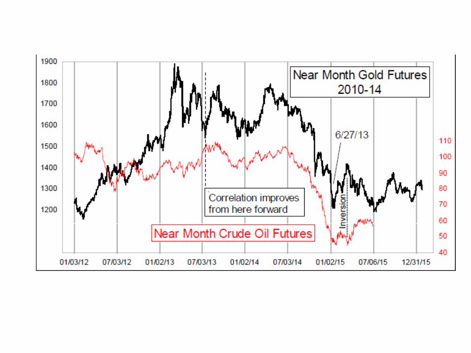

Now the two seem to have gotten back in sync, as oil prices have chopped sideways around the $60/barrel level while waiting forthe signal from gold’s pattern to do something new. It suggests that oil prices should see an early July low, and then a rise into a top ideally equating to September.We do not have a logical relationship in this case for why gold should lead crude oil prices. We instead believe that crude oil is just following a pattern of commodity price collapseas modeled by gold previously, and employing the same commodity market psychology at work on price movements.That hypothesis makes no sense in terms of the Bakken shale, orSaudi production, or hybrids affecting gasoline demand, or anything which supposedly matters. But this hypothesis does have the advantage of matching the facts of how prices have behaved.
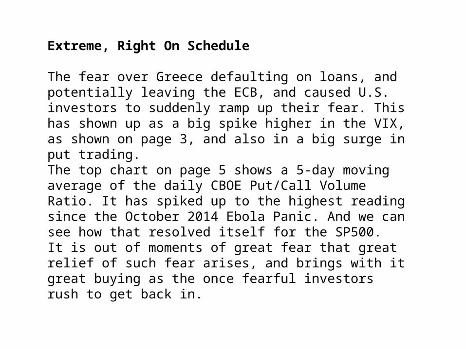
Extreme, Right On Schedule
The fear over Greece defaulting on loans, and potentially leaving the ECB, and caused U.S. investors to suddenly ramp up their fear. This has shown up as a big spike higher in the VIX, as shown on page 3, and also in a big surge in put trading.The top chart on page 5 shows a 5-day moving average of the daily CBOE Put/Call Volume Ratio. It has spiked up to the highest reading since the October 2014 Ebola Panic. And we can see how that resolved itself for the SP500.It is out of moments of great fear that great relief of such fear arises, and brings with it great buying as the once fearful investors rush to get back in.

There are no guarantees, only analysis of past instances and what they led to when we saw conditions like this. The fearful moment does not have to be done just because it reveals itself; but history shows that traders and investors can only remain fearful for just so long before they start to revert to optimism again, and bringing their money with them as they make that reversion.This bottoming effort is all happening pretty much according to the schedule of our still-experimental BC Indicator. “BC” is a code name, and someday we will reveal the true math involved, but suffice it to say that it represents a compilation of multiple cycles and weightings, and that it seems to do a good job of forecasting future market turning points.
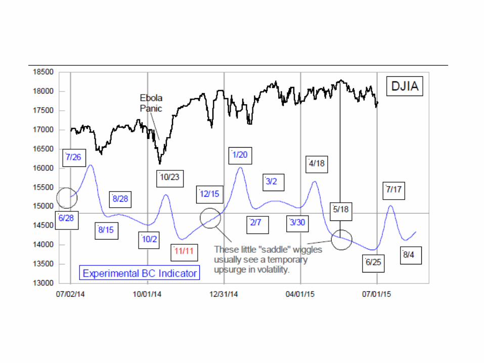
We should also point out that it does a good job of forecasting, but it has a significant problem. Sometimes the signals it shows can invert, which is why we list them in the table as “implied” tops or bottoms. Lately, though, price action has been pretty well in sync with what the BC Indicator’s pattern says should happen.The bottom ideally due June 25 got extended by a couple of trading days, on account of the worry over Greece leaving the EU. Now we face a presumptive rally toward an implied top due July 17, a date which our regular mathematical Timing Model signals do not exactly support (yet).That July 17 (implied) top would be early for the early August top suggested by the eurodollar COT leading indication. But there is an implied bottom due August 4, which would fit nicely, if only the price and the pattern were to invert. We wish this was a more precise leading indicator than it is, but we would still rather know what it says than to not know.
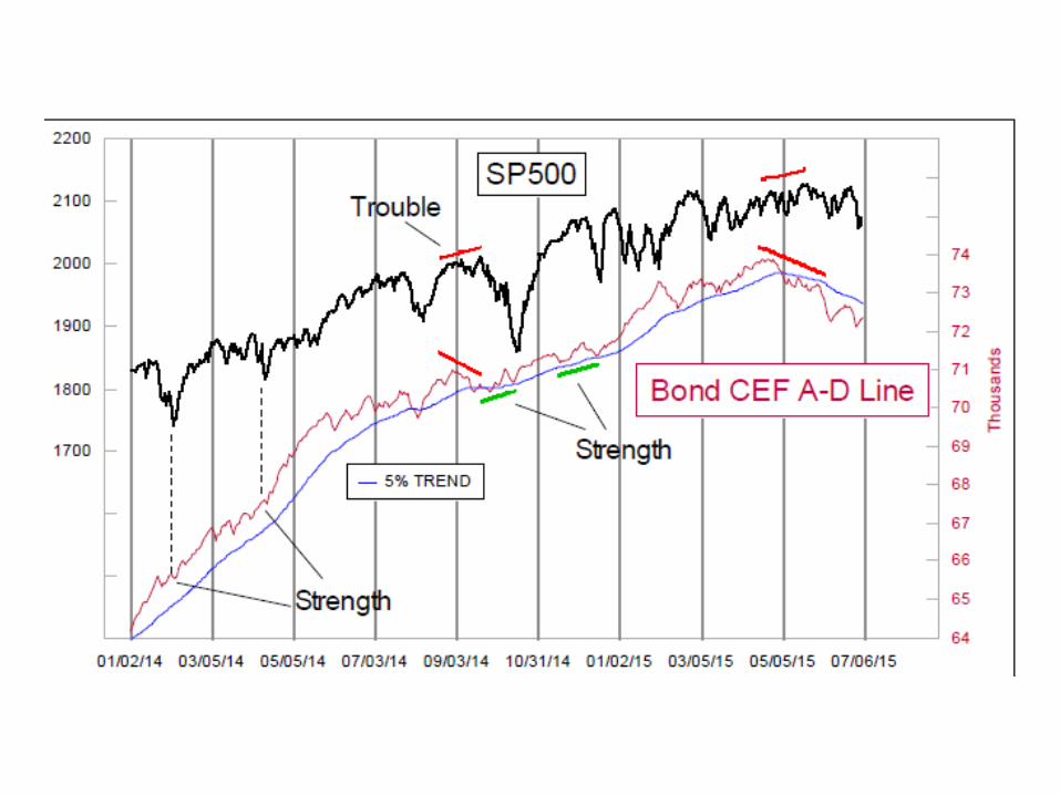
Bad News In The Hi-Yield Market
The NYSE’s A-D Line saw a peak on April 24, and has yet to exceed that level. Indeed, we would need to see 7761 net advancing issues in the days and weeks ahead just to get back up to the level of that peak. Major tops like what we saw in 1987, 1990, 2000, and 2007, tend to see an A-D Line peak well ahead of the final price peak.One other similarity of such peaks is in the behavior of the high-yield corporate bond market. The so-called “junk bonds” are thought to be tied to the fortunes of long-term interest rates, but in reality they behave much more like the stock market, but with an interesting twist. Hi-yield bonds are much more sensitive to financial market liquidity,either good or bad, and so they can give us an insight about what lies ahead for the overall financial market situation.
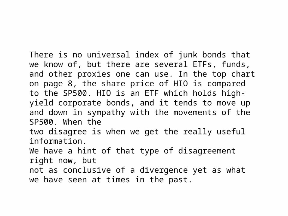
There is no universal index of junk bonds that we know of, but there are several ETFs, funds, and other proxies one can use. In the top chart on page 8, the share price of HIO is compared to the SP500. HIO is an ETF which holds high-yield corporate bonds, and it tends to move up and down in sympathy with the movements of the SP500. When thetwo disagree is when we get the really useful information. We have a hint of that type of disagreement right now, butnot as conclusive of a divergence yet as what we have seen at times in the past.


A similar message comes from a different fund, the Mainstay High-Yield Corporate Bond Fund, a traditional open-ended mutual fund which also invests in high-yield bonds. This is weekly data, which looks somewhat different from how this fund’s data looks on some data platforms, which adjust for the reinvestment of dividends.When MHCAX is above its own 10% Trend, that is a bullish situation for the overall stock market. Below, not so much. This principle works most of the time, although in 2014 it got into trouble on account of QE3 keeping the stock market going even though hi-yield bond said liquidity was in trouble.

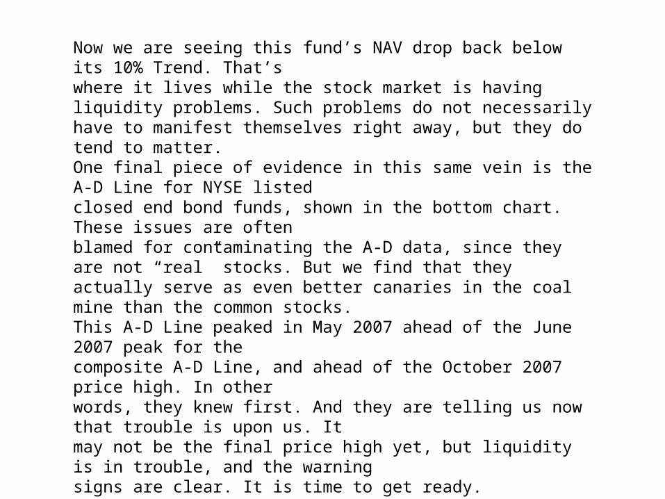
Now we are seeing this fund’s NAV drop back below its 10% Trend. That’swhere it lives while the stock market is having liquidity problems. Such problems do not necessarily have to manifest themselves right away, but they do tend to matter.One final piece of evidence in this same vein is the A-D Line for NYSE listedclosed end bond funds, shown in the bottom chart. These issues are oftenblamed for contaminating the A-D data, since they are not “real” stocks. But we find that they actually serve as even better canaries in the coal mine than the common stocks.This A-D Line peaked in May 2007 ahead of the June 2007 peak for thecomposite A-D Line, and ahead of the October 2007 price high. In otherwords, they knew first. And they are telling us now that trouble is upon us. Itmay not be the final price high yet, but liquidity is in trouble, and the warningsigns are clear. It is time to get ready.