how anyone can make insanely better slides
TRANSCRIPT
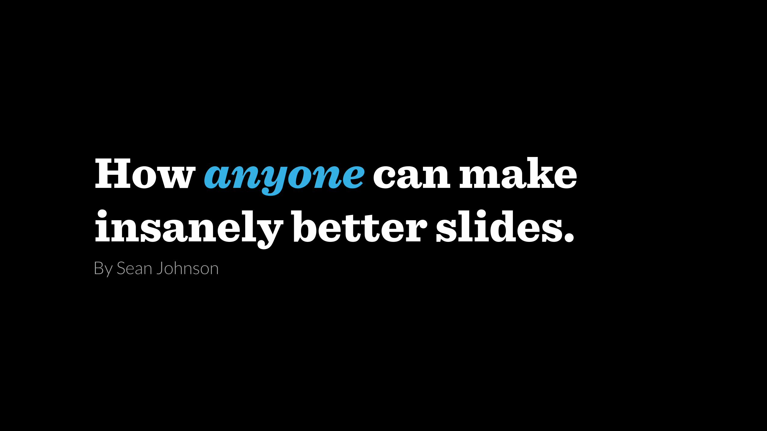
How anyone can make insanely better slides.By Sean Johnson
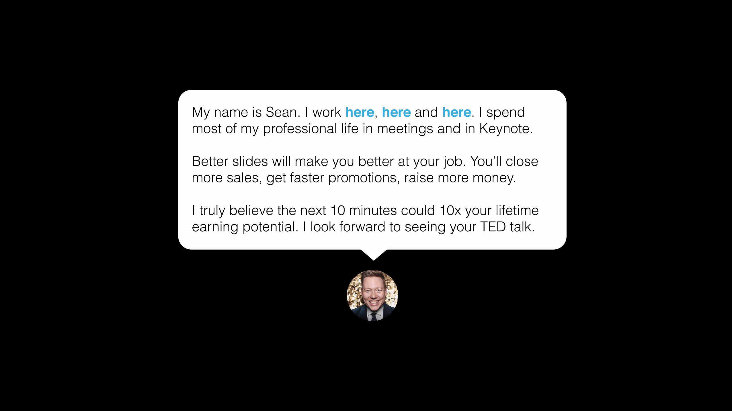
My name is Sean. I work here, here and here. I spend most of my professional life in meetings and in Keynote.
Better slides will make you better at your job. You’ll close more sales, get faster promotions, raise more money.
I truly believe the next 10 minutes could 10x your lifetime earning potential. I look forward to seeing your TED talk.
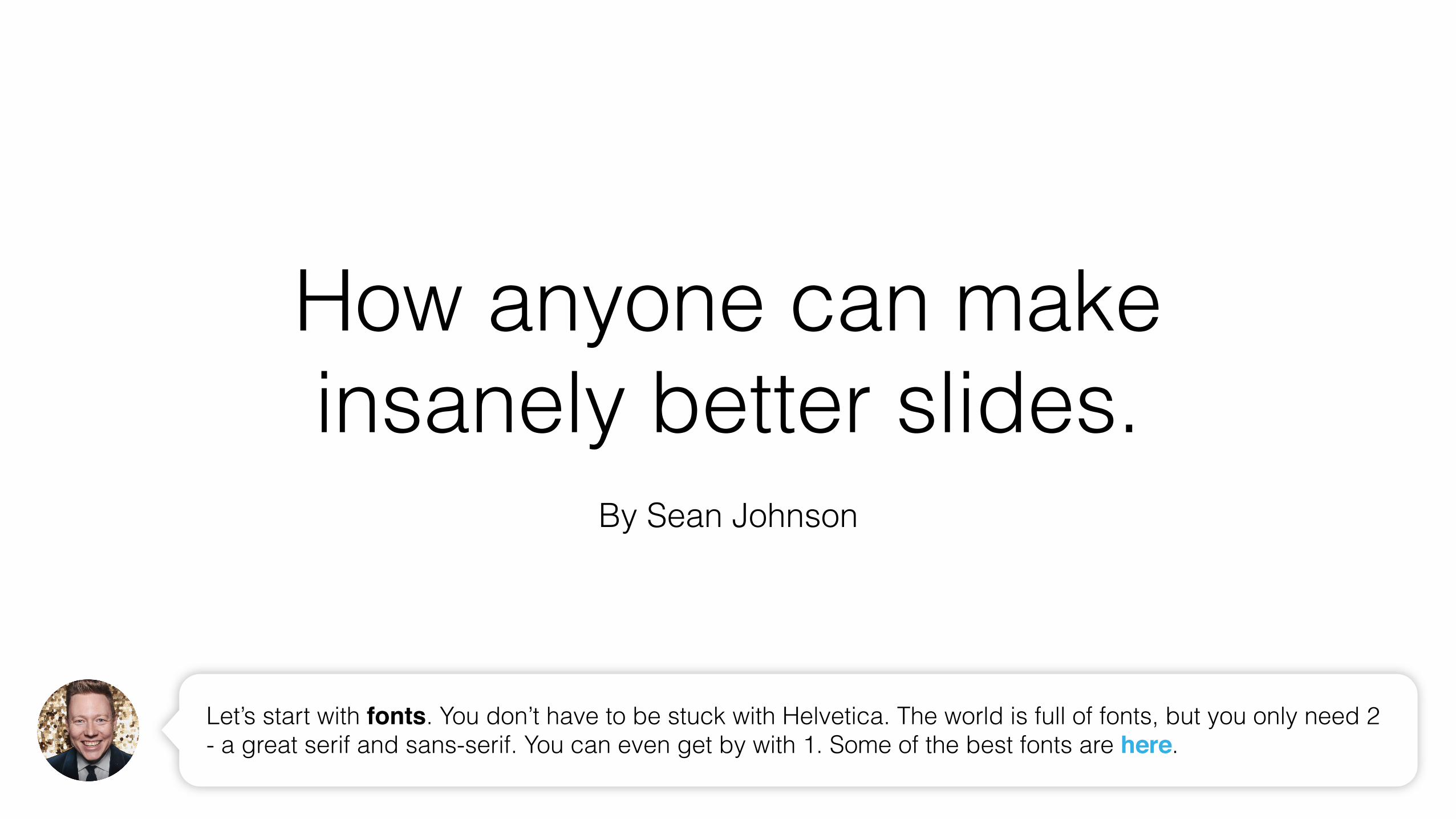
Let’s start with fonts. You don’t have to be stuck with Helvetica. The world is full of fonts, but you only need 2 - a great serif and sans-serif. You can even get by with 1. Some of the best fonts are here.
How anyone can make insanely better slides.
By Sean Johnson

How anyone can make insanely better slides.
By Sean Johnson
There are certain font combinations that work particularly well together. You can find some great font combinations here. I’m using Sentinel and Lato. The san-serif / serif combination is often an effective one.
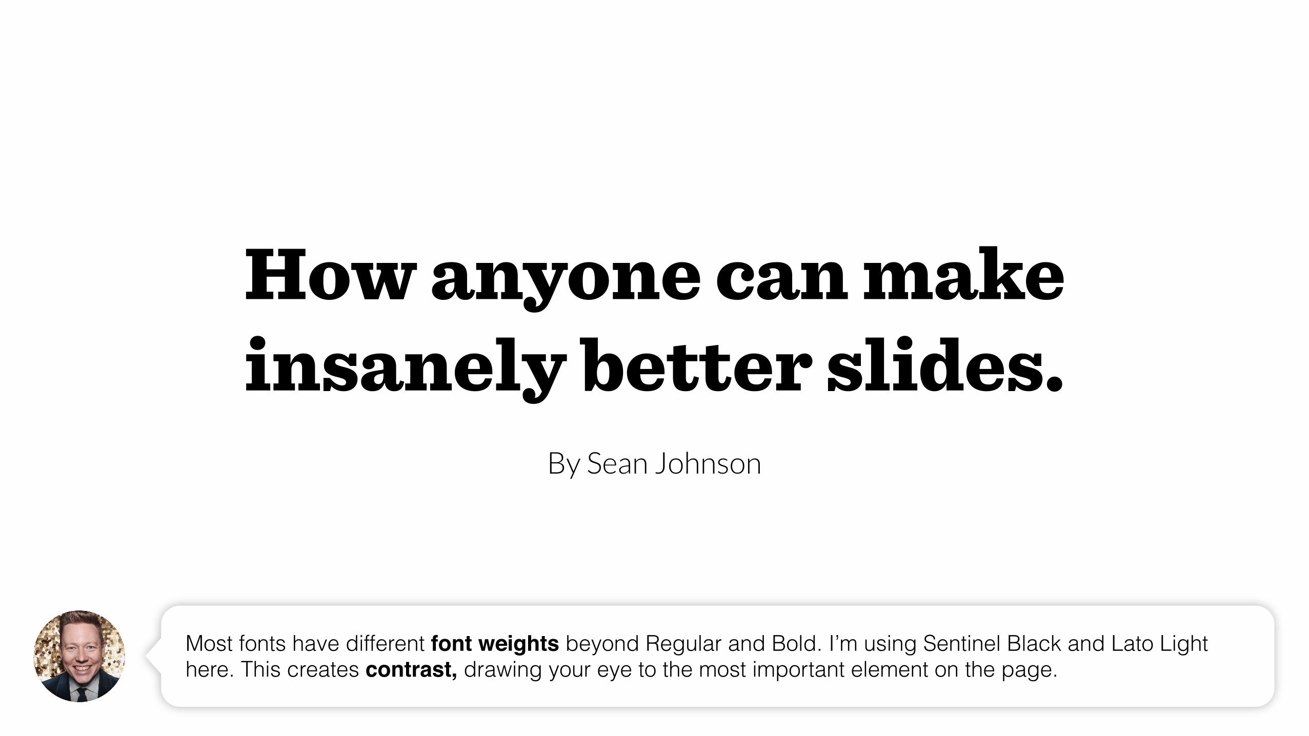
Most fonts have different font weights beyond Regular and Bold. I’m using Sentinel Black and Lato Light here. This creates contrast, drawing your eye to the most important element on the page.
How anyone can make insanely better slides.
By Sean Johnson
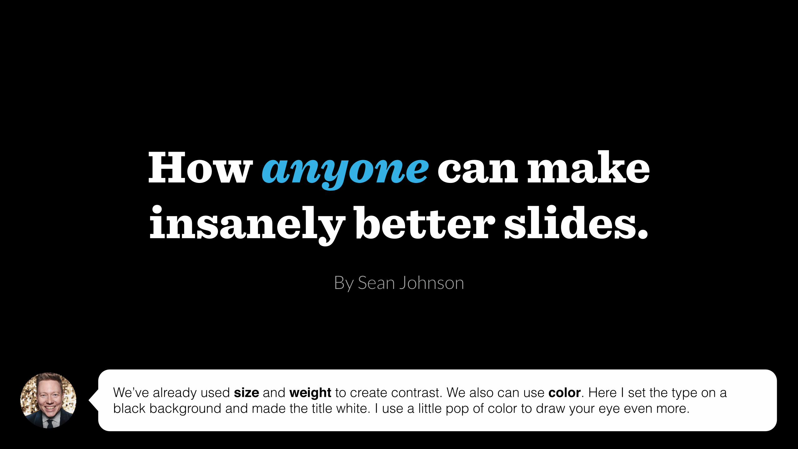
We’ve already used size and weight to create contrast. We also can use color. Here I set the type on a black background and made the title white. I use a little pop of color to draw your eye even more.
How anyone can make insanely better slides.
By Sean Johnson
How anyone can make insanely better slides.By Sean Johnson
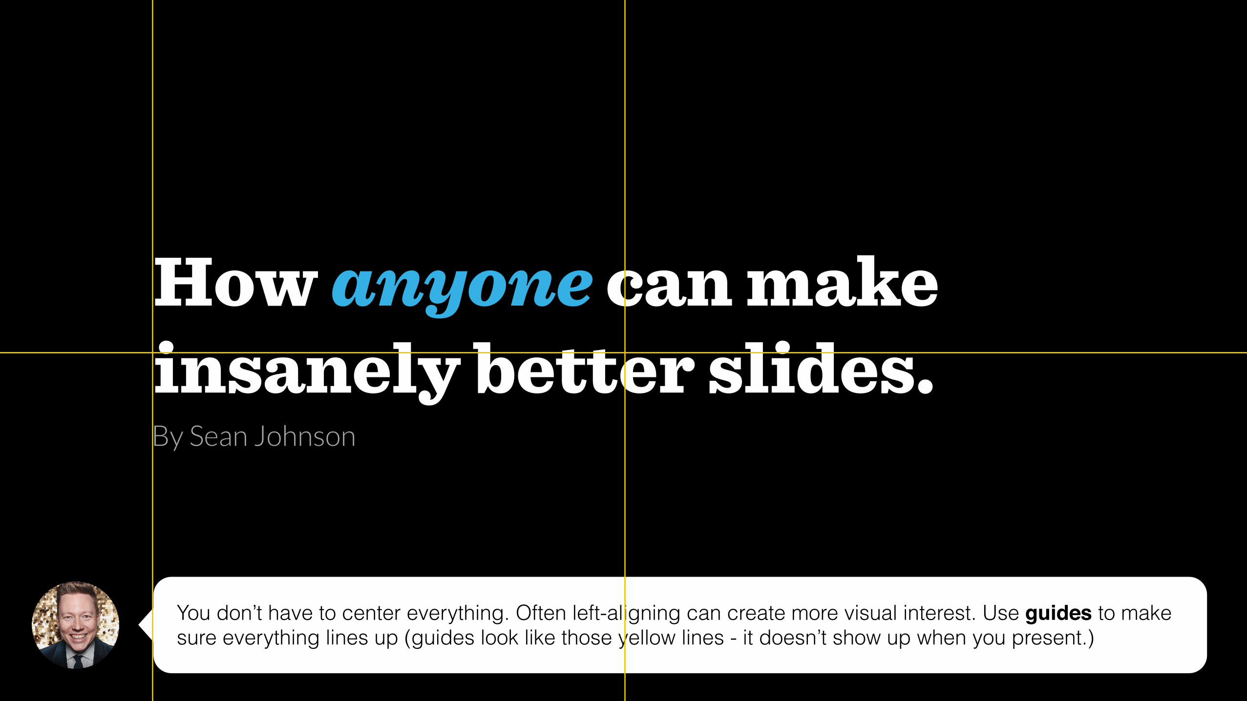
You don’t have to center everything. Often left-aligning can create more visual interest. Use guides to make sure everything lines up (guides look like those yellow lines - it doesn’t show up when you present.)
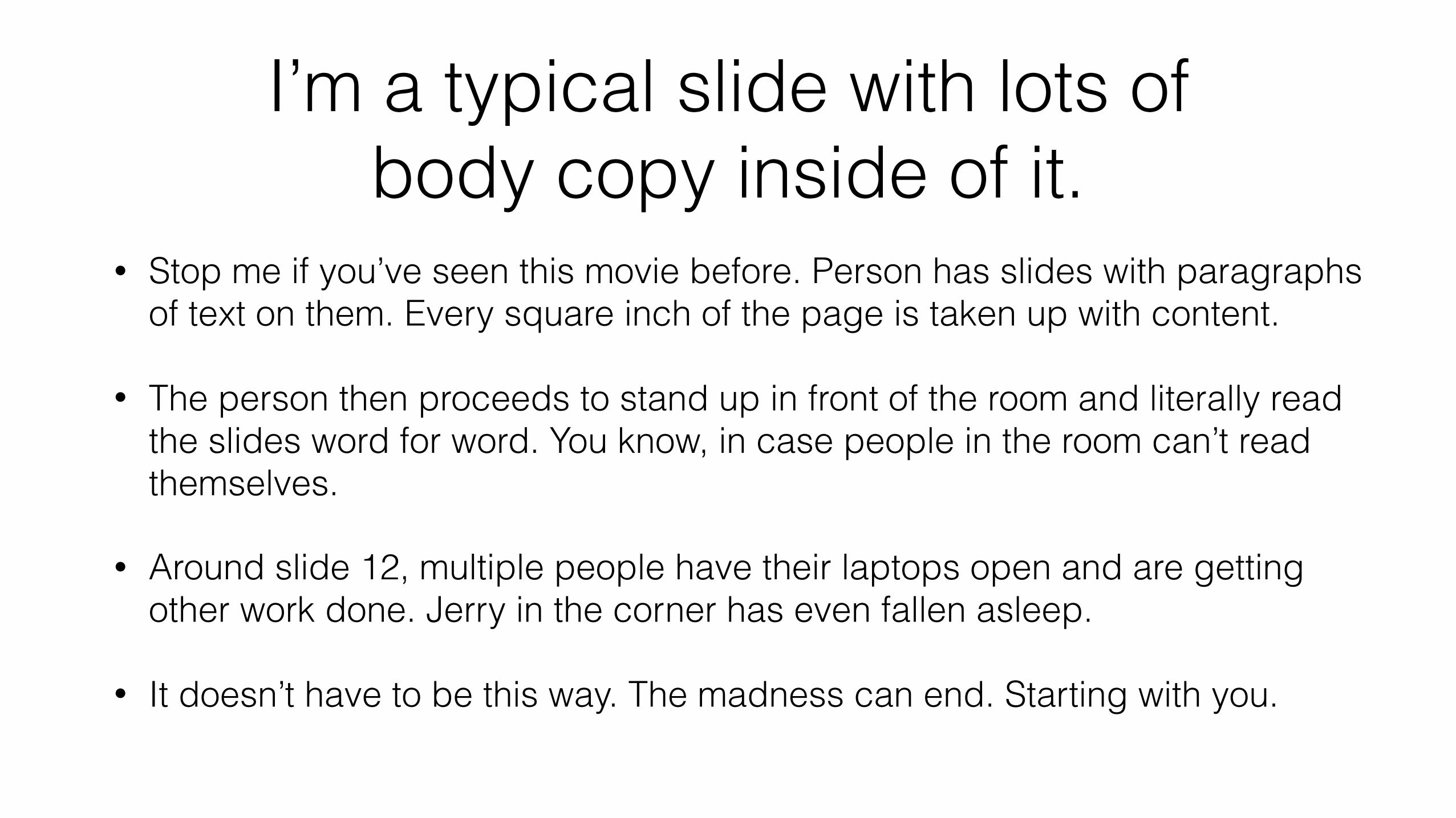
I’m a typical slide with lots of body copy inside of it.
• Stop me if you’ve seen this movie before. Person has slides with paragraphs of text on them. Every square inch of the page is taken up with content.
• The person then proceeds to stand up in front of the room and literally read the slides word for word. You know, in case people in the room can’t read themselves.
• Around slide 12, multiple people have their laptops open and are getting other work done. Jerry in the corner has even fallen asleep.
• It doesn’t have to be this way. The madness can end. Starting with you.
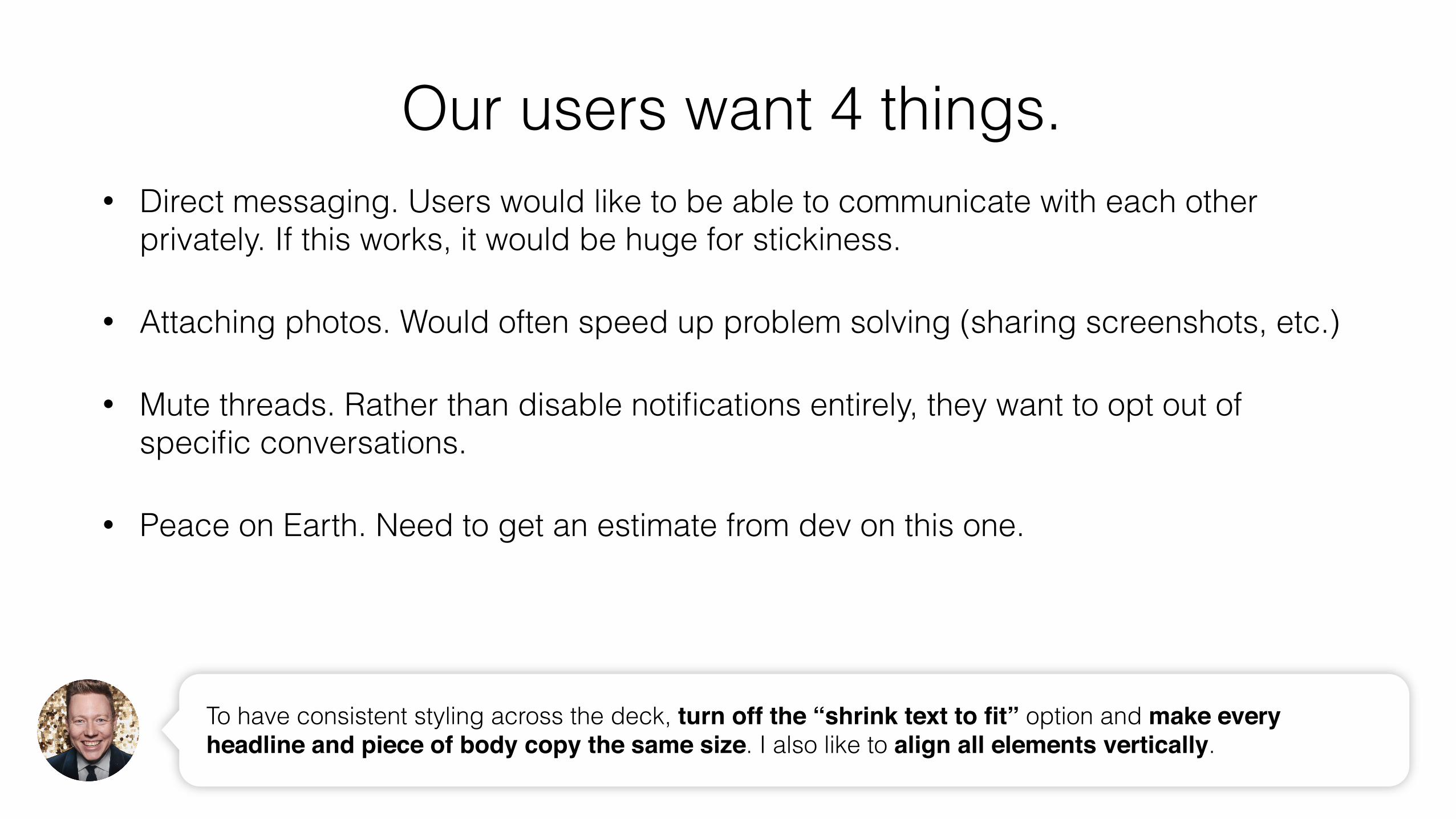
• Direct messaging. Users would like to be able to communicate with each other privately. If this works, it would be huge for stickiness.
• Attaching photos. Would often speed up problem solving (sharing screenshots, etc.)
• Mute threads. Rather than disable notifications entirely, they want to opt out of specific conversations.
• Peace on Earth. Need to get an estimate from dev on this one.
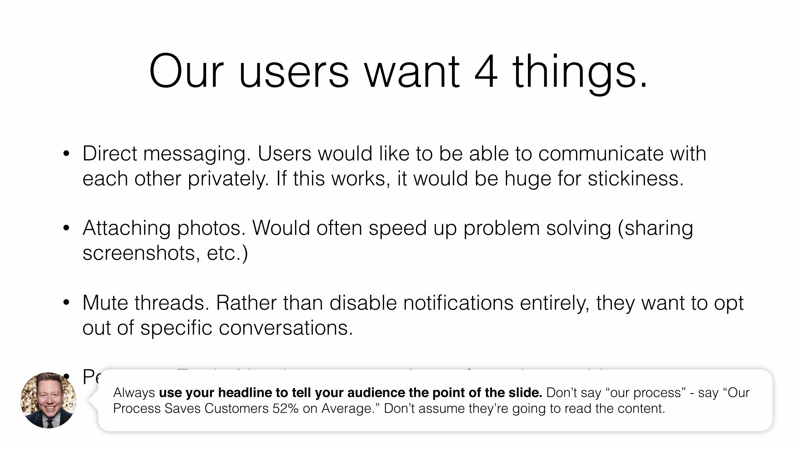
Our users want 4 things.
Always use your headline to tell your audience the point of the slide. Don’t say “our process” - say “Our Process Saves Customers 52% on Average.” Don’t assume they’re going to read the content.
Our users want 4 things.• Direct messaging. Users would like to be able to communicate with each other
privately. If this works, it would be huge for stickiness.
• Attaching photos. Would often speed up problem solving (sharing screenshots, etc.)
• Mute threads. Rather than disable notifications entirely, they want to opt out of specific conversations.
• Peace on Earth. Need to get an estimate from dev on this one.
To have consistent styling across the deck, turn off the “shrink text to fit” option and make every headline and piece of body copy the same size. I also like to align all elements vertically.
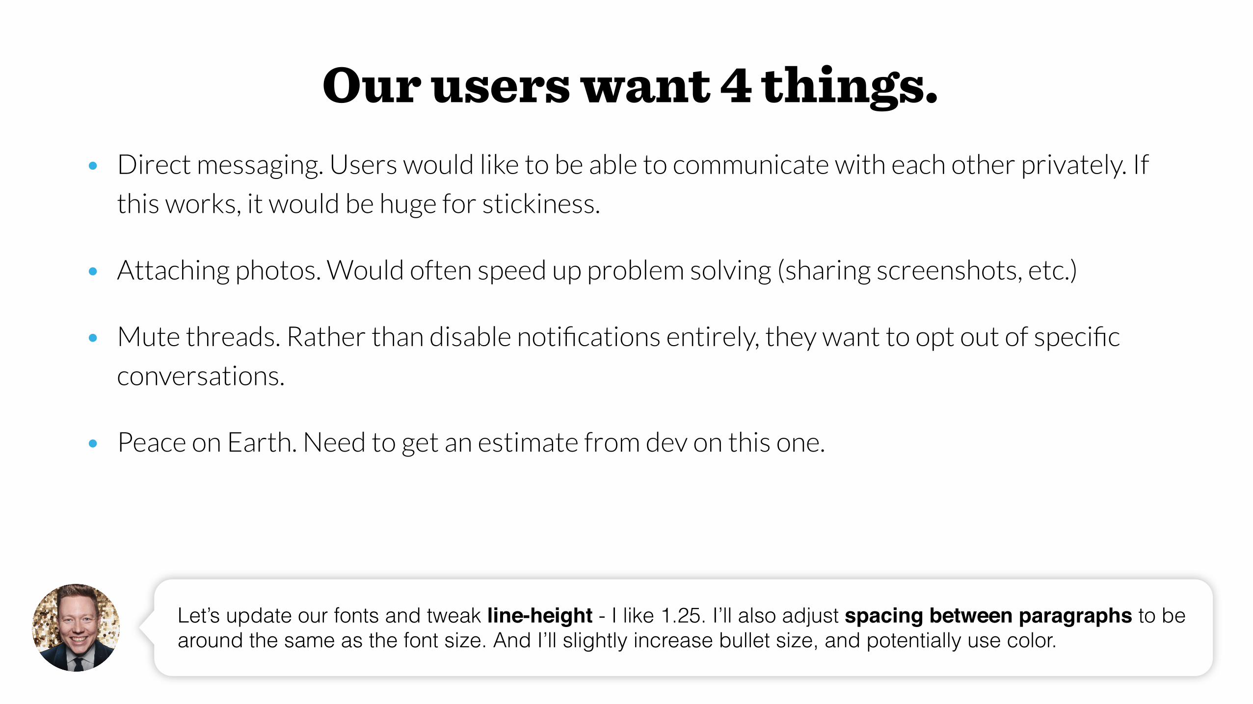
Our users want 4 things.• Direct messaging. Users would like to be able to communicate with each other privately. If
this works, it would be huge for stickiness.
• Attaching photos. Would often speed up problem solving (sharing screenshots, etc.)
• Mute threads. Rather than disable notifications entirely, they want to opt out of specific
conversations.
• Peace on Earth. Need to get an estimate from dev on this one.
Let’s update our fonts and tweak line-height - I like 1.25. I’ll also adjust spacing between paragraphs to be around the same as the font size. And I’ll slightly increase bullet size, and potentially use color.
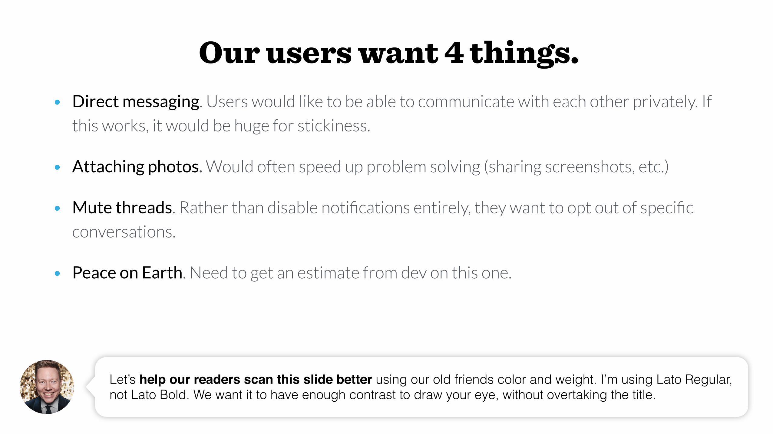
Our users want 4 things.• Direct messaging. Users would like to be able to communicate with each other privately. If
this works, it would be huge for stickiness.
• Attaching photos. Would often speed up problem solving (sharing screenshots, etc.)
• Mute threads. Rather than disable notifications entirely, they want to opt out of specific
conversations.
• Peace on Earth. Need to get an estimate from dev on this one.
Let’s help our readers scan this slide better using our old friends color and weight. I’m using Lato Regular, not Lato Bold. We want it to have enough contrast to draw your eye, without overtaking the title.
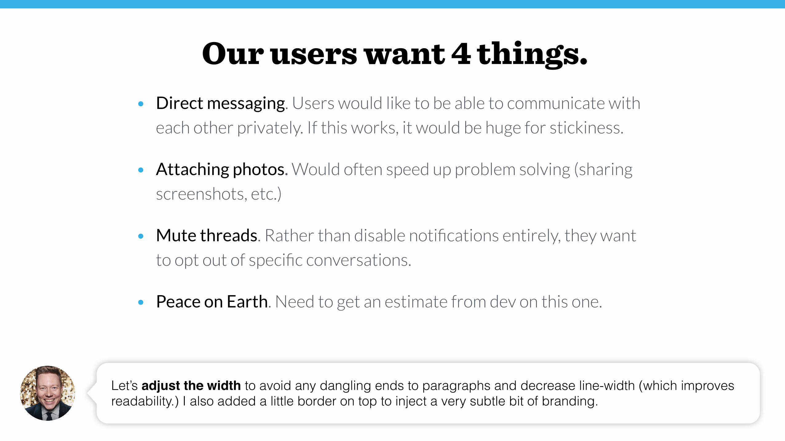
Our users want 4 things.• Direct messaging. Users would like to be able to communicate with
each other privately. If this works, it would be huge for stickiness.
• Attaching photos. Would often speed up problem solving (sharing
screenshots, etc.)
• Mute threads. Rather than disable notifications entirely, they want
to opt out of specific conversations.
• Peace on Earth. Need to get an estimate from dev on this one.
Let’s adjust the width to avoid any dangling ends to paragraphs and decrease line-width (which improves readability.) I also added a little border on top to inject a very subtle bit of branding.
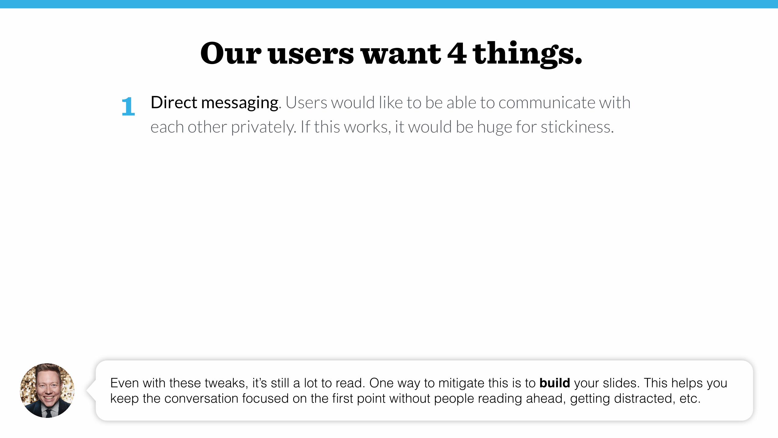
Our users want 4 things.Direct messaging. Users would like to be able to communicate with
each other privately. If this works, it would be huge for stickiness.
Even with these tweaks, it’s still a lot to read. One way to mitigate this is to build your slides. This helps you keep the conversation focused on the first point without people reading ahead, getting distracted, etc.
1
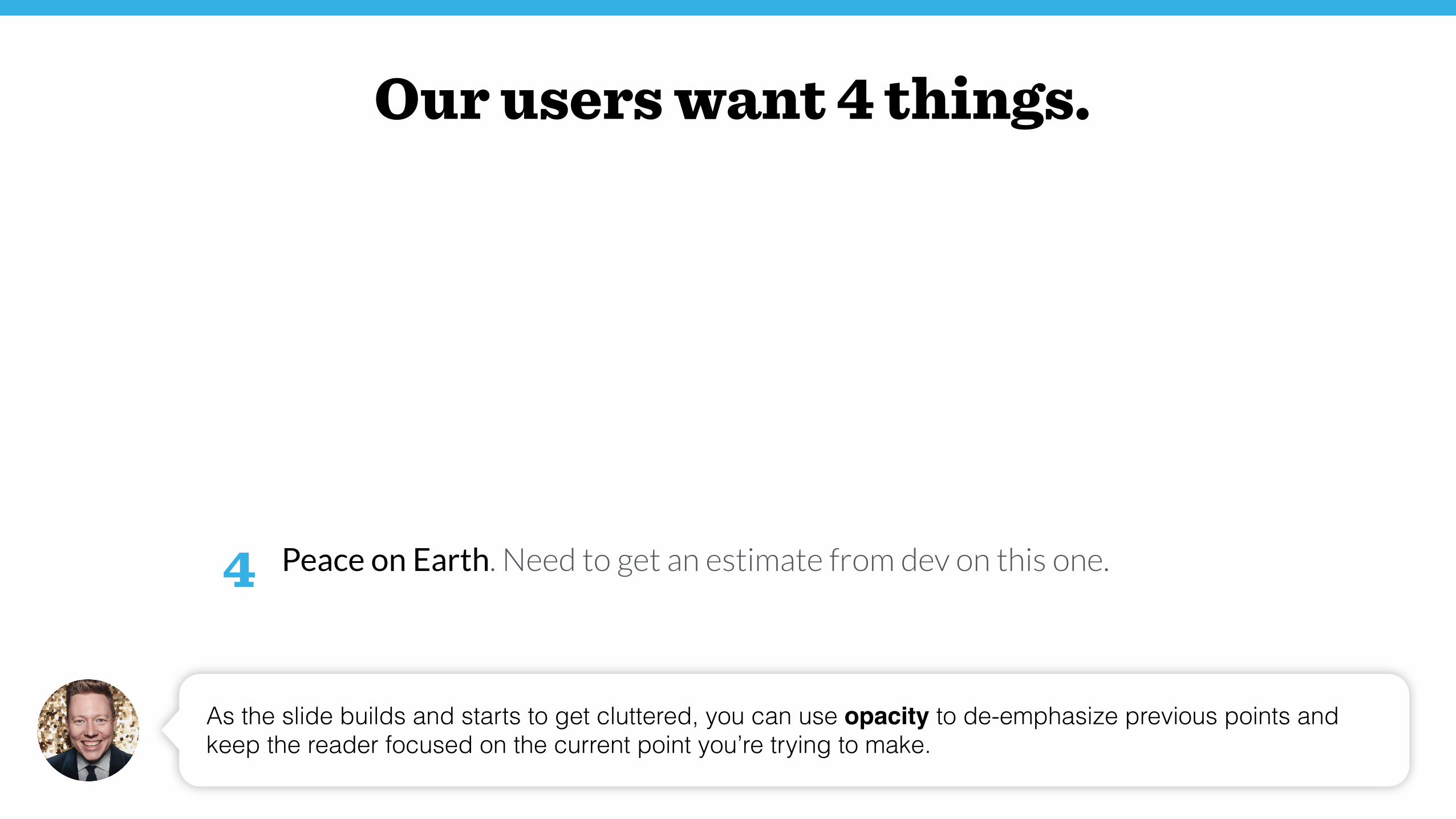
Our users want 4 things.Direct messaging. Users would like to be able to communicate with
each other privately. If this works, it would be huge for stickiness.
Attaching photos. Would often speed up problem solving (sharing
screenshots, etc.)
Mute threads. Rather than disable notifications entirely, they want to
opt out of specific conversations.
Peace on Earth. Need to get an estimate from dev on this one.
As the slide builds and starts to get cluttered, you can use opacity to de-emphasize previous points and keep the reader focused on the current point you’re trying to make.
1
2
3
4
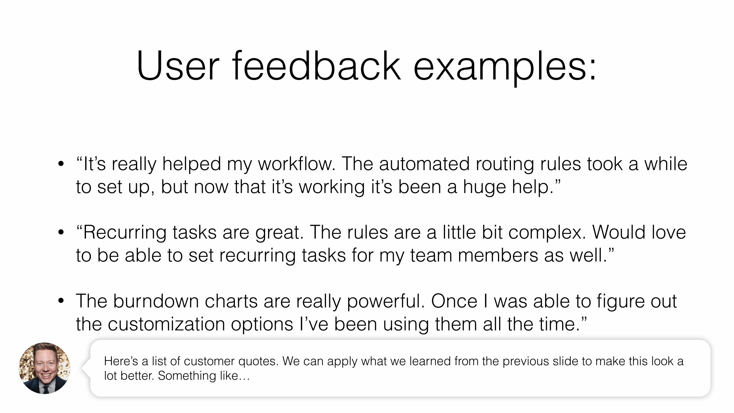
User feedback examples:
• “It’s really helped my workflow. The automated routing rules took a while to set up, but now that it’s working it’s been a huge help.”
• “Recurring tasks are great. The rules are a little bit complex. Would love to be able to set recurring tasks for my team members as well.”
• The burndown charts are really powerful. Once I was able to figure out the customization options I’ve been using them all the time.”
Here’s a list of customer quotes. We can apply what we learned from the previous slide to make this look a lot better. Something like…

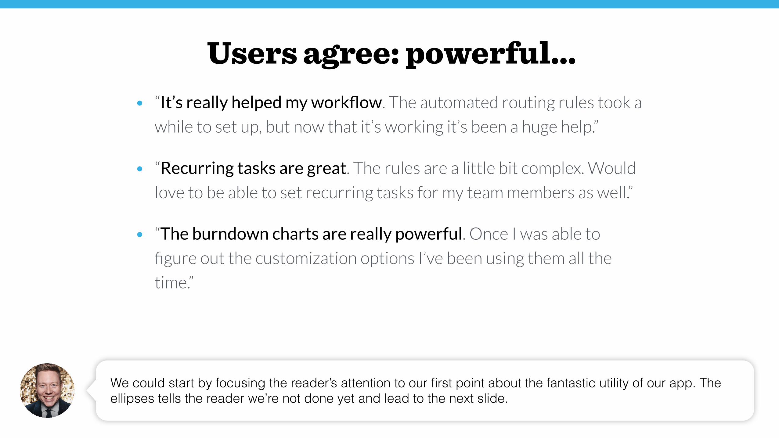
Users agree: powerful, but too complex.• “It’s really helped my workflow. The automated routing rules took a
while to set up, but now that it’s working it’s been a huge help.”
• “Recurring tasks are great. The rules are a little bit complex. Would
love to be able to set recurring tasks for my team members as well.”
• “The burndown charts are really powerful. Once I was able to figure
out the customization options I’ve been using them all the time.”
This. But I think we can make this even more impactful. One strategy would be to progressively call out the things that we think are important. For example…
Users agree: powerful…• “It’s really helped my workflow. The automated routing rules took a
while to set up, but now that it’s working it’s been a huge help.”
• “Recurring tasks are great. The rules are a little bit complex. Would
love to be able to set recurring tasks for my team members as well.”
• “The burndown charts are really powerful. Once I was able to
figure out the customization options I’ve been using them all the
time.”
We could start by focusing the reader’s attention to our first point about the fantastic utility of our app. The ellipses tells the reader we’re not done yet and lead to the next slide.
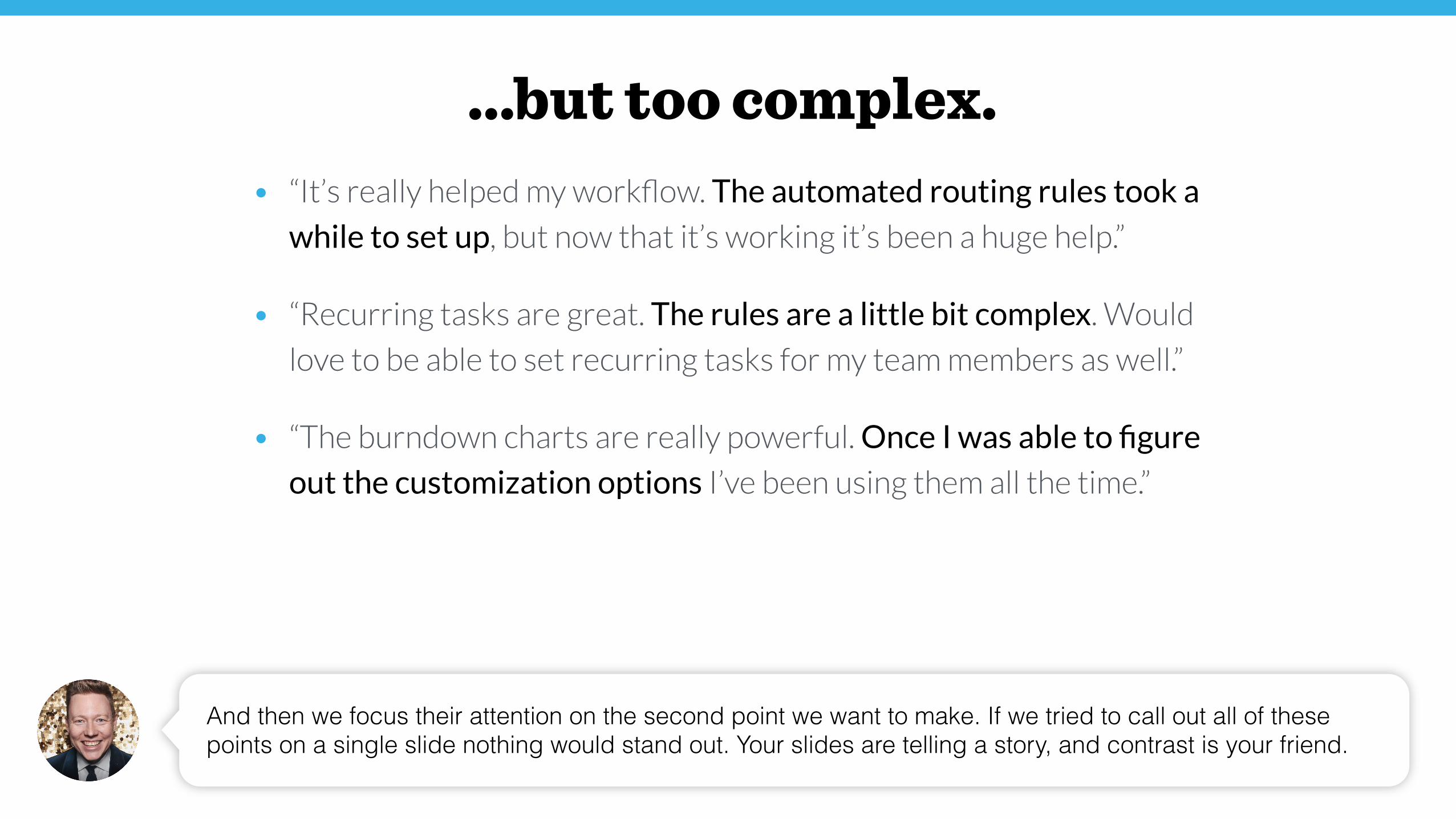
…but too complex.
And then we focus their attention on the second point we want to make. If we tried to call out all of these points on a single slide nothing would stand out. Your slides are telling a story, and contrast is your friend.
• “It’s really helped my workflow. The automated routing rules took a
while to set up, but now that it’s working it’s been a huge help.”
• “Recurring tasks are great. The rules are a little bit complex. Would
love to be able to set recurring tasks for my team members as well.”
• “The burndown charts are really powerful. Once I was able to figure
out the customization options I’ve been using them all the time.”
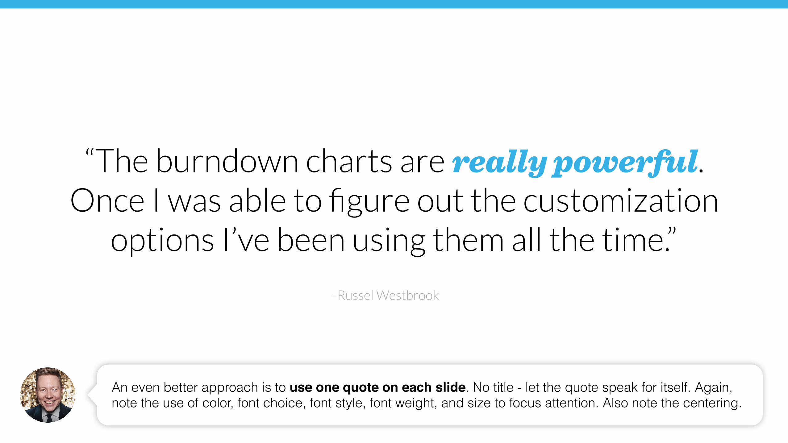
–Russel Westbrook
Once I was able to figure out the customization options I’ve been using them all the time.”
An even better approach is to use one quote on each slide. No title - let the quote speak for itself. Again, note the use of color, font choice, font style, font weight, and size to focus attention. Also note the centering.
“The burndown charts are really powerful.
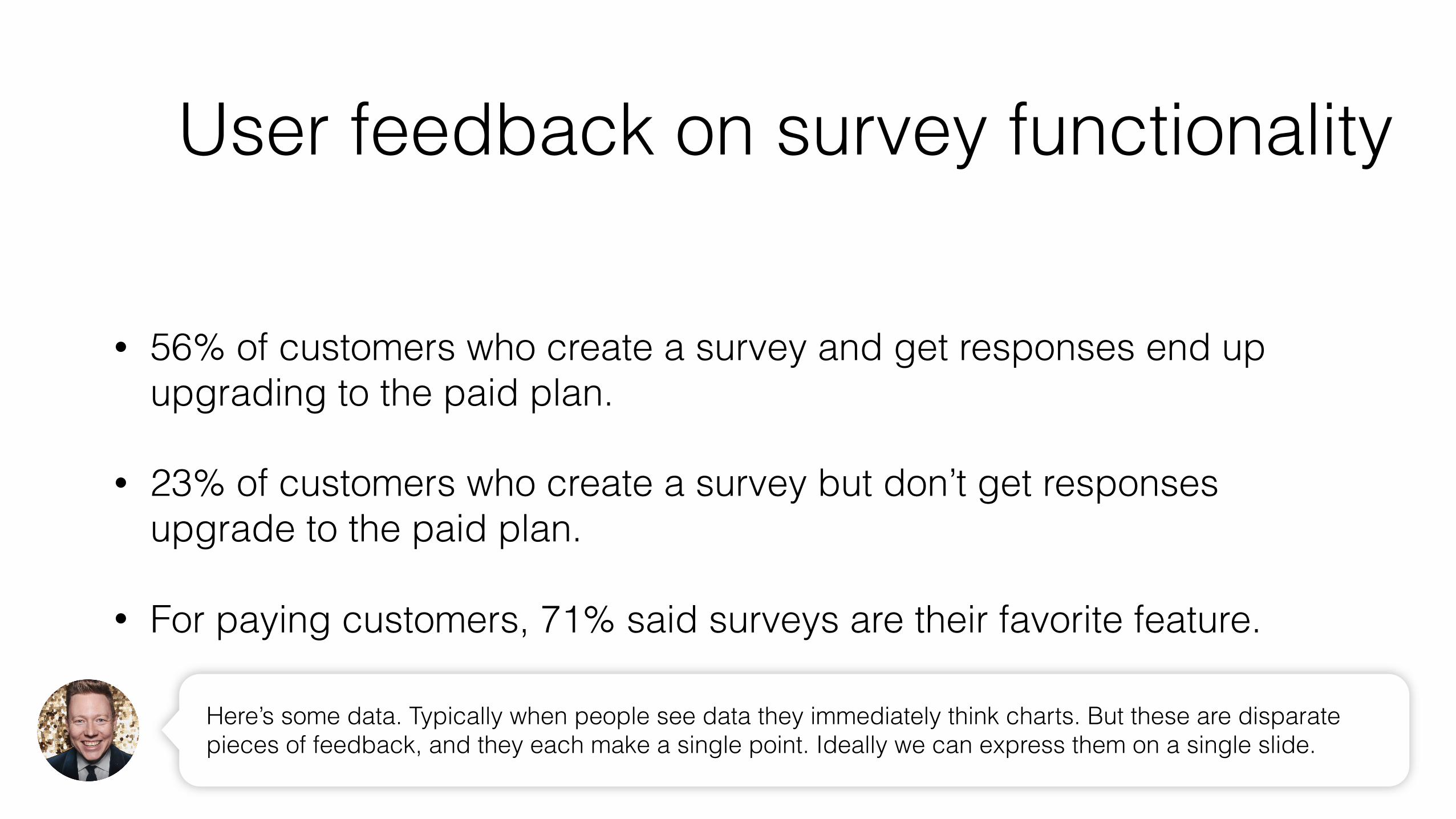
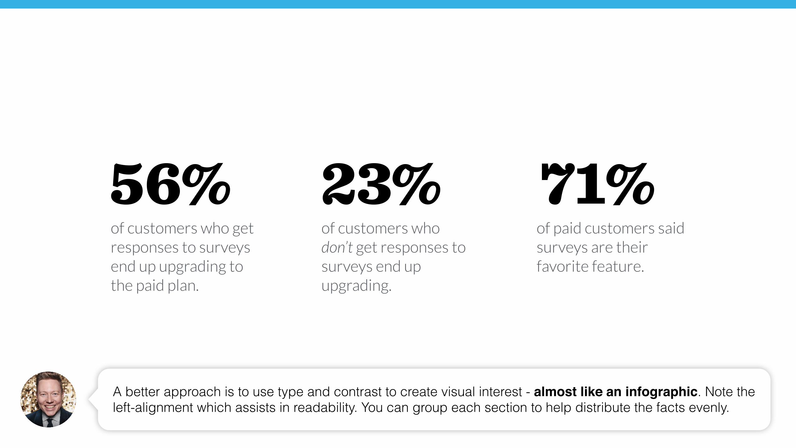
• 56% of customers who create a survey and get responses end up upgrading to the paid plan.
• 23% of customers who create a survey but don’t get responses upgrade to the paid plan.
• For paying customers, 71% said surveys are their favorite feature.
Here’s some data. Typically when people see data they immediately think charts. But these are disparate pieces of feedback, and they each make a single point. Ideally we can express them on a single slide.
User feedback on survey functionality
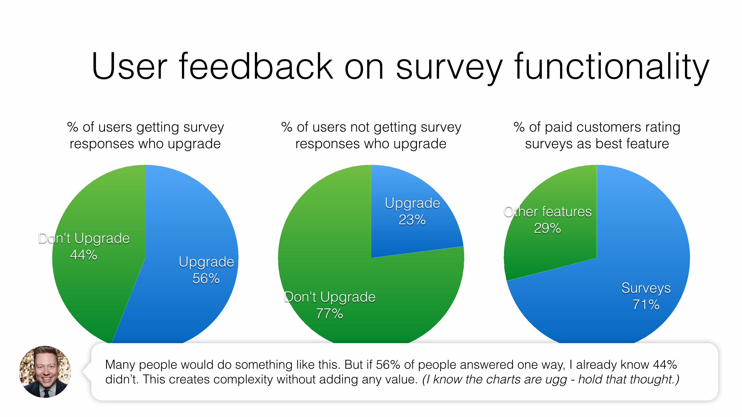
User feedback on survey functionality% of users getting survey responses who upgrade
Don't Upgrade44% Upgrade
56%
% of users not getting survey responses who upgrade
Don't Upgrade77%
Upgrade23%
% of paid customers rating surveys as best feature
Other features29%
Surveys71%
Many people would do something like this. But if 56% of people answered one way, I already know 44% didn’t. This creates complexity without adding any value. (I know the charts are ugg - hold that thought.)
of customers who don’t get responses to surveys end up upgrading.
of customers who get responses to surveys end up upgrading to the paid plan.
56% 23% 71% of paid customers said surveys are their favorite feature.
A better approach is to use type and contrast to create visual interest - almost like an infographic. Note the left-alignment which assists in readability. You can group each section to help distribute the facts evenly.
Joe DwyerMatt Anarde Sean Johnson
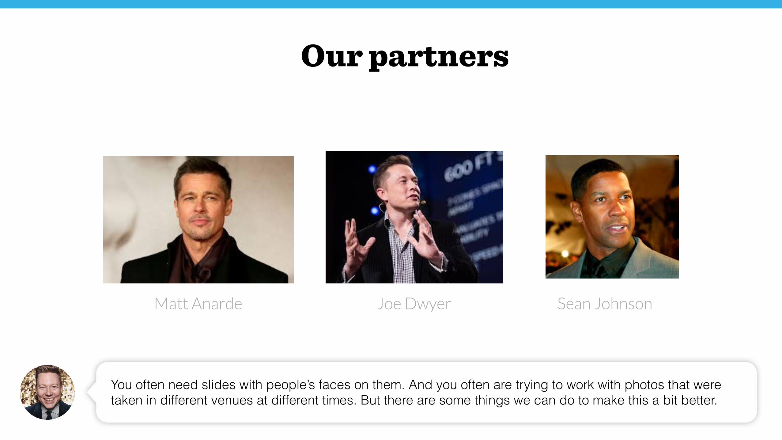
You often need slides with people’s faces on them. And you often are trying to work with photos that were taken in different venues at different times. But there are some things we can do to make this a bit better.
Our partners
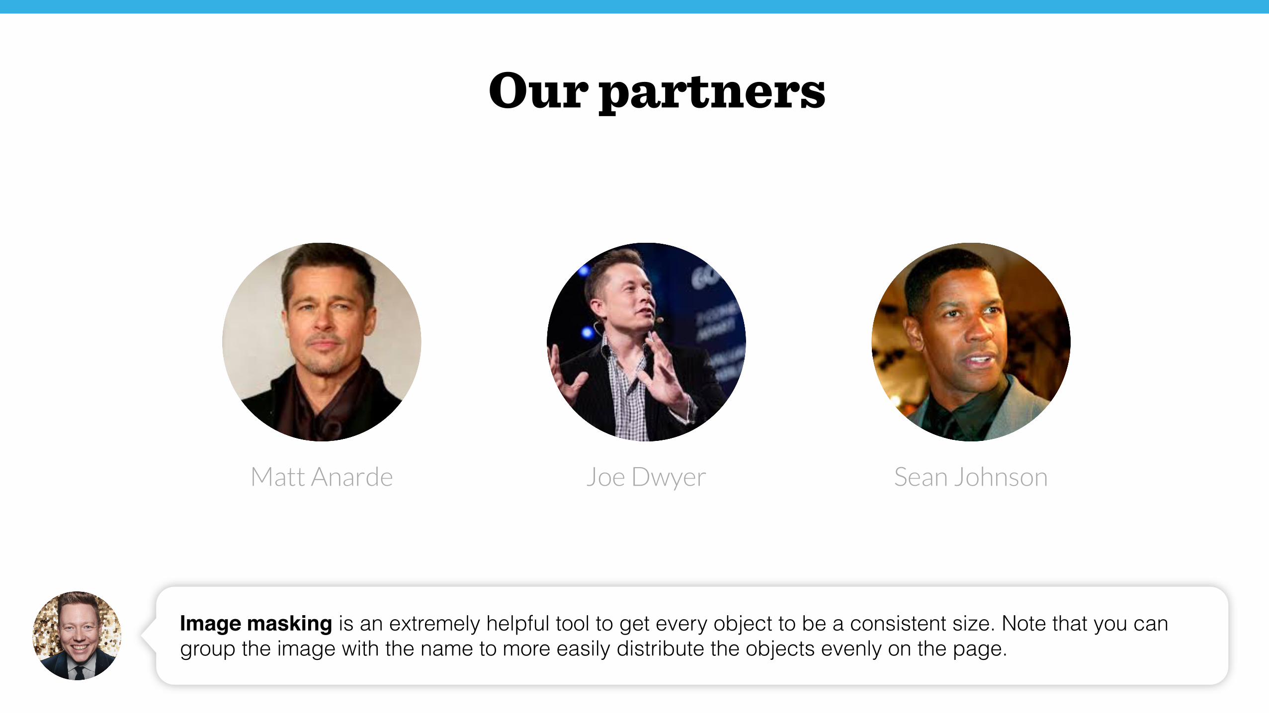
Joe DwyerMatt Anarde Sean Johnson
Image masking is an extremely helpful tool to get every object to be a consistent size. Note that you can group the image with the name to more easily distribute the objects evenly on the page.
Our partners
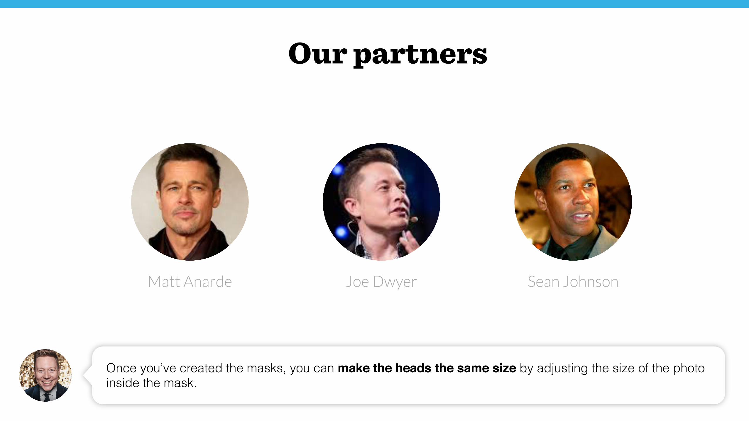
Joe DwyerMatt Anarde Sean Johnson
Once you’ve created the masks, you can make the heads the same size by adjusting the size of the photo inside the mask.
Our partners
Joe DwyerMatt Anarde Sean Johnson
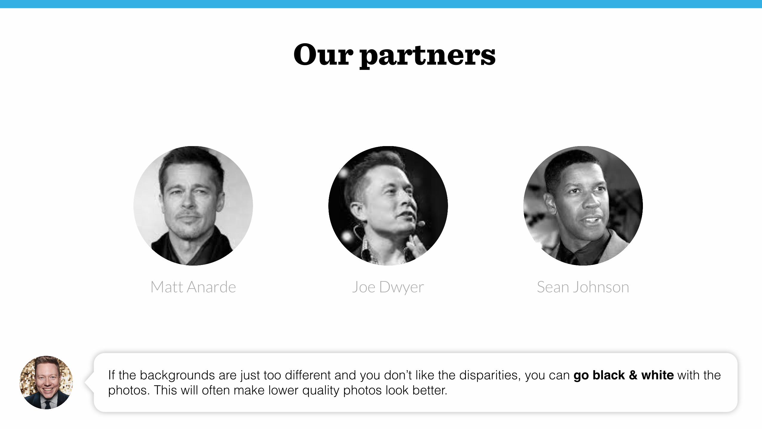
If the backgrounds are just too different and you don’t like the disparities, you can go black & white with the photos. This will often make lower quality photos look better.
Our partners
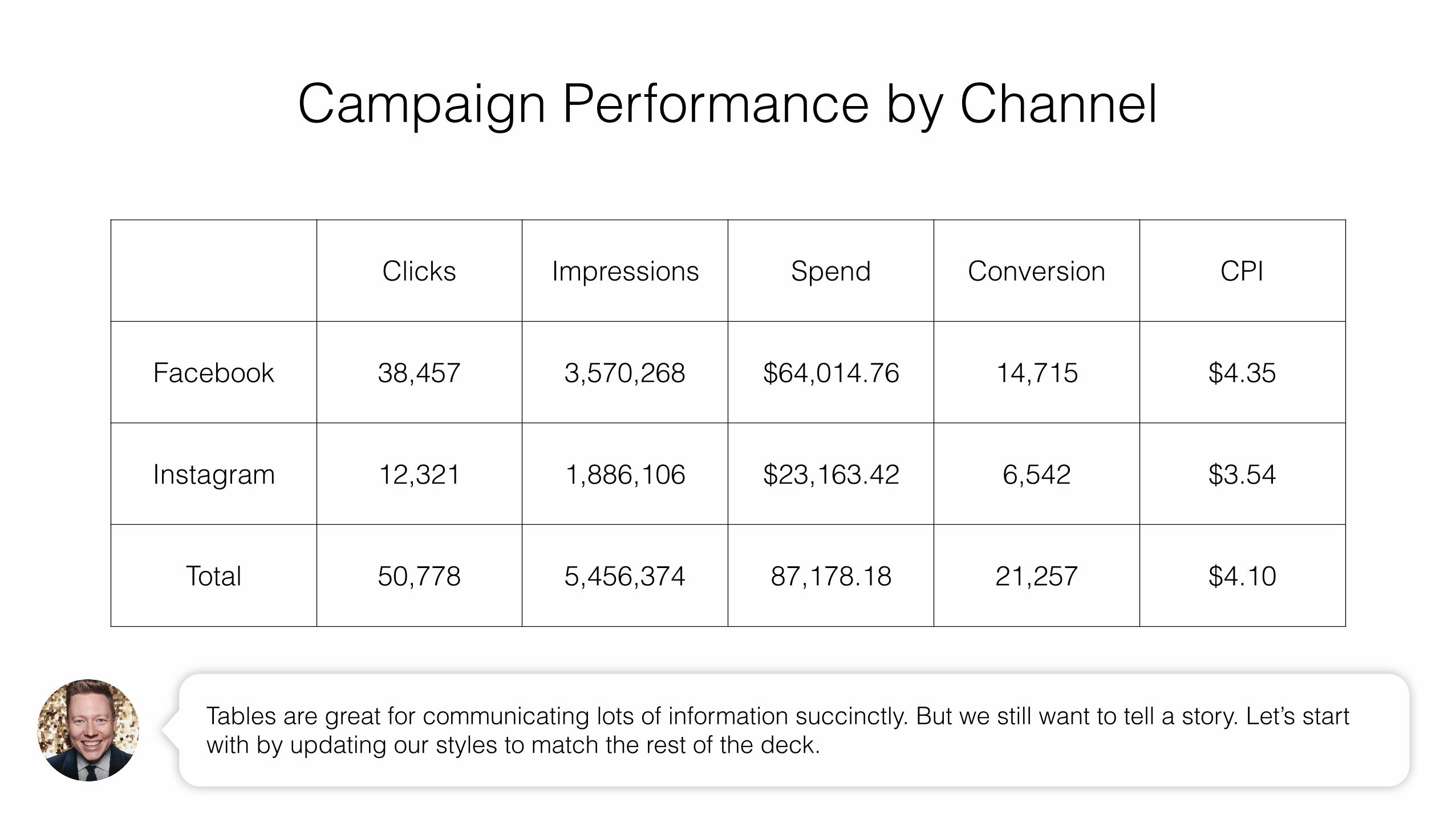
Campaign Performance by Channel
Clicks Impressions Spend Conversion CPI
Facebook 38,457 3,570,268 $64,014.76 14,715 $4.35
Instagram 12,321 1,886,106 $23,163.42 6,542 $3.54
Total 50,778 5,456,374 87,178.18 21,257 $4.10
Tables are great for communicating lots of information succinctly. But we still want to tell a story. Let’s start with by updating our styles to match the rest of the deck.
Clicks Impressions Spend Conversion CPI
Facebook 38,457 3,570,268 $64,014.76 14,715 $4.35
Instagram 12,321 1,886,106 $23,163.42 6,542 $3.54
Total 50,778 5,456,374 87,178.18 21,257 $4.10
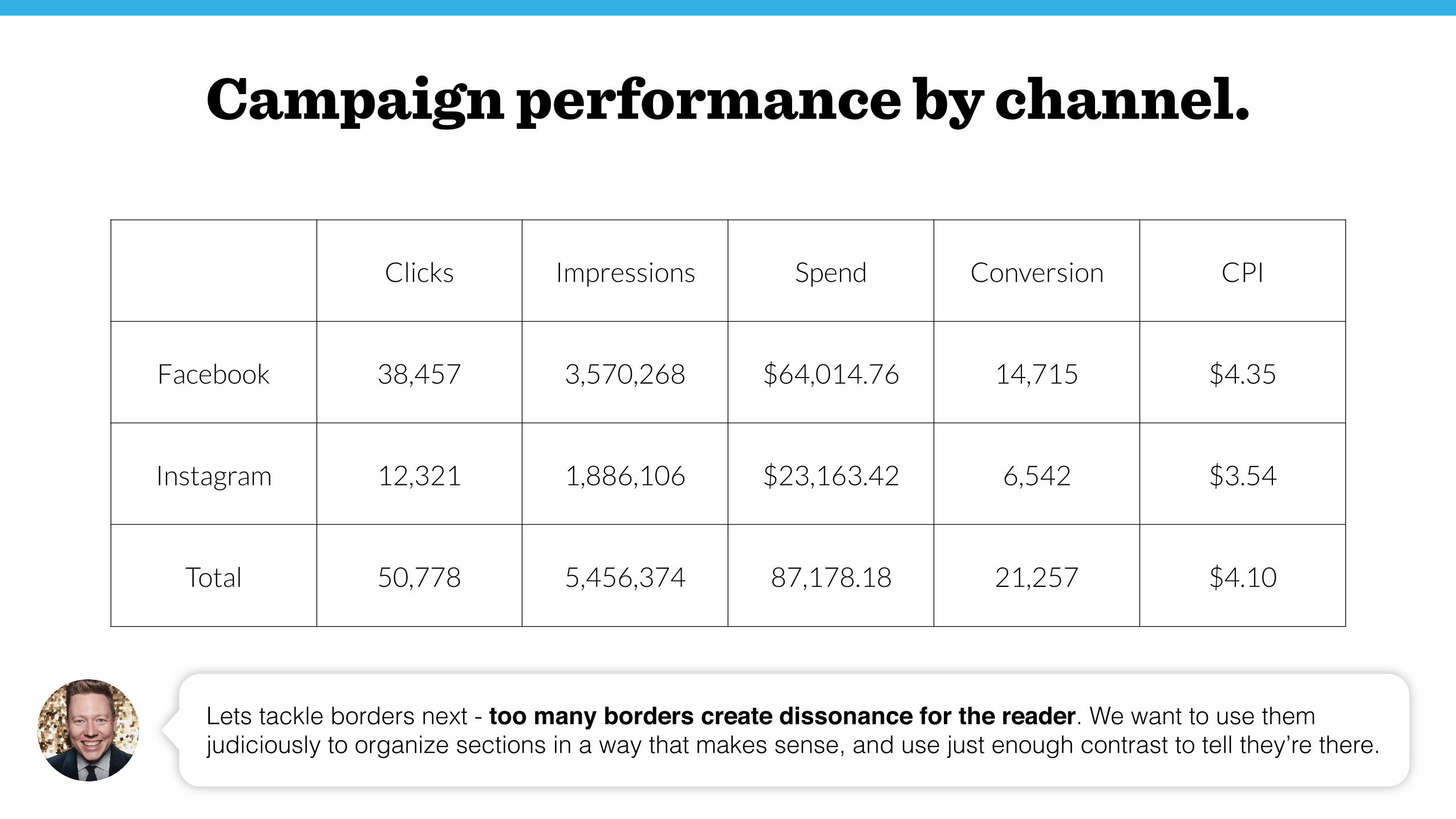
Lets tackle borders next - too many borders create dissonance for the reader. We want to use them judiciously to organize sections in a way that makes sense, and use just enough contrast to tell they’re there.
Campaign performance by channel.
Clicks Impressions Spend Conversion CPI
Facebook 38,457 3,570,268 $64,014.76 14,715 $4.35
Instagram 12,321 1,886,106 $23,163.42 6,542 $3.54
Total 50,778 5,456,374 87,178.18 21,257 $4.10
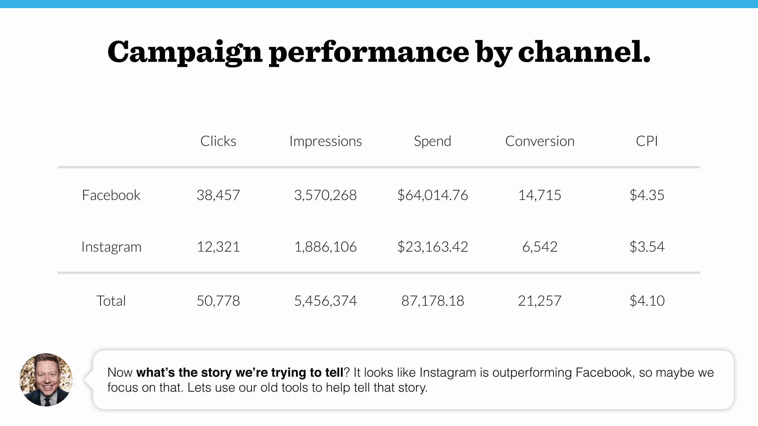
Now what’s the story we’re trying to tell? It looks like Instagram is outperforming Facebook, so maybe we focus on that. Lets use our old tools to help tell that story.
Campaign performance by channel.
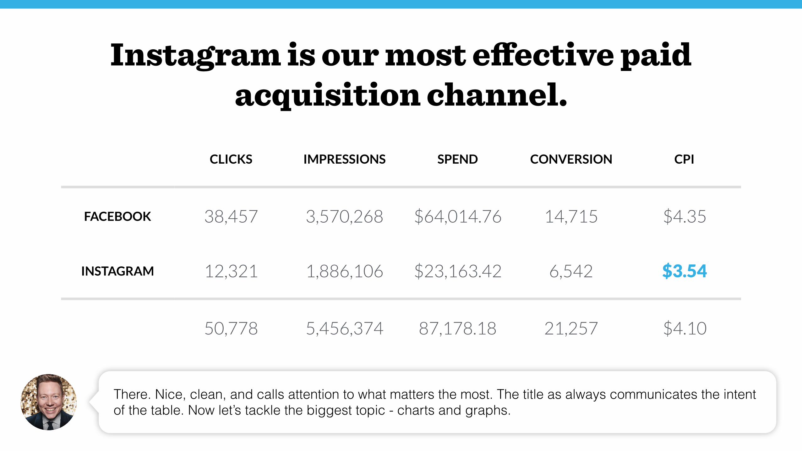
CLICKS IMPRESSIONS SPEND CONVERSION CPI
FACEBOOK 38,457 3,570,268 $64,014.76 14,715 $4.35
INSTAGRAM 12,321 1,886,106 $23,163.42 6,542 $3.54
50,778 5,456,374 87,178.18 21,257 $4.10
There. Nice, clean, and calls attention to what matters the most. The title as always communicates the intent of the table. Now let’s tackle the biggest topic - charts and graphs.
Instagram is our most effective paid acquisition channel.
Register
Complete Profile
Create First Task
Invite Colleagues
Complete First Task
0% 15% 30% 45% 60%
Task
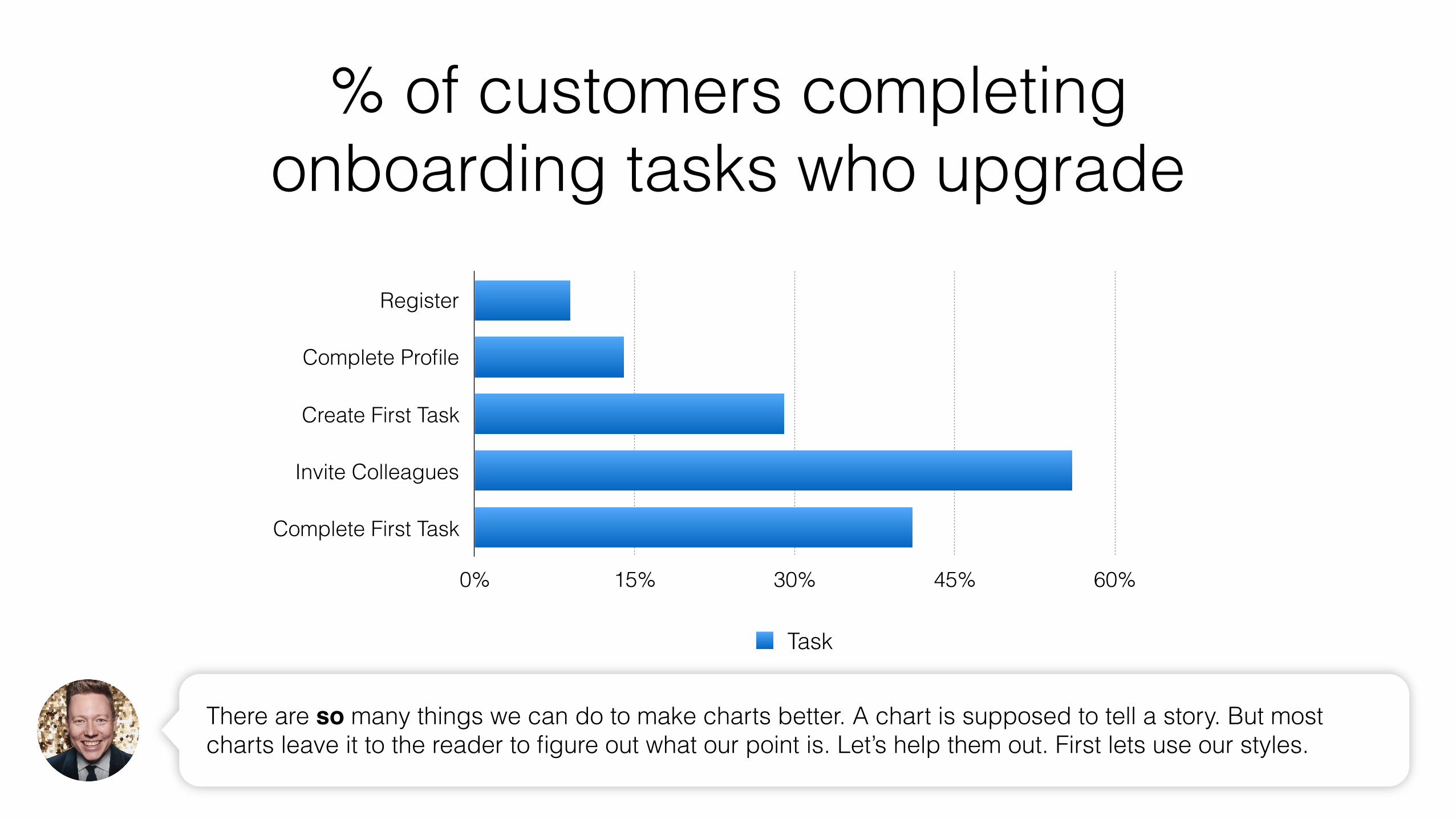
% of customers completing onboarding tasks who upgrade
There are so many things we can do to make charts better. A chart is supposed to tell a story. But most charts leave it to the reader to figure out what our point is. Let’s help them out. First lets use our styles.
Register
Complete Profile
Create First Task
Invite Colleagues
Complete First Task
0% 15% 30% 45% 60%
Task
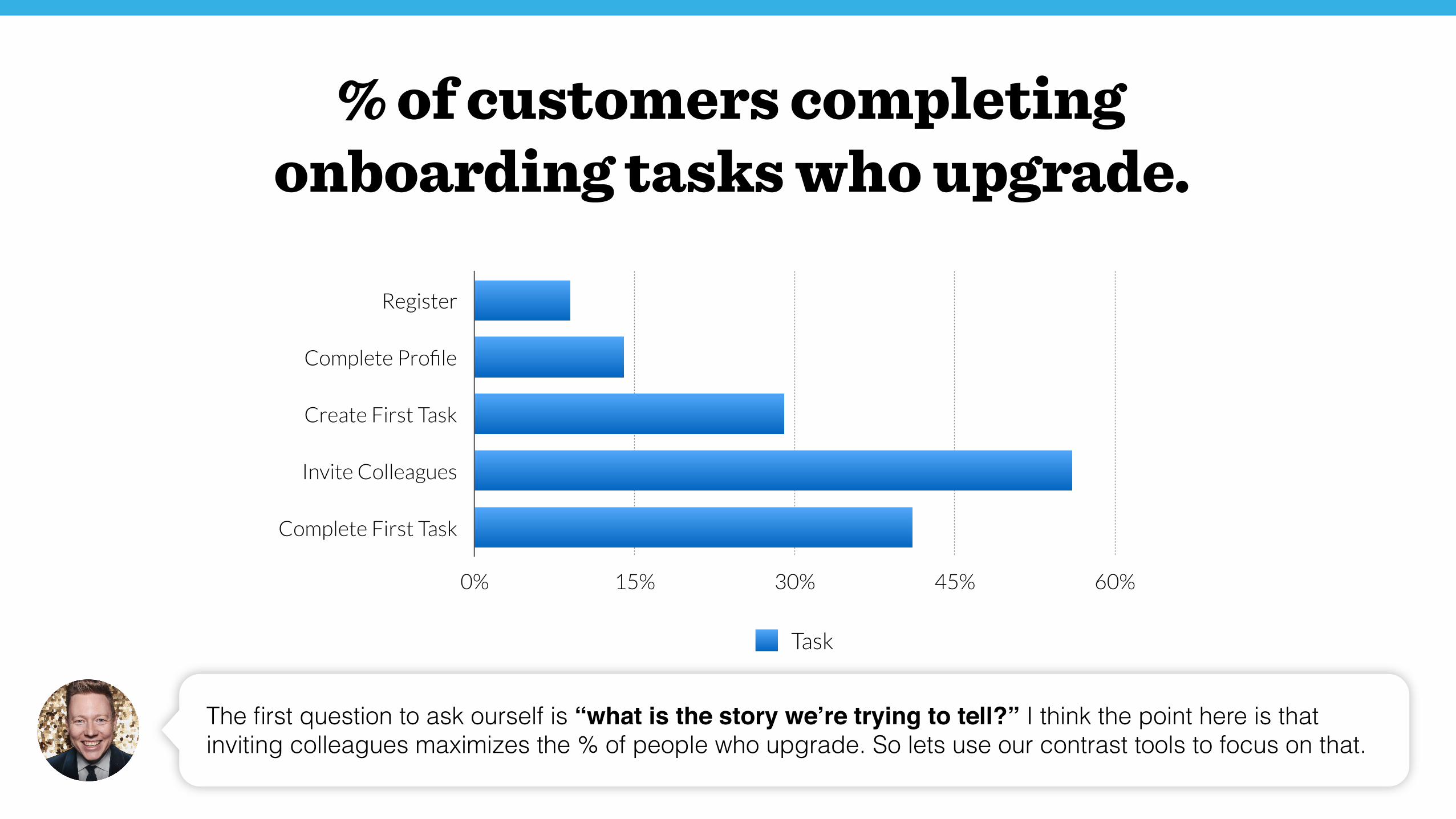
The first question to ask ourself is “what is the story we’re trying to tell?” I think the point here is that inviting colleagues maximizes the % of people who upgrade. So lets use our contrast tools to focus on that.
% of customers completing onboarding tasks who upgrade.
Register
Complete Profile
Create First Task
Invite Colleagues
Complete First Task
0% 15% 30% 45% 60%
Task
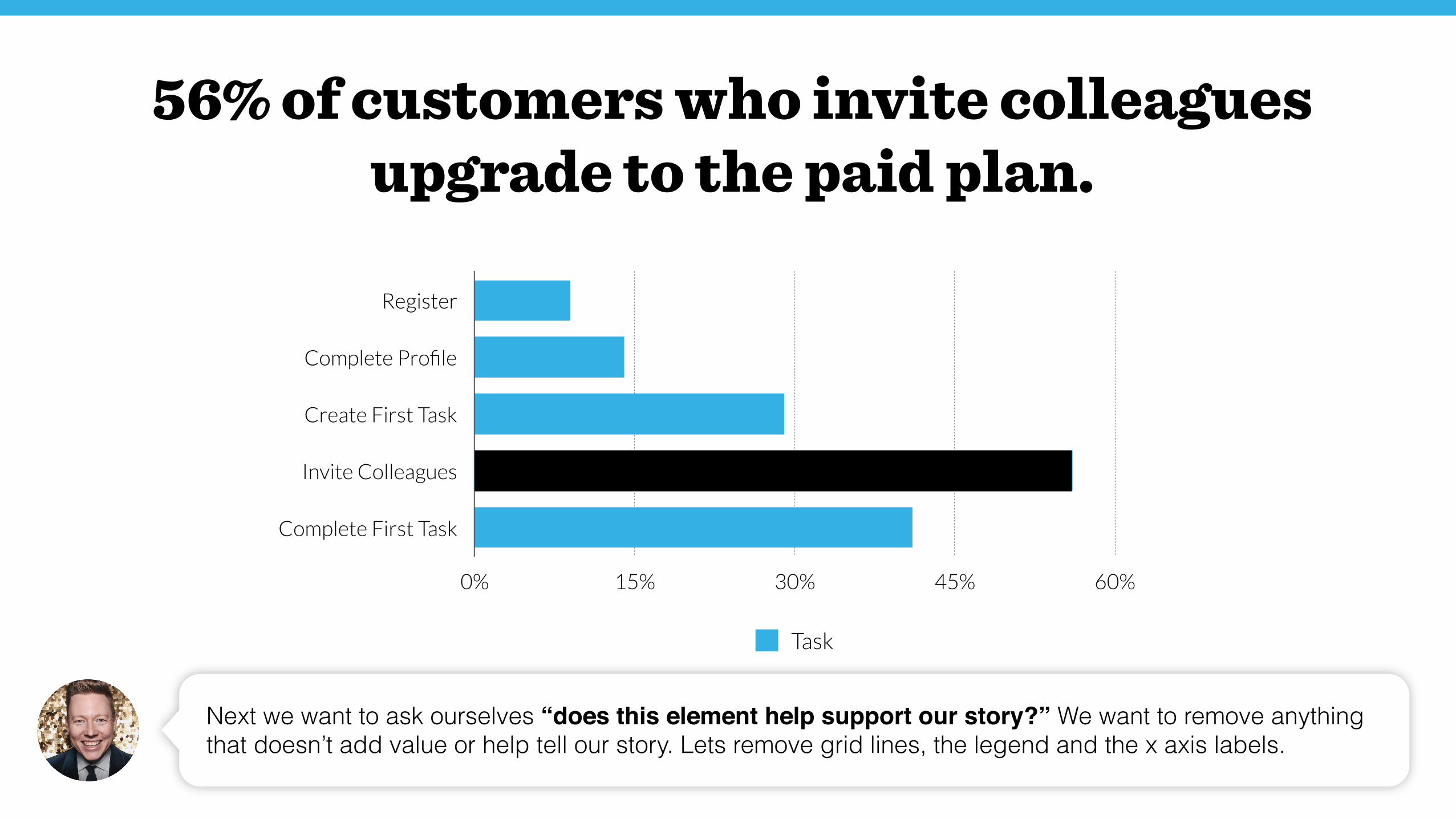
56% of customers who invite colleagues upgrade to the paid plan.
Next we want to ask ourselves “does this element help support our story?” We want to remove anything that doesn’t add value or help tell our story. Lets remove grid lines, the legend and the x axis labels.
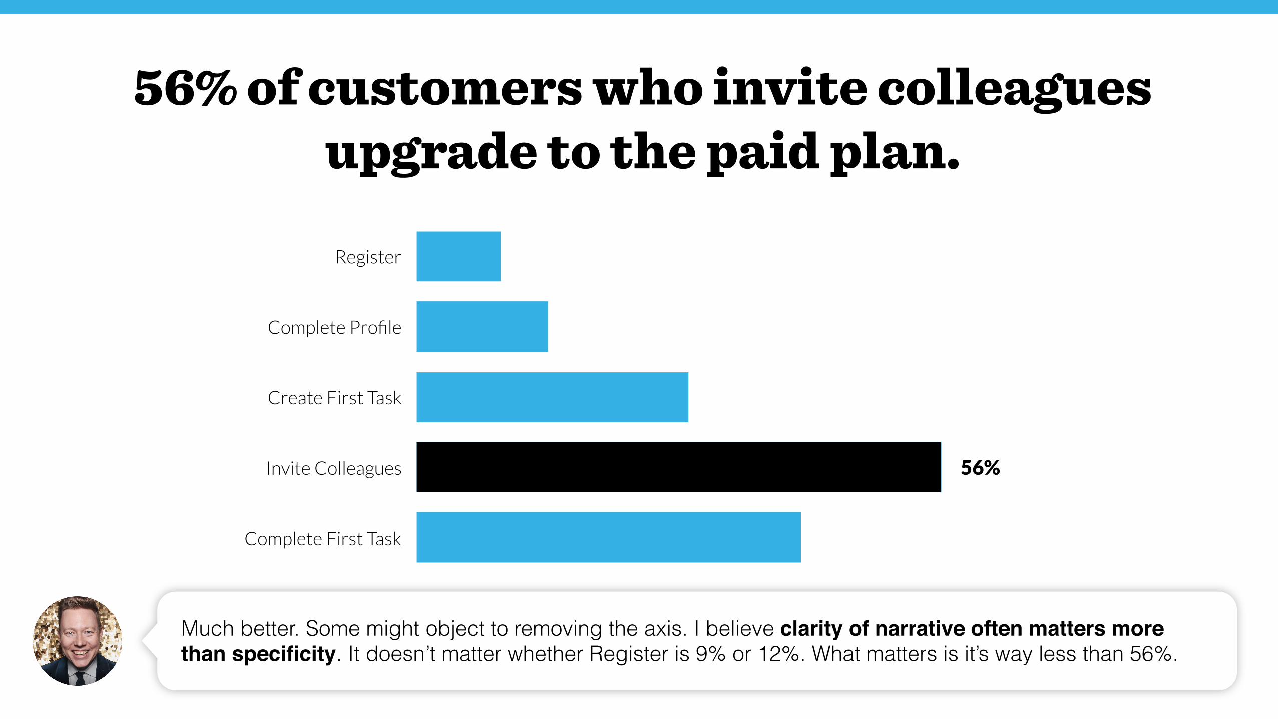
Register
Complete Profile
Create First Task
Invite Colleagues
Complete First Task
Much better. Some might object to removing the axis. I believe clarity of narrative often matters more than specificity. It doesn’t matter whether Register is 9% or 12%. What matters is it’s way less than 56%.
56%
56% of customers who invite colleagues upgrade to the paid plan.
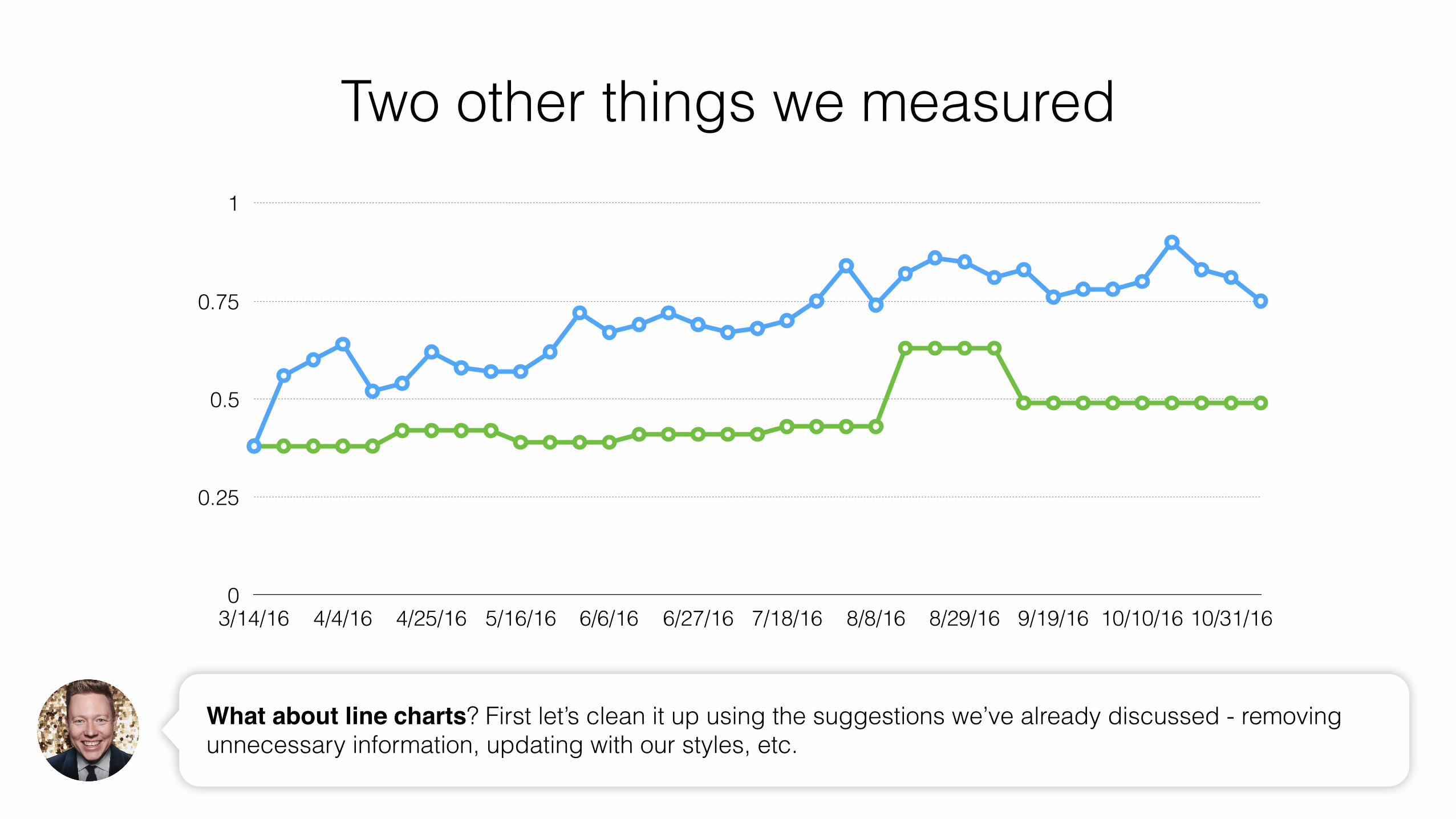
Two other things we measured
0
0.25
0.5
0.75
1
3/14/16 4/4/16 4/25/16 5/16/16 6/6/16 6/27/16 7/18/16 8/8/16 8/29/16 9/19/16 10/10/16 10/31/16
What about line charts? First let’s clean it up using the suggestions we’ve already discussed - removing unnecessary information, updating with our styles, etc.
0
0.25
0.5
0.75
1
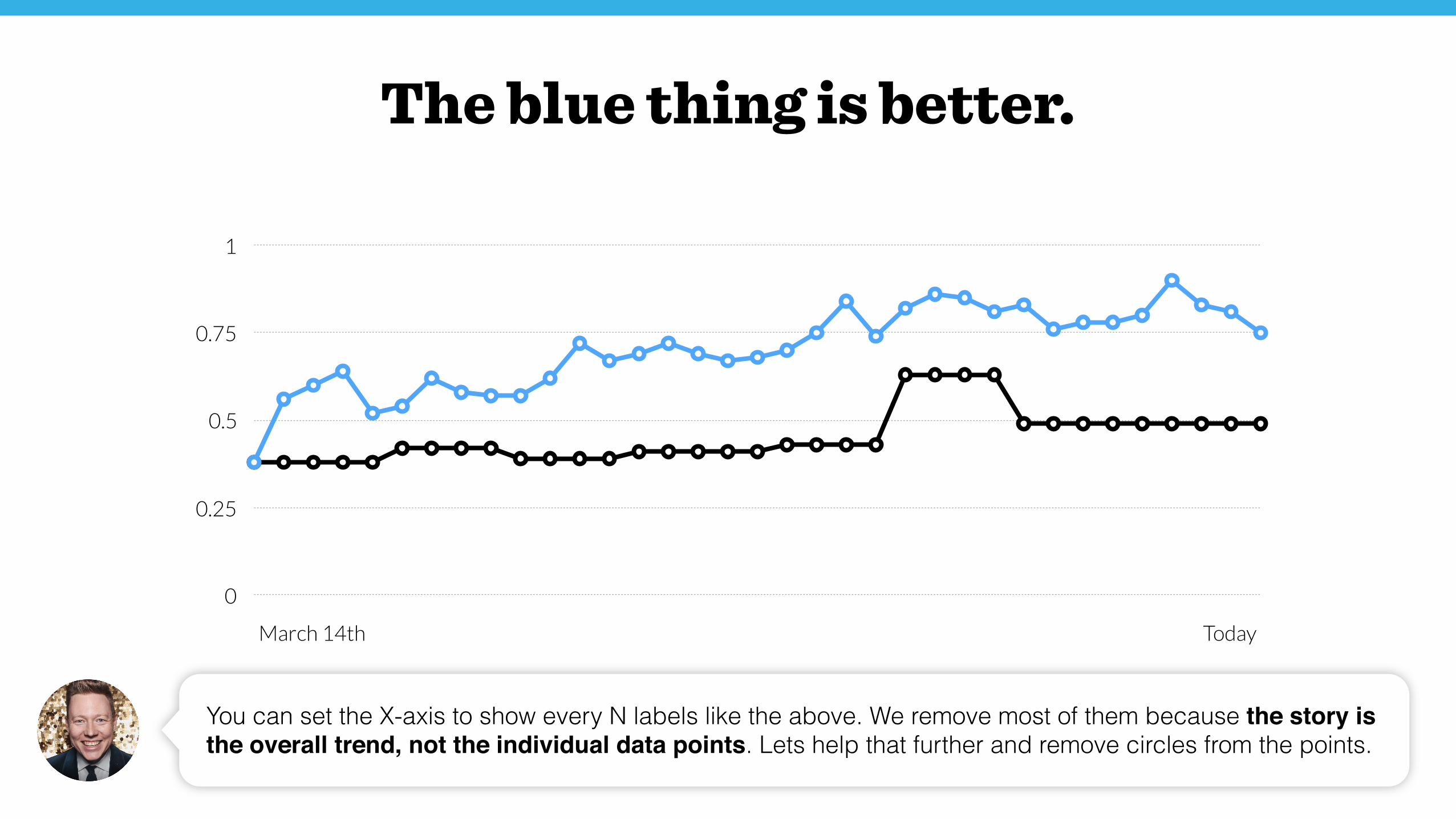
You can set the X-axis to show every N labels like the above. We remove most of them because the story is the overall trend, not the individual data points. Lets help that further and remove circles from the points.
The blue thing is better.
March 14th Today
0
0.25
0.5
0.75
1
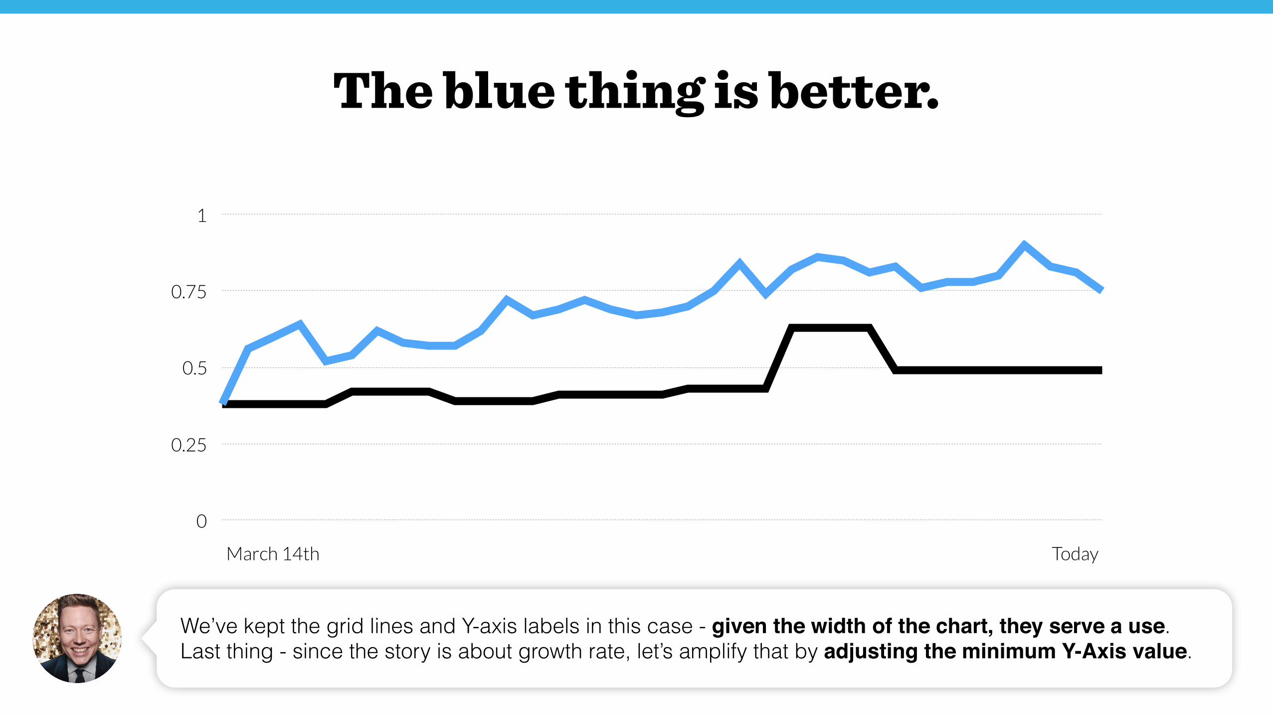
We’ve kept the grid lines and Y-axis labels in this case - given the width of the chart, they serve a use. Last thing - since the story is about growth rate, let’s amplify that by adjusting the minimum Y-Axis value.
The blue thing is better.
March 14th Today
0.25
0.5
0.75
1
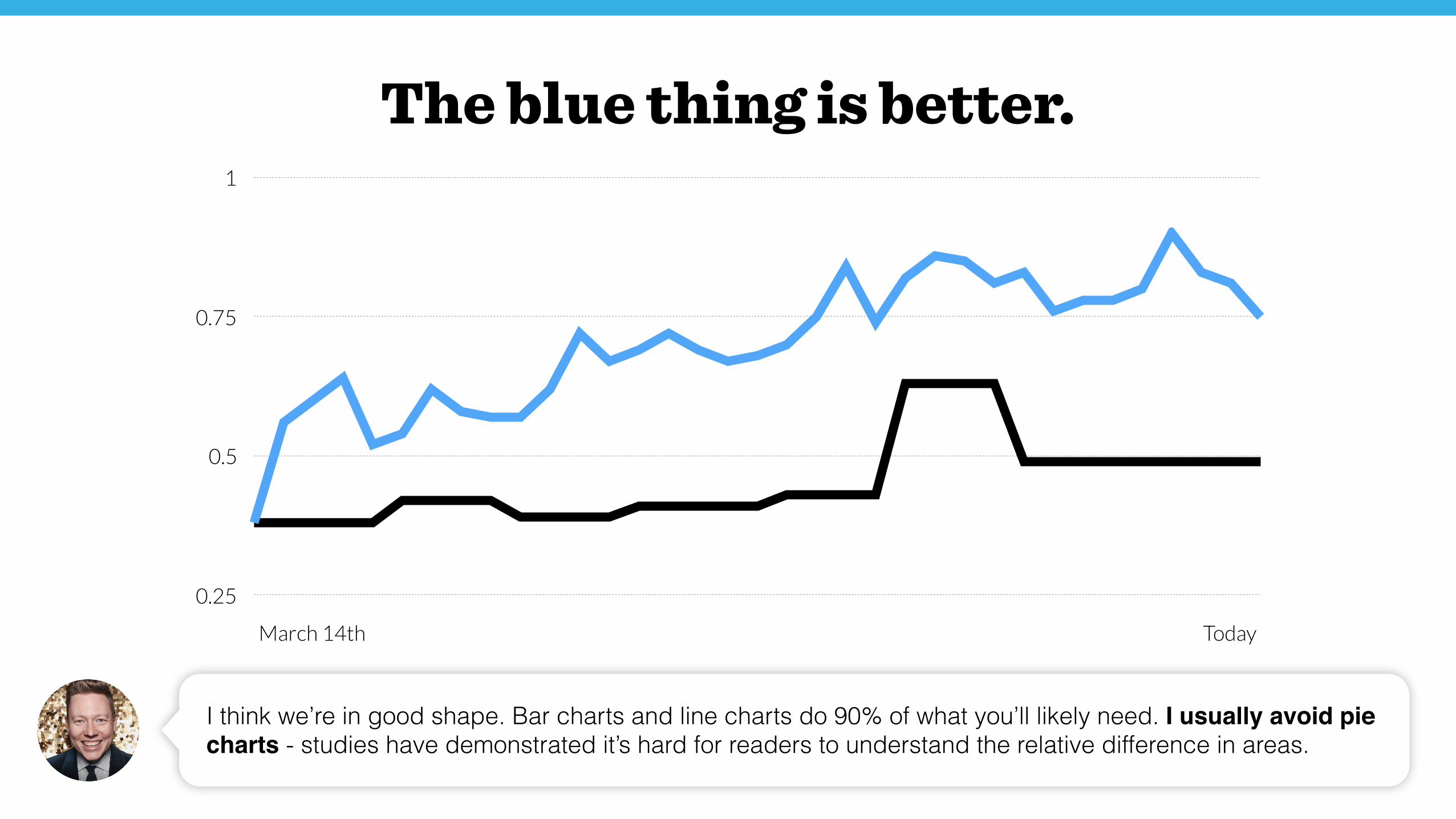
I think we’re in good shape. Bar charts and line charts do 90% of what you’ll likely need. I usually avoid pie charts - studies have demonstrated it’s hard for readers to understand the relative difference in areas.
The blue thing is better.
March 14th Today
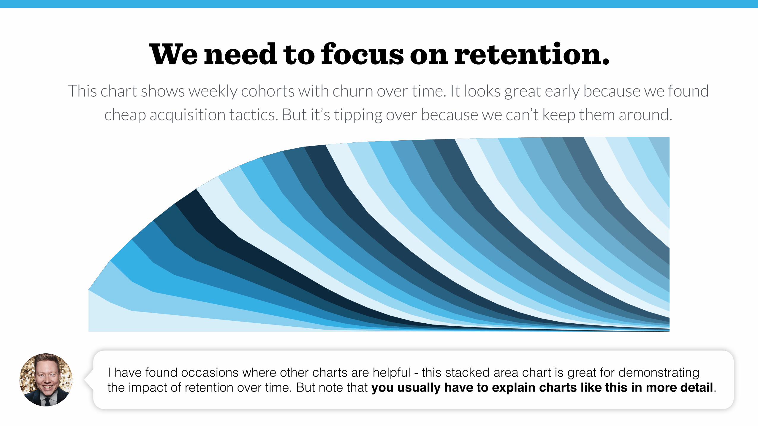
I have found occasions where other charts are helpful - this stacked area chart is great for demonstrating the impact of retention over time. But note that you usually have to explain charts like this in more detail.
We need to focus on retention.This chart shows weekly cohorts with churn over time. It looks great early because we found
cheap acquisition tactics. But it’s tipping over because we can’t keep them around.
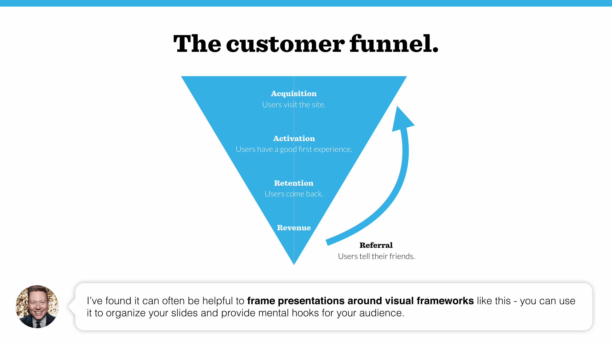
Acquisition Users visit the site.
Activation Users have a good first experience.
Retention Users come back.
Referral Users tell their friends.
Revenue
I’ve found it can often be helpful to frame presentations around visual frameworks like this - you can use it to organize your slides and provide mental hooks for your audience.
The customer funnel.
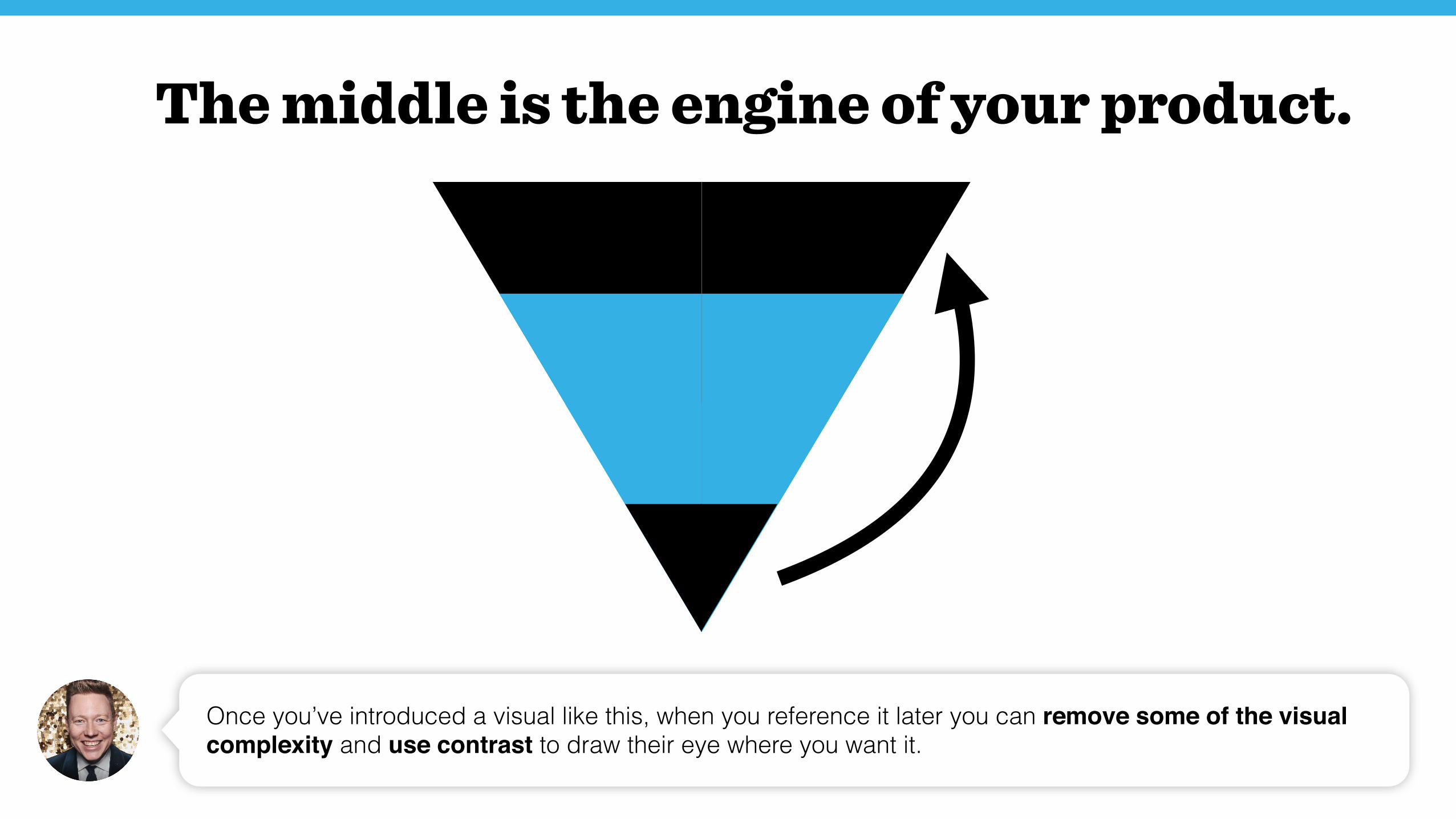
The middle is the engine of your product.
Once you’ve introduced a visual like this, when you reference it later you can remove some of the visual complexity and use contrast to draw their eye where you want it.
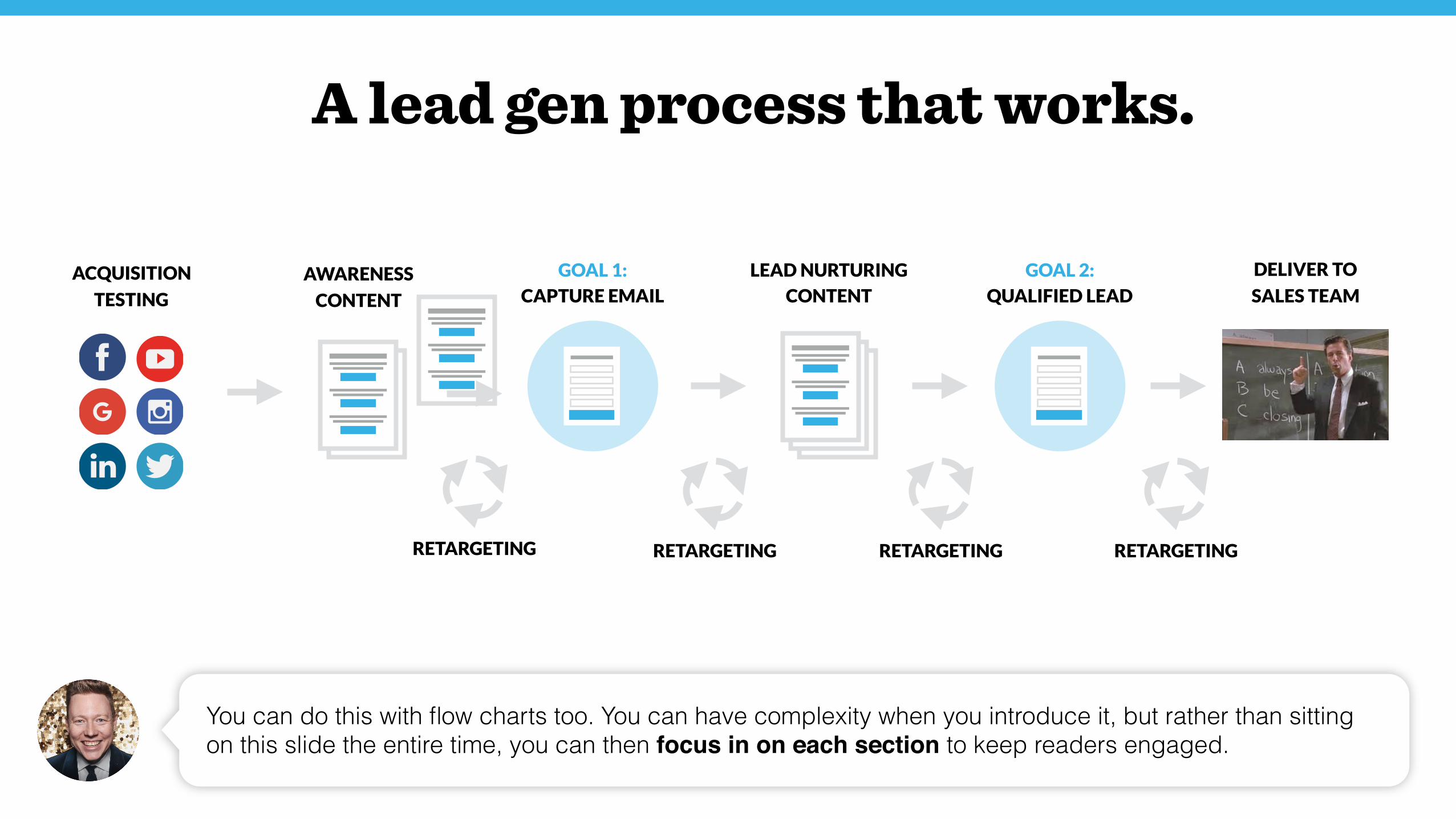
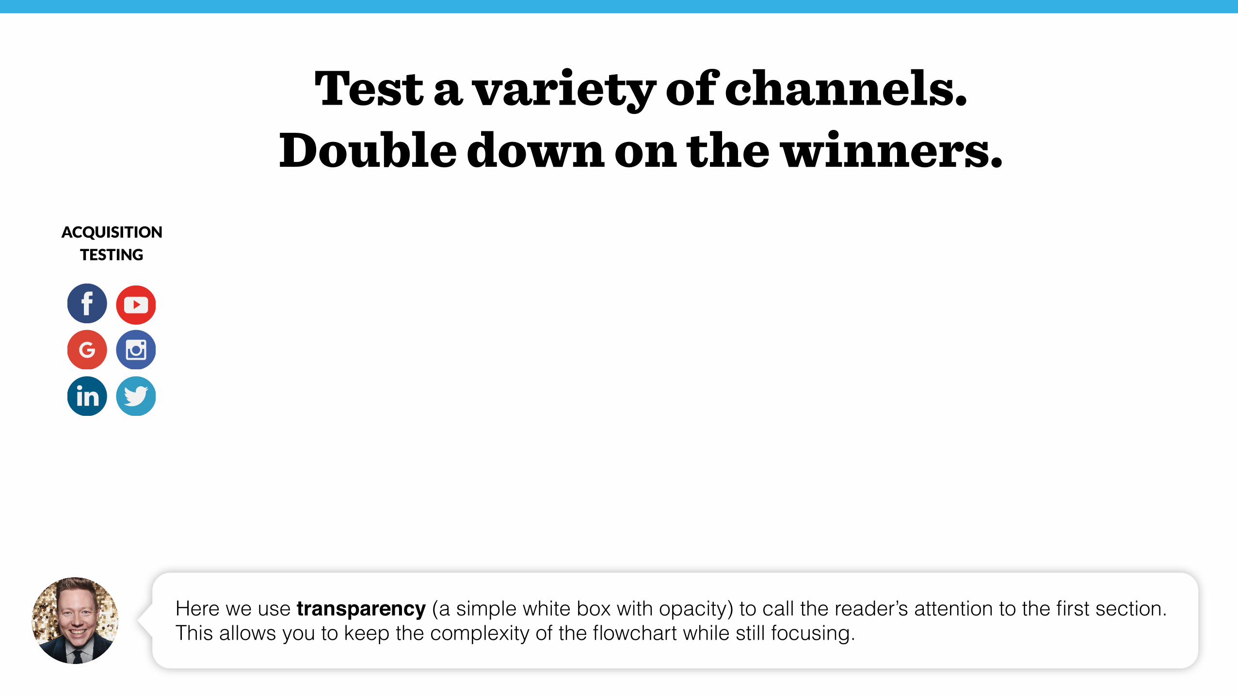
ACQUISITION
TESTING
AWARENESS
CONTENT
LEAD NURTURING
CONTENT
GOAL 1:
CAPTURE EMAIL
GOAL 2:
QUALIFIED LEAD
DELIVER TO
SALES TEAM
RETARGETING RETARGETING RETARGETING RETARGETING
A lead gen process that works.
You can do this with flow charts too. You can have complexity when you introduce it, but rather than sitting on this slide the entire time, you can then focus in on each section to keep readers engaged.
ACQUISITION
TESTING
AWARENESS
CONTENT
LEAD NURTURING
CONTENT
GOAL 1:
CAPTURE EMAIL
GOAL 2:
QUALIFIED LEAD
DELIVER TO
SALES TEAM
RETARGETING RETARGETING RETARGETING RETARGETING
Test a variety of channels. Double down on the winners.
Here we use transparency (a simple white box with opacity) to call the reader’s attention to the first section. This allows you to keep the complexity of the flowchart while still focusing.
That’s it! I hope you found this helpful. If you have other ideas or suggestions I’d love to hear about them - lets connect on LinkedIn or follow me on Twitter.
Thanks for reading!