how effective is the combination of your main
TRANSCRIPT

How effective is the combination of your main
product and ancillary texts?

For my three products and ancillary texts I have kept an obvious theme of film noir in keeping with house style. This was important so that the three compliment one another and are easily recognisable, this continuity prevents confusion for the audience and the three interlinking are more likely to entice them. The following are a list of the fonts and elements used to show evidence of my continuity and how my three products are successfully combined.
Teaser Trailer
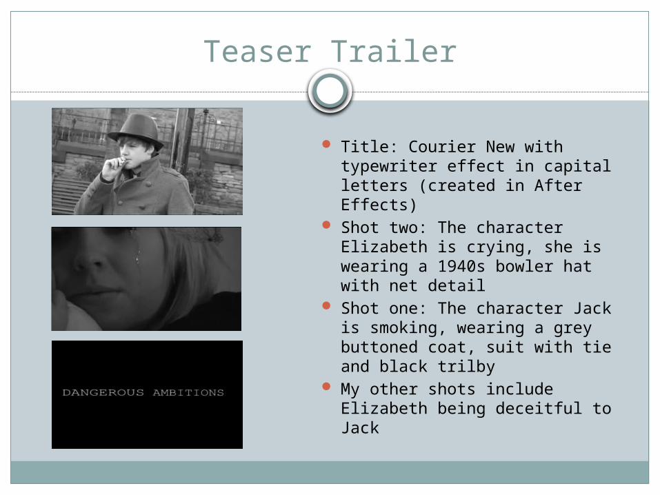
Title: Courier New with typewriter effect in capital letters (created in After Effects)
Shot two: The character Elizabeth is crying, she is wearing a 1940s bowler hat with net detail
Shot one: The character Jack is smoking, wearing a grey buttoned coat, suit with tie and black trilby
My other shots include Elizabeth being deceitful to Jack
Film Poster
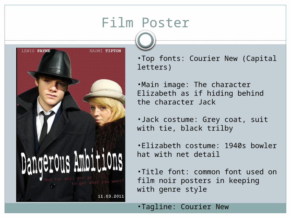
•Top fonts: Courier New (Capital letters)
•Main image: The character Elizabeth as if hiding behind the character Jack
•Jack costume: Grey coat, suit with tie, black trilby
•Elizabeth costume: 1940s bowler hat with net detail
•Title font: common font used on film noir posters in keeping with genre style
•Tagline: Courier New
•Red background
Film Magazine Cover
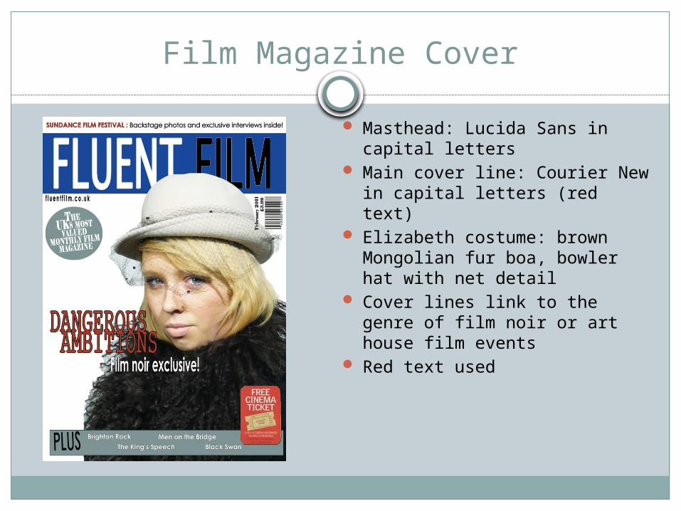
Masthead: Lucida Sans in capital letters
Main cover line: Courier New in capital letters (red text)
Elizabeth costume: brown Mongolian fur boa, bowler hat with net detail
Cover lines link to the genre of film noir or art house film events
Red text used

Combination of product and ancillary texts
To successfully combine my three products I have used the font Courier New throughout, this font is the most similar to a typewriter look which links to the style of my film and narrative. I have used this as the main cover line text on my film magazine, the film title on my teaser trailer and for the surrounding text on my film poster. This continuity helps with establishing brand identity.
The two main characters, Jack and Elizabeth, appear on both the poster and within the trailer and Elizabeth being used on my film magazine front cover. This then helps the audience identify with actors and characters and can easily develop an understanding of the time period.
The characters' costumes are the same in all three products to show that they are in character and not the actor, this keeps with a house style and the iconography of the femme fatale combines the products successfully.
The colour red has also been used throughout the products as it connotes danger which highlights the title name. This has been used for the background of the poster, text on the magazine cover and although in black and white, fake blood has bee used in one of our shots in keeping with the brand identity.
Overall I think the combination of the fonts, colour scheme, actors, costume and key iconography have created a successful complimenting promotional package for my film noir teaser trailer, therefore the combination of my main product and ancillary texts have been effective.