how to design a logo
TRANSCRIPT
How toDesign a Logo

2 | How to Design a logo
The sleek simplicity of the Nike “Swoosh”, the old-fashioned curls of the Coca-Cola red script, the emphatic symmetry of McDonald’s golden arches, and that nice big bite taken out of the Apple apple. These are examples of logos whose emblematic design features are ingrained in our modern psyche. Whether the company they represent invented their product or not, each of those logos are intrinsically linked to their industry, defining how we visualize the appearance of sneakers, soda, fast food and consumer electronics. These are logos that transcend the bounds of their graphics; they’re icons of modern life.
These examples are reminders that the importance of a business’s logo can’t be overstated. The simple graphical and visual details in a logo are what customers and consumers will immediately be drawn to when looking at a company’s website, their ads, business cards and any other products and materials that a company produces. With the proliferation of branding and ecommerce, logos have never been in greater demand. At the same time, consumers today are savvy and quick to judge; logos are therefore the most important component of business marketing
How to Design a Logo

because they are a consumer’s first - and sometimes only - impression of a business. While this has led to a boom in logo design services, it also means that the bar for logos has been set high.
Designing a logo for businesses and brands might seem simple, but it requires more than Photoshop and InDesign skills. Logo designers have to work well with customers and be able to establish a clear and legible message and identity through design, fulfilling a business’s needs without being redundant or commonplace. So let’s get into the specifics. This is what you need to know to design a logo.
How to Design a Logo
3 | How to Design a logo
4 | How to Design a logo
There are all sorts of logos. Just like the companies that they represent, logos run the gamut in terms of their shape, style, color and tone. The whacky psychedelic style of the MTV logo is pretty different from the straightedge flatness of The Gap. Nevertheless there are some basic features and trends that reflect best practices for logo design. Of course, sometimes a client will want to intentionally go against the grain and buck common sense trends as an identity statement. For the majority of the logos you’re designing though, you’ll want to follow some basic guidelines.
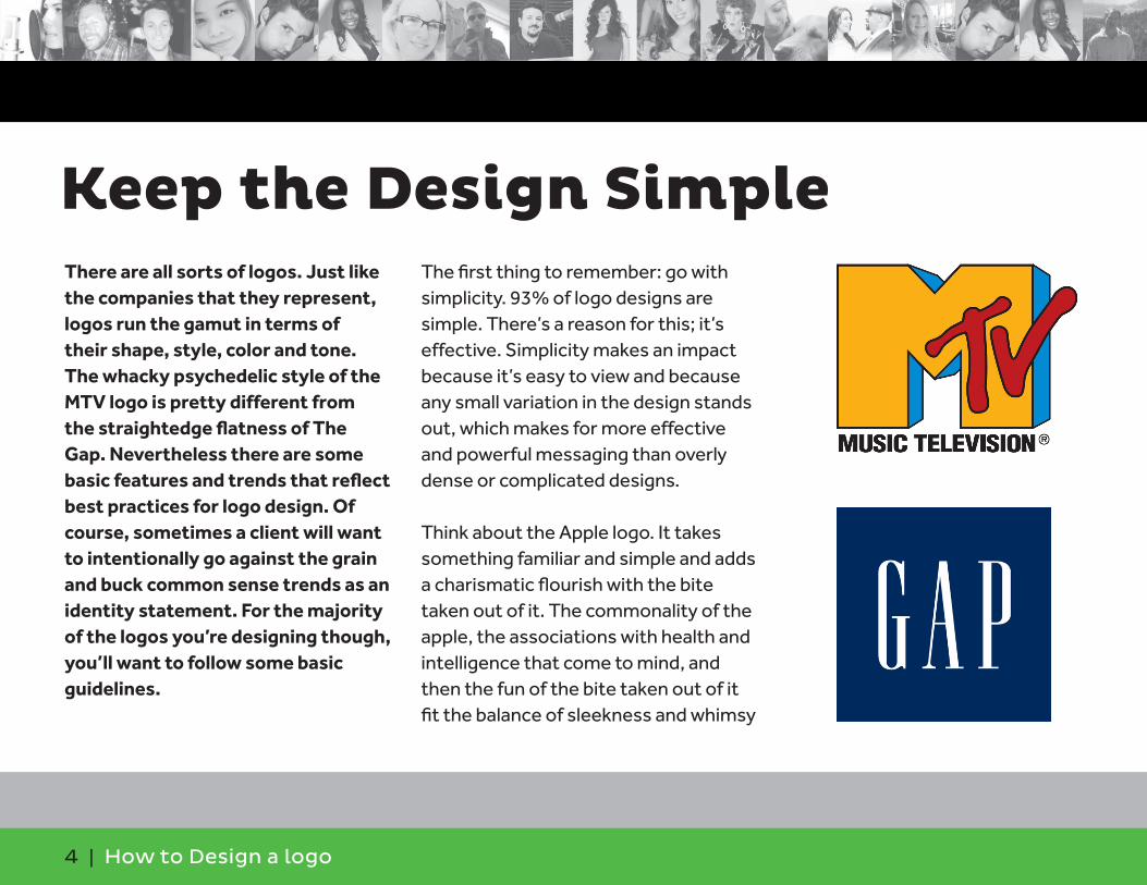
The first thing to remember: go with simplicity. 93% of logo designs are simple. There’s a reason for this; it’s effective. Simplicity makes an impact because it’s easy to view and because any small variation in the design stands out, which makes for more effective and powerful messaging than overly dense or complicated designs.
Think about the Apple logo. It takes something familiar and simple and adds a charismatic flourish with the bite taken out of it. The commonality of the apple, the associations with health and intelligence that come to mind, and then the fun of the bite taken out of it fit the balance of sleekness and whimsy
Keep the Design Simple

5 | How to Design a logo
that define the company’s identity. The IBM logo, on the other hand, is a simple, blocky, bold serif font that is striated. This simple break in the font makes the understated logo dynamic, which is in line with the company’s reserved but strong identity. What’s simpler and more straightforward than the Target target? The name is not even necessary anymore because its symbol is so easily identifiable as a target: red center, white circle, red circle. Presto! It’s visually absorbing - a target is meant to direct attention - and also suggests subliminally that the Target store is a destination, somewhere to aim yourself toward and where you can hit the “bull’s-eye” and get whatever you need.
Keep the Design Simple

6 | How to Design a logo
Color is the most dynamic feature in a logo and also probably the most difficult thing to determine. Colors have so many associations that you have to be thoughtful in deciding which to use.
While logos come in all sorts of colors, the most popular for top brands are blue (33%), red (29%), gray scale colors (28%) and yellow or gold (13%). Of course there are tons of top brand logos in green (Starbucks), brown (UPS), pink (Barbie) and all variety of other colors.
The first thing to consider when thinking about color is how many colors to use. Check out the logos for top brands and you’ll notice that most only have one or two. 95% of top brands, in fact, use only one or at most two. This is another way in which designs are kept simple so as to make a more significant impact. Using a limited palette intensifies the associations linked to the color and therefore needs to
Match Color and Message

7 | How to Design a logo
be considered when taking into account the message your client wants with their logo.
Think about the logos for Gap and Levi’s. Their basic formal elements are the same: a single color quadrilateral with the brand’s name printed in white inside. Yet the character of the logos is dramatically different. The Levi’s red is active, it speaks to intensity, daring, a cowboy-style confidence and flare with an old-fashioned appeal while the Gap blue is calmly confident, conservative, stable and also feels more contemporary.
The old versus new quality of red and blue comes through in Coca-Cola’s and Pepsi’s logos. Coca-Cola red invokes the long history of Coca-Cola, you’re reminded that it’s been
Match Color and Message

8 | How to Design a logo
around since the late 19th century - just like Levi’s. The Pepsi blue is meant to appear more recent, which is exactly how the company has characterized itself. Pepsi’s block sans-serif font is also meant to contrast with the old-fashioned character of the Coca-Cola font. Unlike Gap’s logo, however, Pepsi includes red, as well as white, to give it a dynamic, yin-and-yang like contrast that makes it edgier, more assertive and youthful.
Pepsi is in that statistically small category of logos that has more than two colors, but there are plenty of other major brands that have effectively used many colors so as to appear unique. Google is the most notable among them. The current, and recently redesigned, Google logo is the company name written in a flat sans-serif font with the two “g”s in blue, one “o” and an “e” in red, another “o” in yellow and the one “l” in green. The logo design thus appears playful, fun and very distinct. This style, in some ways, has come to define the character of tech company casual. NBC has used the rainbow colors of its peacock logo to great effect as well, establishing a distinct and evocative logo that remains immediately recognizable.
Match Color and Message
9 | How to Design a logo
While everything covered so far are tried and true characteristics of successful logo design, designers today are finding that they’re having to be more and more daring and innovative in their logo designs to get them and their clients noticed.
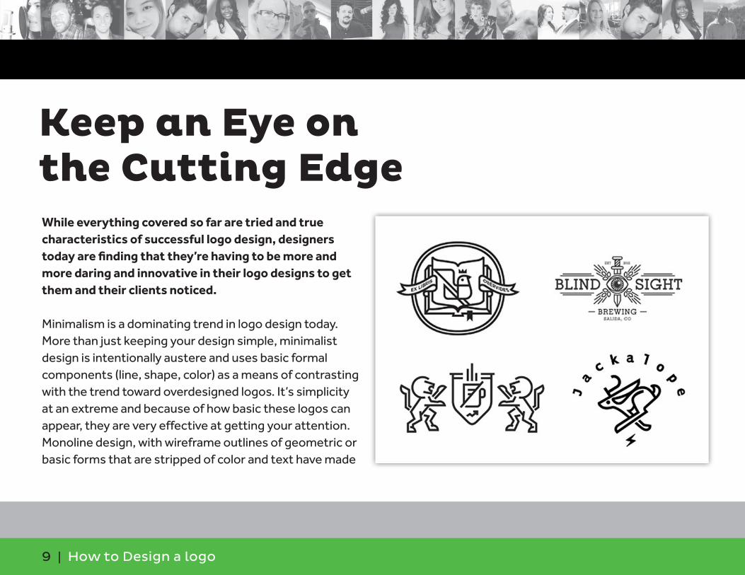
Minimalism is a dominating trend in logo design today. More than just keeping your design simple, minimalist design is intentionally austere and uses basic formal components (line, shape, color) as a means of contrasting with the trend toward overdesigned logos. It’s simplicity at an extreme and because of how basic these logos can appear, they are very effective at getting your attention. Monoline design, with wireframe outlines of geometric or basic forms that are stripped of color and text have made
Keep an Eye onthe Cutting Edge

10 | How to Design a logo
a big splash with new and growing brands. Creatively using negative space is another way of grabbing consumer attention and has become increasingly popular. Maybe the most famous use of negative space is the FedEx logo in which the space between the “E” and the “x” creates an arrow, a subtle and powerful image that, once you notice it, you can never stop seeing it.
There’s also a noticeable shift toward handmade looking logos and fonts. It’s related to the artisanal and local trends in consumption. Logos that appear sketched out by hand or cursive-style fonts and simple graphics that look like doodles are therefore becoming great marketing tools. This approach also mollifies the impersonal character of websites and ecommerce, in which consumers never actually interact with a human being. The handmade appearance immediately leads consumers to think positively about the people behind the operation.
Keep an Eye on the Cutting Edge
11 | How to Design a logo
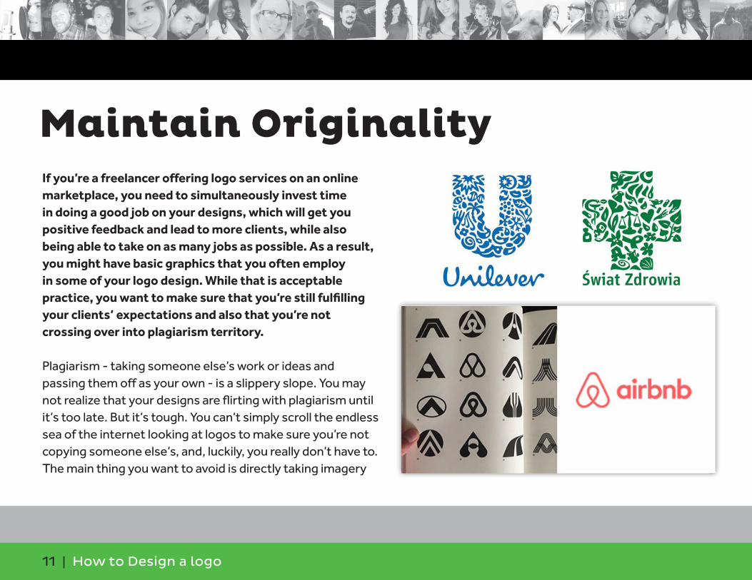
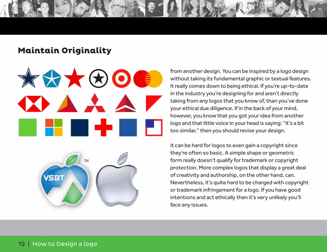
If you’re a freelancer offering logo services on an online marketplace, you need to simultaneously invest time in doing a good job on your designs, which will get you positive feedback and lead to more clients, while also being able to take on as many jobs as possible. As a result, you might have basic graphics that you often employ in some of your logo design. While that is acceptable practice, you want to make sure that you’re still fulfilling your clients’ expectations and also that you’re not crossing over into plagiarism territory.
Plagiarism - taking someone else’s work or ideas and passing them off as your own - is a slippery slope. You may not realize that your designs are flirting with plagiarism until it’s too late. But it’s tough. You can’t simply scroll the endless sea of the internet looking at logos to make sure you’re not copying someone else’s, and, luckily, you really don’t have to. The main thing you want to avoid is directly taking imagery
Maintain Originality
12 | How to Design a logo
from another design. You can be inspired by a logo design without taking its fundamental graphic or textual features. It really comes down to being ethical. If you’re up-to-date in the industry you’re designing for and aren’t directly taking from any logos that you know of, than you’ve done your ethical due diligence. If in the back of your mind, however, you know that you got your idea from another logo and that little voice in your head is saying: “it’s a bit too similar,” then you should revise your design.
It can be hard for logos to even gain a copyright since they’re often so basic. A simple shape or geometric form really doesn’t qualify for trademark or copyright protection. More complex logos that display a great deal of creativity and authorship, on the other hand, can. Nevertheless, it’s quite hard to be charged with copyright or trademark infringement for a logo. If you have good intentions and act ethically then it’s very unlikely you’ll face any issues.
Maintain Originality
13 | How to Design a logo
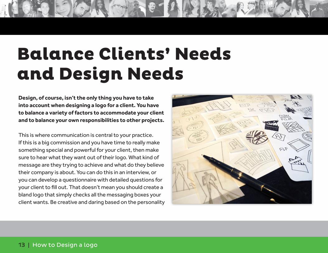
Design, of course, isn’t the only thing you have to take into account when designing a logo for a client. You have to balance a variety of factors to accommodate your client and to balance your own responsibilities to other projects.
This is where communication is central to your practice. If this is a big commission and you have time to really make something special and powerful for your client, then make sure to hear what they want out of their logo. What kind of message are they trying to achieve and what do they believe their company is about. You can do this in an interview, or you can develop a questionnaire with detailed questions for your client to fill out. That doesn’t mean you should create a bland logo that simply checks all the messaging boxes your client wants. Be creative and daring based on the personality
Balance Clients’ Needs and Design Needs
14 | How to Design a logo
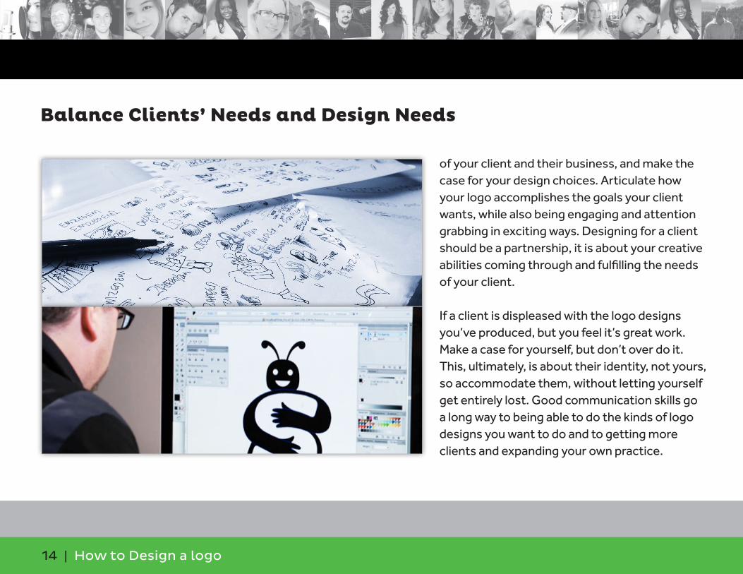
of your client and their business, and make the case for your design choices. Articulate how your logo accomplishes the goals your client wants, while also being engaging and attention grabbing in exciting ways. Designing for a client should be a partnership, it is about your creative abilities coming through and fulfilling the needs of your client.
If a client is displeased with the logo designs you’ve produced, but you feel it’s great work. Make a case for yourself, but don’t over do it. This, ultimately, is about their identity, not yours, so accommodate them, without letting yourself get entirely lost. Good communication skills go a long way to being able to do the kinds of logo designs you want to do and to getting more clients and expanding your own practice.
Balance Clients’ Needs and Design Needs
15 | How to Design a logo
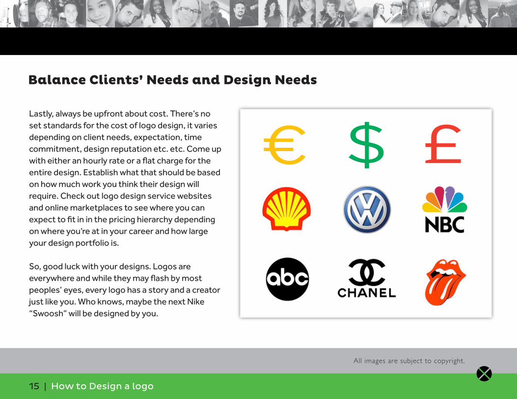
Lastly, always be upfront about cost. There’s no set standards for the cost of logo design, it varies depending on client needs, expectation, time commitment, design reputation etc. etc. Come up with either an hourly rate or a flat charge for the entire design. Establish what that should be based on how much work you think their design will require. Check out logo design service websites and online marketplaces to see where you can expect to fit in in the pricing hierarchy depending on where you’re at in your career and how large your design portfolio is.
So, good luck with your designs. Logos are everywhere and while they may flash by most peoples’ eyes, every logo has a story and a creator just like you. Who knows, maybe the next Nike “Swoosh” will be designed by you.
Balance Clients’ Needs and Design Needs
All images are subject to copyright.
€ $ £