how to develop meaningful key · 2018-05-24 · e thank you for joining us on the journey to...
TRANSCRIPT


KEY
PERFORMANCE
INDICATORS
HOW TO DEVELOP MEANINGFUL
Intrafocus Limited 1 Park Road Winchester Hampshire SO226AA United Kingdom _________________
First published in Great Britain in 2012 Published as a Kindle version in 2014 This version published in 2018 Ó Intrafocus Limited ISBN: 978-19448435-5 All rights reserved. No part of this publication may be reproduced, stored in a retrieval system, or transmitted in any form or by any means, electronic, mechanical, photocopying, recording or otherwise, without prior written permission of the author. This book may not be lent, resold, hired out or otherwise disposed of by way of trade in any form of binding or cover other than that in which it is published, without prior consent of the author. All trademarks used herein are the property of their respective owners. The use of any trademark in this text does not vest in the author any trademark ownership rights in such trademarks, nor does the use of such trademarks imply any affiliation with the endorsement of this book by such owners.
Wel
com
e Thank you for joining us on the journey to develop meaningful key performance indicators.
We hope you find this booklet instructive and helpful.
It has been written based on decades of collective experience of many practitioners. Its purpose is simple; to provide a quick reference guide and introduction to a simple, but highly effective, methodology.
This is one book in a series of e-books freely available from Intrafocus, please take a moment to look at our website.
www.intrafocus.com

Table of Contents
Introduction ........................................................................................... 1 Key Performance Indicators ................................................................. 2 The Methodology .................................................................................. 4 Step 1 – Create Objectives.................................................................... 6 Step 2 – Describe Results .................................................................... 10 Step 3 – Identify KPIs .......................................................................... 14 Step 4 – Define Thresholds ................................................................. 26 Step 5 – Measure ................................................................................ 34 Step 6 – Interpret Results ................................................................... 42 Step 7 – Take Action............................................................................ 58 Conclusion ........................................................................................... 64 Common Key Performance Indicators ............................................... 68 Supplemental – Strategy 101 ............................................................. 86 Selecting Strategy Management Software ........................................ 91 Appendix .............................................................................................. 98

Forward The basis of this methodology is not new. It has been drawn from decades of in-the-field experience and other published methodologies. The way in which it has been put together is new. This methodology simplifies the process of developing meaningful Key Performance Indicators (KPIs). This document provides a step-by-step guide. In the appendix you will find a set of templates that will help you through the process.
My thanks go to Stacey Barr, world-renowned Performance Measure Specialist and Howard Rohm, CEO of the Balanced Scorecard Institute for their help in producing this document. We highly recommend Stacy Barr’s PuMP® Performance Measure Blueprint and The Balanced Scorecard Institutes’ The Institute Way, both of which you will contribute to your understanding of performance measurement and strategic planning.
Clive Keyte


1 | P a g e
Introduction
Successful Strategy Implementation The success of a strategy is not determined by how well it has been written. Some of the greatest strategies have been written with careful thought and insight. They are masterpieces that cannot be faulted. Other than being left on the shelf in head-offices around the world to gather dust. Most companies and organisations are good at writing strategies; only a few are good at implementing them.
Developing Meaningful KPIs This methodology provides a guide to the process of developing Key Performance Indicators (KPIs) to support a strategy. It describes how to connect KPIs to objectives, create sensible targets, allocate ownership and present evidence that objectives are being met.
Once KPIs have been defined, they need to be presented in a way that will ensure accurate interpretation. This methodology provides examples that show how to link description to action thus moving an organisation closer to its objectives and ultimately its strategy.

2 | P a g e
Key Performance Indicators
What are Key Performance Indicators? In business, government and non-profit organisations we measure a multitude of things. We do this to keep on track, to make improvements and to drive our strategy. Unfortunately, often where we think we have a decent set of key performance indicators, actually we have a hotchpotch of tasks, objectives and projects with a few badly described metrics. There is a real need to understand exactly what we mean when we talk about a Key Performance Indicator.
A Key Performance Indicator (KPI) is often referred to as a Key Performance Measure, Performance Measure, Measure or a Metric. This is perfectly valid, the important thing is the definition not the label, if Metric is the term generally used in your organisation, then use it. In a formal Balanced Scorecard structure, as defined by the Balanced Scorecard Institute, the term Performance Measure is used. More frequently in business Key Performance Indicator or KPI is used. For clarity and brevity, the term KPI will be used in this document.
A KPI is something that can be counted and compared. It provides evidence of the success, or failure, of a strategic objective over a specified time.
The definition above includes a set of words that need further explanation to ensure the statement is fully understood:
Counted This may seem a little trite, however, counted means that a quantity can be assigned. Examples are a number, percentage or currency.
3 | P a g e
‘Counted’, does not mean a percentage achieved. One of the most frequent mistakes made when developing KPIs is to create a project and assess its success through how much work has been done. Just because a project has completed does not mean it has been a success. Success is dependent on an outcome not an activity.
Compared A number or value may be interesting, but it only becomes useful when it is compared to what is optimal, acceptable or unacceptable. Every KPI must have a comparator or benchmark. Using an industry benchmark gives an objective quality to the comparator, objectivity is not required, but it is desirable.
Evidence The evidence will fall out by counting and comparing correctly. It is important to strive for a measure that will be observed in the same way by all stakeholders. The evidence should be clear and have specific meaning.
Objective A KPI only has significance if it is contributing to an objective. If there is no objective, why is it being measured in the first place? This does not mean we should ignore all operational measures; they still need to be in place – but even operational measures should ultimately contribute to an objective.
Specified Time Everything is time bound; progress towards meeting an objective and therefore a strategy must be measured over a specified period of time.
4 | P a g e
The Methodology This methodology is based on years of experience in this field. It is aimed at companies and organisations that already have a defined strategy and a reasonable idea about what their primary objectives are. It has seven steps. Steps five and six have been illustrated by using an automation system called QuickScore. This is not the only automation system available in the market but has been used to provide an insight into the advantages of software automation.
In any business performance management system, the data added into the system has to help drive the business forward. It is tempting to measure far too much and not be specific in the hope the system will ‘sort it out’. The following methodology ensures the right activities are pursued.
The key is to start small. One, two or three objectives is perfectly fine in the early stages. Once practiced in creating a few successful objectives and KPIs, then a company-wide challenge can be taken.
Steps 1-4 of the methodology are template driven, these steps need to be completed several times. The first time through may take a while, thereafter, it becomes much simpler.
Steps 5-7 are more descriptive.

5 | P a g e
STEP
ON
E
6 | P a g e
Step 1 – Create Objectives The Golden Rule: KPIs are based on objectives. A KPI should not exist unless it contributes to an objective. During step 1, try not to think about measuring things, you mind may well go in that direction, but restrain yourself. Work on objectives first, these provide the reason to measure. A KPI should not exist without an objective.
Write down an objective or two that you believe will result in a business improvement in your organisation.
Here are some examples that you may have considered:
• Increase company profit
• Increase revenue by 10% next year
• Reduce sales costs
These are really good objectives and easily measurable. Starting with financials is an obvious place to begin.
However, think about some objectives that can be more easily controlled to contribute to these top-line financial objectives, for example:
• Increase the number of projects worth £250k or more
• Improve skill level of senior consultants
• Implement a sales plan (more on this ‘objective’ later!)
At this stage it is not important to be precise, during the next stage we will crisp up the objective definitions.
7 | P a g e
Thought should be put into how the objectives will contribute to an overall strategy; whether or not your organisation has any control over the objectives (it’s best to have some level of control); that the objectives are single objectives and not several under the guise of a single objective and finally they should be important or related to something in need of attention.
Go back to the objectives you have written and answer these questions:
1. Will they contribute to the company/organisation strategy?
2. Are they important and will they make a difference?
3. Are they single objectives?
4. Do you have some level of control to influence the result?
5. Can they be measured?
If the answer to all (or most) of the questions above is yes, then move on to step 2. If the answer to most of the questions is no, then refine the objectives. They do not have to be perfect, but they do need to be halfway there.

8 | P a g e

9 | P a g e
STEP
TW
O
10 | P a g e
Step 2 – Describe Results Earlier it was noted that one of the most common mistakes made when defining a KPI is to focus on activities rather than results. Objectives, like KPIs, are concerned with results. It is essential to create a result for each objective using a results-oriented language. This forces us to think more precisely about what we are actually trying to achieve.
For example, if we look at one of the objectives given above, implement a sales plan, this may seem to be a very sensible thing to do but it is not a performance objective. It is an activity that can only be measured through the time it takes to implement the plan. It will tell us nothing about success or failure of the sales plan, only that it has been implemented.
[Important note: Activities, initiatives and projects are vitally important. They are the means by which we implement change to make improvements. However, we need to measure the improvement not the change, to demonstrate success or otherwise. Therefore, we need results-oriented objectives]
The previous example might be more useful if it included why we want to implement a sales plan. It may be; to reduce the sales cycle. This is still a bit vague and may be better expressed as; to reduce the time taken to convert a qualified lead into a sale. This is much better and has produced an objective with a tangible result. This also illustrates the need to bring clarity into the language we use to create our objectives. That is, what are we actually trying to achieve?
In business we have a tendency to use words and phrases like; best practice, optimised, world class, efficient, effective, productive. Although the implied meaning is positive, the actual meaning is

11 | P a g e
vague. Objectives using these words are not results-oriented and will therefore always fall short when used in performance improvement activities. It is always better to use words that have a common meaning and cannot be vaguely interpreted.
Using words that relate to how we physically perceive things in the world is a good technique to sense-check we are on the right track. Let’s use our previous example; reduce the time taken to convert a qualified lead into a sale. If we think about how we would physically perceive this, it would almost certainly result in asking the question; what is the optimum time? This in turn would lead to a more succinct expression that would include a physical parameter, for example: reduce the number of days to convert a qualified lead into a sale. We now have an objective that describes a result, has clarity in interpretation and in this case has a time parameter.
At this stage it is not important to go so far as including a target within the objective. It would have been easy to express our example as; reduce the number of days to convert a qualified lead to a sale from 30 to 25. Targets are the domain of the measure rather than the objective. When we look at measures in the next step we will look closely at how to set targets in the context of viable comparators or benchmarks.
In summary, the step 2 task is to:
1. Check that the objective is an objective (not an activity, plan or project).
2. Frame the objective using result-oriented language.
3. Remove vague words and include things that can be physically perceived.
12 | P a g e
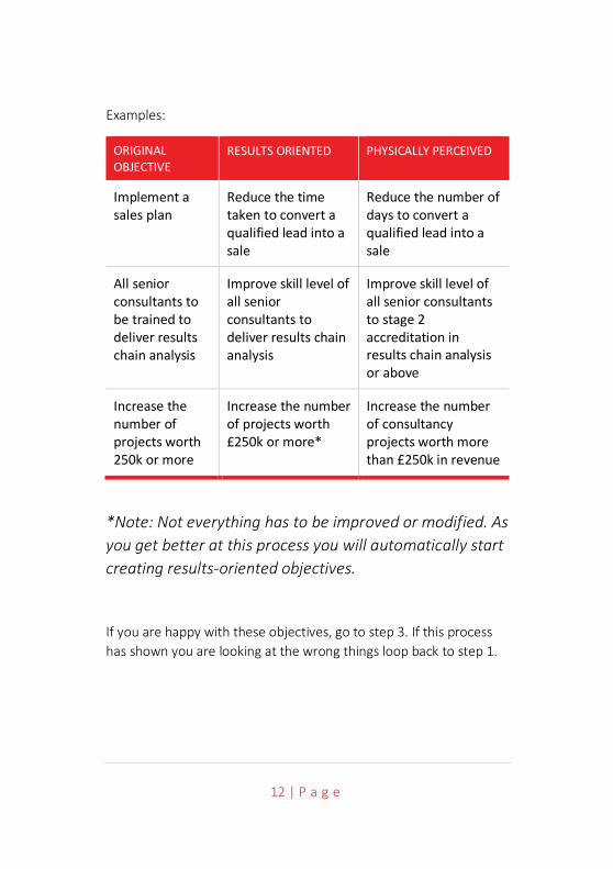
Examples:
ORIGINAL OBJECTIVE
RESULTS ORIENTED PHYSICALLY PERCEIVED
Implement a sales plan
Reduce the time taken to convert a qualified lead into a sale
Reduce the number of days to convert a qualified lead into a sale
All senior consultants to be trained to deliver results chain analysis
Improve skill level of all senior consultants to deliver results chain analysis
Improve skill level of all senior consultants to stage 2 accreditation in results chain analysis or above
Increase the number of projects worth 250k or more
Increase the number of projects worth £250k or more*
Increase the number of consultancy projects worth more than £250k in revenue
*Note: Not everything has to be improved or modified. As you get better at this process you will automatically start creating results-oriented objectives.
If you are happy with these objectives, go to step 3. If this process has shown you are looking at the wrong things loop back to step 1.

13 | P a g e
STEP
TH
REE

14 | P a g e
Step 3 – Identify KPIs There are three key activities that need to occur when identifying a KPI:
1. The KPI needs to be clearly described (and based on an objective).
2. The KPI needs to be rated in terms of importance.
3. The KPI needs to be calculated and ownership assigned.
The KPI needs to be clearly described It does not matter at the moment if lots of words are used to describe a KPI. Later on, a short ‘label’ will be created for convenience. For now, it needs to have a very clear description and therefore will end up as a statement or short sentence. Start with one of your objectives previously defined.
Next, focus on the physically perceived part of the objective, this will give you a clue as to the tangible things you need to measure. In the example above; Reduce the number of days to convert a qualified lead into a sale, the tangible items are ‘days’ and ‘qualified leads’ and ‘sales’. These are the things that can be measured and will be included in the final KPI. At a later point we will include descriptions for each of the tangible items.
A word of warning: don’t at this point simply go back to what you are measuring already and say something like “got that covered, we already have a lead to sales ratio’’. It may be that you do have it covered, however, it is more likely that the particular KPI you are thinking of was created years ago based on a formula that is no longer relevant. Clearly this will not be true of all KPIs, but the check needs to be made.
15 | P a g e
It is now time to consider lead and lag KPIs. All too often our KPIs concentrate on lag measures. That is, those measures that occur after the event. Typically, financial measures fall into this category; revenue, gross margin, net profit and costs are all things that we measure after an event has happened. We need to do this as we can learn and adjust, but the act of measurement does not cause change. Why do we concentrate on lag KPIs? Simply because they are easy to count and provide proof of success or failure. If I stand on a set of scales, they tell me whether or not I have lost or gained weight. If my objective is to lose weight, getting on the scales has not helped. However, if I measure how many times I go for a run and how much I have eaten (and plan for this) then I have put in place two lead KPIs that should help me succeed. Lead KPIs are harder to identify but they are the only KPIs that can be influenced and therefore make a difference.
We must not underestimate the importance of lead KPIs. It may take a little longer to identify these KPIs, but it is worth the effort in the long run. Even if they are discarded they may provide additional insight into the way an organisation is being run.
Another quality of a typical lead KPI is that it may not hold a guarantee of success. In the following example; The number of sales people trained in selling our products to grade III certification, we believe that this will have a positive impact on our objective. Common sense dictates that trained people will perform better than untrained people. However, we will only have the proof when we see a positive change in a lag KPI.
The tangible part of an objective needs to be extracted and written into the KPI. For example:

16 | P a g e
OBJECTIVE KPI DESCRIPTION
Reduce the number of days to convert a qualified lead into a sale
The average number of days between a qualified lead and a sale
OR
The average number of days between qualified leads and sales that result in an order value greater than £250k
OR
The percentage of sales generated within 30 days of lead qualification
OR
The number of sales people trained in selling our products to grade III certification (note this is a ‘lead’ measure)
As can be seen from the above, each KPI is relevant to the objective but is measuring it in a slightly different way. Also, we can see that the measure type has been added, in the cases above ‘average’ and ‘percentage’. Furthermore, we can see that a calculation is beginning to form, the KPI calculation is a very important part of the identification as it provides the scientific/objective basis for its accuracy.
For now, let’s concentrate on the description, the key things to remember are;
• Write the description in the form of a sentence.
• Include the tangible words, the things that can be counted.
17 | P a g e
• Don’t immediately think you have it covered.
• Think in terms of a calculation that will be performed.
The KPI needs to be rated in terms of importance Time and effort should be put into rating KPIs. It is important to ensure the right things are measured.
A simple decision matrix can be used, start with the following:
• How applicable is the KPI to a related business objective?
• What is the relative worth of the KPI, do you really need to know?
• How easily can the data be found to make the measurement?
For each KPI ask the three questions above and rate them High Medium or Low. As a guide use the following:
For Applicability:
• High – This KPI will give me enough information to determine whether or not we are achieving this business objective.
• Medium – This KPI will give me enough information to make an informed decision as to whether or not the business objective has been met, provided it is augmented with some additional information or another measure.
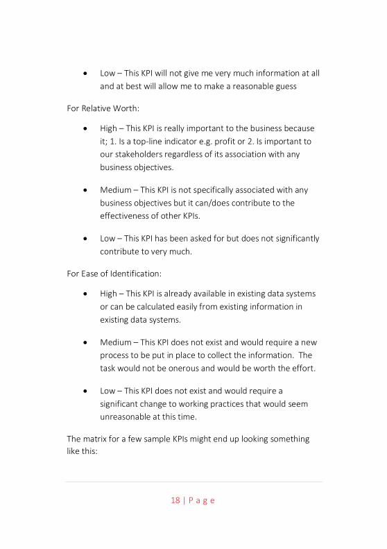
18 | P a g e
• Low – This KPI will not give me very much information at all and at best will allow me to make a reasonable guess
For Relative Worth:
• High – This KPI is really important to the business because it; 1. Is a top-line indicator e.g. profit or 2. Is important to our stakeholders regardless of its association with any business objectives.
• Medium – This KPI is not specifically associated with any business objectives but it can/does contribute to the effectiveness of other KPIs.
• Low – This KPI has been asked for but does not significantly contribute to very much.
For Ease of Identification:
• High – This KPI is already available in existing data systems or can be calculated easily from existing information in existing data systems.
• Medium – This KPI does not exist and would require a new process to be put in place to collect the information. The task would not be onerous and would be worth the effort.
• Low – This KPI does not exist and would require a significant change to working practices that would seem unreasonable at this time.
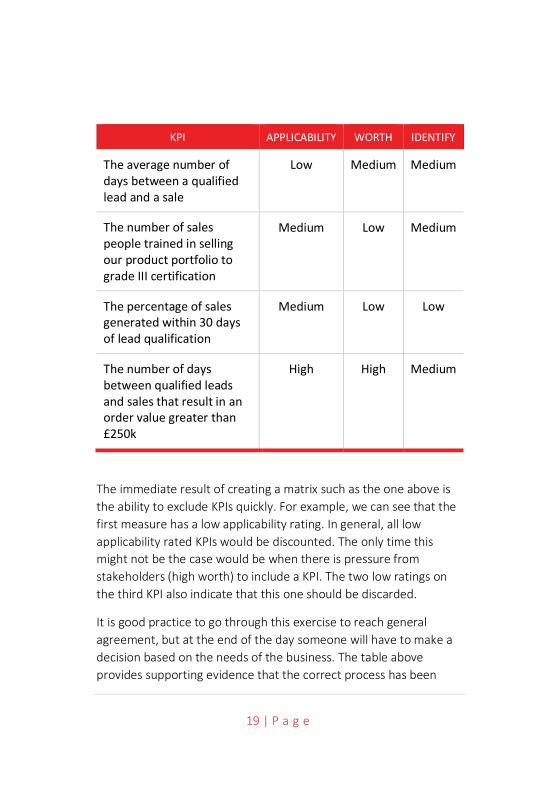
The matrix for a few sample KPIs might end up looking something like this:
19 | P a g e
KPI APPLICABILITY WORTH IDENTIFY
The average number of days between a qualified lead and a sale
Low Medium Medium
The number of sales people trained in selling our product portfolio to grade III certification
Medium Low Medium
The percentage of sales generated within 30 days of lead qualification
Medium Low Low
The number of days between qualified leads and sales that result in an order value greater than £250k
High High Medium
The immediate result of creating a matrix such as the one above is the ability to exclude KPIs quickly. For example, we can see that the first measure has a low applicability rating. In general, all low applicability rated KPIs would be discounted. The only time this might not be the case would be when there is pressure from stakeholders (high worth) to include a KPI. The two low ratings on the third KPI also indicate that this one should be discarded.
It is good practice to go through this exercise to reach general agreement, but at the end of the day someone will have to make a decision based on the needs of the business. The table above provides supporting evidence that the correct process has been
20 | P a g e
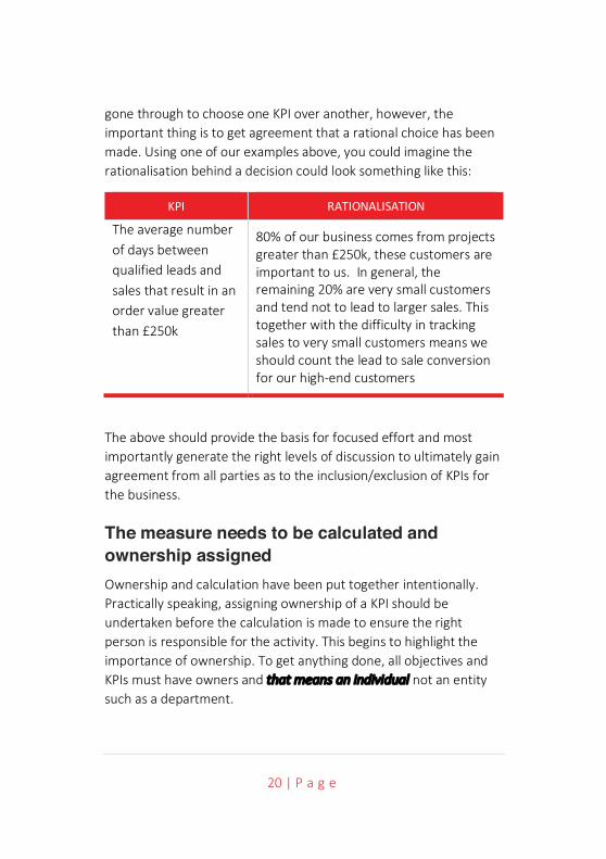
gone through to choose one KPI over another, however, the important thing is to get agreement that a rational choice has been made. Using one of our examples above, you could imagine the rationalisation behind a decision could look something like this:
KPI RATIONALISATION
The average number of days between qualified leads and sales that result in an order value greater than £250k
80% of our business comes from projects greater than £250k, these customers are important to us. In general, the remaining 20% are very small customers and tend not to lead to larger sales. This together with the difficulty in tracking sales to very small customers means we should count the lead to sale conversion for our high-end customers
The above should provide the basis for focused effort and most importantly generate the right levels of discussion to ultimately gain agreement from all parties as to the inclusion/exclusion of KPIs for the business.
The measure needs to be calculated and ownership assigned Ownership and calculation have been put together intentionally. Practically speaking, assigning ownership of a KPI should be undertaken before the calculation is made to ensure the right person is responsible for the activity. This begins to highlight the importance of ownership. To get anything done, all objectives and KPIs must have owners and that means an individual not an entity such as a department.
21 | P a g e
There are two types of ownership we need to concern ourselves with: owners and updaters. An owner is the person who takes full responsibility for the KPI. The updater (who could be the owner as well) is the person who gathers the required data and updates the KPI when required.
An effective owner should:
• Have some level of control over the KPI
• Own or actively contribute to the KPI’s objective
• Agree to own the KPI (and not just be assigned to it)
• Know where to acquire the measurement data
• Ensure the KPI is updated on time with valid data
An owner who is in a position to comply with the above is much more likely to take the job of managing the KPI seriously.
All too often, KPIs are foisted upon individuals who have no real control or interest in the KPI itself (or the associated objective) and therefore update the information begrudgingly, or worse, with incorrect information.
The first job of the owner is to ensure that the KPI is properly described, that there is agreement on the validity (i.e. the right KPI has been chosen) and that the KPI calculation (if there is one) can be based on available data. Available data in this context can mean data that will be made available in the future as well as existing data.
Using the example above; The average number of days between qualified leads and sales that result in an order value greater than £250k, let’s see what this means in practical terms. The KPI description usually provides enough information to give an

22 | P a g e
indication as to where the data being measured resides. For example, in the KPI Total revenue generated for consultancy services the data will almost certainly reside in the company financial system. In the case of our example, a calculation will be required and therefore the collection of data may be a little more complicated.
For each KPI the following things need to be taken into consideration:
• Description: A sentence to describe as accurately as possible what the KPI is for.
• Label: The short description, used for presentational purposes, generally 1-5 words.
• Owner: The individual who owns and will drive the KPI (this applies equally to objectives; indeed, ownership of objectives is more important than ownership of KPIs as the former drives the latter).
• Updater: The individual who is responsible for updating the KPI at the pre-defined times.
• Calculation: A mathematical formula that describes how the data elements (tangible perceivable items) are combined to provide a number, percentage or currency (sometimes a yes/no).
• Frequency: How often the KPI is counted and recorded.
• Scope: What should be included or discounted, often a cap or data range.

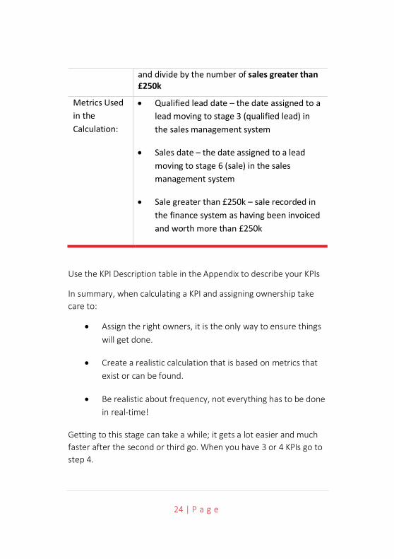
23 | P a g e
• Metrics: The data and the sources of data used in the calculation, it is important to provide a description of the metric items individually to avoid ambiguity.
It is only when looking closely at a KPI requiring a calculation that it becomes evident all of the information above is required. It is good practice to identify and record this information for every KPI during this phase. Typically, a table such as the one below, can be used:
OBJECTIVE AND INTENDED RESULT
Objective: Reduce large order sales cycle
Intended Result:
Reduce the number of days to sell a large order
KEY PERFORMANCE INDICATOR
Label: Large order sales cycle
Description: The average number of days between qualified leads and sales that result in an order value greater than £250k
Owner: Jim Jones
Updater: Jill Johnson
Frequency: Monthly
Scope: For sales that occur during the reporting month
Calculation: In a single Month, for all sales greater than £250k; add the number of days between the qualified lead date subtracted by the sales date
24 | P a g e
and divide by the number of sales greater than £250k
Metrics Used in the Calculation:
• Qualified lead date – the date assigned to a lead moving to stage 3 (qualified lead) in the sales management system
• Sales date – the date assigned to a lead moving to stage 6 (sale) in the sales management system
• Sale greater than £250k – sale recorded in the finance system as having been invoiced and worth more than £250k
Use the KPI Description table in the Appendix to describe your KPIs
In summary, when calculating a KPI and assigning ownership take care to:
• Assign the right owners, it is the only way to ensure things will get done.
• Create a realistic calculation that is based on metrics that exist or can be found.
• Be realistic about frequency, not everything has to be done in real-time!
Getting to this stage can take a while; it gets a lot easier and much faster after the second or third go. When you have 3 or 4 KPIs go to step 4.

25 | P a g e
STEP
FO
UR
26 | P a g e
Step 4 – Define Thresholds A Key Performance Indicator has limited value unless it can be compared to something. There may be some value as a record of change over time; however, unless it is known what sort of change is required, even this has little value.
A KPI without a comparator can be used to help stabilise performance. For example, with a new process it is often the case actual values will vary wildly month on month until a process is bedded in. We may not know what a valid variance should be but recording the values will eventually provide enough data to generate an upper limit and a lower limit. So eventually, even a KPI without a comparator will create values to be compared to!
These limits will become the Thresholds.
Thresholds are frequently based on targets. This can be an area of contention. Targets are often set using arbitrary methods or justified using unhelpful interpretations of data. However, targets can be helpful when starting the process of defining thresholds. The key point about any target is that it needs to be reasonable and achievable.
Targets and thresholds are well understood when looking at financial measures. We often look at a variance (threshold) to an expected result (target). For example, if expected monthly revenue was £325k and the actual revenue recorded was £309k the variance would be -£16k. This may or may not be a cause for concern depending on what was considered an acceptable variation to the target. For a KPI to be useful we need to clearly state both the acceptable and unacceptable results, the thresholds. There are several threshold models; for the purpose of illustration we will start with the most common: Red, Amber, Green (RAG).
27 | P a g e
Red, Amber, Green Model In the RAG model there are two threshold points:
• When the KPI should turn Green (from Amber).
• When the KPI should turn Red (from Amber).
There are no hard and fast rules to the meanings attributed to each of the coloured areas but in general it is as follows:
• Green – an acceptable result, we are on target.
• Amber – there may be a problem, we should investigate.
• Red – an unacceptable result, there is a potential problem that needs rectification.
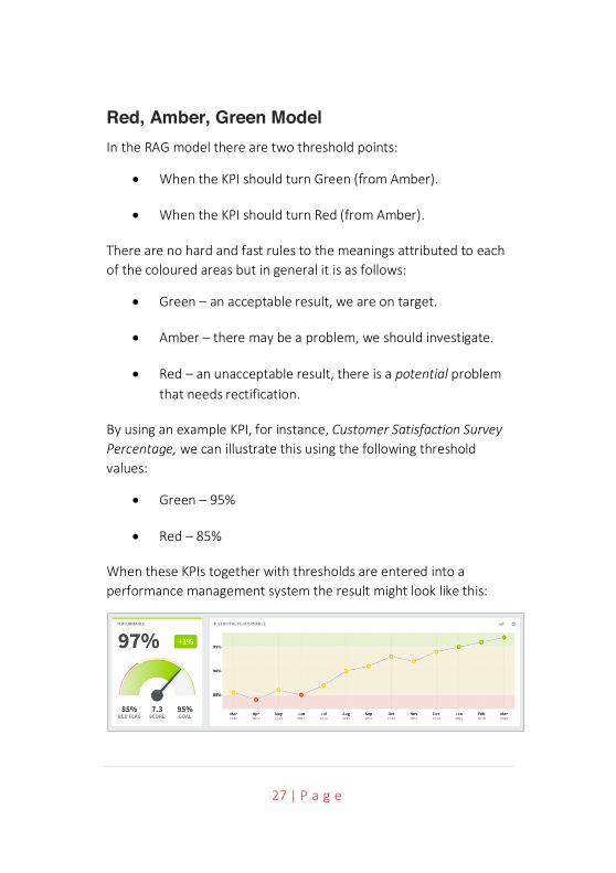
By using an example KPI, for instance, Customer Satisfaction Survey Percentage, we can illustrate this using the following threshold values:
• Green – 95%
• Red – 85%
When these KPIs together with thresholds are entered into a performance management system the result might look like this:
28 | P a g e
As can be seen, by setting threshold values the viewer can instantly and very graphically see the current situation and more importantly the history leading to this point. History provides a context to better understand the performance of the KPI, more of this in chapter 6.
Out of the numerous threshold models there are two more that should be looked at. The first is a simple extension of the RAG model, the second a variant that accommodates measures that are not linear in nature.
Red, Amber, Green, Blue Model Often there is a need for a better understanding of an ‘over-achieved’ status. This is particularly true in the area of sales and client management. Sales bonuses may be based on not only achieving a target but over-achieving it as well. For example, it may be desirable to over-achieve in client management engagement where non-sales time spent with a client is deemed to be a positive activity. In this case an extension of the RAG model can be used; the Red, Amber, Green, Blue variant. With RAGB it is normal to set five thresholds:
• The lowest acceptable result
• When the KPI should turn Red (from Amber)
• When the KPI should turn Green (from Amber)
• When the KPI should turn Blue (from Green)
• The highest acceptable (or capped) result
Using this type of threshold model, a pre-determined over-achieved status can be monitored and managed. Using the example of client engagement management and looking at the KPI, Average hour’s
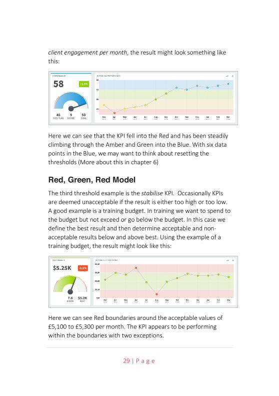
29 | P a g e
client engagement per month, the result might look something like this:
Here we can see that the KPI fell into the Red and has been steadily climbing through the Amber and Green into the Blue. With six data points in the Blue, we may want to think about resetting the thresholds (More about this in chapter 6)
Red, Green, Red Model The third threshold example is the stabilise KPI. Occasionally KPIs are deemed unacceptable if the result is either too high or too low. A good example is a training budget. In training we want to spend to the budget but not exceed or go below the budget. In this case we define the best result and then determine acceptable and non-acceptable results below and above best. Using the example of a training budget, the result might look like this:
Here we can see Red boundaries around the acceptable values of £5,100 to £5,300 per month. The KPI appears to be performing within the boundaries with two exceptions.

30 | P a g e
One of the by-products of defining thresholds is the ability to turn the KPI into a relative score. In the three examples above, the first was a percentage, the second was a number (hours) and the third a currency. Each had defined thresholds. A performance management system can take this information and create a calculation to normalise the data and then turn it into a normalised score, for example between 0-10. With a normalised score, the scores across the system can be rolled up to higher levels.
For example, a set of normalised KPI scores can be rolled up to an objective score. A set of objective scores can be rolled up to produce a departmental score and a set of departmental scores can be rolled up to produce a company or group level score. To illustrate this point, the following chart shows the combined normalised scores for the KPI examples we have used for the Objective, Improve Customer Satisfaction:
Here we can see a combined normalised score out of 10. The objective, which is measured through the success (or failure) of the three KPIs can be seen as a chart in its own right.
Therefore, we need to add the final elements to our KPI definition. Using the ‘large order sales cycle’ example it will look like this:

31 | P a g e
OBJECTIVE AND INTENDED RESULT
Objective: Reduce large order sales cycle
Intended Result:
Reduce the number of days to sell a large order
KEY PERFORMANCE INDICATOR
Label: Large order sales cycle
Description: The average number of days between qualified leads and sales that result in an order value greater than £250k
Owner: Jim Jones
Updater: Jill Johnson
Frequency: Monthly
Scope: For sales that occur during the reporting month
Calculation: In a single Month, for all sales greater than £250k; add the number of days between the qualified lead date subtracted by the sales date and divide by the number of sales greater than £250k
Metrics Used in the Calculation:
• Qualified lead date – the date assigned to a lead moving to stage 3 (qualified lead) in the sales management system

32 | P a g e
• Sales date – the date assigned to a lead moving to stage 6 (sale) in the sales management system
• Sale greater than £250k – sale recorded in the finance system as having been invoiced and worth more than £250k
Thresholds Red (from Amber): 20
Green (from Amber): 25
Once you have defined the threshold values for a number of KPIs go to step 5.

33 | P a g e
STEP
FIV
E

34 | P a g e
Step 5 – Measure It is at this stage that objectives and KPIs can be loaded into a dedicated performance management system. It is possible to keep track of your KPIs using a spreadsheet, however, spreadsheets are notoriously difficult to manage and maintain. Given there are numerous cost-effective options available we would not recommend the use of spreadsheets (except for setup and trial purposes).
There are two parts to step 5:
1. Creating a scorecard (Organisation/Perspective/Objective/KPI) structure.
2. Uploading or entering data on a regular basis.
Creating a Scorecard Structure This requires some thought. At a later date you may want to restrict access to certain parts of your organisational structure. Most performance management systems will allow you to move things around so don’t be too concerned about getting the structure perfect, just keep permission allocation in mind. You can start by basing your scorecard structure on your existing organisational structure. Experience suggests that at the HQ strategic level, a balanced scorecard approach is best, and this is supplemented by a departmental sub-structure that feeds KPIs into the top level.
For the purpose of illustration, we will be using the QuickScore performance management system. This starts with a node structure upon which all permissions to the system are based. A typical organisational/balanced scorecard structure might look like this:
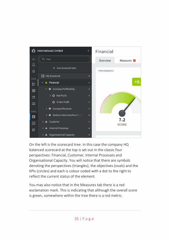
35 | P a g e
On the left is the scorecard tree. In this case the company HQ balanced scorecard at the top is set out in the classic four perspectives: Financial, Customer, Internal Processes and Organisational Capacity. You will notice that there are symbols denoting the perspectives (triangles), the objectives (ovals) and the KPIs (circles) and each is colour coded with a dot to the right to reflect the current status of the element.
You may also notice that in the Measures tab there is a red exclamation mark. This is indicating that although the overall score is green, somewhere within the tree there is a red metric.
36 | P a g e
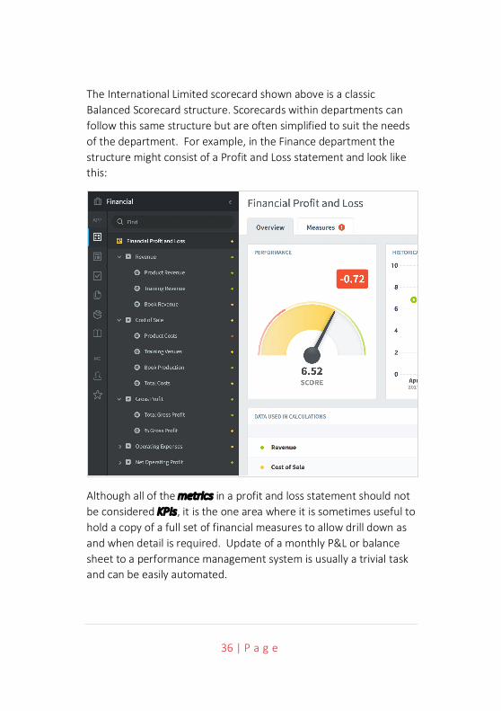
The International Limited scorecard shown above is a classic Balanced Scorecard structure. Scorecards within departments can follow this same structure but are often simplified to suit the needs of the department. For example, in the Finance department the structure might consist of a Profit and Loss statement and look like this:
Although all of the metrics in a profit and loss statement should not be considered KPIs, it is the one area where it is sometimes useful to hold a copy of a full set of financial measures to allow drill down as and when detail is required. Update of a monthly P&L or balance sheet to a performance management system is usually a trivial task and can be easily automated.

37 | P a g e
Once you have decided on the overall structure, you can build the system. Most systems will allow you to manually create the structure and some will allow you to model the structure in a spreadsheet template and then upload it. The latter approach is less time consuming and can allow you to setup and tear down structures quickly and therefore introduces the means to experiment.
When looking at performance management systems, be sure to check they allow you to input all of the data in the KPI description tables you have created.
In summary, to create a structure for your scorecard, answer the following questions:
• Who will be looking at the system and what do I want them to see? This will provide the first insight. If there are areas you want to restrict access to e.g. a financial balance sheet, place them in an organisational node by themselves.
• Do I want a cross-organisational view? In which case think about a balanced scorecard approach.
• Do I want a strategic scorecard and departmental scorecards? This is a traditional approach; it allows you to maintain a few KPIs (a good thing) while at the same time allowing department heads the flexibility to measure other things that may be important to them.
Once again, start small. Work on a few objectives and a few KPIs, get proficient, you can always add more.
The second part of step 5 is to look at how the data is entered or uploaded into the system.
38 | P a g e
Adding Data As a rule of thumb, for a top-level HQ scorecard you should have no more than 36 KPIs. If you are using the Balanced Scorecard methodology, this will be based on four Perspectives, each of which has two or three Objectives, each of which has two or three KPIs. There is a very good chance you will have many more KPIs. Most organisations want to measure much more than is necessary. This being the case you need to look very carefully at two things:
• How frequently updates take place.
• How to automate updates if required.
Frequency - Previously we included a Frequency item in our KPI description but did not say much about it. We are living in a ‘now’ world and as such we often feel it is important to know what is happening at this very moment. This forces us down a route of measuring things in real-time. Operationally this may be very important. On a production line you need to know about the health of the product at every stage of the manufacturing process. However, strategically this is of little importance. What may be important is the result of the measurement. For example, the number of defects per week or per month. All businesses are different, but as a guide:
KPIs should be part of the monthly management reporting cycle; occasionally there may be a need to measure things weekly and rarely, under extraordinary circumstances, daily.
Why? The time it takes to implement a corrective action means even for a small business, the time to react will be days or weeks and not hours.
39 | P a g e
Updates – whether to automate or not will become a trade-off between the expense of building an automated system and value of the released time of the individuals that update the system on a regular basis. Most performance management systems will provide built-in automation capability to allow a direct connection to spreadsheets, databases and to the more popular back-end ERP systems. This is useful if you want to include metrics (as distinct to KPIs) as part of the system to allow users to drill down to detail when required. A good example of this may be an end of month financial summary.
Uploading financial data is usually quite straightforward. The simplest way is to download the financial data to a spreadsheet of a specified format, place the spreadsheet into a common area (usually a secure ftp server) and then schedule a regular upload. Typically, in an operation like this there will be a one-off task of mapping the spreadsheet data to the KPIs you have previously defined in your system.
With financial measures, the metrics could be useful in drill-down scenarios but the job of updating each one manually every month would be tedious. Most financial systems have an export to spreadsheet function, so the data can easily be exported to a spreadsheet and imported into the performance management system. This is a very low-cost mechanism that not only speeds up the process but ensures greater accuracy.
Once you have decided on an update mechanism, be it manual or automated, you can start adding actual data to the structure. For the data to be meaningful, you will need at least 5-9 months history. This may mean feeding in some historical data or waiting until there is enough data to work with.
You will then be ready to move to Step 6.

40 | P a g e

41 | P a g e
STEP
SIX
42 | P a g e
Step 6 – Interpret Results Once you have a set of historical actual data you can start interpreting the results. There are two phases to this activity, first to create a set of dashboards and reports from the data and second to interpret the results.
The purpose of reporting is to provide enough detail to enable an organisation to be managed effectively and make decisions. The advantage of using an automated system is the reports are updated when any KPI value is changed. Care needs to be taken when designing a dashboard or report, the key question to be asked is:
• Who is the audience for the dashboard or report?
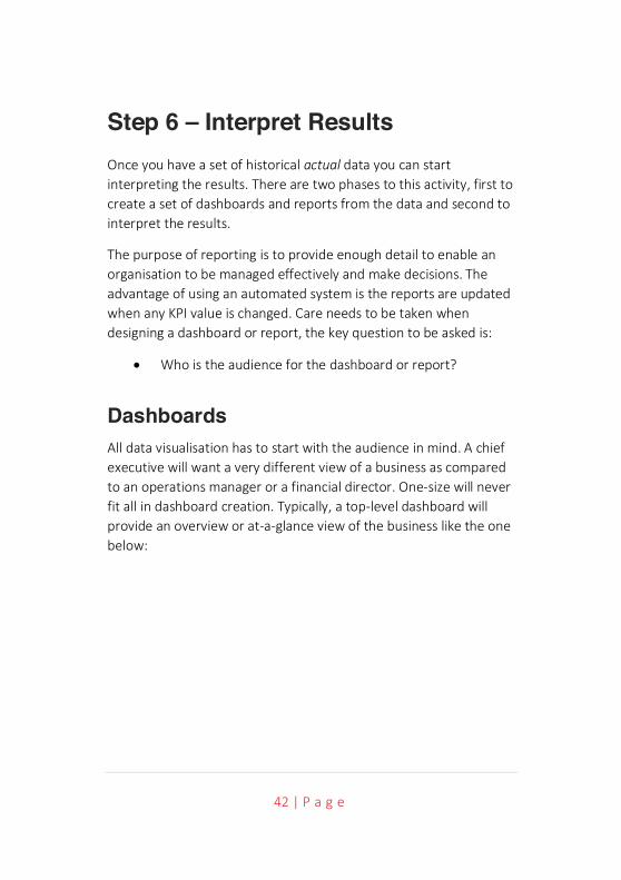
Dashboards All data visualisation has to start with the audience in mind. A chief executive will want a very different view of a business as compared to an operations manager or a financial director. One-size will never fit all in dashboard creation. Typically, a top-level dashboard will provide an overview or at-a-glance view of the business like the one below:
43 | P a g e
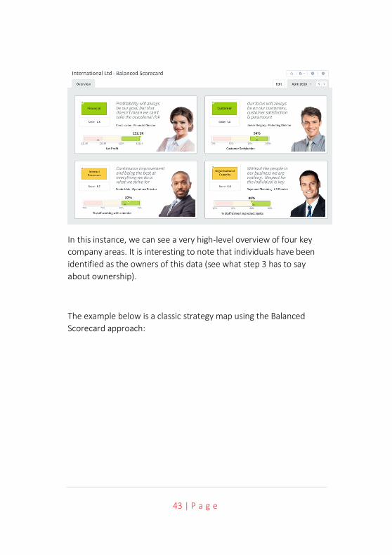
In this instance, we can see a very high-level overview of four key company areas. It is interesting to note that individuals have been identified as the owners of this data (see what step 3 has to say about ownership).
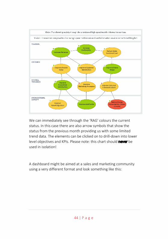
The example below is a classic strategy map using the Balanced Scorecard approach:
44 | P a g e
We can immediately see through the ‘RAG’ colours the current status. In this case there are also arrow symbols that show the status from the previous month providing us with some limited trend data. The elements can be clicked on to drill-down into lower level objectives and KPIs. Please note: this chart should never be used in isolation!
A dashboard might be aimed at a sales and marketing community using a very different format and look something like this:
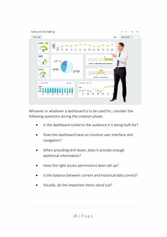
45 | P a g e
Whoever or whatever a dashboard is to be used for, consider the following questions during the creation phase:
• Is the dashboard suited to the audience it is being built for?
• Does the dashboard have an intuitive user interface and navigation?
• When providing drill-down, does it provide enough additional information?
• Have the right access permissions been set up?
• Is the balance between current and historical data correct?
• Visually, do the important items stand out?

46 | P a g e
Finally, for dashboard creation; don’t get carried away with the technology or a colourful chart, simplicity is the best way to get over a complex message.
Reports To clarify, for the purpose of this document, reports are classified specifically as row and column representations of data.
In a performance management system, a KPI report might look something like this, notice how the RAG colours are subdued unless rolled-over with a mouse:
This is very similar to a spreadsheet view. Typically, this type of report is normally used during a drill-down activity when more information on a KPI is required.
47 | P a g e
Interpreting Results Earlier we spent time looking at thresholds. One of the unfortunate by-products of defining thresholds is to reinforce a knee-jerk reaction when interpreting data. For example, when applying colour coding, as in the report above, the eye is immediately drawn to the red values. Where it might be worthwhile exploring strings of red instances, it is rarely worthwhile spending time on single red instance; it will never provide the whole story. We may have taken a step forward but cannot simply rely on a RAG status to enable decision making.
Why? Because businesses are complex entities, no single or identifiable cause can hold the key to a solution. Just because a KPI is 5% down on last month’s performance or is different to last year’s performance or has gone below an artificially imposed threshold, does not automatically mean there is a problem.
Using thresholds gives us what we need to undertake a point analysis of a KPI. Simply put, if the KPI moves from an acceptable position (green) towards an unacceptable position (red) then we might need to start a line of enquiry.
You may consider the first line of enquiry is to ask the owner of the measure for an explanation. This seems like a reasonable course of action to take. However, asking an owner will almost certainly, at best, result in a defensive response and, at worst, cause tampering with the KPI in an attempt to remove the problem. Tampering is an issue in business where focus is placed on individual performance rather than on business performance. A much better course of action is to look at patterns in the data and not at the individuals responsible for the data.
Clearly there will be times when the owners of the data need to be approached, especially when exploring anomalies. This should be

48 | P a g e
done with care and sensitivity, focusing on the data. Again, another good reason to look at patterns, at least that way a conversation will be more objective.
In business it is rare that poor performance in one area will be isolated; there are usually multiple contributing factors. Therefore, a pattern will emerge from the data. (Note: there will always be anomalies, if when looking at an unusual pattern in one KPI everything else looks fine, then it may simply be an anomaly, more on this later). When poor performance is identified in one KPI, it is important to look for patterns across related KPIs.
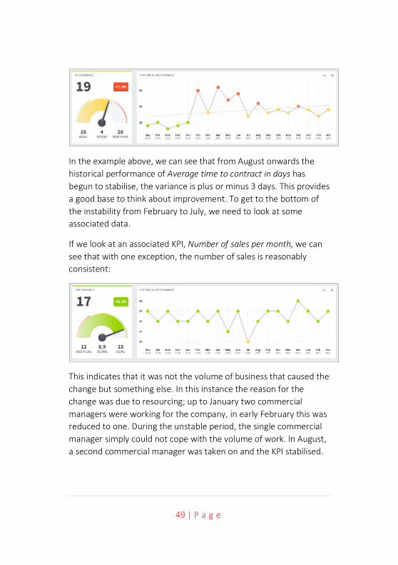
Looking for patterns is the most crucial activity when interpreting KPIs. To illustrate this, we will use a new example, the metric; The average time to contract in days. This KPI measures the time between a sales order being taken and a contract being signed, in days. Driving down contract negotiation time is a common objective as legal/commercial fees are usually priced in hours and can be very expensive.
Trends The first thing to check when looking at a KPI over a period of time is the stability of the measure. In the example below, we can see that during the period January to July the KPI results were highly erratic. This in itself is a cause for concern. However, it is important to recognise the difference between rectifying unpredictable behaviour and attempting to improve performance.
Any business performance improvement plan needs to be based on performance that is reasonably predictable or stable.
49 | P a g e
In the example above, we can see that from August onwards the historical performance of Average time to contract in days has begun to stabilise, the variance is plus or minus 3 days. This provides a good base to think about improvement. To get to the bottom of the instability from February to July, we need to look at some associated data.
If we look at an associated KPI, Number of sales per month, we can see that with one exception, the number of sales is reasonably consistent:
This indicates that it was not the volume of business that caused the change but something else. In this instance the reason for the change was due to resourcing; up to January two commercial managers were working for the company, in early February this was reduced to one. During the unstable period, the single commercial manager simply could not cope with the volume of work. In August, a second commercial manager was taken on and the KPI stabilised.
50 | P a g e
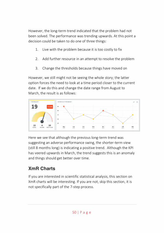
However, the long-term trend indicated that the problem had not been solved. The performance was trending upwards. At this point a decision could be taken to do one of three things:
1. Live with the problem because it is too costly to fix
2. Add further resource in an attempt to resolve the problem
3. Change the thresholds because things have moved on
However, we still might not be seeing the whole story; the latter option forces the need to look at a time period closer to the current date. If we do this and change the date range from August to March, the result is as follows:
Here we see that although the previous long-term trend was suggesting an adverse performance swing, the shorter-term view (still 8 months long) is indicating a positive trend. Although the KPI has veered upwards in March, the trend suggests this is an anomaly and things should get better over time.
XmR Charts If you are interested in scientific statistical analysis, this section on XmR charts will be interesting. If you are not, skip this section, it is not specifically part of the 7-step process.
51 | P a g e
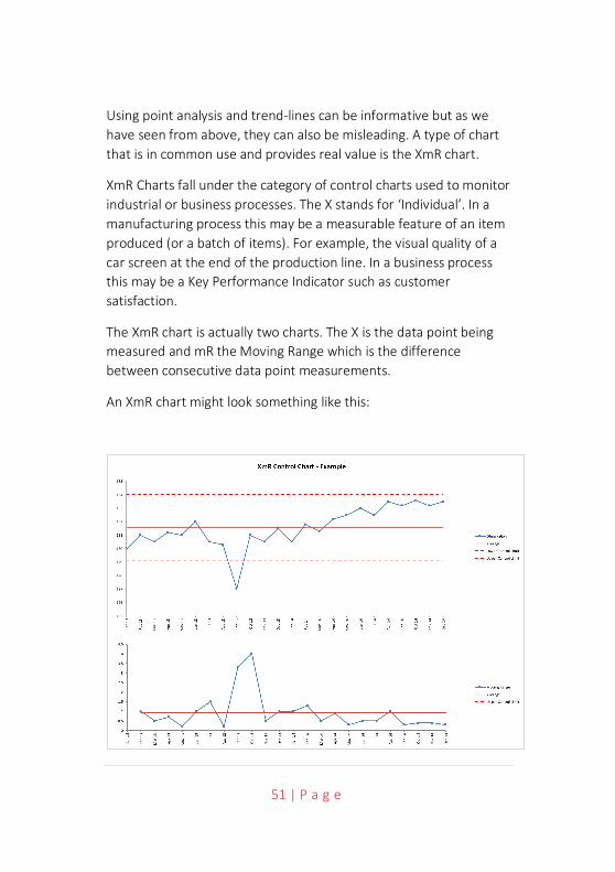
Using point analysis and trend-lines can be informative but as we have seen from above, they can also be misleading. A type of chart that is in common use and provides real value is the XmR chart.
XmR Charts fall under the category of control charts used to monitor industrial or business processes. The X stands for ‘Individual’. In a manufacturing process this may be a measurable feature of an item produced (or a batch of items). For example, the visual quality of a car screen at the end of the production line. In a business process this may be a Key Performance Indicator such as customer satisfaction.
The XmR chart is actually two charts. The X is the data point being measured and mR the Moving Range which is the difference between consecutive data point measurements.
An XmR chart might look something like this:

52 | P a g e
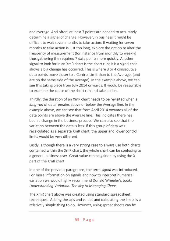
The upper chart (X-Chart) displays the data-points over time (Observation) together with a calculated average (Average). The lower chart displays the Moving Range (mR-Chart) with its Average and Upper Control Limit. The Moving Range Average in the mR portion of the chart is used to calculate the Upper and Lower Control Limits of the x-chart portion.
There is no Lower Control Limit in the mR chart as the value of the difference between consecutive observations is recorded as an Absolute Value (positive number). Take a look at ‘Wikipedia Control Charts’ for a quick overview of how the calculated values are calculated. Douglas Montgomery’s book, Introduction to Statistical Control, provides much more detail if you are interested.
The XmR chart, through the upper and lower control limits, provides information to determine what a Natural Process Limit is. When looking at business performance, we will often over-react when a performance measure changes without considering the natural limits of change. All performance indicators change; it is the natural order of business. Understanding the natural limits of change is vitally important to the successful management of an organisation.
There are several things we need to consider. Firstly, there will always be special cases. In the chart above, the September 2013 metric is an outlier. It has fallen outside the natural limits of the of the process variation. It is also a single instance. The causes of single instances are usually very easy to determine. It may be a seasonal variation; it may be the result of a natural disaster. Whatever it is, it can usually be discounted very quickly and not considered a cause for concern.
Secondly, a minimum of 5 data points, and sometimes more, are needed to accurately calculate the upper and lower control limits
53 | P a g e
and average. And often, at least 7 points are needed to accurately determine a signal of change. However, in business it might be difficult to wait seven months to take action. If waiting for seven months to take action is just too long, explore the option to alter the frequency of measurement (for instance from monthly to weekly) thus gathering the required 7 data points more quickly. Another signal to look for in an XmR chart is the short run; it is a signal that shows a big change has occurred. This is where 3 or 4 consecutive data points move closer to a Control Limit than to the Average, (and are on the same side of the Average). In the example above, we can see this taking place from July 2014 onwards. It would be reasonable to examine the cause of the short run and take action.
Thirdly, the duration of an XmR chart needs to be revisited when a long-run of data remains above or below the Average line. In the example above, we can see that from April 2014 onwards all of the data points are above the Average line. This indicates there has been a change in the business process. We can also see that the variation between the data is less. If this group of data was recalculated as a separate XmR chart, the upper and lower control limits would be very different.
Lastly, although there is a very strong case to always use both charts contained within the XmR chart, the whole chart can be confusing to a general business user. Great value can be gained by using the X part of the XmR chart.
In one of the previous paragraphs, the term signal was introduced. For more information on signals and how to interpret numerical variation we would highly recommend Donald Wheeler’s book, Understanding Variation: The Key to Managing Chaos.
The XmR chart above was created using standard spreadsheet techniques. Adding the axis and values and calculating the limits is a relatively simple thing to do. However, using spreadsheets can be

54 | P a g e
fraught with difficulties if the information has to be provided to a group of people or it is part of a much larger business performance activity. If this is the case, then turning to a software solution is probably a better alternative. There are many software packages available. They can be configured to take into account things like long-run effects and display results to provide a greater level of information. For example, the chart above (using the X-Chart portion) would look like this:
Here we can see the upper and lower control limits interpreted as the green portion of the chart. The upper control limit has been set to the upper value of the green area and the lower control limit as the lower value of the green area. The Average is the difference between the upper and lower green values. An additional lower limit, in the form of an amber band has been added providing the familiar red/amber/green/blue (RAGB) business parameters. The chart has also re-calculated the latter October to April long-run set of data points and changed the upper and lower control limits accordingly.
Whatever system is used to look at performance data, the key is to look at the data as a whole and over a reasonable duration. This control chart provides far better analysis of the data as compared to traditional trend lines or month on month or year on year comparisons. There is, of course, still the need to take into account associated data and other external or internal factors.
55 | P a g e
All situations will be different; here is some guidance to be used when interpreting the results provided by your KPIs:
• Do not rely on point analysis, business is too complex for that.
• Check that the KPI is stable and predictable.
• Always look at related KPIs.
• Train yourself to look at patterns within KPIs and across multiple KPIs.
• Be prepared for more questions rather than answers.
• Drill down into source data for more information.
• Look at long-term and short-term trends (short = 6 months, not less).
• Talk to the owner of the KPI (using data, not emotion).
• The key is to see the difference between normal variation and abnormal.
• Look for ways to change and not control outcomes.
The last item on the list leads into step 7. When it is clear a KPI (or and objective) is moving in the wrong direction then action needs to be taken. The action needs to be linked to the KPI (or objective) and progress monitored and managed over time to correct or improve the situation.

56 | P a g e

57 | P a g e
STEP
SEV
EN
58 | P a g e
Step 7 – Take Action Taking action comes in two major forms. The first is to put in place a remedial activity when a problem occurs; the second is to create strategic initiatives to promote change.
Remedial Activity Putting in place a remedial activity or assigning an action is a relatively simple process and something that organisations do almost every day. The key here is to ensure that the activity or action is well thought through and not the result of a knee-jerk reaction due to an anomaly. There are a number of things that should be taken into account when creating a remedial activity or action:
• It should be associated to a KPI – The only way to confirm an action has had a positive effect is to observe a positive change in the KPI. Just because an action has been completed does not mean the situation has been resolved.
• It should not be the result of a short-term anomaly – Refer back to Step 6 for guidance on this. If a KPI goes into the red, it does not necessarily mean there is a problem.
• Be sure to assign the action to an individual – tasked individuals feel responsible and accountable, departments do not.
• Ensure the action is clear – in much the same way as a KPI has to be described properly, an equal amount of attention has to be given to describing an action. Be sure to ask the owner of the action if they understand what is required, when it is required, and who will be involved.
59 | P a g e
• Actions tend to be short-term activities – If an action turns into a long-term activity, then it should be more properly described as a an Initiative.
Strategic Initiatives Creating and managing Strategic Initiatives is a complex process. Strategic Initiatives cause change. When a business is stagnant or failing, setting a strategy, building objectives, setting targets and KPIs will be to no avail unless activities are put in place to evoke change. Strategic Initiatives can cause significant organisational impact. They must always be associated to one or more strategic objectives.
There are five things that need to be considered:
1. Generating a list of candidate initiatives.
2. Developing the selection criteria.
3. Selecting and prioritising the initiatives.
4. Describing the prioritised initiatives.
5. Funding, implementing and management of the initiatives.
Generating the list of initiatives During the process of creating Objectives and KPIs you will have undoubtedly thought of things that need to be done to fulfil the objectives and cause improvement in the KPIs. These things may have been parked up to this point. If you do not have a list, then one has to be created. Go back over your objectives and KPIs and write down all of the things that you think need to be done to enable
60 | P a g e
improvement. This can be undertaken as a group exercise or individually.
It is not important at this stage to consider whether an initiative is valid or whether there is funding available or resources to allocate. It is important to create a full and complete list. You may find that buried within the list is a crucial game-changer.
Developing the selection criteria This is the first filtering stage. By developing a set of selection criteria and applying the criteria to each item on the list, the list will be reduced dramatically.
Consensus has to be reached on the most important criteria. This should not be overly complex, and the criteria should be few in number, ideally just three items. Selection complexity and additional criteria can be added in the next stage. Typical criteria might be:
• The potential strategic gains related to the organisational vision. • A judgement on the anticipated implementation and
operational cost. • The time required to implement.
Using the above criteria should take out the ‘nice-to-have’ initiatives that have no real strategic significance.
Select and prioritise the initiatives With a manageable number of initiatives left (this really depends on the size of the organisation but should be no more than 15) a more formal ranking framework can be applied. There are several methods that can be used which include:
Consensus voting – based on the criteria developed and some additional specific criteria. Participants can then workshop and vote

61 | P a g e
on what they consider are the most important initiatives. Care must be taken to ensure the right people are attending, i.e. those with a good knowledge of the business and strategic process to date. Discussion will need to take place after the voting to establish good-reason for a vote to avoid votes made because of a vested interest rather than the good of the organisation.
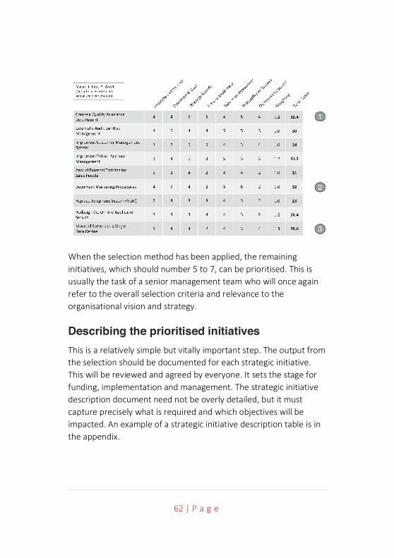
Matrix Scoring – This is a good way to present a visual framework and is usually undertaken in the form of a two-by-two matrix. In a workshop, a grid is placed on a wall with the X and Y axis being something like Impact and Cost respectively. The initiatives are placed on the grid. The group of initiatives placed in the low-impact, high-cost quadrant is usually eliminated, and a judgement taken on the remainder.
Weighting Criteria Scoring – Probably the most scientific approach. In the example below, a set of criteria has been identified to determine priority. A weighting for each criterion is established and each initiative scored against the criteria. This can take a long time and requires good discipline from the participants, but it does provide a very good output.
62 | P a g e
When the selection method has been applied, the remaining initiatives, which should number 5 to 7, can be prioritised. This is usually the task of a senior management team who will once again refer to the overall selection criteria and relevance to the organisational vision and strategy.
Describing the prioritised initiatives This is a relatively simple but vitally important step. The output from the selection should be documented for each strategic initiative. This will be reviewed and agreed by everyone. It sets the stage for funding, implementation and management. The strategic initiative description document need not be overly detailed, but it must capture precisely what is required and which objectives will be impacted. An example of a strategic initiative description table is in the appendix.
63 | P a g e
Funding, implementation and management All projects require funding and it is this stage that often causes the most heated debate. If the previous stages have been undertaken with care, then funding should not be a barrier. Funding should have been considered in the selection criteria. One thing that often happens at this stage, however, is that the highest priority initiative is usually the most expensive and needs the whole budget.
It is therefore not unusual to re-prioritise to look for lower-cost projects that can be implemented quickly and drive a significant change. This may require the team to look at ways of staging or delaying the highest priority initiative to release funds for lower priority initiatives.
When the funding issues have been resolved, then the implementation can begin. The initiatives then become projects and a project manager assigned, this is crucial!
Strategic Initiatives provide the means to achieve business Objectives. This connection has to be maintained. Strategic Initiatives are useless in isolation. To re-iterate, just because an initiative has been completed, does not necessarily mean an improvement has been made, it just means the initiative is complete. If an initiative is connected to an improvement objective, then we can measure whether or not an impact has been made. The initiative becomes the engine that drives the strategy.
64 | P a g e
Conclusion This methodology has a primary goal to ensure that valid KPIs can be created, monitored and acted upon and ensures that the right objectives are established and that they contribute to an organisations strategy.
Here are a few things that need reinforcement:
• The golden rule: KPIs are based on objectives. There is no reason for a KPI to exist unless it is contributing to an objective.
• Think about objectives in terms of results, they should have a tangible element, something that can be measured.
• Objectives should use words that relate to how we physically perceive things in the world. This is a good technique to sense-check you are on the right track.
• When creating a KPI it needs to be clearly described, based on an objective, rated in terms of importance and assigned ownership.
• There should be a good mix of lead and lag KPIs, do not rely heavily on lag KPIs, they cannot influence an outcome.
• Assigning thresholds is not only a good discipline (it forces discussion about good, bad and indifferent results ahead of time) but enables highly visual reporting.
• Think about the structure of your reports and ownership. When you start to use a performance management
65 | P a g e
solution you may need to think about assigning permissions and ownership.
• Think hard about the need for real-time reporting; will it make a difference to the way the business is managed?
• Dashboards are a great way to provide an at-a-glance view of the business; take care during construction to think about who the target audience is.
• Interpreting results is a process, it is not a reaction. Any dip into the red needs to be examined carefully and in context, the KPI owner must be involved.
• Actions need to be physically linked to objectives/KPIs and managed together; they are all part of the same process.
• Strategic Initiatives need to be considered as projects in their own right.
And finally, review your scorecard structure at least every six months. We have a tendency to consider this as an annual job, in today’s environment that is not good enough. Keep competitive, keep on top of your KPIs.

66 | P a g e

67 | P a g e
CO
MM
ON
KPI
S
68 | P a g e
Common Key Performance Indicators We would normally advise that Key Performance Indicators are specific to businesses or organisations. However, there are a set of KPIs that are so generic, between five and ten of them always get used in scorecards.
Financial Measures
Revenue The amount of money that a company actually receives during a specific period, including discounts and deductions for returned merchandise. It is the “top line” or “gross income” figure from which costs are subtracted to determine net income. Revenue is calculated by multiplying the price at which goods or services are sold by the number of units or amount sold.
Calculation Revenue is determined by the amount of sales made less the discounts and/or deductions for returned or refunded merchandise or services
Example For a fashion retailer this may be the number of items of clothes sold multiplied by the selling price less the number of items of clothes return multiplied by the selling price.

69 | P a g e
Net Profit This KPI is generally considered to be the most important measure of business performance. Net profit is the result of deducting the total costs associated with the production of goods and services from the same revenue. When in surplus, a net profit allows the company to invest in growth/pay dividend to shareholders.
Calculation Sales revenue minus total costs of the production of goods and services – Net Profit (£).
Example Identify the revenue derived from the total sales in a given year (1000 items x £100 = £100,000). Then combine the total cost associated with production in a given year (cost of sales £30,000 + operating expenses £25,000 + taxes £9,000) = £64,000. Subtract total cost associated with production (£64,000) from total revenue (£100,000) = £36,000 net profit.
Gross Profit Gross profit is the result of deducting the direct costs associated with the sale of goods and services from the revenue, however it does not include deductions for general overhead costs such as payroll, taxation, and interest payments etc.
Calculation Revenue minus direct costs of the production of goods and services = Gross Profit (£).
Example Identify the revenue derived from the total sales in a given year (1000 items x £100 = £100,000). Identify the total direct cost
70 | P a g e
associated with sales in a given year = £30,000. Subtract total direct cost associated with sales (£30,000) from total revenue (£100,000) = £70,000 gross profit.
Revenue Growth Rate Revenue is the income obtained by a company (cash or cash equivalents) from its activities; the rate that revenue grows in a given period provides the potential for a company to “make money” and indicates how well an organisation is achieving its strategic objectives. However, it should be noted that for a company to “make money” it is necessary to compare the outflow of expenses with inflow of revenue.
Calculation Revenue growth is calculated by comparing the current revenue (from a quarter or other time period) to that of the previous equivalent time period.
Example Revenue from business activities in 2014 = £500,000. Revenue from business activities in 2015 = £550,000. To express revenue growth as a currency value (£) (2015: £550,000 – 2014: £500,000) = +£50,000 revenue growth over 12 months. To express revenue growth as a percentage (£50,000 divided by 500,000) x 100 = +10% revenue growth over 12 months.
Return on Investment The efficiency of an investment based upon the ratio of money lost/gained relative to the total capital investment over a given time frame/project. Return on investment must be considered in
71 | P a g e
association with an appropriate time frame; some projects may yield short term returns while others require a longer-term view with expected “pay-outs” lagging behind the initial capital expenditure but continuing for several years thereafter. The return on investment may be calculated on completion of a project or over a specific part of a project to inform progress on rate of return. This information may be used to understand how a particular project or company is performing, or to inform investment decisions prior to committing capital to a project/company.
Calculation (Gain from investment – cost of investment) divided by cost of investment.
Example Increased Market Awareness – through the provision of a new website e.g. calculation made after one year: (Gain from investment of £50,000 – costs of investment £32,000) divided by cost of investment £32,000 = 0.56. 0.56 x 100 = 56% ROI over one year.
72 | P a g e
Customer
Customer Satisfaction Index Customer Satisfaction Index is based on the premise that satisfied customers will be more likely to carry out repeat purchases of goods/services, remain loyal to an organisation and offer positive feedback. It follows therefore that this measure indicates how successful and organisation is at delivering goods/services to the market. Customer Satisfaction is important to an organisation’s financing, as the cost of attracting new customers is generally higher than that required to maintain a relationship with an existing customer. It also offers a tool to highlight gaps that may arise between the product/service offered and the expectation of customers. A mix of qualitative and quantitative assessments is considered to provide the most accurate assessment; this may be obtained from a survey immediately following the delivery of goods/services or after a given period of time (e.g. annually).
Calculation The customer scores satisfaction with criteria such as expectations, perceived value, etc. The scores may then be weighted to reflect relative significance to an organisation or combined to form a single numerical score identifying the customer’s overall level of satisfaction or dissatisfaction. Sample size/survey method must also be selected to ensure it is representative of customers.
Example For a retail outlet: post purchase questionnaire.
Score 1-5 perceived quality (1 = poor/dissatisfied. 5 = Good/very satisfied).
Therefore, customer satisfaction index = average of all scores across all customers taking survey.
73 | P a g e
Net Promoter Score Based on the premise that the customer experience of your goods/services will place them into one of the following groups (Promoter, Passive, Detractor). The net promoter score is based on a single question in order to measure overall customer satisfaction: How likely are you to recommend the product/service to a friend or colleague?” It follows that organisations identified with better rate of Promoters vs. Detractors are likely to grow more rapidly than those of their competitors with poorer relative performance. This measure identifies satisfaction “from the customer’s eyes” and with appropriate sample size, data collection and analysis over time, provides information on customer satisfaction trends.
Calculation Based on a scale of 1-10 (1 = bad, 10 = good).
- Promoter score: 9-10
- Passive score: 7-8
Detractor score: 1-6
Example 100 customers asked the question (How likely are you to recommend the product/service to a friend or colleague?”). Twelve score between 1-6, 20 score between 7-8, 68 score between 9-10. Therefore, 12/100 * 100 = 12%. 68/100 *100 = 68%. 68%-12% = 56%. The net promoter score= 56%.
74 | P a g e
Customer Retention Rate All businesses/organisations require customers to purchase products/use services. The retention of existing customers is important to an organisation’s financing, as the cost of attracting new customers in generally higher than maintaining the relationship with existing customers. Furthermore, an established (loyal) customer relationship is more likely to yield additional opportunities for the sale of additional or related products/services. A “healthy” percentage of customers returning for repeat business is a likely indicator of good customer satisfaction, however it is necessary to evaluate the context of repeat business to ensure such customers contribute to desired profitability levels, purchasing cycles and customer lifetime value.
Calculation Usually calculated on a monthly basis (this should be adjusted as appropriate to fit with purchasing cycle suited to the business type). Customer Retention Rate = number of customers at the beginning of a given period with the opportunity to be retained, divided by number of those customers that remained customers at the end of given period.
Example For care hire company: for a given month 500 hire agreements are arranged of which 200 have the potential to be repeat business. Of these 200 agreements, 50 are renewed at the end of the month. The customer retention rate is (50 divided by 200 = 0.25) x 100 = 25%.
75 | P a g e
Customer Profitability Score Customers contribute varying amounts (and value) to a company over the purchasing cycle. It is important to understand which customers contribute positively to the organisation’s profit and identify which customers will not generate appropriate revenue to cover transaction costs. This measure is intended as a tool to inform/prioritise resources to focus effort on the retention of the “right” customers rather than striving to satisfy all customers regardless of their value to the organisation. It is important to schedule analysis over the purchasing cycle in order to consider the customer’s historic value, current value, and lifetime value at appropriate times.
Calculation Customer Profitability Score = revenues earned from a customer in a given period minus the cost of supporting the customer in the same period.
Example If the average annual cost per customer is £195: Customer A generates £365 profit, CPS: 365 – 195 = £170. Customer B generates £1425 profit, CPS: 1425 – 195 = £1230. Therefore, Customer B is more valuable Customer A.
Customer Complaints In the course of business, it is inevitable that some customers will feel that the goods/services provided fall short of their expectations and make a complaint. Customers with complaints tend to share their experiences and seek to influence behaviour. It is therefore important to minimise the potential for complaints. Often customers do not complain, but simply stop buying goods/services
76 | P a g e
and move to a competitor. However, evidence suggests that dealing with complaints in a swift and effective manner is likely to retain the customer in almost all cases.
Calculation Data collection method/measurement methods vary and should be appropriate to the particular organisation but may include some of the following or a selection of criteria forming a scored matrix: number of complaints over time or complaints relating to a particular product. Response time/time taken to resolve the complaint. Cost to resolve complaint. Number of complaints successfully resolved.
Example Not required. The important thing is to deal with the complaint quickly and effectively, because a reputation is difficult to build and easy to lose!

77 | P a g e
Internal Processes
Time to Market The time required to move a product or service from conception to market. The shorter the time to market, the quicker a return on investment can be realised. The measure also offers an indication as to the efficiency of internal management processes associated with the process. A short time to market allows the rapid introduction of new technology, providing a flow of new products to meet customer expectation (particularly in the IT and telecommunications industries) and offers a competitive advantage for companies working with short life cycle products. Rapid time to market must still accommodate appropriate development time to ensure products/services are fit for purpose and to avoid risk or low customer satisfaction which could result from “Fast-tracked” offerings.
Calculation The time taken (days/weeks/moths/years) to move a product or service from concept to delivery to the customer.
Example A comparator is required for this measure. It is usually the Estimated Time to Market. That is the planned time expected from concept to delivery. With the comparator a determination of good, bad or indifferent can be made.
Quality Index The word “quality” requires qualification in terms of its context and to what extent it is considered to be poor or good; in business the objective is usually to ensure that the goods/services are fit for
78 | P a g e
purpose and meet with the customer’s expectations while still affording a commercial organisation the opportunity to make a profit. The Quality Index is intended to allow evaluation of key factors that make up “appropriate quality” and may include the following: fit for purpose, customer expectation, cost of quality, component percentage error, components identified as outside specified tolerance etc.
Calculation Select 5-10 appropriate key factors for evaluation. Each is then scored and weighted to highlight importance to the organisation. The final figure is usually expressed as a percentage.
Example A design agency might select time to complete, rework hours and customer complaints as three factors with a 2x weighting on rework hours. Each factors could be expressed as a percentage and then averaged to provide the final percentage.
Rework Level To ensure design, calibration, production and in-process checks deliver a product/service that meets intended specification first time, every time. This should avoid the requirement for onerous final quality control checks and the associated requirement to return sub-standard issues for costly rectification. The quantity of product/service that fails to meet with the required specification but is capable of receiving amendment to meet compliance is termed the “rework level”. The rework level may be considered as a measure of the organisation’s effectiveness of meeting customer expectations first time without the requirement for correction or alteration.
79 | P a g e
Calculation Usually expressed as a percentage relating to a production “run” or period of service and based on a frequency appropriate for the business. Identification of the number of products from a production run/service period that require rework (and are subsequently passed as compliant with the original specification).
Example 1000 gear shafts are inspected to identify any that fall outside tolerance; two of the shafts are identified as oversize. Two of the shafts are reworked and subsequently passed as within specified tolerance. Two divided by 1000 = 0.002. 0.002 x 100 = 0.2% rework level.
80 | P a g e
Order Fulfilment Cycle Time The time between customer order and customer receipt of product or service – short OFCT is likely to be considered very important by the customer as it represents the total “time waiting” experienced. The OFCT is an organisation’s measure of success in its delivery of an end-to-end process. Review of the OFCT may highlight areas that contribute to a greater/lesser extent to process speed and therefore offer a tool to assist in prioritisation of effort and resources to improve the process. Customers are increasingly demanding short cycle times – requiring flexible production and just in time delivery. And organisation’s ability to match customer expectations in this area of business is therefore important to maintain and grow a customer base.
Calculation The average time taken (days/weeks/months/years) to source, make and deliver a product/service from order to customer receipt.
Example The time taken to deliver a fitted kitchen from the point that the design was signed off by the customer.
First Contact Resolution Business requires communication with the customer to assist with queries, offer support and resolve concerns – the objective of First Contact Resolution is to provide timely, appropriate resolutions in line with a customer’s expectations on the first occasion. Successful resolution on the first occasion helps to minimise the cost of administration/avoids the requirement for repeat calls and gives the best chance of maintaining high customer satisfaction levels.
81 | P a g e
Calculation The data used in calculation must focus on achieving satisfaction for the customer rather than adopting simplistic measures comparing queries with calls received. An approach combining queries, call data and customer satisfaction survey is best with measurement and reporting on a continuous basis.
Example The simple example is ratio between the number of calls and number of calls dealt with first time. However, other factors (see calculation) should be considered.
Capacity
Employee Satisfaction Index Evaluation of the degree to which employees are content/happy in their work roles. This measure is considered of importance due to the casual link between happy/motivated employees who are more likely to deliver satisfaction to customers and drive successful business performance. Furthermore, this link is evidence to support the inclusion of both financial and non-financial perspectives as recommended in the balanced scorecard approach to business strategy. Information is generally collected via a satisfaction survey, based upon a selection of key areas that represent the overall staff experience.
Calculation Employees score answers to questions with 1-5 rating (1 = strongly disagree, 5 = strongly agree). Total the number of points for each respondent, and the total number of questions answered by the respondent. Employee satisfaction index (%) = (Total point score divided by total questions) x 100.
82 | P a g e
Example Identify a selection of key questions that may include the following: effectiveness of leadership, management support, organisational culture, and conditions of service.
Revenue Per Employee Employees are the most valuable assets for any organisation however their needs dictate that they are also likely to be the most expensive. The revenue per employee identifies the revenue derived from the number of employees as a ratio and is considered helpful to measure the overall efficiency of an organisation. In the case of an improving ratio of revenue to employee numbers this suggests improved productivity when benchmarked against similar business type.
Calculation Usually calculated on a quarterly frequency – trends are identified over time and with reference to corresponding periods in previous years to accommodate cyclical/seasonal variation. Revenue per employee = revenue, divided by number of full time employees (full time equivalent).
Example Revenue per employee will vary greatly dependent on the type of organisation. For example, a large consultancy agency will have a much higher revenue per employee than a high street retail shop.
Supply Chain Effectiveness The measure of how well an organisation can move product/services from conception to the customer. The attributes of

83 | P a g e
an effective supply chain will offer transparency, flexibility and alignment to tailor the system to the strategic benefit of the organisation. In recent years, supply chain outsourcing has been re-examined and greater emphasis built upon a partnering approach. This has the benefit of adding a degree of control/influence across organisational boundaries’ allowing increased opportunity to measure performance, improved coordination of the system and improved capability to cater for fluctuations in demand. An appropriate level of supply chain integration with partners is therefore considered to be advantageous in the development of an effective supply chain.
Calculation An overall calculation might be: the average time taken (days/weeks/months/years) to source, design/make and deliver a product/service from order to customer receipt. However, there are often parts of the supply chain that need to be measured, e.g. the time taken from order to delivery of raw materials to the factory.
Example The average delivery time of ballast and cement to a building site from two separate suppliers.
Salary Competitiveness Ensuring you have the right people in the right jobs is hugely important. Competing for the best talent in a competitive market and getting it right is therefore equally important. This starts with offering a competitive salary. All other things being equal, a competitive salary only needs to be slightly higher than the competition. The key data points are existing salaries within the company, competitor salaries and market data; relative to specific jobs/grades.

84 | P a g e
Calculation This can be described as a ratio; for examples, salary offered by company/salary offered by competitor’s company. However, it is more usually described using actual numbers: company salary of £67,000 as compared to the competitor salary of £63,000 as compared to the benchmark/market salary of £61,000.
Example See calculation.
Energy Consumption In recent years customers and businesses have developed an increasing awareness of their environmental footprint. The consumption of energy derived from non-renewable sources is not sustainable and is likely to become an increasing cost to business in the future. Government legislation and tax incentives are increasingly applied to encourage the use of renewable energy and encourage business to develop more energy efficient practice. The measure of an organisation’s energy consumption (when compared to a similar business) helps demonstrate its efficiency level and environmental credentials.
Calculation The amount of energy consumed in a given period (KWh). The value of energy consumed in a given period (£). The percentage change in energy consumed in a given period (KWh).
Example A large data centre with a huge footprint spanning acres needed to keep tabs on energy consumption and so chose to measure the value of energy consumed per month.

85 | P a g e
STRA
TEG
Y 10
1

86 | P a g e
Supplemental – Strategy 101 The previous chapters of this booklet make several assumptions about the strategic process. It may be that you are new to developing organisational or business strategy. If this is the case, the following chapter is for you.
In business, not-for-profit and government, the word ‘strategy’ is used to describe many things. There is no definitive answer to the question “what is a strategy?” A better starting point might be to ask the question “what do we want to achieve?”
The Long-Term View Strategy is about taking a long-term view. As opposed to ‘tactics’, which centre on short-term gain. In today’s world, strategy and tactics occasionally get mixed as technological advances that have caused the ‘strategic cycle’ to condense. Where in the past a strategic outlook might have been 5-10 years, today it usually more like 1-3 years (with a ‘nod’ to the future). Clearly, this view is industry dependent. In pharmaceuticals, for example, there is still a need to take a long-term view when producing drugs. However, in the high-tech industries, for example, mobile phones, new models become available every year that can force a quick change of direction.
Nevertheless, strategy is about a long-term view. A company, organisation or government needs to plan for the future, communicate the plan, implement the plan, monitor progress and modify the plan continuously. The last two parts of this process is usually poorly executed or missed entirely. A strategy is a living thing. It is not an activity that takes place once a year, is communicated and forgotten.
87 | P a g e
There is a well-known industry statistic that is often misquoted; “90% of strategies fail”. This is not true. The statistic is actually “90% of strategies fail in execution”. The strategies are usually very good. Time and patience have been put into developing, documenting and communicating and strategy. At the time of development, everyone has signed up and agrees that the strategy is sounds and should be put into action. However, the strategy gets put up on the shelf until the following year, is dusted off and used for input into the next years round of activity. The strategy needs to be embedded into the normal day-to-day working of the organisation. To do this, a process has to be followed.
Strategic Process At its most basic, the strategic planning process consists of five steps:
1. Vision/Mission and Goals
2. Research and Analysis
3. Formulation/Objectives
4. Implementation
5. Evaluation and Control
with loops back from step 5 to step 3 and step 1.
If each of these steps are undertaken correctly then a strategy should succeed. Easier said than done. As with complex structures that are defined simply, it is the interpretation of the model that can cause confusion and result in failure of the plan.

88 | P a g e
It does not help that there are several ‘strategic mnemonics’ in general use being applied inefficiently. For example, when asked what strategic progress was being used in a particular company, the answer PESTLE was given. PESTLE is a useful tool, especially when applied to step two above, but it is not a strategic process. A distinction must be made between a strategic ‘tool’ and a strategic ‘process’. For a list of recognised strategic tools, go to the Strategic Analysis section of our Strategic Guides.
A recognised strategic process will put the detail behind the steps required to build, implement monitor and evaluate a strategy. Some refer directly to the five steps above, some use different terminology. Many companies/organisations have taken it upon themselves to create their own strategic process. We would not recommend this. You may think you are unique or that you want to develop a competitive edge by doing things differently. However, we are talking about a process here; it is content that will make or break the strategy, not reinventing the process. Recognised strategic processes have been tried and tested for years, often decades, and have proven track records of success.
There are three strategic processes that you should consider evaluating (then adopt one):
Strategic Diamond Published in the 2001 edition of The Academy of Management Executive by Professors Donald Hambrick and James Fredrickson. The Strategy Diamond identifies and elaborates upon five elements with a question related to each:
1. Arenas: where will we be active?
2. Vehicles: how will we get there?
89 | P a g e
3. Differentiators: how will we win in the marketplace?
4. Staging: what will be our speed and sequence of moves?
5. Economic logic: how will we obtain our returns?
The interesting thing about this process is that it is not a ‘process’ at all. The authors say:
“We do not mean to portray strategy development as a simple, linear process. The key is not in following a sequential process, but rather in achieving a robust, reinforced consistency among the elements of the strategy itself.”
For some organisations, this loosely linked set of activities (all of them need to be completed) may suit their culture, for others a more disciplined approach is required.
Blue Ocean Strategy
It must be said that Blue Ocean Strategy is a set of tools leaning towards the first three steps described in the basic process above. However, in the expanded edition of W. Chan Kim and Renee Mauborgne’s best-selling book of the same name, they begin to foray into steps four and five. A huge Internet resource base offering multiple helpful tools and guidance supports the book.
The authors say:
“Blue Ocean Strategy represents a systematic approach to making the competition irrelevant and outlines principles and tools any organisation can use to create and capture their own blue oceans.”
Blue Ocean Strategy should be considered in any strategic approach. It may be lacking as an overall strategic process at the moment, but the success of the approach is undeniable. In time the back-end of
90 | P a g e
the process may well be added as well. In the meantime, the tools used could be integrated into the Strategy Diamond (above) or the Balanced Scorecard (below).
Balanced Scorecard The Balanced Scorecard is a full end-to-end, step-by-step strategic process. Developed by Drs Kaplan and Norton over 20 years ago and re-developed later into an integrated strategic planning system by the Balanced Scorecard Institute.
According to the Balanced Scorecard Institute:
“More than half of major companies n the US, Europe and Asia are using balanced scorecard approaches. A recent global study by Bain & Co listed Balanced Scorecard fifth on its top ten most widely used management tools around the world, a list that includes costly-related strategic planning at number one. Balanced Scorecard has also been selected by the editors of Harvard Business Review as one of the most influential business ideas of the past 75 years.”
The fundamental feature of the Balanced Scorecard is the treatment of an organisation when viewing strategy. It sets out a ‘balanced’ view creating ‘perspectives’ that look at Financial, Customer, Internal Processes and Organisational Capacity. The “Nine Step” process created by the Balanced Scorecard Institute, and described in their book The Institute Way, provides not only the detail but also real examples of how the process had been implemented by companies and organisations around the world.
91 | P a g e
Selecting Strategy Management Software When selecting strategy management software, an easy-to-use and powerful web-based solution that requires little or no IT involvement is essential. The solution should allow for either an on-demand hosted system or local installation.
Some organisations have the benefit of fully integrated ERP, CRM and Finance systems, however, most do not. For most organisations, pulling together a monthly report requires individuals to collate data from the various systems and build template spread sheets or PowerPoint presentations. Unfortunately, this gives rise to errors and frequently results in the wrong interpretation of the data.
Balanced Scorecard RFP – Many companies are either required to or chose to place tenders for the goods and services they procure. The tender process often includes a formal Request for Proposal (RFP). This is usually sent out to a vendor shortlist.
For most organisations, purchasing a cost-effective dedicated strategy management solution is the best way to go. But what should you be looking for when making a product decision? Here are a few considerations:
Ease of Use First and foremost, the solution must be easy to use. This means you should be able to install the system quickly and be able to build a set of scorecards in hours rather than weeks or months. All new applications require some ‘study’ time but once taught the application should be intuitive. If you are not offered a free trial,

92 | P a g e
then avoid the solution, as it is probably too complex. Once you have a free trial, check to see what level of support you are offered to get started. A couple of free demonstrations should be a minimum.
Scorecards Strategy management usually requires a scorecard. Typically, a scorecard will consist of three or four themes, a set of objectives and a set of measures (KPIs). However, there are many instances where a scorecard might be more, or less complicated. For example, a financial scorecard might simply restate a Profit and Loss statement. A call-centre scorecard might just focus on KPIs and not have any objectives. Therefore, the application must be flexible enough to create any scorecard structure that is required.
Dashboards A strategy scorecard is a great way to build a set of KPIs and relate them to objectives or place them into common areas of interest. But, a scorecard cannot draw disparate items together into a single view to make comparisons. The application should allow you to quickly assemble data from various scorecards into a cohesive and informative whole. The best systems will provide a variety of dashboard objects such as gauges, charts, tasks, milestones, bubbles and free text areas, but they should not overwhelm the user.

93 | P a g e
Strategy Maps A strategy map is a specific type of dashboard. Strategy scorecards are often used to manage a strategic process, for example, the Balanced Scorecard methodology. A strategy map usually consists of an arrangement of strategic objectives in a ‘bubble’ format. The bubbles colour-up to red, amber or green and have a drill-down function to reach the underlying KPI data.
Alerts Alerting should come as a standard in any strategy management application. Alerts should be definable at a system and individual level. For example, system reminders for users to update metrics when they are due or overdue. Or personal alerts, for example, to be notified when a KPI value goes below a certain threshold or a note has been added.
Initiatives, Tasks and Milestones Large projects are usually managed separately to a scorecard using a project management process. However, there are often initiatives associated with projects that are managed as part of the scorecard. Typically, these are set up as tasks and milestones and connected to an objective or a KPI. It is important for the application to be able to set up these objects and add the relationships. In addition, when a KPI is failing and ‘in-the-red’ it is important to quickly kick off a task to remedy the situation. The application should have this basic function.
94 | P a g e
Row and Column Reports Creating scorecards and visually impressive dashboard can really help the reporting process. But there will always come a time when the data needs to be examined in a typical spreadsheet layout that is a row and columns. The application should have this provision and include an export function allowing users to export to a spreadsheet for further manipulation if required.
Cascaded Scorecards and Templating Medium to large sized organisations will typically start with an executive scorecard and want to ‘cascade’ this to its divisions, departments and teams. Any application should allow unlimited levels of cascade. The scorecards should have the ability to link to each other and roll up or roll down data and targets.
For some organisations, the scorecards that are rolled out are the same or very similar. The application should provide a template function where a ‘master’ scorecard can be created. This way, changes to the scorecards structure need only be made once and they will be automatically replicated to lower levels. More sophisticated applications should allow for ‘local’ variants to be made to the sub-levels without impacting the upper levels.
Weighting Not all elements of a scorecard are equal. As such, the need to weight elements is important. This should include overall areas or perspectives as well as objectives and KPIs.

95 | P a g e
Briefings Typically, an application will include all the objects described above. At some stage, these will need to be pulled together in the form of a briefing. That is, a management report that contains objects like dashboards, row and column reports, strategy maps, initiatives and single or grouped KPIs. The ability to view these in an uncluttered way online, as a presentation is vitally important as is the ability to export the final briefing.
Mobile Mobile is no longer an optional extra. There are more mobile searches conducted on Google than on regular PC’s or laptops. It is not necessary to have a mobile ‘app’. In fact, it is often desirable not to, as the app must be downloaded, and the interface may differ to the desktop version. Ideally, the application should be built on fully ‘responsive’ web technology providing a consistent user experience across all devices.
Data Import and Integration Data import and integration is a required feature of any system. At the very least the application should allow bulk update via a spreadsheet. This way, historical data can be entered easily and quickly. In many instances, the number of KPIs being updated in any given reporting period can be very large. In these cases, the ability to create a source data upload spreadsheet can be very useful.
Where data needs to be kept in-step with source ERP or CRM or financial systems the ability to connect directly is a bonus. This activity will require some level of IT support to generate the correct
96 | P a g e
database calls to retrieve the data. This is usually a one-off activity and can be used to schedule regular updates.
User Permissions and Security Typically, KPI management systems are set by default to allow all users to see everything. Generally, this open-access structure is viewed by practitioners as having very positive benefits. However, there will always be time when data must be protected and should only be viewed and manipulated by specific groups or individuals.
The ability to set group and user permissions, in these cases, becomes a required feature.
Data Export and Archiving Scorecards, dashboards, reports, initiatives and briefings should have an export facility to formats including Word, Excel, PowerPoint and PDF. The ability to archive all scorecard objects, as well as an entire system should be in place.
Software Most solutions today are web-based application and support all the primary web browsers. Some of these can be installed in a local datacentre. One of the primary functions of KPI management system is to centralise data, therefore the application needs to be ‘server’ driven. Desktop, laptop or for that matter tablet or mobile applications that do not refer to a central repository are not desirable.

97 | P a g e
APP
END
IX
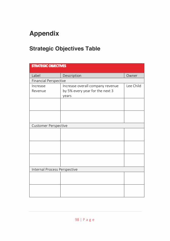
98 | P a g e
Appendix
Strategic Objectives Table
STRATEGIC OBJECTIVES
Label Description Owner Financial Perspective Increase Revenue
Increase overall company revenue by 5% every year for the next 3 years
Lee Child
Customer Perspective
Internal Process Perspective
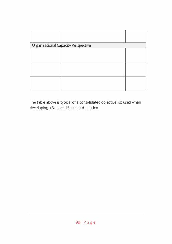
99 | P a g e
Organisational Capacity Perspective
The table above is typical of a consolidated objective list used when developing a Balanced Scorecard solution
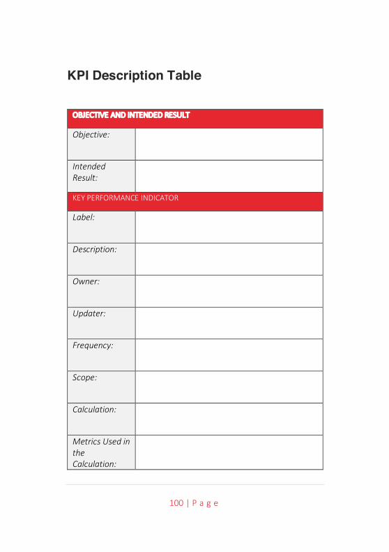
100 | P a g e
KPI Description Table
OBJECTIVE AND INTENDED RESULT
Objective:
Intended Result:
KEY PERFORMANCE INDICATOR
Label:
Description:
Owner:
Updater:
Frequency:
Scope:
Calculation:
Metrics Used in the Calculation:
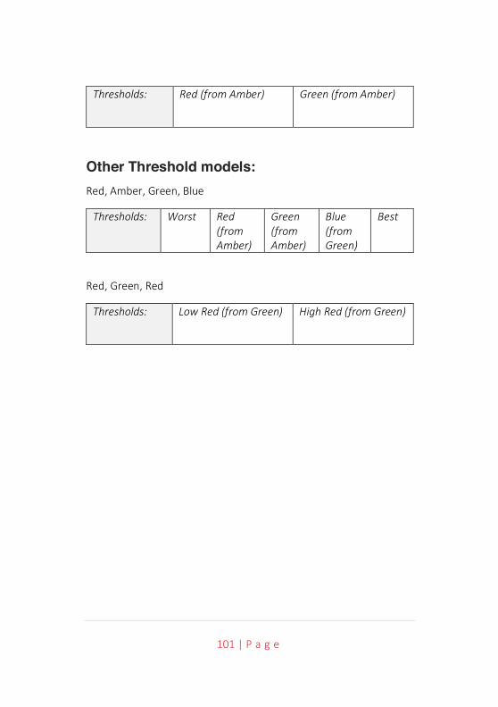
101 | P a g e
Thresholds: Red (from Amber) Green (from Amber)
Other Threshold models: Red, Amber, Green, Blue
Thresholds: Worst Red (from Amber)
Green (from Amber)
Blue (from Green)
Best
Red, Green, Red
Thresholds: Low Red (from Green) High Red (from Green)
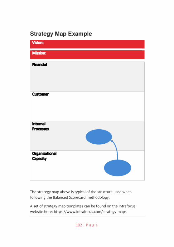
102 | P a g e
Strategy Map Example Vision:
Mission:
Financial
Customer
Internal Processes
Organisational Capacity
The strategy map above is typical of the structure used when following the Balanced Scorecard methodology.
A set of strategy map templates can be found on the Intrafocus website here: https://www.intrafocus.com/strategy-maps
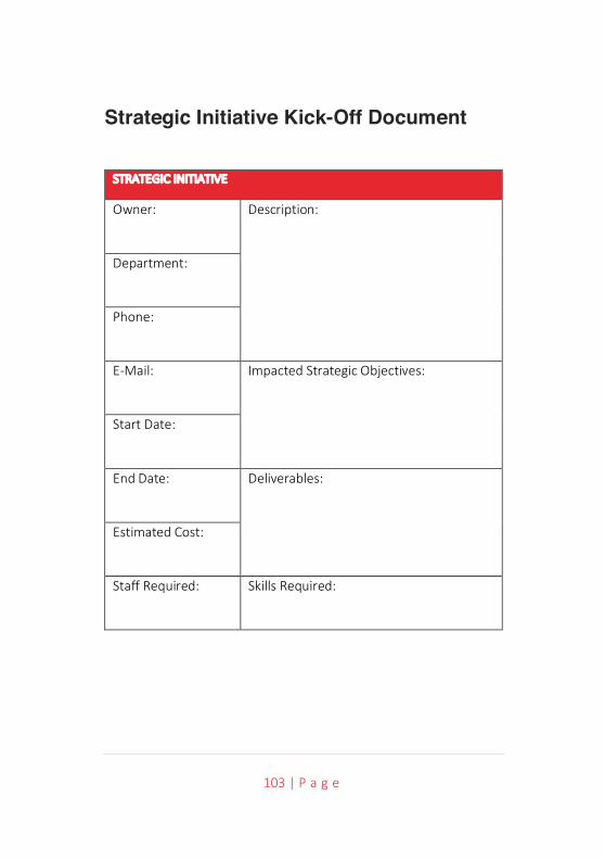
103 | P a g e
Strategic Initiative Kick-Off Document
STRATEGIC INITIATIVE
Owner: Description:
Department:
Phone:
E-Mail: Impacted Strategic Objectives:
Start Date:
End Date: Deliverables:
Estimated Cost:
Staff Required: Skills Required:
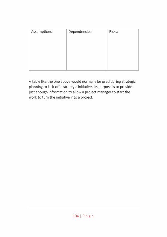
104 | P a g e
Assumptions: Dependencies: Risks:
A table like the one above would normally be used during strategic planning to kick-off a strategic initiative. Its purpose is to provide just enough information to allow a project manager to start the work to turn the initiative into a project.
105 | P a g e