html & css - brookdale cc comp-166brookdalecomp166.com/books/html/html-and-css-anthology.pdfhtml...
TRANSCRIPT
HTML & CSS: A SitePoint Anthology - 1
January 2016
HTML & CSS: A SitePoint Anthology
#1

HTML & CSS: A SitePoint Anthology
HTML & CSS: A SitePoint Anthology - January 2016
Living in Interesting Times 1
• Keeping Up 2• Understanding the Medium 3• Developing the Web Platform 4 12 Little Known CSS Facts 8
• 1. The color Property Isn’t Just for Text 8• 2. The visibility Property Can Be Set to “collapse” 9• 3. The background Shorthand Property Has New Values 10• 4. The clip Property Works Only on Absolutely Positioned Elements 11• 5. Vertical Percentages are Relative to Container Width, Not Height 12• 6. The border Property is Kind of Like Inception 12• 7. The text-decoration Property is Now a Shorthand 13• 8. The border-width Property Accepts Keyword Values 14• 9. Nobody Uses border-image 14• 10. There’s an empty-cells Property 14• 11. The font-style Property Accepts a Value of “oblique” 15• 12. word-wrap is the Same as overflow-wrap 16 Accessible Footnotes with CSS 18
• Creating a sample document 19• Making it accessible 20• Providing back links 23• Final thoughts 24 An Introduction to Mobile-First Media Queries 26
• Shades of Mobile-First 27• Creating Mobile-First Media Queries 27• Source Ordering: A More Complex Example 29• A Couple More Advantages 30• Manage Your Media Queries with Sass 30• Conclusion 31

HTML & CSS: A SitePoint Anthology
Beyond Media Queries — It’s Time to Get Elemental 33
• Media Queries: The Origins 34• Adjusting Elements to the Container, Not Viewport 34• Modularity Goes Out the Window 36• Workarounds 36• Why Don’t We Have Element Queries Yet? 37
Client-Side Form Validation with HTML5 39
• Form Validation with HTML5 40• The type Attribute 40• The pattern Attribute 41• Giving Hints 42• The required Attribute 43• Summary 43
12 Little-Known CSS Facts (The Sequel) 45
• 1. The border-radius property can use “slash” syntax 45• 2. The font-weight property accepts relative keywords 47• 3. There is an outline-offset property 48• 4. There is a table-layout property 48• 5. The vertical-align property works differently on table cells vs. other elements 49• 6. The ::first-letter pseudo-element is smarter than you think 50• 7. You can use invalid characters as delimiters in your HTML class lists 51• 8. Animation iterations can be fractional values 52• 9. Some developers have discovered this one by accident ... 53• 10. You can select ranges of elements 54• 11. Pseudo-elements can be applied to some void elements 55• 12. Some attribute values are case insensitive in selectors 55 How to Code HTML Email Newsletters 58
• HTML Email Fundamentals 59• Step 1: Use HTML Tables for Layout 60• Step 3: Adopt Best Practices 63• Step 4: Code for Google Mail, Lotus Notes, and Outlook 2007 66• Step 5: Coding for Phones and Tablets 68

HTML & CSS: A SitePoint Anthology
• Summary 69• Further Reading 70
HTML5 Video: Fragments, Captions, and Dynamic Thumbnails 73
• Media Fragments 73• Adding Captions or Subtitles 76• Dynamic Thumbnails with Canvas 77• Conclusion 79 Replacing Radio Buttons Without Replacing Radio Buttons 81
• Use what’s already there 82• What do we know about radio buttons? 82• The adjacent sibling combinator 83• Never forget 85• IEH8 86• Conclusion 88 Understanding CSS Grid Systems from the Ground Up 90
• The Benefits 91• The Primary Components 91• Resetting the Box Model 91• Clearing Floats 92• Defining Columns 92• Creating Gutters 93• Calculating Column Widths 93• Optimizing for Mobile Devices 95• Pulling it all Together 96• Conclusion 97 CSS is Alive and Well 99
• CSS tips and tricks are in high demand 101• CSS books are in high demand 102• Final thoughts 103

HTML & CSS: A SitePoint Anthology
Introduction
Welcome to HTML & CSS: A SitePoint Anthology #1, a collection of the most useful and interesting articles on HTML and CSS that have been published on sitepoint.com recently, plus an exclusive article from a bona fide web standards rock star, none other than Opera Software’s Bruce Lawson. HTML and CSS are fast-moving topics: over the past few years, the number of features that are available to us has been expanding at a very rapid rate. It’s difficult to stay abreast of everything, of course, but hopefully the collection of practical articles presented in this article will provide you with some solid techniques that you can use in your work, and maybe provide some inspiration of things to try in future projects We’ve covered a range of topics, including little-known CSS facts, validation, HTML video, grid systems, media queries, and more.
In addition to the mostly practical, tutorial-type articles presented here, we’ve also added a couple of broader pieces to help put the evolution of HTML and CSS in context. The first is the aforementioned article from Bruce Lawson, entitled “Living in Interesting Times”, which discusses the difficulties faced by the Web (and web developers) currently, and what you can do to help overcome them. The second is a piece from sitepoint.com’s HTML and CSS channel editor Louis Lazaris. Entitled “CSS is Alive and Well”, it discusses the challenges that CSS faces from technologies like React, and presents solid evidence as to why CSS won’t be going anywhere soon. I hope that you enjoy this anthology and find it useful; it’s the first of many such collections that we’re planning to publish on a variety of topics. We’d very much welcome your feedback on this book, as it will help us shape the series in the future. Copyright © 2016 SitePoint Pty. Ltd.

HTML & CSS: A SitePoint Anthology - 1
“May you live in interesting times”, goes the (alleged) old Chinese curse. And, for those of us who work making the Web, we do. The Web has never been so ubiquitous or, perversely, so threatened.
The threats are two-fold and dangerous: first, native apps on closed platforms that don’t allow meaningful browser choice, and secondly, developers who don’t understand the medium in which they work.
Of course, the Web has seen off technology threats before; in 2004, those of us who make web standards were so spooked by Flash, and then Silverlight, that a guerilla group of browser employees started writing the spec that became known as “HTML5”. The problem that HTML5 was meant to address was that of transforming the Web from being simply a collection of hyperlinked documents to becoming an application platform.
By adding new features and APIs, or standardising existing proprietary, undocumented features so that they could be interoperably implemented, we now have a raft of new capabilities that were only possible in native environments a few years ago: geolocation; in-browser storage; music synthesis; camera and microphone access; and – increasingly – interaction with the real world around us through sensors and the Internet of Things.
Living in Interesting Times
By Bruce LawsonOpen Web Standards
Opera

2 - HTML & CSS: A SitePoint Anthology
The Web has also risen to the challenge of the proliferation of devices well. In some ways, this was built into it from the start – as Tim Berners-Lee wrote on the 25th birthday of the Web:
“The good news is that the web has openness and flexibility woven into its fabric. The protocols and programming languages under the hood – including URLs, HTTP, HTML, JavaScript and many others – have nearly all been designed for evolution, so we can upgrade them as new needs, new devices and new business models expose current limitations.”
http://www.wired.co.uk/magazine/archive/2014/03/web-at-25/tim-berners-lee
The Web was always designed to run across operating systems, different computers, different devices and different input/output modes. When websites have failed to do so, it’s because the developer chose to browser-sniff, assume the user has a mouse or a screen, or assume a certain screen width. The capabil-ities of CSS Media Queries have been with us for a while – the first working draft was published in 2001.
Keeping Up
There’s a lot to know in web development. The landscape is ever-changing, and there’s always some-thing new to learn (that’s what this book is for!). Recently, Dutch developer Peter-Paul Koch called for a moratorium on new browser features as the rate of new developments was becoming overwhelming:
“We get ever more features that become ever more complex and need ever more polyfills and other tools to function — tools that are part of the problem, and not of the solution.[…]The innovation machine is running at full speed in the wrong direction. We need a break. We need an opportunity to learn to the features we already have responsibly — without tools! Also, we need the time for a fundamental conversation about where we want to push the web forward to. A year-long moratorium on new features would buy us that time.”
http://www.quirksmode.org/blog/archives/2015/07/stop_pushing_th.html
And it’s true that the rate of change in web development is daunting. We need to learn Flexbox, and soon we’ll need to learn CSS Grid Layout, too. (Oh wow, I can’t wait for CSS Grids; finally, a way for designers to express layout visually, using – well – basically, ASCII art.) We’ll need to learn EcmaScript 6, and … and …

HTML & CSS: A SitePoint Anthology - 3
But, of course, like any other discipline, you don’t need to know everything. You need to know what’s possible, and how to look up the details when you do need a particular feature
Even Ian Hickson, the editor of HTML, told me
“The platform has been too complex for any one person to fully understand for a long time already. Heck, there are parts of the Web platform that I haven’t even tried to grok — for example, WebGL or IndexDB — and parts that I continu-ally find to be incredibly complicated despite my efforts at understanding them.”
http://html5doctor.com/interview-with-ian-hickson-html-editor/
.. and that was two and a half years ago!
Understanding the Medium
Even if it were possible, knowing every facet of web development is less important than understanding and respecting the medium in which we develop. Native apps for single platforms are (arguably) easier to develop, so some developers coming to the Web treat it as if it were the same as developing a native app - using the Web to deliver content to a single browser or device, and blocking the rest.
This isn’t new, of course - remember the days of “best viewed in Internet Explorer 5 with a 800x600 monitor”? If you’re too young to remember that, you don’t need long to hunt down a “best viewed in Chrome” or “this site is optimised for Safari on iPad” pseudo-web page.
The “killer app” for the web is reach. The web can reach anyone, anywhere, on any computer or device, running any operating system, with a screen or voice output, with touch input, a keyboard, or a mouth-stick as long as your code doesn’t prevent it from doing so.
“But, of course, like any other discipline, you don’t need to know everything. You need to know what’s possible, and how to look up the details when you do need a particular feature”
“The ‘killer app’ for the web is reach. The web can reach anyone, any-where, on any computer or device, running any operating system, with a screen or voice output, with touch input, a keyboard, or a mouth-stick as long as your code doesn’t prevent it from doing so.”

4 - HTML & CSS: A SitePoint Anthology
And this has never been more important; billions of new people are coming online, mostly with mobile devices that you’ve never heard of, across highly-congested networks, with little memory, and expen-sive, capped data plans. 94% of the unconnected people in the world live in emerging markets; more than 50% of the world lives in Asia, where there are hugely dynamic economies of people eager to partic-ipate in the global markets, but where bandwidth is slow due to infrastructure and geography (think of the Himalayas and Indonesia’s thousands of islands).
This isn’t to say that we need to dumb down our websites - far from it. We need to design for reach and diversity; use accessible, semantic HTML as our foundation, beautify using CSS, taking care to test in browsers that don’t support the latest greatest features, and enhance - but not require - JavaScript. Your e-commerce website will feel more clunky without JavaScript, sure; but if your website is clunky, and your competitors’ websites simply fail, you’ll get the business.
Beware the siren song of the lavish frameworks that require JavaScript simply to construct the same DOM that you could achieve with HTML. Downloading, parsing and executing JavaScript takes time and eats CPU – thereby draining battery.
Of course, progressively enhancing with script is great. Service Workers will soon allow your website to work offline (they’re not quite ready yet). And if your user’s browser doesn’t support JavaScript, or doesn’t support Service Workers, your website will work fine, online, but not offline; no-one gets a worse experience.
It’s possible in Opera for Android and Chrome for Android to provide a manifest file - a few bytes of JSON – which allows a user to save a site to their home screen with an icon, then tickle it into life with their finger, causing it to open full-screen in the browser, indistinguishably from a native app (see https://dev.opera.com/articles/installable-web-apps/ for more). In browsers that don’t support this, you don’t get the possibility to add the site to home screen, but the website still works.
Developing the Web Platform
The next stage of development of the Web depends on progressive enhancement and, crucially, depends on the involvement of engaged developers – people like you. Take 20 minutes to read the Extensible Web Manifesto – but here are the highlights:
“We aim to tighten the feedback loop between the editors of web standards and web developers. Today, most new features require months or years of standard-ization, followed by careful implementation by browser vendors, only then followed by developer feedback and iteration. We prefer to enable feature devel-

HTML & CSS: A SitePoint Anthology - 5
opment and iteration in JavaScript, followed by implementation in browsers and standardization.[…]By explaining existing and new features in terms of low-level capabilities, we:
} Reduce the rate of growth in complexity, and therefore bugs, in implementations.
} Make it possible to polyfill more of the platform’s new features.
} Require less developer education for new features. Educational materials can build off of concepts that are already in the platform.
[…]We want web developers to write more declarative code, not less. This calls for eliminating the standards bottleneck to introducing new declarative forms, and giving library and framework authors the tools to create them.In order for the open web to compete with its walled competitors, there must be a clear path for good ideas by web developers to become part of the infrastruc-ture of the web. We must enable web developers to build the future web.”
https://extensiblewebmanifesto.org/
It’s a bold move to want to involve developers in the evolution of the Web, but we’ve done it before. In 2011, I noticed that every conference I attended, developers told me that sending the “right” images to the right devices was their biggest headache; they had to choose between low-res images that looked murky on new-fangled retina devices, or sending super quality images that got compressed by browsers on older or non-retina devices.
So I wrote a blogpost with a straw man suggestion. Mat Marques, a developer for Boucoup in Boston USA had been thinking the same; he took my idea and set up the Responsive Images Community Group (RICG) which refined my straw man (= made it sane) with other developers and employees of Opera, Google, and Mozilla.
Then we crowd-funded $15,000 so C++ wrangler Yoav Weiss could give up client work and write the code for Blink (the engine that powers Chrome and Opera) and WebKit (which powers Safari). Now, <picture>, <img srcset> and related responsive images markup are in the HTML specification and all modern browsers except for Safari.

6 - HTML & CSS: A SitePoint Anthology
As Mat Marquis wrote,
“the RICG’s main contribution to the web platform wasn’t picture, srcset, or sizes. They’re wonderful and they’ll make websites faster for everybody forever, but they’re just one set of features. To get them done we had to punch a hole through the thick technical, cultural, and institutional walls that separate the people who make browsers from the people who make websites. The lines of communication we’ve built between the different sets of people who write specifications, HTML, and C++ for a living seem more valuable than any one feature.”
https://lists.w3.org/Archives/Public/public-respimg/2014Aug/0001.html
The RICG is renamed “Responsive Issues Community Group” and is working on Element Queries. The Extensible Web Manifesto signatories are working with the W3C Technical Architecture Group and CSS Working Group to give developers a way to extend CSS - to hook into the heavily optimised code already inside browsers, change little bits to do your bidding without rewriting full CSS in JavaScript. This is called Project Houdini – it’s in its early days yet, but it looks really promising.
If you want to become involved in groups of developers that are evolving the web, join the Web Incuba-tor Community Group (WICG) that aims to “make it as easy as possible for developers to propose new platform features, in the spirit of the Extensible Web Manifesto.
If you can’t afford the time, that’s fine – read this book, implement the things that appeal to you, using progressive enhancement principles, with accessibility in mind, and test across browsers. Not being part of the problem makes you part of the solution.

HTML & CSS: A SitePoint Anthology - 7

8 - HTML & CSS: A SitePoint Anthology
CSS is not an overly complex language. But even if you’ve been writing CSS for many years, you probably still come across new things — properties you’ve never used, values you’ve never considered, or specification details you never knew about.
In my research, I come across new little tidbits all the time, so I thought I’d share some of them in this post. Admittedly, not every-thing in this post will have a ton of immediate practical value, but maybe you can mentally file some of these away for later use.
1. The color Property Isn’t Just for Text
Let’s start with the easier stuff. The color property is used extensively by every CSS developer. Some of you not as experienced with CSS may not realize, however, that it doesn’t define only the color of the text.
Take a look at the demo below:
See the Pen CtwFG by SitePoint on CodePen.
12 Little Known CSS Facts
By Louis LazarisSitePoint HTML & CSS
Editor
HTML & CSS: A SitePoint Anthology - 9
Notice in the CSS, only one color property is used, on the body element, setting it to yellow. As you can see, everything on the page is yellow, including:
} The alt text displayed on a missing image
} The border on the list element
} The bullet (or marker) on the unordered list
} The number marker on the ordered list
} The hr element
Interestingly, the hr element, by default does not inherit the value of the color property, but I had to force it to do so by using border-color: inherit . This is kind of odd behaviour to me.
All of this is verified by the spec:
“This property describes the foreground color of an element’s text content. In addition it is used to provide a potential indirect value … for any other proper-ties that accept color values.”
2. The visibility Property
Can Be Set to “collapse”
You’ve probably used the visibility property hundreds of times. The most commonly used values are visible (the default for all elements) and hidden, which makes an element disappear while allowing it to still occupy space as if it was there (which is unlike display: none).
A third and rarely used value for the visibility property is collapse. This works the same way as hidden on all elements except table rows, table row groups, table columns, and table column groups. In the case of these table-based elements, a value of collapse is supposed to work similar to display: none, so that the space occupied by the collapsed row/column can be occupied by other content.

10 - HTML & CSS: A SitePoint Anthology
Unfortunately, the way browsers handle collapse is not consistent. Try the following demo:
See the Pen visibility: collapse by SitePoint on CodePen.
The CSS-Tricks Almanac advises never to use this, due to the browser inconsistencies.
From my observations:
} In Chrome, it makes no difference if you apply collapse or hidden (See this bug report and comments)
} In Firefox, Opera, and IE11, collapse seems to respond exactly as it should: The row is removed and the row below moves up.
Admittedly, this value is probably rarely ever going to be used, but it does exist, so if you didn’t know about it before, I guess in some odd way you are now smarter.
3. The background Shorthand
Property Has New Values
in CSS2.1 the background shorthand property included 5 longhand values – background-color, background-image, background-repeat, background-attachment, and background-position. In CSS3 and beyond, it now includes three more, for a total of up to 8. Here’s how the values map:
background: [background-color]
[background-image]
[background-repeat]
[background-attachment]
[background-position] / [ background-size]
[background-origin]
[background-clip];
Notice the forward slash, similar to how font shorthand and border-radius can be written. The slash allows you to include a background-size value after the position in supporting browsers.

HTML & CSS: A SitePoint Anthology - 11
In addition, you also have up to two optional declarations for background-origin and background-clip.
So the syntax looks like this:
.example { background: aquamarine url(img.png)
no-repeat
scroll
center center / 50%
content-box content-box;
}
Test it in your browser using this demo:
See the Pen New background shorthand values by SitePoint on CodePen.
As for browser support, these new values seem to work fine in all modern browsers, but it’s likely you’ll have to provide good fallbacks for any nonsupporting browsers so it degrades gracefully.
4. The clip Property Works Only on
Absolutely Positioned Elements
Speaking of background-clip, you’ve likely also seen clip before. It looks like this:
.example {
clip: rect(110px, 160px, 170px, 60px);
}
This will ‘clip’ the element at the specified locations (explained here). The only caveat is that the element to which you apply clip must be positioned absolutely. So you have to do this:
.example {
position: absolute;
clip: rect(110px, 160px, 170px, 60px);
}

12 - HTML & CSS: A SitePoint Anthology
You can see how clip is disabled in the demo below when position: absolute is toggled:
See the Pen siFJu by SitePoint on CodePen.
You could also set the element to position: fixed, because, according to the spec, fixed-position elements also qualify as ‘absolutely positioned’ elements.
5. Vertical Percentages are Relative
to Container Width, Not Height
This one is a tad bit confusing at first, which I’ve written about before. While you might know that percentage widths are calculated based on the width of the container, percentages on properties like top and bottom padding and top and bottom margins are likewise calculated based on the width of the container, rather than the height. Here’s an example that you can adjust with a range slider, so you can see the effect:
See the Pen qLnpm by SitePoint on CodePen.
Notice that there are 3 “vertical” percentages declared on the inner box (top and bottom padding, and bottom margin). When the slider moves, it changes only the container width. But the other values change in response to this, as the output on the page shows, showing that these values, when declared as percentages, are based on container width.
6. The border Property is Kind of Like Inception
We’ve all done this at some point:
.example { border: solid 1px black; }
The border property is a shorthand property that sets border-style, border-width, and border-color — all in a single declaration.
“While you might know that percentage widths are calculated based on the width of the container, percentages on properties like top and bottom padding and top and bottom margins are likewise calculated based on the width of the container, rather than the height.”

HTML & CSS: A SitePoint Anthology - 13
But don’t forget that each of the properties that the border property represents is itself a shorthand property. So border-width alone can be declared:
.example { border-width: 2px 5px 1px 0; }
This will set different widths for each of the four borders. And the same is true for border-color and border-style, as shown in this awful demo:
See the Pen multiple border shorthands by SitePoint on CodePen.
In addition, each of those properties can be broken down even further with border-left-style, border-top-width, border-bottom-color, and so on.
But the catch is that you cannot use the regular border shorthand to set different values for different sides. So it’s shorthand inside of shorthand inside of shorthand, but not exactly.
7. The text-decoration
Property is Now a Shorthand
I knew something on this list would blow your mind. This is now standard, according to the spec:
a { text-decoration: overline aqua wavy; }
This property now represents 3 properties: text-decoration-line, text-decoration-color, and text-decoration-style.
Unfortunately, Firefox is the only browser that supports these new properties, and (I’m assuming, for backwards compatibility), doesn’t support them in the shorthand yet.
Try the demo below in Firefox:
See the Pen HapgB by SitePoint on CodePen.
The demo is using the longhand values to do this. This ultimately will be a tough one because currently any browser that sees an extra value in text-decoration will nullify the entire declaration, which is clearly not good for backwards compatibility.

14 - HTML & CSS: A SitePoint Anthology
8. The border-width Property
Accepts Keyword Values
Not exactly earth-shattering, and this isn’t new, but, in addition to standard length values (e.g. 5px or 1em), the border-width property accepts three keyword values: medium, thin, and thick.
In fact, the initial value of the border-width property is “medium”. The demo below uses “thick”:
See the Pen border-width keyword “thick” by SitePoint on CodePen.
When browsers render these keyword values, the spec doesn’t require that they map them to specific length values, but, from what I can see, all browsers seem to use 1px, 3px, and 5px.
9. Nobody Uses border-imageI wrote about the CSS3 border-image property on SitePoint a while back. The feature is supported in all modern browsers except IE10 and below. But does anybody care?
It seems like a really neat feature, allowing you to create border images that are fluid. Use the resize handle in this demo to test it out:
See the Pen border-image demo by SitePoint on CodePen.
Unfortunately, border-image seems like a novelty that not many people are using. But maybe I’m wrong. If you know of any examples of border-image in use on a real project, or if you’ve used it, please let us know in the comments and I’ll be happy to admit I was wrong.
10. There’s an empty-cells Property
This one has support everywhere including IE8, and it looks like this:
table { empty-cells: hide; }
As you probably figured out, it’s used for HTML tables. It tells the browser whether to show or hide table cells that have no content in them. Try the toggle button in this demo to see the effect of changing

HTML & CSS: A SitePoint Anthology - 15
the value of the empty-cells property:
See the Pen empty-cells demo by SitePoint on CodePen.
In this case, I had to ensure the borders were visible and not collapsed and I had to add some spacing between the cell borders. In some cases, this property would have no visual effect because there needs to be something visible on the table for this to make any difference.
11. The font-style Property
Accepts a Value of “oblique”
Just about every time you see the font-style property, it’s used either with a value of “normal” or “italic”. But you can also give it a value of “oblique”:
See the Pen italic vs. oblique by SitePoint on CodePen.
But what exactly does that mean? And why does it look the same as italic?
The spec explains that the value “oblique”…
“…selects a font that is labeled as an oblique face, or an italic face if one is not.”
The description of “italic” in the spec is basically the same. The word “oblique” is a typographic term that basically represents slanted text, but not a true italic.
Due to the way CSS handles oblique text, it’s interchangeable with italic unless (as the spec explains) the font being used has a face that is identified as oblique.
I’ve never heard of a font that actually has an oblique face, but maybe I’m wrong. From the research I’ve done, it seems that it’s wrong for a font to offer both italic and oblique faces, because oblique is supposed to be a faux version of italic on fonts that don’t have a true italic.
So, if I’m not mistaken, what this means is if a font does not have a true italic face, setting the CSS to font-style: italic will actually display the font as font-style: oblique.

16 - HTML & CSS: A SitePoint Anthology
12. word-wrap is the Same as overflow-wrapThe word-wrap property is not used too often, but it’s very useful in specific circumstances. One often-used example is to help long unbroken strings of text (like URLs) to wrap, rather than break out of their container. Here’s an example:
See the Pen word-wrap demo by SitePoint (@SitePoint) on CodePen.
Because this was originally a Microsoft creation, this property is supported in all browsers including Internet Explorer all the way back to IE5.5.
Despite cross-browser and, from what I can see, consistent support, the W3C decided to replace word-wrap with overflow-wrap — I’m guessing due to the former name being considered a mis-nomer. overflow-wrap has the same values as word-wrap, and word-wrap is now considered “an alternate syntax” for overflow-wrap.
While a few new browsers do support overflow-wrap, it seems pointless to bother with it since old browsers handle word-wrap just fine, and all browsers are required to continue to support word-wrap indefinitely, for legacy reasons.
We can start using overflow-wrap when all in-use browsers auto update — but until then, I don’t see a point in changing from the old syntax.

HTML & CSS: A SitePoint Anthology - 17

18 - HTML & CSS: A SitePoint Anthology
I was playing with CSS counters the other day and thought about using them to deal with footnotes. Accord-ing to Plagiarism which has a surprisingly long entry on the matter, footnotes are:
[…] notes placed at the bottom of a page. They cite references or comment on a designated part of the text above it.
You often see them in papers when the author wants to add a piece of information or cite a reference without doing it in the middle of the content or using parentheses. Usually, footnotes are represented with a number according to the position of the footnote in the document, then the same numbers are present at the bottom of the document, adding extra content.
The problem with footnotes on the web is that they can be a pain to maintain. If you happen to work on the same document often, changing the order of sections, adding references along the way, it might be tedious to have to re-number all existing footnotes.
For example, if you have 3 existing references to footnotes in a document, and you want to add another one, but on a piece of content that occurs before all the others, you have to re-number them all. Not great…
Accessible Footnotes with CSS
By Hugo GiraudelSitePoint CSS Goblin
& Sass Hacker

HTML & CSS: A SitePoint Anthology - 19
We could use CSS counters to make this whole thing much easier. What if we did not have to maintain the numbering by hand and it could be done automatically?
The only thing we would have to pay attention to, is that the order of the actual notes in the footer respect the order of appearance of the references in the text.
Creating a sample document
Let’s create a sample document so we can get started.
<article>
<h1>CSS-Powered Footnotes</h1>
<p>Maintaining <a href="#footnotes">footnotes</a> manually can be a pain. By using <a
href="#css">CSS</a> <a href="#css-counters">counters</a> to add the numbered referenc-
es in the text and an ordered list to display the actual footnotes in the footer, it
becomes extremely easy.</p>
<footer>
<ol>
<li id="footnotes">Footnotes are notes placed at the bottom of a page.
They cite references or comment on a designated part of the text above it.</li>
<li id="css">Cascading Style Sheets</li>
<li id="css-counters">CSS counters are, in essence, variables maintained
by CSS whose values may be incremented by CSS rules to track how many times
they're used.</li>
</ol>
</footer>
</article>
Our example is lightweight: we have some content in an <article> element, which contains some links (<a>) pointed at in-document IDs, mapped to the notes in the <footer> of the article.
With a few styles, it might look like this:
“The problem with footnotes on the web is that they can be a pain to maintain. If you happen to work on the same document often, changing the order of sections, adding refer-ences along the way, it might be tedious to have to re-number all existing footnotes.“

20 - HTML & CSS: A SitePoint Anthology
Making it accessible
Before actually getting onto the counters thing, we should make sure our markup is fully accessible for screen-readers. The first thing we want to do is add a title to our footer that will serve as a description or our footnote references. We’ll hide this title with CSS so it doesn’t show up visually.
<footer>
<h2 id="footnote-label">Footnotes</h2>
<ol>
...
</ol>
</footer>
Then, we want to describe all our references with this title, using the aria-describedby attribute:
<p>Maintaining <a aria-describedby="footnote-label" href="#footnotes">footnotes</a>
manually can be a pain. By using <a aria-describedby="footnote-label" href="#css">CSS</
a> <a aria-describedby="footnote-label" href="#css-counters">counters</a> to add the
numbered references in the text and an ordered list to display the actual footnotes in
the footer, it becomes extremely easy.</p>
Now screen reader users will understand when links are references to footnotes.

HTML & CSS: A SitePoint Anthology - 21
Adding the references
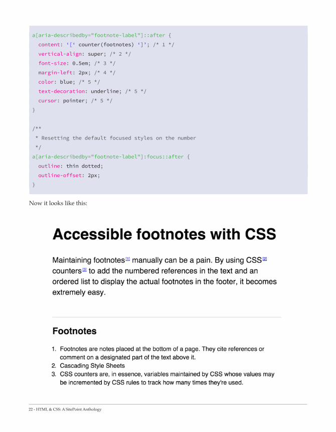
I know what you’re thinking: He said there would be CSS counters. Where are the CSS counters? Well worry not, my friend, they are coming.
What we are going to do is increment a counter for every link in the document that has an aria-describedby attribute set to footnote-label. Then we’ll display the counter using the ::after pseudo-element. From there, it’s all about applying CSS styles.
/**
* Initialiazing a `footnotes` counter on the wrapper
*/
article {
counter-reset: footnotes;
}
/**
* Inline footnotes references
* 1. Increment the counter at each new reference
* 2. Reset link styles to make it appear like regular text
*/
a[aria-describedby="footnote-label"] {
counter-increment: footnotes; /* 1 */
text-decoration: none; /* 2 */
color: inherit; /* 2 */
cursor: default; /* 2 */
outline: none; /* 2 */
}
/**
* Actual numbered references
* 1. Display the current state of the counter (e.g. `[1]`)
* 2. Align text as superscript
* 3. Make the number smaller (since it’s superscript)
* 4. Slightly offset the number from the text
* 5. Reset link styles on the number to show it’s usable
*/
22 - HTML & CSS: A SitePoint Anthology
a[aria-describedby="footnote-label"]::after {
content: ‘[‘ counter(footnotes) ‘]’; /* 1 */
vertical-align: super; /* 2 */
font-size: 0.5em; /* 3 */
margin-left: 2px; /* 4 */
color: blue; /* 5 */
text-decoration: underline; /* 5 */
cursor: pointer; /* 5 */
}
/**
* Resetting the default focused styles on the number
*/
a[aria-describedby="footnote-label"]:focus::after {
outline: thin dotted;
outline-offset: 2px;
}
Now it looks like this:

HTML & CSS: A SitePoint Anthology - 23
Pretty nice, huh? As a final touch, when heading to a footnote from a reference, we want to highlight the note in the footer so we actually see what is the note being referred to, which we can do using the :target pseudo-class:
footer :target {
background: yellow;
}
It is a bit raw, so feel free to customise. Although I must say I like the pure yellow for a highlight – it looks so authentic:
Providing back links
Our demo needs one final element to be fully accessible (as well as pretty cool): back-to-content links. Think about it: You focus a reference, head to the relevant note in the footer, read it and then… nothing. You need a way to go back to where you left!
Providing those links is not that hard: we only need to add a unique ID attribute to each reference in the content so they can be linked to. I decided to go simple and take the ID they refer to, and simply append -ref to it:

24 - HTML & CSS: A SitePoint Anthology
<p>Maintaining <a aria-describedby="footnote-label" href="#footnotes" id="foot-
notes-ref">footnotes</a> manually can be a pain. By using <a aria-describedby="foot-
note-label" href="#css" id="css-ref">CSS</a> <a aria-describedby="footnote-label"
href="#css-counters" id="css-counters-ref">counters</a> to add the numbered references
in the text and an ordered list to display the actual footnotes in the footer, it
becomes extremely easy.</p>
Then each list item from the footer has its own link heading to the relevant id we just added. The content of the link is the backlink Unicode icon ( ), and it has an aria-label attribute with a value of “Back to content”.
<ol> <li id="footnotes">Footnotes are notes placed at the bottom of a page. They cite
references or comment on a designated part of the text above it. <a href="#foot-
notes-ref" aria-label="Back to content"></a></li> <li id="css">Cascading Style Sheets <a
href="#css-ref" aria-label="Back to content"></a></li> <li id="css-counters">CSS count-
ers are, in essence, variables maintained by CSS whose values may be incremented by CSS
rules to track how many times they're used. <a href="#css-counters-ref" aria-label="Back
to content"></a></li> </ol>
To target those links in CSS, we can rely on the aria-label attribute the same way we did for aria-describedby:
[aria-label="Back to content"] {
font-size: 0.8em;
}
You can see a working example here:
http://codepen.io/SitePoint/pen/QbMgvY
Final thoughts
With nothing but a couple of lines of CSS and a few ARIA attributes, we managed to create CSS-powered footnotes that are accessible and do not need any JavaScript. How cool is that?
On topic, I highly recommend Semantic CSS with intelligent selectors from Heydon Pickering. Also, be sure to check out a11y.css from Gaël Poupard to check the accessibility of your pages.
Huge thanks to Heydon Pickering for his valuable help regarding accessibility in this demo.

HTML & CSS: A SitePoint Anthology - 25

26 - HTML & CSS: A SitePoint Anthology
There is no denying the influence of responsive ap-proaches in our design and implementation efforts. What was once new and unknown is now the assumed standard.
When I started down the path of understanding the impact of responsive web design, I had an easy time finding out how to do something with media queries, but I had a harder time finding out why I should do it a certain way. This article is an attempt to remedy this situation.
My intent is that it will serve as a helpful introduction for those of you attempting to understand the massive implications of the mobile-first approach and for those more experienced with the approach it can serve as a good refresher.
I will focus on the details of writing mobile-first media queries, and this will also include why we should do this and close with guidance for starting out. However, first we should look at some important distinctions in the phrase “mobile-first”.
An Introduction to Mobile-First
Media Queries
By Chris Poteet@chrispoteetpro
siolon.com

HTML & CSS: A SitePoint Anthology - 27
Shades of Mobile-First
It is important for our discussion to distinguish that “mobile-first” has two distinct senses. Some might see this as unnecessary, but for the guidance I will share at the end of the article it is important.
Many are familiar with the philosophical approach put forth by Luke Wroblewski in his book entitled Mobile First. Luke writes about the design advantages of a mobile-first strategy, the biggest impact being the imposed constraints of mobile devices that force us to focus on the essentials. He also talks about how mobile devices have capabilities that allow us to enhance the experience (e.g. GPS, accelerometer, etc.). This is what I will refer to as mobile-first design.
However, this is not the only sense, and this article will focus on the second sense. The second sense I will refer to as mobile-first implementation. This uses the technical tenets of responsive design, as coined by Ethan Marcotte. This means that when we actually implement the interface (prototype or production), we start out designing at the smallest viewport possible (which we will call a “mobile viewport,” but someday this might be “watch viewport” as the smallest) and we then progressively add styles and sometimes other enhancements as the viewport increases.
Let’s now look at the how and the benefits of mobile-first media queries.
Creating Mobile-First Media Queries
Rather than explaining all the ins and outs of media queries in this section, I want to focus specifically on how the technique is technically accomplished. Let’s look at two different media queries and dissect their implementation. Please note that I’m keeping this simple so I will avoid any specific class naming structure or style.
.sidebar { float: left; width: 25%; }
.content { float: left; width: 75%;
}
@media (max-width: 40em) {
.sidebar, .content {
float: none;
width: auto;
}
}

28 - HTML & CSS: A SitePoint Anthology
You can see this simple example at work in this CodePen demo. Resize the window to see the change take place.
In this sample, I have two elements that are using floats so that they are lined up horizontally, and I have percentage-based widths on both of them. Then I have a media query breakpoint where the floats are disabled and the width is restored to full width using the “auto” value.
What are the problems with this approach?
1. It forces us to “undo” styles through our media queries. This is not an efficient approach to managing your styles, but we should instead be adding styles.
2. Our original float styles go against the natural flow of HTML elements. Block elements natural-ly clear on the top and bottom and flow at 100%, so the “undo” styles are merely declaring explicitly what the elements already do naturally.
3. This does not allow us to embrace the same constraints that we may have used in our mo-bile-first design. We essentially are going in two different philosophical directions.
You can usually spot the implementations that start at large viewports and go down by the presence of “max-width” in the media queries. This is not always the case, but it is usually a pretty strong indicator. Now let’s look at another example:
@media (min-width: 40em) {
.sidebar {
float: left;
width: 25%;
}
.content {
float: left;
width: 75%;
}
}
Now let’s look at the advantages of this model, which are really the opposite of the problems we started with above (a demonstration of this is on CodePen as well).

HTML & CSS: A SitePoint Anthology - 29
1. Instead of undoing the floats as we go down, we only need to add the floats when we need them. This reduces a lot of unnecessary CSS.
2. In this instance we are taking what HTML gives us by default and not going against it unneces-sarily. By default, browsers us give us what we want and need in smaller viewport so we utilize those defaults (i.e. block elements are set to width: auto by default).
3. Using this method we are philosophically on the same page of our mobile-first design.
Source Ordering: A More Complex Example
The example above is very simple and on purpose, but let’s look at a more complex example. One of the first things you will learn about and have to deal with is the problem of DOM source ordering.
Even though flexbox is exciting, we will never get away from considering source order as we create responsive interfaces.
Source ordering refers to how a document is rendered as a result of the DOM structure. The DOM renders top to bottom, and until the advent of flexbox we didn’t have a pure CSS method to decouple rendering from source order.
In this third CodePen example you can see priority highlighted from left to right.
Source ordering is a very important concept to understand as you move into responsive web design. From the example above you can see when the viewport dips below 40em the most important content (labeled “first priority”) is on top. This is what we want to happen given the importance of limited space in small viewports.
Now you could get something similar in the desktop-down implementation, but what I’ve seen people do is fall into old tendencies of not thinking first about the importance of source ordering. Mobile-first design and implementation makes it an inescapable reality, and when these are paired together the result is a powerful solution. Then technologies like flexbox can be used as an enhancement when needed if the need to change the rendering order exists.
“Even though flexbox is exciting, we will never get away from consid-ering source order as we create responsive interfaces.”

30 - HTML & CSS: A SitePoint Anthology
A Couple More Advantages
The mobile-first code above is a great example of responsible implementation through progressive enhancement. It is important to note that there are still old mobile browsers that do not support media queries, and it is helpful that they will receive the smaller viewport layout. There are other browsers that have issues with media queries, most importantly IE8 and below. You can polyfill media queries, or use a preprocessor solution.
There is another important benefit to structure our media queries in this way, and that is performance. Tim Kadlec has done the research to show that using media queries in this manner can avoid unnecessary downloads.
So, for instance, if you wanted to add a background image only at larger viewports or even swap out a smaller for a larger one, you save downloads and loading time.
If I were to add an image to my sidebar in the example above, it would download and show up only when the viewport reaches at least 40em.
Manage Your Media Queries with Sass
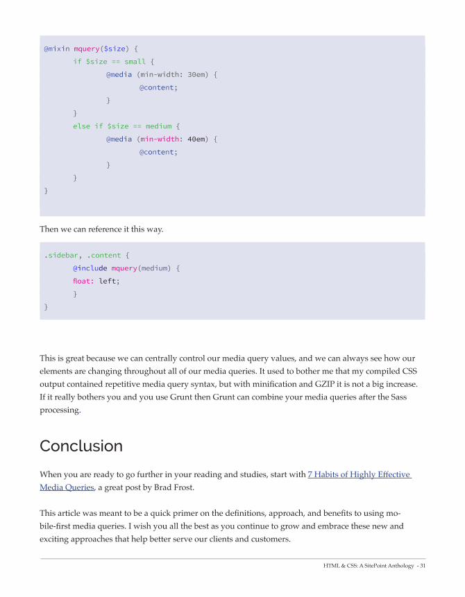
Before I conclude, I recommend that you use a preprocessor to help you manage your media queries. There are countless options and even preprocessor syntaxes for handling this (Sass, Less, Stylus). I prefer a simpler approach and Chris Coyier has demonstrated a Sass mixin that I use in my projects. I will update it to use my preferred language.
Mobile-First implementation is more efficie nt and future-friendly (Image credit:Brad
Frost)
HTML & CSS: A SitePoint Anthology - 31
@mixin mquery($size) {
if $size == small {
@media (min-width: 30em) {
@content;
}
}
else if $size == medium {
@media (min-width: 40em) {
@content;
}
}
}
Then we can reference it this way.
.sidebar, .content {
@include mquery(medium) {
float: left;
}
}
This is great because we can centrally control our media query values, and we can always see how our elements are changing throughout all of our media queries. It used to bother me that my compiled CSS output contained repetitive media query syntax, but with minification and GZIP it is not a big increase. If it really bothers you and you use Grunt then Grunt can combine your media queries after the Sass processing.
Conclusion
When you are ready to go further in your reading and studies, start with 7 Habits of Highly Effective Media Queries, a great post by Brad Frost.
This article was meant to be a quick primer on the definitions, approach, and benefits to using mo-bile-first media queries. I wish you all the best as you continue to grow and embrace these new and exciting approaches that help better serve our clients and customers.

32 - HTML & CSS: A SitePoint Anthology

HTML & CSS: A SitePoint Anthology - 33
When Ethan Marcotte wrote this piece outlining the concepts behind Responsive Web Design, I wonder if he knew how popular the concept would become. Or that it would be mainstream in just a few years.
Today, every responsive site on the net relies heavily on media queries to adapt the layout and other elements to the size of the viewport. It’s almost like a bit of magic. We suddenly don’t have to create separate code, files and the works for each mobile device size. Our website magically ‘responds’.
But sometimes, I wonder if we took Ethan’s words too literally. That we got complacent about media queries. We pounced on media queries as the golden solution for responsive designs… and stopped looking beyond.
Don’t get me wrong. I love Responsive Web Design. I love that it enables us to show the same content, well enough, on all kinds of device sizes. And I love media queries — the technology that makes it possible for me to change layouts based on the device size (simplistically speaking). But the more I work
Beyond Media Queries — It’s
Time to Get Elemental
By Richa Jainheartizn.com

34 - HTML & CSS: A SitePoint Anthology
with them, the more painfully aware I am of how inadequate and grossly overused they are.
Media Queries: The Origins
Those of you who are familiar with media queries, just bear with me for a minute.
Media queries came about from the need to tailor presentation to a range of output devices, without changing the content itself. A media query checks the media type against the user agent string, and if there’s a match, it goes on to check against certain physical attributes of the device, like height, width, orientation, etc. This is a simple and effective way to serve different presentations on devices with varying dimensions. It’s no coincidence that the need for media queries grew along with the increasing adoption of smart phones and other mobile devices worldwide.
The most commonly used media query features are the ones for height and width. For the browser window or view port there are width, height, min/max-width, min/max-height and for the device there are device-width, device-height, min/max- device-width, min/max- device-height. So you can effective-ly specify how you want things to change when the viewport or device size changes.
Yes, that’s more or less what it’s all about. Why am I repeating the basics? To draw the focus back to the basics of media queries — the basic concepts that we tend to overlook in our love for media queries:
1. Media Queries were meant to address the problem of displaying the same content across multiple device sizes.
2. They are not modular.
And this is where media queries start becoming a problem — when you really want to build modular, independent components.
Adjusting Elements to the Container, Not Viewport
So imagine you’re working on an ecommerce site. Trying to be modular and write good code, you create an element, say my_product, to represent each product. This element has an image of the product and some text describing it.
“We pounced on media queries as the golden solution for responsive designs… and stopped looking beyond.”
HTML & CSS: A SitePoint Anthology - 35
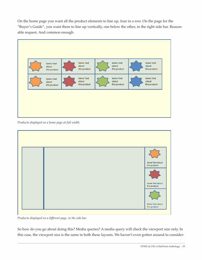
On the home page you want all the product elements to line up, four in a row. On the page for the “Buyer’s Guide”, you want them to line up vertically, one below the other, in the right side bar. Reason-able request. And common enough.
Products displayed on a home page at full width.
Products displayed on a different page, in the side bar.
So how do you go about doing this? Media queries? A media query will check the viewport size only. In this case, the viewport size is the same in both these layouts. We haven’t even gotten around to consider-

36 - HTML & CSS: A SitePoint Anthology
ing different device sizes.
We just want the my_product element to display differently depending on whether its container is narrow (i.e. limited to the sidebar), or wide (i.e. spread across the whole page). We can’t use media queries for this. Is there anything else in CSS that let’s us do this cleanly?
Sadly no. There are a couple of hacks, and scripts that can help; but no clean way (that I know of) to do this. Heydon Pickering hit a similar wall when trying to make his design independent of the content and number of elements.
Modularity Goes Out the Window
To handle this, I’d have to maintain code to style my_product differently, depending on where it is used. If I want to make this responsive, and account for different device sizes, I’m in for more trouble. I’d have to figure out and maintain different breakpoints for this element, depending on the device size. I’m not even going to get into how contorted the code will get. You can look up Ian Storm Taylor’s account of struggling with media queries, Scott’s issues over at FilamentGroup, and Tyson Matanich’s discussion of the problem. Yes, I’m not the only one struggling with this.
I like simple, clean code. I like to keep it modular. I like DRY (Don’t Repeat Yourself). I do not like having the same code sprinkled around in multiple places like confetti.
It’s a basic task — if an element gets too narrow (or small or whatever), change the style a bit. There should be a simple way to do it without getting all tangled. There should be a way to link the style of an element to its container, Instead of always linking to its viewport size or the device dimensions.
Workarounds
A few creative people, who struggled with this, have tried to make things easier for the rest of us mortals. Some innovative workarounds to address the current lack in our CSS specifications are:
} Elementary by Scott Jehl
} Element Queries by Tyson Matanich
} EQ.js by Sam Richards

HTML & CSS: A SitePoint Anthology - 37
} CSS Element Queries from Marcj
These are all good. And they serve the purpose. But they each have their own limitations and add in complexity. We need something simpler, cleaner, built into CSS.
Why Don’t We Have Element Queries Yet?
There’s been much discussion about having ‘Element Queries’ — along the same lines as media queries but tied to the component rather than the viewport. RICG is even working on a draft for the use cases and requirements. But it is still in the initial stages. There are a few practical issues that need to be sorted out first. The main issue relates to circularity. There are many ways you can specify an element’s size depending on its contents. What happens when those contents in turn depend on the size of the containing element? What comes first — the chicken or the egg? The debate is still on about the best way to handle this.
But like other problems that appeared impossible in the past, I’m sure this can also be worked out. It’s not impossible. It’s more a matter of the problem getting the attention it deserves. With media queries hogging the limelight, the discussion around element queries isn’t gathering enough momentum. While media queries help us with RWD, they are limited. We need to look beyond.
Media queries and ‘element queries’ are complementary. They address different situations and needs. Just because we now have media queries, doesn’t mean we should sit complacently and not push for further growth in CSS. We need to thrash out the best way to address the issue of element queries.
Over the next few years, the internet is poised for explosive growth, with more websites (good and bad!) being created every day than ever in the past, websites more complex than ever in the past. The majority of developers seem to be happy with what they have at the moment and are too busy, or lazy, to look towards the future.
We need to look ahead and make sure we have the right set of tools to handle the complexities. Else we’ll have a few billion websites, with spaghetti code strewn all over.

38 - HTML & CSS: A SitePoint Anthology

HTML & CSS: A SitePoint Anthology - 39
When building web applications, it is important you take security seriously, especially when it has to do with collecting data from users.
It is a common maxim in security to trust nobody, hence never trust the user to enter correct or valid form values. For example, in an email form field, instead of entering a valid email address, the user might enter an invalid one or malicious data obviously ignoring the intent of the request.
When it comes to validating form values, it can be done on the client-side (web browser) and on the server-side (using your preferred server-side language).
In the past, client-side validation could only be achieved using JavaScript or using libraries from frameworks (think jQuery validation plugin). But that is changing or rather has changed because validation can now be done using HTML5 without having to write complex JavaScript validation code.
Client-Side Form Validation
with HTML5
By Agbonghama Collins@w3guy
w3guy.com

40 - HTML & CSS: A SitePoint Anthology
Form Validation with HTML5
HTML5 includes a fairly solid form validation mechanism powered by the following <input /> attributes: type, pattern, and require. Thanks to these new attributes in HTML5, you can delegate some data verification functions to the browser.
Let’s examine these new form attributes to see how they can aid form validation.
The type Attribute
This form attribute indicates what kind of input control to display such as the popular <input type="text" /> for handling simple text data.
Some form controls inherit validation systems without having to write any code. For example, <input type="email" /> validates the field to ensure the entered data is in fact a valid email address.
If the field contains an invalid value, the form cannot be submitted for processing until it is corrected.
Try the demo below by entering an invalid email:
http://codepen.io/SitePoint/pen/BFwhz
There is also <input type="number" />, <input type="url" /> and <input type="tel" /> for validating numbers, URLs, and telephone numbers respectively.
Note: The formatting of phone numbers varies from country to country due to the inconsistency in lengths and formats. As a result, the specification doesn’t define an algorithm for validating these, hence it isn’t supported web browsers at the time of writing.
Mind you, validation can be provided to tel using the pattern attribute which accepts a Regular Expression string, and which we’ll consider next.

HTML & CSS: A SitePoint Anthology - 41
The pattern Attribute
The pattern attribute will likely make a lot of developers, especially those working on the front-end, happy. This attribute specifies a format (in the form of a JavaScript Regular Expression) that the field value is checked against.
Regular expressions (RegEX) provide a powerful, concise, and flexible means for matching strings of text such as particular characters, words, or patterns of characters.
Regular expressions are a language used for parsing and manipulat-ing text. They are often used to perform complex search-and-replace operations, and to ensure that text data is well-formed.
Today, regular expressions are included in most programming languages, as well as in many scripting languages, editors, applica-tions, databases, and command-line tools.
By passing a RegEX string as the value for the pattern attribute, you can dictate what value is accept-able by the form field and also inform the user of errors.
Let’s see some examples of using regular expressions for validating form field data.
Telephone numbers:
As mentioned, the tel input type isn’t fully supported by web browsers due to the inconsistent format of telephone numbers across different countries.
For example, in my country, Nigeria, the telephone format is xxxx-xxx-xxxx which would be some-thing like 0803-555-8205.
The RegEX ^\d{4}-\d{3}-\d{4}$ matches the format hence the input element would look like this:
<label for="phonenum">Phone Number:</label>
<input type="tel" pattern="^\d{4}-\d{3}-\d{4}$" >
http://codepen.io/SitePoint/pen/Eambf
“Regular expressions (RegEX) provide a powerful, concise, and flexible means for match-ing strings of text such as particular characters, words, or patterns of characters.”

42 - HTML & CSS: A SitePoint Anthology
Alpha-Numeric Values
The following matches an alpha-numeric (combination of alphabets and numbers) character.
<input type="text" pattern="[a-zA-Z0-9]+" >
Demo: http://codepen.io/SitePoint/pen/nptlf
Twitter Username
This regular expression matches a Twitter username with the leading @ symbol. For example @tech4sky.
<input type="text" pattern="^@[A-Za-z0-9_]{1,15}$" >
Demo: http://codepen.io/SitePoint/pen/nKGro Hex Color Code
This one matches a hexadecimal color. For example #3b5998 or #000.
<input type="text" pattern="^#+([a-fA-F0-9]{6}|[a-fA-F0-9]{3})$" >
Demo: http://codepen.io/SitePoint/pen/ejqig
Giving Hints
To provide the user with a description of the pattern, or an error reporting on the field if an invalid value is entered, you can use the title attribute, like this:
<input type="text" name="ssn"
pattern="^\d{3}-\d{2}-\d{4}$"
title="The Social Security Number" />

HTML & CSS: A SitePoint Anthology - 43
Demo: http://codepen.io/SitePoint/pen/hbuxg
If you’re new to Regular Expressions, you can check out this document on WebPlatform.org to give you a head start. In most cases, however, you should be able to use Google to search for the regular expres-sion you want, or even use a tool to help you.
The required Attribute
This is a Boolean attribute used to indicate that a given input field’s value is required in order to submit the form. By adding this attribute to a form field, the browser requires the user to enter data into that field before submitting the form.
This replaces the basic form validation currently implemented with JavaScript, making things a little more usable and saving us some development time.
Example: <input type="text" name="my_name" required /> or <input type="text" name="my_name" required="required" /> for XHTML compatibility.
All the demos embedded above use the required attribute, so you can test those by trying to submit any of the forms without entering anything in the field.
Summary
Browser support for form validation features is pretty strong, and you can easily polyfill them where necessary.
It is worth noting that relying solely on the browser (client-side) for validation can be dangerous because it can be circumvented by a malicious user or by computer bots.

44 - HTML & CSS: A SitePoint Anthology
Not all browsers support HTML5, and not all input sent to your script will come from the form. This means that server-side side validation should also be in place before the form data is sent to the server for processing.

HTML & CSS: A SitePoint Anthology - 45
Over a year ago I published the original 12 Lit-tle-known CSS Facts and, to this day, it has been one of SitePoint’s most popular articles ever.
Since that post was published, I’ve been collecting more little CSS tips and tidbits for a new post. Because we all know that every successful movie should spawn a cheesy sequel, right?
So let’s get right into this year’s developer’s dozen.
1. The border-radius property
can use “slash” syntax
This is something I’ve written about before more than four years ago on SitePoint, but I still think many beginners and even some experienced developers don’t know this feature exists.
12 Little-Known CSS Facts
(The Sequel)
By Louis LazarisSitePoint HTML & CSS
Editor

46 - HTML & CSS: A SitePoint Anthology
Believe it or not, the following is valid border-radius code:
.box {
border-radius: 35px 25px 30px 20px / 35px 25px 15px 30px;
}
If you’ve never seen that, it might seem a little confusing, so here’s the explanation from the spec:
“If values are given before and after the slash, then the values before the slash set the horizontal radius and the values after the slash set the verti-cal radius. If there is no slash, then the values set both radii equally.”
The spec also provides the following diagram:
The caption for that image explains: “The two values of border-top-left-radius: 55pt 25pt define the curvature of the corner.”
So the use of the slash in the value allows you to create curved corners that are not symmetrical.
If you want a more detailed consideration of this, check out my original article linked above, or better yet, try out this handy little interactive demo from MDN:
Most border-radius genera-tors do not allow you to set these optional values. The MDN generator is the only one I’ve found that does this.
MDN: Border-radius generator

HTML & CSS: A SitePoint Anthology - 47
2. The font-weight property
accepts relative keywords
Normally when you see the font-weight property defined, the value will be either normal or bold. You might also occasionally see an integer value in hundred increments: 100, 200, etc., up to 900.
The two values that are often forgotten, however, are bolder and lighter.
According to the spec, these keywords specify a bolder or lighter weight than the inherited value. This comes into play most significantly when you are dealing with a font that has multiple weights that are bolder than just plain “bold” and lighter than just normal text.
In the hundred-based values, “bold” maps to 700 and “normal” maps to 400. So if you have a font that has a 300 weight, but nothing lower, a value of “lighter” will produce 300 if the inherited value is 400. If there is no lighter weight (i.e. 400 is the lightest weight) then it will just stay at 400 and thus a value of “lighter” will have no effect.
Look at this CodePen demo.
http://codepen.io/SitePoint/pen/domZLx
In this example, I’m using a font called Exo 2, which has 18 different styles available. My demo embeds only the non-italic styles, which are enough for each of the hundred-based weights.
Notice that the demo includes 12 nested ‘box’ elements with different font-weight values, including “bolder” and “lighter” so you can see how these affect the weight of the text in different inheritance contexts. Below is the CSS from that example. Notice the comments in the code, and remember that each subsequent “box” is nested inside the previous:
.box { font-weight: 100; }
.box-2 { font-weight: bolder; / maps to 400 / }
.box-3 { font-weight: bolder; / maps to 700 / }
.box-4 { font-weight: 400; }
.box-5 { font-weight: bolder; / maps to 700 / }
.box-6 { font-weight: bolder; / maps to 900 / }
.box-7 { font-weight: 700; }
.box-8 { font-weight: bolder; / maps to 900 / }
.box-9 { font-weight: bolder; / maps to 900 / }

48 - HTML & CSS: A SitePoint Anthology
.box-10 { font-weight: lighter; / maps to 700 / }
.box-11 { font-weight: lighter; / maps to 400 / }
.box-12 { font-weight: lighter; / maps to 100 / }
In this case, the “bolder” and “lighter” keywords will map only to the 100, 400, 700, and 900 values. With 9 different styles, these keywords will never map to the 200, 300, 500, 600, and 800 values.
This happens because you’re telling the browser to choose the next font in the series that is considered either ‘bold’ or ‘light’. So it’s not picking the next boldest or the next lightest, but merely a bold or light font relative to what is inherited. If, however, the lightest font started at 300 (as in the case of Open Sans), and the inherited value was 400, then a value of “lighter” would map to 300.
This might all be a bit confusing at first, but you can fiddle around with the demo to see how these keywords work.
3. There is an outline-offset property
The outline property is pretty well known due to its ability to help in debugging (it doesn’t affect page flow). The spec, however, has added an outline-offset property, which does exactly what its name suggests — it lets you define how far the outline should be offset from the element.
In this CodePen demo, move the range slider left or right to see the outline offset change. The range in this example covers 0px to 30px, but you could go as large as you want in the CSS. Take note that although the outline property is a shorthand property, it doesn’t include outline-offset, so you always have to define outline-offset separately.
The only major drawback to the outline-offset property is the fact that it’s supported in every browser except Internet Explorer (not even IE11).
4. There is a table-layout property
You’re probably thinking, Old news. I know all about display: table, bruh. Easiest way to vertically center! But that’s not what I’m talking about. Notice I said the table-layout property, not the display property.

HTML & CSS: A SitePoint Anthology - 49
The table-layout property isn’t the easiest CSS feature to explain so let’s first go to the spec, and then look at an example. The spec says:
“With this (fast) algorithm, the horizontal layout of the table does not depend on the contents of the cells; it only depends on the table’s width, the width of the columns, and borders or cell spacing.”
That might be the first time in W3C specification history that something is hard to understand. LOL JK.
But seriously, as always, a live example will help. In this CodePen demo demo, the table has table-layout: fixed added in the CSS. Click the toggle button to toggle it off, then on, etc.
You can see in this example the advantage of using table-layout: fixed, as opposed to the default of auto. This won’t always be the best choice and it won’t always be necessary, but it’s a nice one to keep in mind when dealing with tables that have cells with variable-width data.
Chris Coyier did a great write-up on this property last year, so if you want a much more comprehensive discussion, that’s your best bet.
5. The vertical-align property works
differently on table cells vs. other elements
If you’ve been coding websites since the mid-2000s or earlier, or if you’ve done a lot of HTML emails, then you’ve probably at some point assumed the vertical-align property was the standard upgrade to the old HTML4 valign attribute, which is now listed as an obsolete, non-conforming feature in HTML5.
But vertical-align in CSS doesn’t really work that way. Except on tables. Which, I think is kind of weird, but I suppose it makes more sense than the property not working at all on tables.
So what’s the difference when this property is applied to regular elements compared to table cells?
When not applied to table cells, the vertical-align property follows these basic rules:
} It works only on inline or inline-block elements.

50 - HTML & CSS: A SitePoint Anthology
} It has no effect on the contents of an element but instead it changes the alignment of the element itself in relation to other inline or inline-block elements.
} It can be affected by text/font settings like line-height and by the size of adjacent inline or inline-block elements.
Check out this CodePen demo.
The vertical-align property is defined on the input element. By pressing one of the buttons, you’ll change the value to what’s written on the button. You’ll notice that each of the values changes the position of the input.
Overall, that demo is a really rudimentary look at this property and its values. For a much deeper look, check out Christopher Aue’s 2014 post.
When it comes to tables, however, vertical-align works very differently. In such a case, you apply the property/value to one or more table cells, and the content of the table cells is affected by the chosen alignment.
As shown in this CodePen demo, only four of the values work on table cells, and although there is an effect on the sibling cells with a value of baseline, the main effect is on the alignment of content inside the cell on which you’ve applied vertical-align.
6. The ::first-letter pseudo-
element is smarter than you think
The ::first-letter pseudo-element allows you to style the first letter of an element, letting you do a drop-cap effect which has been common in print for many years.
The good thing about this one is that browsers seem to have a decent standard for what constitutes the “first letter” of an element. I first saw this when Matt Andrews tweeted about it, although he seemed to imply that it was a bad thing. You can see his examples in this CodePen demo.
Looks to me like the four big browsers all handle these the same way, so that’s great because I think this is the correct behavior. It would be a little weird if something like an open parenthesis was treated as a “first letter”. That would be more like “first character”, which I suppose could be a whole new pseu-do-class in itself.

HTML & CSS: A SitePoint Anthology - 51
7. You can use invalid characters as
delimiters in your HTML class lists
This concept was discussed in 2013 by Ben Everard, and I think it’s worth expanding on.
Ben’s post was about using the slash (“/”) character to separate his HTML classes into groups, to make his code easier to read or scan. As he points out, although the unescaped slash is an invalid character, browsers don’t choke on it, they simply ignore it.
So you might have an HTML example like this one:
<div class="col col-4 col-8 c-list bx bx--rounded bx--transparent">
With the slashes, it would become:
<div class="col col-4 col-8 / c-list / bx bx--rounded bx--transparent">
You can use any characters (invalid or not) to produce the same effect:
<div class=“col col-4 col-8 c-list bx bx–rounded bx–transparent”>
<div class=“col col-4 col-8 || c-list || bx bx–rounded bx–transparent”>
<div class=“col col-4 col-8 && c-list && bx bx–rounded bx–transparent”>
All these variations seem to work fine, which you can test in this demo.
Of course, those delimiters cannot be used in your stylesheet as classes, which is what I mean by “invalid”. So the following would be illegal and wouldn’t apply the specified style:
./ { color: blue; }
If you must use these kinds of characters in your HTML classes for the purpose of targeting them in your CSS, you can insert them escaped using this tool. So the above example would work only if your CSS looked like this:
.\/ { color: blue; }

52 - HTML & CSS: A SitePoint Anthology
And taking it even further, Unicode characters don’t have to be escaped at all, so you can do this kind of crazy stuff:
<div class="♥ ★"></div>
And then have the following in your CSS:
.♥ { color: hotpink; }
.★ { color: yellow; }
Alternatively, you can escape these types of characters too, instead of inserting them directly. The following would be equivalent to the previous code block:
.\2665 {
color: hotpink;
}
.\2605 {
color: yellow;
}
8. Animation iterations can be fractional values
When writing CSS keyframe animations, you probably know that you can use the animation-iteration-count property to define the number of times to play the animation:
.example {
animation-iteration-count: 3;
}
The integer value in that example will tell the animation to run 3 full times. But maybe you didn’t know that you can use fractional values:
.example {
animation-iteration-count: .5;
}
In this case, the animation will run a half time (that is, it will stop halfway through its first iteration).

HTML & CSS: A SitePoint Anthology - 53
Let’s look at an example demo that animates two balls on the page. The top ball has an iteration count of “1” while the bottom ball has an iteration count of “.5″.
http://codepen.io/SitePoint/pen/VLXQmM
What’s interesting about this is that the iteration duration is not based on the property/value that’s animating. In other words, if you animate something 100px, the halfway point is not necessarily at 50px. For example, the previous animation uses a timing function of linear, so this ensures the second ball stops visually at the halfway point.
This demo shows the same two animations, this time using a timing function of ease:
http://codepen.io/SitePoint/pen/PqRxov
Notice now the second ball passes the halfway point before it stops. Again, this is because of the different timing function.
If you understand timing functions, then you’ll also realize that a value of ease-in-out will position the ball in the same place as linear. Fiddle around with fractional values and the timing functions to see the different results.
9. Animation shorthand can break because of the
animation’s name
Some developers have discovered this one by accident and there is a warning about it in the spec. Let’s say you have the following animation code:
@keyframes reverse {
from {
left: 0;
}
to {
left: 300px;
}
}
.example {
animation: reverse 2s 1s;

54 - HTML & CSS: A SitePoint Anthology
}
Notice I’m using a name of reverse for the animation. This seems fine at first glance, but notice what happens when we use the above code in a demo.
http://codepen.io/SitePoint/pen/OVvayK
The animation doesn’t work because “reverse” is a valid keyword value for the animation-direction property. This will happen for any animation name that matches a valid keyword value that’s used in the shorthand syntax. This will not happen when using longhand.
Animation names that will break the shorthand syntax include any of the timing function keywords, as well as infinite, alternate, running, paused, and so forth.
10. You can select ranges of elements
I don’t know who first used this but I first saw it in this demo by Gunnar Bittersmann. Let’s say you have an ordered list of 20 elements and you want to select elements 7 through 14, inclusive. Here’s how you can do it with a single selector:
ol li:nth-child(n+7):nth-child(-n+14) {
background: lightpink;
}
http://codepen.io/SitePoint/pen/wamQGv
Unfortunately, Safari has a bug that prevents this technique from working. Fortunately, a solution proposed by Matt Pomaski seems to fix it: Simply reverse the chain so it looks like ol li:nth-child(-n+14):nth-child(n+7). WebKit nightly doesn’t have this bug, so eventually you’ll be able to get this working normally.
This code uses chained structural pseudo-class expressions. Although the expression itself might be a bit confusing, you can see the range you’re targeting by the numbers used in the expression.
To explain exactly what this is doing: In the first part of the chain, the expression says “select the 7th element, then every element after that”. The second part says “select the 14th element, and every element

HTML & CSS: A SitePoint Anthology - 55
before that.” But since the selectors are chained, each limits the previous one’s scope. So the second part of the chain doesn’t allow the first part to go past 14 and the first part of the chain doesn’t allow the second part to go back past 7.
For a more detailed discussion of these types of selectors and expressions, you can read my old post on the subject.
11. Pseudo-elements can be applied
to some void elements
If you’re like me, at some point you’ve probably tried to apply a pseudo-element to an image or a form input. This won’t work because pseudo-elements don’t work on replaced elements. I think many developers have the assumption that void elements (that is, elements that don’t have closing tags) all fall under that category. But that’s not true.
You can apply a pseudo-element to some void elements that aren’t replaced elements. This includes hr elements, as in this demo:
http://codepen.io/SitePoint/pen/ZGxmpK
The colored area in that example is a horizontal rule (hr element) and it has both ::before and ::after pseudo-elements applied to it. Interestingly, I couldn’t get the same result using a br element, which is also a non-replaced void element.
You can also add pseudo-elements to meta tags and link elements, if you are crazy enough to convert those to display: block, as shown in the demo below.
http://codepen.io/SitePoint/pen/KporNg
12. Some attribute values are case
insensitive in selectors
Finally, here is a bit of an obscure one. Let’s say you have the following HTML:

56 - HTML & CSS: A SitePoint Anthology
<div class="box"></div> <input type="email">
You could style both of those elements using the attribute selector, like this:
div[class="box"] { color: blue; }
input[type="email"] { border: solid 1px red; }
That would work fine. But what about this?
div[class="BOX"] { color: blue; }
input[type="EMAIL"] { border: solid 1px red; }
Notice both attribute values are now in uppercase. In this case, the .box element will not receive the styles, because the class attribute is case sensitive. The email field, on the other hand, will apply the styles because the value of the type attribute is not case sensitive. Nothing necessarily groundbreaking here, but maybe it’s something you hadn’t realized before.

HTML & CSS: A SitePoint Anthology - 57

NEWSLETTER
58 - HTML & CSS: A SitePoint Anthology
This article was first published in 2006, then re-edited in 2011 — and now it’s been re-re-edited in 2015.
HTML email newsletters have come a long way since this article was first published back in 2006. HTML email is still a very successful communications medium for both publishers and readers. Publishers can track rates for email opens, forwards, and clickthroughs, and measure reader interest in products and topics; readers are presented with information that’s laid out like a web page, in a way that’s more visually appealing, and much easier to scan and navigate, than plain text email.
Coding an HTML email is a fun, practical problem for programmers to solve. Unlike coding a web page, HTML emails need to display well on old email software — think Outlook or Mac Mail, as well as adapt to phone and tablet screens. I’ll show you how to create HTML emails that display well on any device, plus ideas to adapt your current HTML email code to display on phones and tablets.
This is actually the third revision of an article that was written and published on sitepoint.com in 2004, and includes new, up-to-date material that will help you ensure that your HTML email newsletters meet the requirements of today’s email clients.
How to Code HTML
Email Newsletters By Tim SlavinkidscodeCS

HTML & CSS: A SitePoint Anthology - 59
HTML Email Fundamentals
The biggest pain when coding HTML email is that so many different software tools are available to read email, from desktop software such as Eudora, Outlook, AOL, Thunderbird, and Lotus Notes, to web-based email services such as Yahoo!, Hotmail, and Google Mail, to email apps on phones and tablets. The software used to render HTML for each email software tool determines what HTML and CSS code works and doesn’t work.
If you thought it was difficult to ensure the cross-browser compatibility of your web sites, be aware that this is a whole new game – each of these email software tools can display the same email in vastly different ways. And even when these tools do display an HTML email properly, accounting for variances in, for example, the widths at which readers size their windows w hen reading emails makes things even trickier.
Whether you choose to code your HTML email by hand (my personal preference) or to use an existing template, there are two fundamental concepts to keep in mind when creating HTML email:
1. Use HTML tables to control the design layout and some presentation. You may be used to using pure CSS layouts for your web pages, but that approach just won’t hold up in an email environ-ment.
2. Use inline CSS to control other presentation elements within your email, such as background colors and fonts.
The quickest and easiest way to see how HTML tables and inline CSS interact within an HTML email is to download some templates from Campaign Monitor and MailChimp. When you open up one of these templates, you’ll notice a few things we’ll discuss in more detail later:
} CSS style declarations appear below the body tag, not between the head tags.
} No CSS shorthand is used: instead of using the abbreviated style rule font: 12px/16px Arial, Helvetica, you should instead break this shorthand into its individual properties: font-family, font-size, and line-height.
} spans and divs are used sparingly to achieve specific effects, while HTML tables do the bulk of the layout work.
“If you thought it was difficult to ensure the cross-browser compati-bility of your web sites, be aware that this is a whole new game”

60 - HTML & CSS: A SitePoint Anthology
} CSS style declarations are very basic, and do not make use of any CSS files.
My Code HTML Email site also has actual HTML emails I’ve downloaded and formatted so you can study to see how others created email.
Step 1: Use HTML Tables for Layout
That’s right: tables are back, big time!
Web standards may have become the norm for coding pages for display in web browsers, but this isn’t the Web, baby. A few email software clients are light years behind the eight-ball in terms of CSS support, which means we must resort to using tables for layout if we really want our newsletters to display consistently for every reader (see the reading list at the end of this article for some excellent resources on CSS support in mail clients).
So put your standards-compliant best practices and lean markup skills aside: we’re about to get our hands dirty!
The first step in creating an HTML email is to decide what kind of layout you want to use. For newslet-ters, single column and two-column layouts work best, because they control the natural chaos that results when a large amount of content is pushed into such a small space as an email. Single column email designs also make it easy to display well on phones and tablets.
A single-column layout typically consists of:
1. a header, containing a logo and some (or all) of the navigation links from the parent web site to reinforce the branding and provide familiarity for site visitors
2. intra-email links to stories that appear further down in the email followed by the stories and content
3. a footer at the bottom of the email, which often contains links that are identical to the top navigation, as well as instructions for unsubscribing
Two-column emails also use a header and footer. Like a two-column web page, they typically use a narrow, side column to house features and links to more information, while the wider column holds the body content of the email. To get a two-column email layout to display well on a phone or tablet requires some code-fu, as you’ll see later in this article.
“That’s right: tables are back, big time! “

HTML & CSS: A SitePoint Anthology - 61
Promotional emails follow similar rules but contain much less in the way of content and links. They often include one or two messages, and sometimes make use of one big image with small explanatory text and some links below the image.
All of these email layout possibilities can be created easily, using HTML tables to divide up the space into rows and columns. In fact, using HTML tables is the only way to achieve a layout that will render consistently across different mail clients.
No matter how your email is designed, it’s important to remember the most important content should appear at or near the top of the email, so it is visible immediately when a reader opens your email. The top left of an email message is often the first place people look when they open an email.
This is the approach that I use to create HTML emails:
} For a two-column layout, create one table each for the header, the two center content columns, and the footer — that’s three tables in all. Wrap these tables into another container table. Use the same approach for single-column layouts, but give the content table one col umn. This approach is especially suitable if the design of your email contains images that are broken up over multiple table cells. Otherwise, a single table with td rows for its header (with colspan="2" if the design uses two columns), content, and footer should display fine in all but Lotus Notes email software.
} Use the attributes within the table and td tags to control the table’s display. For example, setting border="0", valign="top", align="left" (or center, if that suits the design), cellpadding="0", cellspacing="0", and so on. This primarily helps older email clients to display the email in a (barely) acceptable way.
} Even if the design of your email doesn’t include a border around your table, you might find it helpful during development to set border="1" to help with the debugging of any problems that arise with the internal alignment of tr and td tags. Change it back to border="0" for testing and production.
While this approach might offend purists who prefer to code using the latest standards, it is the only viable approach at this point. But the fact that we’re using tables for layout doesn’t mean we need to resort to old-school methods entirely. For example, no matter how poorly Lotus Notes displays HTML email, you should never have to resort to using the font tag. And while Outlook 2007’s HTML render-ing engine is less than perfect, it does display basic HTML tables just fine.
There are some caveats, though; let’s take a look at styling our text next.
62 - HTML & CSS: A SitePoint Anthology
Step 2: Add CSS Styles
Did I say CSS support was poor in mail clients? Well, it is. But you can (and should) still utilize CSS for the styles in your email once your nested table layout is in place. There are just a few things to watch out for. Here are the steps that I use.
First, use inline styles to store all of your style information, as shown here:
<p style="color: red;"></p>
This includes table, td, p, a, and so on.
Do not use the CSS style declaration in the HTML head tag, as you might when authoring web pages. Instead, place your style declaration right below the body tag — Google Mail, however, looks for any style declaration in the email and (helpfully) deletes it. Also, don’t bother using the link element to reference an external style sheet: Google Mail, Hotmail, and other email software will ignore, modify, or delete these external references to a style sheet.
For your container table — the one that houses the header, content, and footer tables — set the table width to 98%. It turns out that Yahoo! mail needs that 1% cushion on either side in order to display the email properly. If side gutters are critical to your email’s design, set the width to 95% or even 90% to avoid potential problems. Of course, the tables inside the container table should be set to 100%.
Put general font style information in the table td closest to the content. Yes, this can result in repetitive style declarations within multiple td cells. Put font style definitions into heading (e.g. h1, h2), p, or a tags only when necessary.
Use divs sparingly to float small boxes of content and links to the right or left inside a table’s td cell. Google Mail, for one, seems to ignore the CSS float declaration (yet Yahoo! and Hotmail cope with it just fine). Sometimes it’s better to code a more complex table layout than to rely on the float declaration. Or, since it’s all too easy to clutter up an email, ask your designer to put the floated content in the narrow side column instead. Flaky support for floats is one issue that may cause an email design to be reworked.
While divs appear to be barely useful, spans appear to work almost every time, because they’re inline elements. In some cases, spans can be used for more than just coloring or sizing text: they can be used to position text above or below content.

HTML & CSS: A SitePoint Anthology - 63
Note that some email delivery services will unpack style definitions to make them more explicit and, therefore, more readable by all email software. For example, the CSS shorthand style="margin: 10px 5px 10px 0;" may be expanded into the long style declaration shown ear-lier. Test each email and look to see what happens to the email code. Start with CSS shorthand because, in the worst case, it appears to work well with all email software.
If you’ve downloaded and studied the email templates from Campaign Monitor and MailChimp, you’ll see that they treat the container table as if it were the html body tag. The Campaign Monitor team refer to this table as the “BodyImposter,” which is a great way to think about the frame or wrapper table. From a CSS perspective, the container table does what the html body element would do if services like Google Mail didn’t disable or ignore the body tag.
Step 3: Adopt Best Practices
Knowing that you’ve created valid HTML email using the guidelines I’ve suggested is only part of the solution — there are several best practices that you should follow to ensure that your email is well received.
The next step is to test your HTML email in a variety of email clients. Often this will identify problems that require workarounds.
The first test tools to use are the Firefox and Internet Explorer web browsers. If the email displays well or perfectly in both browsers, there’s a good chance testing the email in Outlook, Yahoo!, Google Mail, and other services will reveal only minor problems.
If possible, I’d also recommend testing your email in Internet Explorer 6 — this should give you a good indication of how your email will render in Outlook 2003 (refer to the list of resources at the end of this article for information on running Internet Explorer 6). Finally, to test how email will look on an iPhone or iPad, check your HTML email in a Safari web browser.
Once the email appears fine in those two web browsers, use an email delivery service to send the email to a range of test email accounts. Ideally, this should include accounts with the Yahoo!, Hotmail, and Google Mail services.
The test accounts you use should, of course, be determined by the domain names in the mailing list of people who will receive the email. For example, if there are no AOL subscribers on this list, it’s probably a waste of time and money to set up, and test with, an AOL email account.

64 - HTML & CSS: A SitePoint Anthology
Here are the most common code tweaks that I’ve found necessary during this test phase:
} Sometimes, a switch from percentage widths to fixed widths is needed. While this is not ideal — because readers can and do resize their email windows while reading — somtimes, using a fixed width is the only way to have a layout display properly in multiple email clients.
} If there’s a spacing issue with the columns in the email design, first tweak the cellpadding and cellspacing attributes of the HTML tables. If that doesn’t work, apply CSS margin and padding attributes. HTML spacing works better with older email software.
} Image displacement can occur when a td cell is closed right below an img tag. This is an ancient HTML problem. Putting the </td> tag right after (on the same line as) the img tag eliminates the annoying and mystifying 1-pixel gap.
In addition, the following best practices are recommended:
} Avoid using JavaScript. Most email software will disable it anyway.
} If an image is sliced up and spread across several HTML table cells, test the email using many test accounts. Sometimes, it might look great in Outlook but be shifted by one or more pixels in Hotmail and other services. Also consider making the image a background image on a new HTML table that encases all of the table rows and columns that would display parts of your background image; this often achieves the same effect as slicing an image up,but uses less code and can provide better results (see below). Note that Outlook 2007 does not display background images; be sure to test your email code with your target email software.
} For background images, use the table’s background attribute instead of using CSS. This works more consistently across email software than other potential solutions.
} Store the email images on a web server — preferably in a folder that’s separate from your web site’s images (for example, in a folder called /images/email), and don’t delete them. Some people open emails weeks or months later, the same way people use bookmarks to return to web sites.
} Be sure all your images use the alt, height, and width attributes. Setting values for these attributes improves results in Google Mail, as well as maintaining your layout when a reader has their images turned off. Note, however, that Outlook 2007 does not recognize the alt attribute.

HTML & CSS: A SitePoint Anthology - 65
} Use the target="_blank" attribute for the a tags, so that people who read with webmail services don’t have the requested page appear within their webmail interface.
} While a 1×1-pixel image can be used to force spacing to create a precise email layout, spammers often use 1×1-pixel images to determine if their email has been opened. Using this practice will increase the likelihood that your email is classified as spam.
} Similarly, avoid using a large image “above the fold” in the email. This is another classic spammer practice and may cause your email to be interpreted as spam.
It’s important to make sure your HTML email displays acceptably with images turned off. Many email applications set the display of images to “off” by default. For example, if you use a background image to provide a background color with white font color over it, make sure the default background color for that part of the HTML table is dark, not white.
When I’m testing how an email displays with images off, I usually use my text editor to replace each image’s src attribute with a unique combination of characters such as “xsrcx”, and then revert it back again after the test.
Once the HTML email has been tweaked so that it displays well in your test email accounts, the next step is to go through a checklist. For example, verify the following:
} Does the From address display properly (as a name, not a bare email address)?
} Is the subject line correct?
} Is the contact information correct and visually obvious?
} Does the top of the email display the text, “You received this email because … Unsubscribe instructions are at the bottom of this email.”?
} Does your email contain text asking readers to add your From address to their email address book?
} Does the top of your email include a link to the web version of the message?
Many email delivery services include the ability to see how your HTML email displays in a wide range of email software. It helps you identify what code tweaks are needed before sending.

66 - HTML & CSS: A SitePoint Anthology
Step 4: Code for Google Mail, Lotus
Notes, and Outlook 2007
Google Mail, Lotus Notes, and Outlook 2007 present their own unique coding challenges. Outlook 2007, believe it or not, has significantly less support for CSS than previous versions of Outlook!
Google Mail’s lack of support is a little more forgiveable — because the application runs in a browser, it cannot control the contents of the emails it displays. Consequently, Google’s engineers have had to take steps to ensure their application displays properly regardless of the quality of the HTML or CSS in which emails are written.
As a result, Google Mail acts like an artifact of the early 1990s, when web standards were primitive. It takes some work, but it is possible to crack open a Google Mail page and see just how convoluted their approach to rendering HTML email actually is.
For one thing, Google Mail deletes the CSS styles contained between any style tags, no matter where they appear in the email. And fonts displayed within HTML tables — the only alternative to using styles — have the odd habit of appearing larger than intended, no matter how the HTML email is structured.
The good news, however, is that if you code to account for the oddities of these three email applications, your HTML email code is likely to display well in most, if not all, email clients. Here are some techniques that appear to work well in Google Mail and other older email software:
} Define the background color in a td cell with the bgcolor attribute, not the CSS style.
} As noted above, use the background attribute in the td cell for background images instead of using CSS. One side-effect of this approach is that the background image can be made as tall as needed — if the content used in your email template is likely to vary in size, using an extra-tall background image in this way allows the height of the email shrink or expand, depending on the height of the copy, from one email to the next. Remember, though, that Outlook 2007 ignores background images completely.
} If it works better, use the padding declaration to control margins within a td cell. The margin style does not work in these cells, but padding does.
} If you need a border around a td cell, keep in mind that Google Mail displays a border around a td cell when it’s defined in a div, but not when it’s defined as a border style in a td tag.

HTML & CSS: A SitePoint Anthology - 67
} If you need a light-colored link against a dark background color, put the font definition in the td cell (so it applies to p and a tags equally) then add a color: style to the a tag.
} If the p and a fonts appear to be different sizes, wrap the a tag in a p tag.
} Google Mail aggressively uses the right-hand column of the Google Mail user interface, which squeezes the HTML email into the center panel. Be sure the padding style in the content tds is set to 10 pixels all round, so that text does not hit against the left and right edges.
} When testing an HTML email with a Google Mail account, it’s likely that you’ll find that one or more font styles are missing in the td, h1, h2, p, a, and other tags. Inspect every font carefully to make sure Google Mail displays the fonts correctly.
Besides Google Mail, there’s another, less obvious hazard a programmer faces when creating HTML email: Lotus Notes. Many large corporations continue to support and upgrade their Notes installations.
Unfortunately, it’s impossible to tell which companies use Notes. The best approach is to follow the guidelines described in this article — the more primitive the code, the more likely it will work well, if not perfectly, with Notes.
That said, it’s quite possible Lotus Notes will introduce to your HTML email quirks that are almost beyond belief. For example, older versions of Notes can convert images to their proprietary formats, or simply ignore flawless basic HTML in one email, but display other HTML fine in another email.
Here are a few tips that will help you convince Notes to display your HTML email properly:
} As we discussed previously, use a container table that contains all the internal layout tables (for example, for the header, content, and footer). This keeps the email together in one chunk of HTML, so pieces of the layout are less likely to wander when displayed in Notes.
} Create a gutter around the container table by setting the width to a percentage and/or using a cellpadding of at least 5.
} As I mentioned earlier, avoid using a style declaration in your email’s head tag. It might be the approach that adheres to web standards, but Notes (like Google Mail) might delete your styles. Rely, instead, on inline styles within the table, td, h1, h2, p, a, and other tags.
} Use absolute URLs to images stored on a web server. You can’t do much about Notes converting images, but using remote images might help.

68 - HTML & CSS: A SitePoint Anthology
} Intra-email links, using named anchors, rarely (if ever) work in Notes. It’s simply best to avoid links that jump down the email to a specific piece of content.
} Avoid colspans in your HTML tables. Notes — especially its earlier versions — can deal only with basic table layouts.
} Be sure that your td cell widths are accurate. Unlike web browsers, which automatically set all cells to the widest-defined width, Notes sizes each td cell based on its defined width.
} Centering an email layout usually won’t work in Notes. Email layouts generally have to be left-aligned.
Using these techniques to achieve a successful render in Google Mail and Lotus Notes will ensure that your emails also display fine in Outlook 2007, which uses an older HTML rendering engine. Microsoft has published details about what their email software will and won’t display properly; more details can be found in the Resources section at the end of this article).
Campaign Monitor, an email delivery service, has a comprehensive list of CSS elements support for every popular mobile, web and desktop email client.
Step 5: Coding for Phones and Tablets
An amazing number of people read HTML email on their smart phones and tablets, as well as their desktop email software. Adapting your HTML tables to display well on these devices turns out to be somewhat easy. It helps CSS support is very good for the HTML rendering engines used on new phones and tablets.
The solution is to use the CSS @media definition to target the HTML table TD cells and boost the font sizes needed to display well. For example, fonts on an iPhone need to be 13 pixels to be legible. The best part? Webmail and desktop email software will either strip out or ignore your @media definitions while your phone and tablet will read the code and display everything perfectly.
Here’s a sample set of @media definitions to display a one-column layout HTML table for phones and tablets:

HTML & CSS: A SitePoint Anthology - 69
@media only screen and (max-width: 480px) { / mobile-specific CSS styles go here /
table[class=email], table[class=email-content] {
clear: both;
width: 320px !important;
font-size: 13px !important;
}
}
Place this @media code directly below your body tag class="email" to your table definition and class="email-content" to your TD cells. When your HTML email is viewed with a device (or web browser horizontally re-sized) less than 480 pixels, these definitions will activate.
The secret to coding a two-column HTML email to adapt to small phone and tablet screens? Put each column into its own table. Next, for each HTML table, use inline CSS to float: left and HTML align="left" to float and align each content column table to the left. Then add class="email" to your table definition and class="email-content" to your TD cells.
With the @media code above, for screens less than 480 pixels wide, this will set the column tables, your left and right columns, the same width as the left content column and slides under the main column.
This approach can be used to target any layout design changes to work with phones and/or tablets.
This solution comes from an excellent guide from Campaign Monitor, Responsive Email Design, which has even more details and ideas about how to make HTML email responsive to different screen sizes.
Summary
Many people who receive email prefer HTML over text for a number of reasons. For programmers, though, the task of creating an HTML email that will display consistently appears both simple and horribly complex. This article has described many of the issues and strategies for creating markup that will work across email software.
What’s the best idea to take away from this article? If there’s a choice to be made between a simple email design and a more complex solution, simplicity is always the safest bet.

70 - HTML & CSS: A SitePoint Anthology
Further Reading
These resources offer valuable information that will help you if you want to learn more about coding HTML email.
} Campaign Monitor: Guide to CSS Support in Email
} Campaign Monitor: Responsive Email Design
} MailChimp: Email on Mobile Devices
} MailChimp: Email Blueprints
} MailChimp: Email Marketing Field Guide
And here are some more…
Email Standards Project
The Email Standards Project is probably the best starting point for understanding exactly to what degree HTML and CSS are supported by different email clients. The site also maintain an acid test that can be used to compare compliance across email software, and there are several ways in which you can participate to help improve email support of web standards.
Free Campaign Monitor and MailChimp HTML Email Templates
Both of these email delivery services actively test their templates over time with different email clients. However, there are subtle differences in the approach that each takes — Campaign Monitor places a style declaration within the head tag, while MailChimp does not. Be sure to test your final HTML code with whatever email clients are used by recipients of your email list.
Plain Text Email Design Guidelines
This article lists a number of simple techniques for making text emails easier to scan.
Testing HTML Email
From SitePoint, this article explores testing procedures across multiple email clients. Other related

HTML & CSS: A SitePoint Anthology - 71
articles on SitePoint include creating HTML email layouts and understanding multivariate testing.
Articles about Blocked Email Images by Campaign Monitor
From 2004, the ClickZ article shows how major email software compares when images are blocked or when the content is viewed in a preview pane. The Campaign Monitor article goes into greater detail, listing actual examples and ideas how to combat default image-off rendering of your emails, as well as designing your email to look okay in preview panes.
Word 2007 HTML and CSS Rendering Capabilities in Outlook 2007
The official Microsoft description of what Outlook 2007 will and will not render for HTML and CSS. Includes a link to a validator that works in Dreamweaver, as well as Microsoft editing tools.
MailChimp Email HTML Coding/Delivery Guide
Lots of great information about all aspects of HTML email, including how spam filters work.
The “Secrets of HTML Email” Series
Some of this information is old but a good piece on Lotus Notes is offered.
CSS and Email, Kissing in a Tree
This excellent CSS-only approach to HTML email was published by A List Apart. NOTE: The author has written an update to this article, posted at the Campaign Monitor blog, Optimizing CSS presentation in HTML emails.
How HTML Code Affects E-Mail Deliverability
A decent overview that describes how different email services view the HTML you include in an HTML email. You can’t address every problem directly (for example, creating a clear boundary between the HTML and text versions of your email is a problem for your email service provider, if you use one) but it helps to know what happens.

72 - HTML & CSS: A SitePoint Anthology

HTML & CSS: A SitePoint Anthology - 73
Web and application developers who want to do more with online video may find that three little-known, or at least less often discussed, HTML5 video features may open many new and creative techniques to inte-grate video in new ways.
In this article I’ll describe: media fragments, the track element, and HTML5 video’s ability to integrate easily with other elements.
Media Fragments
Media fragments or media fragment URIs are a W3C recommendation created to enable some aspects of native video handling in web browsers.
At present, this feature can be used to start or end video playback at a particular instant in time. One
HTML5 Video: Fragments,
Captions, and Dynamic
Thumbnails
By Armando Roggioecommerceboy

74 - HTML & CSS: A SitePoint Anthology
could imagine this feature enabling a sort of video sprite that allowed an HTML game developer, as an example, to load a single video file, but easily play different sections in response to some player action.
In its simplest form, the media fragment start time is added to the video source URL. Notice in the following example, the “#t=20” after the source URL where the “t” represents a temporal media frag-ment.
<video controls>
<source src="102614-video-sample.mp4#t=20">
</video>
In the code above the video would begin playback at 00:20 (assuming mm:ss). Let’s look at another example:
<video controls>
<source src="102614-video-sample.mp4#t=6,20">
</video>
The example above would start playing at 0:06 and continue to play until 0:20.
The time values in the src URI may also be specified in hour-minute-second format (hh:mm:ss):
<video controls>
<source src="102614-video-sample.mp4#t=00:00:20">
</video>
To demonstrate media fragments, I have a 27-second snorkeling video that has three fairly obvious transitions. The first section starts at the beginning of the video (00:00:00), the next section begins at approximately 00:00:06, and the third transition occurs at about 00:00:17.
In the demo, there is a button representing each of the video segments. I have also included two separate source files to ensure the video will play in most browsers.
Below you’ll find the video code along with the navigation:
<video id="frag1" controls preload="metadata" width="720px" height="540px">
<source src="102614-video-sample.mp4"
type='video/mp4;codecs="avc1.42E01E, mp4a.40.2"'

HTML & CSS: A SitePoint Anthology - 75
data-original="102614-video-sample.mp4">
<source src="102614-video-sample.webm"
type='video/webm;codecs="vp8, vorbis"'
data-original="102614-video-sample-webmhd.webm">
</video>
<div class="nav">
<button data-start="0">Section One</button>
<button data-start="6">Section Two</button>
<button data-start="17">Section Three</button>
</div>
Data attributes have been added to the source elements and buttons to make it easier to insert the time-based media fragments with JavaScript. Effectively, the script loads a new source with a time-based media fragment when the button is clicked.
function mediaFragOne() {
var video, sources, nav, buttons;
video = document.querySelector('video#frag1');
sources = video.getElementsByTagName('source');
nav = document.querySelector('video#frag1+nav');
buttons = nav.getElementsByTagName('button');
for (var i = buttons.length - 1; i >= 0; i--) {
buttons[i].addEventListener('click', function() {
for (var i = sources.length - 1; i >= 0; i--) {
sources[i].setAttribute(
'src', (sources[i].getAttribute('data-original')
.concat('#t=' + this.getAttribute('data-start'))));
video.load();
video.play();
};
});
};
}
mediaFragOne();
Here’s a CodePen demo.
http://codepen.io/SitePoint/pen/c376d7feb0826d02d244046ed0e7bd77

76 - HTML & CSS: A SitePoint Anthology
Adding Captions or Subtitles
HTML5 video includes a built-in means of presenting on-screen text timed perfectly to match the video content. This can be used to add video captioning for better accessibility, offer a translated transcript (a subtitle), provide a description of what is happening, or even present chapter or section titles.
This feature uses a track element to describe what kind of text is being added, and provide a source for the text.
In this example, a video, which includes spoken English, has a Spanish subtitle track that is displayed by default.
<video id="Subtitle" controls preload="metadata">
<source src="102614-maui-with-words.mp4" type="video/mp4">
<source src="102614-maui-with-words.webm" type="video/webm">
<track src="102614-maui-es.vtt"
label="Español Subtítulos"
kind="subtitles" srclang="es" default>
</track>
</video>
Notice that the track element is placed inside of the video element, and that it has several attributes, include src, label, kind, srclang, and default.
} src provides the URL for the timed text file. It is, for obvious reasons, required.
} label is the track’s title. It may be presented to the user.
} kind must have a value of either “subtitles”, “captions”, “descriptions”, “chapters”, or “metadata”.
} srclang indicates the track text’s language, and is required when kind is set to “subtitles”.
} default is a Boolean attribute telling the browser that this text track should load initially.
The text track file linked in the src is in Web Video Text Tracks Format (WebVTT). At its most basic, a WebVTT file needs to declare what it is and provide a series of cues with blank lines in between. Here’s an example:

HTML & CSS: A SitePoint Anthology - 77
WEBVTT FILE
1
00:00:03.000 –> 00:00:04.500
Este material de buceo
2
00:00:04.600 –> 00:00:07.900
fue filmada en el cráter Molokini
3
00:00:08.000 –> 00:00:09.500
Maui, Hawaii
Each cue in the WebVTT file may have a number or a name. The interval in which the text should be displayed on the screen is described in hour, minute, second, and millisecond format.
Finally, I should also note that in some browsers, including subtitles will add a closed-caption button to the video controls.
You can view the demo at this location for a working version in Chrome, or view this CodePen example below for one that works in Firefox.
http://codepen.io/SitePoint/pen/a129641cf868d065938936764652e506
For a more comprehensive look at these features, check out Ankul Jain’s article covering HTML5’s track element.
Dynamic Thumbnails with Canvas
A significant advantage for using HTML5 video is that it can interact with other HTML elements in ways that third-party plugins cannot.
As an example, in 2010, Pete LePage, who works in developer relations for Google, described how to use HTML5 video and canvas together.

78 - HTML & CSS: A SitePoint Anthology
In LePage’s example, a video is added to the HTML document, a canvas element is created, and then the screen image is captured every five seconds and displayed on the screen. Here’s the relevant part of the HTML:
<video id="thumb" controls preload="metadata" width="750px" height="540px">
<source src="102614-video-sample.mp4"
type='video/mp4;codecs="avc1.42E01E, mp4a.40.2"'>
<source src="102614-video-sample-webmhd.webm"
type='video/webm;codecs="vp8, vorbis"'>
</video>
<canvas id="canvas"
width="750px" height="540px"
style="display:block;">
</canvas>
<div id="screenShots"></div>
The JavaScript from LePage’s demonstration includes several event listeners, variables, and functions:
var video = document.getElementById("thumb");
video.addEventListener("loadedmetadata", initScreenshot);
video.addEventListener("playing", startScreenshot);
video.addEventListener("pause", stopScreenshot);
video.addEventListener("ended", stopScreenshot);
var canvas = document.getElementById("canvas");
var ctx = canvas.getContext("2d");
var ssContainer = document.getElementById("screenShots");
var videoHeight, videoWidth;
var drawTimer = null;
function initScreenshot() {
videoHeight = video.videoHeight;
videoWidth = video.videoWidth;
canvas.width = videoWidth;
canvas.height = videoHeight;
}

HTML & CSS: A SitePoint Anthology - 79
function startScreenshot() {
if (drawTimer == null) {
drawTimer = setInterval(grabScreenshot, 1000);
}
}
function stopScreenshot() {
if (drawTimer) {
clearInterval(drawTimer);
drawTimer = null;
}
}
function grabScreenshot() {
ctx.drawImage(video, 0, 0, videoWidth, videoHeight);
var img = new Image();
img.src = canvas.toDataURL("image/png");
img.width = 120;
ssContainer.appendChild(img);
}
In the demo, the canvas element is set to display: none, which means we only see the resized thumbnails, not the original canvas image. The demonstration can take a moment to load, but it does show how relatively simple it can be to get HTML5 video to work with other HTML elements.
View the dynamic thumbnails demo here
Conclusion
So that’s a summary of 3 HTML5 video features maybe you haven’t used yet. If you know of any other interesting and little-known tips on HTML5 video, we’d love to hear about them in the comments.
Credits: Music used in the example videos is Thaiz Itch’s “Etude No.5 – 5. SA-GA-MA-PA-NI-SA”. Video is from the my recent trip to Maui, Hawaii.

80 - HTML & CSS: A SitePoint Anthology

HTML & CSS: A SitePoint Anthology - 81
Forms elements! They’re a pain to style, aren’t they? It’s tempting to replace them altogether, with some custom markup and CSS of our own design.
The trouble is, the resultant rat’s nest of divs and spans will lack the semantic and behavioral qualities that made the standard type="radio" input accessible.
<div class="radio-label">
<div class="radio-input" data-checked="false" data-value="accessible"></div>
accessibility?
</div>
Replacing Radio Buttons
Without Replacing Radio
Buttons
By Heydon Pickering@heydonworks
heydonworks.com

82 - HTML & CSS: A SitePoint Anthology
This is just a lonely piece of text that says “accessibility?” Tragic, really. To make this even begin to work correctly again, we need to add all sorts of remedial WAI-ARIA semantics. In the immortal words of Iron Maiden, “can I play with madness?”
<div class="radio-label" id="accessible-radio">
<div class="radio-input" data-checked="false" data-value="accessible"
aria-labelledby="accessible-radio" role="checkbox" aria-checked="false">
</div>
accessibility?
</div>
Our example is still one hundred percent inaccessible because we have yet to cludge all of the conven-tional behaviors and key bindings established by the standard type="radio". This will require the tabindex attribute and JavaScript galore — and do you know what? I’m not even going to begin down that road.
What I have done is available as a CodePen demo, and to follow is an explanation of the technique.
http://codepen.io/SitePoint/pen/qhCba/
Note: If you’ve not used radio buttons with a keyboard before, know that you are able to focus the active button using the TAB key and change the active button using the UP and DOWN arrow keys. This is standard UA behavior, not a JavaScript emulation.
Use what’s already there
To think accessibly, you need to consider the HTML the interface and the CSS merely the appearance of that interface; the branding. Accordingly, we need to look for ways to seize control of UI aesthetics without relying on the recreation of the underlying markup that marks a departure from standards.
What do we know about radio buttons?
One thing we know about radio buttons is that they can be in either a checked or unchecked state. Never mind ARIA, this is just HTML’s checked attribute.

HTML & CSS: A SitePoint Anthology - 83
<label for="accessible">
<input type="radio" value="accessible" name="quality" id="accessible">
accessible
</label>
<label for="pretty">
<input type="radio" value="pretty" name="quality" id="pretty">
pretty
</label>
<label for="accessible-and-pretty">
<input type="radio" value="pretty" name="quality" id="accessible-and-pretty"
checked> accessible and pretty
</label>
Fortuitously, we can express the checked state via the :checked pseudo-class in CSS:
[type="radio"]:checked {
/* styles here */
}
Less fortuitously, there aren’t many properties we can place in this block that will actually be honored — especially not consistently across browsers. Radio buttons obstinately refuse to be bent to our will.
The adjacent sibling combinator
I love the adjacent sibling combinator with a passion that a man perhaps should not reserve for CSS selector expressions. It allows me to style elements according to the nature of the elements that precede them.
This is a powerful notion in regard to our radio buttons because it allows us to defer the appearance of state changes onto elements that can actually be styled easily.
“I love the adjacent sibling combinator with a passion that a man perhaps should not reserve for CSS selector expressions. It allows me to style elements accord-ing to the nature of the elements that precede them.”
84 - HTML & CSS: A SitePoint Anthology
[type="radio"]:checked + span {
/* styles for a span proceeded by a checked radio button */
}
We will, of course, have to add span elements to the markup, but worse fates could befall the HTML.
<fieldset>
<legend>Radio Control Quality</legend>
<label for"accessible">
<input type="radio" value="accessible" name="quality" id="accessible">
<span>accessible</span>
</label>
<label for="pretty">
<input type="radio" value="pretty" name="quality" id="pretty">
<span>pretty</span>
</label>
<label for=”accessible-and-pretty”>
<input type="radio" value="pretty" name="quality" id="accessi-
ble-and-pretty" checked>
<span>accessible and pretty</span>
</label>
</fieldset>
We don’t want to actually style the label text, but we have created the necessary relationship to move vi-sual feedback away from the <input>. The radio button styling will, in fact, be deferred to the <span> element’s ::before pseudo-content.
Hiding the radio button is just a case of employing an accessible hiding technique like that found in HTML5 Boilerplate’s CSS:
[type="radio"] {
border: 0;
clip: rect(0 0 0 0);
height: 1px;
margin: -1px;
overflow: hidden;
padding: 0;

HTML & CSS: A SitePoint Anthology - 85
position: absolute;
width: 1px;
}
But if it’s hidden, how can anyone click it? By nesting the radio button in a <label>, user agents make the <label> itself a handler for toggling the radio. This is a good technique in any case because it increases the “hit area” of an otherwise diminutive control.
The styling
As previously mentioned, we will be using pseudo content to forge our “radio button”. This way, we can treat the styling of the label text separately.
[type="radio"] + span::before {
content: '';
display: inline-block;
width: 1em;
height: 1em;
vertical-align: -0.25em;
border-radius: 1em;
border: 0.125em solid #fff;
box-shadow: 0 0 0 0.15em #000;
margin-right: 0.75em;
transition: 0.5s ease all;
}
Note the use of border and box-shadow to create the concentric rings. The checked style subsequently transitions the box shadow’s radius spread and incorporates a green on/correct/selected/positive color; the kind that’s usually defined somewhere in your Sass variables.
[type="radio"]:checked + span::before {
background: green;
box-shadow: 0 0 0 0.25em #000;
}

86 - HTML & CSS: A SitePoint Anthology
Never forget
All that remains is to incorporate a focus style so that keyboard users can see which element is in their control. An outline on thin dotted on the <span> would suffice, but I have opted for a unicode arrow, pointing to the control via ::after. This visual feedback is more emphatic than browser vendors provide by default, helping to increase the accessibility of the focus state.
[type="radio"]:focus + span::after {
content: '\0020\2190';
font-size: 1.5em;
line-height: 1;
vertical-align: -0.125em; }
IE8
IE8 poses a problem because it neither supports the checked pseudo-class nor the box-shadow and border-radius that helped form our radios. The selector support can be polyfilled with a library like Selectivizr and the styles can be handled differently (perhaps a background image?) but my preferred strategy would probably be to harness graceful degradation. Sass or LESS can tersely isolate the prob-lematic declaration blocks.
Note that enhancements to label such as cursor: pointer are applied to all browsers.
/ One radio button per line /
label {
display: block;
cursor: pointer;
line-height: 2.5;
font-size: 1.5em;
}
:not(.lt-ie9) {
/* HTML5 Boilerplate accessible hidden styles */
[type="radio"] {
border: 0;
clip: rect(0 0 0 0);

HTML & CSS: A SitePoint Anthology - 87
height: 1px; margin: -1px;
overflow: hidden;
padding: 0;
position: absolute;
width: 1px;
}
[type="radio"] + span {
display: block;
}
/* the basic, unchecked style */
[type="radio"] + span::before {
content: '';
display: inline-block;
width: 1em;
height: 1em;
vertical-align: -0.25em;
border-radius: 1em;
border: 0.125em solid #fff;
box-shadow: 0 0 0 0.15em #000;
margin-right: 0.75em;
transition: 0.5s ease all;
}
/* the checked style using the :checked pseudo class */
[type="radio"]:checked + span::before {
background: green;
box-shadow: 0 0 0 0.25em #000;
}
/* never forget focus styling */
[type="radio"]:focus + span::after {
content: '\0020\2190';
font-size: 1.5em;
line-height: 1;
vertical-align: -0.125em;
}
}

88 - HTML & CSS: A SitePoint Anthology
Conclusion
There you have it, a solution to themeable radio controls that uses a whole lot of this…
} HTML
} CSS
… and none of this:
} JavaScript
} WAI-ARIA
} Wheel reinventing
} Voodoo
http://codepen.io/SitePoint/pen/qhCba
Naturally, the basic technique could be applied to checkbox controls as well, but you’d have to be mindful of the check (tick) design. So, what do you think? Plain unicode? Icon font? Background image? Or maybe a shape created entirely in CSS?

HTML & CSS: A SitePoint Anthology - 89

90 - HTML & CSS: A SitePoint Anthology
Over the past few years CSS grid systems have grown a lot in popularity, quickly becoming considered best practice for rapid layout scaffolding. As a result, there has been no shortage of frameworks popping up offering their own grid systems trying to garner favor.
If you’re the curious type, such as myself, than you may be asking yourself what exactly grid systems bring to the table? How do they work? And how might you go about creating your own? These are just some of the questions I will be trying to answer as I explore the various concepts at play while stitching together a basic grid system from the ground up.
What is a Grid System?
In case you’re new to CSS grid systems, we’ll start with a quick definition. In basic terms, a grid system is a structure that allows for content to be stacked both vertically and horizontally in a consistent and easily manageable fashion. Additionally, grid system code is project-agnostic giving it a high degree of portability so that it may be adopted on new projects.
Understanding CSS Grid
Systems from the Ground Up
By Ryan Morr@ryanmorr
ryanmmorr.com

HTML & CSS: A SitePoint Anthology - 91
“In basic terms, a grid system is a structure that allows for content to be stacked both vertically and horizontally in a consistent and easily manageable fashion.”
The Benefits
} They increase productivity by providing simple and predictable layout scaffolding to HTML design. The structure of a page can be formulated quickly without second guessing its precision or cross-browser compatibility.
} They are versatile in how layouts can be constructed, being adaptable in varying combinations of rows and columns. They even support nested grids for more complex use cases. No matter your layout requirements, a grid system is almost certainly well suited.
} They are ideal for responsive layouts. This is where grid systems reign supreme. They make it incredibly easy to create mobile friendly interfaces that are adaptable to different sized viewports.
The Primary Components
Grid systems include two key components: rows and columns. Rows are used to accommodate the columns. Columns make up the final structure and contain the actual content. Some grid systems will additionally include containers, which serve as wrappers for the layout.
Resetting the Box Model
First and foremost, it is important for any grid system to reset the box model. By default, the browser does not include the padding and border within the declared width and height of an element. This does not bode well for responsiveness. Thankfully, this can be fixed by setting the box-sizing property to border-box for both rows and columns:
.row, .column {
box-sizing: border-box;
}
Now we can leverage percentages for the widths of the columns. This allows the columns to scale upwards and downwards within different viewports while maintaining the structure.

92 - HTML & CSS: A SitePoint Anthology
Clearing Floats
In order to align the columns horizontally, grid systems will float the columns. This means you need to clear the floating elements on the row to maintain the structure of the layout. This is where a clearfix comes in:
.row:before, .row:after {
content: " ";
display: table;
}
.row:after {
clear: both;
} `
By applying the clearfix to the row in your CSS, it will cause the row to stretch to accommodate the columns it contains without adding to the markup.
Defining Columns
For columns, the styles need to be defined in 2 parts: the common styles and the widths. First the common:
.column {
position: relative;
float: left;
}
Here, the column is given a relative position to allow any absolutely position content within the column to be positioned relative to that column. The column is then floated left for horizontal alignment, which will cause the element to become display: block even if it did not start out that way.

HTML & CSS: A SitePoint Anthology - 93
Creating Gutters
Gutters help to create separation between columns for greater legibility and aesthetics. There are 2 schools of thought when approaching gutters; defining paddings within each column or using a percent-age-based left margin for each column.
I prefer the latter approach because it facilitates responsive gutters that will remain relative to the columns and the viewport as a whole with different screen sizes. It also lets you define additional paddings for columns for further flexibility. The biggest advantage of padding-based gutters is in how they simplify calculations for column widths, which will become evident in the next section.
Using the percentage-based margin approach, we can target columns that are an adjacent sibling to a preceding column. This will create a left margin for every column except the first one, which we’ll define at 1.6% using the margin-left property:
.column + .column {
margin-left: 1.6%;
}
Calculating Column Widths
Before we can begin making calculations, we need to determine the maximum amount of columns per row. A popular choice is 12 as it boasts flexibility given that it is divisible by 1, 2, 3, 4, and 6. This permits a variety of different combinations that still allow for evenly distributed columns of the same size.
It’s important to understand that by going with a maximum of 12 columns per row, you need to fulfill that amount for every row regardless of how many columns you want. For example, if you wanted only a row of 3 equal columns, you would use 3 elements that each span 4 columns (4×3=12). Exceeding the sum of 12 will result in the extra column(s) wrapping to a new line.
Now that we know the maximum number of columns, next we need to determine the width of a single (1/12) column using the following formula:
scw = (100 – (m * (mc – 1))) / mc

94 - HTML & CSS: A SitePoint Anthology
Where:
} scw = single column width
} m = margin (1.6%)
} mc = maximum columns (12)
When we plug in the numbers, we get a single column width of 6.86666666667%. From here we can use this number to calculate the rest of the column widths. The formula for this is:
cw = (scw * cs) + (m * (cs – 1))
Where:
} cw = column width
} scw = single column width (6.86666666667%)
} cs = column span (1-12)
} m = margin (1.6%)
Applying this formula for each of the 12 columns results in the following CSS.
.column-1 {
width: 6.86666666667%;
}
.column-2 {
width: 15.3333333333%;
}
.column-3 {
width: 23.8%;
}
.column-4 {

HTML & CSS: A SitePoint Anthology - 95
width: 32.2666666667%;
}
.column-5 {
width: 40.7333333333%;
}
.column-6 {
width: 49.2%;
}
.column-7 {
width: 57.6666666667%;
}
.column-8 {
width: 66.1333333333%;
}
.column-9 {
width: 74.6%;
}
.column-10 {
width: 83.0666666667%;
}
.column-11 {
width: 91.5333333333%;
}
.column-12 {
width: 100%;
}
Optimizing for Mobile Devices
Despite the fact that the grid system is responsive, it can only go so far.For devices with small viewports, such as smartphones, the width of the columns need to be adjusted to allow the content they contain to still appear legible and visually appealing. Media queries help with this:
“Despite the fact that the grid system is respon-sive, it can only go so far.”

96 - HTML & CSS: A SitePoint Anthology
@media only screen and (max-width: 550px) {
.column-1,
.column-2,
.column-3,
.column-4,
.column-5,
.column-6,
.column-7,
.column-8,
.column-9,
.column-10,
.column-11,
.column-12 {
width: auto;
float: none;
}
.column + .column {
margin-left: 0;
}
}
Here, we are telling the grid to allow every column to take up the full width of its container for devices with a viewport smaller than 550px pixels wide. Since gutters are no longer necessary here, we remove those too.
Alternatively, you could opt for a mobile first strategy that takes the opposite approach, scaling upwards to a 12-column layout. In such a case, columns start as full-width, then we establish the column widths and floats to allow them to align horizontally as the screen resolution reaches a specified threshold. This is the preferred approach for Bootstrap’s grid system, which doesn’t institute the column widths until the viewport reaches a minimum width of 992 pixels. This may be a more favorable approach for your use case, and should be something to look out for when evaluating a grid system.
Pulling it all Together
When we combine all the concepts and CSS, we can write HTML layout scaffolding like so:

HTML & CSS: A SitePoint Anthology - 97
<div class="row">
<div class="column column-4"></div>
<div class="column column-4"></div>
<div class="column column-4"></div>
</div>
<div class="row">
<div class="column column-2"></div>
<div class="column column-4"></div>
<div class="column column-4"></div>
<div class="column column-2"></div>
</div>
Check out the full screen demo to see the entire grid system in action, including nested grids. Don’t forget to play around with the screen dimensions to see how the grid handles different viewports.
Conclusion
As you can see, it doesn’t take much to put together a basic grid system. The math is probably the most complex part. Despite its simplicity, the grid continues to be a powerful and flexible tool for layout scaffolding. With the various concepts I’ve discussed here, hopefully you have a better understanding of how grid systems work. This should help you evaluate different grid systems moving forward, and choose the right one for your next project, or even create your own.

98 - HTML & CSS: A SitePoint Anthology

HTML & CSS: A SitePoint Anthology - 99
Due to the ever-growing popularity of React, Face-book’s user interface library, there has been some discussion on the topic of CSS and whether or not it has a future in its current form — that is, in the form of declarations in a separate stylesheet that provide presentation information for a given page or section of markup.
I’m not going to rehash the conversation or the pros and cons here. For those not familiar, here are a few links you can check out:
} The Debate Around “Do We Even Need CSS Anymore?” by Chris Coyier
} React: CSS in JS slides and video presentation
But what I will do is provide some strong evidence that CSS is alive and well.
The developers are restless
When I read the reactions and heated debates in comment sections of articles like this one or this one, two things become clear:
CSS is Alive and Well
By Louis LazarisSitePoint HTML & CSS
Editor

100 - HTML & CSS: A SitePoint Anthology
} Developers are passionate about CSS
} Developers are not happy with some of the proposed solutions for large CSS projects
The two links in the second bullet point in the introduction above are a slide deck and video presentation by Christopher Chedeau, a developer working for Facebook on the React project. This past week was the first time I tried delving into React a little bit, thanks to this great tutorial by Shu Uesegi. After that simple introduction, the slides gave me a little more context.
Christopher addresses 7 CSS architecture problems that he believes can be solved by using JavaScript to manage and implement styles. This is the kind of thing that makes a lot of purists shudder because, with React, you’re basically writing your markup and styles in your JavaScript — something that’s usually discouraged in keeping with “separation of concerns”.
The screenshot below captures one of Christopher’s pertinent slides in this regard, outlining the 7 problems that React attempts to address:

HTML & CSS: A SitePoint Anthology - 101
Christopher makes a great case for solving CSS’s problems in JavaScript, so I highly recommend you keep an open mind and check out his slide deck (although I’ll forgive him for saying that w3schools is his favorite website for learning JavaScript!).
So it’s clear that it feels like a CSS revolution is needed and some might say it’s already under way. But it’s also clear that CSS in its current form is not going away anytime soon.
CSS tips and tricks are in high demand
If you were keeping tabs on your RSS feeds and Twitter stream in the past week or so, then you probably came across my most recent CSS article. That was one of the most enjoyable articles to write, and judging by the incredible response in the comments and on social media, I’m glad to see that it was as enjoyable for readers.
The popularity of those types of articles demonstrates that developers still love CSS in its traditional form. Tweets by Ilya Grigorik, Smashing Magazine, CSS-Tricks, and others were shared and favorited hundreds of times. And the traffic to that article and its predecessor has been amazing.
The content in my articles is mostly covering stuff that’s been available in browsers for years, not just the new “CSS3” features. In fact, I intentionally tried to use as many cross-browser CSS tips as possible and the response has been overwhelming.
But this sort of thing is not unique to my article. Consider past CSS articles on other sites that have been hot in the community. Two that immediately come to mind are, not coincidentally, both by Heydon Pickering:
} Tetris and the Power of CSS
} Quantity Queries for CSS
Readers eat that stuff up! CSS developers of all levels, and even back-end developers, are sure to enjoy that kind of content. It has a special appeal because it’s unique and it demonstrates that there is always something new to learn in CSS. I don’t know what the traffic numbers for those articles were, but I’m sure they were very high in comparison to other articles on the same sites around the same time.

102 - HTML & CSS: A SitePoint Anthology
CSS books are in high demand
Last month, Lea Verou, known throughout the industry for her CSS secrets conference presentations (first and second) has written a book for O’Reilly based on her popular “secrets” premise.
Her “secrets” presentations have been a few of the most shared and popular presentations from the conference circuit over the past 5 years. No wonder she’s used that premise to spawn a book project.
As of this writing, Lea’s book is ranked in the top 3,000 books overall on Amazon (that’s all books included, not limited to web de-velopment) and it’s in the top two or three in a number of different developer-specific Amazon categories.
Again, this demonstrates that CSS in its current form is still in high demand and is not going away soon.
Similarly, here at SitePoint, we’re still pumping out lots of CSS content in the form of books and courses on SitePoint Premium (formerly Learnable). Some of the most popular titles available on SitePoint Premium are the CSS-based content. And there’s more CSS content in the works. So the demand is not slowing down.
Lea Verou’s CSS Secrets

HTML & CSS: A SitePoint Anthology - 103
React won’t kill CSS
As Chris Coyier pointed out in his post (linked above in the intro):
Nobody is saying we don’t need styles. We still need to style things, what’s being talked about is how and where we do that.
This means that even if the industry caught on with stuff like React and we began generating our markup and styles in our JavaScript, we’re still going to need to study CSS, learn new tricks, and un-cover shiny new little-known facts. We’ll just be managing them in our JavaScript instead of in separate stylesheets. A poll that Chris is currently running on CSS-Tricks also indicates that most develop-ers don’t like what React brings to the table in terms of CSS.
And it should also be noted that there’s a lot of important stuff that React doesn’t handle well. So we have a long way to go before we hang up our .css files and move everything into our scripts.
Final thoughts
Part of the popularity of CSS is the fact that it’s easy to learn but hard to master. When CSS becomes intermingled with JavaScript, the “easy to learn” part starts to disappear. For that reason alone, I think we’ll always have traditional stylesheets. But some front-end engineers might simply choose to use more advanced options to deal with the challenges that Christopher Chedeau attempts to tackle in his slides.
That’s my current and probably somewhat ignorant view, based on some of the things I’ve been observ-ing over the past week. What do you think? Can traditional CSS coexist with React-like implementa-tions? Or is React’s current model just a fad that will likely evolve to something more in line with what we’re used to? Let me know your thoughts.
Managing styles with JavaScript poll at CSSTricks.com.

104 - HTML & CSS: A SitePoint Anthology