human abilities: perception james landay john kelleher
Post on 21-Dec-2015
223 views
TRANSCRIPT

Human Abilities: Perception
James LandayJohn Kelleher

2
Typical Person :^)
Do we really have limited memory capacity? Stay tuned
3
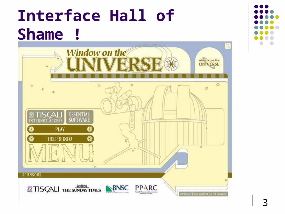
Interface Hall of Shame !

4
Basic Human Capabilities
Do not change very rapidly Not like Moore’s law!
Have limits, which are important to understand Our understanding of human capabilities does
change, ie Cognitive neuroscience Theories of color perception Effect of groups and situation on how we act and react
5
Cognitive Psychology
In order to design something for someone, we need to understand the capabilities and limitations of that person How humans perceive the world around them How humans store and process information and
solve problems How humans physically manipulate objects

6
What we need to know about people Input
Perceptual Systems Processing
Memories Information Processes
Skill Acquisition Learning Reasoning Problem Solving
Output Motor Systems Speech

7
Outline
Perception Human visual system Guidelines for design
Cognition Models of human performance (MHP) Memory
8
Human I/O Channels
Input via the senses Sight Hearing Touch Taste Smell
Output via motor control Limbs (feet?) Fingers Eyes Head Voice
9
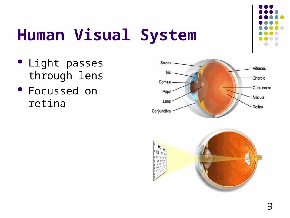
Human Visual System
Light passes through lens
Focussed on retina

10
Retina
Retina covered with light-sensitive receptors rods
primarily for night vision & perceiving movement sensitive to broad spectrum of light can’t discriminate between colors sense intensity or shades of gray
cones used to sense color (contain photopigments)
11
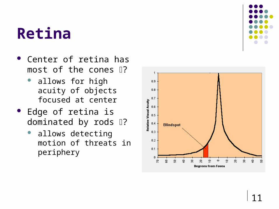
Retina
Center of retina has most of the cones ? allows for high acuity of
objects focused at center Edge of retina is dominated
by rods ? allows detecting motion of
threats in periphery

12
Visible Spectrum

13
Rods
Rods are very sensitive to light, and allow us to see under a very low level of illumination
They give us our night vision, in shades of white, grey and black About 120 millions rods in one eye Located mainly towards the edges of the retina (so better
for peripheral vision)
Can’t resolve fine detail Subject to light saturation
E.g. Leaving cinema during daytime

14
Cones - Color Perception
Concentrated on fovea of retina 3 types each sensitive to different band of spectrum
64% red 32% green only about 2% blue other colors are perceived by combining stimulation
Wavelengths not ‘coloured’ Color results from interaction with nervous system Different wavelengths focused at different distances behind
lens Lens less sensitive to shorter wavelengths
More sensitive to longer wavelengths

15
Color Sensitivity
from: http://www.cs.gsu.edu/classes/hypgraph/color/coloreff.htm
not as sensitive to blue
lots of overlap

16from http://insight.med.utah.edu/Webvision/index.html
Color Sensitivity

17
Distribution of Photopigments Not distributed evenly on retina – mainly around fovea – mainly reds (64%) & very few blues (4%) ?
insensitivity to short wavelengths (blue) No blue cones in retina center (high acuity) ?
“disappearance” of small blue objects you fixate on As we age lens (& aqueous humor) yellows & absorbs shorter
wavelengths ? sensitivity to blue is even more reduced
Implication don’t rely on blue for text or small objects! good for background (sinks into distance) we hold different levels of sensitivity to shades of different colours
18
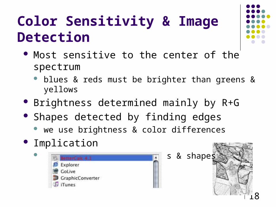
Color Sensitivity & Image Detection Most sensitive to the center of the spectrum
blues & reds must be brighter than greens & yellows
Brightness determined mainly by R+G Shapes detected by finding edges
we use brightness & color differences
Implication hard to deal w/ blue edges & shapes
19
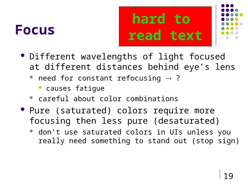
Focus
Different wavelengths of light focused at different distances behind eye’s lens need for constant refocusing ?
causes fatigue careful about color combinations
Pure (saturated) colors require more focusing then less pure (desaturated) don’t use saturated colors in UIs unless you really need
something to stand out (stop sign)
hard to read text

20
Perception & Brightness Size & Depth Perception
Visual angle (larger angle at same distance implies larger object)
Visual acuity (fine detail perception) Measured by Snellen chart e.g. 20/200
Law of size constancy relies on cues - overlapping objects, size and
height of object, familiarity with object. Brightness
Subjective quantity; affected by luminance; contrast visual system adjusts to perceive in differing lighting;
rods/cones visual acuity increases with luminance as does ‘flicker’

21
Shape Constancy
22
Graphical Representation at the Interface
Use realistic graphics in interface effective too expensive often unnecessary
Methods graphical modeling graphical coding

23
Graphical Modeling
Represent 3D objects on 2D surface, requires depth cues Size - larger of two identical objects appears closer than the
smaller one Interposition - a visually blocked object appears to be behind the
blocking object Contrast, clarity and brightness - sharper, more distinct items
appear nearer, duller appears far Shadows - indicate relative position Texture - as apparent distance increases texture of detailed
surface becomes less grainy

24
3-D Cues

25
Depth cues, continued
Motion parallax- move head side to side, objects displaced at
different rates on screen: move camera so image on screen
moves, following rules of motion parallax
stereoscopic - two images, one per eye, shown from slightly
different angles (used in VR head-mounted displays)
26
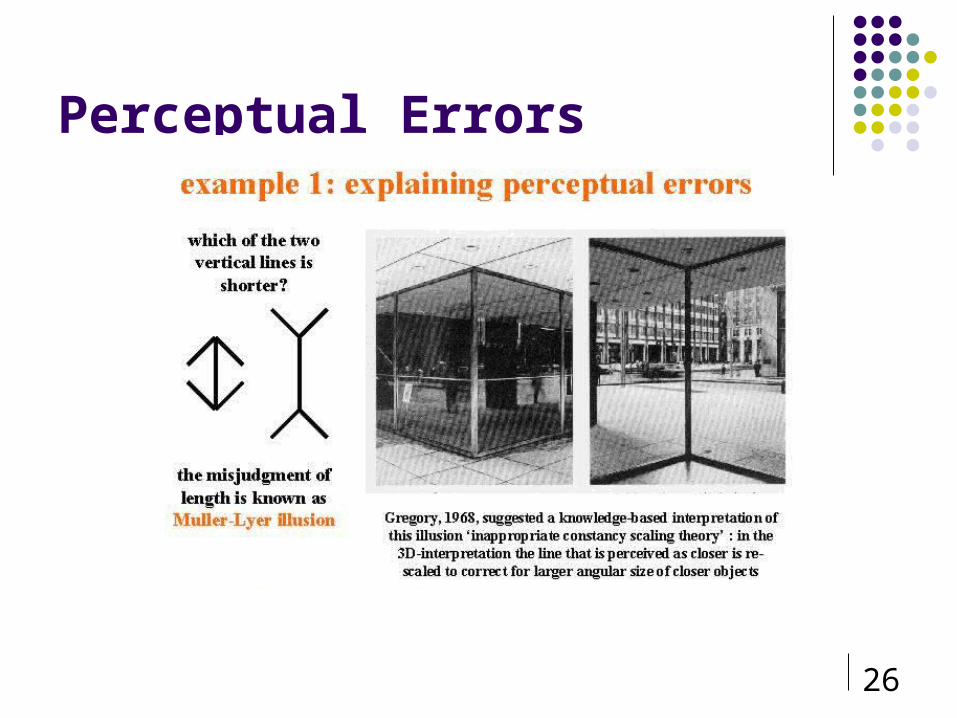
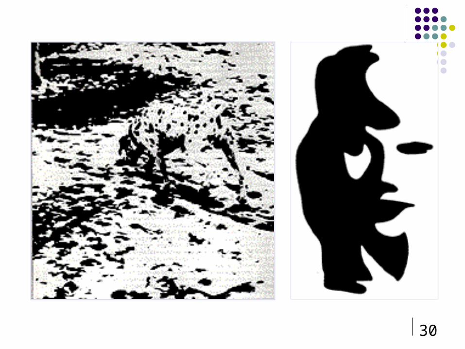
Perceptual Errors

27
Perception Errors

28
Optical Illusions
Upside down TPonzo Effect
Tichener

29
30

31
Color Guidelines Avoid simultaneous display of highly
saturated, spectrally extreme colors e.g., no cyans/blues at the same time as reds,
why? refocusing!
desaturated combinations are better pastels Colour not detectable in peripheral vision
most accurate in foveal vision

32
Using the Hue Circle
Pick non-adjacent colors opponent colors go well
together (red & green) or (yellow
& blue)

33
Color Components
Hue property of the wavelengths of light (i.e., “color”)
Lightness (or value) how much light appears to be reflected from a surface some hues are inherently lighter or darker
Saturation purity of the hue
e.g., red is more saturated than pink color is mixture of pure hue & achromatic color
portion of pure hue is the degree of saturation

34
Color Components (cont.)
Lightness Saturation
from http://www2.ncsu.edu/scivis/lessons/colormodels/color_models2.html#saturation.

35
Color
Red Text Appears to lie in one depth planeAnd blue text appears to lie in a different plane
Red Text Appears to lie in one depth planeAnd blue text appears to lie in a different plane
Red Text Appears to lie in one depth planeAnd blue text appears to lie in a different plane
Red Text Appears to lie in one depth planeAnd blue text appears to lie in a different plane
Color Stereoscopy: Blue and Red text appear to be in different planes.
36
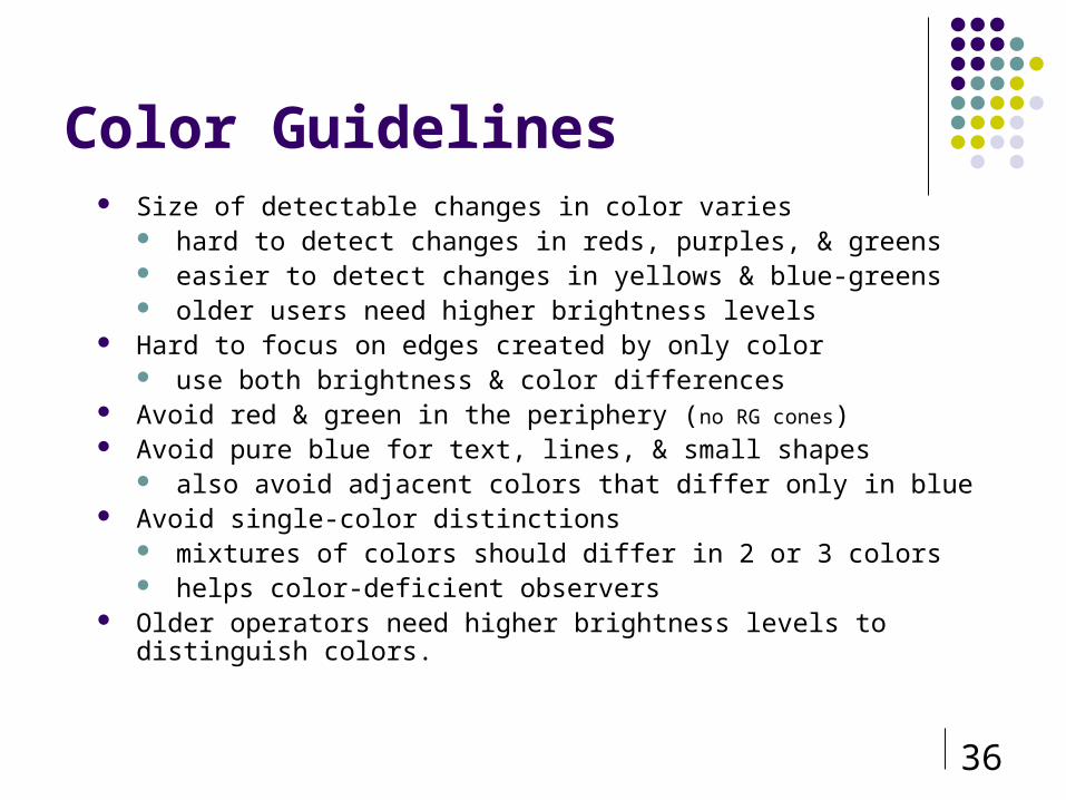
Color Guidelines Size of detectable changes in color varies
hard to detect changes in reds, purples, & greens easier to detect changes in yellows & blue-greens older users need higher brightness levels
Hard to focus on edges created by only color use both brightness & color differences
Avoid red & green in the periphery (no RG cones) Avoid pure blue for text, lines, & small shapes
also avoid adjacent colors that differ only in blue Avoid single-color distinctions
mixtures of colors should differ in 2 or 3 colors helps color-deficient observers
Older operators need higher brightness levels to distinguish colors.
37
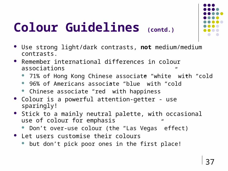
Colour Guidelines (contd.)
Use strong light/dark contrasts, not medium/medium contrasts. Remember international differences in colour associations
71% of Hong Kong Chinese associate “white” with “cold 96% of Americans associate “blue” with “cold” Chinese associate “red” with happiness
Colour is a powerful attention-getter - use sparingly! Stick to a mainly neutral palette, with occasional use of colour for
emphasis Don’t over-use colour (the “Las Vegas” effect)
Let users customise their colours but don’t pick poor ones in the first place!

38
Why Study Color?
1) Color can be a powerful tool to improve user interfaces by communicating key information
2) Inappropriate use of color can severely reduce the performance of systems we build
39
Color Coding
Powerful way of dividing display into separate regions
Useful for searching for information spotting an object in a list, but of less use for
tasks requiring categorization or memorization too many colors (>5±2) will increase search
times More effective with inexperienced users

40
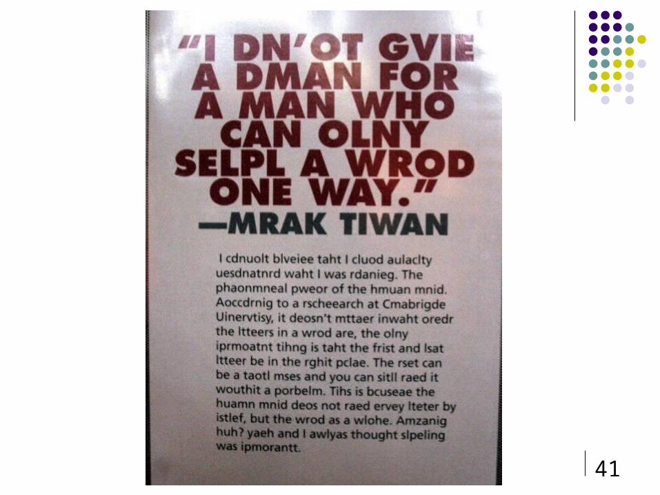
Reading Stages
Perception of visual pattern of word Decoded by reference to internal patterns Interpreted using knowledge of syntax, semantics,
pragmatics Pattern detection
saccades followed by fixations followed by regressions VDU reading poorer than paper - reasons? negative screen contrast (dark on light) increases
luminance and acuity
41

42
Pattern detection

43
Hearing
Physical Characteristics Outer ear
visible, protection, temperature constancy, amplifies, pinna & auditory canal Middle ear
small cavity linked to outer ear by ear drum and inner ear by cochlea cavity contains ossicles which concentrates and amplifies vibrations to cochlea
Inner ear fluid filled for better transmission of signal delicate hair cells (cilia) within cochlea release chemical transmission along
auditory nerve Processing sound
Characteristics of sound: Pitch – frequency (20-20,000 Hz) Loudness - proportional to amplitude of sound wave (30 – 100dB) Timbre - sound generated by different instruments Stereoscopy of sound
Location (50 arc for locating direction) Cocktail party effect (Cherry)
44
Haptic Sense
May be key sense for someone who is visually impaired. Stimulus received via receptors in the skin Pressure (normal) Intense pressure (heat/pain) Temperature (hot/cold)
Sensitivity, Dexterity, Flexibility, Speed Where important?
Mouse, Other I/O, VR, surgery

45
Movement
Time taken to respond to stimulus: reaction time plus movement time
Movement time: dependent on age, fitness etc
Reaction time: dependent on stimulus type Visual: 200 ms Auditory: 150 ms Pain: 700 ms

46CS / PSYCH 4750 46
Work Station Ergonomics – to Facilitate I/O

47
Color: Edward Tufte
Variation in hue

48
Color: Edward Tufte
Variation in luminance better

49
Movement
Increasing reaction time decreases accuracy in the unskilled operator but not in the skilled operator.
Fitt's Law describes the time taken to hit a screen target Mt = a + b log_2(D/S + 1) where a and b are
empirically determined constants, Mt is movement time, D is distance and S is size
Targets in general should be large as possible and the distances as small as possible