iab forum 2015 principles of mobile site design: delight users and drive conversions lina lau,...
TRANSCRIPT

Principles of mobile site design: delight users and drive conversions
Lina Lau Strategic Partner Manager Google

Would you stand in this line if you could order the
iPhone 6 on your mobile device in < 2 mins?
Driving conversions in the digital
world means making it easy for
people to take action

Story about My Dog and buying a Car


Study Design: 25 Site Design Principles
100 Websites
iOS & Android
Participants used
their own device
I’m going to shop for
chairs...
Ok! First I’m going to click on
this button...
119 Hour Long Interviews
Traditional Usability with
Think-Aloud Protocol

Homepage & Site Navigation
Site Search
Commerce & Conversions
Form Entry
Usability & Form Factor
❑Calls-to-action are front and center
❑Menus are short and sweet
❑Easy to get back to the homepage
❑Promotions don’t steal the show
❑Site search is visible (near top of page)
❑Site search results are relevant (autocomplete)
❑Use filters to improve search results
❑Guides users to better search results
❑Users can explore before committing
❑Users can purchase as a guest
❑Existing information is used (e.g. 3rd party payments)
❑Click-to-call is present for complex tasks
❑Easy to finish converting on another device
❑ Info entry is streamlined
❑Uses toggles/dropdowns to simplify input
❑Visual calendars used for date selection
❑Minimize errors with labeling and real-time validation
❑Form design is efficient (auto-fill, progress bar)
❑Entire site is optimized for mobile
❑Don’t need to pinch + zoom (especially CTAs) ❑Product images are expandable (and high quality close-ups are available)
❑Shoppers are told which screen orientation works best (and site works in all orientations)
❑Users aren't brought to new browser windows (calls-to-action stay in same window)
❑Site avoids "full site" labeling (uses "desktop" instead)
❑Site is clear about why it needs user's location (and what it intends to do with it)
25 principles of mobile site design

Homepage Site Search Commerce
Form Entry Usability

Homepage Put in screenshot of advertiser

Principles
1. Keep calls-to-action front and center
2. Keep menus short and sweet
3. Make it easy to get back to the
homepage 4. Don’t let promotions steal the
show
Homepage

Google Confidential and Proprietary
Landing Pages
All tips for Homepage should be considered as essential for landing pages too
What about time on page?
Long or short?
On desktop the answer is almost always long, on mobile short
- Minimise bounce rate
- Benchmark against yourself, try to beat your 90 day best in class number
Bounce / clickthrough rate
BE Obsess about load speed-1 second delay = ~4% decrease in CvR
Our free tool also works on mobile:
Source: Mobile Commerce Daily; KISSMetrics

Homepage & Navigation
What the Endsleigh site does well:
RWD - Consistent design on all devices - main actions promoted
Clean and structured navigation, large font type

Homepage & Navigation
What the Protest site does well:
Desktop and Mobile experience support Protest branding
Minimal navigation focussed on identifying users interest

Homepage & Navigation
What the Priceline site does well:
Focused on key user needs
Not overloaded with content, no blind spots

Homepage & Navigation
Focused on key user needs
Sign in Option
Visible search
Auto- Date selection
BIG Search Button
ATL !

Site Search

Principles
5. Make site search visible
6. Ensure site search results are relevant
7. Implement filters to improve
site search usability
8. Guide users to better search results
Site Search

On-Site Search
What the Amazon site does well:
Search prominent
Auto-completion of search queries

Search Results
Sale Price
Urgency!!!
Product Rating

Search Results
Large lists of filters
Users know what to expect when applying a filter

On-Site Search
What the alpharooms site does well:
Clean list of results with various display options including map view
Users can send filtered list of results via email

Commerce Put in screenshot of advertiser

Principles
9. Let users explore before they commit
10. Let users purchase as a guest
11. Use existing information to
maximise convenience
12. Use click-to-call button for complex tasks
13. Make it easy to finish converting
on another device
Commerce & Conversion
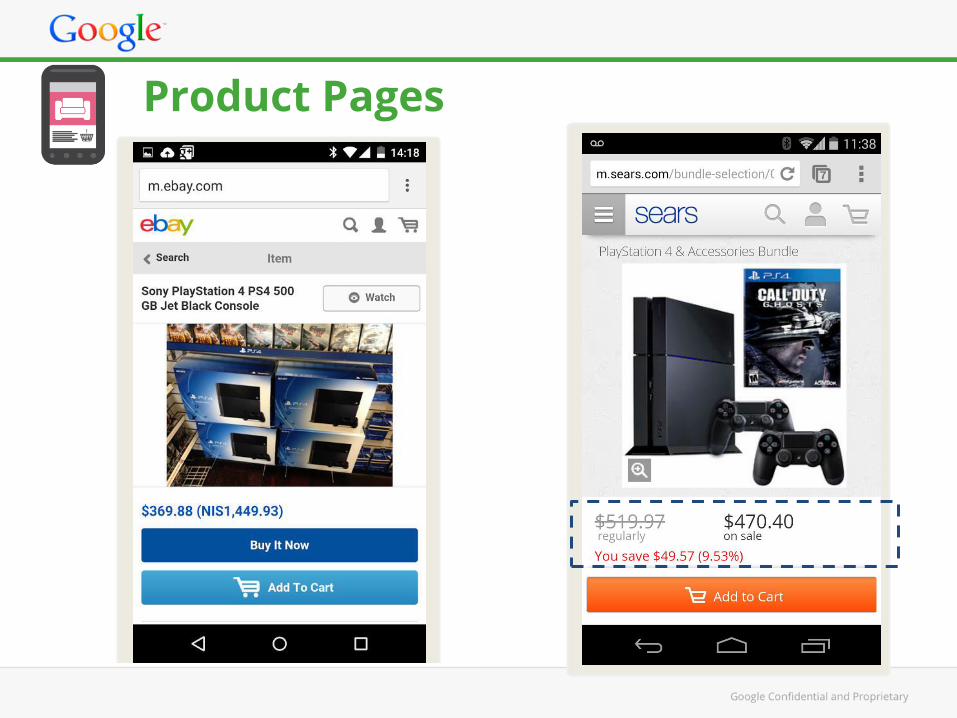
Product Pages

Product / Offer Pages
What the Garmin site does well:
Progressive disclosure
Prominent ever-present CTA
Multiple images available - swipe

Product / Offer Pages
What the Lowes site does well:
Shows in-store availability
Additional CTA appears when scrolling down the page
Product reviews, progressive disclosure

Form Entry Put in screenshot of advertiser

Principles
19. Optimize your entire site for mobile
20. Don’t make users pinch to zoom
21. Make product images expandable
22. Tell users which screen orientation work best
23. Keep your users in a single browser window
24. Avoid full site labelling
25. Be clear why you need a user’s location
Form Factor and Usability

Recommendation
Minimize the number of fields in your forms, and autofill information wherever possible. Use clearly-labeled progress bars to help users get through multi-part forms.
Best in Class
Insert client site example here
Design efficient forms

Form Entry
What the rentalcars.com landing page does well:
Clean landing page with city pre-populated based on search query
Clear branding and site purpose immediately clear

What the Crate and Barrel site does well:
Field labels and form fields are visible at the same time
Amount of input required is limited (zip code populates city and state)
Form fields have the correct input type set
Form Entry

What the Vueling site does well:
Homepage clean and focussed on key user needs
Touch friendly input methods, visual calendar provided
Form Entry

Recommendation
Offer the option to check out as a guest, and encourage registration with tangible benefits.
Insert client site example here
Let users purchase as a guest

Usability Put in screenshot of advertiser

Recommendation
Use clearly visible labels to let users know what you need, and validate for errors in real time to let them know if there s a problem before they submit a form.
Insert client site example here
Minimize form errors with labeling and real-time validation

Recommendation
Always make it clear why you need a user s location, and how the information will influence their experience.
Be clear why you need a user s location
Recommendation
Always make it clear why you need a user s location, and how the information will influence their experience.
Font Size & Colors

Summary
Review The 25 principles of Mobile Site design
Divide your review per page… (HP, Search, Product etc.)
Always Measure (Before & After)
Test, Test & TEST!

© Copyright 2014 Google. All rights reserved. Google and the Google logo are registered trademarks of Google Inc.
Thank You!