ict-trainings.comict-trainings.com/.../css-learning/css-learning.docx · web viewlayout for flyer...
TRANSCRIPT
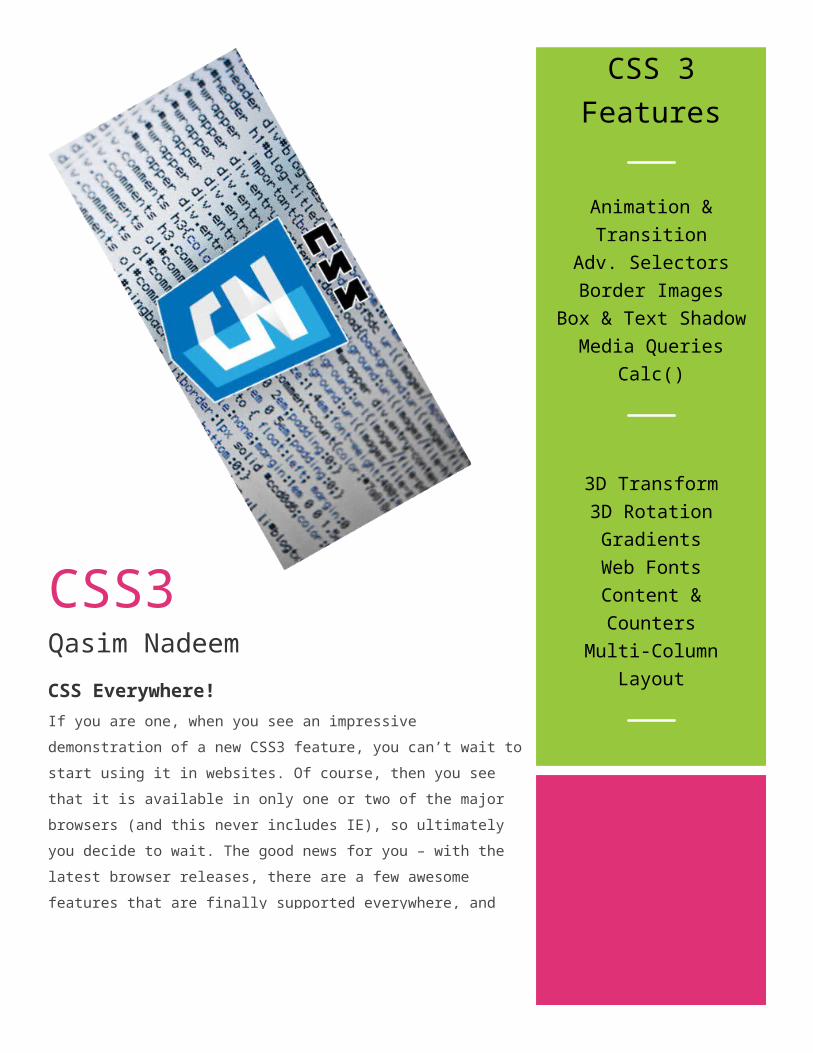
CSS3Qasim NadeemCSS Everywhere!If you are one, when you see an impressive demonstration of a new CSS3 feature, you can’t wait to start using it in websites. Of course, then you see that it is available in only one or two of the major browsers (and this never includes IE), so ultimately you decide to wait. The good news for you – with the latest browser releases, there are a few awesome features that are finally supported everywhere, and you can start using them right now!
CSS 3 Features
Animation & Transition
Adv. SelectorsBorder Images
Box & Text ShadowMedia Queries
Calc()
3D Transform3D RotationGradientsWeb Fonts
Content & CountersMulti-Column
Layout
I
Why use CSS1. Style solves the common problem.Different browsers act differently to documents, so W3C standardizedCSS standard that are supported by all major browsers.
2. Style sheet can save a lot of work.Font and Style attributes of html are used to format the document, so we define them using CSS in a separate file, by changing at one placewe can modify our entire website pages.
3. Multiple style cascade.Style can cascade into many ways i.e. into a single element, head orexternal files.
Three parts of CSSThe StyleTheir PlacementThey Cascade
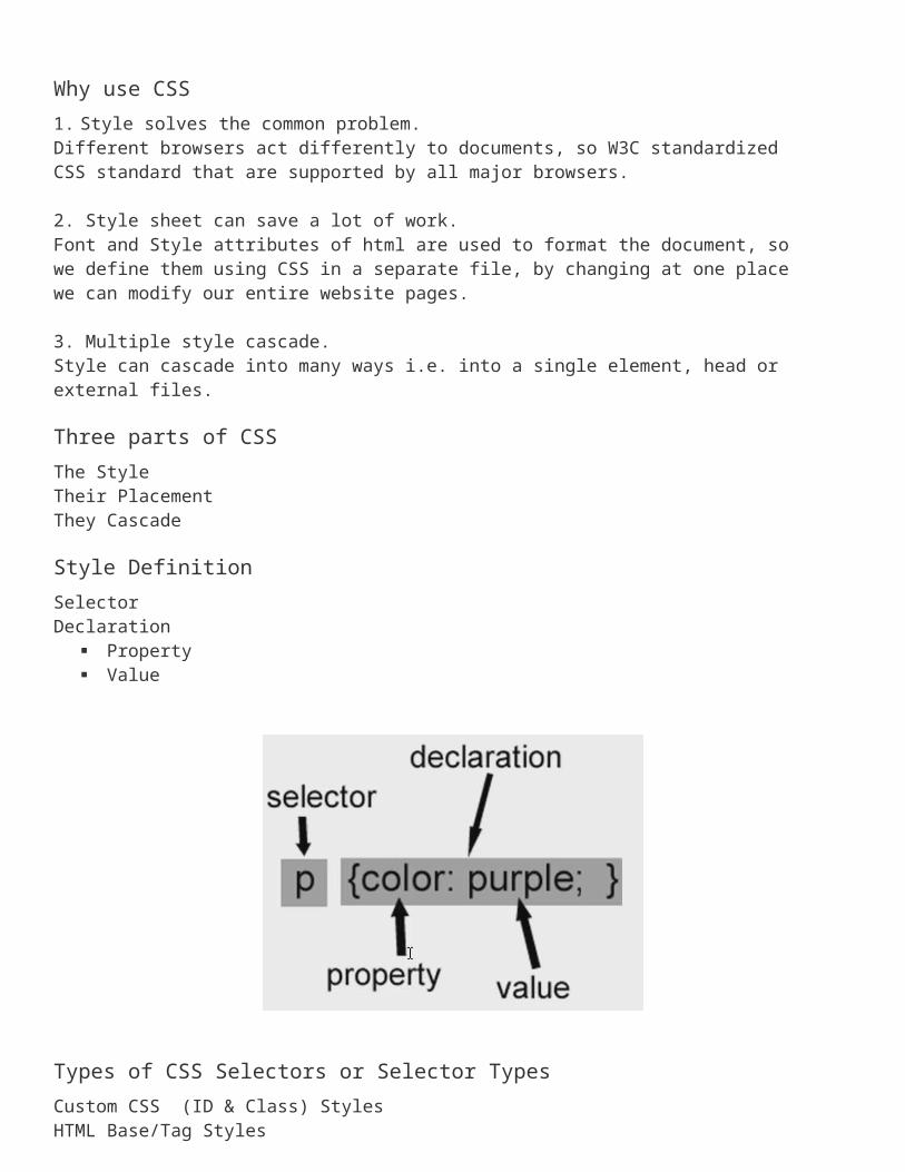
Style DefinitionSelectorDeclaration
Property Value
Types of CSS Selectors or Selector TypesCustom CSS (ID & Class) StylesHTML Base/Tag StylesAdvanced CSS Selector Styles (redefine the format for)- A particular combination of tags- A specific id attributePsuedo Classes e.g. a:hover
HTML Base or Tag Selector
Standard CSS Labs
Lab: Setting Default properties of a tag
<head><style type=“text/css”>body{ color: blue;}h2,h3,h5 { color: green;}h1{
font-size: 36px;font-weight: bold;color: blue;
}p{
font-family: Arial, Helvetica, sans-serif;
font-size: 16px;color: red;
}</style></head>Custom CSS (Class) SelectorCan apply on any HTML tag<html>
Lab: Text Case<head><style type="text/css">
/* Applying selector on specific tag */
p.uppercase {text-transform: uppercase}
p.lowercase {text-transform: lowercase}p.capitalize {text-transform: capitalize}p.bkclr {background-color:
#0000ff;}/* Can apply selector on any tag */.lowercase {text-transform:
lowercase}
</style></head> <body>
<p class="uppercase">This is some text in a paragraph</p> <p class="lowercase">This is some text in a paragraph</p> <p class=”bkclr”>This is some text in a paragraph</p></body></html>
Lab: Custom CSS (ID) Selector
<html><head><style type="text/css">
#uppercase {text-transform: uppercase}
#bkclr {background-color: #0000ff;}
</style></head> <body>
<p id="uppercase">This is some text in a paragraph</p>
<p id=“bkclr">This is some text in a paragraph</p></body></html>
Lab: Context Selector
<html><head><style type="text/css">
#container p{color:red;}td h3 {color: blue;}
</style></head> <body>
<h3>This is some text in a paragraph</h3>
<table border="0" cellspacing="8" cellpadding="0" >
<tr><td width="800"
valign="middle" colspan="2"><h3>Now h3 is in td to test
context style</h3></td>
</tr><div id=“container”><p>Great to
be here</p></div>
</body></html>
Lab: Basic Building Block
Div tag can be place anywhere in the document. We can use it in absolute or relative to other elements.
<div id=“myDiv”></div>Child <div> tag<div id=“myDiv”>
<div id=“childDiv”></div></div>
Lab: Div and Child Div
<head><style type=“text/css”>#myDiv{
position: absolute;top: 25px; left: 11px; width: 560px;
height:350;background-color: grey;
}.box{
border: thin solid #f00;height: 50px; width: 150px;background-color: blue;
}</style></head><body><div id=“myDiv”>
<div class=“box”></div></div></body>
Lab: Formatting Text<html>
<head><style type="text/css">h3 {font-family: times}p {font-family: courier}p.sansserif {font-family: sans-serif}</style></head> <body><h3>This is header 3</h3><p>This is a paragraph</p><p class="sansserif">This is a paragraph</p></body></html>
<html><head><style type="text/css">h1 {font-size: 150%}h2 {font-size: 130%}p {font-size: 100%}</style></head> <body><h1>This is header 1</h1><h2>This is header 2</h2><p>This is a paragraph</p></body></html>
This example demonstrates how to set the style of a font.<html><head><style type="text/css">h1 {font-style: italic}h2 {font-style: normal}p {font-style: oblique}</style></head> <body><h1>This is header 1</h1><h2>This is header 2</h2><p>This is a paragraph</p></body></html>
How to set the variant of a font
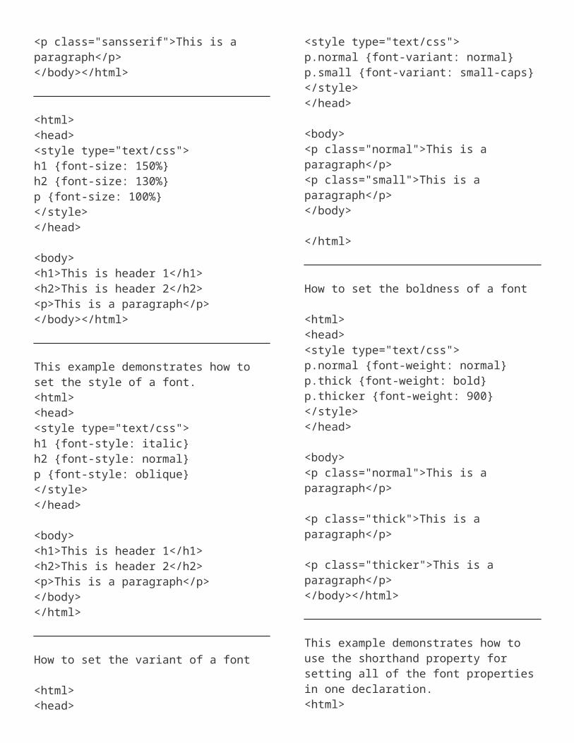
<html><head><style type="text/css">p.normal {font-variant: normal}p.small {font-variant: small-caps}</style></head> <body><p class="normal">This is a paragraph</p><p class="small">This is a paragraph</p></body> </html>
How to set the boldness of a font
<html><head><style type="text/css">p.normal {font-weight: normal}p.thick {font-weight: bold}p.thicker {font-weight: 900}</style></head> <body><p class="normal">This is a paragraph</p> <p class="thick">This is a paragraph</p> <p class="thicker">This is a paragraph</p></body></html>
This example demonstrates how to use the shorthand property for setting all of the font properties in one declaration.<html><head><style type="text/css">p{font: italic small-caps 900 12px arial}
</style></head> <body><p>This is a paragraph</p></body></html>
Lab: Formatting Borders
<html><head><style type="text/css">p.dotted {border-style: dotted}p.dashed {border-style: dashed}p.solid {border-style: solid}p.double {border-style: double}p.groove {border-style: groove}p.ridge {border-style: ridge}p.inset {border-style: inset}p.outset {border-style: outset}</style></head><body><p class="dotted">A dotted border</p> <p class="dashed">A dashed border</p> <p class="solid">A solid border</p> <p class="double">A double border</p> <p class="groove">A groove border</p> <p class="ridge">A ridge border</p> <p class="inset">An inset border</p> <p class="outset">An outset border</p></body></html>
How to set different borders on each side of the element
<html><head><style type="text/css">p.soliddouble {border-style: solid double}p.doublesolid {border-style: double solid}p.groovedouble {border-style: groove double}p.three {border-style: solid double groove}
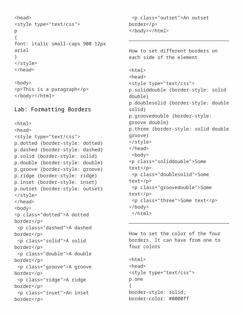
</style></head> <body><p class="soliddouble">Some text</p> <p class="doublesolid">Some text</p> <p class="groovedouble">Some text</p> <p class="three">Some text</p></body> </html>
How to set the color of the four borders. It can have from one to four colors
<html><head><style type="text/css">p.one{border-style: solid;border-color: #0000ff}p.two{border-style: solid;border-color: #ff0000 #0000ff}p.three{border-style: solid;border-color: #ff0000 #00ff00 #0000ff}p.four{border-style: solid;border-color: #ff0000 #00ff00 #0000ff rgb(250,0,255)}</style></head><body> <p class="one">One-colored border!</p> <p class="two">Two-colored border!</p> <p class="three">Three-colored border!</p> <p class="four">Four-colored border!</p> <p><b>Note:</b> The "border-color" property does not work if it is used alone. Use the "border-style" property to set the borders first.</p>
</body></html>
How to set the width of the bottom border
<html><head><style type="text/css">p {border-style: solid;border-bottom-width: 15px}</style></head> <body><p><b>Note:</b> The "border-bottom-width" property does not work if it is used alone. Use the "border-style" property to set the borders first.</p></body> </html>
How to set the width of the left border
<html><head><style type="text/css">p {border-style: solid;border-left-width: 15px}</style></head> <body><p><b>Note:</b> The "border-left-width" property does not work if it is used alone. Use the "border-style" property to set the borders first.</p></body> </html>
How to set the width of the right border
<html>
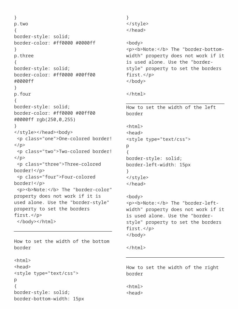
<head><style type="text/css">p {border-style: solid;border-right-width: 15px}</style></head> <body><p><b>Note:</b> The "border-right-width" property does not work if it is used alone. Use the "border-style" property to set the borders first.</p></body></html>
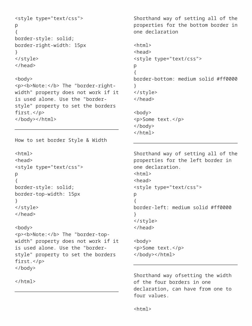
How to set border Style & Width
<html><head><style type="text/css">p {border-style: solid;border-top-width: 15px}</style></head> <body><p><b>Note:</b> The "border-top-width" property does not work if it is used alone. Use the "border-style" property to set the borders first.</p></body> </html>
Shorthand way of setting all of the properties for the bottom border in one declaration
<html><head><style type="text/css">p {border-bottom: medium solid #ff0000}
</style></head> <body><p>Some text.</p></body></html>
Shorthand way of setting all of the properties for the left border in one declaration.<html><head><style type="text/css">p {border-left: medium solid #ff0000}</style></head> <body><p>Some text.</p></body></html>
Shorthand way ofsetting the width of the four borders in one declaration, can have from one to four values.
<html><head><style type="text/css">p.one {border-style: solid;border-width: 5px}p.two {border-style: solid;border-width: 5px 10px}p.three {border-style: solid;border-width: 5px 10px 1px}p.four {border-style: solid;
border-width: 5px 10px 1px medium}</style></head><body><p class="one">Some text</p><p class="two">Some text</p><p class="three">Some text</p><p class="four">Some text</p><p><b>Note:</b> The "border-width" property does not work if it is used alone. Use the "border-style" property to set the borders first.</p></body></html>
Shorthand way of setting all the properties for the four borders in one declaration, can have from one to three values
<html><head><style type="text/css">p {border: medium double rgb(250,0,255)}</style></head> <body><p>Some text</p></body></html>
Lab: Setting Margins
<html><head><style type="text/css">p.leftmargin {margin-left: 2cm}</style></head> <body><p>This is a paragraph with no margin specified</p><p class="leftmargin">This is a paragraph with a specified left margin</p></body> </html>
How to set the right margin of a text
<html><head><style type="text/css">p.rightmargin {margin-right: 8cm}</style></head> <body><p>This is a paragraph with no margin specified</p><p class="rightmargin">This is a paragraph with a specified right margin</p></body></html>
How to set the top margin of a text
<html><head><style type="text/css">p.topmargin {margin-top: 5cm}</style></head> <body><p>This is a paragraph with no margin specified</p><p class="topmargin">This is a paragraph with a specified top margin</p></body></html>
Shorthand way of setting all of the margin properties in one declaration
<html><head><style type="text/css">p.margin {margin: 2cm 4cm 3cm 4cm}</style></head> <body><p>This is a paragraph with no specified margins</p>
<p class="margin">This is a paragraph with specified margins</p><p>This is a paragraph with no specified margins</p></body></html>
Lab: Formatting Table Cells
<html><head><style type="text/css">td {padding-left: 2cm}</style></head><body><table border="1"><tr><td>This is a tablecell with a left padding. This is a tablecell with a left padding.</td></tr></table></body></html>
<html><head><style type="text/css">td {padding-right: 5cm}</style></head> <body><table border="1"><tr><td>This is a table cell with a right padding. This is a table cell with a right padding.</td></tr></table></body></html>
How to set the bottom padding of a table cell.
<html><head><style type="text/css">td {padding-bottom: 2cm}
</style></head> <body><table border="1"><tr><td>This is a table cell with a bottom padding</td></tr></table></body></html>
Lab: Formatting List
<html><head><style type="text/css">ul.disc {list-style-type: disc}ul.circle {list-style-type: circle}ul.square {list-style-type: square}ul.none {list-style-type: none}</style></head> <body><ul class="disc"><li>Coffee</li><li>Tea</li><li>Coca Cola</li></ul><ul class="circle"><li>Coffee</li><li>Tea</li><li>Coca Cola</li></ul> <ul class="square"><li>Coffee</li><li>Tea</li><li>Coca Cola</li></ul> <ul class="none"><li>Coffee</li><li>Tea</li><li>Coca Cola</li></ul></body></html>
<html><head><style type="text/css">
ol.decimal {list-style-type: decimal}ol.lroman {list-style-type: lower-roman}ol.uroman {list-style-type: upper-roman}ol.lalpha {list-style-type: lower-alpha}ol.ualpha {list-style-type: upper-alpha}</style></head> <body><ol class="decimal"><li>Coffee</li><li>Tea</li><li>Coca Cola</li></ol><ol class="lroman"><li>Coffee</li><li>Tea</li><li>Coca Cola</li></ol> <ol class="uroman"><li>Coffee</li><li>Tea</li><li>Coca Cola</li></ol> <ol class="lalpha"><li>Coffee</li><li>Tea</li><li>Coca Cola</li></ol> <ol class="ualpha"><li>Coffee</li><li>Tea</li><li>Coca Cola</li></ol></body></html>
How to set an image as the list-item marker
<html><head><style type="text/css">ul {list-style-image: url('arrow.gif')}</style>
</head> <body><ul><li>Coffee</li><li>Tea</li><li>Coca Cola</li></ul></body> </html>
<html><head><style type="text/css">ul.inside {list-style-position: inside} ul.outside {list-style-position: outside}</style></head> <body><p>This list has a list-style-position with a value of "inside":</p><ul class="inside"><li>Earl Grey Tea - A fine black tea</li><li>Jasmine Tea - A fabulous "all purpose" tea</li><li>Honeybush Tea - A super fruity delight tea</li></ul> <p>This list has a list-style-position with a value of "outside":</p><ul class="outside"><li>Earl Grey Tea - A fine black tea</li><li>Jasmine Tea - A fabulous "all purpose" tea</li><li>Honeybush Tea - A super fruity delight tea</li></ul></body></html>
Advance CSS Labs
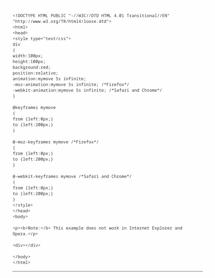
Lab: CSS Animation
<!DOCTYPE HTML PUBLIC "-//W3C//DTD HTML 4.01 Transitional//EN" "http://www.w3.org/TR/html4/loose.dtd"><html><head><style type="text/css"> div{width:100px;height:100px;background:red;position:relative;animation:mymove 5s infinite;-moz-animation:mymove 5s infinite; /*Firefox*/-webkit-animation:mymove 5s infinite; /*Safari and Chrome*/}
@keyframes mymove{from {left:0px;}to {left:200px;}}
@-moz-keyframes mymove /*Firefox*/{from {left:0px;}to {left:200px;}}
@-webkit-keyframes mymove /*Safari and Chrome*/{from {left:0px;}to {left:200px;}}</style></head><body>
<p><b>Note:</b> This example does not work in Internet Explorer and Opera.</p>
<div></div>
</body></html>
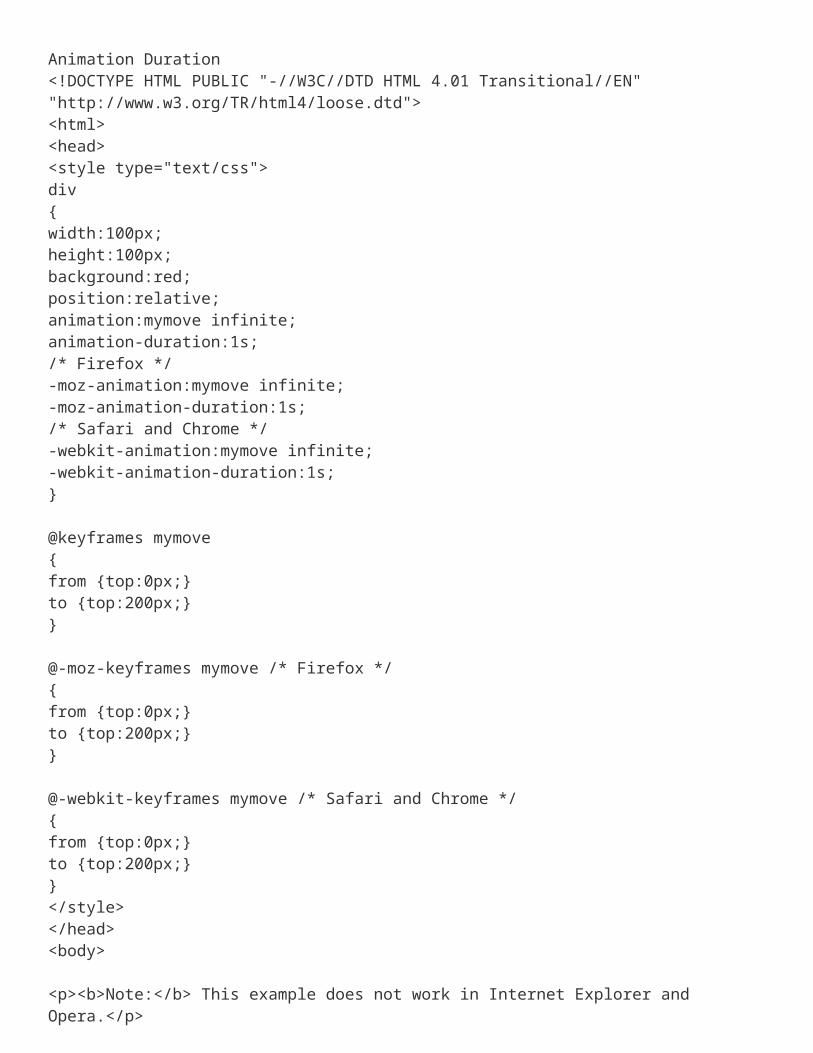
Animation Duration<!DOCTYPE HTML PUBLIC "-//W3C//DTD HTML 4.01 Transitional//EN" "http://www.w3.org/TR/html4/loose.dtd"><html><head><style type="text/css">
div{width:100px;height:100px;background:red;position:relative;animation:mymove infinite;animation-duration:1s;/* Firefox */-moz-animation:mymove infinite;-moz-animation-duration:1s;/* Safari and Chrome */-webkit-animation:mymove infinite;-webkit-animation-duration:1s;}
@keyframes mymove{from {top:0px;}to {top:200px;}}
@-moz-keyframes mymove /* Firefox */{from {top:0px;}to {top:200px;}}
@-webkit-keyframes mymove /* Safari and Chrome */{from {top:0px;}to {top:200px;}}</style></head><body>
<p><b>Note:</b> This example does not work in Internet Explorer and Opera.</p>
<div></div>
</body></html>
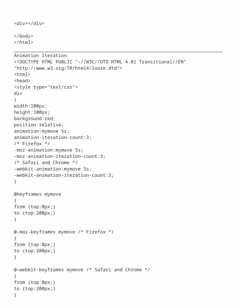
Animation Iteration<!DOCTYPE HTML PUBLIC "-//W3C//DTD HTML 4.01 Transitional//EN" "http://www.w3.org/TR/html4/loose.dtd"><html><head><style type="text/css"> div{
width:100px;height:100px;background:red;position:relative;animation:mymove 5s;animation-iteration-count:3;/* Firefox */-moz-animation:mymove 5s;-moz-animation-iteration-count:3;/* Safari and Chrome */-webkit-animation:mymove 5s;-webkit-animation-iteration-count:3;}
@keyframes mymove{from {top:0px;}to {top:200px;}}
@-moz-keyframes mymove /* Firefox */{from {top:0px;}to {top:200px;}}
@-webkit-keyframes mymove /* Safari and Chrome */{from {top:0px;}to {top:200px;}}</style></head><body>
<p><b>Note:</b> This example does not work in Internet Explorer and Opera.</p>
<div></div>
</body></html>
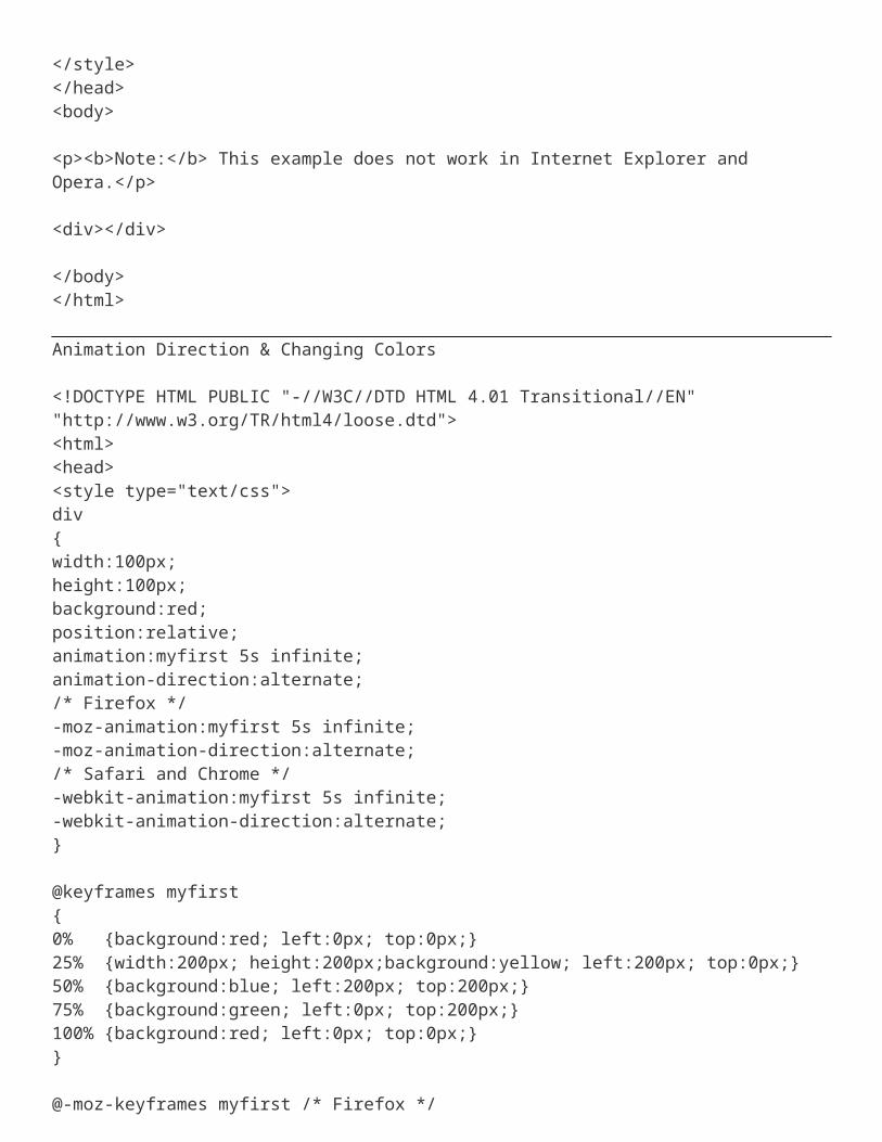
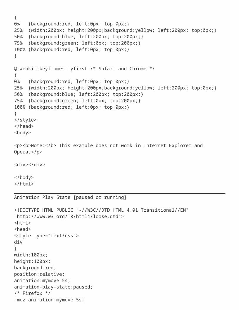
Animation Direction & Changing Colors
<!DOCTYPE HTML PUBLIC "-//W3C//DTD HTML 4.01 Transitional//EN" "http://www.w3.org/TR/html4/loose.dtd"><html><head><style type="text/css"> div{width:100px;
height:100px;background:red;position:relative;animation:myfirst 5s infinite;animation-direction:alternate;/* Firefox */-moz-animation:myfirst 5s infinite;-moz-animation-direction:alternate;/* Safari and Chrome */-webkit-animation:myfirst 5s infinite;-webkit-animation-direction:alternate;}
@keyframes myfirst{0% {background:red; left:0px; top:0px;}25% {width:200px; height:200px;background:yellow; left:200px; top:0px;}50% {background:blue; left:200px; top:200px;}75% {background:green; left:0px; top:200px;}100% {background:red; left:0px; top:0px;}}
@-moz-keyframes myfirst /* Firefox */{0% {background:red; left:0px; top:0px;}25% {width:200px; height:200px;background:yellow; left:200px; top:0px;}50% {background:blue; left:200px; top:200px;}75% {background:green; left:0px; top:200px;}100% {background:red; left:0px; top:0px;}}
@-webkit-keyframes myfirst /* Safari and Chrome */{0% {background:red; left:0px; top:0px;}25% {width:200px; height:200px;background:yellow; left:200px; top:0px;}50% {background:blue; left:200px; top:200px;}75% {background:green; left:0px; top:200px;}100% {background:red; left:0px; top:0px;}}</style></head><body>
<p><b>Note:</b> This example does not work in Internet Explorer and Opera.</p>
<div></div>
</body></html>
Animation Play State [paused or running]
<!DOCTYPE HTML PUBLIC "-//W3C//DTD HTML 4.01 Transitional//EN" "http://www.w3.org/TR/html4/loose.dtd"><html><head><style type="text/css"> div{width:100px;height:100px;background:red;position:relative;animation:mymove 5s;animation-play-state:paused;/* Firefox */-moz-animation:mymove 5s;-moz-animation-play-state:paused;/* Safari and Chrome */-webkit-animation:mymove 5s;-webkit-animation-play-state:paused;}
@keyframes mymove{from {left:0px;}to {left:200px;}}
@-moz-keyframes mymove /* Firefox */{from {left:0px;}to {left:200px;}}
@-webkit-keyframes mymove /* Safari and Chrome */{from {left:0px;}to {left:200px;}}</style></head><body>
<p><b>Note:</b> This example does not work in Internet Explorer and Opera.</p>
<div></div>
</body></html>
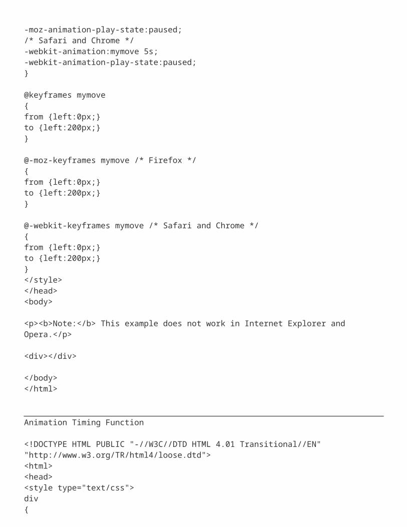
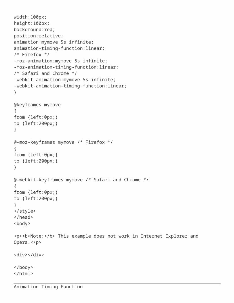
Animation Timing Function
<!DOCTYPE HTML PUBLIC "-//W3C//DTD HTML 4.01 Transitional//EN" "http://www.w3.org/TR/html4/loose.dtd"><html><head><style type="text/css"> div{width:100px;height:100px;background:red;position:relative;animation:mymove 5s infinite;animation-timing-function:linear;/* Firefox */-moz-animation:mymove 5s infinite;-moz-animation-timing-function:linear;/* Safari and Chrome */-webkit-animation:mymove 5s infinite;-webkit-animation-timing-function:linear;}
@keyframes mymove{from {left:0px;}to {left:200px;}}
@-moz-keyframes mymove /* Firefox */{from {left:0px;}to {left:200px;}}
@-webkit-keyframes mymove /* Safari and Chrome */{from {left:0px;}to {left:200px;}}</style></head><body>
<p><b>Note:</b> This example does not work in Internet Explorer and Opera.</p>
<div></div>
</body></html>
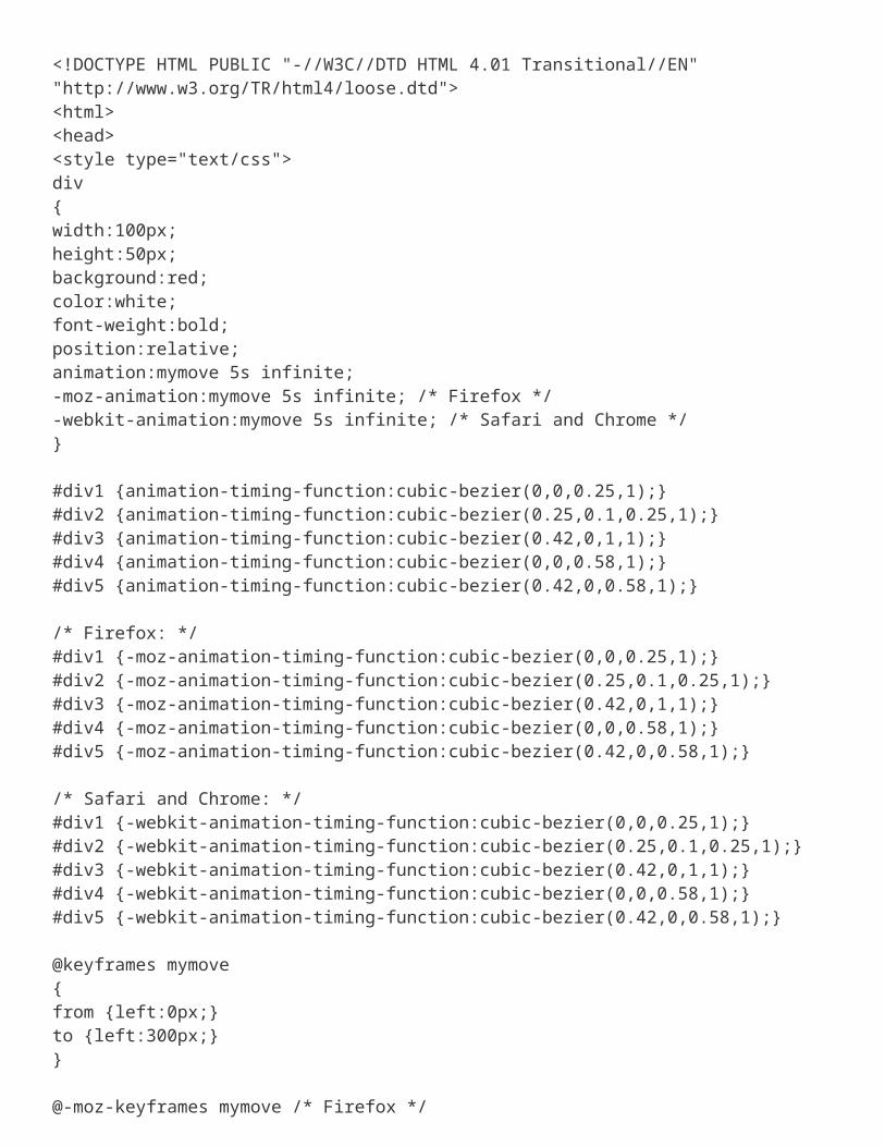
Animation Timing Function
<!DOCTYPE HTML PUBLIC "-//W3C//DTD HTML 4.01 Transitional//EN" "http://www.w3.org/TR/html4/loose.dtd"><html><head><style type="text/css"> div{width:100px;height:50px;background:red;color:white;font-weight:bold;position:relative;animation:mymove 5s infinite;-moz-animation:mymove 5s infinite; /* Firefox */-webkit-animation:mymove 5s infinite; /* Safari and Chrome */}
#div1 {animation-timing-function:cubic-bezier(0,0,0.25,1);}#div2 {animation-timing-function:cubic-bezier(0.25,0.1,0.25,1);}#div3 {animation-timing-function:cubic-bezier(0.42,0,1,1);}#div4 {animation-timing-function:cubic-bezier(0,0,0.58,1);}#div5 {animation-timing-function:cubic-bezier(0.42,0,0.58,1);}
/* Firefox: */#div1 {-moz-animation-timing-function:cubic-bezier(0,0,0.25,1);}#div2 {-moz-animation-timing-function:cubic-bezier(0.25,0.1,0.25,1);}#div3 {-moz-animation-timing-function:cubic-bezier(0.42,0,1,1);}#div4 {-moz-animation-timing-function:cubic-bezier(0,0,0.58,1);}#div5 {-moz-animation-timing-function:cubic-bezier(0.42,0,0.58,1);}
/* Safari and Chrome: */#div1 {-webkit-animation-timing-function:cubic-bezier(0,0,0.25,1);}#div2 {-webkit-animation-timing-function:cubic-bezier(0.25,0.1,0.25,1);}#div3 {-webkit-animation-timing-function:cubic-bezier(0.42,0,1,1);}#div4 {-webkit-animation-timing-function:cubic-bezier(0,0,0.58,1);}#div5 {-webkit-animation-timing-function:cubic-bezier(0.42,0,0.58,1);}
@keyframes mymove{from {left:0px;}to {left:300px;}}
@-moz-keyframes mymove /* Firefox */{from {left:0px;}to {left:300px;}}
@-webkit-keyframes mymove /* Safari and Chrome */{
from {left:0px;}to {left:300px;}}</style></head><body>
<p><b>Note:</b> This example does not work in Internet Explorer and Opera.</p>
<div id="div1">linear</div><div id="div2">ease</div><div id="div3">ease-in</div><div id="div4">ease-out</div><div id="div5">ease-in-out</div>
</body></html>
Lab: Background Setup in Center
body{ background-image:url('images/background.jpg');background-repeat:no-repeat;background-attachment:fixed;background-position:center; }
Lab: Overflow
<!DOCTYPE HTML><html><head><style type="text/css"> div{width:110px;height:110px;border:thin solid black;overflow-x:hidden;overflow-y:hidden; /* scroll or auto */}</style></head><body>
<div><p style="width:140px">In my younger and more vulnerable years my father gave me some advice that I've been turning over in my mind ever since.'Whenever you feel like criticizing anyone,' he told me, just remember that all the people in this world haven't had the advantages that you've had.' </p></div>
<p>Overflow-x specifies whether or not to clip the left/right edges of the content.</p><p>Overflow-y specifies whether or not to clip the top/bottom edges of the content.</p>
</body></html>Lab: Z-Index and Opacity
<html><head><style>
#d1,#d2{position:absolute;
width:200px;height:200px;
}#d1{
background-color:#00CC33;top:100;z-index:4;
}#d2{
background-color:#09C;top:150;z-index:3;opacity: .20;filter:alpha(opacity=20); /*for IE8 or earlier*/
}</style></head>
<body><div id="d1">
<p>Test</p> </div> <div id="d2"> <p>Z index</p> </div> </body></html>
Lab: Transparency & image Hoverimg{opacity:0.4;filter:alpha(opacity=40); /* For IE8 and earlier */}img:hover{
opacity:1.0;filter:alpha(opacity=100); /* For IE8 and earlier */}Lab: The CSS3 @import @media @page@import url(searchStyles.css);@import url(styles.css);/*#printable { display: none; }*/
@media print{ #non-printable { display: none; } #printable {
display: block;width:100%;
}/** {size: landscape; }*/
} @page { margin: .2cm; size: landscape; } /*@page :left { margin-left: .2in; } @page :right {margin-right: .2in;}*/
Lab: The CSS3 @font-face RuleBefore CSS3, web designers had to use fonts that were already installed on the user's computer.
With CSS3, web designers can use whatever font he/she likes.
When you have found/bought the font you wish to use, include the font file on your web server, and it will be automatically downloaded to the user when needed.
Your "own" fonts are defined in the CSS3 @font-face rule.
<html><head><style type="text/css">
@font-face{font-family: myFirstFont;src: url('fonts/HammerThin.ttf'), url('fonts/HammerThin.eot'); /* IE9+ */}
div{font-family:myFirstFont,Arial,Parchment;}</style></head><body>
<div>Samjhe</div></body></html>
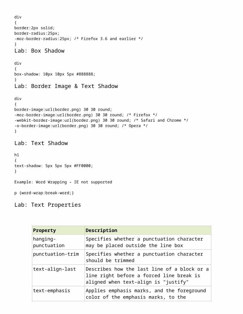
@font-face{font-family: myFirstFont;src: url('Sansation_Bold.ttf'), url('Sansation_Bold.eot'); /* IE9+ */font-weight:bold;}Lab: Rounded Cornersdiv{border:2px solid;border-radius:25px;-moz-border-radius:25px; /* Firefox 3.6 and earlier */}Lab: Box Shadowdiv{box-shadow: 10px 10px 5px #888888;}Lab: Border Image & Text Shadowdiv{border-image:url(border.png) 30 30 round;-moz-border-image:url(border.png) 30 30 round; /* Firefox */-webkit-border-image:url(border.png) 30 30 round; /* Safari and Chrome */-o-border-image:url(border.png) 30 30 round; /* Opera */}
Lab: Text Shadowh1{text-shadow: 5px 5px 5px #FF0000;}
Example: Word Wrapping – IE not supported
p {word-wrap:break-word;}
Lab: Text Properties
Property Descriptionhanging-punctuation Specifies whether a punctuation character may be
placed outside the line boxpunctuation-trim Specifies whether a punctuation character should
be trimmedtext-align-last Describes how the last line of a block or a line right
before a forced line break is aligned when text-align is "justify"
text-emphasis Applies emphasis marks, and the foreground color of the emphasis marks, to the element's text
text-justify Specifies the justification method used when text-align is "justify"
text-outline Specifies a text outlinetext-overflow Specifies what should happen when text overflows
the containing elementtext-shadow Adds shadow to texttext-wrap Specifies line breaking rules for textword-break Specifies line breaking rules for non-CJK scriptsword-wrap Allows long, unbreakable words to be broken and
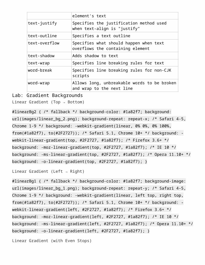
wrap to the next lineLab: Gradient BackgroundsLinear Gradient (Top → Bottom)
#linearBg2 { /* fallback */ background-color: #1a82f7; background: url(images/linear_bg_2.png); background-repeat: repeat-x; /* Safari 4-5, Chrome 1-9 */ background: -webkit-gradient(linear, 0% 0%, 0% 100%, from(#1a82f7), to(#2F2727)); /* Safari 5.1, Chrome 10+ */ background: -webkit-linear-gradient(top, #2F2727, #1a82f7); /* Firefox 3.6+ */ background: -moz-linear-gradient(top, #2F2727, #1a82f7); /* IE 10 */ background: -ms-linear-gradient(top, #2F2727, #1a82f7); /* Opera 11.10+ */ background: -o-linear-gradient(top, #2F2727, #1a82f7); }
Linear Gradient (Left → Right)
#linearBg1 { /* fallback */ background-color: #1a82f7; background-image: url(images/linear_bg_1.png); background-repeat: repeat-y; /* Safari 4-5, Chrome 1-9 */ background: -webkit-gradient(linear, left top, right top, from(#1a82f7), to(#2F2727)); /* Safari 5.1, Chrome 10+ */ background: -webkit-linear-gradient(left, #2F2727, #1a82f7); /* Firefox 3.6+ */ background: -moz-linear-gradient(left, #2F2727, #1a82f7); /* IE 10 */ background: -ms-linear-gradient(left, #2F2727, #1a82f7); /* Opera 11.10+ */ background: -o-linear-gradient(left, #2F2727, #1a82f7); }
Linear Gradient (with Even Stops)
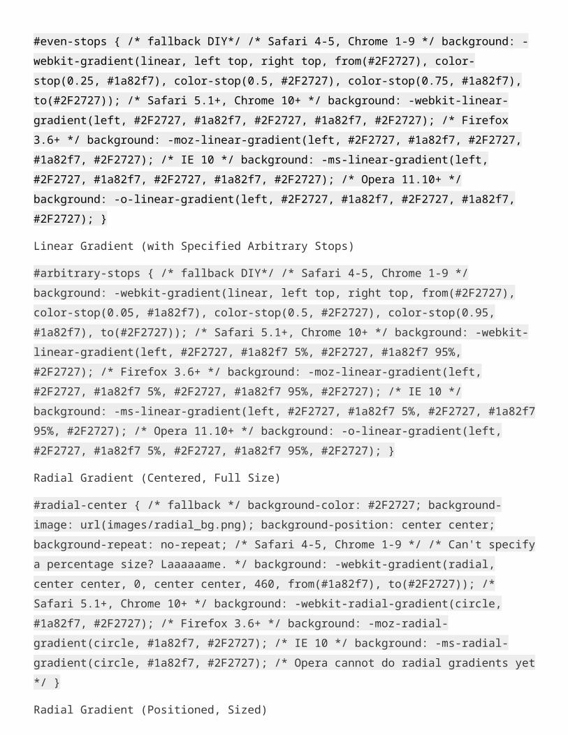
#even-stops { /* fallback DIY*/ /* Safari 4-5, Chrome 1-9 */ background: -webkit-gradient(linear, left top, right top, from(#2F2727), color-stop(0.25, #1a82f7), color-stop(0.5, #2F2727), color-stop(0.75, #1a82f7), to(#2F2727)); /* Safari 5.1+, Chrome 10+ */ background: -webkit-linear-gradient(left, #2F2727, #1a82f7, #2F2727, #1a82f7, #2F2727); /* Firefox 3.6+ */ background: -moz-linear-gradient(left, #2F2727, #1a82f7, #2F2727, #1a82f7, #2F2727); /* IE 10 */ background: -ms-linear-gradient(left, #2F2727,
#1a82f7, #2F2727, #1a82f7, #2F2727); /* Opera 11.10+ */ background: -o-linear-gradient(left, #2F2727, #1a82f7, #2F2727, #1a82f7, #2F2727); }
Linear Gradient (with Specified Arbitrary Stops)
#arbitrary-stops { /* fallback DIY*/ /* Safari 4-5, Chrome 1-9 */ background: -webkit-gradient(linear, left top, right top, from(#2F2727), color-stop(0.05, #1a82f7), color-stop(0.5, #2F2727), color-stop(0.95, #1a82f7), to(#2F2727)); /* Safari 5.1+, Chrome 10+ */ background: -webkit-linear-gradient(left, #2F2727, #1a82f7 5%, #2F2727, #1a82f7 95%, #2F2727); /* Firefox 3.6+ */ background: -moz-linear-gradient(left, #2F2727, #1a82f7 5%, #2F2727, #1a82f7 95%, #2F2727); /* IE 10 */ background: -ms-linear-gradient(left, #2F2727, #1a82f7 5%, #2F2727, #1a82f7 95%, #2F2727); /* Opera 11.10+ */ background: -o-linear-gradient(left, #2F2727, #1a82f7 5%, #2F2727, #1a82f7 95%, #2F2727); }
Radial Gradient (Centered, Full Size)
#radial-center { /* fallback */ background-color: #2F2727; background-image: url(images/radial_bg.png); background-position: center center; background-repeat: no-repeat; /* Safari 4-5, Chrome 1-9 */ /* Can't specify a percentage size? Laaaaaame. */ background: -webkit-gradient(radial, center center, 0, center center, 460, from(#1a82f7), to(#2F2727)); /* Safari 5.1+, Chrome 10+ */ background: -webkit-radial-gradient(circle, #1a82f7, #2F2727); /* Firefox 3.6+ */ background: -moz-radial-gradient(circle, #1a82f7, #2F2727); /* IE 10 */ background: -ms-radial-gradient(circle, #1a82f7, #2F2727); /* Opera cannot do radial gradients yet */ }
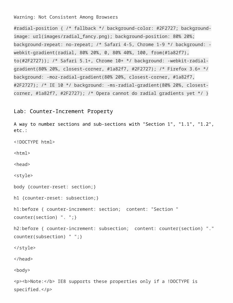
Radial Gradient (Positioned, Sized)
Warning: Not Consistent Among Browsers
#radial-position { /* fallback */ background-color: #2F2727; background-image: url(images/radial_fancy.png); background-position: 80% 20%; background-repeat: no-repeat; /* Safari 4-5, Chrome 1-9 */ background: -webkit-gradient(radial, 80% 20%, 0, 80% 40%, 100, from(#1a82f7), to(#2F2727)); /* Safari 5.1+, Chrome 10+ */ background: -webkit-radial-gradient(80% 20%, closest-corner, #1a82f7, #2F2727); /* Firefox 3.6+ */ background: -moz-radial-gradient(80% 20%, closest-corner, #1a82f7, #2F2727); /* IE 10 */ background: -ms-radial-gradient(80% 20%, closest-corner, #1a82f7, #2F2727); /* Opera cannot do radial gradients yet */ }
Lab: Counter-Increment Property
A way to number sections and sub-sections with "Section 1", "1.1", "1.2", etc.:
<!DOCTYPE html>
<html>
<head>
<style>
body {counter-reset: section;}
h1 {counter-reset: subsection;}
h1:before { counter-increment: section; content: "Section " counter(section) ". ";}
h2:before { counter-increment: subsection; content: counter(section) "." counter(subsection) " ";}
</style>
</head>
<body>
<p><b>Note:</b> IE8 supports these properties only if a !DOCTYPE is specified.</p>
<h1>HTML tutorials</h1>
<h2>HTML Tutorial</h2>
<h2>XHTML Tutorial</h2>
<h2>CSS Tutorial</h2>
<h1>Scripting tutorials</h1>
<h2>JavaScript</h2>
<h2>VBScript</h2>
<h1>XML tutorials</h1>
<h2>XML</h2>
<h2>XSL</h2>
</body>
</html>
Lab: Multiple Columns<!doctype html>
<html>
<head>
<meta charset="utf-8" />
<title>First Document</title>
<style>
div {-webkit-column-count: 3; /* Chrome, Safari, Opera */
-moz-column-count: 3; /* Firefox */
column-count: 3;
column-fill:balance;
-webkit-column-rule: 4px inset #ff00ff; /* Chrome, Safari, Opera */
-moz-column-rule: 4px outset #ff00ff; /* Firefox */
column-rule: 4px outset #ff00ff;
}
</style>
</head>
<body>
<h1>ICT Trainings</h1>
<hr color="#FF0000" size="10" />
<div>The key to social media and the most important thing to realize is that it's not about having a megaphone to shout about your products and services, but rather to interact and engage with potential customers; by doing this you will see them be drawn to your business naturally.</div>
</body>
</html>
Lab RGBA [Red Green Blue Alpha]Alpha specifies the opacity level of that color.
rgba(107, 146, 98, 0.96)
Lab: FLEX BOX<!DOCTYPE html><html><head><style> .flex-container { display: -webkit-flex; display: flex; /*-webkit-flex-direction: column; flex-direction: column;*/ width: 400px; height: 250px; background-color: lightgrey;}
.flex-item { background-color: cornflowerblue; width: 100px; height: 100px; margin: 10px;}</style></head><body>
<div class="flex-container"> <div class="flex-item">flex item 1</div> <div class="flex-item">flex item 2</div> <div class="flex-item">flex item 3</div> </div>
</body></html>
Lab: MEDIA Query
<!DOCTYPE html><html><head><meta name="viewport" content="width=device-width, initial-scale=1.0"><style>.wrapper {overflow:auto;}
#main {margin-left: 4px;}#leftsidebar {float: none;width: auto;}#menulist {margin:0;padding:0;}
.menuitem { background:#CDF0F6; border:1px solid #d4d4d4; border-radius:4px; list-style-type:none; margin:4px; padding:2px;}
@media screen and (min-width: 480px) { #leftsidebar {width:200px;float:left;} #main {margin-left:216px;}}</style></head><body>
<div class="wrapper"> <div id="leftsidebar"> <ul id="menulist"> <li class="menuitem">Menu-item 1</li> <li class="menuitem">Menu-item 2</li> <li class="menuitem">Menu-item 3</li> <li class="menuitem">Menu-item 4</li> <li class="menuitem">Menu-item 5</li> </ul> </div> <div id="main"> <h1>Resize the browser window to see the effect!</h1> <p>This example shows a menu that will float to the left of the page if the viewport is 480 pixels wide or wider. If the viewport is less than 480 pixels, the menu will be on top of the content.</p> </div></div>
</body></html>
Lab: Rotate
<!DOCTYPE html><html><head><style>div { width: 300px; height: 100px; background-color: yellow; border: 1px solid black;}
div#myDiv {
-webkit-transform: rotateZ(90deg); /* Safari */ transform: rotateZ(90deg); /* Standard syntax */}
</style></head><body>
<div>This a normal div element.</div>
<div id="myDiv">The rotateZ() method rotates an element around its Z-axis at a given degree. This div element is rotated 90 degrees.</div>
<p><b>Note:</b> Internet Explorer 9 (and earlier versions) does not support the rotateZ() method.</p>
</body></html>
Lab: CSS Sprites
<!DOCTYPE html><html><head><style>#navlist { position: relative;}
#navlist li { margin: 0; padding: 0; list-style: none; position: absolute; top: 0;}
#navlist li, #navlist a { height: 44px; display: block;}
#home { left: 0px; width: 46px; background: url('img_navsprites.gif') 0 0;}
#prev { left: 63px; width: 43px; background: url('img_navsprites.gif') -47px 0;}
#next { left: 129px; width: 43px; background: url('img_navsprites.gif') -91px 0;}</style></head><body>
<ul id="navlist"> <li id="home"><a href="default.asp"></a></li> <li id="prev"><a href="css_intro.asp"></a></li> <li id="next"><a href="css_syntax.asp"></a></li></ul>
</body></html>