idrc data visualization review en/amanda-cox... · idrc data visualization review ... plosion in...
TRANSCRIPT
IDRC Data Visualization Review
Written by Amanda Cox
Data visualization is not a new concept for
IDRC, or for its partners. IDRC-supported re-
search has dabbled in visualization use for
years. Although the majority of these visuali-
zations involved simple graphs and charts, the
concept of complementing presentations with
illustrative representations of data is not new.
That said, the term data visualization can be
intimidating for those less familiar with the
field. This is partly because of the recent ex-
plosion in dynamic and interactive data visu-
alizations which have flooded the internet and
media publications. While these innovative
displays often create quite a splash, the key
principles for producing effective visualiza-
tions remain the same regardless of whether
your data visualization is static or dynamic.
As IDRC-supported research has used data
visualizations, the Evaluation Unit commis-
sioned a series of visualizations to be review
by Amanda Cox, Graphics Editor at the New
York Times. The set are data visualizations
nominated as being good quality by IDRC
staff and from a review of recent documents
filed in IDRC’s Digital Library.
The examples highlighted represent a range of
forms and levels of difficulty, but are not
meant to represent an exhaustive assessment
of data visualization use. Instead, this review
is organized to assist learning, and thus uses
each example to illustrate larger design prin-
ciples which could be applied to data visuali-
zations across the Centre’s work.
A framework for success
The framework for this review was predicated
on the understanding that the most effective
data visualizations are clear, focused and
compelling. While these characteristics can be
subjective and audience-dependent, they provide
a strong starting point for assessing data visuali-
zations which are intended to communicate re-
search.
For the purposes of this review, clarity is defined
by four main questions: Is the charting form ap-
propriate? Are titles appropriate? Are the units
of the data familiar to the intended audience?
Does the visualization anticipate the questions it
raises?
Focus relates to the following questions: Does the
language used in the visualization support at
least one specific idea? Do design choices such as
colours, typography, or highlighted areas support
at least one specific idea? In more complicated
visualizations, is it clear that some parts of the
information are more important than other parts?
Finally, compelling: Will your audience want to
talk about or act upon this data? Does the rich-
ness of the data justify a visualization? Would
incorporating photography or annotations make
the data more relatable?
Summary
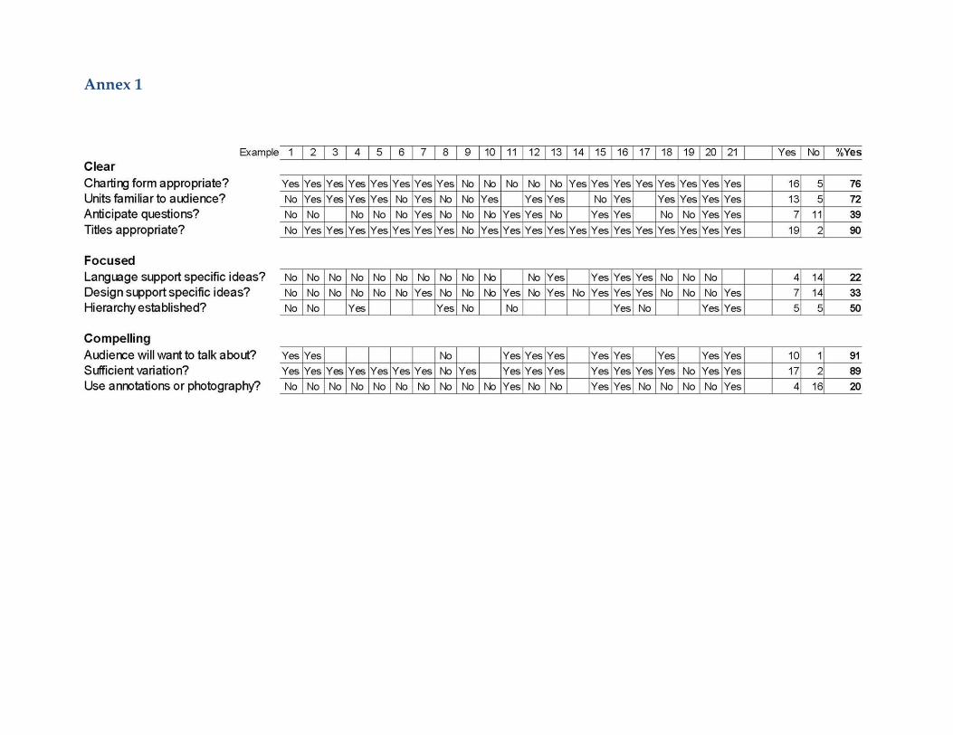
A review of 21 data visualizations produced by
IDRC's projects found that the Centre's data visu-
alization work is generally clear. About three-
quarters of the projects used the best possible
charting form, such as a map or a bar chart, for
the data shown. (See Appendix 1 and the discus-
sion of each visualization for detailed assess-
ments.) Units for the data were typically included
and appropriate. Nearly all of the projects incor-
porated a title that described the data.
These titles, however, were overwhelmingly ge-
neric descriptions, which would have been ap-
2
propriate regardless of the research results.
They simply described the topic of data, in-
stead of what was learned from analyzing it.
Presumably, the purpose of most visualiza-
tions is not to simply convey that data exists,
but to help reach some sort of a conclusion.
For many readers, titles will be the first piece
of information they read. Using generic titles
forces readers to draw their own (possibly
misguided) conclusions about the patterns
shown in the visualization.
In fact, very few of the visualizations used any
language in support of a specific, focused idea.
Firm conclusions could be found in the reports
accompanying the visualizations: “Cuba and
South Africa are the most active in South-
South collaborations”, “Five out of the 19 pro-
jects completely lack a gender component,
while nine consider the issue only superficial-
ly” or “The global average cost [of transferring
money] has not come down.” But the words
used within the visualizations were often very
timid.
Design choices also tended to be generic. Col-
our, typography, or highlighted areas were
rarely used to draw attention to points of in-
terest. Using colour in a way that supports a
message, as well as sorting tables by a value of
interest, are among the most frequent criti-
cisms in this review.
Among the more complicated visualizations,
about half established a clear hierarchy in
which some of the information was clearly
more important than other parts. These were
established with position, color, and size.
Nearly all of the visualizations included a suf-
ficient amount of variation to justify a graphic,
but few of the visualizations described trends
or anomalous points, anticipated questions
that the visualization raised, or indicated areas
that experts found interesting.
Most of the interactive work in this review al-
lowed users to look up data of interest to them. In
general, these visualizations functioned well and
navigation was clear, though none of the exam-
ples used technology that allows smooth transi-
tions between views.
Key issues and trends
Within the last five years, presenting large
amounts of data – especially in an interactive way
– has become substantially easier, and the volume
of this type of work has grown rapidly.
Much current attention is being devoted toward
making interactive work that functions on mobile
and tablet devices. Increasing amounts of atten-
tion is also being paid to real-time, streaming vis-
ualization, and collecting data from non-
traditional sources, such as crowd-sourcing.
With non-traditional sources, transparency and
proper sourcing is a larger issue than it is with
data gathered as part of traditional research pro-
jects or by governmental organizations. Regard-
less of the size, provenance, or complexity of final
visualizations, providing access to full data tends
to generate goodwill and greater faith in results,
assuming confidentiality can be maintained.
As interactive work matures, more analysis is be-
ing incorporated into visualizations. Links to in-
teresting findings can be part of the visualization
itself or part of a blog-type post that sits on top of
the visualization. Other mature work involves
combining different types of media. For example,
photography of research projects linked to a map
might make data feel more relevant than simple
circles on the same map. Audio of experts ex-
plaining their results alongside charts might also
help clarify difficult ideas.
Many of the examples in this review display rela-
tively small amounts of data in a static way. Even
when a visualization is intended to be viewed
online, this may often be the most effective way
3
to communicate research results. Why? Static
visualizations tend to give the creator more
control over the message. In the same way that
editing is an important part of writing, distil-
ling information to what is important is crucial
for effective visualization. In contrast, interac-
tive displays of larger amounts of information
may be more engaging for topics that are very
familiar to or personally relevant for an in-
tended audience.
The following section considers 21 examples
chosen from IDRC-supported research. These
examples have been grouped into five broad
subject areas: colour, sorting tables, choosing a
chart type, clarity, and interaction.
All of the examples have positive elements,
but the review mainly focuses on opportuni-
ties for improvement, in the hopes that rela-
tively simple changes could result in more ef-
fective or more powerful communication.
Colour
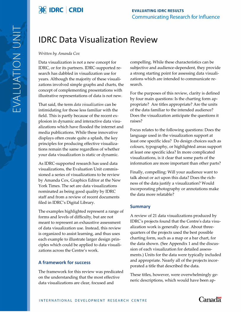
Example 1: Designing for Emphasis
Design choices should help a reader determine
what is important. In the example above, some
choices appear to have been made without con-
sidering the data.
For example, terrain shown in the background is
unlikely to be very relevant in a map of South-
South collaborations between biotech firms. In-
stead, simple country outlines might have been
used to convey relevant information. Countries
like Mexico and Nigeria, which may be un-
derrepresented because they were not surveyed,
could be coloured in a slightly lighter shade.
At first glance, the data is forced to compete for
attention with a deep blue ocean and bold typog-
raphy. Bold type – a great tool to emphasize sali-
ent points or to help readers skim through a
graphic — should seldom be used for every label.
And, whenever possible, type should not be ob-
scured by data. Using great circle arcs may fur-
ther reduce clutter.
Example 1
4
Finally, a key should be part of almost every
graphic. Does a thick line represent 40 current
collaborations? Or three within the last five
years? Without reading the accompanying
text, it is impossible to know. Conclusions
from the accompanying text can also be drawn
into the graphic. Consider which of the follow-
ing is a more compelling introduction: “The
size of each node represents ...” or “Biotech
firms in South Africa have many collabora-
tions with India, but none with China.”
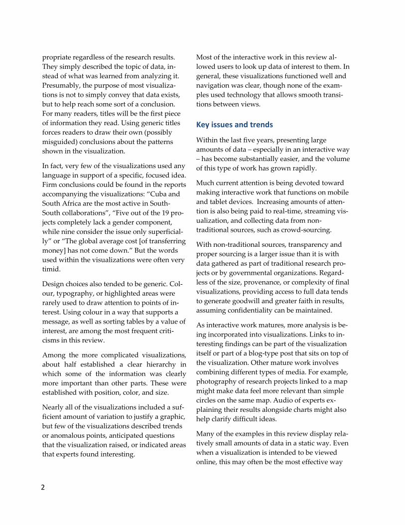
Example 2: Making some data secondary
With four separate keys, it's clear that the map
above has a lot going on. As a look-up table, it is
reasonably successful. But if someone comes to
the map without knowing what they are looking
for, where should they start? What is most im-
portant?
The title — “The Internet: Out of Africa” — is one
clue. But the colours chosen to represent each
country's wealth make the fact that Libya is
wealthy jump out.
Example 2
5
Using a very light gray palette to encode
wealth would visually suggest that the wealth
data is secondary, in the same way it is clear
that Spain is secondary.
Another option would be to remove the in-
come data from the background altogether.
Trying to layer too many pieces of information
into one view is unwise. It is better to make
one strong point in three simple graphics that
are displayed next to each other. A small map
of income could still accompany the main
map. Size, like colour, is very useful in imme-
diately conveying relative importance.
A secondary point: charts that label every data
point do not need scales.
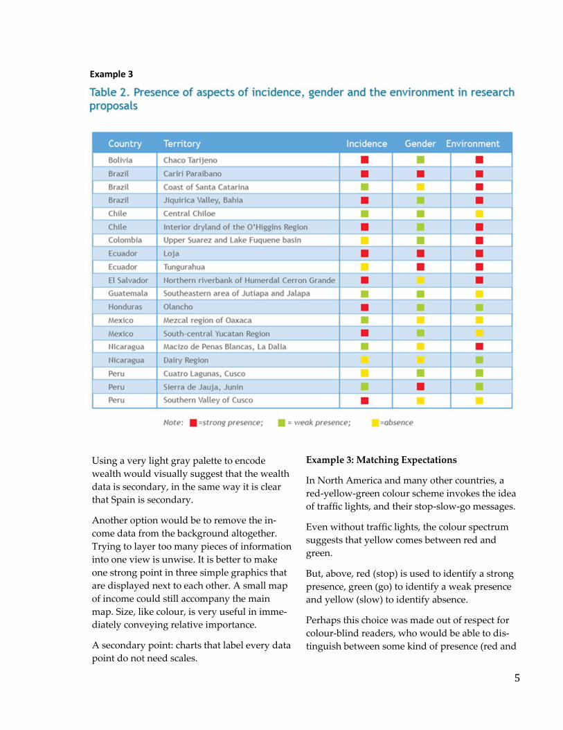
Example 3: Matching Expectations
In North America and many other countries, a
red-yellow-green colour scheme invokes the idea
of traffic lights, and their stop-slow-go messages.
Even without traffic lights, the colour spectrum
suggests that yellow comes between red and
green.
But, above, red (stop) is used to identify a strong
presence, green (go) to identify a weak presence
and yellow (slow) to identify absence.
Perhaps this choice was made out of respect for
colour-blind readers, who would be able to dis-
tinguish between some kind of presence (red and
Example 3

6
green) and absence (yellow). Even if this is the
case, a more natural solution could be found.
For example, the squares representing absence
could be removed altogether, and a dark and
light shade could be used to suggest the
strength of presence.
Basic words describing the table (“Incidence,
gender and the environment in methodologi-
cal proposals”) are repeated in four places.
Some of this space could be used more effec-
tively by describing what the data actually
shows (e.g., “Gender perspectives are strongly
present in four proposals, while the environ-
ment is strongly present in 10 proposals.”).
Sorting
Example 4: Sorting and colour
Alphabetical sorting is usually not the best choice
in a chart with numerical data. In the example
above, colour suggests the primary focus of the
chart is the percentage of people who were stu-
dents during the last six months, so the data
could be sorted by that value. Sorting by one
value allows easier comparisons for the other
values. Does the pattern for the self-employed
(the final bar) follow the same pattern as that for
students? With sorting, it would be easy to tell.
Again, colour should be used thoughtfully. Here,
certain categories are more similar to others. For
Example 4
7
example, the unemployed, employed, and
self-employed are all part of the labor force.
Thoughtful colour choices could make this
clear.
Choosing to label only key values in a chart
with many numbers is a good idea. To reduce
clutter, units like percentage signs are only
necessary on the first value.
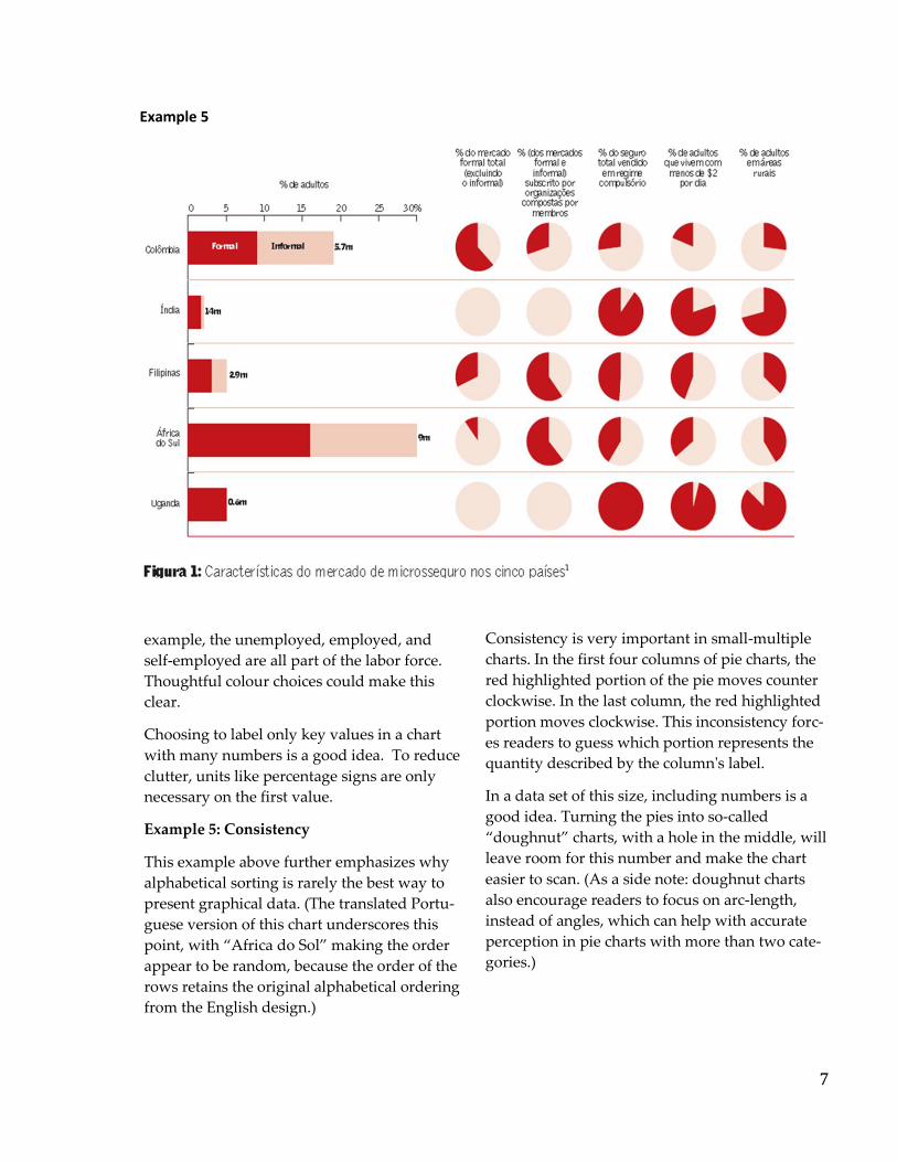
Example 5: Consistency
This example above further emphasizes why
alphabetical sorting is rarely the best way to
present graphical data. (The translated Portu-
guese version of this chart underscores this
point, with “Africa do Sol” making the order
appear to be random, because the order of the
rows retains the original alphabetical ordering
from the English design.)
Consistency is very important in small-multiple
charts. In the first four columns of pie charts, the
red highlighted portion of the pie moves counter
clockwise. In the last column, the red highlighted
portion moves clockwise. This inconsistency forc-
es readers to guess which portion represents the
quantity described by the column's label.
In a data set of this size, including numbers is a
good idea. Turning the pies into so-called
“doughnut” charts, with a hole in the middle, will
leave room for this number and make the chart
easier to scan. (As a side note: doughnut charts
also encourage readers to focus on arc-length,
instead of angles, which can help with accurate
perception in pie charts with more than two cate-
gories.)
Example 5
8
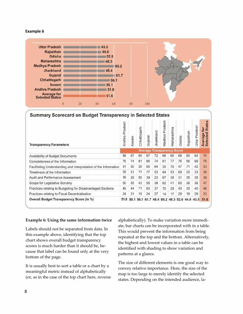
Example 6: Using the same information twice
Labels should not be separated from data. In
this example above, identifying that the top
chart shows overall budget transparency
scores is much harder than it should be, be-
cause that label can be found only at the very
bottom of the page.
It is usually best to sort a table or a chart by a
meaningful metric instead of alphabetically
(or, as in the case of the top chart here, reverse
alphabetically). To make variation more immedi-
ate, bar charts can be incorporated with in a table.
This would prevent the information from being
repeated at the top and the bottom. Alternatively,
the highest and lowest values in a table can be
identified with shading to show variation and
patterns at a glance.
The size of different elements is one good way to
convey relative importance. Here, the size of the
map is too large to merely identify the selected
states. Depending on the intended audience, la-
Example 6
9
bels should be provided, or the map should be
much smaller.
A side note: while this example is a print
graphic, some recent interactive league tables
have successfully allowed users to place dif-
ferent weights on individual metrics to devel-
op their own averages.
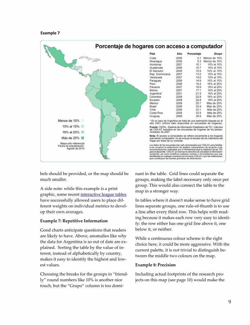
Example 7: Repetitive Information
Good charts anticipate questions that readers
are likely to have. Above, anomalies like why
the data for Argentina is so out of date are ex-
plained. Sorting the table by the value of in-
terest, instead of alphabetically by country,
makes it easy to identify the highest and low-
est values.
Choosing the breaks for the groups in “friend-
ly” round numbers like 10% is another nice
touch, but the “Grupo” column is too domi-
nant in the table. Grid lines could separate the
groups, making the label necessary only once per
group. This would also connect the table to the
map in a stronger way.
In tables where it doesn't make sense to have grid
lines separate groups, one rule-of-thumb is to use
a line after every third row. This helps with read-
ing because it makes each row very easy to identi-
fy: the row either has one grid line above it, one
below it, or neither.
While a continuous colour scheme is the right
choice here, it could be more aggressive. With the
current palette, it is not trivial to distinguish be-
tween the middle two colours on the map.
Example 8: Precision
Including actual footprints of the research pro-
jects on this map (see page 10) would make the
Example 7
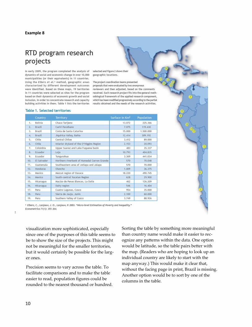
10
visualization more sophisticated, especially
since one of the purposes of this table seems to
be to show the size of the projects. This might
not be meaningful for the smaller territories,
but it would certainly be possible for the larg-
er ones.
Precision seems to vary across the table. To
facilitate comparisons and to make the table
easier to read, population figures could be
rounded to the nearest thousand or hundred.
Sorting the table by something more meaningful
than country name would make it easier to rec-
ognize any patterns within the data. One option
would be latitude, so the table pairs better with
the map. (Readers who are hoping to look up an
individual country are likely to start with the
map anyway.) This would make it clear that,
without the facing page in print, Brazil is missing.
Another option would be to sort by one of the
columns in the table.
Example 8
11
Charting Forms
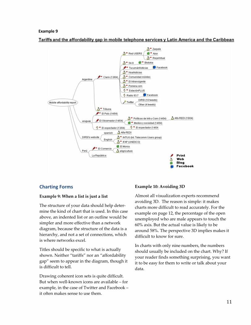
Example 9: When a list is just a list
The structure of your data should help deter-
mine the kind of chart that is used. In this case
above, an indented list or an outline would be
simpler and more effective than a network
diagram, because the structure of the data is a
hierarchy, and not a set of connections, which
is where networks excel.
Titles should be specific to what is actually
shown. Neither “tariffs” nor an “affordability
gap” seem to appear in the diagram, though it
is difficult to tell.
Drawing coherent icon sets is quite difficult.
But when well-known icons are available – for
example, in the case of Twitter and Facebook –
it often makes sense to use them.
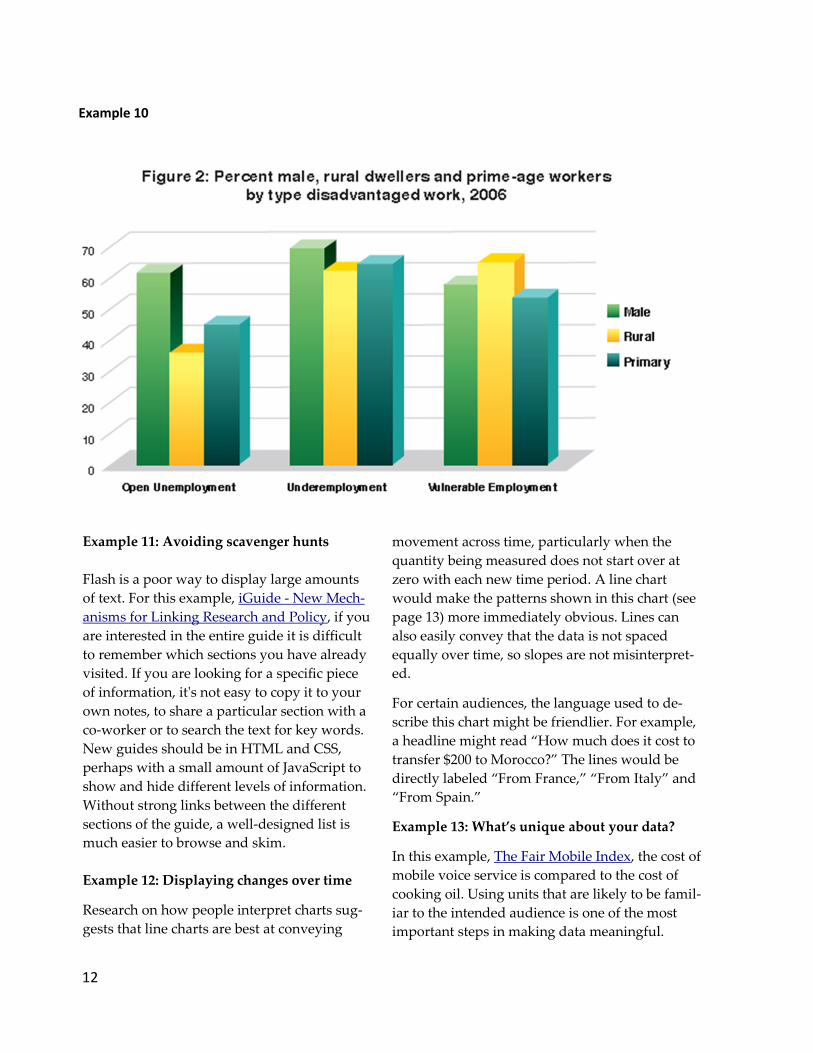
Example 10: Avoiding 3D
Almost all visualization experts recommend
avoiding 3D. The reason is simple: it makes
charts more difficult to read accurately. For the
example on page 12, the percentage of the open
unemployed who are male appears to touch the
60% axis. But the actual value is likely to be
around 58%. The perspective 3D implies makes it
difficult to know for sure.
In charts with only nine numbers, the numbers
should usually be included on the chart. Why? If
your reader finds something surprising, you want
it to be easy for them to write or talk about your
data.
Example 9
12
Example 10
Example 11: Avoiding scavenger hunts
Flash is a poor way to display large amounts
of text. For this example, iGuide - New Mech-
anisms for Linking Research and Policy, if you
are interested in the entire guide it is difficult
to remember which sections you have already
visited. If you are looking for a specific piece
of information, it's not easy to copy it to your
own notes, to share a particular section with a
co-worker or to search the text for key words.
New guides should be in HTML and CSS,
perhaps with a small amount of JavaScript to
show and hide different levels of information.
Without strong links between the different
sections of the guide, a well-designed list is
much easier to browse and skim.
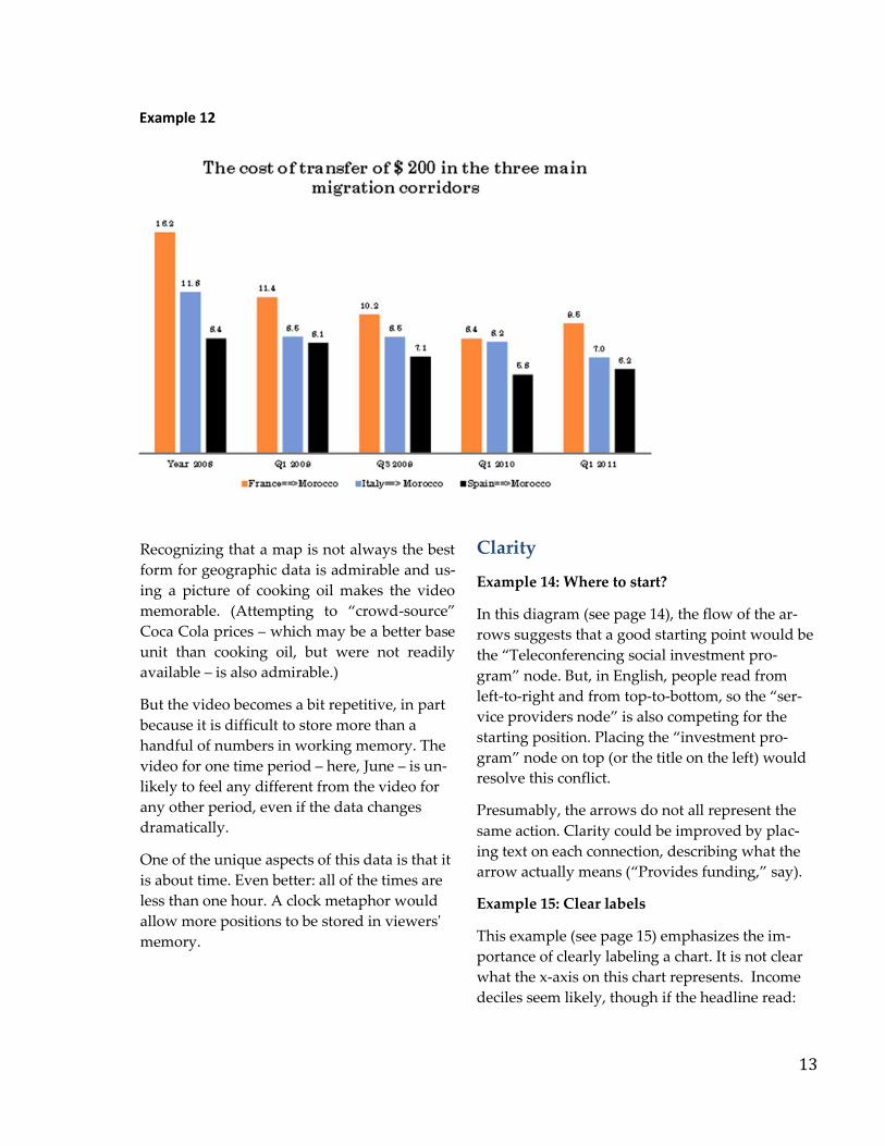
Example 12: Displaying changes over time
Research on how people interpret charts sug-
gests that line charts are best at conveying
movement across time, particularly when the
quantity being measured does not start over at
zero with each new time period. A line chart
would make the patterns shown in this chart (see
page 13) more immediately obvious. Lines can
also easily convey that the data is not spaced
equally over time, so slopes are not misinterpret-
ed.
For certain audiences, the language used to de-
scribe this chart might be friendlier. For example,
a headline might read “How much does it cost to
transfer $200 to Morocco?” The lines would be
directly labeled “From France,” “From Italy” and
“From Spain.”
Example 13: What’s unique about your data?
In this example, The Fair Mobile Index, the cost of
mobile voice service is compared to the cost of
cooking oil. Using units that are likely to be famil-
iar to the intended audience is one of the most
important steps in making data meaningful.
13
Recognizing that a map is not always the best
form for geographic data is admirable and us-
ing a picture of cooking oil makes the video
memorable. (Attempting to “crowd-source”
Coca Cola prices – which may be a better base
unit than cooking oil, but were not readily
available – is also admirable.)
But the video becomes a bit repetitive, in part
because it is difficult to store more than a
handful of numbers in working memory. The
video for one time period – here, June – is un-
likely to feel any different from the video for
any other period, even if the data changes
dramatically.
One of the unique aspects of this data is that it
is about time. Even better: all of the times are
less than one hour. A clock metaphor would
allow more positions to be stored in viewers'
memory.
Clarity
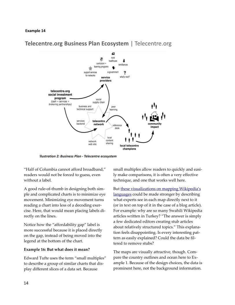
Example 14: Where to start?
In this diagram (see page 14), the flow of the ar-
rows suggests that a good starting point would be
the “Teleconferencing social investment pro-
gram” node. But, in English, people read from
left-to-right and from top-to-bottom, so the “ser-
vice providers node” is also competing for the
starting position. Placing the “investment pro-
gram” node on top (or the title on the left) would
resolve this conflict.
Presumably, the arrows do not all represent the
same action. Clarity could be improved by plac-
ing text on each connection, describing what the
arrow actually means (“Provides funding,” say).
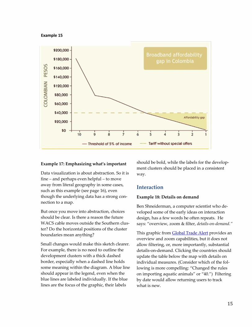
Example 15: Clear labels
This example (see page 15) emphasizes the im-
portance of clearly labeling a chart. It is not clear
what the x-axis on this chart represents. Income
deciles seem likely, though if the headline read:
Example 12
14
“Half of Columbia cannot afford broadband,”
readers would not be forced to guess, even
without a label.
A good rule-of-thumb in designing both sim-
ple and complicated charts is to minimize eye
movement. Minimizing eye movement turns
reading a chart into less of a decoding exer-
cise. Here, that would mean placing labels di-
rectly on the lines.
Notice how the “affordability gap” label is
more successful because it is placed directly
on the gap, instead of being moved into the
legend at the bottom of the chart.
Example 16: But what does it mean?
Edward Tufte uses the term “small multiples”
to describe a group of similar charts that dis-
play different slices of a data set. Because
small multiples allow readers to quickly and easi-
ly make comparisons, it is often a very effective
technique, and one that works well here.
But these visualizations on mapping Wikipedia’s
languages could be made stronger by describing
what experts see in each map directly next to it
(or in text on top of it in the case of a blog article).
For example: why are so many Swahili Wikipedia
articles written in Turkey? “The answer is simply
a few dedicated editors creating stub articles
about relatively structured topics.” This explana-
tion feels disappointing. Is every interesting pat-
tern as easily explained? Could the data be fil-
tered to remove stubs?
The maps are visually attractive, though. Com-
pare the country outlines and ocean here to Ex-
ample 1. Because of the design choices, the data is
prominent here, not the background information.
Example 14
15
Example 17: Emphasizing what’s important
Data visualization is about abstraction. So it is
fine – and perhaps even helpful – to move
away from literal geography in some cases,
such as this example (see page 16), even
though the underlying data has a strong con-
nection to a map.
But once you move into abstraction, choices
should be clear. Is there a reason the future
WACS cable moves outside the Southern clus-
ter? Do the horizontal positions of the cluster
boundaries mean anything?
Small changes would make this sketch clearer.
For example, there is no need to outline the
development clusters with a thick dashed
border, especially when a dashed line holds
some meaning within the diagram. A blue line
should appear in the legend, even when the
blue lines are labeled individually. If the blue
lines are the focus of the graphic, their labels
should be bold, while the labels for the develop-
ment clusters should be placed in a consistent
way.
Interaction
Example 18: Details on demand
Ben Shneiderman, a computer scientist who de-
veloped some of the early ideas on interaction
design, has a few words he often repeats. He
says: “overview, zoom & filter, details-on-demand.”
This graphic from Global Trade Alert provides an
overview and zoom capabilities, but it does not
allow filtering, or, more importantly, substantial
details-on-demand. Clicking the countries should
update the table below the map with details on
individual measures. (Consider which of the fol-
lowing is more compelling: “Changed the rules
on importing aquatic animals” or “40.”) Filtering
by date would allow returning users to track
what is new.
Example 15

16
Example 17
Critically, the circles on the protectionist and
liberalizing maps should be scaled in the same
way to allow easy comparisons between the
maps.
User interaction might also be improved. With
the type of rollovers used here, the mouse
must directly touch a circle before its infor-
mation box is displayed. This type of interac-
tion is known as hit detection. Instead of hit
detection, many modern visualization toolkits
find the nearest element as the mouse is
moved, which would prevent the information
box from flickering on and off. Compare the ex-
perience of traveling over the map with the
smoothness of an example like this.
Example 19: Meaningful interaction
Tableau is a useful tool for exploratory analysis,
and it has a low learning curve for creating cer-
tain types of interactivity. But some of Tableau’s
drawbacks for presentation reveal themselves in
this interactive example, Trinidad and Tobago
Trade Report. Keys get cut off. The legend for the
bar chart (see page 17) is oddly disconnected
from the chart. (In fact, it's not clear why this leg-
end is necessary at all, since the labels are repeat-
ed on the actual graph.)
17
This visualization also features a time slider
which reveals each segment of the line chart.
However, without annotation describing why
certain points are interesting, the slider is dis-
tracting. Interactivity that merely hides data
shown in a simple static line chart is not use-
ful. Analysts may find Tableau – and the drill-
ing into data it sometimes encourages – reve-
latory, but presentation for wider audiences
may require additional finesse or other tools.
Example 20: Determining intent
Data visualization should be judged according
to how well it does what it intends to do. This
example called Global Impact Study ICT Ven-
ue Inventory Database, a filterable database of
different venues, is clearly intended for pro-
fessional users. (A barrier that forces users to
sign in makes that clear.) For casual users, a
blank default screen is intimidating. But that
may be exactly what professional users appre-
ciate. The experience of the map and charts
could be improved by not requiring a full re-
fresh when query parameters are changed, but
that may require more work than is justified.
Example 21: Defining success
In some cases, the mere existence of data may
be what is powerful for outsiders. And very
local, real-time data may be the sort that most
affects people's lives. This example, Harrass-
Map, does both: it demonstrates that data ex-
ists, and allows people to look up incidents in
their own neighborhoods.
The refresh on the map is too slow to encour-
age much interaction, though, assuming users
do not already know what they are looking
for. With a fast internet connection, using the
filters takes as long as a second. This is a short
amount of time, but it is at least ten times
longer than the time frame that feels immedi-
ately responsive. After even a second, it can be
difficult to remember the pattern that was
previously shown on the map to compare or
contrast with the new view. Finally, the scale on
the chart at the bottom suggests the project has
run much longer than its developer anticipated.
That said, those quibbles – or concerns about how
representative the data is likely to be – are unlike-
ly to matter here. The individual data points are
compelling for both outside observers and the
local population.
Conclusion
Two simple steps would improve the effective-
ness of IDRC-supported visualization work.
First, every static visualization should include a
headline or other language that describes the
findings of the visualization in a meaningful way.
What is its takeaway message? In many cases, the
projects have made strong and thoughtful conclu-
sions about what the data means and why it is
important in the text accompanying the visualiza-
tion. These conclusions should be repeated, in a
concise way, within the visualization. A quick
check: does the headline or other prominent text
include a verb?
Second, the conclusions of the visualization
should shape its design. Designers should think
about how the choices they make with colour or
type help guide readers to interesting findings.
Would a line or two of text pointing directly to
the most interesting parts allow readers to see
patterns or relationships they might otherwise
miss?
For interactive work, the first step is to decide on
a goal. Work that primarily allows people to look
up information about themselves or their com-
munities will likely be quite different from work
that intends to show broader patterns or trends.
So far, a lot of successful interactive work – with-
in the Centre and the larger data visualization
community – falls into the former category.
But interactive work that incorporates explana-
tions or annotations is becoming more common,
18
and it may mean that interactivity plays a
more prominent role in communicating re-
search in the near future. Already, this trend is
clear in text books.
Finally, the Centre should critically examine
results from projects like the UN’s Global
Pulse. This lab has been a leader in data visu-
alization within the development space, and
its work may help the Center consider wheth-
er experimenting with larger data sets or new
forms of data collection would be useful for its
own mission.
About Amanda Cox
Amanda is a graphics editor at the New York
Times. She joined the Times in 2005, after
completing a masters in statistics from the
University of Washington. Amanda has a
strong background in data visualization theo-
ry and design and has a fondness for concep-
tual pieces. She has warmly been referred to as
the “Queen of InfoVis”, and has served as a
keynote speaker, university lecturer, graphic
consultant, and a judge for data visualization
competitions. Amanda, and her colleagues
have also received several awards for their
dynamic work, including top honors at
Malofiej, the largest international infographics
competition.
This review was commissioned by IDRC’s Evalua-
tion Unit with assistance from Jacqueline Strecker
and Tricia Wind.
Annex 1