ieee transactions on visualization and computer...
TRANSCRIPT

IEEE TRANSACTIONS ON VISUALIZATION AND COMPUTER GRAPHICS 1
A Survey of Radial Methods forInformation Visualization
Geoffrey M. Draper, Yarden Livnat, Member, IEEE, and Richard F. Riesenfeld
Abstract— Radial visualization, or the practice of displayingdata in a circular or elliptical pattern, is an increasingly commontechnique in information visualization research. In spite of itsprevalence, little work has been done to study this visualizationparadigm as a methodology in its own right. We provide ahistorical review of radial visualization, tracing it to its rootsin centuries-old statistical graphics. We then identify the typesof problem domains to which modern radial visualization tech-niques have been applied. A taxonomy for radial visualizationis proposed, in the form of seven design patterns encompassingnearly all recent work in this area. From an analysis of thesepatterns, we distill a series of design considerations that systembuilders can use to create new visualizations that address aspectsof the design space that have not yet been explored. It is hopedthat our taxonomy will provide a framework for facilitatingdiscourse among researchers and stimulate the development ofadditional theories and systems involving radial visualization asa distinct design metaphor.
Index Terms— Information visualization, multivariate visual-ization, visualization techniques and methodologies, interactivedata exploration and discovery
I. INTRODUCTION
The goal of information visualization is to communicate tech-nical information in a graphical, interactive, and understandableway. This paper focuses on an emerging paradigm in informationvisualization, namely, radial visualization. We use the term radialvisualization to describe any interactive system that arrangesdata in a elliptical fashion. Radial visualization is an increas-ingly popular metaphor in information visualization and HCIresearch; indeed, many recent papers in the field of informationvisualization make use of radial visualization to at least someextent. Examples include the Hyperbolic Browser [52], RadialTraffic Analyzer [49], and VisAlert [55]. The prevalence of radialvisualization is perhaps due to its aesthetic appeal, its compactlayout, and its ability to put selectable data within easy reachof the user [27]. Whatever the reason, the sheer popularity ofthis visualization metaphor makes it a subject worthy of furtheranalysis. Somewhat surprisingly, little effort has been devoted tostudying radial visualization as a distinct methodology of its own.
The present work aims to fill this identified gap. To ourknowledge, this paper is the first such effort to gather, review, andanalyze the vast body of research involving radial visualization.We first provide a historical review of radial visualization, tracingit from its modest roots in the centuries-old discipline of statisticalgraphics. We then identify the principal types of problem do-mains to which modern radial visualization techniques have beenapplied. A taxonomy for radial visualization is proposed, in the
G. Draper and R. Riesenfeld are with the University of Utah School ofComputing.
Y. Livnat is with the University of Utah Scientific Computing and ImagingInstitute.
form of seven design patterns encompassing nearly all recent workin this area. We discuss several examples of each pattern, drawnfrom both academic and commercial arenas. From an analysisof these patterns, we then distill a series of design dimensions,or considerations, that system builders can use to create newvisualizations that address aspects of the design space that havenot yet been explored. Finally, we suggest possible avenues offuture work in radial visualization by applying the design patternsand dimensions presented herein to additional problem domains.
In so doing, we are not suggesting that radial visualization isa panacea for all information visualization problems. Rather, wehope instead to raise the research community’s awareness of radialvisualization, elevating it from an interesting visual gimmickto a unique methodology of its own. Information visualizationresearchers will thus be able to evaluate radial techniques in thecontext of others, and select whichever visualization metaphor ismost appropriate for a given problem.
II. A HISTORY OF RADIAL GRAPHICS IN STATISTICS
The term radial visualization appears to have been coined byHoffman et al. [35] in the 1990s, but the underlying conceptsare firmly rooted in the statistical graphics literature of the 19thcentury. Today, techniques such as the pie chart, starplot, andradar plot are frequently used in business and in the media tocommunicate numerical data visually. These graphics are thecommon ancestors of virtually all the radial visualization methodsfound in state-of-the-art research, so we begin our survey withthem.
A. Pie charts
A radial display is a visualization paradigm in which infor-mation is laid out in a circular or elliptical pattern. Perhaps theearliest use of a radial display in statistical graphics was the piechart. The first known occurrence of a pie chart (Figure 1) was inWilliam Playfair’s 1801 treatise, The Statistical Breviary [63], adetailed listing of the population and wealth in the nations of 19thcentury Europe. Spence [70] reviews the historical background ofPlayfair’s work and its influence on modern statistical graphics.
Although commonly used in mainstream media, the pie charthas some limitations. In particular, when the wedges in a pie chartare almost the same size, it is difficult to determine visually whichwedge is largest (Figure 2). A bar chart is generally better suitedfor this task. In fact, Wilkinson [83] points out that a pie chart issimply a stacked bar chart in polar coordinates. Although the chartshown in Figure 2a is typical of the most common variety of piechart, other variants exist as well. Wilkinson describes an alternatepie chart whose area is not divided up into wedges, but ratherconcentric rings. In contrast to a traditional pie chart, comparisonsamong the different entities are based on the length of the variousradii (Figure 2b), rather than on the angular magnitude of a wedge.

IEEE TRANSACTIONS ON VISUALIZATION AND COMPUTER GRAPHICS 2
Fig. 1. “A chart representing the extent, population, and revenues of the principal nations in Europe” (from William Playfair’s The Statistical Breviary [63]).
Although a ring with a longer radius will usually have a largerarea, for concentric rings the area also depends on the offset ofeach ring from the center of the circle. This potential for confusionis likely one reason for this variety of pie chart not having metwidespread acceptance.
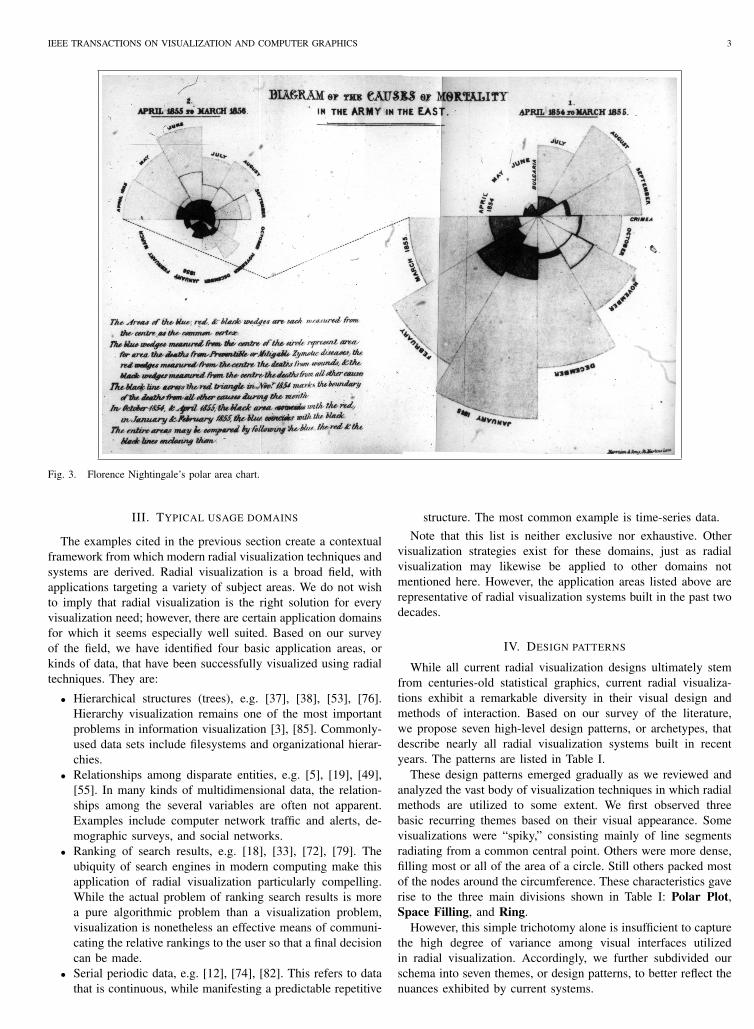
A variant of the pie chart was also used by Florence Nightin-gale [61] in the 1850s to communicate the poor sanitary condi-tions of British Army hospitals during the Crimean War. Eachwedge corresponds to one month, and the area of the wedgerepresents the total number of deaths incurred at the hospitalduring that month. The Nightingale chart, now known as a rosediagram or polar area chart, is chiefly different from a piechart in that each wedge of Nightingale’s chart is equiangular.Accordingly, the differences in area among wedges stem fromthe fact that each wedge has a different radius, rather than adifferent angular magnitude. In Figure 3, reprinted from [61], thelarge light-colored portion of each wedge shows the proportionof deaths in a given month that were due to preventable diseasesrather than wounds incurred in battle. The chart on the leftshows how the death rate dropped dramatically after Nightingaleimplemented sanitary reforms at the hospital.
B. Star plots
The star plot is another form of radial diagram that figuresprominently in statistical graphics. This form of chart is alter-nately known as a kiviat diagram or a spider web, and is designedfor viewing multivariate systems in a compact form. A star plotis constructed by mapping each variable to one of several axesradiating from a common center point. The axes are spacedequiangularly from each other, and the range of each variable isscaled such that each axis is of the same length. The data pointsare then drawn at their appropriate location on the axes, and lines
are drawn connecting them. Star plots are the radial equivalent ofparallel coordinates [40].
There are minor stylistic differences in the ways star plots maybe rendered. In one variant, like the one shown in Figure 4a,the axes are drawn but the circumference is not. Others draw thecircumference, but omit the axes (Figure 4b). Still other star plotsemploy a combination of these two extremes [25].
Moreover, multiple star plots may be superimposed to allowcomparisons among several distinct data sets with common fieldnames. This gives rise to a type of graphic called the radarplot [83]. Radar plots are most effective when the area enclosedby one entity is entirely contained within another area (Figure5) or when transparency is used, allowing comparison of relativeareas without occlusion.
C. Sociograms
One of the first modern applications of radial displays wasfor sociometry, “the study and measurement of interpersonalrelationships in a group of people [58].” The target sociogram,introduced by Northway [62], depicts people as small circles,and relationships between people as lines between those circles(Figure 6).
Radial visualization extends the radial display concept to in-clude the interactive manipulation of data. Most often, this meansthat the radial visualization has been implemented as part of acomputer program, but this is not necessarily so. For example,Northway [62] also discusses an interactive analog to the targetsociogram called the peg board sociogram (Figure 7). In it, thepeople are represented by pegs that may be moved anywhereon the board, and relationships are represented by rubber bandsstretched between pegs. In this manner, the placement of peopleand relationships can be modified interactively.
IEEE TRANSACTIONS ON VISUALIZATION AND COMPUTER GRAPHICS 3
Fig. 3. Florence Nightingale’s polar area chart.
III. TYPICAL USAGE DOMAINS
The examples cited in the previous section create a contextualframework from which modern radial visualization techniques andsystems are derived. Radial visualization is a broad field, withapplications targeting a variety of subject areas. We do not wishto imply that radial visualization is the right solution for everyvisualization need; however, there are certain application domainsfor which it seems especially well suited. Based on our surveyof the field, we have identified four basic application areas, orkinds of data, that have been successfully visualized using radialtechniques. They are:
• Hierarchical structures (trees), e.g. [37], [38], [53], [76].Hierarchy visualization remains one of the most importantproblems in information visualization [3], [85]. Commonly-used data sets include filesystems and organizational hierar-chies.
• Relationships among disparate entities, e.g. [5], [19], [49],[55]. In many kinds of multidimensional data, the relation-ships among the several variables are often not apparent.Examples include computer network traffic and alerts, de-mographic surveys, and social networks.
• Ranking of search results, e.g. [18], [33], [72], [79]. Theubiquity of search engines in modern computing make thisapplication of radial visualization particularly compelling.While the actual problem of ranking search results is morea pure algorithmic problem than a visualization problem,visualization is nonetheless an effective means of communi-cating the relative rankings to the user so that a final decisioncan be made.
• Serial periodic data, e.g. [12], [74], [82]. This refers to datathat is continuous, while manifesting a predictable repetitive
structure. The most common example is time-series data.Note that this list is neither exclusive nor exhaustive. Other
visualization strategies exist for these domains, just as radialvisualization may likewise be applied to other domains notmentioned here. However, the application areas listed above arerepresentative of radial visualization systems built in the past twodecades.
IV. DESIGN PATTERNS
While all current radial visualization designs ultimately stemfrom centuries-old statistical graphics, current radial visualiza-tions exhibit a remarkable diversity in their visual design andmethods of interaction. Based on our survey of the literature,we propose seven high-level design patterns, or archetypes, thatdescribe nearly all radial visualization systems built in recentyears. The patterns are listed in Table I.
These design patterns emerged gradually as we reviewed andanalyzed the vast body of visualization techniques in which radialmethods are utilized to some extent. We first observed threebasic recurring themes based on their visual appearance. Somevisualizations were “spiky,” consisting mainly of line segmentsradiating from a common central point. Others were more dense,filling most or all of the area of a circle. Still others packed mostof the nodes around the circumference. These characteristics gaverise to the three main divisions shown in Table I: Polar Plot,Space Filling, and Ring.
However, this simple trichotomy alone is insufficient to capturethe high degree of variance among visual interfaces utilizedin radial visualization. Accordingly, we further subdivided ourschema into seven themes, or design patterns, to better reflect thenuances exhibited by current systems.

IEEE TRANSACTIONS ON VISUALIZATION AND COMPUTER GRAPHICS 4
(a) Standard pie chart.
(b) Concentric pie chart.
Fig. 2. The pie chart. Notice that it is difficult to discern relative magnitudeamong similarly-sized entities.
TABLE IDESIGN PATTERNS FOR RADIAL VISUALIZATION
Pattern Examples
Polar Plot Tree [43], [53], [76]Star [33], [34], [71]
Space FillingConcentric [18], [49], [85]Spiral [12], [20], [82]Euler [5], [37], [59]
Ring Connected [19], [55], [69]Disconnected [9], [23], [74]
A. Polar Plot
The Polar patterns are divided into two camps, Tree and Star.In either one, the center of the graphic carries some specialmeaning. For example, it may represent the root node of a tree, theorigin of a coordinate system, or search terms in a query. Othernodes extend radially outward from the center. Unlike a star plot,the radii of a Polar Plot visualization are not necessarily all thesame length. The linear distance between a node and the centertypically carries some semantic significance. Furthermore, somemeaning is often ascribed to the size at which a node is rendered.
1) Tree pattern:Defining characteristics: Origin at or near center ofcanvas; line segments radiating outward from origin;
(a) Star plot with visible axes.
(b) Star plot with invisible axes.
Fig. 4. Two equivalent renderings of a star plot.
Fig. 5. Radar plot showing differences in relative area.

IEEE TRANSACTIONS ON VISUALIZATION AND COMPUTER GRAPHICS 5
Fig. 6. The target sociogram, an early example of radial display (reprintedfrom [62] by permission of University of Toronto Press).
Fig. 7. The peg board sociogram, an analog radial visualization (reprintedfrom [62] by permission of University of Toronto Press).
other segments branching off from these; may be nestedmany levels deep.Common uses: Viewing and browsing hierarchical datastructures, such as trees; viewing relationships amongdisparate entities.
The Tree pattern traces its roots to the radial graph layoutalgorithm used in some graph-drawing contexts. Early refer-ences to radial graph layouts include the “centrifugal represen-tation” of Carpano [13] and the “ring diagram” of Reggiani andMarchetti [66], as well as the influential work by Eades [24].Radial graph layouts are usually rendered in 2D, especially forinformation visualization contexts, but 3D variants also exist [14],[31], [44], [60], [67].
Fig. 8. MoireGraph (reprinted from [43]). c©2006 IEEE
Inspired in part by the artwork of M.C. Escher [32], theHyperbolic Browser [52]–[54] is a good example of an interactiveradial visualization that follows the Tree pattern. However, theHyperbolic Browser allows the display and navigation of manymore nodes than traditional tree layouts. This is done by layingout the hierarchy of the graph on the hyperbolic plane, whichis then rendered as a standard (Euclidean) circle. This has thedesirable effect that nodes on the periphery of the user’s area ofinterest appear smaller, allowing the user to focus on the nodeshe or she is most interested in, while still preserving the overallcontext of how the current node fits into the global topology ofthe graph.
Extending the concepts introduced by the Hyperbolic Browser,the MoireGraphs visualization by Jankun-Kelly and Ma [43]facilitates comparison among nodes at the same tree level. A keyidea to this end is their additional constraint that all nodes atthe same tree level must share the same radial distance from thecenter point (Figure 8). MoireGraphs also support a wider rangeof navigation techniques than the Hyperbolic Browser. Similarmethods can be found in the RINGS system [76]. Emphasizinginteractivity and efficient space usage, RINGS facilitates thebrowsing of large hierarchical structures such as filesystems.
Similar in appearance and spirit to Northway’s target so-ciograms (see Section II), Brandes et al. [8] present a diagramfor visualizing the communication patterns among organizationswithin a municipality (Figure 9). The radius of an icon is basedon the centrality, or importance, of that actor (entity) within theorganization. Directed edges between icons represent one-waycommunication; undirected edges denote two-way communica-tion. Additional semantic information is communicated by thesize, color, and shape of an individual icon. Interestingly, theangular position, or theta, of an icon is computed purely foraesthetics, and carries no direct semantic meaning. However, theindirect benefit is that it helps reduce edge-crossings, which wouldotherwise obscure meaning [65].
The Visual Thesaurus [77] from Thinkmap, Inc. is a commer-cial Java applet based on the Tree pattern. The user keys in aword, and the system responds with an animated visualization of

IEEE TRANSACTIONS ON VISUALIZATION AND COMPUTER GRAPHICS 6
Fig. 9. Policy network diagram (reprinted from [8]). c©2003 IEEE
Fig. 10. The Visual Thesaurus. (Image courtesy of Thinkmap, Inc.)
that word and all its synonyms arranged in a radial tree structure(Figure 10). The user can then further refine the query by selectingone of the nodes in the display.
2) Star pattern:Defining characteristics: Origin at or near center ofcanvas; line segments radiating outward from origin; nobranching.Common uses: Ranking of search results; viewingrelationships among disparate entities.
Our next design pattern is the Star pattern. The Star patternfinds its origins in the star plot, as discussed in Section II-B. Incontrast to the Tree pattern, in which there may be any number
Fig. 11. Starstruck, a thematic document visualization (reprinted from [34]).c©1998 IEEE
of intermediate nodes between the root and the leaves, systemsusing the Star pattern typically connect leaf nodes to the root witha single straight line segment. This is at once a simplification anda specialization. On the one hand, Star-based visualizations tendto be smaller and less visually complex than those employing theTree pattern. However, the Star pattern also offers less variety inits visual representation and affords fewer options for interactivity.
The Starstruck [34] system uses the Star pattern for showingrelationships among themes within a document. The center ofthe visualization represents a given document, and each theme isdepicted as a small icon at the end of a line segment emanatingfrom the center point. The length of the line represents thestrength of that theme in the document. The distance from oneline to another represents how closely the two themes are relatedone to another (Figure 11).
The Neighbourhood Explorer [71] system applies the Starpattern to the domain of real estate. It allows the user tobrowse through a graphical list of homes for sale. Multiple axesextend radially outward from a picture of a reference home inthe center of the visualization. Each axis represents a differenthome attribute, such as price, number of bedrooms, or acreage.Pictures of other homes are positioned on the axes based on howthey compare with respect to a selected attribute relative to thereference home. A comparison home can appear on more thanone axis.
In the Sparkler system [33], Havre et al. propose a Star-basedvisualization for performing queries on a collection of documents.Their visualization supports the depiction of multiple queries atonce. Icons representing the various queries are placed in thecenter of the graphic. The results to each query are representedas point-clusters at various radii around the circle. The distancebetween a particular result and its query icon indicates theestimated relevance of that result to the query.
Ishihara et al. [42] apply the Star pattern to the task ofdisplaying query results. As with other systems, the results arerendered as icons positioned at various distances from a centralnode. Their approach is distinguished from other systems in thatthe distance of each node to the center is based on the timestamprather than a qualitative measure of “relevance.” Less current
IEEE TRANSACTIONS ON VISUALIZATION AND COMPUTER GRAPHICS 7
Fig. 12. DataMeadow visualization showing multiple linked DataRoses(reprinted from [25]). c©2007 IEEE
results are rendered farther from the center.Star Coordinates [47] is another multidimensional visualization
strategy bearing a strong resemblance to the other Star-basedsystems described above. Likewise, Star Coordinates’ data pointsare plotted relative to one of several attribute axes. In contrast,however, the points are not guaranteed to fall within the rangesuggested by the length of the axis. Indeed, the points may lieanywhere in the graphic, so determining which attributes corre-spond to a given point can be ambiguous. This visualization thusbears some visual similarity to scatterplots [6]. Optionally, thepoints can be scaled and normalized to fit within the parametersof the axis.
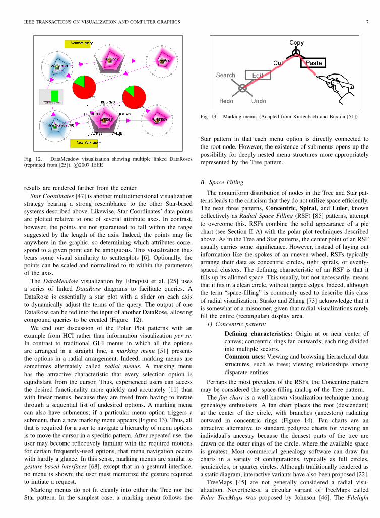
The DataMeadow visualization by Elmqvist et al. [25] usesa series of linked DataRose diagrams to facilitate queries. ADataRose is essentially a star plot with a slider on each axisto dynamically adjust the terms of the query. The output of oneDataRose can be fed into the input of another DataRose, allowingcompound queries to be created (Figure 12).
We end our discussion of the Polar Plot patterns with anexample from HCI rather than information visualization per se.In contrast to traditional GUI menus in which all the optionsare arranged in a straight line, a marking menu [51] presentsthe options in a radial arrangement. Indeed, marking menus aresometimes alternately called radial menus. A marking menuhas the attractive characteristic that every selection option isequidistant from the cursor. Thus, experienced users can accessthe desired functionality more quickly and accurately [11] thanwith linear menus, because they are freed from having to iteratethrough a sequential list of undesired options. A marking menucan also have submenus; if a particular menu option triggers asubmenu, then a new marking menu appears (Figure 13). Thus, allthat is required for a user to navigate a hierarchy of menu optionsis to move the cursor in a specific pattern. After repeated use, theuser may become reflectively familiar with the required motionsfor certain frequently-used options, that menu navigation occurswith hardly a glance. In this sense, marking menus are similar togesture-based interfaces [68], except that in a gestural interface,no menu is shown; the user must memorize the gesture requiredto initiate a request.
Marking menus do not fit cleanly into either the Tree nor theStar pattern. In the simplest case, a marking menu follows the
Fig. 13. Marking menus (Adapted from Kurtenbach and Buxton [51]).
Star pattern in that each menu option is directly connected tothe root node. However, the existence of submenus opens up thepossibility for deeply nested menu structures more appropriatelyrepresented by the Tree pattern.
B. Space Filling
The nonuniform distribution of nodes in the Tree and Star pat-terns leads to the criticism that they do not utilize space efficiently.The next three patterns, Concentric, Spiral, and Euler, knowncollectively as Radial Space Filling (RSF) [85] patterns, attemptto overcome this. RSFs combine the solid appearance of a piechart (see Section II-A) with the polar plot techniques describedabove. As in the Tree and Star patterns, the center point of an RSFusually carries some significance. However, instead of laying outinformation like the spokes of an uneven wheel, RSFs typicallyarrange their data as concentric circles, tight spirals, or evenly-spaced clusters. The defining characteristic of an RSF is that itfills up its allotted space. This usually, but not necessarily, meansthat it fits in a clean circle, without jagged edges. Indeed, althoughthe term “space-filling” is commonly used to describe this classof radial visualization, Stasko and Zhang [73] acknowledge that itis somewhat of a misnomer, given that radial visualizations rarelyfill the entire (rectangular) display area.
1) Concentric pattern:
Defining characteristics: Origin at or near center ofcanvas; concentric rings fan outwards; each ring dividedinto multiple sectors.Common uses: Viewing and browsing hierarchical datastructures, such as trees; viewing relationships amongdisparate entities.
Perhaps the most prevalent of the RSFs, the Concentric patternmay be considered the space-filling analog of the Tree pattern.
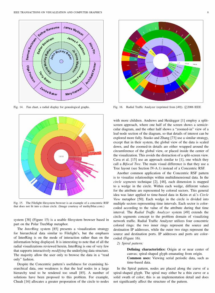
The fan chart is a well-known visualization technique amonggenealogy enthusiasts. A fan chart places the root (descendant)at the center of the circle, with branches (ancestors) radiatingoutward in concentric rings (Figure 14). Fan charts are anattractive alternative to standard pedigree charts for viewing anindividual’s ancestry because the densest parts of the tree aredrawn on the outer rings of the circle, where the available spaceis greatest. Most commercial genealogy software can draw fancharts in a variety of configurations, typically as full circles,semicircles, or quarter circles. Although traditionally rendered asa static diagram, interactive variants have also been proposed [22].
TreeMaps [45] are not generally considered a radial visu-alization. Nevertheless, a circular variant of TreeMaps calledPolar TreeMaps was proposed by Johnson [46]. The Filelight
IEEE TRANSACTIONS ON VISUALIZATION AND COMPUTER GRAPHICS 8
Fig. 14. Fan chart, a radial display for genealogical graphs.
Fig. 15. The Filelight filesystem browser is an example of a concentric RSFthat does not fit into a clean circle. (Image courtesy of methylblue.com.)
system [38] (Figure 15) is a usable filesystem browser based inpart on the Polar TreeMap metaphor.
The InterRing system [85] presents a visualization strategyfor hierarchical data similar to Filelight’s, but the emphasisof InterRing is on the mode of interaction rather than on theinformation being displayed. It is interesting to note that of all theradial visualizations reviewed herein, InterRing is one of very fewthat supports interactively modifying the underlying data structure.The majority allow the user only to browse the data in a “readonly” fashion.
Despite the Concentric pattern’s usefulness for examining hi-erarchical data, one weakness is that the leaf nodes in a largehierarchy tend to be rendered too small [85]. A number ofsolutions have been proposed to this problem. For example,Chuah [16] allocates a greater proporation of the circle to nodes
Fig. 16. Radial Traffic Analyzer (reprinted from [49]). c©2006 IEEE
with more children. Andrews and Heidegger [1] employ a split-screen approach, where one half of the screen shows a semicir-cular diagram, and the other half shows a “zoomed-in” view of aleaf-node section of the diagram, so that details of interest can beexplored more fully. Stasko and Zhang [73] use a similar strategy,except that in their system, the global view of the data is scaleddown, and the zoomed-in details are either wrapped around thecircumference of the global view, or placed inside the center ofthe visualization. This avoids the distraction of a split-screen view.Cava et al. [15] use an approach similar to [1], one which theycall a Bifocal Tree. The main visual difference is that they use aTree layout (see Section IV-A.1) instead of a Concentric RSF.
Another common application of the Concentric RSF patternis to visualize relationships within multidimensional data. In thecircle segments technique [2], [48], each dimension is mappedto a wedge in the circle. Within each wedge, different valuesfor the attribute are represented by colored sectors. This generalidea was later applied to time-based data in Keim et al.’s CircleView metaphor [50]. Each wedge in the circle is divided intomultiple sectors representing time intervals. Each sector is color-coded according to the value of the attribute during that timeinterval. The Radial Traffic Analyzer system [49] extends thecircle segments concept to the problem domain of visualizingnetwork traffic. Radial Traffic Analyzer utilizes four concentriccolored rings: the two inner rings represent the source anddestination IP addresses, while the outer two rings represent thesource and destination ports. IP addresses and ports are color-coded (Figure 16).
2) Spiral pattern:
Defining characteristics: Origin at or near center ofcanvas; spiral-shaped glyph emanating from origin.Common uses: Viewing serial periodic data, such astime-based data.
In the Spiral pattern, nodes are placed along the curve of aspiral-shaped glyph. The spiral may either be a thin curve or asolid swath of color; this is an implementation detail and doesnot significantly affect the structure of the pattern.

IEEE TRANSACTIONS ON VISUALIZATION AND COMPUTER GRAPHICS 9
Fig. 17. Radial visualization of serial periodic data (Adapted from Carlisand Konstan [12]).
In the definitive paper on Spiral RSFs, Carlis and Konstan [12]observe that by arranging serial periodic data in a spiral shape,certain patterns in the periodicity of the data are easier to detectthan in traditional line-plot diagrams.1 Their definition of serialperiodic data is data that “has a serial (continuous) dimension thatexhibits periodicity.” Examples of serial periodic data include thegrowth rate of trees, students’ time allocation throughout theiracademic careers, or even the regular, predictable progression oftones from one octave to another on a piano keyboard. Carlisand Konstan’s visualization places serial data along the curve ofa spiral, but enforces that each “period” of the data occupy onecomplete revolution of the spiral, with corresponding elementswithin each period occupying the same angle. Carlis and Konstanuse a diagram similar to Figure 17 to track the annual feedingpatterns of chimpanzees. The twelve axes correspond to thetwelve months in a year, with each complete loop correspondingto one year. By following one axis from the center outward, onecan see the data’s variance over a number of years at the sametime each year.
The SpiralView system [7] uses a similar visualization, butapplies it to the problem of monitoring alerts on a computernetwork. By employing a periodic Spiral layout, SpiralViewenables analysts to spot recurring patterns of network activity.
An even earlier example of a Spiral interface can be foundin the NIRVE system [18] for displaying results of a document-based search. It introduces several motifs that would appear inlater efforts; namely, the placement of more relevant results nearthe center of the display. However, NIRVE uses a 3D approach,which means some results will obscure others, and parallax isnecessary to derive meaningful information. This visualizationhas also been criticized for using space inefficiently [72].
Torres et al. [79] use a radial visualization to browse resultsfrom an image-based search engine. In contrast to many currentimage search engines, the terms of the query itself are images,
1The use of spirals to visualize periodic data was re-introduced in 2001 byWeber et al. [82]. Although topically quite similar to Carlis and Konstan’s1998 paper, Weber et al. do not reference it, so one may surmise that bothgroups likely invented spiral graphs independently.
not text. Hence, the search compares how similar the resultantimages are to the reference (query) image. In their prototypeimplementation, the user can select either a Concentric interfaceor a Spiral interface. In either case, those images that resemblethe reference image more strongly appear closer to the center ofthe display.
RankSpiral [72] is another spiral interface for search engines.As with Torres et al. [79], the top search results appear near thecenter of the visualization. An interesting feature of RankSpiralis that the title of each web page found in the search is displayedalongside the icon representing the page. Occlusion events areaverted by widening the spiral sufficiently to accommodate thetitle text.
Spiral RSFs have also found application in portable devices andambient systems [64]. In one of the first applications of radialvisualization to handheld computers, the SpiraList system [39]applies a Spiral layout to the problem of locating people in ahandheld computing device’s address book. Taking advantage ofthe device’s touchscreen capability, a thumb is used to scrollthrough names in the address book. In the SpiraClock ambientsystem by Dragicevic and Huot [20], the familiar metaphor ofan analog clock face is mapped to a Spiral RSF. SpiraClockdisplays upcoming events around the circumference of a spiral,and continuously updates them to reflect the passage of time.SpiraClock has the additional benefit that it does not require agreat deal of screen real estate to be effective, and can run as asmall applet or widget in the periphery of the user’s workspace.
Despite its name, the Spiral Calendar system [57] is a Spiralinterface only in the loosest sense [12]. In this case, the spiralshape is just a decorative side effect; it is not central to theinterpretation of the data nor the interactivity of the system. TheSpiral Calendar shows a 3D view of a calendar widget spiralingtowards the viewer, progressing from coarse to fine resolution (i.e.years, months, weeks, days).
3) Euler pattern:Defining characteristics: Multiple circles placed inside(or adjacent to) a larger circle; may be nested manylevels deep.Common uses: Viewing and browsing hierarchical datastructures, such as trees; viewing relationships amongdisparate entities.
The third RSF design pattern is the Euler pattern, which isessentially the interactive analog to the Euler diagram [4].
The Zoomology system [37] is the archetypal example of theEuler pattern for radial visualization of hierarchical data. Incontrast to the more common approach of placing the root node inthe center of the visualization, Zoomology treats the outer ring asthe root, with the child nodes embedded within. In general, eachnode’s children are rendered as inner circles. The user interfacepermits the user to zoom into any section of the diagram (hencethe name). The authors compare the operation of zooming intoever-smaller rings to “flying through a tunnel,” suggesting theimportance of smooth animation to preserve the user’s sense ofcontext from one level of detail to the next.
Combining the ideas of Zoomology with MoireGraphs [43], theMoireTrees system [59] also supports the notion of zooming intoone of several child nodes. However, MoireTrees aims to preservean even greater sense of context than Zoomology. Specifically,for any node in the hierarchy, MoireTrees displays the entire pathfrom the root node to the current node. Each time the user drills
IEEE TRANSACTIONS ON VISUALIZATION AND COMPUTER GRAPHICS 10
down one level into the hierarchy, the previous level is shownas a ring encompassing the current level. Thus, after multipleexpansions, the path from the current node to the root is shownas a series of concentric rings around the circumference of thedisplay (Figure 18).
Although originally conceived as a 3D tree layout algorithm, a2D mapping of the PhylloTrees method [14] yields a space-fillingradial diagram consisting of tightly-packed nodes. Its algorithmis based on phyllotactic patterns found in nature; e.g. the arrange-ment of seeds in a sunflower head [81].
In an interesting spin on the Euler pattern, Van Berendonck andJacobs’ Bubbleworld system [5] is designed to display results ofqueries on a collection of documents. In contrast to Zoomology,Bubbleworld uses clusters of adjacent rings (or “bubbles”) on aplane to denote relationships among topics. Key words from theuser’s search terms are positioned as nodes around the bubble,and icons of various shapes and colors are clustered withinthe bubble’s interior to show the results of the query. Iconsare positioned inside the bubble according to the relevance oftheir underlying document to a specific key word. The user canrefine a query, spawning additional bubbles which are renderedtangentially to a key word on the parent bubble’s circumference.In this way, the visualization provides an explicit trail of whichkey words link to related queries.
We close our discussion of the RSF patterns by briefly men-tioning a space-filling variant of the marking menu. Known as apie menu,2 its options are rendered as wedges rather than edgesand vertices. Pie menus closely resemble pie charts, and do notfit cleanly into any of the three RSF patterns.
C. Ring-based
Our last two design patterns for radial visualizations are theConnected Ring and Disconnected Ring patterns. The Ringpatterns borrow ideas from both the Polar Plot and Space Fillingpatterns. As in the RSFs, the visualization is usually constrainedto fit inside the confines of a circle. Nodes of interest areplaced around the circumference of a ring. The center point ofthe circle usually has little significance on its own, althoughadditional information may nonetheless be displayed within thering’s interior.
1) Connected Ring pattern:Defining characteristics: Nodes positioned around cir-cumference of ring; line segments connecting nodes;additional nodes optionally appear in ring’s interior.Common uses: Viewing relationships among disparateentities.
The most common application of the Connected Ring patternis to show relationships among nodes in a data set. This informa-tion is typically shown by visually linking data points together.Typically the links are rendered as line segments between twonodes, although spline-based curves are also sometimes used.
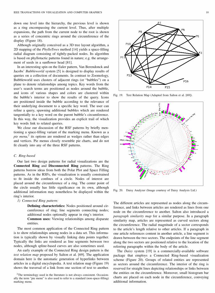
An early example of the Connected Ring design pattern is thetext relation map proposed by Salton et al. [69]. The applicationdomain here is the automatic generation of hyperlinks betweenarticles in a digital encyclopedia. A text relation map (Figure 19)shows the traversal of a link from one section of text to another.
2The terminology used in the literature is not always consistent. Occasion-ally the term “pie menu” is also used to refer to a standard (non-space-filling)marking menu.
Fig. 19. Text Relation Map (Adapted from Salton et al. [69]).
Fig. 20. Daisy Analyzer (Image courtesy of Daisy Analysis Ltd.)
The different articles are represented as nodes along the circum-ference, and links between articles are rendered as lines from onenode on the circumference to another. Salton also introduced aparagraph similarity map for a similar purpose. In a paragraphsimilarity map, articles are represented as curved sectors alongthe circumference. The radial magnitude of a sector correspondsto the article’s length relative to other articles. If a paragraph inone article references content in another article, a line segment isdrawn between the two sectors. The endpoints of the line segmentalong the two sectors are positioned relative to the location of thereferring paragraphs within the body of the article.
The Daisy system [19] is a commercially-available softwarepackage that employs a Connected Ring-based visualizationscheme (Figure 20). Groups of related entities are representedas sectors around the circumference. The interior of the ring isreserved for straight lines depicting relationships or links betweenthe entities on the circumference. Moreover, small histogram barcharts are placed on each node in the circumference, conveyingadditional information.

IEEE TRANSACTIONS ON VISUALIZATION AND COMPUTER GRAPHICS 11
Fig. 18. Browsing a tree structure using MoireTrees (reprinted from [59]). c©2005 IEEE
NetMap [30] is another commercial visualization system, de-signed primarily for law enforcement agencies, insurance compa-nies, or other organizations that need to find links among largevolumes of disparate data. NetMap’s visualization metaphor issimilar to Daisy’s, in many respects, in that related variables aregrouped sequentially around the circumference of a ring. As withDaisy, a line is drawn between two nodes to indicate a relationshipbetween them. However, NetMap does not include histogramsalong the circumference.
Tominski et al. [78] introduce two multidimensional radialvisualizations, the TimeWheel and the MultiComb. In MultiComb,multiple variable plots are arranged around a circle. MultiCombsupports two arrangements of the plots. In one case, the plots runparallel to the circumference of the circle. In the other, the plotsextend outward from the center of the circle (Figure 21a), similarto Daisy’s histograms. In TimeWheel, an axis representing an in-dependent variable (such as time) is placed in the center, and axesrepresenting multiple dependent variables are positioned aroundthe central axis, forming an approximate ellipse (Figure 21b).Relations between the dependent and independent variables arerendered as colored lines.
In the Connected Ring visualizations discussed thus far, theprimary means of correlating data points is to draw a line betweena node on one position of the circumference to another nodeelsewhere on the circumference. While this is effective for manyapplications, one drawback to this approach is that the interior ofthe ring becomes a veritable cloud of intersecting lines, makingcertain relationships difficult to spot.
TimeWheel, as described above, addresses this issue somewhatby connecting points on the circumference to a central node in thering’s interior, rather than to other points on the circumference.This reduces the average length of the line segments, which inturn reduces the visual clutter of the interface.
The VisAlert system [29], [55], [56] takes this approach onestep further. The problem domain of VisAlert is computer networkintrusion detection. The interior of the ring is reserved for aschematic of the network topology, while possible alerts areplaced around the circumference. For each alert experienced by anode on the network, a line is drawn connecting the alert’s iconto the affected node’s icon (Figure 22). By placing additionalinformation (i.e. the network map) inside the ring, this area istransformed from a passive zone of connecting lines, to a canvason which important domain-specific data is displayed.
The Manager’s Dartboard system [21] employs a visualizationmetaphor similar to VisAlert’s, but with a greater emphasis oninteractivity. Queries are initiated by dragging an icon from thecircumference into the ring’s interior. Line segments are thenrendered, connecting the icon(s) in the interior to icon(s) on thecircumference wherever a relationship exists between the entitiesrepresented by the icons.
(a) MultiComb.
(b) TimeWheel.
Fig. 21. Two visualizations for multidimensional visualization (Adapted fromTominski et al. [78]).
Regardless of whether the lines converge on the ring’s cir-cumference (as in Daisy [19] and NetMap [30]) or in the ring’sinterior (as in VisAlert [55] and Manager’s Dartboard [21]), onemust ask how a system that relies on converging line segmentsto indicate correlation can avoid eventual scalability issues as thenumber of nodes and lines grows. One approach to this problem,suggested by Holten [36], is to “bundle” similar edges togethernear the center of the circle, and branch out gradually towardthe circumference (Figure 23). The edges are rendered as B-spline curves so that the branches appear less abrupt to the humaneye. (A similar bundling technique is often employed by airlineroute maps, in which a vast majority of flights originate from arelatively small number of “hub” cities.)
We close our discussion of Connected Ring systems withexamples of this pattern applied to 3D. Most 3D radial systemsare graph-drawing implementations and therefore are instances ofthe Tree pattern. However, the problem domain of representing

IEEE TRANSACTIONS ON VISUALIZATION AND COMPUTER GRAPHICS 12
Fig. 22. VisAlert’s user interface (reprinted from [56]). c©2005 IEEE
Fig. 23. Bundling edges to reduce visual clutter (reprinted from [36]). c©2006IEEE
geographic relationships on a world map is a natural fit both forthe Connected Ring pattern and for 3D. The GeoSOM systemby Wu and Takatsuka [84] has been used to visualize the flowof international trade, however, each country’s position on themap is determined by similarity in attributes rather than actualgeographic location. The VIBall system [88] takes a somewhatdifferent approach. It depicts Internet traffic between countries asa series of lines projected onto a geographically-accurate worldmap. In contrast to many 3D visualization applications, VIBall isa true 3D interface: two video projectors are used for displayingthe map of the world onto a white plastic sphere. The sphere isset up on rollers, so that it can be rotated via direct manipulation,and the projected display is updated appropriately.
2) Disconnected Ring pattern:
Defining characteristics: Nodes positioned around cir-
Fig. 24. Viewing poll results for a given subpopulation.
cumference of ring; additional nodes optionally appearin ring’s interior.Common uses: Viewing relationships among disparateentities.
The Disconnected Ring pattern emerged in response to the in-evitable scalability issues associated with rendering links betweenicons. Even with the edge-bundling technique [36] describedin the previous section, eventually the display becomes toocluttered as the number of edges increases. This, then, is thebasic difference of the Disconnected Ring pattern: no explicitlinks are rendered. It follows that the icons themselves must bearthe burden of communicating salient information about the data,either through their shape, position, color, or labels.
A recent example of the Disconnected Ring pattern is theSQiRL system [23]. Designed to visualize the results of opinionpolls, a percentage breakdown of respondents’ answers to selectedquestions is placed around the circumference. By default, thepercentages reflect the survey population as a whole, but specificsubpopulations can be designated by placing icons representingrefinement criteria within the ring’s interior (Figure 24).
The Event Tunnel system [74] exhibits many of the qualitiesof a Disconnected Ring pattern, but extends them to 3D. Theapplication domain here is the visualization of tasks’ progressover time. Each unit of time (for example, a day) is representedas a ring, with the rings stacked so as to form a cylinder. Ateach level of the ring, icons representing simultaneous events areplaced around the circumference. The cylinder is oriented towardsthe display such that the user looks “down” the cylinder, withrecent events closer to the front and past events stretching awayinto the distance. Related events are grouped by color. In this way,the user can see how long a particular task took, and whetherits progress was continuous or punctuated with bursts of activitybetween periods of inactivity.
We conclude our discussion of the Disconnected Ring patternwith two more examples of radial widgets taken from the broaderfield of HCI. In a novel alternative to the traditional calendarwidget, Brewer et al. [9] introduce a ring-based navigation widget(Figure 25) as part of their geographic information browser

IEEE TRANSACTIONS ON VISUALIZATION AND COMPUTER GRAPHICS 13
Fig. 25. A radial date-selection widget (reprinted from [9]). c©2000 IEEE
system. This widget displays controls for selecting the month anddate in concentric rings, thus allowing the user to select any datein the year via a compact radial interface. Moreover, by displayingevery month and date in a unified space, the user avoids havingto traverse a linear sequence of months as in a typical calendarwidget.
A radial menu that exhibits some qualities of the DisconnectedRing pattern is the tracking menu [28]. Similar in appearance toa marking menu or a pie menu, the tracking menu places iconsfor one kind of functionality around the circumference of themenu, while reserving the interior area of the menu for supportiveoptions.
Table II presents a mapping of the design patterns proposed inthis section to the usage scenarios reviewed in Section III. Wehave provided references to example systems where the patternsand applications coincide. It should be noted that some systemsmay exhibit attributes of more than one pattern. In these cases,we identify it with the pattern that, in our judgment, is the mostdominant. An empty cell in Table II simply means that we did notfind a matching system in our search, not that a certain patternis inherently unfit for any particular purpose. On the contrary,gaps in this table merely suggest opportunities for future research.For example, it is conceivable that a system using the ConnectedRing pattern could be used for visualizing hierarchical structuresor search results, but to our knowledge this has not yet beenattempted.
V. DESIGN DIMENSIONS
The patterns in Section IV describe the visual themes prevalentin recent radial visualization systems. In this section, we focus onvarious design dimensions [64] that system builders must considerin architecting new systems. These dimensions (or choices) are
more abstract than the patterns, and consider not only the arrange-ment of widgets on a display, but the needs of the applicationareas for which current systems are built. The dimensions are:
• Unit of visualization• Significance of centroid• Level of interactivity• Access permissions• 2D versus 3DWhile it might seem counterintuitive to introduce these dimen-
sions after the presentation of the design patterns, we believethat an understanding of the basic themes and usage scenarios ofexisting radial visualization systems is prerequisite to appreciatingthe issues surrounding the application of the design dimensions.The systems mentioned in Section IV each address these con-siderations in their own way. Some of these dimensions may beapplicable to information visualization systems in general, but wefocus the present discussion to their specific application to radialvisualization. We now describe each dimension in more detail,and discuss their relationship to the design patterns introduced inthe previous section.
A. Unit of visualization
The unit of visualization, in this context, refers to the graphicalcomponents that make up the radial visualization. Among thesystems surveyed herein, we have already seen a great deal ofdiversity with respect to this dimension.
For example, in most instances of the Tree and Star patterns,the basic units are glyphs connected by line segments. Exam-ples include Starstruck [34], MoireGraphs [43], and HyperbolicBrowser [53]. This approach is likewise used by some instancesof the Spiral RSF pattern, such as the prototype by Carlisand Konstan [12]. Line segments are also a central feature ofsystems using the Connected Ring pattern, like VisAlert [55] andDaisy [19].
Other systems use glyphs or icons to represent nodes, butrely on position and proximity to communicate relationshipswith other data points, rather than connecting line segments. Themost obvious example from traditional statistical graphics is thescatterplot [6]. This approach is likewise employed by a numberof the systems reviewed herein, across a spectrum of designpatterns. However, it is perhaps most evident in the Euler RSFpattern, which by definition consists of a collection of disjointnodes. See for example, Zoomology [37] and PhylloTrees [14].Moreover, the Spiral RSF pattern is also compatible with thisapproach; in these instances, the spiral shape is implicit in thepositioning of the nodes rather than by an explicit spiral glyph.See, for example, RankSpiral [72] and SpiralView [7]. Systemsusing the Disconnected Ring pattern also rely on the position,size, and shape of glyphs to communicate information.
The third basic unit of visualization employed by radial visu-alization system is the sector. In most instances, the sectors donot stand alone, but are placed adjacent to other sectors to forma complete ring. Sectors are used primarily in the ConcentricRSF pattern to form the concentric rings that make up thecircle. Typically, systems using this pattern are designed to fill acomplete circle, with no gaps. However, this is not necessarily thecase. The Filelight system [38] is an example of a Concentric RSFthat does not require the circle to be complete. In most examplesof the Ring patterns (both Connected and Disconnected), the rings

IEEE TRANSACTIONS ON VISUALIZATION AND COMPUTER GRAPHICS 14
TABLE IITYPICAL APPLICATIONS OF RADIAL DESIGN PATTERNS
Tree Star Concentric Spiral Euler Connected DisconnectedHierarchical structures [53], [76] - [22], [38], [85] - [37], [59] - -Ranking of search results - [33], [34], [42] [79] [18], [72], [79] [5] - -Serial periodic data - - - [12], [82] - - [74]Relationships amongdisparate entities
[77] [71] [49] - - [19], [30], [55],[69]
[23]
themselves consist of discrete sectors. A notable exception is theEvent Tunnel [74], in which the rings are rendered as thin circlesupon which small spherical icons are positioned.
In addition to selecting the unit of visualization from anaesthetic standpoint, builders of radial visualization systems mustalso consider the units’ representational fidelity [64]. For example,will the units — glyphs, icons, or sectors — represent entities(rows) or attributes (columns) in a database? Will they representnumeric quantities, textual results, or abstract concepts? Since thedisplay area of any information visualization system is limited, thechoice made here can greatly affect the visualization’s scalability.
B. Significance of centroidThe next design dimension is concerned with what role, if any,
the centroid (or center point) of the display canvas will play inthe semantics of the visualization. This dimension most directlyrelates to the Tree, Star, Concentric, and Spiral patterns. Intraditional graph visualization, the center point usually representsthe root node of a tree. In some systems, such as Visual The-saurus [77] and Neighbourhood Explorer [71], the central noderepresents a frame of reference against which connected nodesmay be compared. Alternately, the center of the graphic mayprovide a descriptive context for the remainder of the diagram.For example, although not shown in Figure 16, the innermostcircle of the Radial Traffic Analyzer [49] sometimes contains thename of the geographic region whose network traffic is currentlybeing visualized. In many time-series spiral visualizations [12],[82], the center of the spiral denotes the starting point of thetime interval under consideration. As one can see, the meaningof the centroid is domain-specific, and varies across applicationsand design patterns.
In the systems which adhere to the Connected Ring andDisconnected Ring patterns, the ring’s interior space is typicallyreserved for application-specific purposes. In diagrams such as thetext relation map [69] and commercial systems like Daisy [19] andNetMap [30], the interior of the ring is occupied by line segmentsconnecting related nodes on the circumference. VisAlert [55]instead uses the area inside the ring to render a network topologymap. Systems like Manager’s Dartboard [21] and SQiRL [23] putno information in the ring’s interior by default, instead reservingthat space for user-specified queries. Strictly speaking, the EventTunnel [74] leaves the interior of the ring completely empty, butdue to the necessary projection of the 3D cylinder onto a 2Ddisplay area, in practice the interior space of each ring is filledwith the projection of the rings beneath it.
It is worth noting that although current instantiations of theConnected Ring and Disconnected Ring patterns have placedmore emphasis on the interior of the ring as a whole, rather thanon the exact centroid, these were implementation-specific designchoices, not a requirement of the patterns. Future systems builtusing these patterns may well ascribe specific meanings to thering’s center point.
C. Level of interactivity
Interactivity plays an important role in any information visual-ization method, and radial visualization is no exception. From ouranalysis of the systems surveyed herein, we conclude that none ofthe radial design patterns are intrinsically “better” for interactiveapplications than another. In general, each pattern can either beused as a standalone static graphic, or as part of an interactivesystem.
Yang et al. [85] suggest five interaction techniques for radialvisualization. Although these operations were originally proposedin the context of RSF-based systems for visualizing hierarchicaldata, the principles behind them extend to the other designpatterns as well. The operations are: selection, the process ofselecting certain nodes for further operations; reconfiguration,the process of modifying the data; distortion, the process of tem-porarily enlarging certain objects of the display while maintainingcontext; drill-down/roll-up, the process of exposing/hiding nodesin the display; and pan, zoom, and rotation, the process ofmodifying the focus, scale, and orientation of the display.
Most of the systems surveyed in Section IV support oneor more of these operations. For instance, systems that usethe Tree pattern will often support a combination of distortionand drill-down/roll-up techniques to permit smooth browsing oflarge hierarchies. MoireGraphs [43] and RINGS [76] are typicalexamples. Visualizations designed for viewing search results, suchas RankSpiral [72], generally permit the selection of responsesfor further analysis. As a typical example of the Connected Ringpattern, the VisAlert system [55] allows the user to pan and zoomthe network map inside the ring’s interior, as well as expand andcollapse sectors along the circumference.
D. Access permissions
For many radial visualization tasks, the goal is to view andcomprehend the data, not necessarily modify it. Hence, read-onlyaccess to the underlying data is sufficient. Our survey of radialvisualization techniques confirms this assumption. We found veryfew systems that support the interactive editing of data. Twoexceptions are InterRing [85] and Manager’s Dartboard [21].This does not necessarily mean that other systems do not haveediting features, just that we were unable to determine it fromtheir published descriptions. Note, however, that a visualizationsystem’s lack of “write” access to the data should not be construedas an inherent weakness. It is often the case that the integrity ofthe visualization requires that the user not be able to modify thedata. This is true for many types of data, for example, electionresults, census data, network traffic, etc. System builders mustconsider the problem domain and intended purpose of a proposedradial visualization system before deciding whether to incorporateediting operations into the user interface.

IEEE TRANSACTIONS ON VISUALIZATION AND COMPUTER GRAPHICS 15
E. 2D versus 3D
The debate over 2D versus 3D methods for information vi-sualization remains unresolved [17], [75]. Nevertheless, a vastmajority of radial visualization systems available today, bothacademic and commercial, are based on a 2D design. Those thatdo support 3D are chiefly implementations of novel tree layoutalgorithms, such as Cone Trees [67] and PhylloTrees [14]. Aspreviously mentioned, the VIBall [88] is unique in that it is atactile 3D system, rather than a 2D projection of a 3D image. Webelieve that the perceived bias towards 2D interfaces for radialvisualization is due in large part to the formidable occlusion issuesrelated to 3D graphics [26].
VI. LOOKING FORWARD
The dimensions outlined in Section V, coupled with thecontents of Table II, suggest that the design space for radialvisualization has not yet been fully explored. New visualizationsystems can be created by applying one or more patterns tonew problem domains. For example, recent work by Burch andDiehl [10] combines elements from both the Concentric RSFand Connected Ring patterns to visualize dynamic compounddigraphs. Future systems of this type may justify the inclusionof a new design pattern into the taxonomy presented herein.
Thus, we do not claim that the seven design patterns presentedherein encompass the entire range of possibilities for radialvisualization. It is a relatively young discipline, and only in recentyears has it made significant inroads into the broader field ofinformation visualization. By considering the design dimensionsoutlined in Section V and applying these choices to new data sets,future system builders will create additional radial visualizationswhich go beyond the design patterns described in this work.
The visualization of hierarchical data is an important topicin information visualization, so we expect that those designpatterns which lend themselves to hierarchical data (namely, Treeand Concentric RSF) will continue to see widespread use andextension. We foresee that future radial visualization systemswill be able to visualize ever larger hierarchies. However, we donot expect the resolution of commodity display screens to growdramatically in the near future. Rather, we anticipate that improve-ments in the capacity of radial visualization systems will be dueto the development of new techniques for distortion and drill-down/roll-up, coupled with normal increases in computationalpower.
Regarding the dimension of interactivity [87], we likewiseexpect this to improve in many ways. More and more ra-dial visualization will be done via collaborative tabletop inter-faces [41], portable computers, and touchscreen displays. Wedo not expect these interaction techniques to supplant the desk-top mouse/keyboard paradigm; this will remain a good generalpurpose platform for everyday tasks. Rather, we expect thatadvanced visualization applications will gradually migrate to morespecialized devices.
The sheer abundance of systems utilizing some form of radialvisualization would suggest that users find this approach satisfy-ing; however, some quantitative usability studies have also beendone. Barlow and Neville [3] report a study in which users wereable to navigate a hierarchical data set more quickly using a radialchart than with other tree representations. In addition, Vliegen etal. [80] suggest that radially-rendered TreeMaps leverage users’familiarity with pie charts, thus lowering the barriers to their
acceptance. A usability test conducted by Yee et al. [86] indicatesthat radial animation helps users maintain context better thanlinear animation in the same visualization. Certain ring-basedvisualizations [21], [23] were also shown to be easy to learnfor novice users, while still providing valuable insights into thedata. These results, while compelling, are not enough. Additionalquantitative evaluations of radial visualization methods are neededto shed further light on the general and specific effectiveness ofthese techniques. This is a valid avenue for further research inthis area.
VII. CONCLUSION
Although radial visualization is becoming an increasinglycommon metaphor in information visualization, the underlyingconcepts trace their origins to the well-established field of sta-tistical graphics. In this paper, we have examined recent workin radial visualization from three perspectives. First, we lookat the kinds of problems for which radial visualization hasbeen used. Second, we propose seven design patterns for radialvisualization, based on our analysis of current systems. Third,we suggest five dimensions, or design choices, that builders ofradial visualizations must consider in creating new systems. Weconclude by offering insights regarding how radial visualizationtechniques may be extended in the future.
We envisage that this survey will raise the community’s aware-ness of radial visualization and elevate it from an interestingvisual gimmick employed in an ad hoc manner by a handful ofinformation visualization systems, to a bona fide methodology inits own right. While no single approach is right for every problem,researchers may wish to consider the unique properties of theradial metaphor in designing future visualizations. We hope thatthe analysis and taxonomy presented herein will motivate andfacilitate continued research in the creative development of thisconstantly evolving collection, leading to new schemes that betterserve the manifold challenges in information visualization.
ACKNOWLEDGMENT
This work was supported in part by the Scientific Computingand Imaging Institute at the University of Utah, and by the AirForce Research Laboratory, of the United States Air Force, AirForce Material Command, of the U.S. Department of Defenseunder Contract No. F30602-03-C-0257 through the Advanced Re-search and Activity’s (ARDA) Advanced Intelligence CommunityInformation Assurance Research Thrust. Additional support wasgiven by the Graduate School and School of Computing at theUniversity of Utah. We also thank the anonymous reviewers fortheir insightful suggestions which greatly improved this paper.
REFERENCES
[1] K. Andrews and H. Heidegger. Information slices: Visualising andexploring large hierarchies using cascading, semi-circular discs. InInfoVis 1998 Late Breaking Hot Topic Papers, pages 9–12, 1998.
[2] M. Ankerst, D. A. Keim, and H.-P. Kriegel. Circle segments: Atechnique for visually exploring large multidimensional data sets. InIEEE Visualization ’96, Hot Topic Session, 1996.
[3] T. Barlow and P. Neville. A comparison of 2-d visualizations ofhierarchies. In InfoVis 2001, pages 131–138, 2001.
[4] M. E. Baron. A note on the historical development of logic diagrams:Leibniz, euler and venn. The Mathematical Gazette: The Journal of theMathematical Association, 53(384):113–125, May 1969.

IEEE TRANSACTIONS ON VISUALIZATION AND COMPUTER GRAPHICS 16
[5] C. V. Berendonck and T. Jacobs. Bubbleworld: a new visual informationretrieval technique. In APVis ’03: Proceedings of the Asia-Pacificsymposium on Information visualisation, pages 47–56, Darlinghurst,Australia, Australia, 2003. Australian Computer Society, Inc.
[6] J. Bertin. Semiology of Graphics. University of Wisconsin Press, 1984.[7] E. Bertini, P. Hertzog, and D. Lalanne. SpiralView: Towards Security
Policies Assessment through Visual Correlation of Network Resourceswith Evolution of Alarms. In IEEE Symposium on Visual AnalyticsScience and Technology (VAST 2007), volume 2, pages 139–146, Oct.2007.
[8] U. Brandes, P. Kenis, and D. Wagner. Communicating centrality inpolicy network drawings. IEEE Transactions on Visualization andComputer Graphics, 9(2):241–253, Apr. 2003.
[9] I. Brewer, A. M. MacEachren, H. Abdo, J. Gundrum, and G. Otto.Collaborative geographic visualization: enabling shared understandingof environmental processes. In InfoVis 2000, pages 137–141, 2000.
[10] M. Burch and S. Diehl. Timeradartrees: Visualizing dynamic compounddigraphs. In Proceedings of Tenth Joint Eurographics/IEEE-VGTCSymposium on Visualization (EuroVis2008), 2008.
[11] J. Callahan, D. Hopkins, M. Weiser, and B. Shneiderman. An empiricalcomparison of pie vs. linear menus. In CHI ’88: Proceedings of theSIGCHI conference on Human factors in computing systems, pages 95–100, New York, NY, USA, 1988. ACM.
[12] J. V. Carlis and J. A. Konstan. Interactive visualization of serial periodicdata. In UIST ’98: Proceedings of the 11th annual ACM symposium onUser interface software and technology, pages 29–38, New York, NY,USA, 1998. ACM Press.
[13] M.-J. Carpano. Automatic display of hierarchized graphs for computer-aided decision analysis. IEEE Transactions on Systems, Man, andCybernetics, SMC-10(11):705–715, Nov. 1980.
[14] S. Carpendale and A. Agarawala. Phyllotrees: Harnessing naturesphyllotactic patterns for tree layout. In InfoVis 2004, pages p3–p3, 2004.
[15] R. A. Cava, P. R. G. Luzzardi, and C. M. D. S. Freitas. The bifocal tree:a technique for the visualization of hierarchical information structures.In Workshop on Human Factors in Computer Systems (IHC 2002), 2002.
[16] M. C. Chuah. Dynamic aggregation with circular visual designs. InInfoVis 1998, pages 35–43, 151, 1998.
[17] A. Cockburn. Revisiting 2d vs 3d implications on spatial memory. InProceedings of the fifth conference on Australasian user interface, pages25–31, 2004.
[18] J. Cugini, C. Piatko, and S. Laskowski. Interactive 3D Visualization forDocument Retrieval. In Proceedings of the Workshop on New Paradigmsin Information Visualization and Manipulation , ACM Conference onInformation and Knowledge Management (CIKM ’96), 1996.
[19] Daisy Analysis Ltd. Daisy 2003. http://www.daisy.co.uk/. Accessed 14November 2007.
[20] P. Dragicevic and S. Huot. SpiraClock: a continuous and non-intrusivedisplay for upcoming events. In CHI ’02: CHI ’02 extended abstracts onHuman factors in computing systems, pages 604–605, New York, NY,USA, 2002. ACM Press.
[21] G. Draper, Y. Livnat, and R. Riesenfeld. A visual query languagefor correlation discovery and management. In Proceedings of the 2ndAnnual Visual and Iconic Language Conference (VaIL 2008), pages 14–23, 2008.
[22] G. M. Draper and R. F. Riesenfeld. Interactive fan charts: A space-savingtechnique for genealogical graph exploration. In 8th Annual Workshopon Technology for Family History and Genealogical Research, Provo,Utah, USA, 2008. Brigham Young University.
[23] G. M. Draper and R. F. Riesenfeld. Who Votes for What? A VisualQuery Language for Opinion Data. IEEE Transactions on Visualiza-tion and Computer Graphics (Proceedings Visualization / InformationVisualization 2008), 14(6):1197–1204, November-December 2008.
[24] P. Eades. Drawing free trees. In Bulletin of the Institute of Combinatoricsand its Applications, pages 10–36, 1992.
[25] N. Elmqvist, J. Stasko, and P. Tsigas. DataMeadow: A Visual Canvasfor Analysis of Large-Scale Multivariate Data. In IEEE Symposium onVisual Analytics Science and Technology (VAST 2007), volume 2, pages187–194, Oct. 2007.
[26] N. Elmqvist and P. Tsigas. A taxonomy of 3d occlusion management forvisualization. Visualization and Computer Graphics, IEEE Transactionson, 14(5):1095–1109, Sept.-Oct. 2008.
[27] P. M. Fitts. The information capacity of the human motor system incontrolling the amplitude of movement. In Journal of ExperimentalPsychology, pages 381–391, 1954.
[28] G. Fitzmaurice, A. Khan, R. Pieke, B. Buxton, and G. Kurtenbach.Tracking menus. In UIST ’03: Proceedings of the 16th annual ACM
symposium on User interface software and technology, pages 71–79,New York, NY, USA, 2003. ACM.
[29] S. Foresti, J. Agutter, Y. Livnat, S. Moon, and R. Erbacher. Visual cor-relation of network alerts. IEEE Computer Graphics and Applications,26(2):48–59, March/April 2006.
[30] J. Galloway and S. J. Simoff. Network data mining: methods andtechniques for discovering deep linkage between attributes. In APCCM’06: Proceedings of the 3rd Asia-Pacific conference on Conceptual mod-elling, pages 21–32, Darlinghurst, Australia, Australia, 2006. AustralianComputer Society, Inc.
[31] M. Gross, T. Sprenger, and J. Finger. Visualizing information on asphere. In InfoVis 1997, pages 11–16, 1997.
[32] B. Grunbaum. Mathematical Challenges in Escher’s Geometry. InH. S. M. Coxeter, M. Emmer, R. Penrose, and M. L. Teuber, editors, M.C. Escher: Art and Science: Proceedings of the International Congresson M.C. Escher, pages 53–67, New York, NY, USA, 1985. ElsevierScience Pub. Co.
[33] S. Havre, E. Hetzler, K. Perrine, E. Jurrus, and N. Miller. Interactivevisualization of multiple query results. In InfoVis 2001, pages 105–112,2001.
[34] B. Hetzler, P. Whitney, L. Martucci, and J. Thomas. Multi-faceted insightthrough interoperable visual information analysis paradigms. In InfoVis1998, pages 137–144, 161, 1998.
[35] P. Hoffman, G. Grinstein, K. Marx, I. Grosse, and E. Stanley. DNAvisual and analytic data mining. In VIS ’97: Proceedings of the 8thconference on Visualization ’97, pages 437–ff., Los Alamitos, CA, USA,1997. IEEE Computer Society Press.
[36] D. Holten. Hierarchical edge bundles: Visualization of adjacencyrelations in hierarchical data. In InfoVis 2006, pages 741–748, 2006.
[37] J. Y. Hong, J. DAndries, M. Richman, and M. Westfall. Zoomology:Comparing two large hierarchical trees. In Poster Compendium of IEEEInformation Visualization (2003), 2003.
[38] M. Howell. Filelight. http://www.methylblue.com/filelight/. Accessed 15 August 2007.
[39] S. Huot and E. Lecolinet. SpiraList: a compact visualization techniquefor one-handed interaction with large lists on mobile devices. InNordiCHI ’06: Proceedings of the 4th Nordic conference on Human-computer interaction, pages 445–448, New York, NY, USA, 2006. ACMPress.
[40] A. Inselberg and B. Dimsdale. Parallel coordinates: a tool for visualizingmulti-dimensional geometry. In IEEE Visualization ‘90, pages 361–378,1990.
[41] P. Isenberg and S. Carpendale. Interactive tree comparison for co-located collaborative information visualization. IEEE Transactions onVisualization and Computer Graphics, 13(6):1232–1239, Nov. 2007.
[42] M. Ishihara, K. Misue, and J. Tanaka. Ripple presentation for treestructures with historical information. In APVIS ’06: Proceedings of theAsia Pacific symposium on Information visualisation, pages 153–160,Darlinghurst, Australia, Australia, 2006. Australian Computer Society,Inc.
[43] T. Jankun-Kelly and K.-L. Ma. Moiregraphs: radial focus+contextvisualization and interaction for graphs with visual node. In InfoVis2003, pages 59–66, 2003.
[44] C.-S. Jeong and A. Pang. Reconfigurable disc trees for visualizing largehierarchical information space. In InfoVis 1998, pages 19–25, 1998.
[45] B. Johnson and B. Shneiderman. Tree-Maps: a space-filling approachto the visualization of hierarchical information structures. In VIS ’91:Proceedings of the 2nd conference on Visualization ’91, pages 284–291,Los Alamitos, CA, USA, 1991. IEEE Computer Society Press.
[46] B. S. Johnson. Treemaps: Visualizing Hierarchical and CategoricalData. PhD thesis, University of Maryland, 1993.
[47] E. Kandogan. Visualizing multi-dimensional clusters, trends, and outliersusing star coordinates. In KDD ’01: Proceedings of the seventh ACMSIGKDD international conference on Knowledge discovery and datamining, pages 107–116, New York, NY, USA, 2001. ACM Press.
[48] D. A. Keim. Information visualization and visual data mining. IEEETransactions on Visualization and Computer Graphics, 8(1):1–8, Jan.2002.
[49] D. A. Keim, F. Mansmann, J. Schneidewind, and T. Schreck. Monitoringnetwork traffic with radial traffic analyzer. In 2006 IEEE SymposiumOn Visual Analytics Science And Technology (VAST), pages 123–128,2006.
[50] D. A. Keim, J. Schneidewind, and M. Sips. CircleView: a new approachfor visualizing time-related multidimensional data sets. In AVI ’04:Proceedings of the working conference on Advanced visual interfaces,pages 179–182, New York, NY, USA, 2004. ACM Press.

IEEE TRANSACTIONS ON VISUALIZATION AND COMPUTER GRAPHICS 17
[51] G. Kurtenbach and W. Buxton. The limits of expert performance usinghierarchic marking menus. In CHI ‘93, pages 482–487, 1993.
[52] J. Lamping and R. Rao. Laying out and visualizing large trees usinga hyperbolic space. In UIST ’94: Proceedings of the 7th annual ACMsymposium on User interface software and technology, pages 13–14,New York, NY, USA, 1994. ACM.
[53] J. Lamping and R. Rao. The hyperbolic browser: A focus+contexttechnique based on hyperbolic geometry for visualizing large hierarchies.Journal of Visual Languages and Computing, 7:33–55, 1996.
[54] J. Lamping, R. Rao, and P. Pirolli. A focus+context technique basedon hyperbolic geometry for visualizing large hierarchies. In CHI’95: Proceedings of the SIGCHI conference one Human factors incomputing systems, pages 401–408, New York, NY, USA, 1995. ACMPress/Addison-Wesley Publishing Co.
[55] Y. Livnat, J. Agutter, S. Moon, R. F. Erbacher, and S. Foresti. Avisualization paradigm for network intrusion detection. In Proceedingsof the 2005 IEEE Workshop on Information Assurance and Security,pages 30–37, 2005.
[56] Y. Livnat, J. Agutter, S. Moon, and S. Foresti. Visual correlation forsituational awareness. In InfoVis 2005, pages 95–102, 2005.
[57] J. D. Mackinlay, G. G. Robertson, and R. DeLine. Developing calendarvisualizers for the information visualizer. In UIST ’94: Proceedingsof the 7th annual ACM symposium on User interface software andtechnology, pages 109–118, New York, NY, USA, 1994. ACM Press.
[58] Merriam-Webster, Inc. Merriam-Webster Online Dictionary.http://www.m-w.com/. Accessed 9 August 2007.
[59] M. J. Mohammadi-Aragh and T. Jankun-Kelly. Moiretrees: Visualizationand interaction for multi-hierarchical data. In K. W. Brodlie, D. J.Duke, and K. I. Joy, editors, EuroGraphics - IEEE VGTC Symposiumon Visualization, pages 59–66, 2005.
[60] T. Munzner. H3: Laying Out Large Directed Graphs in 3D HyperbolicSpace. In InfoVis 1997, pages 2–10, 1997.
[61] F. Nightingale. Notes on matters affecting the health, efficiency, andhospital administration of the British army : founded chiefly on theexperience of the late war. London: Harrison and Sons, 1858.
[62] M. L. Northway. A Primer of Sociometry. University of Toronto Press,2nd edition, 1967.
[63] W. Playfair. The statistical breviary; shewing, on a principle entirelynew, the resources of every state and kingdom in Europe; illustrated withstained copper plate charts, representing the physical powers of eachdistinct nation with ease and perspicuity. To which is added, a similarexhibition of the ruling powers of Hindoostan. London: for J. Wallis,1801.
[64] Z. Pousman and J. Stasko. A taxonomy of ambient information systems:four patterns of design. In AVI ’06: Proceedings of the workingconference on Advanced visual interfaces, pages 67–74, New York, NY,USA, 2006. ACM.
[65] H. Purchase. Which aesthetic has the greatest effect on human under-standing? In GD ’97: Proceedings of the Fifth International Symposiumon Graph Drawing, pages 248–261, 1997.
[66] M. G. Reggiani and F. E. Marchetti. A proposed method for representinghierarchies. IEEE Transactions on Systems, Man, and Cybernetics,18(1):2–8, Jan. 1989.
[67] G. G. Robertson, J. D. Mackinlay, and S. K. Card. Cone trees: animated3d visualizations of hierarchical information. In CHI ’91: Proceedings ofthe SIGCHI conference on Human factors in computing systems, pages189–194, New York, NY, USA, 1991. ACM Press.
[68] D. Rubine. Specifying gestures by example. In SIGGRAPH ‘91, pages329–337, 1991.
[69] G. Salton, J. Allan, C. Buckley, and A. Singhal. Automatic analysis,theme generation, and summarization of machine-readable texts. Sci-ence, 264(5164):1421–1426, 1994.
[70] I. Spence. No humble pie: The origins and usage of a statistical chart.Journal of Educational and Behavioral Statistics, 30(4):353–368, 2005.
[71] R. Spence. Information Visualization, pages 85–88. ACM Press, 1stedition, 2001.
[72] A. Spoerri. RankSpiral: Toward Enhancing Search Results Visualiza-tions. In InfoVis 2004, 2004.
[73] J. Stasko and E. Zhang. Focus+context display and navigation techniquesfor enhancing radial, space-filling hierarchy visualizations. In InfoVis2000, pages 57–65, 2000.
[74] M. Suntinger, H. Obweger, J. Schiefer, and M. E. Groller. The eventtunnel: Interactive visualization of complex event streams for businessprocess pattern analysis. Visualization Symposium, 2008. PacificVIS ’08.IEEE Pacific, pages 111–118, March 2008.
[75] M. Tavanti and M. Lind. 2d vs 3d, implications on spatial memory. InInfoVis 2001, pages 139–145, 2001.
[76] S. T. Teoh and K.-L. Ma. RINGS : A Technique for Visualizing LargeHierarchies. In Graph Drawing 2002, pages 268–275, Berlin, 2002.Springer-Verlag.
[77] Thinkmap, Inc. Visual Thesaurus. http://www.visualthesaurus.com/. Accessed 26 August 2007.
[78] C. Tominski, J. Abello, and H. Schumann. Axes-based visualizationswith radial layouts. In SAC ’04: Proceedings of the 2004 ACMsymposium on Applied computing, pages 1242–1247, New York, NY,USA, 2004. ACM Press.
[79] R. S. Torres, C. G. Silva, C. B. Medeiros, and H. V. Rocha. Visualstructures for image browsing. In CIKM ’03: Proceedings of the twelfthinternational conference on Information and knowledge management,pages 49–55, New York, NY, USA, 2003. ACM Press.
[80] R. Vliegen, J. J. van Wijk, and E.-J. van der Linden. Visualizing businessdata with generalized treemaps. In InfoVis 2006, pages 789–796, 2006.
[81] H. Vogel. A Better Way to Construct the Sunflower Head. 44:179–189,1979.
[82] M. Weber, M. Alexa, and W. Muller. Visualizing time-series on spirals.In InfoVis 2001, pages 7–13, 2001.
[83] L. Wilkinson. The Grammar of Graphics (Statistics and Computing).Springer, 1st edition, 1999.
[84] Y. Wu and M. Takatsuka. Visualizing multivariate network on the surfaceof a sphere. In Proceedings of the 2006 Asia-Pacific Symposium onInformation Visualization (APVIS2006), 2006.
[85] J. Yang, M. O. Ward, and E. A. Rundensteiner. InterRing: an interactivetool for visually navigating and manipulating hierarchical structures. InInfoVis 2002, pages 77–84, 2002.
[86] K.-P. Yee, D. Fisher, R. Dhamija, and M. Hearst. Animated explorationof dynamic graphs with radial layout. In InfoVis 2001, pages 43–50,2001.
[87] J. S. Yi, Y. ah Kang, J. T. Stasko, and J. A. Jacko. Toward a deeper un-derstanding of the role of interaction in information visualization. IEEETransactions on Visualization and Computer Graphics, 13(6):1224–1231, Nov. 2007.
[88] B. Yip, S. Goyette, and C. Madden. Visualising internet traffic datawith three-dimensional spherical display. In APVis ’05: Proceedings ofthe 2005 Asia-Pacific symposium on Information Visualisation, pages153–158, Darlinghurst, Australia, Australia, 2005. Australian ComputerSociety, Inc.

IEEE TRANSACTIONS ON VISUALIZATION AND COMPUTER GRAPHICS 18
Geoffrey M. Draper is a PhD candidate in computerscience at the University of Utah. His researchinterests include information visualization, human-computer interaction, graphics, and vintage com-puting. He recently accepted a faculty position incomputer science at Brigham Young University–Hawaii.
Yarden Livnat is a research scientist at the Scien-tific Computing and Imaging Institute at the Univer-sity of Utah. His research interests include visualanalytics with emphasis on situational awareness,scientific visualization, and software common com-ponents architecture. Livnat has a PhD in computerscience from the University of Utah.
Richard F. Riesenfeld is a professor of computerscience at the University of Utah, where he joinedthe faculty in 1972. Computer-aided geometric de-sign and computer graphics are his research spe-cialties. Riesenfeld received the PhD degree fromthe School of Computer and Information Science atSyracuse University in 1973.