ielts diagram - alonot.com · web viewthe diagram illustrates the way the water supply system...
TRANSCRIPT
IELTS DIAGRAM
IELTS Diagram: Introduction and Overview
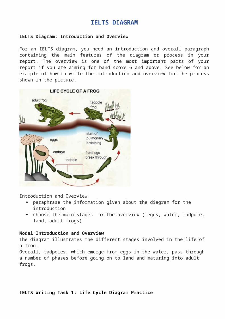
For an IELTS diagram, you need an introduction and overall paragraph containing the main features of the diagram or process in your report. The overview is one of the most important parts of your report if you are aiming for band score 6 and above. See below for an example of how to write the introduction and overview for the process shown in the picture.
Introduction and Overview paraphrase the information given about the diagram for the introduction choose the main stages for the overview ( eggs, water, tadpole, land, adult frogs)
Model Introduction and OverviewThe diagram illustrates the different stages involved in the life of a frog. Overall, tadpoles, which emerge from eggs in the water, pass through a number of phases before going on to land and maturing into adult frogs.
IELTS Writing Task 1: Life Cycle Diagram Practice
Below is an IELTS writing task 1 life cycle diagram model answer and practice. You will see how to write an introduction and overview for a diagram report.
IELTS Diagram Model Answer & Practice
This gap fill gives the first two paragraphs of the above IELTS practice diagram. Use the words listed to fill in the gaps.
wing fix spot remain hatch end behind stage emerge eggs lay structure elytra finish curl over
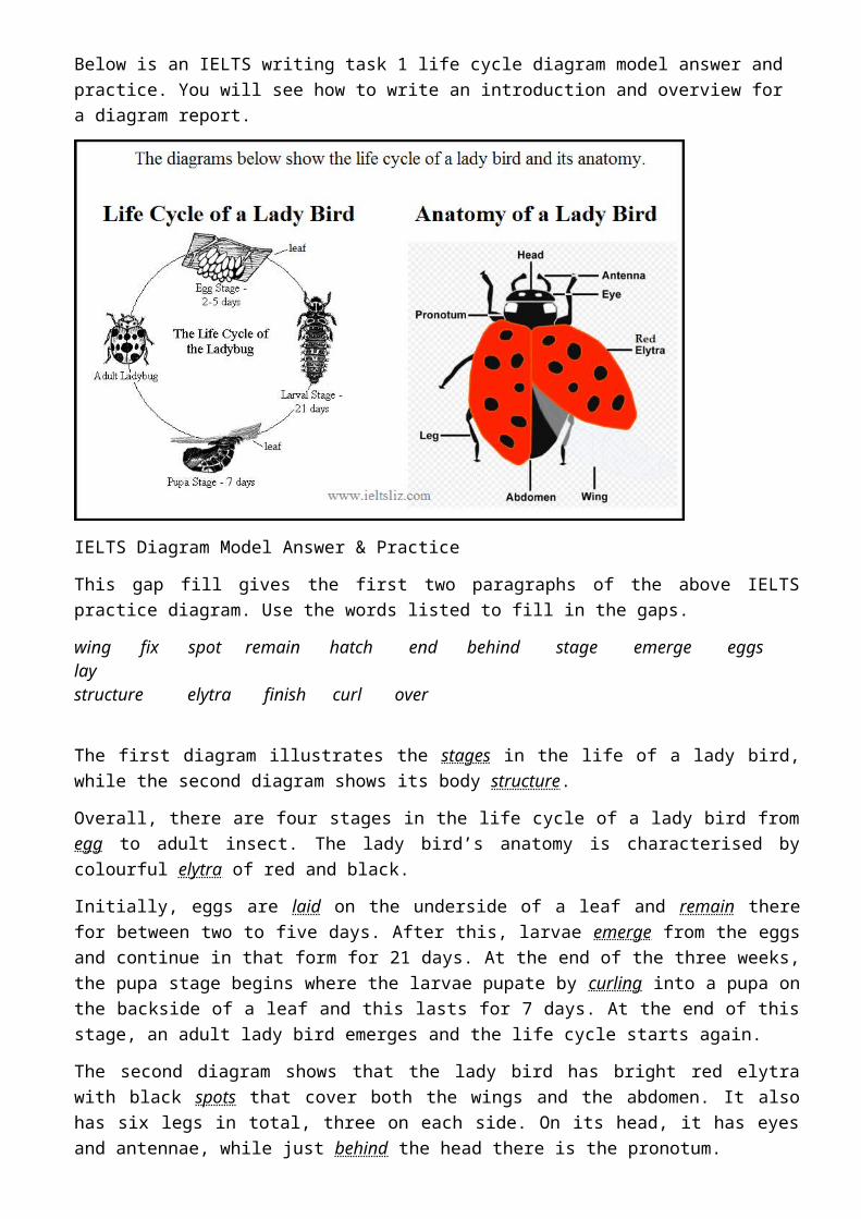
The first diagram illustrates the stages in the life of a lady bird, while the second diagram shows its body structure.
Overall, there are four stages in the life cycle of a lady bird from egg to adult insect. The lady bird’s anatomy is characterised by colourful elytra of red and black.
Initially, eggs are laid on the underside of a leaf and remain there for between two to five days. After this, larvae emerge from the eggs and continue in that form for 21 days. At the end of the three weeks, the pupa stage begins where the larvae pupate by curling into a pupa on the backside of a leaf and this lasts for 7 days. At the end of this stage, an adult lady bird emerges and the life cycle starts again.
The second diagram shows that the lady bird has bright red elytra with black spots that cover both the wings and the abdomen. It also has six legs in total, three on each side. On its head, it has eyes and antennae, while just behind the head there is the pronotum.
(186)
IELTS Water Cycle Diagram:

You should put the following information in each paragraph:
Introduction: You need to introduce the content of the diagram (the process of the water cycle).Overview: Put the key stages in this statement (a continual cycle of evaporation, cloud formation, rain and water returning to the sea).Body paragraph A: Water in the ocean, evaporation, condensing water vapour and cloud formation.Body Paragraph B: Precipitation, rain or snow, lakes, surface run off, ground water, impervious layer and salt water intrusion. You also need to note that at the water cycle starts again as the water returns to the ocean.For the body paragraphs, you need to describe each stage in detail using full sentences linked together. You should divide the body into two or three paragraphs for all diagrams.
Example: Introduction and Overview
The diagram illustrates the key stages in the water cycle.
Overall, the water cycle is a continual process of water evaporating and forming clouds which then return the water to the land and sea in the form of rain.
Note: You can see that the introduction is short and brief. You can see that the overview contains the key words as well as the key stages in summary.It is possible to put these two sentences into one paragraph.
IELTS Rainwater DiagramReported in 2015 and 2018 in the IELTS writing task 1 test.
IELTS Rainwater Diagram
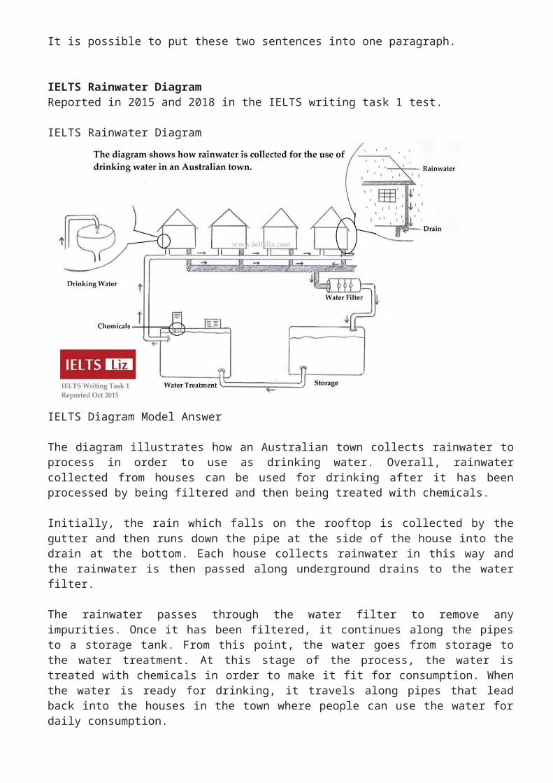
IELTS Diagram Model Answer
The diagram illustrates how an Australian town collects rainwater to process in order to use as drinking water. Overall, rainwater collected from houses can be used for drinking after it has been processed by being filtered and then being treated with chemicals.
Initially, the rain which falls on the rooftop is collected by the gutter and then runs down the pipe at the side of the house into the drain at the bottom. Each house collects rainwater in this way and the rainwater is then passed along underground drains to the water filter.
The rainwater passes through the water filter to remove any impurities. Once it has been filtered, it continues along the pipes to a storage tank. From this point, the water goes from storage to the water treatment. At this stage of the process, the water is treated with chemicals in order to make it fit for consumption. When the water is ready for drinking, it travels along pipes that lead back into the houses in the town where people can use the water for daily consumption.
IELTS Diagram - Practice Exercise
Fill in the gaps in the paragraph below with the appropriate article or correct form of the noun (a / an / the / nothing / plural).
The diagram below shows how hydro-electric power is generated.

Example
(1) ……..…..(Electricity) is generated by (2) ….….…..(water) passing through(3) ….….….….(turbine).
Answers:(1) Electricity (no article and no plural)(2) water (no article and no plural)(3) a turbine (we must use an article here as this is a countable noun and we are introducing it for the first time)
Diagram Exercise:
It can be seen that (1) ……………………(evaporation) is caused by (2) ………………….(sun’s heat) and results in (3) …………….(cloud formation) which later leads to (4) …………….. (rain). As rain falls, it is collected in (5) ………………… (reservoir) which is controlled by (6) ………….(dam). The flow of the water from (7) ……………(dam), is controlled by (8) ………….. (valve) which opens and closes to allow water to flow to (9) ………….. (turbine) below for (10) ………… (production) of electricity.
AnswersIt can be seen that (1) evaporation is caused by (2) the sun’s heat and results in (3) cloud formation which later leads to (4) rain. As rain falls, it is collected in (5) a reservoir which is controlled by (6) a dam. The flow of the water from (7) the dam, is controlled by (8) a valve which opens and closes to allow water to flow to (9) a turbine below for (10) the production of electricity.
IELTS Water Supply Diagram
The IELTS diagram below shows two diagrams in two different time periods.
Model Answer: Water Supply Diagram
The diagram illustrates the way the water supply system currently works in Australia and the plans for future changes. Overall, the main change in the future water supply system is based on recycling water for use in the city.
The current water supply system shows that pure water is stored in a dam before being transferred to a city to be used by households, shops and factories. From the city, storm water is directed straight into the river whereas waste water is sent to the water treatment plant to be processed. After the waste water is treated, it is safe to be released into the river.
Regarding the future water supply system, it can be seen that the storage of pure water in the dam and the uses of it in the city are the same as the previous system. However, both the storm water
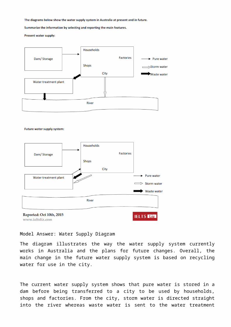
and waste water from the city are to be directed to the water treatment plant for processing after which they will both be recycled back for use in the city. It is planned that no water will be released into the river.
(187)
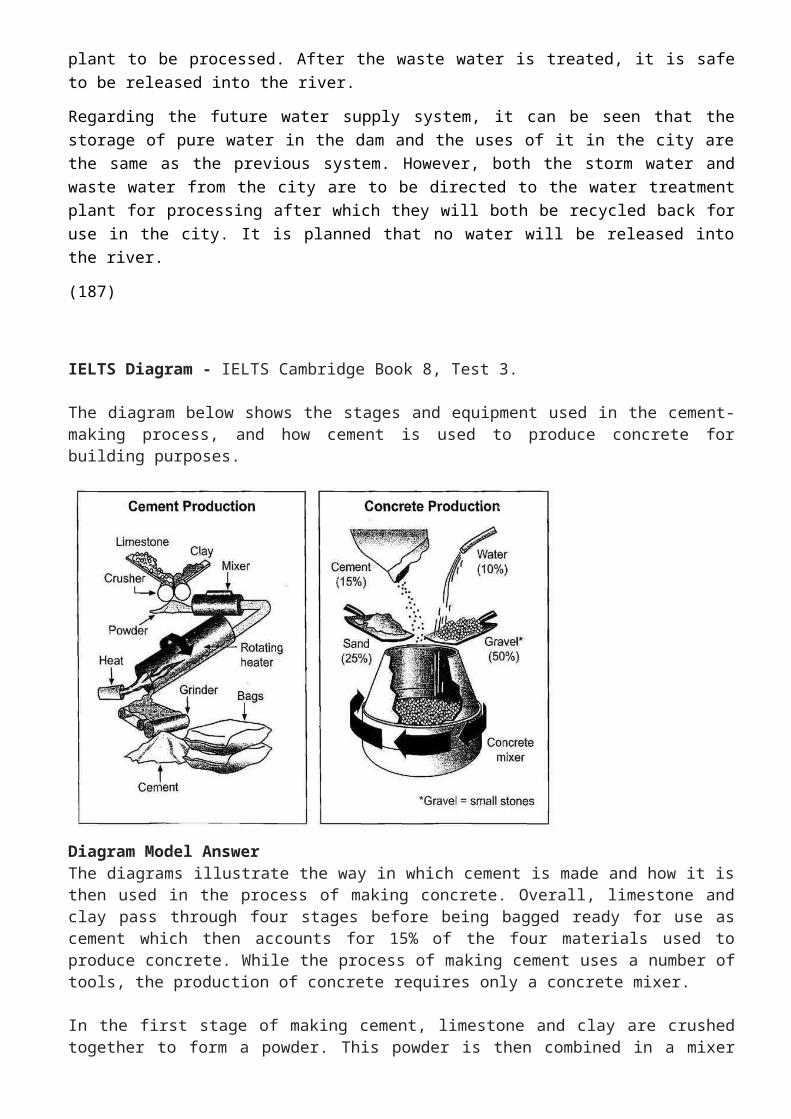
IELTS Diagram - IELTS Cambridge Book 8, Test 3.
The diagram below shows the stages and equipment used in the cement-making process, and how cement is used to produce concrete for building purposes.
Diagram Model AnswerThe diagrams illustrate the way in which cement is made and how it is then used in the process of making concrete. Overall, limestone and clay pass through four stages before being bagged ready for use as cement which then accounts for 15% of the four materials used to produce concrete. While the process of making cement uses a number of tools, the production of concrete requires only a concrete mixer.
In the first stage of making cement, limestone and clay are crushed together to form a powder. This powder is then combined in a mixer before passing into a rotating heater which has constant heat applied at one end of the tube. The resulting mixture is ground in order to produce cement. The final product is afterwards put into bags ready to be used.
Regarding the second diagram, concrete consists of mainly gravel, which is small stones, and this makes up 50% of the ingredients. The other materials used are sand (25%), cement (15%) and water (10%). These are all poured into a concrete mixer which continually rotates to combine the materials and ultimately produces concrete.
Comments: This diagram gives a concise introduction. The overview contains key features of both diagrams and also highlights the connection between them. The body paragraphs are organised well and linking devices are used flexibly and accurately. Each body paragraphs explained the steps of each process in a logical order. Complex sentences are accurate and there is also passive voice used. Collocations are well used.
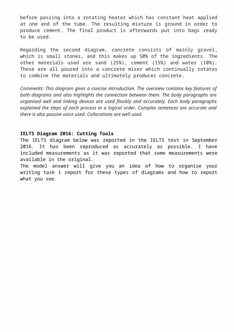
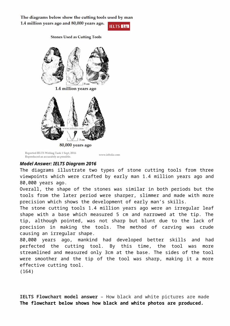
IELTS Diagram 2016: Cutting ToolsThe IELTS diagram below was reported in the IELTS test in September 2016. It has been reproduced as accurately as possible. I have included measurements as it was reported that some measurements were available in the original.The model answer will give you an idea of how to organise your writing task 1 report for these types of diagrams and how to report what you see.
Model Answer: IELTS Diagram 2016The diagrams illustrate two types of stone cutting tools from three viewpoints which were crafted by early man 1.4 million years ago and 80,000 years ago. Overall, the shape of the stones was similar in both periods but the tools from the later period were sharper, slimmer and made with more precision which shows the development of early man’s skills.The stone cutting tools 1.4 million years ago were an irregular leaf shape with a base which measured 5 cm and narrowed at the tip. The tip, although pointed, was not sharp but blunt due to the lack of precision in making the tools. The method of carving was crude causing an irregular shape.80,000 years ago, mankind had developed better skills and had perfected the cutting tool. By this time, the tool was more streamlined and measured only 3cm at the base. The sides of the tool were smoother and the tip of the tool was sharp, making it a more effective cutting tool.(164)
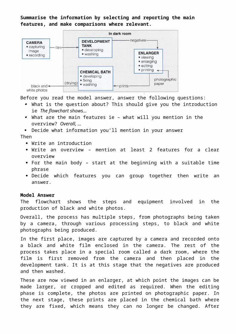
IELTS Flowchart model answer – How black and white pictures are madeThe flowchart below shows how black and white photos are produced.
Summarise the information by selecting and reporting the main features, and make comparisons where relevant.
Before you read the model answer, answer the following questions: What is the question about? This should give you the introduction ie The flowchart shows… What are the main features ie – what will you mention in the overview? Overall, … Decide what information you’ll mention in your answer
Then Write an introduction Write an overview – mention at least 2 features for a clear overview For the main body – start at the beginning with a suitable time phrase Decide which features you can group together then write an answer.
Model AnswerThe flowchart shows the steps and equipment involved in the production of black and white photos.
Overall, the process has multiple steps, from photographs being taken by a camera, through various processing steps, to black and white photographs being produced.
In the first place, images are captured by a camera and recorded onto a black and white film enclosed in the camera. The rest of the process takes place in a special room called a dark room, where the film is first removed from the camera and then placed in the development tank. It is at this stage that the negatives are produced and then washed.
These are now viewed in an enlarger, at which point the images can be made larger, or cropped and edited as required. When the editing phase is complete, the photos are printed on photographic paper. In the next stage, these prints are placed in the chemical bath where they are fixed, which means they can no longer be changed. After being washed and dried, the finished black and white photographs are removed from the dark room.
(182)
IELTS MAP
IELTS Map:
Useful Map Languagenorth south east west north east, south-east, north-west, south-westX is located in the north east of the town.The population of Y is 60,000.Y has a population of 60,000.X is located to the north east of Y, which has a population of 60,000.The railway (main road) runs through / crosses / passes through /goes through Y.A is located in the town center which has a railway running through it from north to south.B is situated in the north east of the town just outside the housing area.Paraphrases for MapsBe careful with paraphrases. Most words in the key do not need to be paraphrased.
town center = city center / center of the town (a town is not a city, don’t try to paraphrase the word town)road = street (road and street are different)housing area = residential areais located = is situated / lies / is
Model Writing Task 1: Map Comparison
The maps illustrate how Meadowside village and Fonton, which is a neighbouring town, have developed over three different time periods (1962, 1985 and the present).
Overall, Meadowside village increased in size and has become Meadowside Suburb as it merged together with Fonton. Furthermore, there have been significant changes in infrastructure, housing and facilities over the period given.
In 1962, both Meadowside and Fonton were completely separate with no roads or rail connecting them. While Fonton had a railway line running through it to the north, Meadowside, located to the west of Fonton, only had a small road from the west.
By 1985, there was a considerable growth in the size of Meadowside village and Fonton. The small road in Meadowside village had been converted into a main road and was also extended to the east to connect with Fonton. Meadowside, moreover, had also developed a housing estate in the west, a leisure complex and a supermarket in the south.
Currently, both Meadowside, which is now a suburb, and Fonton are joined. The railway line, which runs through Fonton, has been extended to the west where a train station has been built. To the north of the station, a hotel has been constructed and opposite the station, to the south, there is now a business park.
IELTS LINE GRAPH
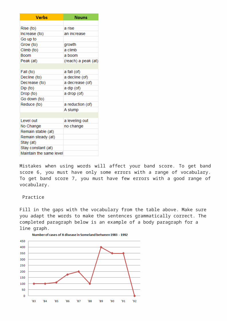
Vocabulary for IELTS Writing Task 1 Line Graph
This lesson looks at some essential words to describe a line graph in IELTS writing task 1. To get a good band score you must show the examiner a range of different words to show upward and downward trends. IELTS line graphs show change over a period of time and you must vary your language when you write your report.
Line Graph Vocabulary

Mistakes when using words will affect your band score. To get band score 6, you must have only some errors with a range of vocabulary. To get band score 7, you must have few errors with a good range of vocabulary.
Practice
Fill in the gaps with the vocabulary from the table above. Make sure you adapt the words to make the sentences grammatically correct. The completed paragraph below is an example of a body paragraph for a line graph.
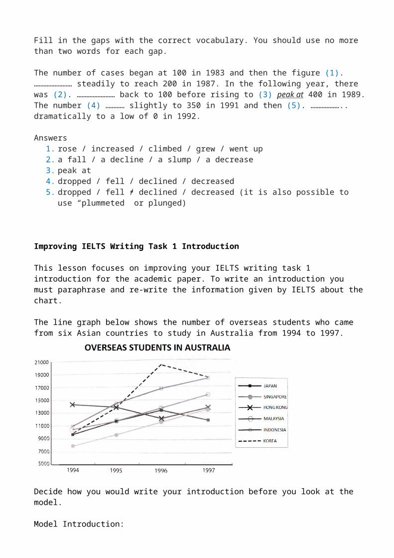
Fill in the gaps with the correct vocabulary. You should use no more than two words for each gap.

The number of cases began at 100 in 1983 and then the figure (1). …………………… steadily to reach 200 in 1987. In the following year, there was (2). …………………… back to 100 before rising to (3) peak at 400 in 1989. The number (4) ………… slightly to 350 in 1991 and then (5). ……………….. dramatically to a low of 0 in 1992.
Answers1. rose / increased / climbed / grew / went up2. a fall / a decline / a slump / a decrease3. peak at4. dropped / fell / declined / decreased5. dropped / fell / declined / decreased (it is also possible to use “plummeted” or plunged)
Improving IELTS Writing Task 1 Introduction
This lesson focuses on improving your IELTS writing task 1 introduction for the academic paper. To write an introduction you must paraphrase and re-write the information given by IELTS about the chart.
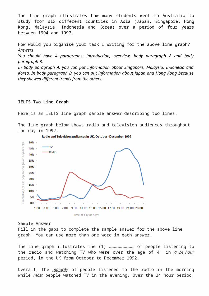
The line graph below shows the number of overseas students who came from six Asian countries to study in Australia from 1994 to 1997.
Decide how you would write your introduction before you look at the model.
Model Introduction:The line graph illustrates how many students went to Australia to study from six different countries in Asia (Japan, Singapore, Hong Kong, Malaysia, Indonesia and Korea) over a period of four years between 1994 and 1997.
How would you organise your task 1 writing for the above line graph? AnswersYou should have 4 paragraphs: introduction, overview, body paragraph A and body paragraph B.In body paragraph A, you can put information about Singapore, Malaysia, Indonesia and Korea. In body paragraph B, you can put information about Japan and Hong Kong because they showed different trends from the others.

IELTS Two Line Graph
Here is an IELTS line graph sample answer describing two lines.
The line graph below shows radio and television audiences throughout the day in 1992.
Sample AnswerFill in the gaps to complete the sample answer for the above line graph. You can use more than one word in each answer.
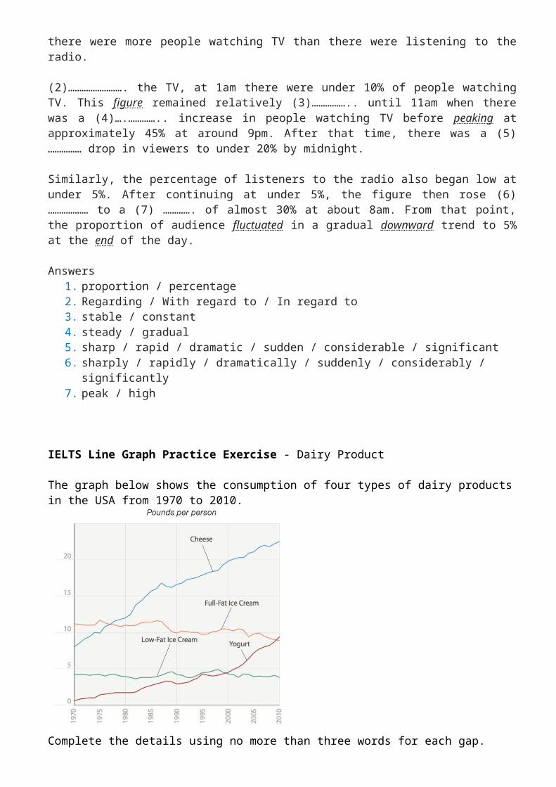
The line graph illustrates the (1) ………………………… of people listening to the radio and watching TV who were over the age of 4 in a 24 hour period, in the UK from October to December 1992.
Overall, the majority of people listened to the radio in the morning while most people watched TV in the evening. Over the 24 hour period, there were more people watching TV than there were listening to the radio.
(2)……………………. the TV, at 1am there were under 10% of people watching TV. This figure remained relatively (3)…………….. until 11am when there was a (4)….………….. increase in people watching TV before peaking at approximately 45% at around 9pm. After that time, there was a (5)…………… drop in viewers to under 20% by midnight.
Similarly, the percentage of listeners to the radio also began low at under 5%. After continuing at under 5%, the figure then rose (6)……………… to a (7) …………. of almost 30% at about 8am. From that point, the proportion of audience fluctuated in a gradual downward trend to 5% at the end of the day.
Answers1. proportion / percentage2. Regarding / With regard to / In regard to3. stable / constant4. steady / gradual5. sharp / rapid / dramatic / sudden / considerable / significant6. sharply / rapidly / dramatically / suddenly / considerably / significantly7. peak / high
IELTS Line Graph Practice Exercise - Dairy Product
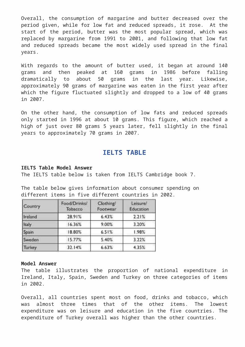
The graph below shows the consumption of four types of dairy products in the USA from 1970 to 2010.
Complete the details using no more than three words for each gap.
The amount of cheese eaten by people from the USA (1)…………….. (2)…………………….. from about 7 pounds in 1970 to reach a (3)…………… of over 20 pounds in 2010. Likewise, the consumption of yoghurt (4)………………. from just over 0 to just under 10 pounds in the final year. There was (5)………………… in the amount of full-fat ice cream eaten of about 2 pounds to reach about 9 pounds in 2010. The consumption of low-fat ice cream (6)………...…. at around 4 pounds over the period given.
Answers(1) rose / climbed / increased / went up(2) steadily / significantly / considerably(3) peak(4) rose / climbed / increased / went up(5) a decrease / a fall / a decline / a drop / a slight fall / a marginal decrease / a minimal drop(6) fluctuated
IELTS Line Graph Model
The graph below shows the consumption of 3 spreads from 1981 to 2007.
Sample Answer
The line graph illustrates the amount of three kinds of spreads (margarine, low fat and reduced spreads and butter) which were consumed over 26 years from 1981 to 2007. Units are measured in grams.
Overall, the consumption of margarine and butter decreased over the period given, while for low fat and reduced spreads, it rose. At the start of the period, butter was the most popular spread, which was replaced by margarine from 1991 to 2001, and following that low fat and reduced spreads became the most widely used spread in the final years.
With regards to the amount of butter used, it began at around 140 grams and then peaked at 160 grams in 1986 before falling dramatically to about 50 grams in the last year. Likewise, approximately 90 grams of margarine was eaten in the first year after which the figure fluctuated slightly and dropped to a low of 40 grams in 2007.
On the other hand, the consumption of low fats and reduced spreads only started in 1996 at about 10 grams. This figure, which reached a high of just over 80 grams 5 years later, fell slightly in the final years to approximately 70 grams in 2007.
IELTS TABLE
IELTS Table Model AnswerThe IELTS table below is taken from IELTS Cambridge book 7.
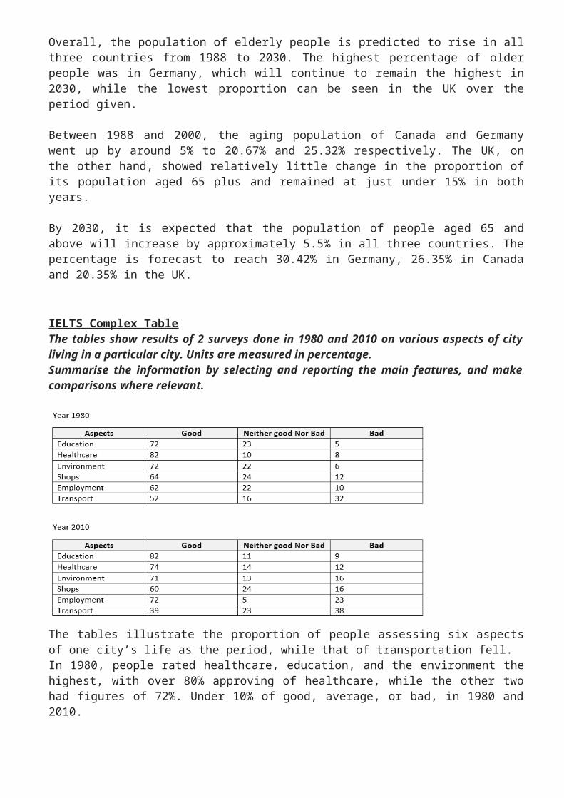
The table below gives information about consumer spending on different items in five different countries in 2002.
Model AnswerThe table illustrates the proportion of national expenditure in Ireland, Italy, Spain, Sweden and Turkey on three categories of items in 2002.
Overall, all countries spent most on food, drinks and tobacco, which was almost three times that of the other items. The lowest expenditure was on leisure and education in the five countries. The expenditure of Turkey overall was higher than the other countries.
In terms of food, drinks and tobacco, Turkey spent the most at 32.14%. The expenditure of Ireland was also high (28.91%) compared to Sweden which spent the least (15.77%). Spain and Italy spent 18.80% and 16.36% respectively.
Italy spent more than the other countries on clothing and footwear (9%) as opposed to the lowest expenditure which could be seen in Sweden at 5.40%. The other three countries spent on average around 6.5%.
The lowest expenditure was on leisure and education which accounted for under 5% in all countries. Turkey spent most on these items at just 4.35% of their national expenditure which is around double that of Spain which spent the least at just 1.98%.
Tips for IELTS Tables Put all your key features in the overview. Be selective. Don’t put too many details in your report. Make sure you write over 150 words but aim for less than 200. Use a range of linking devices eg compared to / as opposed to / in terms of / while etc
IELTS Writing Task 1 Future Prediction Model AnswerThis is a model answer for an IELTS writing task 1 table of future predictions as well as past information. This type of writing task 1 requires you to use both past tense and future forms in order to present the information accurately.
Model Answer with Future Predictions
The table gives information about the proportion of the population who are 65 years old and over in 3 countries (Canada, Germany and the UK) in 1988, 2000 and an estimated percentage in 2030.
Overall, the population of elderly people is predicted to rise in all three countries from 1988 to 2030. The highest percentage of older people was in Germany, which will continue to remain the highest in 2030, while the lowest proportion can be seen in the UK over the period given.
Between 1988 and 2000, the aging population of Canada and Germany went up by around 5% to 20.67% and 25.32% respectively. The UK, on the other hand, showed relatively little change in the proportion of its population aged 65 plus and remained at just under 15% in both years.
By 2030, it is expected that the population of people aged 65 and above will increase by approximately 5.5% in all three countries. The percentage is forecast to reach 30.42% in Germany, 26.35% in Canada and 20.35% in the UK.
IELTS Complex TableThe tables show results of 2 surveys done in 1980 and 2010 on various aspects of city living in a particular city. Units are measured in percentage.Summarise the information by selecting and reporting the main features, and make comparisons where relevant.

The tables illustrate the proportion of people assessing six aspects of one city’s life as the period, while that of transportation fell.In 1980, people rated healthcare, education, and the environment the highest, with over 80% approving of healthcare, while the other two had figures of 72%. Under 10% of good, average, or bad, in 1980 and 2010.Overall, healthcare, education, and the environment were given the highest scores in both years, and transport facilities received the lowest. Meanwhile, education’s rating rose over respondents thought these three services were bad. As for shopping and unemployment, both had similar figures, as 62-64% expressed approval, and 22-24% said they were average. Only a half of those surveyed gave a high score to transportation, with roughly a third stating it was bad.Turning to 2010, the most significant changes were seen in education, as over 80% were happy with it, and in healthcare whose good rating fell to 74%. The employment situation improved, as in 2010, almost three-quarters of those asked expressed satisfaction. In contrast, approval of the transport facilities fell to 39%, and a similar proportion stated it was bad. Finally, with regard to the environment and shopping, their approval levels both remained relatively unchanged.
BAR CHART
IELTS Bar Chart Model
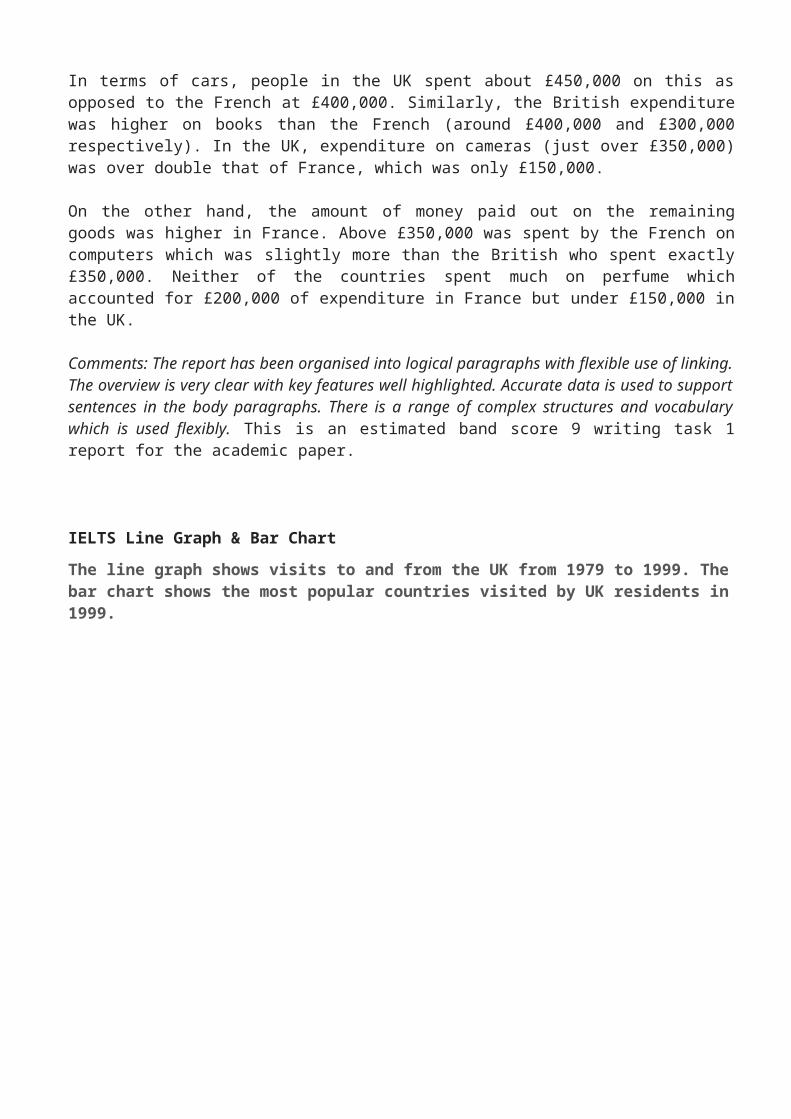
Sample AnswerThe chart illustrates the amount of money spent on five consumer goods (cars, computers, books, perfume and cameras) in France and the UK in 2010. Units are measured in pounds sterling.
Overall, the UK spent more money on consumer goods than France in the period given. Both the British and the French spent most of their money on cars whereas the least amount of money was spent on perfume in the UK compared to cameras in France. Furthermore, the most significant difference in expenditure between the two countries was on cameras.
In terms of cars, people in the UK spent about £450,000 on this as opposed to the French at £400,000. Similarly, the British expenditure was higher on books than the French (around £400,000 and £300,000 respectively). In the UK, expenditure on cameras (just over £350,000) was over double that of France, which was only £150,000.
On the other hand, the amount of money paid out on the remaining goods was higher in France. Above £350,000 was spent by the French on computers which was slightly more than the British
who spent exactly £350,000. Neither of the countries spent much on perfume which accounted for £200,000 of expenditure in France but under £150,000 in the UK.
Comments: The report has been organised into logical paragraphs with flexible use of linking. The overview is very clear with key features well highlighted. Accurate data is used to support sentences in the body paragraphs. There is a range of complex structures and vocabulary which is used flexibly. This is an estimated band score 9 writing task 1 report for the academic paper.
IELTS Line Graph & Bar Chart
The line graph shows visits to and from the UK from 1979 to 1999. The bar chart shows the most popular countries visited by UK residents in 1999.
Line Graph & Bar Chart Model Answer
The line graph illustrates the number of UK residents going abroad from the UK and overseas residents visiting the UK between 1979 and 1999, while the bar chart gives information about how many UK residents travelled to five of the most popular countries in 1999. Units are measured in millions of people.
Overall, there was an increase in the number of visits to and from the UK and there were more visits abroad by UK residents than visits to the UK by overseas residents over the period given. Furthermore, the most popular country to visit by UK residents was France in 1999.
The number of UK residents visiting overseas began at just under 15 million in 1979 and rose significantly to reach over 50 million in 1999. Around 10 million overseas residents visited the UK in the first year before climbing steadily to just under 30 million by the final year.
In 1999, France was visited by over 10 million UK residents, followed by Spain at approximately 9 million. The USA and Greece had about 4 million and 3 million visitors respectively. The least popular country visited was Turkey which had only about 2 million UK residents going there.
IELTS Writing Task 1 Bar charts 2017
IELTS Writing Task 1 Answer 2017The two bar charts illustrate the population growth as well as the birth and death rates in England and Wales between 1700 and 2000. The population is given in millions, while the birth and death rates are per 1000 people.
Overall, there was a dramatic increase in the population of England and Wales over the 400 years. The birth and death rates initially witnessed a growth but then steadily declined over the period given. The birth rate was constantly higher than the death rate over the period given.
The population of England and Wales stood at under 10 million in 1700 which then doubled to around 15 million in 1800. By 2000, the figure had reached a high of almost 50 million, almost 5 times that of the population in 1700.
The birth rate was just under 10 per 1000 in 1700 and rose dramatically to peak at over 20 per 1000 in 1800 before dropping to slightly over 10 in the final century. The death rate showed a similar trend but was between 5 and 10 per 1000 less than the birth rate at all times.
(187 words)
BAR CHART EXERCISE
The bar chart below shows the number of research students studying different subject in 2005.
Model IELTS Bar Chart Report
Fill in the report below using the following verbs. You must put the verbs in the correct form and tense. Each verb can be used more than once.
to be / to see / to study / to illustrate / to show / to choose / to learn / to prefer
The bar chart (1). ………………… how many male and female research students (2). ……………….. six different subjects (linguistics, psychology, natural sciences, engineering, programming and mathematics) in 2005.
Overall, there (3). …………. more male research students than females in 2005. Although the most popular subject for both genders 4. …………..natural sciences, men least (5). …………….. linguistics and women (6). …………. little interest in mathematics. Linguistics was the only subject that 7. ………… favoured by women more than men.
There was a similar number of men and women in three subjects. There were equal numbers in research students (200) (8). ……………….. natural sciences. There was a difference between the genders of about 25 in both psychology and linguistic with more women (9). …………….. linguistics (around 110) and more men taking psychology (200).
A difference of about half (10)………… evident in engineering and programming where 150 men chose both subjects. By contrast, 200 men selected mathematics which was approximately five fold that of women (about 40).
Answers
1) illustrates2) studied3) were

4) was5) preferred6) showed7) was8) studying / learning9) studying / learning / choosing10)was
BAR CHART LESSON – Put sentences in order
Creating a Model Answer for IELTS writing task 1.
Below you will find 10 sentences. Put them in order to create a high band score model answers.
D) The bar chart illustrates how many hours adolescents in Chester spent on seven activities each week between 2002 and 2007.
G) Overall, the most popular activity over the period given was watching TV, whereas bowling was the least favourite.
C) Going to pubs and discos, watching TV and shopping all showed an increase in the number of hours teenagers spent on these activities.
B) The other pursuits showed a decrease in hours, except watching DVD’s which fluctuated.
A) Teenagers spent 25 hours on watching television in 2002 which increased to almost 40 hours in the final year.
I) Both going to pubs and discos, and shopping more than doubled in hours from over 5 to over 15 and from over 5 to exactly 15 respectively.
E) While teenagers occupied 10 hours doing homework in 2002, this figure dropped to just over 5 in 2007.
J) Playing sport fell more dramatically from 10 hours to around 3 hours.
H) Bowling was under 5 hours throughout the entire period declining by about 4 hours in total.
F) The number of hours teenagers dedicated to watching DVD’s was only 10 hours in first and final years, but reached a peak of over 15 hours in 2004 and 2005.
Answers: D, G, C, B, A, I, E, J, H, F
The bar chart illustrates how many hours adolescents in Chester spent on seven activities each week between 2002 and 2007.
Overall, the most popular activity over the period given was watching TV, whereas bowling was the least favourite. Going to pubs and discos, watching TV and shopping all showed an increase in the number of hours teenagers spent on these activities. The other pursuits showed a decrease in hours, except watching DVD’s which fluctuated.
Teenagers spent 25 hours on watching television in 2002 which increased to almost 40 hours in the final year. Both going to pubs and discos, and shopping more than doubled in hours from over 5 to over 15 and from over 5 to exactly 15 respectively.
While teenagers occupied 10 hours doing homework in 2002, this figure dropped to just over 5 in 2007. Playing sport fell more dramatically from 10 hours to around 3 hours. Bowling was under 5 hours throughout the entire period declining by about 4 hours in total. The number of hours teenagers dedicated to watching DVD’s was only 10 hours in first and final years, but reached a peak of over 15 hours in 2004 and 2005.
(194)
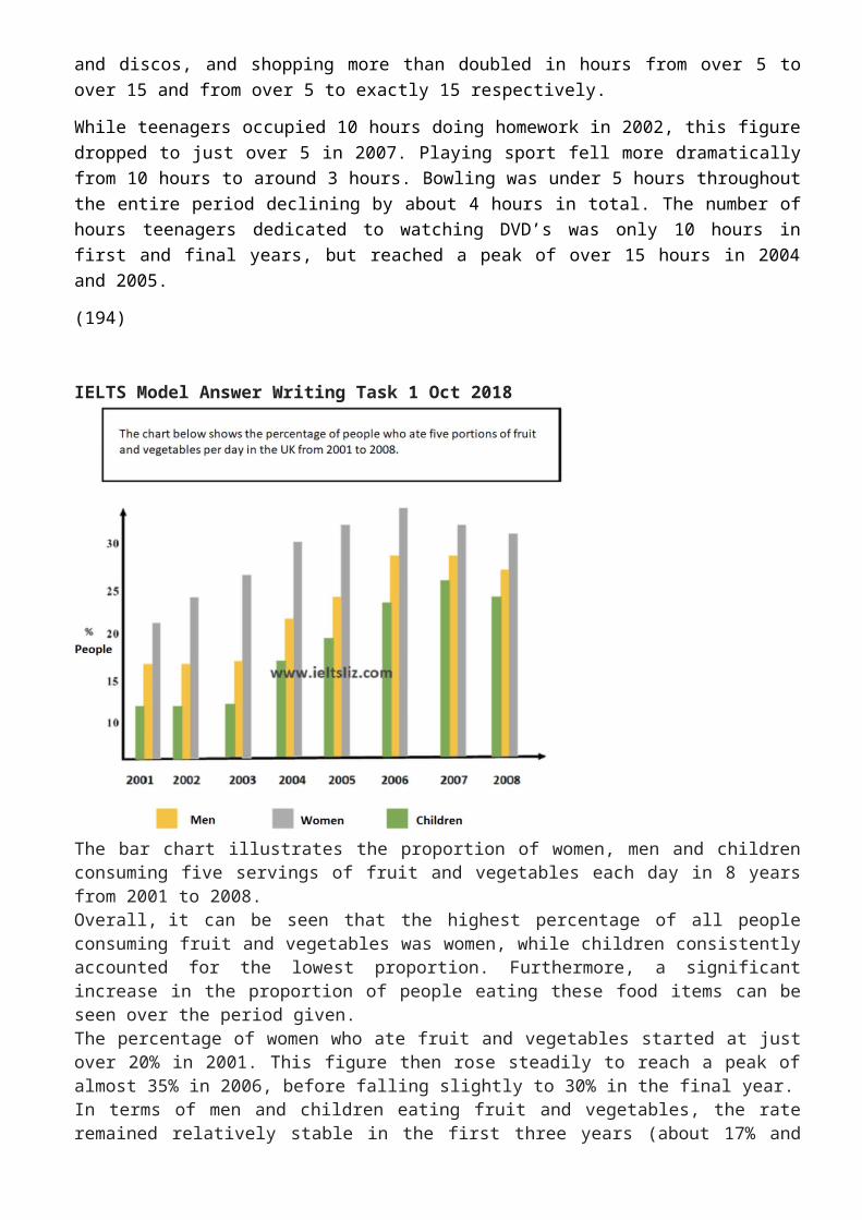
IELTS Model Answer Writing Task 1 Oct 2018
The bar chart illustrates the proportion of women, men and children consuming five servings of fruit and vegetables each day in 8 years from 2001 to 2008.

Overall, it can be seen that the highest percentage of all people consuming fruit and vegetables was women, while children consistently accounted for the lowest proportion. Furthermore, a significant increase in the proportion of people eating these food items can be seen over the period given.The percentage of women who ate fruit and vegetables started at just over 20% in 2001. This figure then rose steadily to reach a peak of almost 35% in 2006, before falling slightly to 30% in the final year.In terms of men and children eating fruit and vegetables, the rate remained relatively stable in the first three years (about 17% and 12% respectively). From this point, the proportion of men climbed gradually to peak at about 27% in both 2006 and 2007, after which it dropped to about 26%. A similar growth in the figure for children was evident reaching 25% in 2007 and around 24% in the final year.
PIE CHARTS
How to Describe Pie Charts in IELTS Writing Task 1
You can be given two pie charts to compare in IELTS writing task 1. Below are easy steps to write each paragraph in order to describe your pie chart in a complete report. Each step takes you through a paragraph practice and sample models. Learn about the introduction, overview and body paragraphs for your pie chart.
Introduction
You must paraphrase the information given at the top of the charts “The graph shows the main sources of energy for the USA in 1980 and 1990”. You cannot copy this, you must use your own language.
Tips
the graph = the pie chart

shows = illustrates
main sources of energy = energy production from different sources
for the USA = don’t change this
in 1980 and 1990 = in two different years (1980 and 1990)
Model
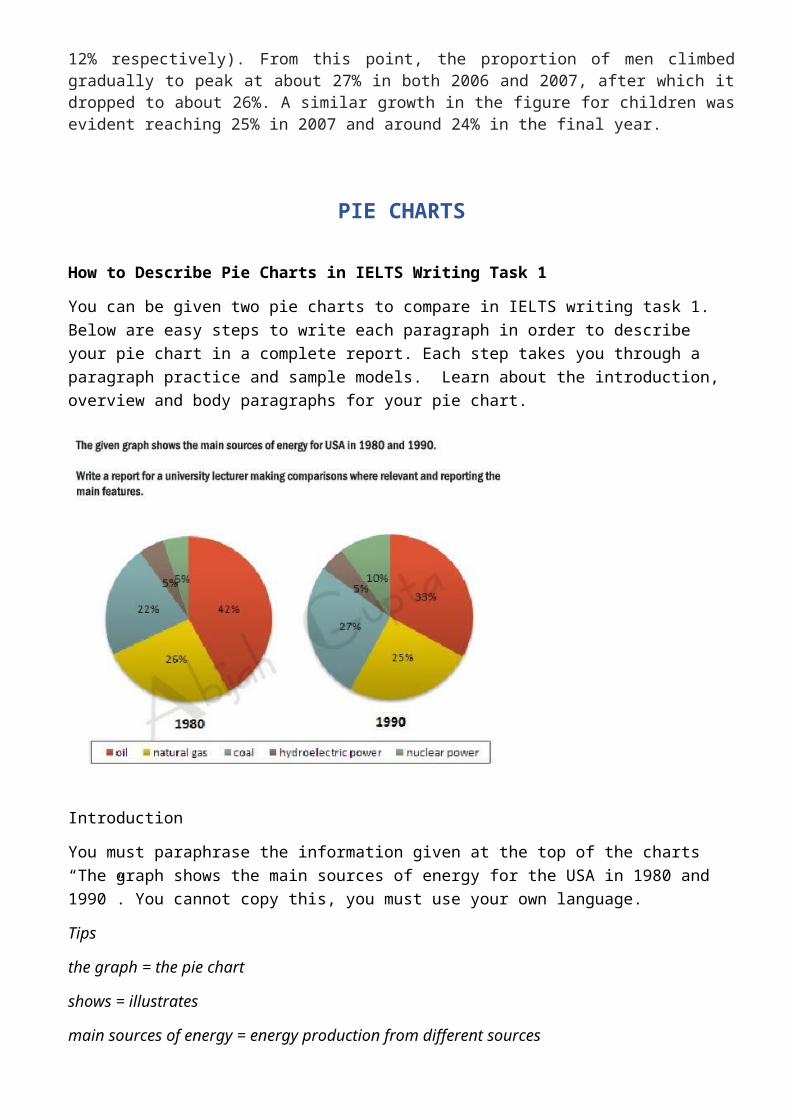
The pie charts illustrate the changes in energy production from five different sources (oil, natural gas, coal, hydroelectric power and nuclear power) for the USA in two different years (1980 and 1990).
Overview
The overview contains the key features of the charts. Answer the questions below to find the key features.
What was the main source of energy in 1980?
What was the main source of energy in 1990?
Which produced the least energy in 1980?
Which produced the least energy in 1990?
Did the amount of energy produced by each source change a lot or just a little between the years?
Did all types of energy increase by 1990?
Now write your overview before you check the model.
Model
Overall, oil constituted the main source of energy production in both years, while hydroelectric power produced the least energy. There was a slight decrease in production from oil and natural gas, whereas an increase can be seen in the figures for coal and nuclear power.
Body Paragraph A
This paragraph will give details about oil and hydroelectric power, which we highlighted in the overview above.
Tips
You will need to write one sentence about oil comparing the percentage each year and then one sentence about hydroelectric power comparing the years.
You must add data (percentages and dates) to support each sentence
Here are two example sentences. Fill in the gaps with the right words.
The amount of energy produced by oil in the USA 1. ………………. 42% in 1980 and this, then, 2. ………………….. to a third (33%) in 1990. The proportion of energy from hydroelectric power, 3………………, remained constant in both years ………a mere 5%.
Answers

1) accounted for / comprised of / made up / was2) fell / declined / dropped / went down / decreased3) on the other hand / by contrast / in contrast ( we use a linker to highlight that this is
opposing information to the previous sentence)4) at
Body Paragraph B
This paragraph will give detail about the other sources of energy in the pie charts.
Tips
which sources increased?
which sources decreased?
what were the percentages for each source?
Again, fill in the gaps in these model sentences.
The energy generated by natural gas, which was the second 1. …………… source of energy in the USA in 1980, fell 2. ………. 1% to a quarter of all energy produced in 1990. In contrast, production by coal 3. ……………… from 22% to 27% in 1990 4. …………….. there was a 5% rise in energy from nuclear power to reach 10% in the second year.
Answers
largest / major
by (this is used when writing about differences in amounts)
increased / rose / went up / climbed / grew
while / whereas
Grammar Accuracy for IELTS Writing Task 1When you describe a chart, for example a pie chart, in 25% of your marks is based on grammar. In the criteria of grammar, the examiner will check the range of sentence structures and also the accuracy of your grammar. The more mistakes you have, the lower your score will be.There are a number of common errors which students make with their grammar. Here is a list:1 Articles (using a / an / the )2 Plurals3 Uncountable nouns4 Punctuation (commas and full stops)5 Noun verb agreement (remember that third person singular in the present tense has an ‘s’)6 Verb tense7 Prepositions (in / on / at etc)
Grammar Accuracy Practice
Look at the following sentences and find the grammar mistakes. Each sentence may have one or more mistakes.1. The pie charts show the typical expenditure of a household in 6 main categories.2. There was an increase in spending in all areas except for housing and education, which showed a downward trend over the period given.3. The biggest spending in 1950 was 72.2% in 1950 while in 2010 the majority of money spent was on food.4. While the spending on housing was 72.2%, in 2010 the spending was 22%.5. The spending on food was 11.2% in 1950 and 34% in 2010.6. Spending on other items was 4.4% in the first year and 19.2% in the second year.7. The least amount spent on both years was in health care.8. There was a significant decrease in spending on housing from 72% to 22%.
Pie Chart and Bar Chart for IELTS Writing Task 1 exercise
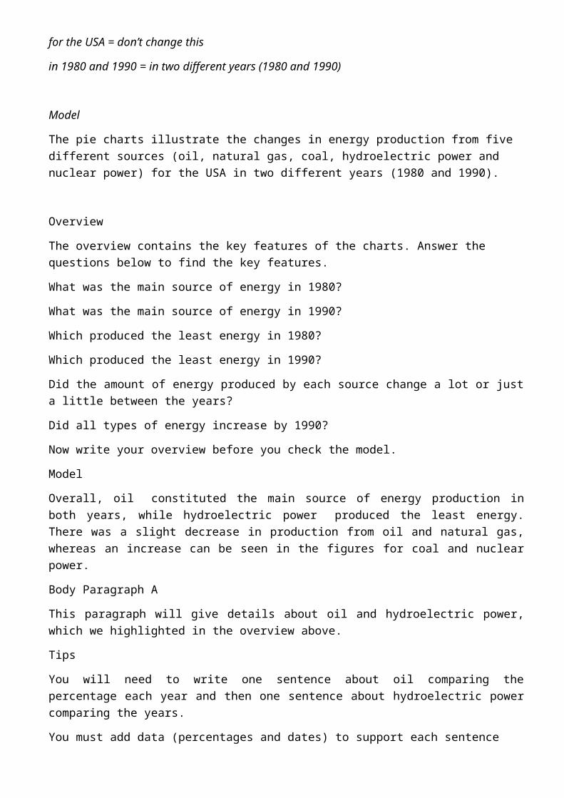
The charts below show the males and females arrested over 5 years and the reasons for the most recent arrests.

Overview.
This paragraph must contain key features from both charts. This means you must write one sentence about the key features of the pie charts and one sentence for the key features of the other chart.
Model Overview
Overall, over the five year period finishing in 1994, there were significantly more males arrested than females. The majority of arrests were due to public drinking while no answer was given for the least number of arrests for both genders.
IELTS Writing Task 1: Pie Chart Model Score 9
These pie charts were reported in the IELTS test in November, 2017.
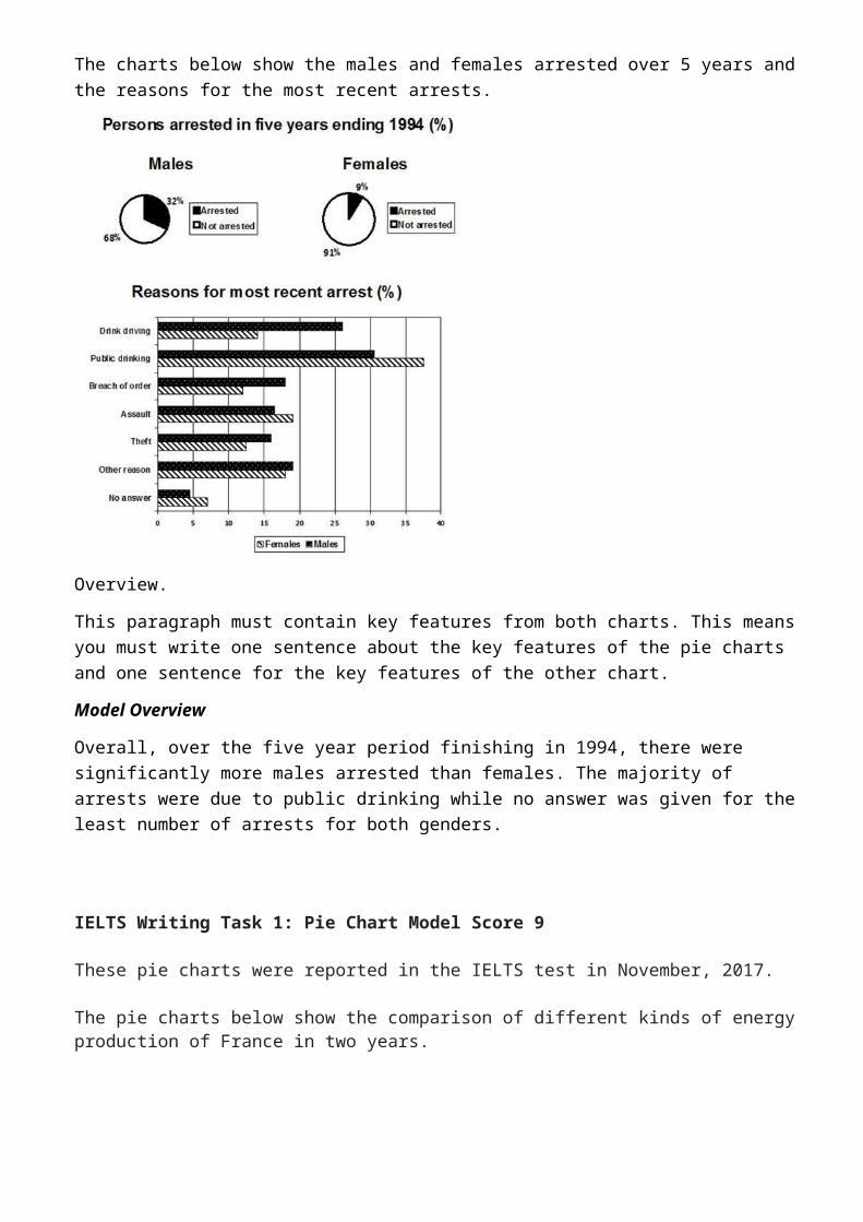
The pie charts below show the comparison of different kinds of energy production of France in two years.
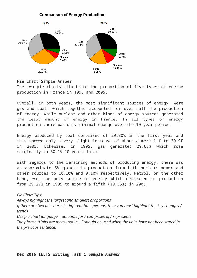
Pie Chart Sample AnswerThe two pie charts illustrate the proportion of five types of energy production in France in 1995 and 2005.
Overall, in both years, the most significant sources of energy were gas and coal, which together accounted for over half the production of energy, while nuclear and other kinds of energy sources generated the least amount of energy in France. In all types of energy production there was only minimal change over the 10 year period.
Energy produced by coal comprised of 29.80% in the first year and this showed only a very slight increase of about a mere 1 % to 30.9% in 2005. Likewise, in 1995, gas generated 29.63% which rose marginally to 30.1% 10 years later.
With regards to the remaining methods of producing energy, there was an approximate 5% growth in production from both nuclear power and other sources to 10.10% and 9.10% respectively. Petrol, on the other hand, was the only source of energy which decreased in production from 29.27% in 1995 to around a fifth (19.55%) in 2005.
Pie Chart Tips:Always highlight the largest and smallest proportions
If there are two pie charts in different time periods, then you must highlight the key changes / trendsUse pie chart language – accounts for / comprises of / representsThe phrase “Units are measured in …” should be used when the units have not been stated in the previous sentence.
Dec 2016 IELTS Writing Task 1 Sample Answer
The task consists of one vertical bar chart and two pie charts. The sample answer is estimated at about band score 8. The sample answer contains some grammar errors – can you find them? Answers below.
Sample Answer – band score 8
The bar chart and pie charts illustrate the percentage of people in Glasgow having three levels of education (university, school and those with no qualifications) in 2010. Information is divided into five age groups in the bar chart and by gender in the pie charts.
Overall, the majority of people with university education were in the younger age groups, while in the oldest age group most people did not have any qualifications. The proportions of men and women were similar and showed little difference between the levels of education.
The percentage of people with a university education was up to 76% in the younger three age groups compared to only 50% in those aged 50 to 75 and just 25% in those over 75. This trend was reversed in those with no qualifications (9% in younger people rising to 72% in the oldest age group). The figure for those with school education was relatively constant at around 20% but was as low as 3% in the over 75’s.
The proportion of men and women in each level of education was around one third with only a slight difference of 3% of university graduates as well as those who did not have educational qualifications.
(198)
IELTS Writing Task 1: Table with Three Pie Charts Model
The topic is the imports of fish to the US from various countries and the value of these imports.
Model Answer: IELTS Table & 3 Pie Charts
The following model answer has been divided into sentences (A-G). Put them in the correct order to find a band score 9 model writing task 1 report.
A) In terms of the source of fish importation, Canada supplied the overwhelming majority in 1988 (60%) compared to China and other countries which provided only 13% and 27% respectively.
B) Regarding the table, the value of imports started at $6.57 billion in the first year, increasing to $8.52 in 1992 and reaching $10.72 in the last year.
C) Overall, the value of imports rose by almost double over the period given.
D) Us imports from Canada fell over the period by just over a half to 28% as opposed to China that witnessed an increase to 30% in 2000.
E) At the start of the period, the US imported fish predominantly from Canada but, by the final year, other countries had become the main source.
F) The table shows the value of fish that was imported to the US (measured in billions of dollars) in 1988, 1992 and 2000, while the three pie charts illustrate the amount of fish that the US brought in from China, Canada and other countries in the same three years.
G) By 1992, other countries had replaced Canada as the main supplier and made up 46% of all imports in 1992 and 42% by 2000.
Answer: F C E B A G D
See the model answer below to check how the above information is organised into paragraphs.
IELTS Model Answer: Table & 3 Pie Charts
The table shows the value of fish that was imported to the US (measured in billions of dollars) in 1988, 1992 and 2000, while the three pie charts illustrate the amount of fish that the US brought in from China, Canada and other countries in the same three years.
Overall, the value of imports rose by almost double over the period given. At the start of the period, the US imported fish predominantly from Canada but, by the final year, other countries had become the main source.
Regarding the table, the value of imports started at $6.57 billion in the first year, increasing to $8.52 in 1992 and reaching $10.72 in the last year.
In terms of the source of fish importation, Canada supplied the overwhelming majority in 1988 (60%) compared to China and other countries which provided only 13% and 27% respectively. By 1992, other countries had replaced Canada as the main supplier and made up 46% of all imports in 1992 and 42% by 2000. US imports from Canada fell over the period by just over a half to 28% as opposed to China that witnessed an increase to 30% in 2000.
Examiner Comment: Vocabulary is accurate and flexible. Paraphrase for the topic vocabulary =fish importation, provided, supplied, suppliers. Please note that the topic vocbaulary provided by IELTS was also used which is fine. Sentences are complex and accurate. The writer offers a good range of sentence structures and linking words (while, overall, regarding, in terms of, compared to, as opposed to). The overview statement is easy to find and contains the key features for both table and charts. Details are well organised into logical body paragraphs. It is fine that body paragraphs are not of equal length in report writing. This is estimated at band 9.
IELTS Writing Task 1 – 2 Pie charts and a bar chart – world’s water 2016 & 2018 (similar)
The pie charts give information about how the world’s water is distributed, whereas the bar chart illustrates the percentage of water used in agriculture, domestic use and industry in three countries (Egypt, Saudi Arabia and Canada).
Overall, salt water makes up an overwhelming majority of the world’s water. Fresh water is made up of mainly water from ice and glaciers. While most water in Egypt and Saudi Arabia is used for agriculture, in Canada it is predominantly used for industry.
The pie charts show that 97% of global water is salt water compared to a mere 3% which is fresh water. Water from ice and glaciers accounts for 79% of all fresh water as opposed to ground water and surface water (20% and 1% respectively).
In terms of the use of water, both Egypt and Saudi Arabia use almost 80% of their water for agriculture in comparison to domestic usage and industry which account for approximately 15% and 10% respectively. The reverse is seen in Canada where only 10% of water is used for agriculture and domestic purposes in contrast to industry, which uses 80% of water in Canada.
(189)
Examiner Comments:
The information is well organised into logical paragraphs. The overview paragraph contains the key features of all charts. Information is accurate and no irrelevant information is given. There is a flexible range of linking devices for showing comparisons. Vocabulary is well used and this report contains complex sentence structures.

__________________________________________________
IELTS Academic Task 1— Table Adam
The table below gives information about the percentage of adults who paid for admission to various entertainment events in five nations in 2012.
Summarize the information by selecting and reporting the main features, and make comparisons where relevant.
Version 1 (according to countries)
The table presents data on purchases of four entertainment types in North America and Europe in 2012. The information is presented in terms of average adult attendance as a percentage of the population.
Overall, it is clear that the most popular form of entertainment in all five countries was movies. The least favourite was museums and galleries in the North American market, and sporting events in Europe.
Over half of Canadian and American adults bought film tickets, the latter at 59.7% of the population and the former at 52.6%. Museums and galleries were favoured by just a fifth of adults in the USA and only 15.6% of Canadians, figures that were nearly doubled and more than doubled, respectively, by their European counterparts. Sports and performing arts ticket purchases were within a 10% variance among all countries.
Among European adults, all four forms of entertainment attracted similar numbers. The greatest gap was about 7% between Germany and both France and the UK in terms of the performing arts, while sports had less than an 8% difference between the highest (UK, 31.1%), and the lowest (France, 22.7%).
(185)
Version 2
The table presents data on the entertainment purchases of adults in Canada, the USA, France, Germany, and the UK in 2012. The information is presented in terms of average adult attendance as a percentage of the population.
Overall, movies were the most popular form of entertainment among adults in all five countries, with museums/galleries and sporting events being the least popular in North America and Europe, respectively.
While the performing arts do not show a great discrepancy in adult attendance, ranging from a low of 31.9% in Canada to a high of 41.9% in France, it is different for museum and gallery visits.
France nearly doubles the USA in this regard (39.1% to 20.6%), while all three European countries, whose rates are relatively similar, more than double Canada’s rate of 15.6%.
In terms of sports, there is a similarly small variance among the five countries, with the UK boasting the most sold tickets to adults at 31.1% of the population, and France the lowest, at 22.7%. Cinemas, meanwhile, attract over half the adult populations of Canada and the USA, while in Europe, the high is just 46.4% in the UK.
IELTS Academic Task1– Bar Graph (Adam)
The chart below provides the results of a survey conducted by a Human Resources Department for a major recruiting company. The survey asked people of different age groups the reasons they keep their jobs and don’t look for a new job.
Summarize the information below. Select and report on the main features and compare where relevant.
The bar graph presents the four main reasons employees choose to remain with their present employers. The questionnaire, which was administered by the HR department of a headhunting company, was given to workers aged 21–30, 31–45, and 46–65.It is clear from the results that priorities change with age, especially in terms of security. Whereas 80% of the oldest group cited job security as a prime reason to continue with their current employer, less than a quarter of the youngest workers, 21%, felt the same. Conversely, the 21-30-year-olds viewed their coworkers as the main motivation to stay at their jobs, at 72%. Less than half of the oldest group said the same.
Salary, while a deciding factor for all three groups, especially those between 31 and 45, still only ranks third among young workers’ priorities. Close behind their coworkers, this group values experience very highly. For both the middle and older groups, experience is the least important reason to stay at their jobs, at roughly 42% and 15% respectively.
(172)
IELTS Academic Task1– Line Graph (Adam)
The graph below shows the number of movie tickets sold around the world each year from 1980 to 2010. Ticket sales, according to genre, are presented in millions.
Summarize the information by selecting and reporting the main features, and make comparisons where relevant.
The line chart presents the changes in global sales of movie tickets over a thirty-year period starting in 1980. Sales are divided by film type and are shown in millions. Overall, sales have increased during this span, with the exception of comedy films, which saw a slight decline.
Comedy films were top sellers with just over 600 million tickets sold in 1980 and steadily fell to around 350 million by 2000, roughly equal to horror film ticket sales. At this point, the genre saw a rebound and finished the period with about 500 million in sales by 2010.
All four of the other genres witnessed an increase in sales, with action/adventure and animation movies showing the greatest rises, especially after 2000. Action/adventure ticket sales almost quadrupled from just under 400 million to about 1.5 billion over the span of the graph, while animation films, which started at the same level as documentaries in 1980, grew 12 times, going from 100 million to 1.2 billion. Documentaries and horror films, though tripling and nearly doubling respectively, had a less significant rise.
(179)